ADV @ UNDERCONSIDERATION Peek here for details
BROWSE
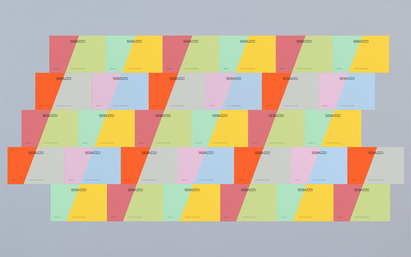
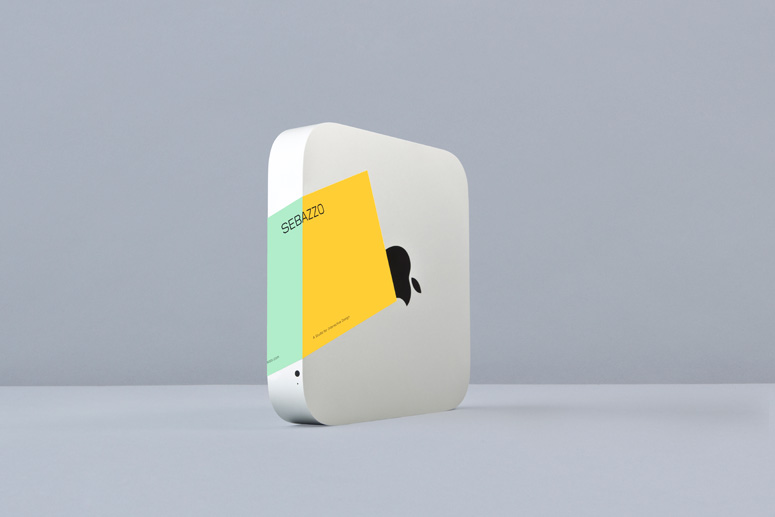
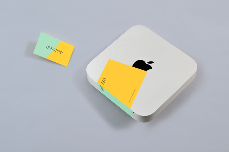
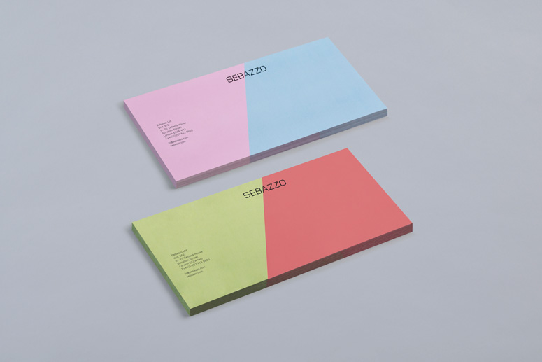
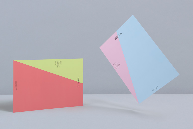
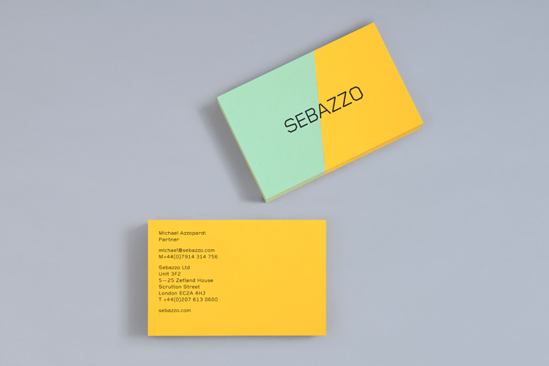
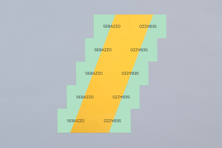
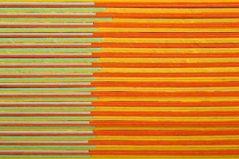
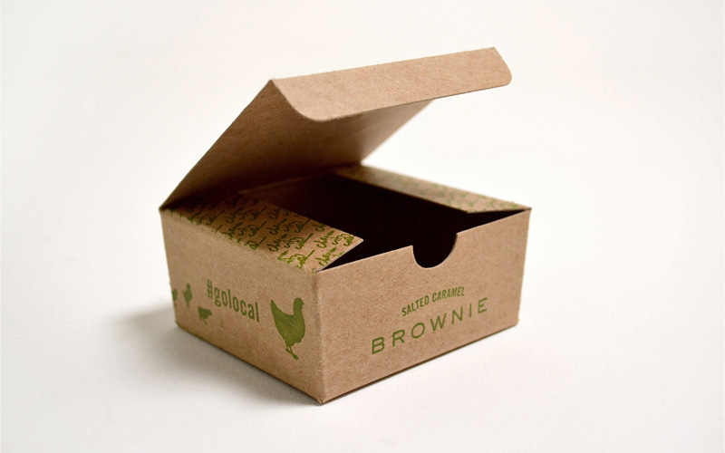
This identity suite uses Wim Crouwel’s geometric and hard-lined Gridnik typeface as a foundation to represent Sebazzo’s technological efficiency and straightforward character. The two-man studio is represented in the paper systems through a division of color, which is achieved through a production technique we do not see very often: paper marquetry. In this case one color of paper is applied as a veneer to another piece of paper.
Client
Sebazzo
Quantity Produced
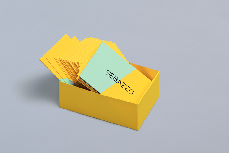
Business cards: 2 × 1000
Letterheads: 2 × 500
Compliment Slips: 2 × 500
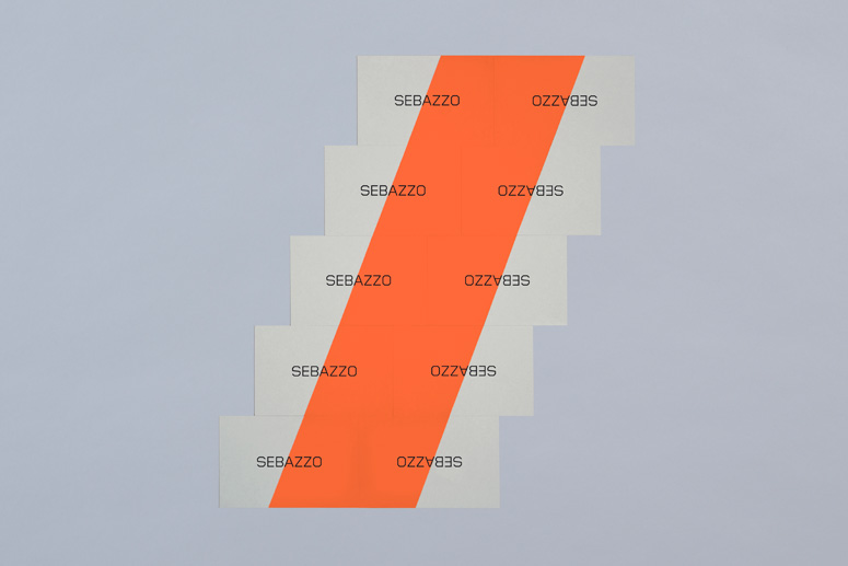
Stickers: 4 × 500
Production Cost
3,000 USD
Production Time
1 week
Dimensions (Width × Height × Depth)
Business cards: 3.35 × 2.17 in
Letterheads: 11.69 × 8.27 in
Compliment Slips: 8.27 × 3.9 in
Stickers: 5.83 × 3.74 in
Page Count
–
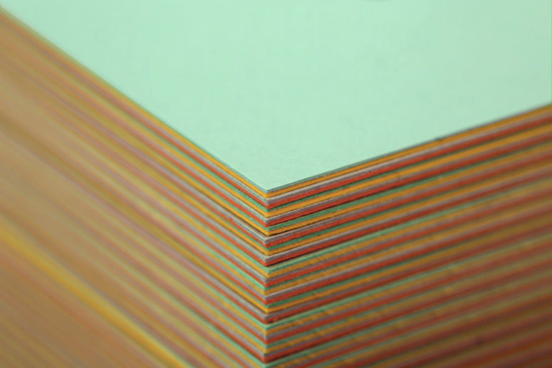
Paper Stock
Pop'Set Grey
Flame orange
Spring Green
Sunshine Yellow
Fasson Velux Supertack 167 g/m2
Aggripina Maxi Offset 140 g/m2
Number of Colors
8
Varnishes
–
Binding
Paper marquetry construction
Typography
Foundry Gridnik
Project Description
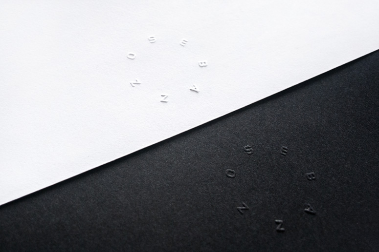
Constructed from Gridnik – the logotype’s uppercase sans-serif letterforms, 45-degree corners, monoline weight, structure and geometry, as well as its compounded nature, all point towards a straightforward and confident technological efficiency and neatly reference the designers that make up Sebazzo. The characters are well spaced, balanced by a central A and executed with a single black ink print treatment that provides a distinctive contrast to the more expressive and tactile sensibilities of the stationery.The diagonal cut of the bright and pastel boards that make up the business cards create a striking but restrained dual tone and subtle dynamic aesthetic that feels like a simple but effective distillation of a two-man studio which compliments the ideation of the name and neatly splits the logotype into its two constituent parts. These are neatly unified by the tactile and crafted qualities of their paper marquetry construction.
Text by Richard Baird.
Production Lesson(s)
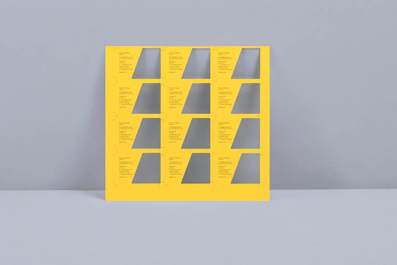
The letterhead and compliment slip are absent the detail of the marquetry process, their full bleed colour palette and angle ties in well with the cards and continues to split the logotype.
Post Author

Duncan Robertson
Former intern at UnderConsideration LLC.
More: Online / On Twitter
Date Published
January 17, 2014
Filed Under
Identity Materials
Offset
Tagged with
geometric
Gridnik
marquetry
two tone


About
FPO (For Print Only), is a division of UnderConsideration, celebrating the reality that print is not dead by showcasing the most compelling printed projects.
FPO uses Fonts.com to render Siseriff and Avenir Next.
FPO is run with Six Apart’s MovableType
All comments, ideas and thoughts on FPO are property of their authors; reproduction without the author’s or FPO’s permission is strictly prohibited
Twitter @ucllc
Sign-up for Mailing List
Mailing list managed by MailChimp
Thanks to our advertisers
About UnderConsideration
UnderConsideration is a graphic design firm generating its own projects, initiatives, and content while taking on limited client work. Run by Bryony Gomez-Palacio and Armin Vit in Bloomington, IN. More…
blogs we publish
Brand New / Displaying opinions and focusing solely on corporate and brand identity work.
Art of the Menu / Cataloguing the underrated creativity of menus from around the world.
Quipsologies / Chronicling the most curious, creative, and notable projects, stories, and events of the graphic design industry on a daily basis.
products we sell
Flaunt: Designing effective, compelling and memorable portfolios of creative work.
Brand New Conference videos / Individual, downloadable videos of every presentation since 2010.
Prints / A variety of posters, the majority from our AIforGA series.
Other / Various one-off products.
events we organize
Brand New Conference / A two-day event on corporate and brand identity with some of today's most active and influential practitioners from around the world.
Brand Nieuwe Conference / Ditto but in Amsterdam.
Austin Initiative for Graphic Awesomeness / A speaker series in Austin, TX, featuring some of the graphic design industry's most awesome people.
also
Favorite Things we've Made / In our capacity as graphic designers.
Projects we've Concluded / Long- and short-lived efforts.
UCllc News / Updates on what's going at the corporate level of UnderConsideration.

Related entries
Andy Stewart Design Identity Materials
Carolina Manresa Identity Materials
Bocanegra Studio Identity Materials
2016 Brand New Conference Badges
Molly Taylor & Co. Identity Materials