ADV @ UNDERCONSIDERATION Peek here for details
BROWSE
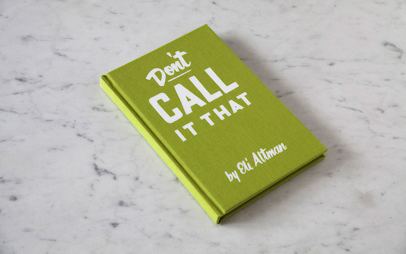
Don’t Call It That: A Naming Workbook
Production Method
Foil stamp
Offset
Design
Boon
Printing
Regal HK
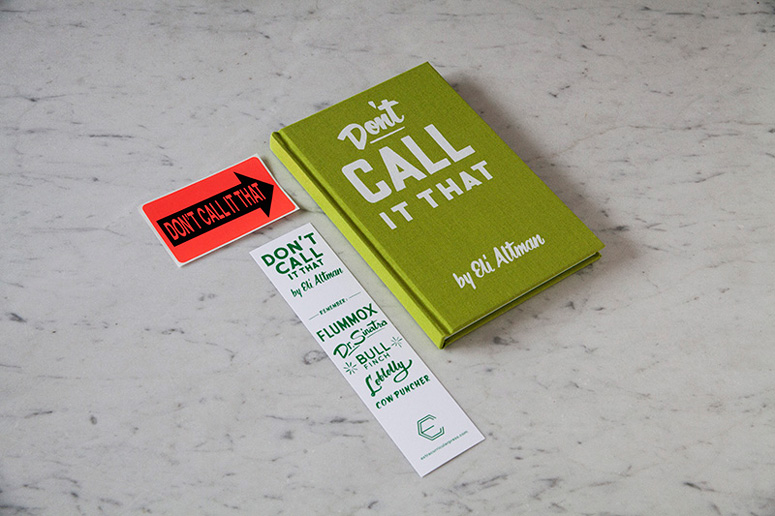
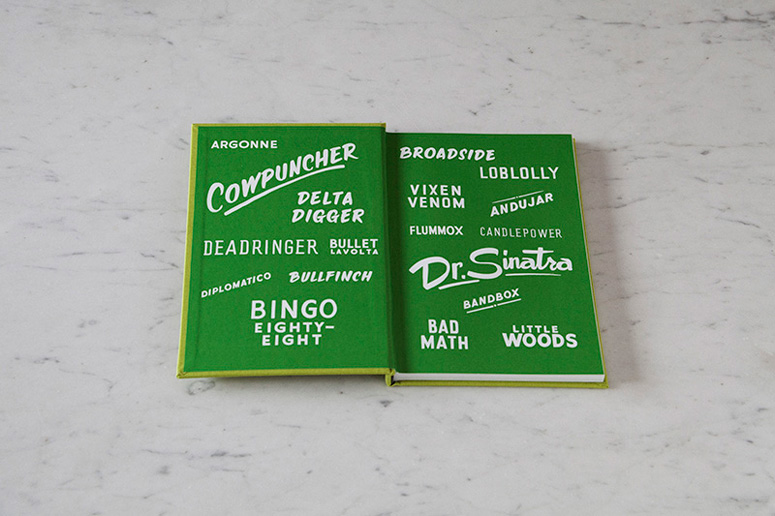
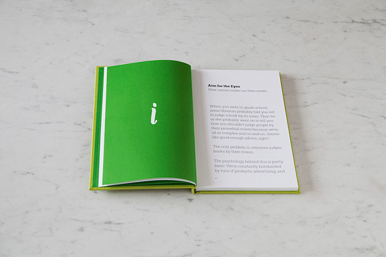
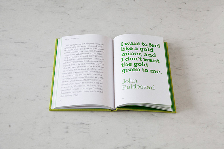
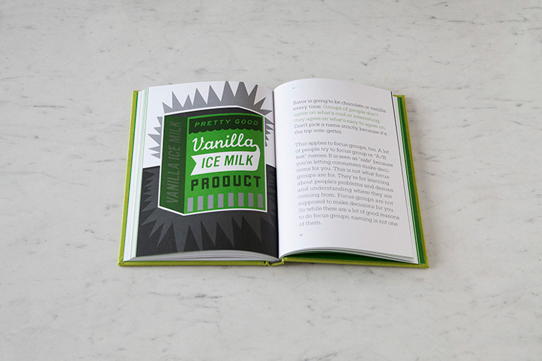
This workbook for naming companies and products comes from the Creative Director at Berkeley-based naming and branding firm A Hundred Monkeys, Eli Altman. From the foil-stamped cover through the two-color printed pages this book is a quality piece of work. Boon Design nailed the workbook look and feel with sturdy materials, large type, and retro illustrations. We are particularly fond of the depth and creativity printed in only two Pantone colors.
Dimensions (Width × Height × Depth)
6 × 9 × 0.5 in
Page Count
125
Paper Stock
–
Number of Colors
2 PMS
Varnishes
–
Binding
Casebound with head and tail bands.
Typography
Fakt Slab Pro
Fakt Pro

Project Description
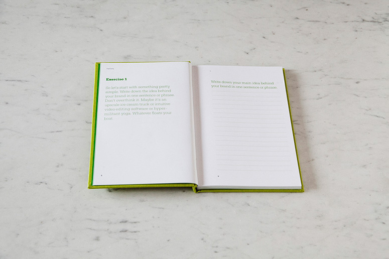
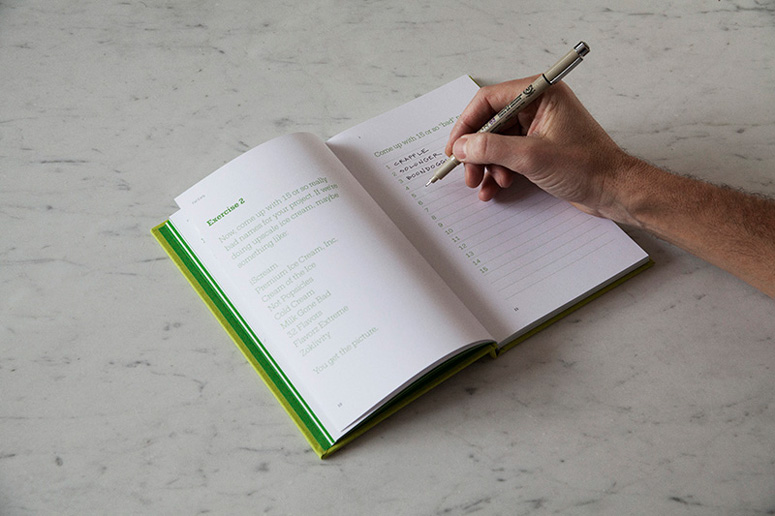
DON'T CALL IT THAT is a step-by-step workbook that will guide you through the naming process. A Hundred Monkeys Creative Director, Eli Altman, will help you develop attention grabbing names that speak to your audience and establish the seed of your brand. The design approach was to make a workbook that is useful, engaging, and able to speak to a widely diverse audience.Production Lesson(s)
Asking for loose color, even on simple two color spot illustrations, is always a good idea.
Post Author

Duncan Robertson
Former intern at UnderConsideration LLC.
More: Online / On Twitter
Date Published
March 24, 2014
Filed Under
Books
Foil stamp
Offset
Tagged with
cloth cover
green
retro
two colors


About
FPO (For Print Only), is a division of UnderConsideration, celebrating the reality that print is not dead by showcasing the most compelling printed projects.
FPO uses Fonts.com to render Siseriff and Avenir Next.
FPO is run with Six Apart’s MovableType
All comments, ideas and thoughts on FPO are property of their authors; reproduction without the author’s or FPO’s permission is strictly prohibited
Twitter @ucllc
Sign-up for Mailing List
Mailing list managed by MailChimp
Thanks to our advertisers
About UnderConsideration
UnderConsideration is a graphic design firm generating its own projects, initiatives, and content while taking on limited client work. Run by Bryony Gomez-Palacio and Armin Vit in Bloomington, IN. More…
blogs we publish
Brand New / Displaying opinions and focusing solely on corporate and brand identity work.
Art of the Menu / Cataloguing the underrated creativity of menus from around the world.
Quipsologies / Chronicling the most curious, creative, and notable projects, stories, and events of the graphic design industry on a daily basis.
products we sell
Flaunt: Designing effective, compelling and memorable portfolios of creative work.
Brand New Conference videos / Individual, downloadable videos of every presentation since 2010.
Prints / A variety of posters, the majority from our AIforGA series.
Other / Various one-off products.
events we organize
Brand New Conference / A two-day event on corporate and brand identity with some of today's most active and influential practitioners from around the world.
Brand Nieuwe Conference / Ditto but in Amsterdam.
Austin Initiative for Graphic Awesomeness / A speaker series in Austin, TX, featuring some of the graphic design industry's most awesome people.
also
Favorite Things we've Made / In our capacity as graphic designers.
Projects we've Concluded / Long- and short-lived efforts.
UCllc News / Updates on what's going at the corporate level of UnderConsideration.

Related entries
2017 Brand New Conference Program
Severe(d): A Creepy Poetry Collection by Holly Riordan
Um Caminho para Santiago CD Package and Diary
BOYCO Classpack® Book
Antes de Perder la Esperanza Book