ADV @ UNDERCONSIDERATION Peek here for details
BROWSE
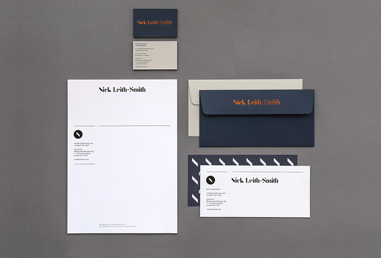
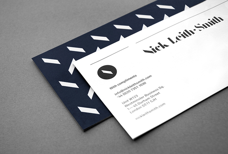
Nick Leith-Smith Collateral
Production Method
Foil stamp
Offset
Design
Tim George
Printing
Generation Press
Formerly known as Data Nature Associates, London-based Nick Leith-Smith Architecture + Design gets a full re-brand that exudes Nick’s core values of quality, craftmanship, and understated luxury.
Client
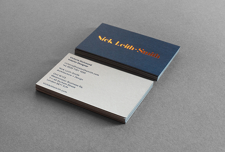
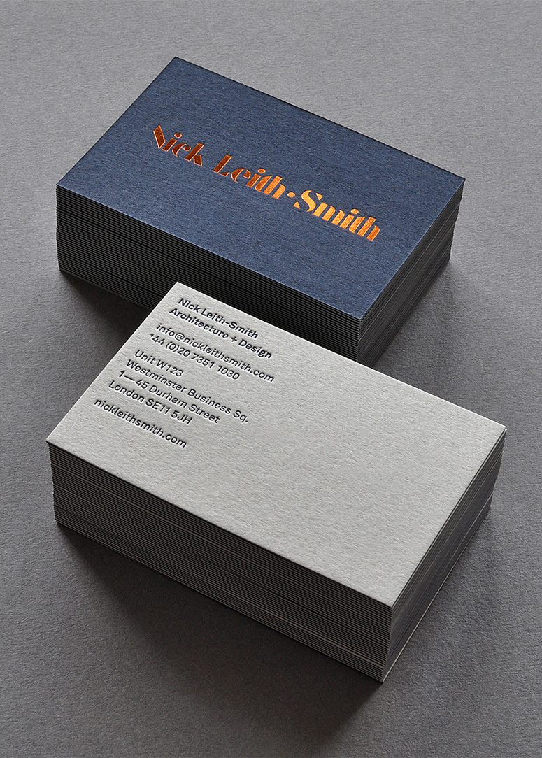
Nick Leith-Smith
Quantity Produced
2,500 (letterhead & comp slip)
800 (business cards)
500 (envelopes)
Production Cost
$3,300
Production Time
2 Weeks
Dimensions (Width × Height × Depth)
–
Page Count
–
Paper Stock
GF Smith / Colorplan / Imperial Blue / 270gsm
GF Smith / Colorplan / Pale Grey / 270gsm
Elliot Baxter / Horizon / White / 120gsm
Number of Colors
2 inks + 2 foils
Varnishes
–
Binding
–
Typography
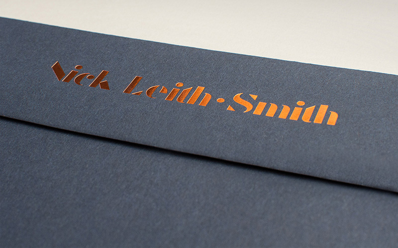
F37 Bella Stencil (customised)
Akkurat
Project Description
A complete re-branding for Nick Leith-Smith Architecture + Design, formerly known as Data Nature Associates. The London-based practice specialise in high quality contemporary design, ranging in scale from bespoke furniture to new-build houses.Following 14 successful years as DNA, Nick decided it was time to move forward. I worked closely with him & the practice to build a new brand from the ground up, communicating the core values of quality, craftsmanship, and understated luxury.
The identity draws inspiration from classic typography with a modern twist. Based on the typeface Bella by F37, the wordmark was tweaked to create a bespoke graphic fitting of the studio's ethos.
This was rolled out across a range of luxurious office stationery, beautifully printed and foil-blocked by Generation Press. I also designed a fully responsive website, built by Nico Pigelet, to showcase Nick's portfolio.
Production Lesson(s)
Attention to detail is paramount. Considering small things, for instance, we printed a pattern on the reverse of the comp slip in a dark blue, and I didn't take into consideration the slight show-through this would create on the front side. In the end, it looked kind of cool, but it wasn't intentional. Also, when it comes to using metallic foils in a foil-blocking process, some colours work better than others. The bronze was super crisp, but the matte blue on the reverse didn't hold its detail quite so well. But these were tiny details in an otherwise stellar job.
Post Author

Kelly Cree
Writer for UnderConsideration LLC.
More: Online / On Twitter
Date Published
June 27, 2014
Filed Under
Collateral
Foil stamp
Offset
Tagged with
duplex
envelope
foil blocking


About
FPO (For Print Only), is a division of UnderConsideration, celebrating the reality that print is not dead by showcasing the most compelling printed projects.
FPO uses Fonts.com to render Siseriff and Avenir Next.
FPO is run with Six Apart’s MovableType
All comments, ideas and thoughts on FPO are property of their authors; reproduction without the author’s or FPO’s permission is strictly prohibited
Twitter @ucllc
Sign-up for Mailing List
Mailing list managed by MailChimp
Thanks to our advertisers
About UnderConsideration
UnderConsideration is a graphic design firm generating its own projects, initiatives, and content while taking on limited client work. Run by Bryony Gomez-Palacio and Armin Vit in Bloomington, IN. More…
blogs we publish
Brand New / Displaying opinions and focusing solely on corporate and brand identity work.
Art of the Menu / Cataloguing the underrated creativity of menus from around the world.
Quipsologies / Chronicling the most curious, creative, and notable projects, stories, and events of the graphic design industry on a daily basis.
products we sell
Flaunt: Designing effective, compelling and memorable portfolios of creative work.
Brand New Conference videos / Individual, downloadable videos of every presentation since 2010.
Prints / A variety of posters, the majority from our AIforGA series.
Other / Various one-off products.
events we organize
Brand New Conference / A two-day event on corporate and brand identity with some of today's most active and influential practitioners from around the world.
Brand Nieuwe Conference / Ditto but in Amsterdam.
Austin Initiative for Graphic Awesomeness / A speaker series in Austin, TX, featuring some of the graphic design industry's most awesome people.
also
Favorite Things we've Made / In our capacity as graphic designers.
Projects we've Concluded / Long- and short-lived efforts.
UCllc News / Updates on what's going at the corporate level of UnderConsideration.

Related entries
2017 Brand New Conference Program
Severe(d): A Creepy Poetry Collection by Holly Riordan
Um Caminho para Santiago CD Package and Diary
BOYCO Classpack® Book
Antes de Perder la Esperanza Book