ADV @ UNDERCONSIDERATION Peek here for details
BROWSE
Shortcross Gin Packaging
Production Method
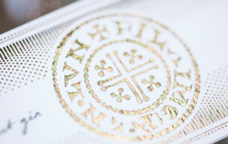
Foil stamp
Letterpress
Design
Paperjam Design
Product Photography: Opposite Page
Printing
CMI Print Services
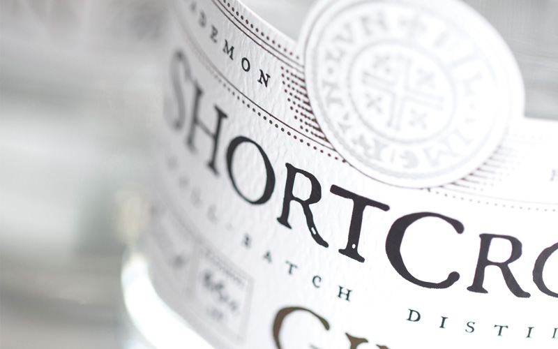
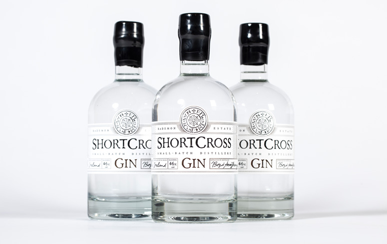
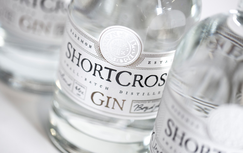
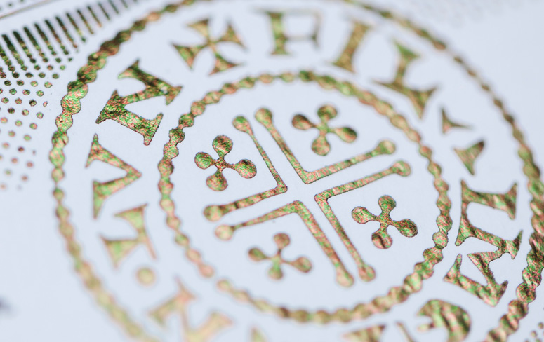
Shortcross Gin was released in May 2014 by Rademon Estate Distillery, the first craft gin distillery in Ireland. Focused on imbuing the rich heritage of Crossgar, Northern Ireland where the distillery is located, Paperjam Design’s hand-adhered, 3-foil labels draw inspiration from a popular 10th century English coin design.
Dimensions (Width × Height × Depth)
–
Page Count
–
Paper Stock
GF Smith / Textured Strathmore Pastelle / Bright White / 216gsm
Number of Colors
black, bronze, silver foil
Varnishes
–
Binding
–
Typography
Modified typeface based on FellTypeItalic
Project Description
Rademon Estate Distillery is the first craft gin distillery to be established in Northern Ireland. The distillery was founded in 2012 by husband and wife team Fiona and David Boyd-Armstrong, it is located just outside Crossgar, County Down, Northern Ireland on the couples historic family estate.Inspired by the distillery's historic surroundings, the design team at Belfast based agency Paperjam wanted to generate a name for the couple's first gin with a focus on their location and heritage. The name Shortcross came from the Gaelic for Crossgar "An Chrois Ghearr" meaning "the short cross". It had history and heritage naturally associated with it and for David and Fiona it had meaning as it subtly referenced the location of their distillery.
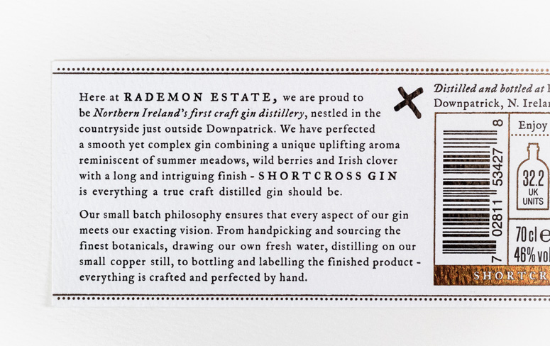
With the selected name finalised for the couple's first gin product, Paperjam then began to create a visual style for the branding and packaging that reflected the quality and uniqueness of their gin and would appeal to a high-end market. The label documents the distillation process by openly displaying the batch number, flavour and alcohol content. This, along with a signature in handwritten type, helps emphasise the one-of-a-kind artisan product and the craftsmanship that goes into each bottle of gin.
Paperjam focused on the heritage associated with the name "Shortcross" and after some research discovered the short cross penny. The coin dates back to the 10th century and was one of the most successful English coin designs in history. Paperjam sourced an original coin and took high-resolution scans to incorporate into the gins branding and packaging.
The couple selected a traditional bottle shape with a heavy base, giving the additional feeling of a high end, premium product. Paperjam really wanted this product to stand out on a shelf and in the very competitive gin market by designing a label that would reinforce the quality of this premium gin. To add an additional level of uniqueness the finished label is applied to each bottle of gin by hand. And as a final finishing touch, each bottle is dipped in black wax.
Shortcross Gin was successfully launched in May 2014 as the first small batch, craft gin distillery in Northern Ireland and now has listings in leading bars and restaurants across the country.
Production Lesson(s)
It is sometimes challenging to do something against the norm, which in this case is usually thin, self-adhesive plastic labels. We, however, wanted to do something totally different, we wanted to create a label that was much more tactile, handcrafted and luxurious.Experimentation was key in coming up with the final label, we experimented with different colours of GF Smith Paper, different paper weights and different foils before coming to our final decisions.
Once we had made the final production choices we then experimented with ways of adhering the labels to the bottles, which would all be be hand, helping cement the unique crafted nature of each bottle.

Post Author

Kelly Cree
Writer for UnderConsideration LLC.
More: Online / On Twitter
Date Published
September 17, 2014
Filed Under
Foil stamp
Letterpress
Packaging
Tagged with
alcohol
bottle
labels


About
FPO (For Print Only), is a division of UnderConsideration, celebrating the reality that print is not dead by showcasing the most compelling printed projects.
FPO uses Fonts.com to render Siseriff and Avenir Next.
FPO is run with Six Apart’s MovableType
All comments, ideas and thoughts on FPO are property of their authors; reproduction without the author’s or FPO’s permission is strictly prohibited
Twitter @ucllc
Sign-up for Mailing List
Mailing list managed by MailChimp
Thanks to our advertisers
About UnderConsideration
UnderConsideration is a graphic design firm generating its own projects, initiatives, and content while taking on limited client work. Run by Bryony Gomez-Palacio and Armin Vit in Bloomington, IN. More…
blogs we publish
Brand New / Displaying opinions and focusing solely on corporate and brand identity work.
Art of the Menu / Cataloguing the underrated creativity of menus from around the world.
Quipsologies / Chronicling the most curious, creative, and notable projects, stories, and events of the graphic design industry on a daily basis.
products we sell
Flaunt: Designing effective, compelling and memorable portfolios of creative work.
Brand New Conference videos / Individual, downloadable videos of every presentation since 2010.
Prints / A variety of posters, the majority from our AIforGA series.
Other / Various one-off products.
events we organize
Brand New Conference / A two-day event on corporate and brand identity with some of today's most active and influential practitioners from around the world.
Brand Nieuwe Conference / Ditto but in Amsterdam.
Austin Initiative for Graphic Awesomeness / A speaker series in Austin, TX, featuring some of the graphic design industry's most awesome people.
also
Favorite Things we've Made / In our capacity as graphic designers.
Projects we've Concluded / Long- and short-lived efforts.
UCllc News / Updates on what's going at the corporate level of UnderConsideration.

Related entries
Black Sheep Studio Business Cards and Promotional Items
Herbst & Spungen Wedding Invitation Suite
Cranky Bucks Promotion
Seegno Business Cards
“Miniature Views” Promotion