ADV @ UNDERCONSIDERATION Peek here for details
BROWSE
Baba Yaga Absinthe Packaging
Production Method
Digital
Emboss
Foil stamp
Offset
Design
Hired Guns Creative
Photography: Sean Fenzl
Printing
Labels: Okanagan Label & Print
Baba Yaga Absinthe is so strong that the designers at Hired Guns Creative had to test several stocks to ensure the paper would not be destroyed should a couple drops land on the outer sleeve.
Dimensions (Width × Height × Depth)
front label: 8.7248 × 5.6505 in.
back label: 8.7248 × 3.25 in.
bottle sleeve: 8.8713 × 11.3178 in.
Page Count
–
Paper Stock
Bottle: Glacier Plus
Sleeve: Paper Tyger / Super White
Number of Colors
Label: 1 ink, 2 foils
Sleeve: 4 colours
Varnishes
–
Binding
–
Typography
–
Project Description
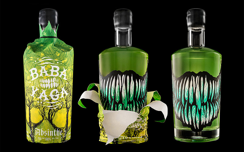
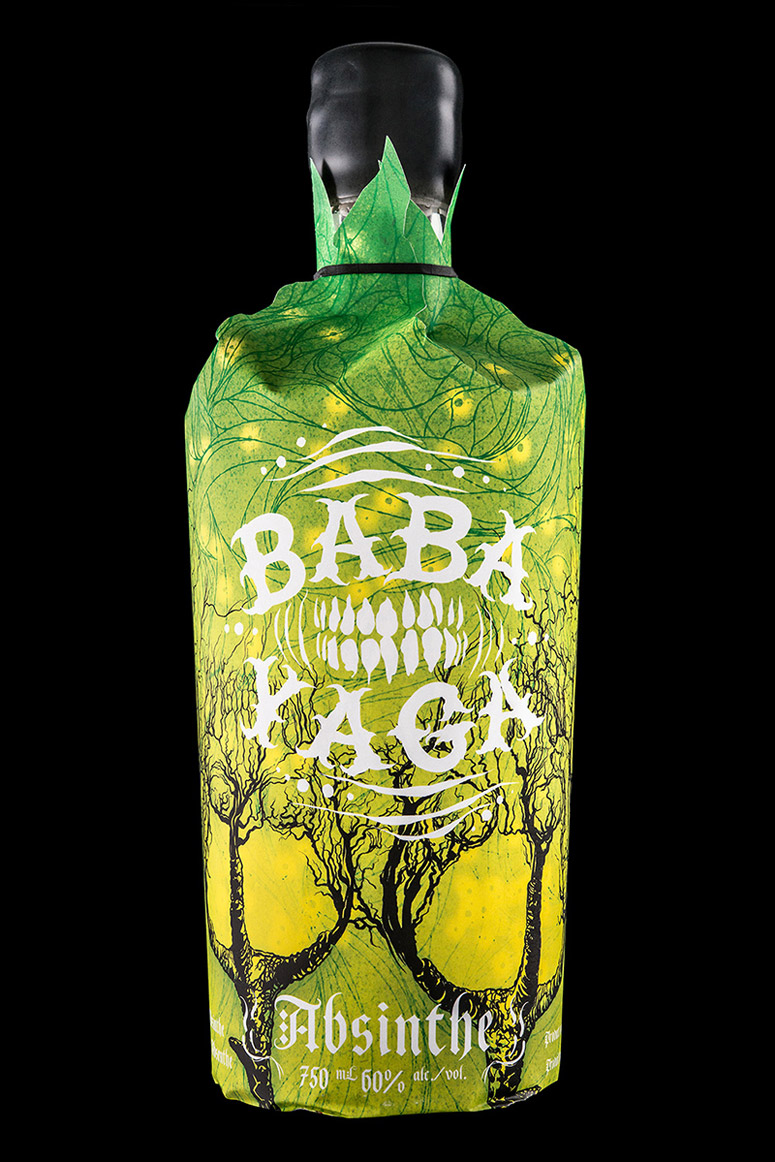
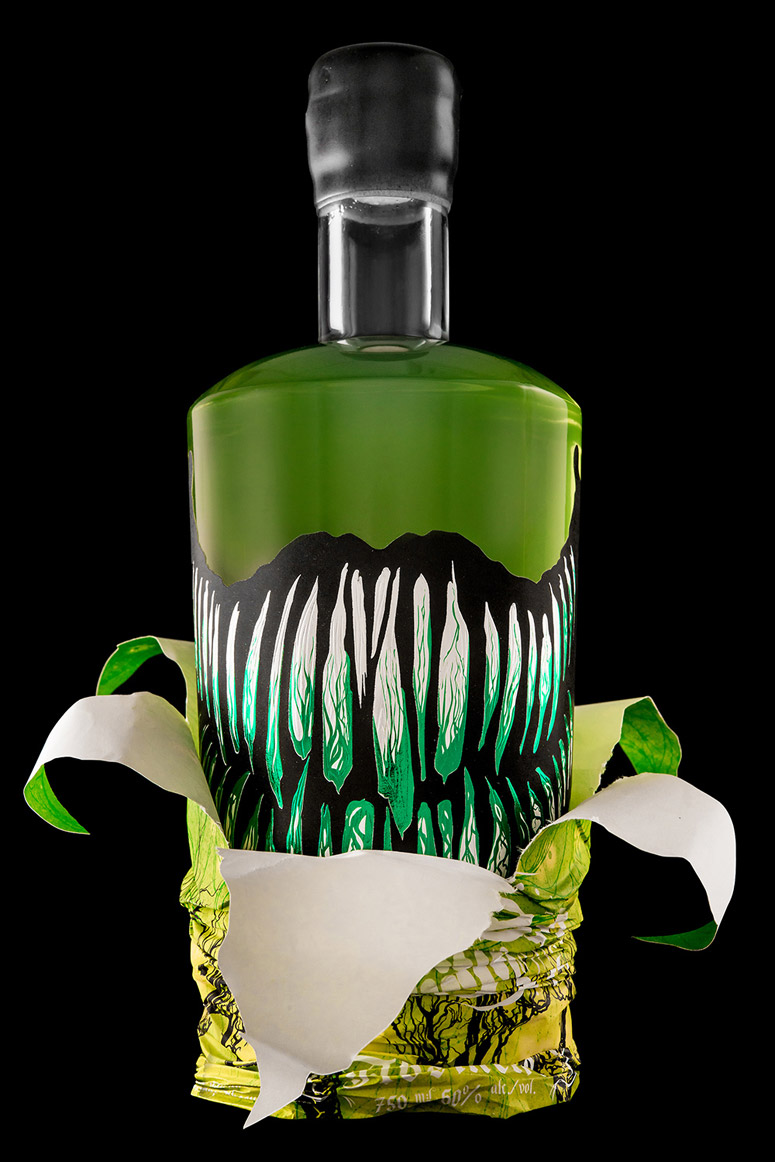
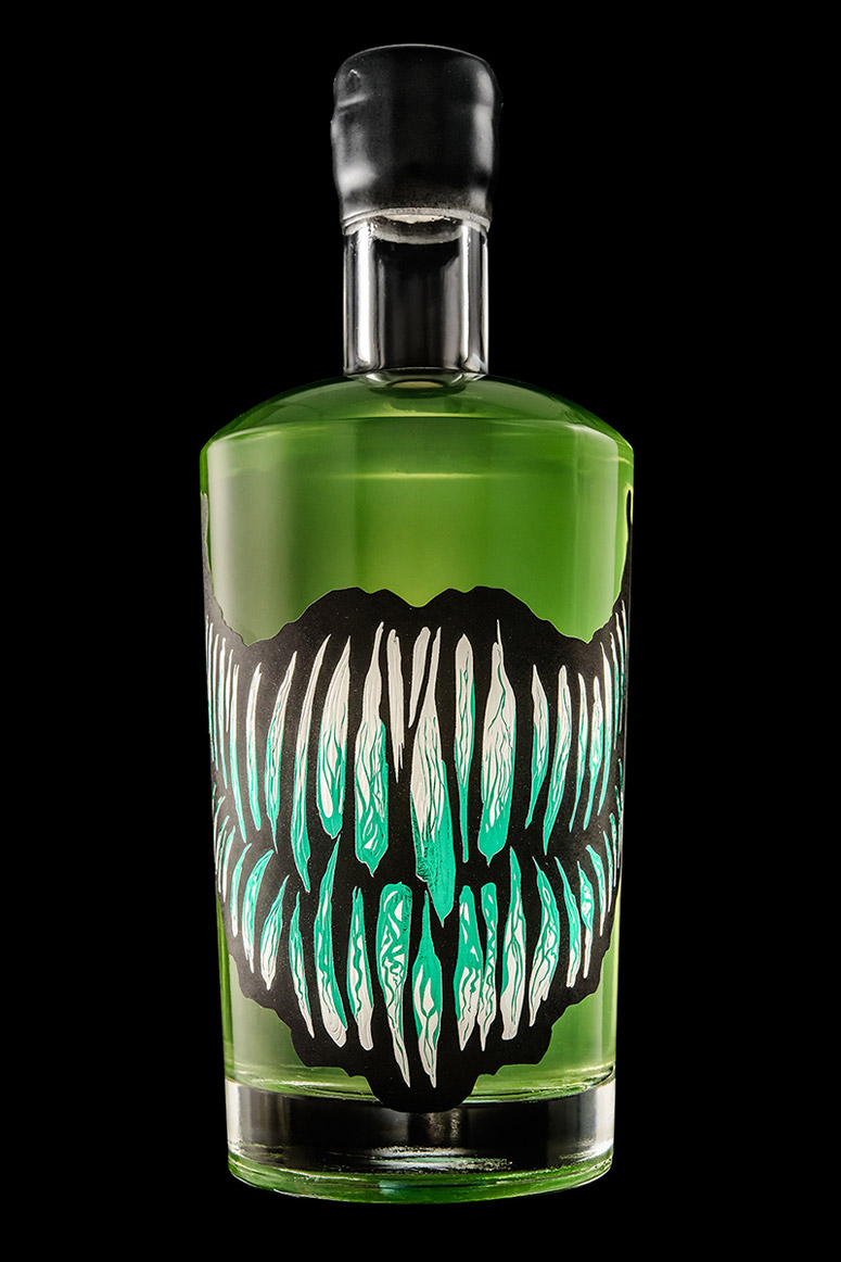
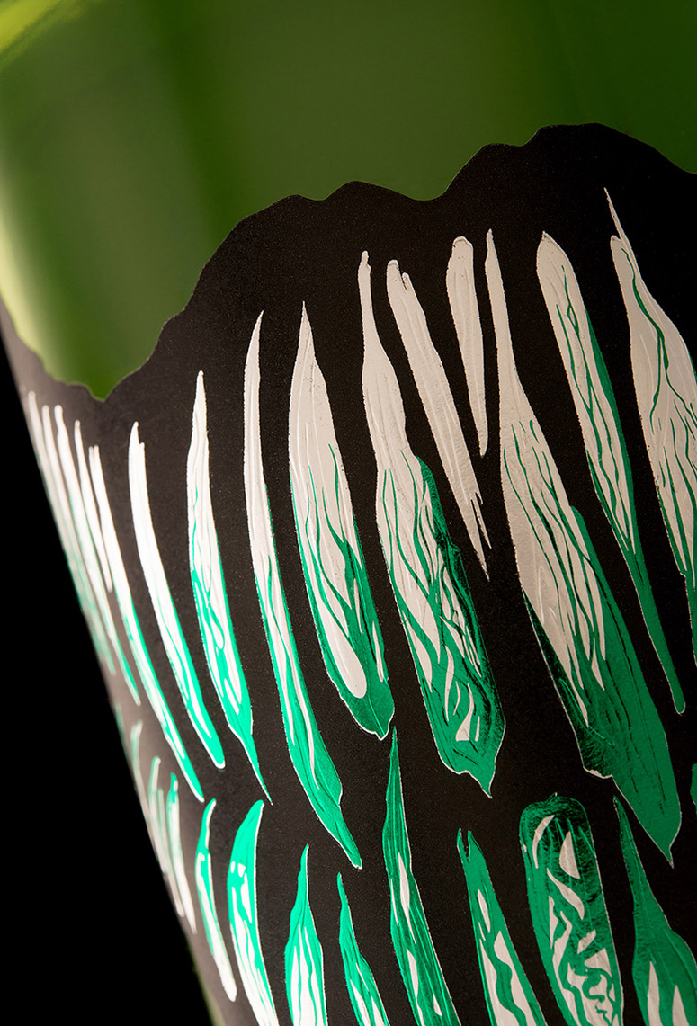
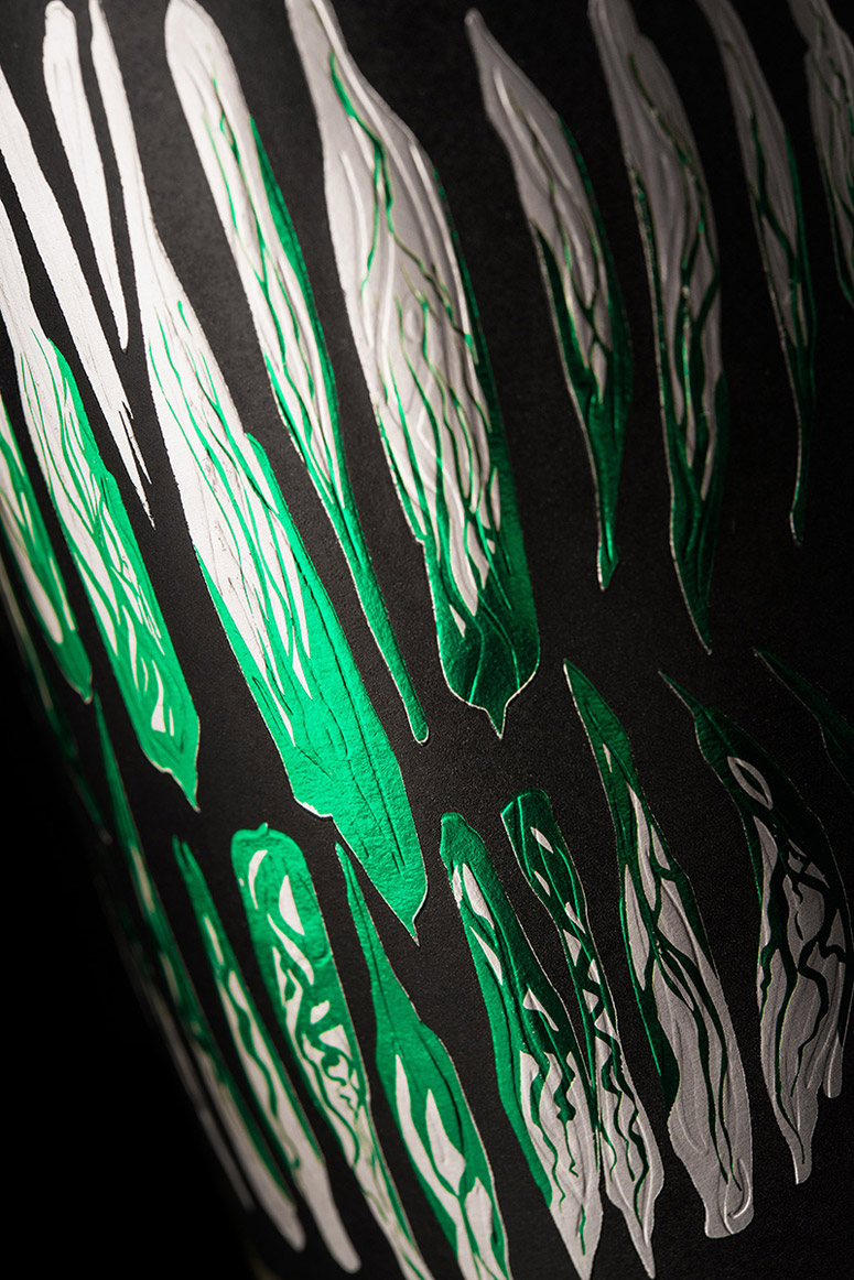
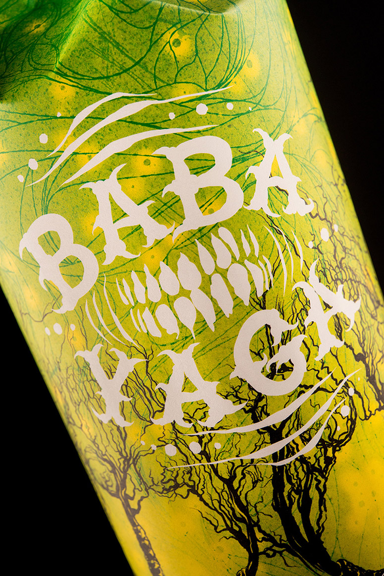
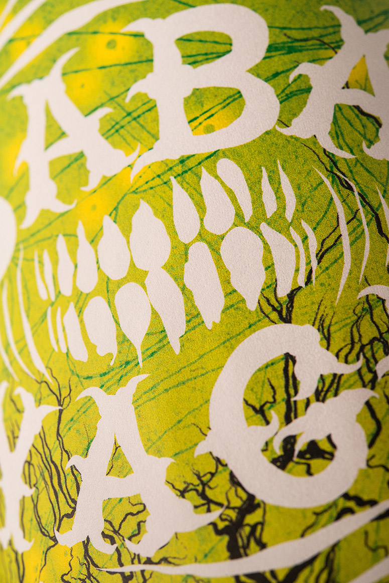
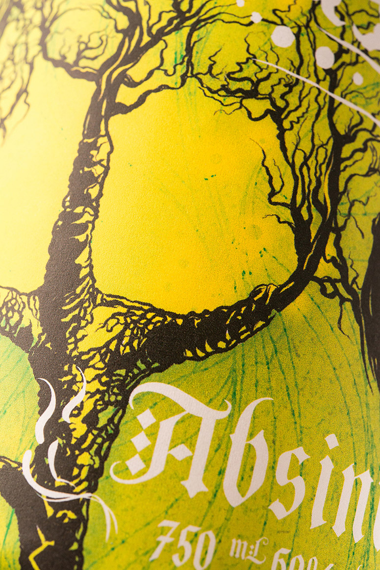
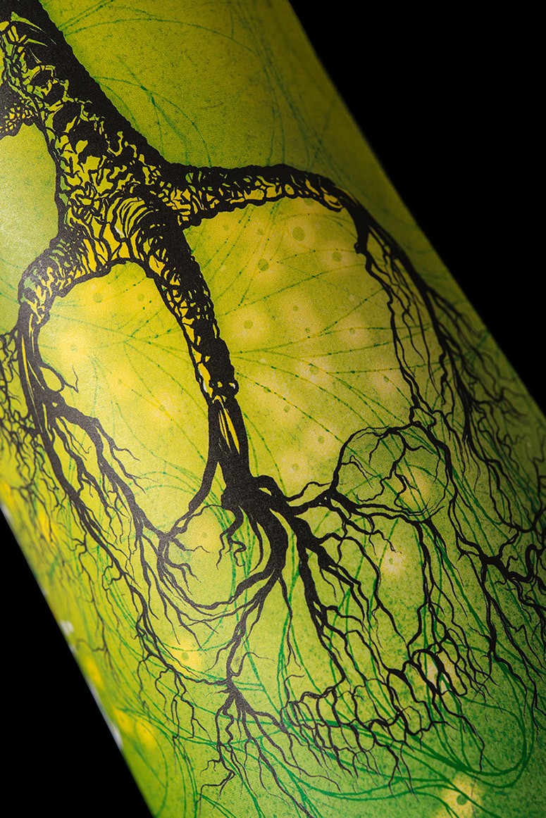
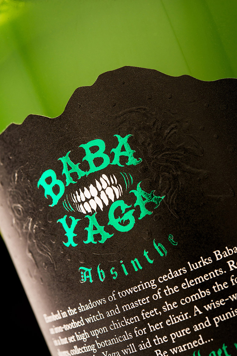
A new-world absinthe deserves a new-world packaging. Rather than the "Paris in 1899" look that so many in the absinthe category favour, we went with a more modern approach, an approach that reflects the experience of authentic absinthe (read: wormwood).The product name is taken from Eastern European folklore — the same region absinthe originated in. Baba Yaga was a wise woman and a healer who lived in the forest in a hut built on top of chicken feet and surrounded by a ring of skulls on top of her fenceposts. She would aid the pure and punish the undeserving.
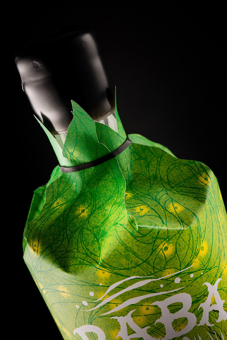
We initially settled on the concept of the front label: a wickedly toothy grin rendered in multiple foils and embossing. But what about all that pesky legally-required information? Adding all of that text to the front label would only diminish its impact. That's when we thought up the idea of the bottle sleeve. It holds all of the legal info and hides the insanity of the inner label until customers get the bottle back to their home. A perfect extension of the absinthe experience.
Production Lesson(s)
The bottle sleeve required a lot of prototyping to get the dieline just right. It needed to fit the tapered bottle like a glove and leave enough room at the top for easy removal of the bottle. The stock selection for both the bottle sleeve and the label involved testing quite a few stocks to find ones that held up to the high alcohol percentage of the liquid inside the bottle. The last thing we wanted on this product was a few drops of high ABV (Alcohol by volume) spirit destroying the packaging.
Post Author

Kelly Cree
Writer for UnderConsideration LLC.
More: Online / On Twitter
Date Published
April 7, 2015
Filed Under
Digital
Emboss
Foil stamp
Offset
Packaging
Tagged with
alcohol
label
sleeve


About
FPO (For Print Only), is a division of UnderConsideration, celebrating the reality that print is not dead by showcasing the most compelling printed projects.
FPO uses Fonts.com to render Siseriff and Avenir Next.
FPO is run with Six Apart’s MovableType
All comments, ideas and thoughts on FPO are property of their authors; reproduction without the author’s or FPO’s permission is strictly prohibited
Twitter @ucllc
Sign-up for Mailing List
Mailing list managed by MailChimp
Thanks to our advertisers
About UnderConsideration
UnderConsideration is a graphic design firm generating its own projects, initiatives, and content while taking on limited client work. Run by Bryony Gomez-Palacio and Armin Vit in Bloomington, IN. More…
blogs we publish
Brand New / Displaying opinions and focusing solely on corporate and brand identity work.
Art of the Menu / Cataloguing the underrated creativity of menus from around the world.
Quipsologies / Chronicling the most curious, creative, and notable projects, stories, and events of the graphic design industry on a daily basis.
products we sell
Flaunt: Designing effective, compelling and memorable portfolios of creative work.
Brand New Conference videos / Individual, downloadable videos of every presentation since 2010.
Prints / A variety of posters, the majority from our AIforGA series.
Other / Various one-off products.
events we organize
Brand New Conference / A two-day event on corporate and brand identity with some of today's most active and influential practitioners from around the world.
Brand Nieuwe Conference / Ditto but in Amsterdam.
Austin Initiative for Graphic Awesomeness / A speaker series in Austin, TX, featuring some of the graphic design industry's most awesome people.
also
Favorite Things we've Made / In our capacity as graphic designers.
Projects we've Concluded / Long- and short-lived efforts.
UCllc News / Updates on what's going at the corporate level of UnderConsideration.

Related entries
2017 Brand New Conference Program
Severe(d): A Creepy Poetry Collection by Holly Riordan
Um Caminho para Santiago CD Package and Diary
BOYCO Classpack® Book
Antes de Perder la Esperanza Book