ADV @ UNDERCONSIDERATION Peek here for details
BROWSE
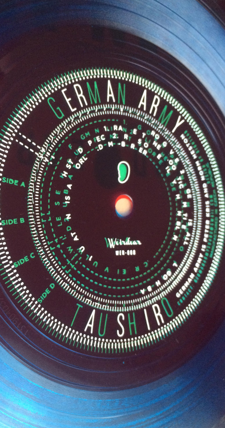
German Army’s Taushiro Records and Packaging
Production Method
Hot stamp
Design
Sightlab Media Research
Art direction and design: Thomas Dudley
Outer sleeve layout: Dianne Lynn
Printing
Pirate Press
Tasked with creating an esoteric package using Flexi discs—common in the 1960s and ’70s as a way of distributing records in newspapers and magazines—Brooklyn designer Thomas Dudley presents a decoder ring style system that is only readable when the two discs interact in the perfect way.
Dimensions (Width × Height × Depth)
7 × 7 in.
Page Count
–
Paper Stock
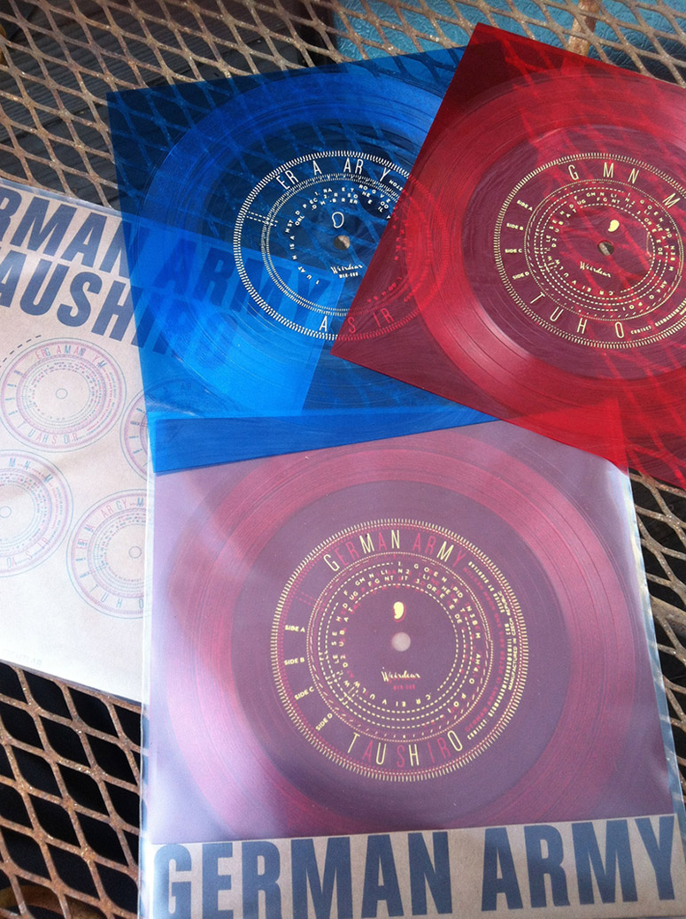
Molded transparent vinyl in red and blue
Number of Colors
–
Varnishes
–
Binding
–
Typography
Gotham Bold
Chalet Comprime Milan 1960 & Cologne 1960
Project Description
Oakland, CA record label Weird Ear Records came to me with an upcoming release they thought I would enjoy - a dark, hypnotic noise/sound collage album by German Army titled "Taushiro" (a near-extinct language spoken by a tiny population of people in Ecuador). The brief from Weird Ear was that they wanted to produce the record on two double-sided Flexi discs - those cheap floppy (or flexi!) lo-fi plastic records that used to occasionally come bound in magazines, and they would like it to be "esoteric". And that was it.Label owners Raub and Dianne are some of my favorite clients: simultaneously hands off AND incredibly generous with solid, honest critique. The album is at times abrasive, sometimes soothing - to me it sounded clinical but dirty, full of tension and obscured objects. Those circular loops and cheap clinical feelings fermented into charts and taxonomies. Looking at specs and samples from the record production house, we got excited about the possibilities of the thin, transparent colored plastics.
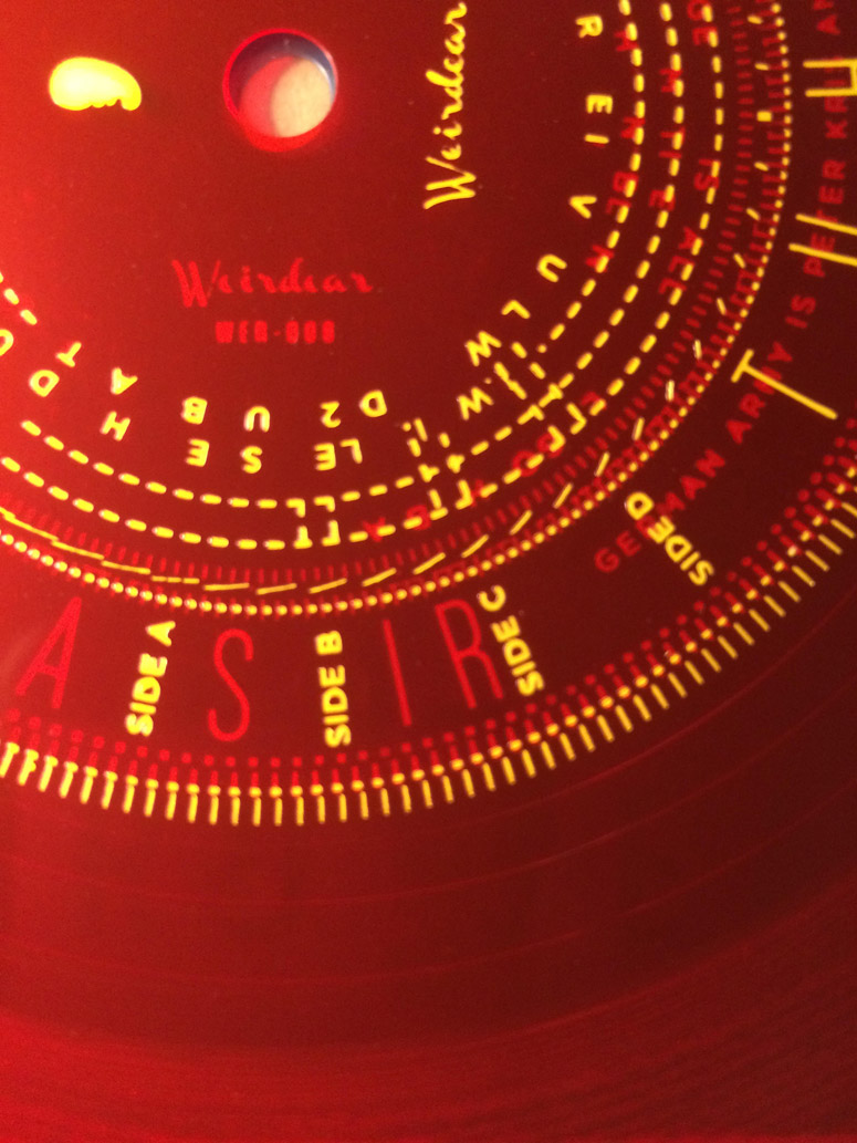
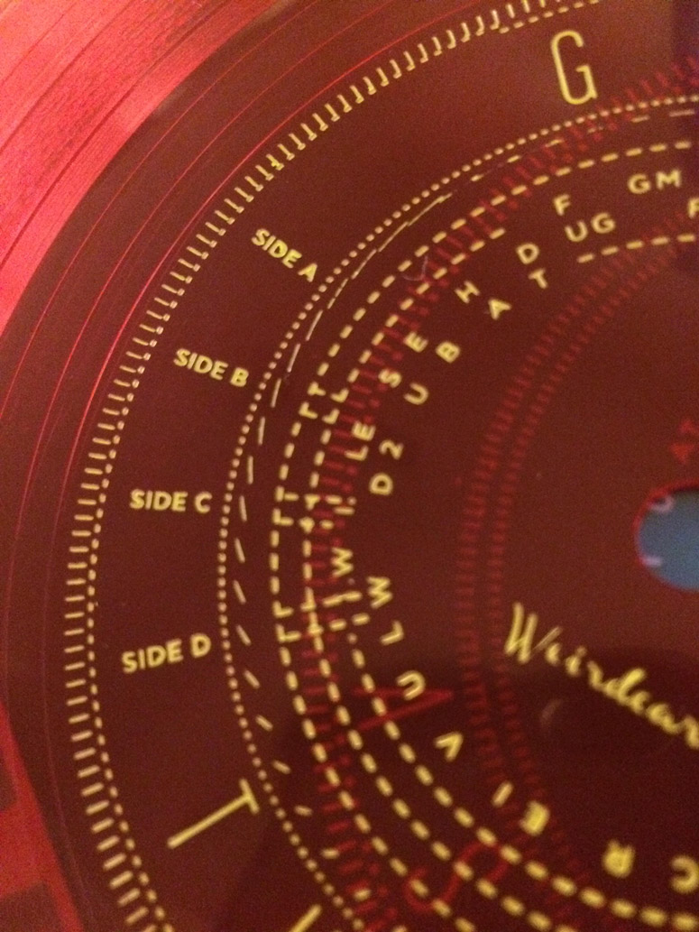
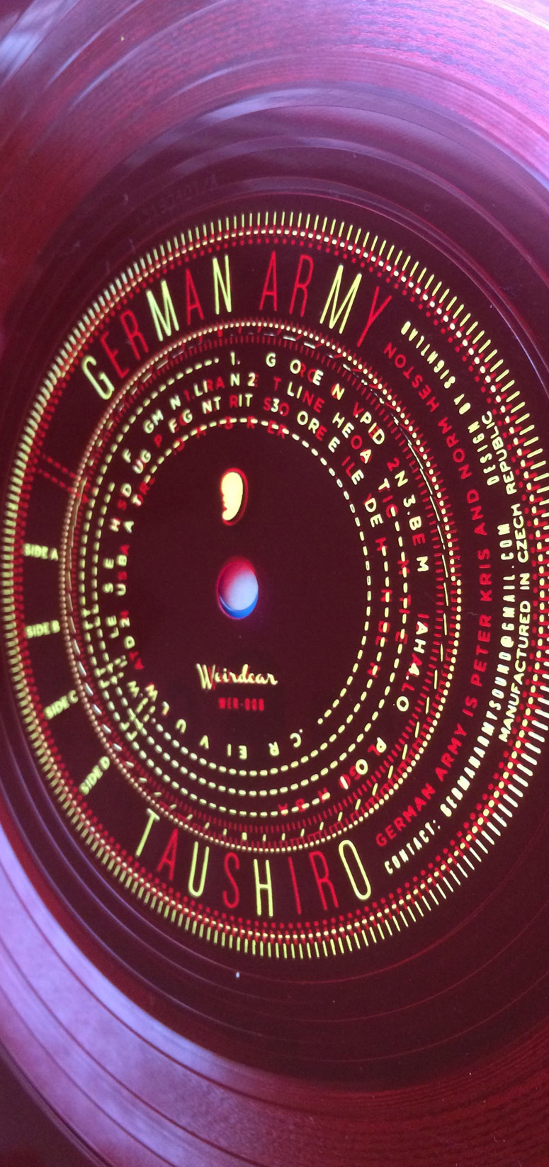
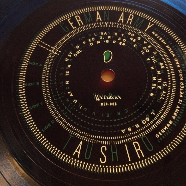
One of the clearest images I kept returning to were the old proportional calculators used in graphic arts reproduction before photoshop and illustrator: round plastic decoders with rings of numbers and windows revealing information. Stewed with military technical marking, cheap east German industrial design, information oppression in that kind of society (people in communist states would smuggle and trade western music, rock and jazz cut into soft plastic sheets like x-rays, which the flexis nicely reference) and cryptography brought me back around to the theme of obscured, dying language.
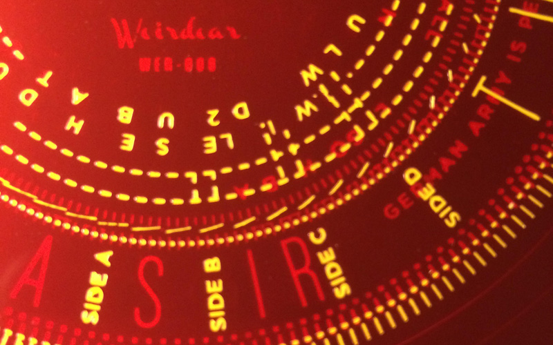
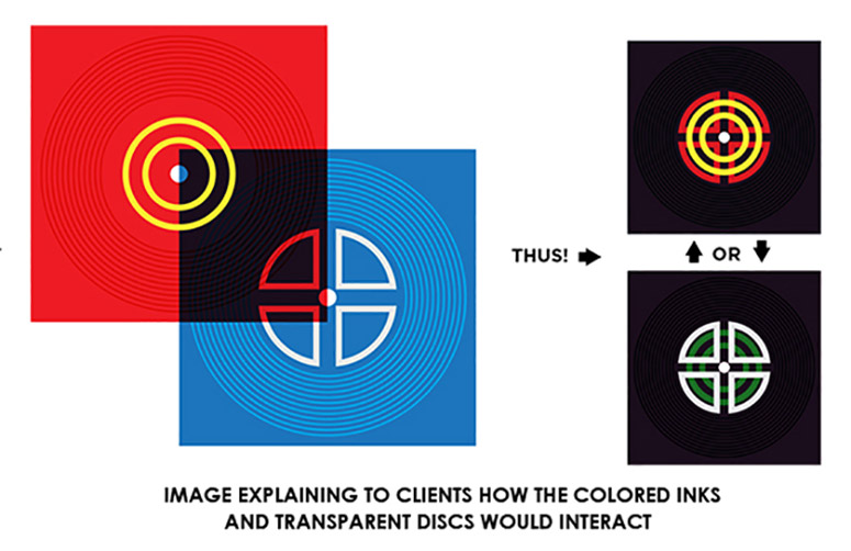
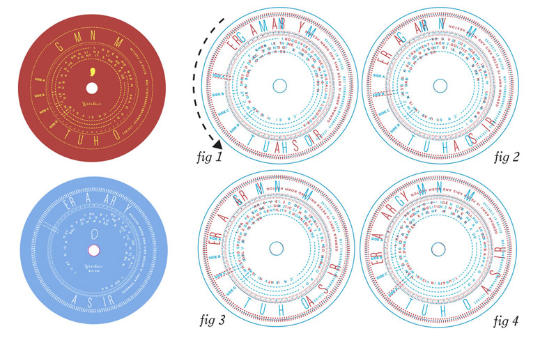
Embracing the credit/track text, I wanted to make it necessary to disrupt the visual communication on the records: like a decoder ring, each disc only has a scattering of the letters that make up the whole. When the records are held together, the album title and track listing can only be read at certain angles - line up the bracket on disc A with the SIDE C marking on disc B, and the track names of side C resolve, while the other track and album information is disordered. Small hashmarks around the text move and shift when lit with a strobe while the record is played. The colors change depending on which disc is on "top" - place the blue disc on top, the yellow print on the red record below comes through green, against the white print of the blue disc.
It is a changeable, interactive object that (for me) just touches the intent of the real work of the recording. Which is my favorite thing about designing for record and book covers: you are making a companion piece, which needs to allure and reference without overshadowing the work. Finding and exploiting that connective thread between the visual element and the music is a treat.
Production Lesson(s)
The original idea was to arrange the information so that depending on the opposing angles (at 90-degree increments) the square records were stored at, those severe angles would revel the text. There is arithmetic involved in working this out, but for the most part at 180 degrees, things either get in the way or line up again. Argh. After puzzling over it for too long, I settled for the smaller angles. Which actually makes the records more fun to rotate, in the end.I have so much nostalgia for flexi discs: Nothing seemed cooler when I was a kid than finding a PLAYABLE RECORD tucked into our newspaper or a magazine. I wanted to include a "tape penny here" spot. You have to weigh the very thin discs down a bit, or the needle will catch the groove and hold the lightweight record in place. Listeners with heavy tone arms will just have to decide where to tape that coin themselves, unguided.

Post Author

Kelly Cree
Writer for UnderConsideration LLC.
More: Online / On Twitter
Date Published
July 29, 2015
Filed Under
Hot stamp
Music Packaging
Tagged with
record
record packaging


About
FPO (For Print Only), is a division of UnderConsideration, celebrating the reality that print is not dead by showcasing the most compelling printed projects.
FPO uses Fonts.com to render Siseriff and Avenir Next.
FPO is run with Six Apart’s MovableType
All comments, ideas and thoughts on FPO are property of their authors; reproduction without the author’s or FPO’s permission is strictly prohibited
Twitter @ucllc
Sign-up for Mailing List
Mailing list managed by MailChimp
Thanks to our advertisers
About UnderConsideration
UnderConsideration is a graphic design firm generating its own projects, initiatives, and content while taking on limited client work. Run by Bryony Gomez-Palacio and Armin Vit in Bloomington, IN. More…
blogs we publish
Brand New / Displaying opinions and focusing solely on corporate and brand identity work.
Art of the Menu / Cataloguing the underrated creativity of menus from around the world.
Quipsologies / Chronicling the most curious, creative, and notable projects, stories, and events of the graphic design industry on a daily basis.
products we sell
Flaunt: Designing effective, compelling and memorable portfolios of creative work.
Brand New Conference videos / Individual, downloadable videos of every presentation since 2010.
Prints / A variety of posters, the majority from our AIforGA series.
Other / Various one-off products.
events we organize
Brand New Conference / A two-day event on corporate and brand identity with some of today's most active and influential practitioners from around the world.
Brand Nieuwe Conference / Ditto but in Amsterdam.
Austin Initiative for Graphic Awesomeness / A speaker series in Austin, TX, featuring some of the graphic design industry's most awesome people.
also
Favorite Things we've Made / In our capacity as graphic designers.
Projects we've Concluded / Long- and short-lived efforts.
UCllc News / Updates on what's going at the corporate level of UnderConsideration.

Related entries
Dominie Press Notebook
Collected Coffee Packaging
Sakao Packaging
Happy White Year 2015 Calendar
Salões de Paris Book Cover