ADV @ UNDERCONSIDERATION Peek here for details
BROWSE
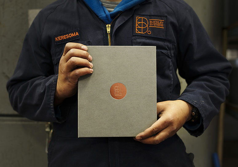
Buckley Systems Business Communication
Production Method
Foil stamp
Design
Transformer
Nigel Smith - Director
Adrian - Creative Director
Jay Yang - Designer, Illustrator
Sandra de Kock - Business Liaison
Ken Grace - Copywriter
Printing
CFS (Client Focused Solutions)
Illustration, photography, and typography all come together to showcase a rich history and a solid present for a company that has many moving parts. A project that started as an open brief slowly found its way to be as unique as its story.
Dimensions (Width × Height × Depth)
–
Page Count
86
Paper Stock
–
Number of Colors
–
Varnishes
–
Binding
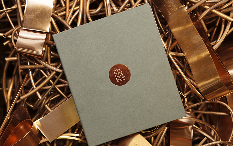
Copper-plated wiro
Typography
Trade Gothic
Brandon Grotesque
Futura
Project Description
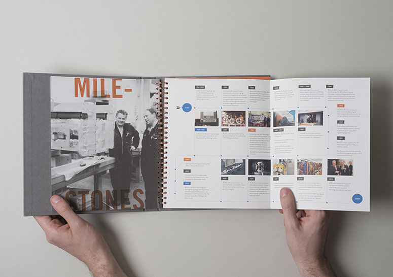
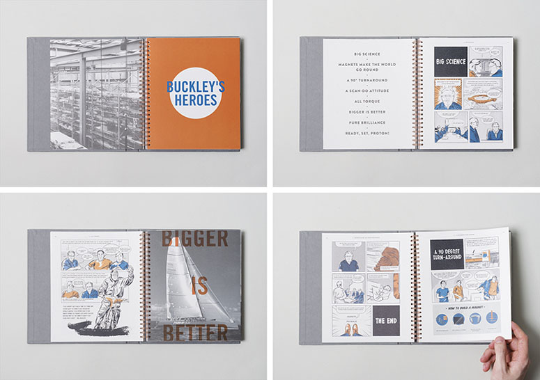
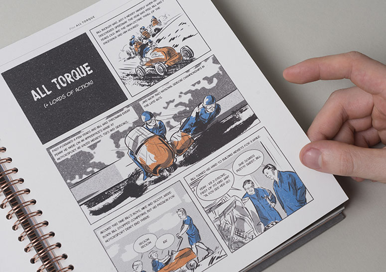
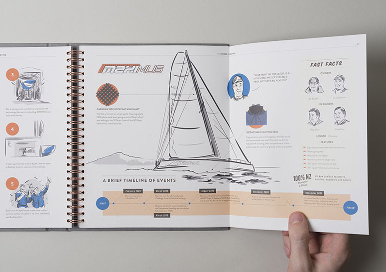
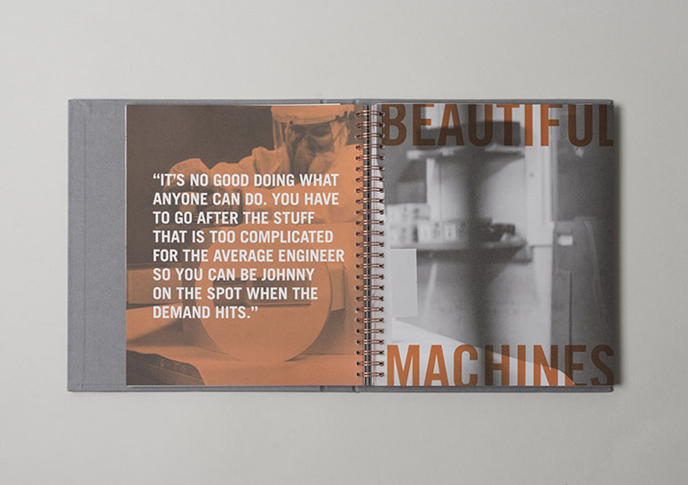
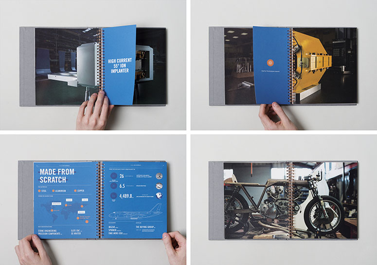
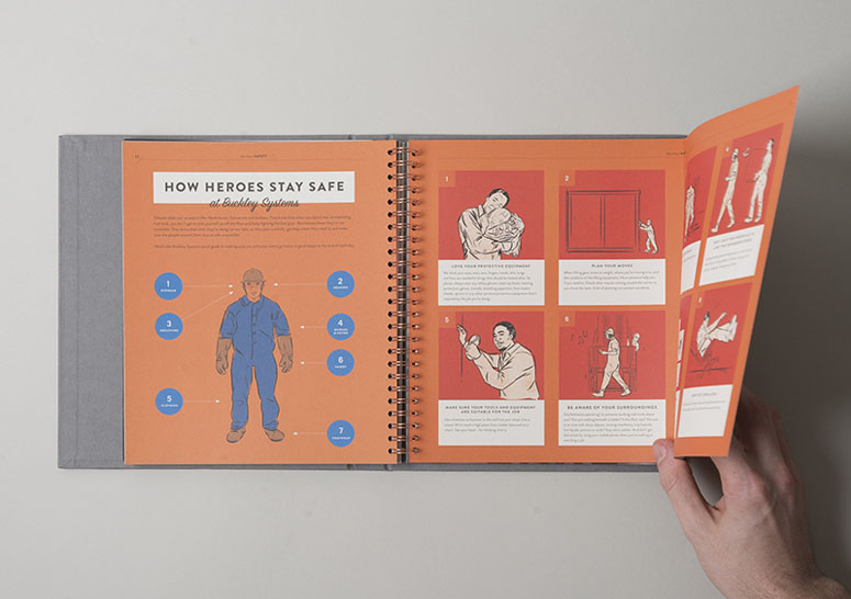
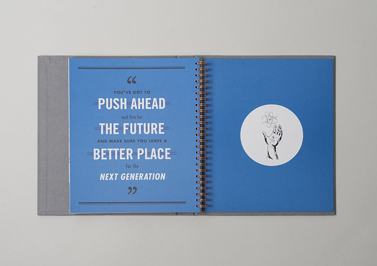
Buckley’s Heroes is a publication designed to celebrate the rich history, many achievements and clever people — past and present — that make Buckley Systems the successful company it is today. Having recently rolled out a bold new visual identity, this brand book aims to fill the large, tight-knit workforce with a sense of belonging, pride and unity.Buckley’s Heroes tells true stories of the company’s beginnings about overcoming adversity and seemingly impossible challenges with sheer grit and innovation, each illustrated like vintage annuals from Bill’s youth. Featuring visionary statements, infographics and dramatic product photography, the publication is a unique, fun and visual way to present the brand’s values and commitment to innovation.
Blending a vintage aesthetic with the bold, contemporary visual identity gives the brand a unique internal visual language that reflects the contrast between the raw heavy engineering workshops and the clean, precision finishing of their highly technical electromagnets. Wire binding electroplated in copper and a textured hardcover with foiled detailing echo the materials used in electromagnet production and give the book a tactile quality.
Production Lesson(s)
Receiving an open brief has its challenges- this book began its project life as a small, saddle-stitched book and months later, and gradually transmuted into a foiled, hard cover bound in copper wiro! However, we felt the history and achievements of Buckley Systems deserved a more substantial treatment. It was a struggle to juggle the design, illustration, and a bit of photography on the side, and it isn't a workflow I would apply to future projects. Our print broker for this project, Grant at CFS had this nugget to offer though, when asked how he managed to keep tabs on the print job with all its components- "Don't stress out - just keep working through the mess and you'll come out fine at the other end".
Post Author

Bryony Gomez-Palacio
Editor of FPO and co-founder of UnderConsideration LLC.
More: Online / On Twitter
Date Published
August 22, 2016
Filed Under
Booklet
Foil stamp
Tagged with
booklet
Brandon Grotesque
Copper-plated wiro
foil stamp
futura
promotion
Trade Gothic


About
FPO (For Print Only), is a division of UnderConsideration, celebrating the reality that print is not dead by showcasing the most compelling printed projects.
FPO uses Fonts.com to render Siseriff and Avenir Next.
FPO is run with Six Apart’s MovableType
All comments, ideas and thoughts on FPO are property of their authors; reproduction without the author’s or FPO’s permission is strictly prohibited
Twitter @ucllc
Sign-up for Mailing List
Mailing list managed by MailChimp
Thanks to our advertisers
About UnderConsideration
UnderConsideration is a graphic design firm generating its own projects, initiatives, and content while taking on limited client work. Run by Bryony Gomez-Palacio and Armin Vit in Bloomington, IN. More…
blogs we publish
Brand New / Displaying opinions and focusing solely on corporate and brand identity work.
Art of the Menu / Cataloguing the underrated creativity of menus from around the world.
Quipsologies / Chronicling the most curious, creative, and notable projects, stories, and events of the graphic design industry on a daily basis.
products we sell
Flaunt: Designing effective, compelling and memorable portfolios of creative work.
Brand New Conference videos / Individual, downloadable videos of every presentation since 2010.
Prints / A variety of posters, the majority from our AIforGA series.
Other / Various one-off products.
events we organize
Brand New Conference / A two-day event on corporate and brand identity with some of today's most active and influential practitioners from around the world.
Brand Nieuwe Conference / Ditto but in Amsterdam.
Austin Initiative for Graphic Awesomeness / A speaker series in Austin, TX, featuring some of the graphic design industry's most awesome people.
also
Favorite Things we've Made / In our capacity as graphic designers.
Projects we've Concluded / Long- and short-lived efforts.
UCllc News / Updates on what's going at the corporate level of UnderConsideration.

Related entries
KitchenAid Limited Edition Cards
BOYCO Classpack® Book
Herbst & Spungen Wedding Invitation Suite
Fracas Productions Business Cards
Gunnel Wåhlstrand Exhibit Book