ADV @ UNDERCONSIDERATION Peek here for details
BROWSE
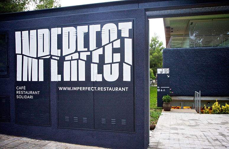
Imperfect Restaurant Materials
Production Method
Digital
Offset
Silkscreen
Design
Sr. y Sra. Wilson
Illustration: Carla Cascales
Photography: Koldo Castillo
Printing
I am Nuria
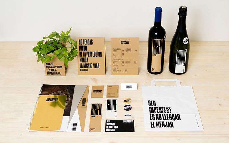
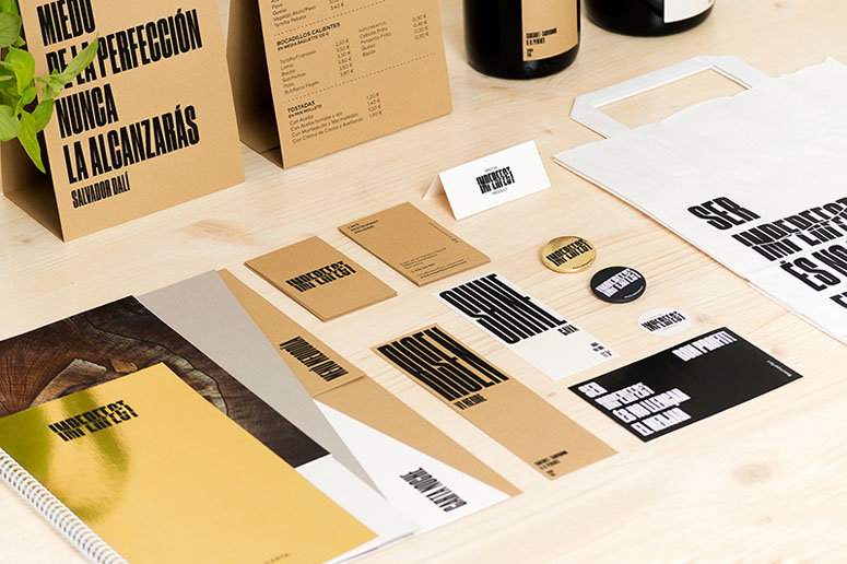
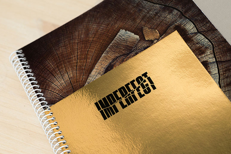
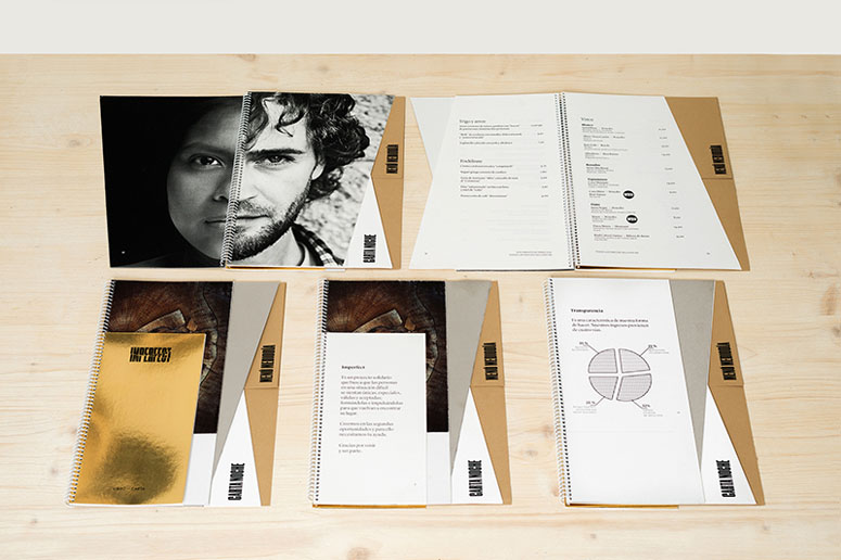
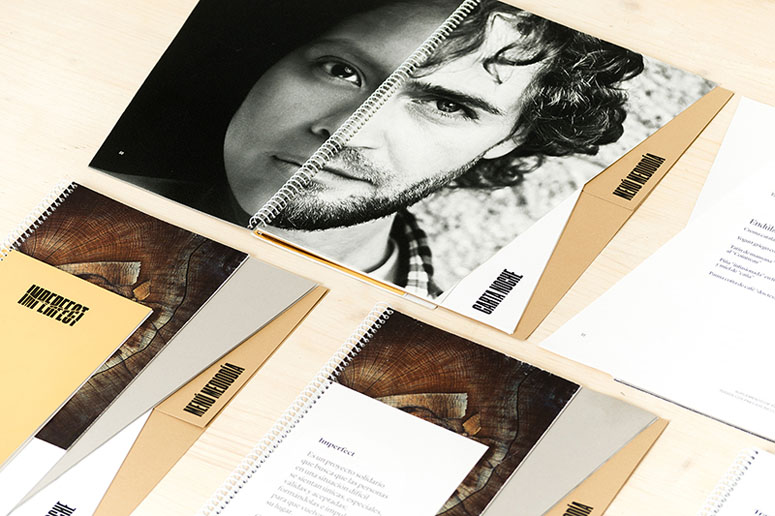
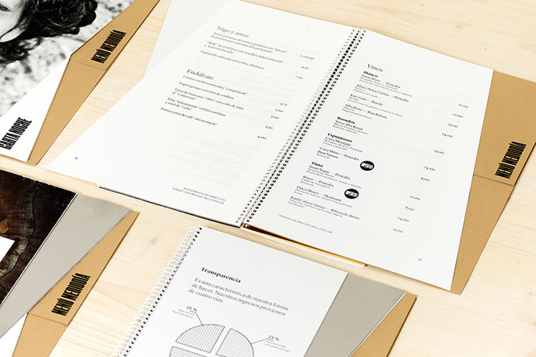
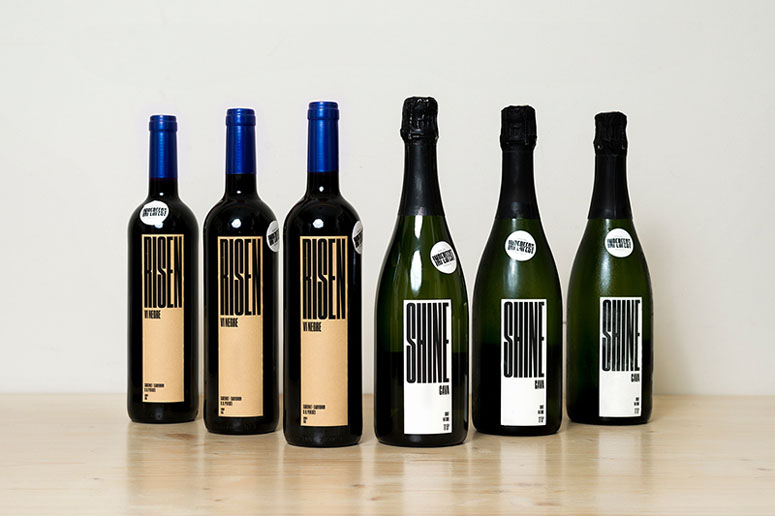
An interesting combination of materials — kraft and gold stock — printed simply in one color are given some added dimension through unexpected angled trims that add to the imperfect-ness of the name.
Project Description
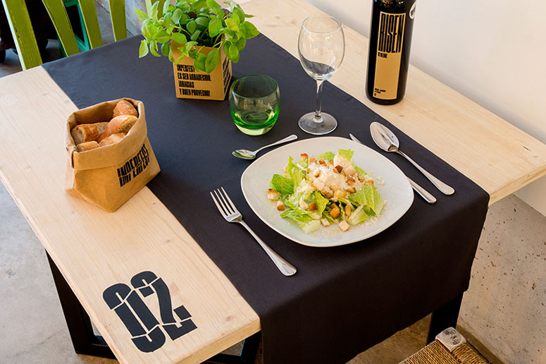
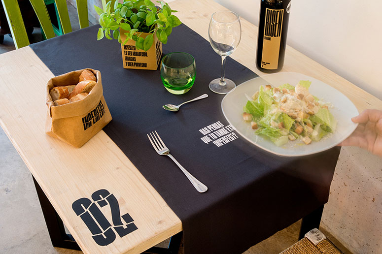
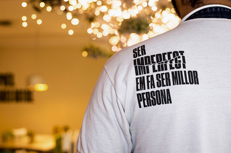
Imperfect is a community restaurant that was created with the aim of helping people at risk of social exclusion to reintegrate into society, by offering personal help and training in catering. It is a local project that aims to serve the community and focuses on reintegrating people into society and work. The brand essence, “we love imperfection”, speaks of giving a second chance â it has an impact on everyone who goes through the program and they clearly learn that although we are all imperfect, we are all useful and valuable.Sr. y Sra. Wilson created the brand strategy and identity and was in charge of the naming and the design of coordinated elements in the restaurant, as well as the signage. We also helped to design some of the spaces in the restaurant.
We wanted to use design to communicate the message and values of Imperfect, and to help to promote a social project that has an impact on people — on those who take part in this social program and also on the customers, as they are invited to reflect on and identify with the project when they come to the restaurant.
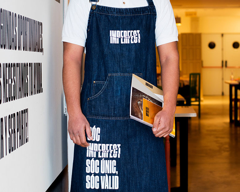
To develop the branding we drew on the philosophy of the Japanese technique of kintsugi, which views breakage and repair as part of the history of an object that should be displayed instead of disguised, as this history and transformation makes the object even more beautiful. Imperfect is kintsugi applied to people.
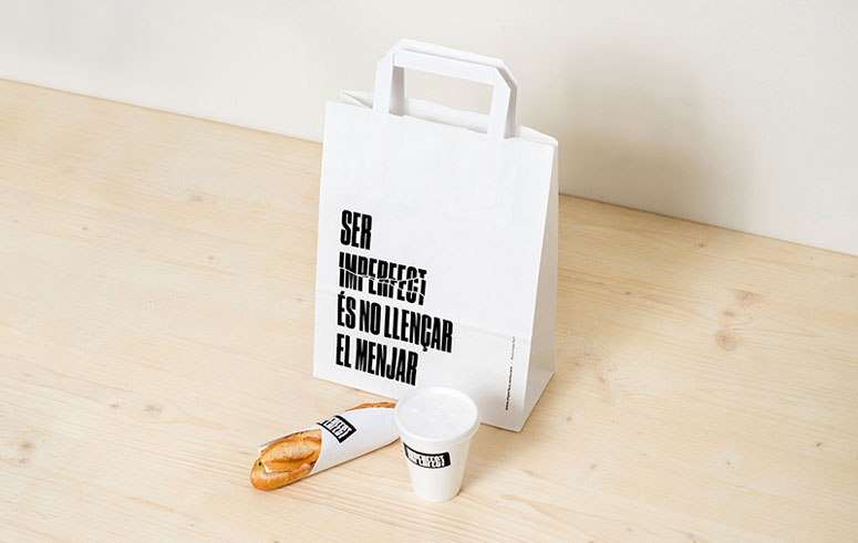
We created an identity based on direct messages to users, to raise awareness of how “we love imperfection”, to highlight that imperfection can be useful and reused.
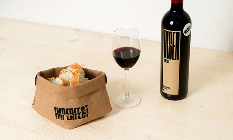
Using the aesthetic notion of wabi-sabi, a Japanese term that highlights “the beauty of imperfection” and that is presented as elements with a natural or rustic look, or elements from nature, we wanted to give all the designed elements a warm composition, with materials that resembled nature, like recycled paper.
Imperfect is a clear example of social design. Using design combined with a low-cost production, we can create the ideal atmosphere that helps to improve society.
Production Lesson(s)
The identity had to be produced at a low cost, and to reduce the cost of the production of the printed elements we worked in collaboration with Fedrigoni and Manter, and all the process for binding and manipulation has been made in-house in handmade.
Post Author

Bryony Gomez-Palacio
Editor of FPO and co-founder of UnderConsideration LLC.
More: Online / On Twitter
Date Published
March 28, 2017
Filed Under
Collateral
Digital
No Data
Offset
Silkscreen
Tagged with
cmyk
collateral
digital
offset
pms
restaurant
silkscreen


About
FPO (For Print Only), is a division of UnderConsideration, celebrating the reality that print is not dead by showcasing the most compelling printed projects.
FPO uses Fonts.com to render Siseriff and Avenir Next.
FPO is run with Six Apart’s MovableType
All comments, ideas and thoughts on FPO are property of their authors; reproduction without the author’s or FPO’s permission is strictly prohibited
Twitter @ucllc
Sign-up for Mailing List
Mailing list managed by MailChimp
Thanks to our advertisers
About UnderConsideration
UnderConsideration is a graphic design firm generating its own projects, initiatives, and content while taking on limited client work. Run by Bryony Gomez-Palacio and Armin Vit in Bloomington, IN. More…
blogs we publish
Brand New / Displaying opinions and focusing solely on corporate and brand identity work.
Art of the Menu / Cataloguing the underrated creativity of menus from around the world.
Quipsologies / Chronicling the most curious, creative, and notable projects, stories, and events of the graphic design industry on a daily basis.
products we sell
Flaunt: Designing effective, compelling and memorable portfolios of creative work.
Brand New Conference videos / Individual, downloadable videos of every presentation since 2010.
Prints / A variety of posters, the majority from our AIforGA series.
Other / Various one-off products.
events we organize
Brand New Conference / A two-day event on corporate and brand identity with some of today's most active and influential practitioners from around the world.
Brand Nieuwe Conference / Ditto but in Amsterdam.
Austin Initiative for Graphic Awesomeness / A speaker series in Austin, TX, featuring some of the graphic design industry's most awesome people.
also
Favorite Things we've Made / In our capacity as graphic designers.
Projects we've Concluded / Long- and short-lived efforts.
UCllc News / Updates on what's going at the corporate level of UnderConsideration.

Related entries
E.A.S.E. Stationery Set
Seegno Business Cards
Alivu EVOO Packaging
Legion Paper All National Stationery Show Promotion
Victoria Will Book