ADV @ UNDERCONSIDERATION Peek here for details
BROWSE
Legion Paper Artist Pads
Production Method
Offset
Design
Kitchen NY
Printing
Hadley Press (for all color on cover)
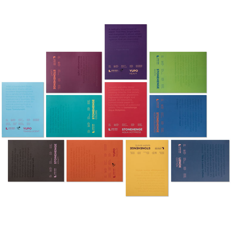
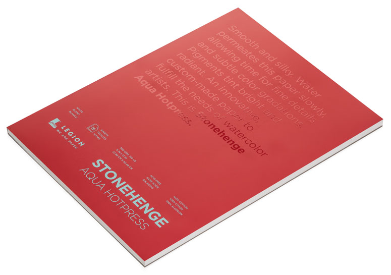
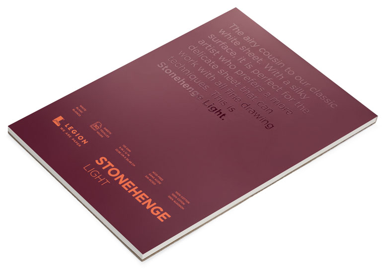
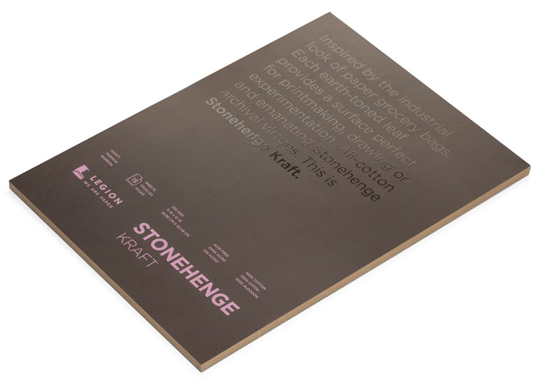
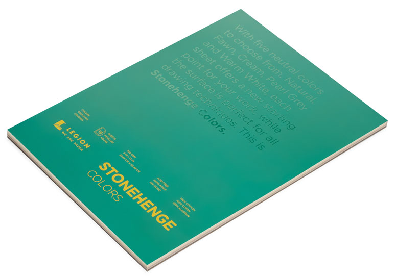
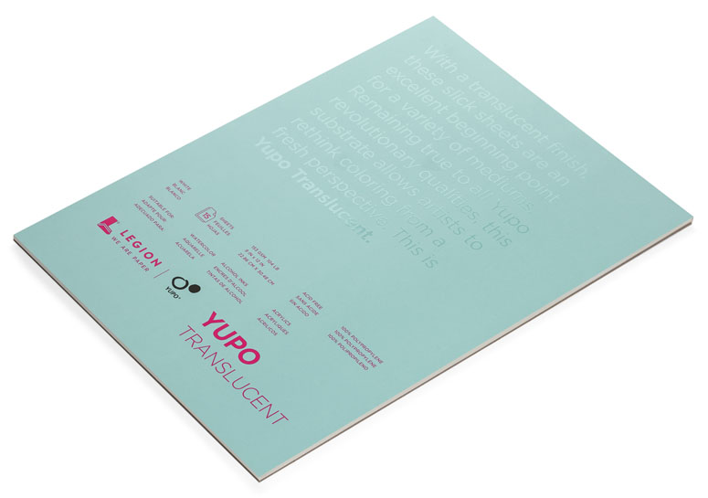
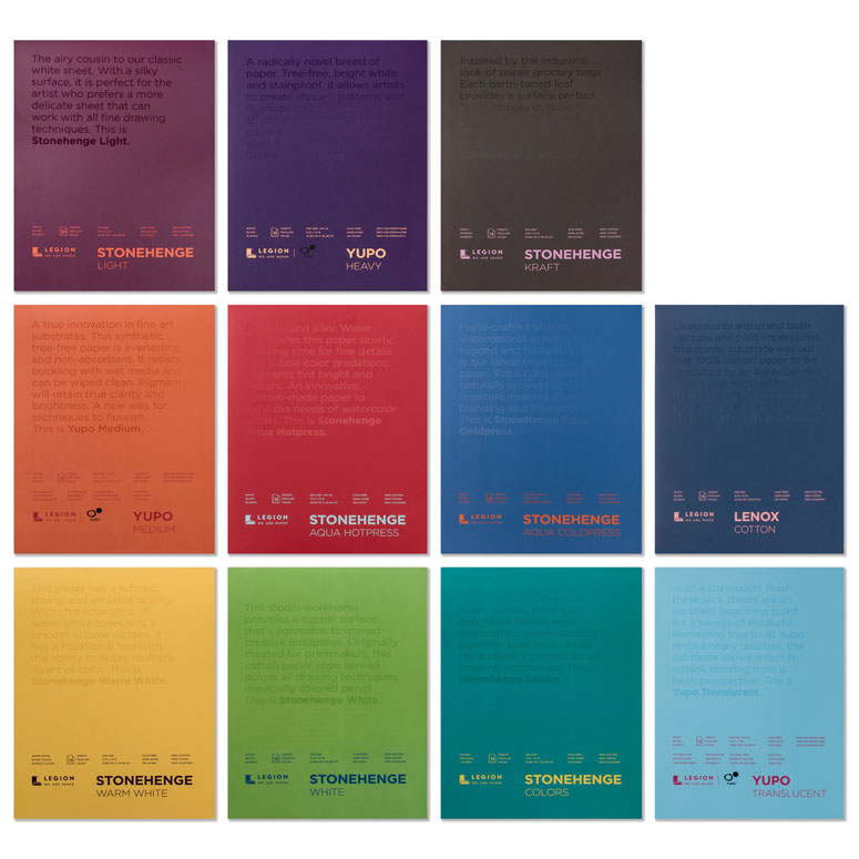
Highlighting the range of paper options at paper distributor, Legion Paper, these pads share a consistent design and a perfect dollop of spot gloss varnish that allows the paper to seep through.
Client
Legion Paper
Quantity Produced
40,000 to start. On-going production.
Production Cost
–
Production Time
3-4 weeks
Dimensions (Width × Height × Depth)
–
Page Count
12-30 depending on the pad
Paper Stock
140lb
250gsm
74lb/144lb (white) 104lb (translucent)
Number of Colors
11 (across all booklets)
Varnishes
Soft Touch
Binding
Internal Tape Binding
Typography
Gotham
Project Description
Art is about connections. Between structure and the whole, ideas and the viewer, the medium and the maker. No matter what the piece of art, all of its elements must work together. Everything must be connected.At Legion, our art is paper. And now we are proud to announce our new redesign, a bold disruptive look that takes three of our papers, new and old, and connects them so you know that you are getting the quality, consistency and substance you demand for your art.
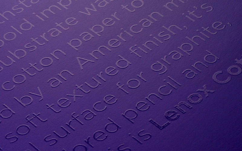
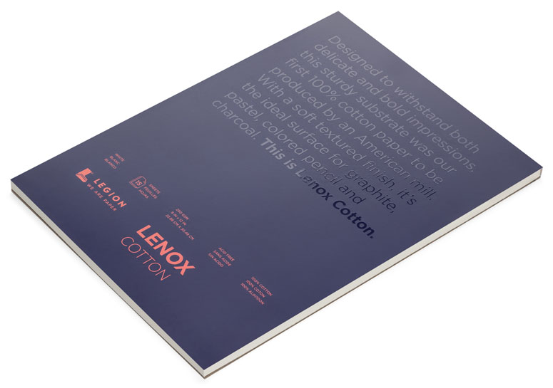
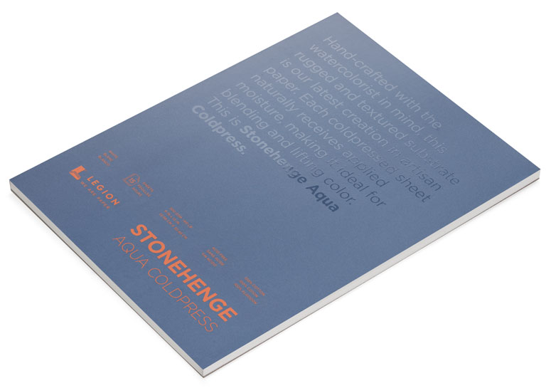
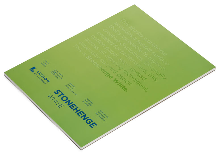
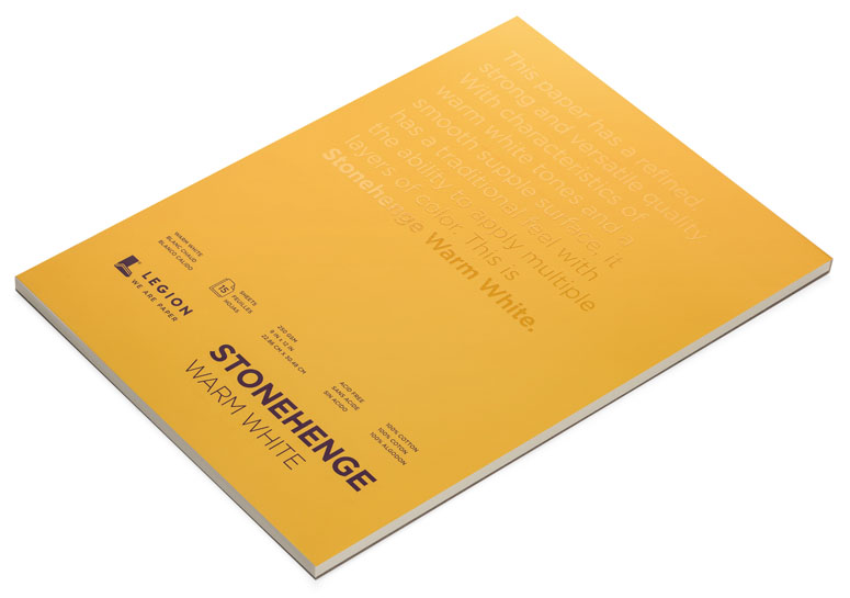
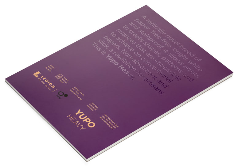
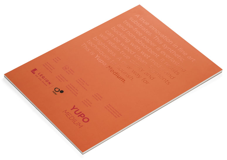
It was time to break tradition. To create something the market had never touched upon. The design-savvy covers strip away the clutter of conventional pad covers, using a varnish text against a solid background color to capture the attention of the artist without being intrusive. Designed for the artist’s eye, the clean, bold type tells you the paper, a beautiful gloss overlay paints an ephemeral verbal picture of exactly what that paper can do.
Orange on purple? That’s Stonehenge Light. Red on orange? That’s Yupo Medium. And so on and so forth. The papers haven’t changed, we’ve just made it easier for you to find them on the shelf and given them a look you'd be proud to leave out in your studio or on your coffee table.
Together, all these covers will connect all of our brands under an umbrella that any novice can recognize and any artist can appreciate. And connections are what it’s all about.
Production Lesson(s)
We learned a lot from design to production of our blocks and pads. Our first challenge in designing the pads was finding a way to stand out on a store shelf, create something new in the market. Once the design was in place, the details on each pad became our main focus. What needs to be included? Languages? Applications? Sizes? How do you include all of the information without making a mess of the pad cover? After numerous design layouts and drafts from the copywriter, it was time for the printing and production.As this was the first batch of many, it was very important to make sure all colors were accurate. After making sure each color was on point, we needed to make sure the spot UV was perfect, visible-but also could become invisible. Again, numerous tests were sent back and forth.
Each step was a learning process. We learned what worked well, what we could do next time. From start to finish, the process was a roller coaster from frustration to excitement. And we are stoked to get these into the market.

Post Author

Bryony Gomez-Palacio
Editor of FPO and co-founder of UnderConsideration LLC.
More: Online / On Twitter
Date Published
March 31, 2017
Filed Under
Booklet
Offset
Tagged with
Gotham
Internal Tape Binding
offset
PMS
soft touch varnish
uv ink


About
FPO (For Print Only), is a division of UnderConsideration, celebrating the reality that print is not dead by showcasing the most compelling printed projects.
FPO uses Fonts.com to render Siseriff and Avenir Next.
FPO is run with Six Apart’s MovableType
All comments, ideas and thoughts on FPO are property of their authors; reproduction without the author’s or FPO’s permission is strictly prohibited
Twitter @ucllc
Sign-up for Mailing List
Mailing list managed by MailChimp
Thanks to our advertisers
About UnderConsideration
UnderConsideration is a graphic design firm generating its own projects, initiatives, and content while taking on limited client work. Run by Bryony Gomez-Palacio and Armin Vit in Bloomington, IN. More…
blogs we publish
Brand New / Displaying opinions and focusing solely on corporate and brand identity work.
Art of the Menu / Cataloguing the underrated creativity of menus from around the world.
Quipsologies / Chronicling the most curious, creative, and notable projects, stories, and events of the graphic design industry on a daily basis.
products we sell
Flaunt: Designing effective, compelling and memorable portfolios of creative work.
Brand New Conference videos / Individual, downloadable videos of every presentation since 2010.
Prints / A variety of posters, the majority from our AIforGA series.
Other / Various one-off products.
events we organize
Brand New Conference / A two-day event on corporate and brand identity with some of today's most active and influential practitioners from around the world.
Brand Nieuwe Conference / Ditto but in Amsterdam.
Austin Initiative for Graphic Awesomeness / A speaker series in Austin, TX, featuring some of the graphic design industry's most awesome people.
also
Favorite Things we've Made / In our capacity as graphic designers.
Projects we've Concluded / Long- and short-lived efforts.
UCllc News / Updates on what's going at the corporate level of UnderConsideration.

Related entries
2017 Brand New Conference Program
Severe(d): A Creepy Poetry Collection by Holly Riordan
Um Caminho para Santiago CD Package and Diary
BOYCO Classpack® Book
Antes de Perder la Esperanza Book