ADV @ UNDERCONSIDERATION Peek here for details
BROWSE
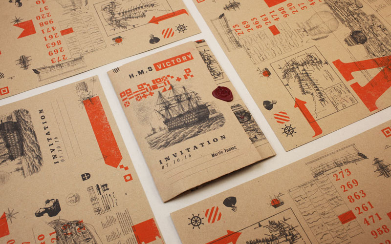
“An Evening onboard the HMS Victory” Invitation
Production Method
Risograph
Design
Richard Heap
Printing
Fred Aldous, Manchester
Sometimes a high end and exclusive event calls for a different vibe. This invite goes historical in look and feel which generated a spark about the event that stood out for a group of people used to glossy paper and crisp materials.
Dimensions (Width × Height × Depth)
Wallet pack: A3
Schedule Booklet (folded): A4
Flyer: A5
Page Count
5
Paper Stock
300 gsm
280 gsm
Number of Colors
2
Varnishes
Hair spray
Binding
–
Typography
Blackoak Standard
Baskerville Bold
Baskerville Bold Italic
Clarendon Black
Cooper Hewitt Heavy
Klinic Slab Black
Klinic Slab Medium Italic
League Gothic Regular
Tenez Black
Project Description
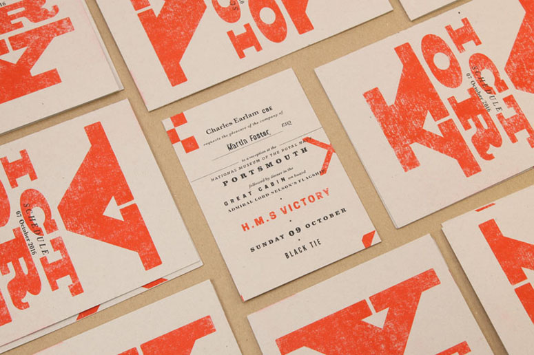
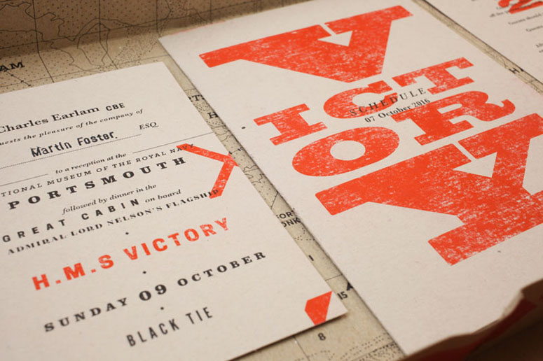
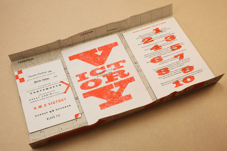
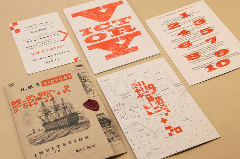
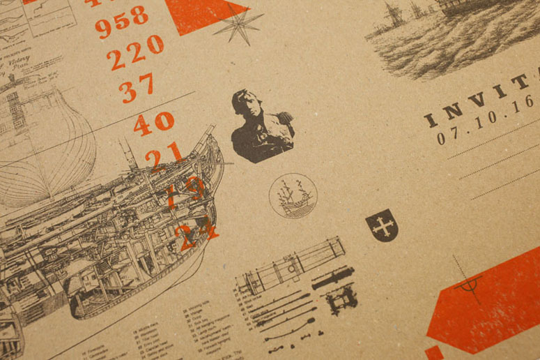
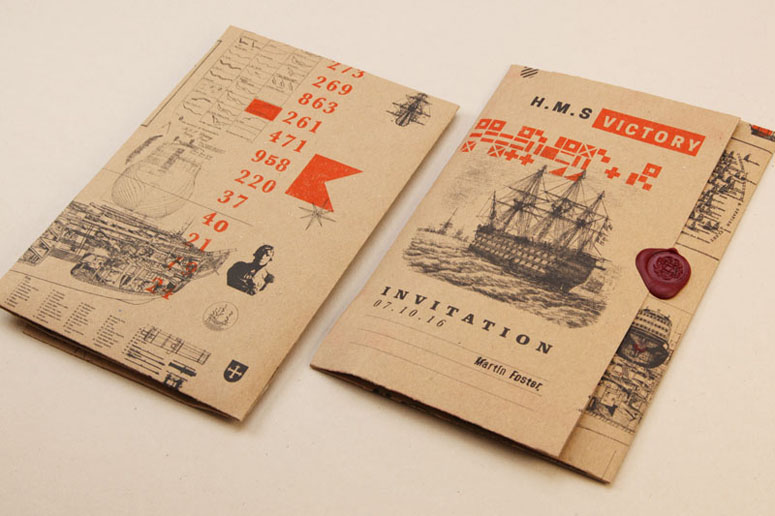
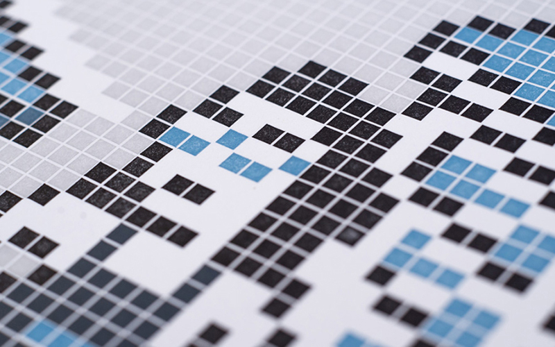
Senior board members of a major UK retailer were to meet for a dinner onboard the HMS Victory - Vice Admiral Lord Nelson's flagship during the Napoleonic Wars. As a site of major historical interest, we looked to create a set of invitational materials that reflected this using two color risograph printing on kraft paper and card stock.The design also aims to that reference the era with a lot of heavy typefaces similar to ones used at the time, as well as incorporating the various ensigns (naval flag patterns) used by the British navy during the battle. For example the horizontal band on the invitation wallet front (and also shown on the back of the schedule) reads 'England Expects Every Man Will Do His Duty' - a message dispatched by Nelson at the start of Trafalgar - the battle which proved a decisive victory against the French. Additional assets were also used to enhance the packs and add further visual interest to the kit, as well as a redrawn historical map (the wallet inner), to help create a sense of anticipation before the event itself.
Produced as a small run of 30 packs, we hoped to create a set of materials that wasn't luxurious or expensive but rather something that was clearly historical with a more analogue and tactile feel - as such riso with it's varying output and registration it created proved a great solution.
Production Lesson(s)
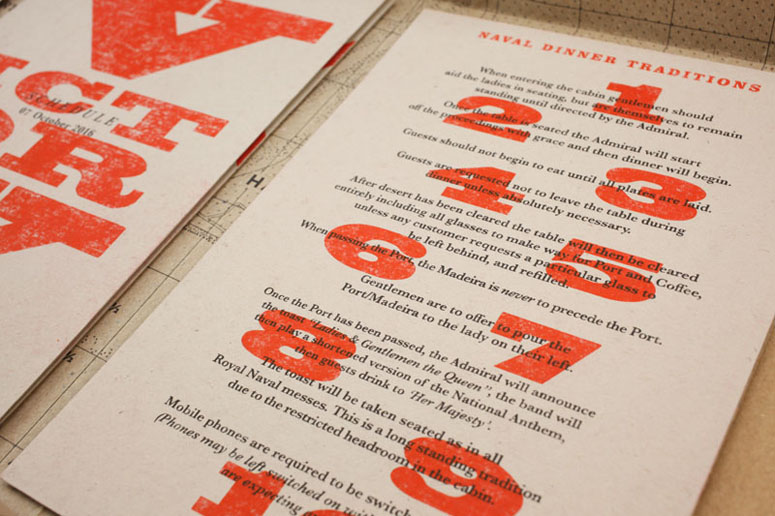
Riso ink can rub off when handled a lot. To account for this we sprayed a hairspray as a clear laquer to help bind the ink to the paper, and prevent any grubby fingers ruining dinner!Furthermore for each guests name we used a rubber stamp on the invite itself and the wallet - we had to make we had plenty of spares as things can get messy with 30 different names to be set on each pack. We also hand folded each of the packs which required lots of patience and steady hands!
Although the print costs were fairly low it did require a fair of time to prepare each pack. However the client loved it, with some great feedback on how different it was from the usual, more slickly produced print materials they receive.

Post Author

Bryony Gomez-Palacio
Editor of FPO and co-founder of UnderConsideration LLC.
More: Online / On Twitter
Date Published
June 27, 2017
Filed Under
Invitations
Risograph
Tagged with
A3
A4
A5
invitation
pms
risograph
rubber stamp
various typefaces


About
FPO (For Print Only), is a division of UnderConsideration, celebrating the reality that print is not dead by showcasing the most compelling printed projects.
FPO uses Fonts.com to render Siseriff and Avenir Next.
FPO is run with Six Apart’s MovableType
All comments, ideas and thoughts on FPO are property of their authors; reproduction without the author’s or FPO’s permission is strictly prohibited
Twitter @ucllc
Sign-up for Mailing List
Mailing list managed by MailChimp
Thanks to our advertisers
About UnderConsideration
UnderConsideration is a graphic design firm generating its own projects, initiatives, and content while taking on limited client work. Run by Bryony Gomez-Palacio and Armin Vit in Bloomington, IN. More…
blogs we publish
Brand New / Displaying opinions and focusing solely on corporate and brand identity work.
Art of the Menu / Cataloguing the underrated creativity of menus from around the world.
Quipsologies / Chronicling the most curious, creative, and notable projects, stories, and events of the graphic design industry on a daily basis.
products we sell
Flaunt: Designing effective, compelling and memorable portfolios of creative work.
Brand New Conference videos / Individual, downloadable videos of every presentation since 2010.
Prints / A variety of posters, the majority from our AIforGA series.
Other / Various one-off products.
events we organize
Brand New Conference / A two-day event on corporate and brand identity with some of today's most active and influential practitioners from around the world.
Brand Nieuwe Conference / Ditto but in Amsterdam.
Austin Initiative for Graphic Awesomeness / A speaker series in Austin, TX, featuring some of the graphic design industry's most awesome people.
also
Favorite Things we've Made / In our capacity as graphic designers.
Projects we've Concluded / Long- and short-lived efforts.
UCllc News / Updates on what's going at the corporate level of UnderConsideration.

Related entries
ARCMTL + LA SERRES - Objets flottants Arts vivants Edition
Risolve Studio 2017 Swatch Book
Marina Cardoso Business Cards
Illustrated Science Zine