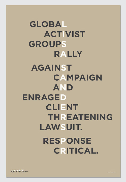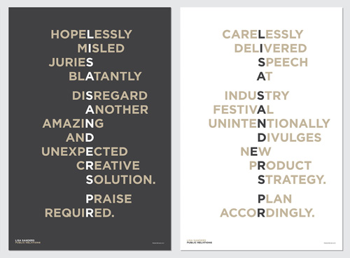
About the Posters
The brief: I needed a simple yet sophisticated messaging piece aimed at prospective clients that explains why hiring PR counsel is a wise move. The message needed to distinguish me and my approach from the sea of rivals while also providing insight into the type of solutions Lisa Sanders Public Relations provides. A final requirement: make it compelling enough that the recipient wouldn’t pitch it into the garbage bin after reading.
The challenges and key objectives: From international networks and national corporations to boutique firms and sole proprietorships, many businesses provide public relations services. Some are well-known brands; most are not. The majority of the latter generally sell themselves using corporate-speak words (“communications” “messaging”) short on description and passion. Red Peak had to separate Lisa Sanders Public Relations from rivals by both communicating the specific industry expertise the firm provides and explaining the business problems PR addresses and the benefits and solutions a campaign or program can deliver. And it had to be smart and pithy, communicating quickly and decisively.
Explanation of the final design: Simplicity and sophistication informed our approach. A deliberately limited palette mirrors the colors of Lisa Sanders Public Relations brand identity and also underscores the accessibility of public relations. Words — a crucial element of PR — are the core of these posters, stylistically through typography and intellectually, for messaging. Copy, laid out horizontally, Haiku-like on each of three posters, describes compelling, potentially catastrophic business scenarios. Public relations is the solution and L I S A S A N D E R S P R — printed vertically, in a contrasting color — is the obvious, thoughtful and appropriate provider.
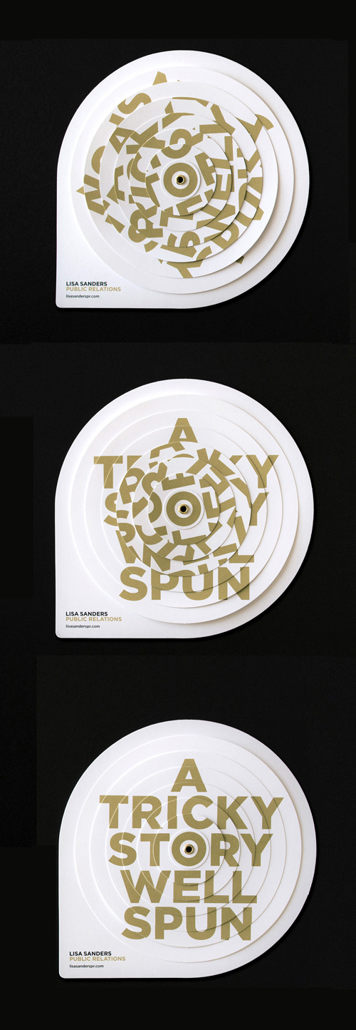
About the Promo
The brief: I requested a simple yet sophisticated messaging piece aimed at prospective clients that explains PR and generates interest for future conversations. The message needed to distinguish my firm from rivals while also providing insight into the type of solutions Lisa Sanders Public Relations provides. A final requirement: make it compelling enough that the recipient wouldn’t pitch it into the garbage bin after reading.
The challenges and key objectives: Many businesses provide public relations services. Some are well-known brands; most are not. The majority of the latter generally sell themselves using corporate-speak (“communications” “messaging”), long on syllables but short on description and passion. Lisa Sanders Public Relations needed differentiation from competitors. We opted to create interest and connection via a puzzle-like challenge, offering a bit of edge and sophistication. It’s a small package that packs a punch.
Explanation of the final design: Simplicity and sophistication informed our approach. The deliberately limited palette mirrors the color of Lisa Sanders Public Relations brand identity and keeps the visual clean. Words — a crucial element of PR — are the core of these mailers, stylistically through typography and intellectually, for messaging. Jumbled copy, presented in a unique layered structure, creates a clever yet not overwhelming mess of messaging (an echo to the sometimes frenetic world of so-called PR spin) that eggs recipients on to solve the scramble. Once revealed, A TRICKY STORY WELL SPUN, smartly communicates the Lisa Sanders Public Relations offer, with a touch of fun.