Waitress: So are you guys here for a convention?
Me: Yeah, it’s a typography convention
Waitress: (puzzled look, uncomfortable silence)
Me: (blank stare)
Waitress: Um, yeah, I don’t know what that means.
And that is the beauty of attending TypeCon: 340 typographic geeks together for a reason nobody understands. Star Trek conventions are more “normal” and we don’t even live in our parents’ basement (at least the majority). What follows is a review of my four days in Minneapolis for TypeCon2003. I hope that this little post can serve future TypeCon attendee-hopefuls get a better picture of what it is like to be in one of the friendliest conferences available
Also, be advised that this is an opinionated review, it’s not watered-down, it’s not sugar-coated and is far from being politically correct. It’s honest as hell.
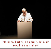 I got to Minneapolis Thursday, July 17, around noonish and shuttled myself to the hotel. Met Chris May, my roomie for the weekend, at the lobby and headed for some lunch. I’ll spare you all the details and I’ll fast-forward to the day’s first event, An Evening with Matthew Carter and Andrew Blauvelt at the Walker Art Center. Matthew Carter talked about his Lauire Haycock Makela-commisioned typeface for the Walker (aptly named Walker) and how it has been applied for the museum. He also showed some examples of what other designers have done with the user-friendly Walker typeface. After Carter, Andrew Blauvelt (Design Director at the Walker) presented the amazing work that the in-house design department creates all year round, which is the only thing that saved this otherwise poor presentation. (Hey, I’m just telling it like I saw it). After that Chris and I headed to Rudolphs to meet fellow Midwestern Speak Up authors Brook Lorntson, Darrel Austin and Ben Kiel. Chris ate some bad Bison Jerky and had to leave early. Good food, bad service and excellent company. Stayed away from any partying and headed to bed.
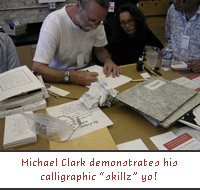 Friday morning I got up early and found my way to the Minnesota Center for Book Arts for two workshops. The first one was Hooked on Classics: Learn Lettering from Traditional Type by extremely talented Ken Barber of House Industries fame. The workshop was very well prepared and imparted, we looked at how to create very expressive lettering starting from regular fonts. The only problem is that it reminded me how much my hand-skills suck (please refrain from any sexual jokes). My second workshop, Calligraphy: Using Alternative Tools for Type Development, was with another extremely talented person — calligrapher Michael Clark. Yet another instance where I realized how glad I am that the computer exists. The workshop was very informative and entertaining, even though there were no hands-on activities. It was a pleasure seeing Michael work his magic.
 All this hand-crafted stuff was very exhausting so I went back to the hotel for some well-deserved rest. Went back out there to check the Type Gallery — an unjuried typeface showing — there was some really nice stuff in there along with the TDC2 2003 winning entries. Scoped out the necessary vendor area, nothing really exciting there,but it was nice to see them vendors support the conference. The next event for the night was another gathering at the Minnesota Center for Book Arts for some excellent, albeit cold in the end, pizza and mingling. There were some lectures too, but the auditorium was extremely hot and I couldn’t take it no more, so I stepped out for a few moments. The last event of the night was the Type Quiz by Allan Haley and Kent Lew — talk about type geeks! They had some really tough questions, I think I only got one right and it obviously had to do with Sagmeister (what’s his favorite typeface?). I can’t remember who won… once again I avoided any partying and went to bed.
Brand new day — first lecture at 8:30 am by Ken Barber, from the aforementioned house Industries, The Case for Craft: Lettering Lessons from American Signage. I have to say first, that I was very impressed by how well prepared Ken was for this lecture and his workshop, I was prejudiced and thought he would come in all lazy and unprepared and just show how cool he is for working at House. His presentation looked at signage found all over the US, obviously funny commentary abounded. Paired with some excellent examples of outdoor lettering, this was probably one of my favorite talks. One good link for all of you: American Sign Museum. Next up WAD and CHG: The Artist and the Engineer by Kent Lew, a look at the work of W.A. Dwiggins and his helpy helper dude C.H. Griffith. I really don’t have much to say about this one, because I dozed off a little, but it was great insight into the working methods of Dwiggins. By jickity!
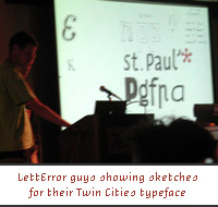 One of the funnest presentations was Typeface Twin Cities: a new font for Minneapolis/St Paul where five or six, can’t remember… actually there is a much better preface for that talk on this page. The winners were the crazy duo of LettError Erik van Blokland and Just van Rossum with an insanely large family of fonts. I think it was something like 16-20 weights ranging from Sans Serif to Serif and from Normal to Weird. There is no way that I can explain what they did because it is so unusual and innovative. They coded their own program that allows the end user to mix and match any of the styles available, that all in all account for over 50,000 characters. They can also control how the typeface — that will appear on a future web site — will look based on the Twin Cities’ weather, wind direction and traffic. To top it all off, the damn typeface reacts to sound, the louder the room got the Weirder the typeface became — I told you, there was no way I could logically explain this. I missed the following lectures, so there is nothing at all to report on those.
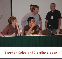
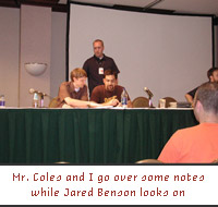
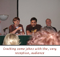 At 4:00 PM, the real fun was about to get started. Stephen Coles from Typographica, Jared Benson and Joe Pemberton from Typophile, Jon Coltz from Daidala and me were preparing to take the unsuspecting crowd by storm. Our panel was moderated by Si Daniels of Microsoft Typography. First of all, let me share some slides that accompanied our presentation, these are only the ones for Speak Up (click on each one to go to the next), everybody had their own set and they all looped constantly on the background. It all started rather civil, with everybody explaining what each of their on-line communities was; sharing our motives, experiences, lack of funds and other tall tales of blogging. For some strange, unknown reason and totally not on purpose I mentioned that we like to swear on Speak Up. A lot. I even managed to anger a high-powered executive at the Type Directors Club (don’t worry, we patched things up later in the evening). We had some great interaction with the audience, they got really involved and all seemed to reflect the energy and excitement of all of us first-time speakers. It was extremely great and exciting, I really wish all loyal Speak Up readers would have been there to cheer us on. There is a video being prepared by the Typophile folks who taped the discussion, I’ll let you know when that is ready. I think Matthew Carter spoke again after our panel, but I couldn’t pay much attention. Later in the evening, there was an auction of rare type specimens, old magazines, hand-lettered signs and anything else that a type geek would spend more money than necessary. The highlight of the night was an awesome striptease by world renowned sign painter and typographer John Downer, who was cheaply trying to raise the price of his self-designed T-shirt. Nonetheless, it was a moment to remember — apparently, this is a trend, he also took of his shirt at ATypI in Rome. To keep the tradition alive, I did no partying.
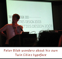
 Sunday at 8:30 am is probably not the best slot for any speaker but James Montalbano proved everybody wrong with a stellar presentation. Both informative and entertaining You Can’t Get There From Here: Designing Type for Federal Highways was based on James’ typeface design (Clearview) for Federal Highways including all the not-so-little nuisances of working with the government and with some damn big signs. I missed the next discussion panel on education and came back for Craig Kroeger’s (of Miniml) Proalias: Miniml Typography, not much on the presentation side, lots of ums and ams that did not allow for a straight sentence (no offense Craig, just work on your presentation skills man!). It was good on the content and information and his bitmap fonts are some of the best available on the web. After that, came one of my favorite presentations by none other than the Aesthetic Apparatus, yessir! It was absolutely insane, funny, entertaining and off-the-wall weird. Dan Ibarra and Michael Byzewski are the best pairing since Punk and Art Chantry. One bad thing I do have to say, is that in a few years they will need to come up with some great and influential presentations other than standing on stage and showing their posters. The excitement could wear off soon and easily. But enough about deep critique, AA is one of the best things happening right now in design and in the end we got some (in their words) Free Shit! by a guy in a moose costume. Had lunch with Nick Shinn. Came back to hear Allan Haley’s Non-Font Typography, or, Look Out Helvetica, Here Come the Green M&Ms which looked at good uses of, um, not using fonts. It was a good presentation with some cool stuff to see on the projector, but by God! Mr. Haley needs to get off the caffeine, I almost had a seizure. The man knows his stuff though. Peter Bilak was next on the roster, he presented Type and Reading. A very interesting look at his approach to design, reading and teaching. We got treated to some amazingly beautiful Quicktime movies of his typefaces dancing the night away. Talented, talented young man.
 Everybody who knows me or came across the first version of Speak Up knows my feelings about trendy, little, eye candy places like K10K and Surfstation, so you can imagine I was very prejudiced when I saw that Mike Cina from WWFT (and K10K contributor) and Jemma Gura (Surfstation contributor as well) were going to be in a panel representing “Design” and entitled There is more than one “i” in Design along with Joe Kral of Test Pilot Collective and Florian Fangohr of Gura-Fangor. It was “moderated” by Joachim M�ller-Lancé of Kame Design who did little moderating and much talking. I hate to say more bad things about this presentation because I have already outgrown my eye-candy-pushers hate phase, so I’ll just say that I wish they would have had a better structure to their presentation (Mike Cina had less than five minutes to present). Also that, if they were up there representing “Design,” they would have shown how their exhorbitant amount of talent can be applied to our profession. Last on the event schedule were Jim Parkinson and Dave Farey with a schooling in typographic know-how. They were the only presenters who used an actual, noisy, projector with real slides and everything — showing some of their typeface design and “Letter Repairing” works. Masters of their craft, these two class-acts put the gold seal on what was a great conference.
It was an almost flawless conference and I feel honored to have been part of it. Many, many mad props to Rich Kegler, Tamye Riggs and all the folk over at S{o}TA who put their heart and souls into this event.
Thanks.
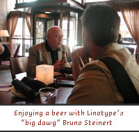
PS. Here are some more picture that I couldn’t fit into the review.


woo hoo!
can't wait for the review!
On Jul.21.2003 at 03:09 PM