spacer
Speak Up
A Division of UnderConsideration
spacer

AuthorsAboutContactspacer
Updates, News and Announcements
Pattern
Logo Smackdown
Show and Tell

Since we all had fun tearing apart the new VH-1 logo, I thought it'd only be fair that we subject ourselves to the same scrutiny of our peers.

Here's the deal: post the last one or two logos you've worked on. These have to be the actual last couple of logos you did. So it doesn't matter if it was the Best-Of-Show logo in the last CA or a modified piece of clip art you gave to Aunt Mabel for her scrap-book shop in the strip-mall. Keep descriptions brief and check your ego at the gate to be prepared for a free-for-all critique session. (All in the name of good fun, of course. ;o)

By darrel on Sep.08.2003 Link Comments [197]

Start Comments

Jump to Most Recent Comment
Comment Divider
Darrel’s comment is:

I'll throw these into the ring:

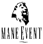
Logo for my current place of employment.

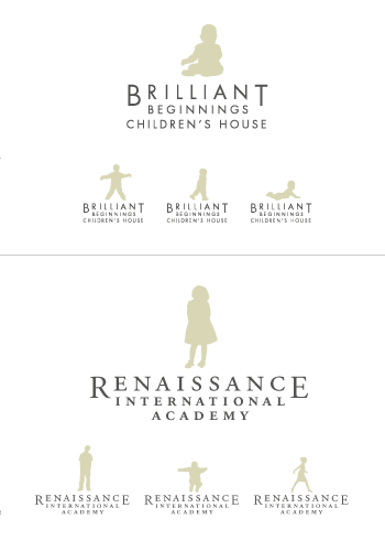
One of those logos for a friend's when they come to you asking "I'm leaving the country on Friday and need to make business cards before then, can you make me a logo" deals.

On Sep.08.2003 at 12:28 PM

Comment Divider
Tan’s comment is:

Fair enough Darrel. I'll give you my last 3. I say, bring it on.

The first is a huge arts foundation in the NW.

The second is a quickie program logo for a design school whose mission is to get stagnated designers to get off their ass and polish their skills to be more marketable.

The third is actually my company's new identity. I'm not even supposed to show anyone yet, so please keep it quiet.

Discuss away.

On Sep.08.2003 at 01:06 PM

Comment Divider
Andrew’s comment is:

Will someone help me put upload an image

On Sep.08.2003 at 01:10 PM

Comment Divider
Andy’s comment is:

Nice logos Darrel. I like the Minnesota Judicial Branch a lot. I like the Volta, except for the "Solutions" part looks a little odd.

Oh boy. I'm almost a pure lurker here, but I'm gonna go ahead and take the plunge. Please be gentle.

This is a logo I am working on for a friends father. He has a medical practice in Louisville, Colorado (Hence the mountains). I'm not really wild about it but it has been through a couple of revisions and the client is feeling positve about it. Medical logos are tough and it's hard to come up with something that's not cliche ridden... Blast away!

On Sep.08.2003 at 01:15 PM

Comment Divider
Armin’s comment is:

> Minn Judicial Branch

That looks like a Sockwell. I like the colors and the type, not sure how well it scales down.

> Volta Solutions

To gradienty, but strong. I like how the V relates to the inverted cone.

> Artsfund

I like it! Reminds of lendingtree.com. Just because of the leaf and colors. I really dig the half of the serifed A combined with the leaf.

> Suitcase thingie

Sorry Tan, reminds me a bit of VH1's.

> pop

Nice, simple, trendy in a good way. Good colors, Segura would be proud.

I post mine in a little bit.

On Sep.08.2003 at 01:21 PM

Comment Divider
Armin’s comment is:

Actually Tan, I really like pop's. It just goes... pop!. Very cool!

On Sep.08.2003 at 01:22 PM

Comment Divider
Tan’s comment is:

Thanks Armin. POP works well. I'm pretty happy w/ it. Damn if there aren't three harder letters to work with.

> Suitcase thingie

Sorry Tan, reminds me a bit of VH1's.

Yea, I know -- it's just ok. Plus, it's a straight rip of 2 Zeal icons. Hey, did it in less than 30. But Darrel said to post the good with the dogs. So...

On Sep.08.2003 at 01:26 PM

Comment Divider
Andrew’s comment is:

How do I upload an image?

On Sep.08.2003 at 01:29 PM

Comment Divider
jonsel’s comment is:

Darrell,

I definitely like the Minnesota logo, despite its Sockwellicity (he'll love that...). The Volta mark is alright. I tend to get violently ill anytime I see a logo with the word "Solutions" in it. Not your fault!

Tan,

Love ArtsFund and the Portfolio logo. That ArtsFund mark is the classic sort of logo that got me into design. I really dig the "pop" mark, but not as crazy about the type. It feels trendy and 70's - those detached p's get me every time.

Andy,

Please delete Rotis from your system now. You'll feel better. Also, I think there are too many elements in the logo - mountains, clouds, cross, a family. The style of the people is more international and iconic while the clouds are illustrative. Not sure they're gellin' together. I like the separation from the clouds to get 2 colors.

I'll post some of mine tonight. I can't wait for the brutality!

On Sep.08.2003 at 01:32 PM

Comment Divider
Darrel’s comment is:

"Solutions" part looks a little odd.

Agreed. ;o)

Thanks for the comment on the courts logo. It's OK...certainly better than what they have (ie, nothing). It was the 'safest' of the bunch, which I suppose was an inevitable choice.

Tan...I really like the Artsfund logo. I don't 'get' the second logo. People still lug around big portfolio cases? ;o) ;o) ;o)

Andrew...sorry, I should have phrased that a bit better. You can't actually upload files. You need to link to files you have uploaded to another server (usually your own).

Andy...I think it's a great logo. I'd suggest a few things to maybe take it a bit further:

  • Try making the people less iconified. The landscape seem much more organic...see if you can get the same feel in the peopole
  • Maybe get rid of the people? I think it'd be nice without them. The ol' less-is-more comment.
  • The type may be a bit small in comparison to teh mark, but I'm sure it all depends on where the logo is going

Dang. This isn't nearly as harsh as I was expecting people to be. ;o)

On Sep.08.2003 at 01:37 PM

Comment Divider
Tan’s comment is:

Andy -- the coal creek logo looks overly-complicated. Like the clouds (could be further simplified) and mountains, not so crazy about the figure sillouhettes. They seem incongruous and a little planted. Are there other ways to say "family" practice other than a literal family? A house, picket fence, small hands in large, etc. -- I dunno.

And if it matters, I read cross first, mountain scenery second, family third.

Darrel, like MJB a lot, hate Volta. But their name already kills it immediately for me -- anything w/ "solutions" is a no-win situation.

On Sep.08.2003 at 01:40 PM

Comment Divider
Darrel’s comment is:

ooh! Tan's picket fence idea is a good one...

On Sep.08.2003 at 01:42 PM

Comment Divider
Tan’s comment is:

> I don't 'get' the second logo. People still lug around portfolios?

it's a walk sign. get it? get going w/ your career and move -- don't stand still.

you have to see it in context I guess. Ok, ok...it's not CA worthy I know.

On Sep.08.2003 at 01:43 PM

Comment Divider
Yitz Woolf’s comment is:

Here are two of mine:

This one was for a client in Toronto that I was doing an advertisement for.
She didn't ask me for a logo - I quickly made one up and threw it in.


This one was for yet another Hebrew school based in Los Angeles.
Based on a fax of the architectural drawings of the proposed building.


I like Darrel's Judicial.
I like Tan's ARTSFUND.

On Sep.08.2003 at 01:46 PM

Comment Divider
marian’s comment is:

The following logo is one I did as a concept just before I left my company: not sure what happened to it after that.

The client wanted something for a software program that would run on Mac OSX, OS9 and Windows, though the OSX was a big selling feature. The logo was primarily for the software application: He didn't think he'd be using it for print at all (though i did a simplified, 1 colour version just in case). I also made the mango as a 16x16 pixel icon, to make sure it worked. Oh, and the font is VERDANA! That's what they use in their software, so I decided to make it easy for them. Don't give me any shit about that.

The following logo was done for a new restaurant next door to its fancy parent restaurant, Lumiere (a Nobu's Next Door concept). When I asked the chef/owner whether this would be a place you'd take your mother to, or a place you'd go to party with the jetsetters, he said "both." The menu has a bit of High French from next door and a bit of low (the burger, and "Feenie's Weenie"). I did Lumiere's logo as well, and we wnated some affinity between the two, but differentiation as well (The "RF" is on both). I also knew they'd be embroidering this on things, so I went quite heavy rather than light. This is a custom logotype.

On Sep.08.2003 at 01:50 PM

Comment Divider
jonsel’s comment is:

Some clarification here: do we post stuff that wasn't picked? Or just what the client bought?

On Sep.08.2003 at 01:57 PM

Comment Divider
Tan’s comment is:

Ooo...I love Lumiere's. But not one of those places you can afford to go to every week. But as to Feenie's, a period in place of a proper apostrophe? Tsk, tsk...risky territory w/ this crowd marian...

And one observation on the mango logo -- it says "mango", but I'm not sure it says "software" or anything else for that matter. Just an interesting, identifiable form.

This is fun people. But Darrel's right -- it's too polite. Where's Felix dammit?

On Sep.08.2003 at 02:00 PM

Comment Divider
marian’s comment is:

Tan, your Artsfund is absolutely stunning. It's beautiful, and original and iconic. I like the quickie student thing as well.

I like Darrell's Judicial Branch ... Seems like maybe they're having a little tangled justice, there.

Andy, the only thing that I don't like about yours is the bubblehead people. It would be stronger without itand ... I just have a thing against bubbleheads. (Hmm.. just read others' comments and see that his has been said already.)

On Sep.08.2003 at 02:05 PM

Comment Divider
graham’s comment is:

can anyone please help me post some stuff? ta.

On Sep.08.2003 at 02:07 PM

Comment Divider
Brent’s comment is:

Someone should let Nancy know about this. If she even cares that is...

On Sep.08.2003 at 02:11 PM

Comment Divider
Yitz Woolf’s comment is:

I'll jump in and be ruthless.

Darrel:

Volta Solutions - I agree with Armin - I am not into the gradient. As well - I think the italic Solutions is too condensed or something is not working.

Tan:

The red guy in the portfolio - I don't like that sillhouette. His hips seem pointy.

Andy:

Coal Creek Family Medicine: too busy. Rotis Semi is a bit annoying.

Marian:

Mango is fun!

I like Feenie's as well. I like that it goes upwards. It's hip. :) I do agree that maybe the single quotation could have had a small point at the bottom. It's nice that you made the font yourself.

On Sep.08.2003 at 02:13 PM

Comment Divider
Yitz Woolf’s comment is:

You have to put it up the image on your own server or a free web hosting server.

You simply link to that location from here.

If you want me to post it on my server - email me the logo/s and I will email you the link.

On Sep.08.2003 at 02:15 PM

Comment Divider
marian’s comment is:

But as to Feenie's, a period in place of a proper apostrophe?

That's not a period, it's the dot of the i. (Heh heh) Bring it on, I love my square-dot apostrophe.

And in defense of the Mango, the client had a really targeted audience and a direct line of selling to them. Like, he wouldn't be advertising or marketing this in any way other than word-of mouth and contacting the people he and his business partner knew. It was kindof a spin-off product, and he didn't want it to say "software" because he said they'd already know that. It was a pretty small target audience.

OK, well I won't get real impolite, but I think The Volta Solutions is utterly reVOLTAing. Sorry, but that gradated cone is not a logo, it's a gradated cone. I just really hate gradations in logos, it makes them impossible to work with in so many applications (I think of struggling with the duMaurier logo as sponsors for arts orgs). The "solutions" part looks as though it was tacked on by someone after the fact, who thinks "we need it to be energetic and forward-looking, so make it sans, all caps italic." I like the "volta" part but it looks familiar: ie not unique.

And Tan, I'm so sorry, but I don't really care for "pop". It's not bad, it just has no distinct personality of its own. it looks like an offshoot of "Wallpaper."

On Sep.08.2003 at 02:22 PM

Comment Divider
Andy’s comment is:

Thank you, your comments are all helpful. Where do I sign up for the 12 step anti-Rotis self help group?

Yitz, I like your EMEK design, has a very Frank Lloyd Wright feel. Hope it looks OK small...

On Sep.08.2003 at 02:28 PM

Comment Divider
Darrel’s comment is:

it's a walk sign. get it?

Oh, I got it...it was just a weak (and failed, apparently) attempt at humour. I long gave up the portfolio and still find it a bit odd that people lug those things around. ;o)

Some clarification here: do we post stuff that wasn't picked? Or just what the client bought?

I was envisioning that you'd just pull out the last few you did, so we could have a mix of both the good and the bad (due to clients getting in the way, of course...it's never *our* fault...)

And thanks for the comments on the Volta...THAT is the kind of smackdown I was looking for ;o)

The "solutions" part looks as though it was tacked on by someone after the fact

It was. ;o) I had a version sans the 'solutions' that I liked better, but they wanted solutions and time was short, so there it is.

BTW, Yitz: I love your site!

On Sep.08.2003 at 02:32 PM

Comment Divider
jesse’s comment is:

I don't do much logo work but I recently did this one for a fun local event.

Hack it up.

On Sep.08.2003 at 02:40 PM

Comment Divider
steven’s comment is:

Ok. Going to be brave here. I will throw in my own personal logo that I am working on right now. It is very much still in progress and I haven't worked out what I want to do with the type treatment below.

I like the iconic portion of it, but not the typography below. Guess this was supposed to only be for finished logos.?!. Oh well.

On Sep.08.2003 at 03:02 PM

Comment Divider
jonsel’s comment is:

Steve,

There's something unbalanced about the letterforms in the icon. The spaces are all equal until the top of the 'd' pops up. Is it supposed to be making a face? I know you said the accompanying type was unfinished. I think it should also be more reflective of the geometry in the icon. The lowercase 'l' especially is a disconnect for me.

Jesse,

Cows in space kick ass.

On Sep.08.2003 at 03:13 PM

Comment Divider
Adrian’s comment is:

My latest:

geek - My own logo, personal and business use.

eye contact - For friends' new optometry business. Never used, but payed for, they still work at LensCrafters.

On Sep.08.2003 at 03:17 PM

Comment Divider
Yitz Woolf’s comment is:

"BTW, Yitz: I love your site!"

Thanks Darrel! Your site is down...

This site rocks!

On Sep.08.2003 at 03:18 PM

Comment Divider
Armin’s comment is:

Here are my three latest. Sadly, the latest one did not get chosen by the client, but I still like it.

It's kinda weird, it's for two schools/day care centers that operate under the same management. One is for toddlers (brill beginnings) up to 3 years old and the other one (renaissance) is for 3 up to 12 yrs old. Anyhoo, I wanted to do a logo that changed, so the little kid on top would be different in each application. I would have printed the business cards four up, and have a different kid on each one.

Next one, I showed it in the Guess thread a few weeks back. For some sort of girly spa. I had to use three hearts and the colors were forced on me.

And lastly, a logo for a friend. Web development company. I built it so it could be "deconstructed" in various ways and still say "Red One" all the time.

On Sep.08.2003 at 03:20 PM

Comment Divider
Darrel’s comment is:

Hack it up.

What's to hack? It's a cow. On a rocket. In space.

It's perfect!

On Sep.08.2003 at 03:22 PM

Comment Divider
eric’s comment is:

The Baby New Year piece was one of the worst experiences i've had in recent times. Originally we went to the client with conceptual type treatments. Client came back with, "i want a baby running at 45 degree angle." We came back with revised great type work and some babies and the client continued to want more babies. Four rounds later and i was making minimum wage. At the end of the day i had to fight to not draw Yosimite Sam at an angle. As the firm that i was working with included a number of now friends, i couldn't walk away from the job.

the fish was for a proposal to redesign the Georgia Aquatic Park. the client was packaging the deal as "Worlds of Water" and wanted something family oriented. To my knowledge it never went further than the entertainment middleman that hired us.

it's funny to me that these are both illustrative solutions because the illustration work i do isn't line oriented and most of the logo work i do is very word/mark related.

anyway... these are the last two logo jobs. have at it.

On Sep.08.2003 at 03:23 PM

Comment Divider
Dave’s comment is:

Here is my company's new identity. Gulp. What do y'all think?

On Sep.08.2003 at 03:25 PM

Comment Divider
damien’s comment is:

Quick smackdown from me - while I dig around for the last logo I did.

1. I feel the cone thing is a bit of a stretch trying to be a strong mark. Something very Adobe Dimensions-esque of that time and era too.

2. I thought pop was great 'cause it did sort of 'pop' but it is a tad bland - without seeing it within the system it looks like it might be.

3. There's some really lovely stuff being shown up here. Some stuff reminds me of other things I've seen. I like your schools logo stuff Armin - but for me, it strays dangerously close to the Pottery Barn Kids concept of having different kids and shit - i know the colors and stuff are different, it just reminded me is all... (which is not a bad thing here -)

Oh and then there's the similarity between Yitz's website and another sort of known illustrator. Sorry but it was too close to not mention it.

On Sep.08.2003 at 03:33 PM

Comment Divider
rebecca’s comment is:

Steve, maybe I'm missing the point but I'm not keen on the round typeface with the angular icon.

Armin I LOVE that baby/girl thing, though I wonder how much they are enhanced by being seen all together like that.

I suck at logos. Take my criticism for what it's worth.

On Sep.08.2003 at 03:34 PM

Comment Divider
Tan’s comment is:

beautiful ID for Renaissance Armin. Just masterful...

but -- now I'm not saying this is bad or anything -- it really does remind me of Pottern Barn Kids stuff.

But they didn't invent kid silhouettes either. Good stuff.

Soulutions. Wuss. Nuff said.

Red One -- I like it enough, but at first glance, it read "Redone" Technologies. Maybe the weights could've contrasted more. I'm being picky.

Yitz -- the Latner logo is nice. The style of the silhouettes (using that word a lot) match the serifs of the logotype. Very nice.

And thanks for all the good stuff about ArtsFund. I got lucky.

On Sep.08.2003 at 03:37 PM

Comment Divider
Patrick H. Lauke’s comment is:

heck, i'm not really a logo designer (some would say i'm no designer at all ;-) ), but...here goes

On Sep.08.2003 at 03:39 PM

Comment Divider
Mongrel’s comment is:

First off, I LOVE this thread. About time.

Dave - that's... what is it? I like minimal, but I don't see how it will invoke the word "form" without being directly in the vicinity. Of course, Nike probably took some time too :)

Favorite so far is Darrel' Artsfund logo, very schmooove. But I'll stop critiquing because I have nothing worthy enough to put here.

Andy - WORD UP LOUISVILLE, CO! (why do I insist on blogging like a punk kid?) I live on McCaslin Blvd, right by the Coal Creek suburia hell. I would enjoy driving past that logo, it's pleasant, and not too niche. Well done.

On Sep.08.2003 at 03:40 PM

Comment Divider
Tan’s comment is:

> Damien: I like your schools logo stuff Armin - but for me, it strays dangerously close to the Pottery Barn Kids concept of having different kids and shit - i know the colors and stuff are different, it just reminded me is all... (which is not a bad thing here -)

> Me: but -- now I'm not saying this is bad or anything -- it really does remind me of Pottern Barn Kids stuff.

Damien and I are actually the same person. I thought you'd guys would like to know that. I just throw on a fake accent when I'm him.

On Sep.08.2003 at 03:41 PM

Comment Divider
Adrian’s comment is:

My favorites so far are ARTSFUND and Brilliant/Renaissance. Although, I do think Brilliant/Renaissance needs tweaking when it is scaled down.

On Sep.08.2003 at 03:42 PM

Comment Divider
damien’s comment is:

>Damien and I are actually the same person.

and when we disagree its just Tan's personality disorders getting all out of hand again.

not mine.

On Sep.08.2003 at 03:46 PM

Comment Divider
Armin’s comment is:

>it really does remind me of Pottern Barn Kids stuff.

Yeah you are all right, I completely forgot about the pottery barn kids thing. They have lamps and toys right? Yes, too close. Not intentional though.

>Red One -- I like it enough, but at first glance, it read "Redone" Technologies.

crap! I posted the original version. I got the exact same complaint. Here is the latest version. Swear to God I didn't just create this right now.

On Sep.08.2003 at 03:51 PM

Comment Divider
Armin’s comment is:

>Although, I do think Brilliant/Renaissance needs tweaking when it is scaled down.

True. Since it didn't get picked I never fully developed it.

On Sep.08.2003 at 03:52 PM

Comment Divider
Tan’s comment is:

Armin -- much better. Not CA better, but better.

On Sep.08.2003 at 03:55 PM

Comment Divider
Veen’s comment is:

For a new communications firm. The only guideline was that it had to be 2 colors.

On Sep.08.2003 at 03:56 PM

Comment Divider
Yitz Woolf’s comment is:

good catch damien - my site is way overdue for an overhaul - I liked the simplicity of Craig Fraziers site at the time... redhanded

On Sep.08.2003 at 04:02 PM

Comment Divider
Yitz Woolf’s comment is:

good catch damien - my site is way overdue for an overhaul - I liked the simplicity of Craig Fraziers site at the time... redhanded

On Sep.08.2003 at 04:02 PM

Comment Divider
Patrick’s comment is:

OK, my 2¢. I haven't read all comments, and it's just as well if I'm repeating others. If two people see the same thing, it's not personal.

Minn. Judicial: Looks nice. Makes me think the scales are broken, though.

Volta: Like the first word. Hate the rest.

ArtsFund: Nice! Wouldn't change a thing. I'm sick of Trajan, but it works.

Portfolio: Love it! Except the figures could be drawn little nicer.

pop: Fun. Clean. It pops.

Coal Creek: Needs simplification. Esp. clouds. And lose the Rotis.

Hebrew School: Both are nice. but the building deems a bit busy.

Mango: Colors are spot on.

Feenie's: Nice, unique typographic solution.

Space Cow: Cute. What was the name?

lyons: Letters are starting to make a face. Not necessarily bad (see UV below).

eye contact: Nice Name. Logo is a tad clunky, particularly the "eye"

Brilliant beginnings: Very nice. Love the rotating mark. Reminds me of Pottery Barn in last year's 365.

Soulutons: Nice. Seems appropriate to the subject. In a cliché sort of way.

RedOne: I like it. Do they separate it into two words when typesetting? Almost could be Redone.

Okay, my most recent three. Not my best lately, but hash away. I could go into justification for each, but I think I've typed enough for now.

My logo. Yes, it's a pixel font. Got a problem with that?

For a friend's group. Heart and Liberty crown dictated. If you saw what they started with you'd understand. Yes, a new website is on the way.

Originally done for a poster as a pro bono for my biggest client's temple. Then they made it their logo.

On Sep.08.2003 at 04:04 PM

Comment Divider
Tan’s comment is:

Eric -- worlds of water looks very Japanese for some reason. I like the iconography of it. Not crazy about the baby one. Nice illustration, but so-so logo.

Adrian -- geek logo: the stroke weight of the star should visually match the type. It doesn't quite right now.

Steven -- the monogram has potential, but the interaction of the letters could use further studies. There's some hierarchy, but it could be clearer.

Veen -- I read 2 H's, a yellow lowercase one, and a black capital one. Why? Are there 2 owners, both named Hinton? The fit of the letters could be refined further -- there are some fit issues, as well as form issues. I'd also lose the thin yellow rule -- it serves little purpose.

Ok, gotta get back to work. Have fun critting mes enfants.

On Sep.08.2003 at 04:08 PM

Comment Divider
Darrel’s comment is:

Got a problem with that?

I don't, but I've found lay-people do.

My current (and way out-of-date) logo is a bitmapped face and every other person I show it too always says 'it looks like your fonts are corrupt'.

Ugh. Lesson learned.

On Sep.08.2003 at 04:24 PM

Comment Divider
Armin’s comment is:

I am surprised at the amount of hebrew logos in here. It mainly freaks me out because I can read what they say. I guess I didn't forget all of my education.

Darrel, didn't you have a cow logo too? Something about software and yellow?

>Armin -- much better. Not CA better, but better.

It's VH1 better.

On Sep.08.2003 at 04:44 PM

Comment Divider
Armin’s comment is:

Patrick, I really like the Polyamorous icon, the type treatment does not do it justice. Something more spicy maybe... something Chasey?

I love well implemented bitmap font logos. Can't say I have seen many. Atomic Media pulls it off beautifully in web and in print.

On Sep.08.2003 at 04:48 PM

Comment Divider
eric’s comment is:

Tan, thanks for the feedback. I'm not happy with the baby at all. Completely strong-armed by the client. I would have pushed for a Windsor MacKay vibe at the least if illustrating the concept was even the best way to go. in my opinion, not.

This being the "last two logos" i thought it better to be honest about my bad days rather than dig through my portfolio for stuff i liked.

On Sep.08.2003 at 04:50 PM

Comment Divider
Armin’s comment is:

Marian, I really dig your mango logo. Like Tan, I think it doesn't say software — but it looks pretty darn cool. It's a very interesting depiction of a mango. Man, a mango right about now would be awesome.

On Sep.08.2003 at 04:51 PM

Comment Divider
Sergio’s comment is:

Well, this is somewhat intimidating. Great work all over the place.

Darrel: Love the first one. Not sure about the 3D cone on the Volta logo. Wouldn't it work better in a flatter form?

Tan: I mistook the Stop sign for a briefcase at first glance too. I think it's the lack of round corners to separate the main black areas.

Armin: Loved all of those. What font is that on the "soulutions" one?

Patrick: Great idea. Wouldn't that work better with a sans-serif font?

Ok. Here's what I made for my personal site. Sorry for the lack of contrast, but I don't have an original at hand. Copy pasted it from a screenshot of my site. (you can see it at http://overcaffeinated.net ) I'd appreciate any critiques on this. I know only the bare minimum of logo design (or any kind of graphic design for that matter).

On Sep.08.2003 at 04:54 PM

Comment Divider
Tan’s comment is:

> Tan: I mistook the Stop sign for a briefcase at first glance too.

It's a portfolio (not a briefcase) and a walk sign. Thus, the metaphor for an art school.

ok, I'm starting to feel like nancy...

On Sep.08.2003 at 05:01 PM

Comment Divider
Armin’s comment is:

> What font is that on the "soulutions" one?

Filosofia! Couldn't live without it. Univers Condensed to complement it.

On Sep.08.2003 at 05:05 PM

Comment Divider
Patrick’s comment is:

>Patrick, I really like the Polyamorous icon, the type treatment does not do it justice. Something more spicy maybe... something Chasey?

I've never been a big fan of Ms. Chase. She's done some great marks, but I'm always put off by someone who injects too much of their own style into identity work. Style (as well as content) should match the client. Besides, her style would be too aggressive in tone for such a friendly group.

>Great idea. Wouldn't that work better with a sans-serif font?

It's kinda odd to judge my logo on it's own, 'cause it's actually part of a fluid system. Built on above-mentioned pixel font and Mrs Eaves. Not-so-subtly mentioning that I do design for both print and interactive, without spelling it out. My logo is only used as a small stamp on the back of business cards, letterhead, and the like. See business card thread. I've always loved juxtaposing seemingly incongrous typefaces. Not sure it's the right pixel font, but I'm happy enough with it.

>It's a portfolio (not a briefcase) and a walk sign

Tan, for what it's worth, I saw it right off, and thought it was a great, clever idea. A touch of clean up / refinement and it'd be my favorite here.

>Filosofia! Couldn't live without it. Univers Condensed to complement it.

The Filosophia works well. I'm not sure about the Univers, though. Seems a little weak. And feels too new/modern/bland against the bodoni/old type inspired filosophia.

On Sep.08.2003 at 05:47 PM

Comment Divider
marian’s comment is:

Oh, too much! Great thread but i can't keep up.

I LOVE eric's worlds of water. Not sure why, just cause it's so lively and original and simple. It says kids and fish and fun to me.

I like the Ultravirgo logo thingy even though I know I've seen things like it before.

the type for Lyons design is just not the right face. The most interesting thing is happening in the lower left corner, and there's some positive/negative space there that is worth exploring.

I like the testicles in the girly-thing Soulutions (heh heh heh), but the sans seems out of place.

I have mixed feelings about Polyamorous NYC. I like the graphic, but the type is really bothering me. I think it just lacks cohesion. I dunno. Maybe not. Maybe I like it. Not sure. OK I like it. It looks sexual, which I presume is the point.

I agree about the weight of the star in geek, but there's something about this logo that I like. Simplicity, probably.

Swear to God I didn't just create this right now.

Hahahaha! Nice Armin!

As for the Brilliant/Rennaissance, I really like these, but I haven't seen the Pottery Barn thing so I'm not tainted by that. They both give a feel of educational standards and happy kids. Dignified feel-good.

IMHO, the Temple Emanuel is a graphic that should not have been adopted as a logo. Too much detail which will disappear at sall sizes and low resolutions.

The 2 H's of Hinton is the kind of thing I would've played with. I can never resist fitting letters together, at least initially. Most of them, however don't make it past the concept stage because of a forced awkwardness, which is what I think this one suffers from.

Logo overload ...

On Sep.08.2003 at 06:12 PM

Comment Divider
KM’s comment is:

Okay, I'll participate. This is the last logo I did for a massage therapy clinic here in Seattle.

On Sep.08.2003 at 06:38 PM

Comment Divider
Anthony’s comment is:

A logo for an online community consultant. You know, where people come together and talk about their, common, craft, like uh, here.

On Sep.08.2003 at 06:58 PM

Comment Divider
Anthony’s comment is:

> various ways and still say "Red One" all the time

In those deconstructions it does not look like "red one" to me, it looks like one one, or eleven, or oh one.

I like the polyamorous logo- I like the feel of it, feels like a polygamist would just love it... along with maybe a few other logos.

The Arts Fund logo is terribly nice, have they started using that? I swear I have seen it around town.

Minnesota judicial branch - Is that line supposed to make the state of Minnesota or is it supposed to mean that justice is crooked?

I like the Brilliant/Ren. stuff PB be damned, soft, schooly and subtle with that old time feel.

On Sep.08.2003 at 07:15 PM

Comment Divider
jesse’s comment is:

Jon and Darrel, thanks!

Patrick, it was for a joint state ag research and Extension initiative for a farm science review and county fair. The theme was 'Heading to the Future' (cheesy, sure . . . but you work with what you're given) and was supposed to appeal to everyone from kids to legislators. They wanted something fun that would work on t-shirts, frisbees, printed matter, anything really. There's a variation of the logo in three colors as well. We generally try to stay away from the 'cows and plows' perception of ag research and focus instead on the high-tech end of things, but I felt this sort of retro approach worked this time. We've had a good public response from it.

Thanks for the comments.

On Sep.08.2003 at 07:33 PM

Comment Divider
Armin’s comment is:

>In those deconstructions it does not look like "red one" to me, it looks like one one, or eleven, or oh one.

Look closer, real close...

ah! Who am I kidding? I didn't pull it off so well. You know? Logos for friends ain't the same.

>an online community

What a ludicrous idea!

On Sep.08.2003 at 07:53 PM

Comment Divider
Tan’s comment is:

> have they started using that? I swear I have seen it around town.

again, thanks. Yes, they've started using it already. Some big ads announcing their rebrand in the newspaper, and it's slowly getting introduced everywhere. If you've been to a Seattle museum or the symphony, opera, or any public theater -- chances are, you might have seen it on a poster or program, etc.

Patrick -- I like the illustrated mark in Poly, and like the type interaction. But the juxtaposition of both elements takes away focus from either. It might be a scale thing, it might be a simplicity thing. It might be just me thing.

Kris -- I like the logo's form. Very strong. It says Olympic and mountain, but I don't see the massage and therapy part.

Anthony -- I like the way you combined the m's. Not sure about the backwards c though. I know they're supposed to look like mouths, but I think you're adding too many metaphors. The speech bubbles and melded m's are probably enough.

And sorry Armin -- Filosophia is one of my least favorite fonts. That unicase is a bit too cute for my taste. It's also AIGA's corp font, not that it's relevant.

> I like the testicles in the girly-thing Soulutions

hahaha.....(Ding! -- chalk one for marian) I feel wrong just pasting that word down. Please refer to them as 'acorns' or 'man-berries' from now on.

Come' on folks. Let's see some more logos...

On Sep.08.2003 at 08:00 PM

Comment Divider
jonsel’s comment is:

Wow...too much to keep up, indeed. The recent few that caught my eye:

EyeContact: Prime example of why logos need to be worked out in black and white. I think the form would be much stronger if the negative and positive spaces formed the e/c combo. Nice eye-dea, though.

Renaissance: Yep, saw the Pottery Barns reference too, but still like the idea and the execution. I'm dying to pull off one of these multi-logos one of these days.

Olympic Massage: I'm afraid of these masseuses! Is that my spine broken in that logo? ;-) Great form and a nice strong visual mark, though.

Worlds of Water: Something about that splooshy fish...I love it.

Ok, I'm off to get a few recent marks and post 'em.

On Sep.08.2003 at 08:18 PM

Comment Divider
Sam Sherwood’s comment is:

Since I'm one of the evil Logoworks underlings, I guess I have to represent. ::grins::

Much like a Baby'R'Us, but a little older.

Program developed for data analytics... can't remember for the life of the me the details!

On Sep.08.2003 at 08:53 PM

Comment Divider
jonsel’s comment is:

As I was putting some .jpgs together, I realized that what I was going to show hasn't launched yet, so it's not good form to post it. Maybe in a few weeks.

So I had to dig a bit and come up with something. The first is not really a logo, per se, but what I've been using as my identity system. I don't use them all together, just one 's' per piece (envelope, invoice, etc.). I usually ink them with some red speedball and then handpress the wood letters. It's paired with some professional Scala and ScalaSans.

The second is a logo that wasn't selected. Ginnie Mae is a government agency that guarantees mortgage-backed securities, ensuring that low-income families can get a mortgage. I was pretty happy with the mark. Oh well.

On Sep.08.2003 at 08:57 PM

Comment Divider
pk’s comment is:

su and i are currently working on:

branimira is a fashion designer (duh). the stacking and forced illegibility goes one level deeper with each collection title, but i'll wait for the site to go live to show that off.

we're breaking the letterforms to pay homage her eastern european background, and the precious/contained nature of the logos reflects the ritual in her clothing (she does lots of victorian-inspired gowns with hand-boned corsetry).

On Sep.08.2003 at 09:12 PM

Comment Divider
Mark’s comment is:

Sam, is it me, or does that bonsai tree have shifty eye?

On Sep.08.2003 at 09:39 PM

Comment Divider
jonsel’s comment is:

PK, I really love the linking leg of the 'R'. Great device. And that illegibility is a nice trick, really. Once you actually attempt to read the letters, it is completely legible. Is the secondary face Priori?

On Sep.08.2003 at 09:43 PM

Comment Divider
zander’s comment is:

precision obsessed eastcoast house dj

anagram for artist, to stamp his paintings

a program where the logo is dictated by the number of users in the company's outlets and the position geographicly of these outlets .. company name organic

icon/logo for network of 12 artists

skateboarding contest where the logo copy "scandinavis open 2003" is always in the company of a headline or notice or signage information and always in differently formed typo"graphic" trees

identity mark for a magazine portraying the inhabitants and users of the "freezone" of christiania in copnehagen denmark a section of the city taken over by "hippies" in the early seventies

On Sep.08.2003 at 09:48 PM

Comment Divider
Tan’s comment is:

hahaha...I love it. First comes man-berries as hearts, and now a shifty-eyed bonsai.

Isn't it amazing how you can totally not see something that's immediately obvious to other people in a logo? And once you see it, there ain't no going back either.

But Sam -- I really like both of your logos. Your type is very old-school traditional and well done. All kidding aside, the tree could be simplified just a wee bit.

Jon -- strong logo for Ginnie Mae. Like it. But let me guess, they wanted something warmer and less financial looking, right?

On Sep.08.2003 at 09:55 PM

Comment Divider
jonsel’s comment is:

they wanted something warmer and less financial looking, right?

Ha! Their main concern was to communicate that they were government-backed. That's a major source of financial protection for anyone who loans money through their programs. If the homeowner defaults, the mortgage still gets paid. So my logo was not right for that. I don't really mind the mark they chose. It fits them. And it's not a standard-issue government seal.

On Sep.08.2003 at 10:02 PM

Comment Divider
Bradley’s comment is:

I'd post logos I've done except I never did any. I'll be happy to post my annual reports though...

On Sep.08.2003 at 10:27 PM

Comment Divider
ps’s comment is:

love mango, hate volta, bonsai is cool, i'd probably hire zander, coal creek makes me want to join a church, commoncraft makes me dream of dot.coms

here some:

these guys represent directors for commercials etc.

ad agency with clients in real estate.

promotional thing for prop-house that specializes in high tech, modern and futuristic props.

rip!

On Sep.08.2003 at 10:31 PM

Comment Divider
Sam Sherwood’s comment is:

Heheh! Judging from the business's site and thought processes, the shifty eyes may have been my subconscious leaking. Much love for the compliments, tho'!

I actually thought about the whole complexity issue, as well. It's not painfully apparent in the jpeg, but all points in the composition are sharp (except the tree limbs), so it sized and printed pretty well. The end result had a thicker mountain, I believe.

The diversity of this thread is impressive! This will make for a read at work. ::shifty eyes::

On Sep.08.2003 at 10:34 PM

Comment Divider
marian’s comment is:

OK, Zander, we get it: king of logos, no need to post it twice. (Just kidding). Really though, I love your logos, even that weird petri dish thing. (But not the constructivist type thing: that's not a logo it's constructivist type). The implicit is just ... just ... spectacularly implicit. And I love the artist anagram, and the 12 artists which is sortof an anagram of the "CBC pizza" from up here in Canada. What typeface is Ploygonen? It is beeeutiful.

I like Branamira graphically but it so doesn't say victorian-inspired gowns with hand-boned corsetry to me. It says Jill Sander with a whip.

I really like that Dreamshop logo. I don't even mind the type, which is kindof predictable. It's very comforting, all 'round.

I think the Olympic logo has too much emphasis on Olympic and not enough on Massage. It is a good strong mark but OUCH don't touch me!

I like the illustrated mark in Poly, and like the type interaction. But the juxtaposition of both elements takes away focus from either. It might be a scale thing, it might be a simplicity thing. It might be just me thing.

I think Tan came close to articulating what I was unsuccessfuly trying to say myself about the Polyamorous. I wondered if it was a scale thing; I also wondered if was an alignment thing. I like the various elements but there is something wrong with that logo. Or maybe there's something wrong with me and Tan.

Sorry ps, but Hi-mech: that's not a logo, that's a russian poster.

Goodnight.

On Sep.09.2003 at 12:17 AM

Comment Divider
marian’s comment is:

Isn't it amazing how you can totally not see something that's immediately obvious to other people in a logo? And once you see it, there ain't no going back either.

This is why logo work is, in my opinion, the hardest of design work. I call it the Rorschach Test of design, because people always see this weird shit, and once they've seen it, you're done for.

"I see worms."

"Where?"

"Right there, that shape looks kindof like a worm going through a guy's head."

"..."

Y'know what I mean? And the other thing that makes it really hard is that if your client is more than one person, then they start having conflicting Rorschach responses which also can lead into conflicting visions about what their company is about. Man o man. I hate logo work.

Goodnight. Really.

On Sep.09.2003 at 12:32 AM

Comment Divider
I. G.’s comment is:

Hmmm, last logo works.

Logo for a software developer in the bank sector, called BankPartner:

Logo for a web software distributor, load777.com:

And a logo for a company in the postpress industry, surprisingly named PostPress...

On Sep.09.2003 at 01:10 AM

Comment Divider
Rick Moore’s comment is:

For my illustration rep:

Self-explanatory; they still haven't used it.

Document storage company; I really hate this one.

On Sep.09.2003 at 01:29 AM

Comment Divider
zander’s comment is:

thanks for the kind words marian, and sorry for posting twice and adding horizontal scroll, my luck ..

the polygonen typeface is called mendoza, done 1991 by jose mendoza de ameyda from paris, somewhat tougher than most serif typeface, it fitted christiania perfectly being sorta different, with a couple of very distinct features, an overall sturdyness, humanistic and passionate... oh i luv it to pieces..

On Sep.09.2003 at 03:39 AM

Comment Divider
Jose’s comment is:

hey andy. i like your coal creek logo.

On Sep.09.2003 at 05:32 AM

Comment Divider
Todd’s comment is:

For a local independent theatre, let me qualify this one by saying the interlocking 3s are the shape of the building:

For a friend:

For a law firm, collaboration with Mr. McGee:

On Sep.09.2003 at 05:33 AM

Comment Divider
Darrel’s comment is:

Zander...dude...1 or 2 samples...and no need to bold everything. Nice stuff, though. ;o)

I like the postpress illustration. I think the Headset logo is nice, albeit a bit dated (seemed like a popular style in the mid-90's).

The law firm logo. Is there a law out their where every law firm has to be a simple set of initial caps of the board members' names? Don't get me wrong...it's a nice logo, I've just never seen a very original logo for a law firm. (Not that I should talk when I used the most overused iconography in the field with the scales in the MJB logo...)

On Sep.09.2003 at 09:20 AM

Comment Divider
Bob’s comment is:

Logo for upcoming blog hosting software:

On Sep.09.2003 at 10:38 AM

Comment Divider
Lea’s comment is:

OK... Um... don't kill me. I'm not much of a logo person, but here are a few I've done.

This is a fake logo I made while I was in school.

Proposed logo for Magna Audio Visual -- tried to use that DVD "surround sound" image thingy and make it look like an "M"

Safewatch Security logo I whipped up 'cause they wanted a logo... like... NOW. Don't you hate rushed jobs?

Ahem... *hides*

On Sep.09.2003 at 11:19 AM

Comment Divider
Lea’s comment is:

Oh! And here's what Magna semi-decided on:

I still will have to make mini variations, but he seems set and liked how the wave thing looked.

On Sep.09.2003 at 11:26 AM

Comment Divider
pk’s comment is:

I like Branamira graphically but it so doesn't say victorian-inspired gowns with hand-boned corsetry to me. It says Jill Sander with a whip.

that works.

brani's young, and her victorian work is probably going to be a starting point for other, less specific collections...so we definitely wanted it to have room for other connotations.

jonsel: yes, it's priori. we're usuing various barnbrook pieces for all her secondary and tertiary typographic works. currently also using melancholia, infidel, and false idol. it's kind of a joke: barnbrook's mason always gets used (terribly) for goth-eek work, so we wanted to stay in the genre...but make something not-ugly.

bob: what's the reasoning behind such nasty typographic forms for the 3B?

On Sep.09.2003 at 11:33 AM

Comment Divider
Andrew ’s comment is:

I just finished rebranding Morey Bodyboards.

What do you think?

On Sep.09.2003 at 11:57 AM

Comment Divider
Sarah B’s comment is:

Wow. I have not done any "real" logos for a while. So here are two I have done for work.

The first, is a logo that graces the "Splash" page of the realbenefits.org members area. Each state that we support has this type of logo..outline of state with the same colors and typeface (Trebuchet) - this is the most recent.

The second is the "re-do" of the awful company logo that I was asked to re-create when I first started here - still not ideal, I had some better ideas...but this is what they went with.

Attack away... maybe I will put some of "mine" (fully created and decided upon by me) when I get home...if your lucky! :) :P

Link to em!!

On Sep.09.2003 at 11:57 AM

Comment Divider
sardonyx’s comment is:

Well, that's our logo. What do you think?

On Sep.09.2003 at 12:00 PM

Comment Divider
Rick G’s comment is:

Okay, so I'm coming late to the party, I know. While trying to put this on my server I crashed it, and couldn't start it back up until I got home.

Anyhow, there's some awesome work on here. Mango rules me. Artsfund is awesome (although, Tan, doesn't Alki Bakery do something similar? You should sue them). Armin, all three of your pieces are gorgie, I love 'em all. Worlds of Water - that fish is so nicely rendered! CommonCraft is nice, nice double-M treatment. It looks a little dot com, but not in a bad way. Zander's Implicit and Petri Dish things are rad.

I'm not crazy about the Rocket Cow, but maybe in context I would "get" it. Polyamorous is beautiful (because every damn thing Patrick does is beautiful) but I wonder how it will reduce. Also, Armin - isn't it weird to read L'Dor Vador in this setting?! DreamShop reminds me of some part of my childhood. I dunno if that's good or not; the logo unsettles me and I don't know why. Boss Talent doesn't work for me at all; it's already been done. Hi-Mech would look good as a hang tag, but I'm not sure of it as a logo.

Right, so now that I've crapped all over everyone else's work, here's a litle something of mine for ripping on. This is the mark I did for a local printer, Passage Printing. Shortly after they adopted it, they went under (damn!).

It's from a screenshot off my personal site, so forgive me the jags.

-R

On Sep.09.2003 at 12:01 PM

Comment Divider
jayna’s comment is:

This is the only logo I'll ever admit to making:

It was for Columbusmusic.com's website.

In general I couldn't design an identity mark to save my life.

On Sep.09.2003 at 12:15 PM

Comment Divider
Su’s comment is:

It says Jill Sander with a whip.

Good. Frankly, I didn't want the thing to say "I'm so goth, I fart bats." The only edict I laid down when PK first asked me if I wanted to work with him on the site was "No black." It would've been really easy(and conceptually cheap) to just grab the latest spiky Margo Chase creation, or *gag* Totally Gothic, or Mason(perfectly good font, but Christ, it's overused[and badly]). The Victorian example PK gave was just that: one example. She's going/gone in different directions. Brani makes nice clothes, plain and simple. They have particular influences and styles right now, but those will change.

We wanted to come up with an ID that was refined enough to stand on its own, regardless of what style clothing it ended up on, and be usable in the future, rather than something she might end up embarrassed by*. So the pieces you've seen are fairly formal, but they only represent the "company" and overarching lines. The third level we can play with and let each collection have its own logo to set it apart. That's where you'll see something a little more representative of the particular work you're looking at.

I see it a bit like with any company that does conceptually different things. Altria has one inclusive(and colorful!) logo for the entire conglomerate. Hopefully ours isn't as ugly. But Kraft Singles have their own look that doesn't have to filter back up to Altria. Additionally, the Kraft Singles ID sure as hell doesn't look anything like the Marlboro logo. The problem is that with most companies that do this, the transparency isn't there. The great majority of the population doesn't know Kraft and Philip Morris are connected, much less of Altria's existence.

*Besides, Barnbrook's work is just damn sexy. Give him your money.

Marian: The Mango logo is sexy. I don't know what about it, but I just like the thing. But I also just like mangos. Mmmmmmm...mango.

Armin: I really like the way the RedOne piece works, though I think the R bothers me. But I tend to fixate on letters like that, for some reason.

On Sep.09.2003 at 12:29 PM

Comment Divider
ps’s comment is:

marian & rick,

i agree with both of you. hi-mec is really not a logo. not sure why the hell i posted it as such...well, maybe because it was monday... it was a poster and a t-shirt. i think "morey" is pretty cool.

On Sep.09.2003 at 12:34 PM

Comment Divider
Thomas O’s comment is:

This is a logo for a local band in Silverlake. They are guitar-based alternative pop (whatever that means anymore). Vocals are soft/sweet with harmonious chorus and lyrics are romantic. Hey you can even check out the tunes at the Gliss site

On Sep.09.2003 at 12:40 PM

Comment Divider
Rick G’s comment is:

Gliss is pretty.

Band logos are nifty - you get so much more lattitude, and they like to have a million different executions.

-R

On Sep.09.2003 at 01:12 PM

Comment Divider
Darrel’s comment is:

I just finished rebranding Morey Bodyboards.

What do you think?

Umm...a nice mark, but rather unremarkable. But maybe that's OK these days now that Morey has a really solid name. Perhaps there's a day of liberation where a company no longer needs to depend on a highly memorable mark to maintain their image (think Sony).

On Sep.09.2003 at 01:33 PM

Comment Divider
Tan’s comment is:

Wow. another 100plus-comments-in-less-than-48-hr thread. This is becoming a common occurence.

Great thread Darrel.

.......

Lea -- your student logo has so much more depth than your work logos. Magna needs refinements.

Andrew -- Morey is bitchin. Great motion in the form -- all done without blur or other tricks.

On Sep.09.2003 at 02:12 PM

Comment Divider
Lea’s comment is:

Tan -- you hit it on the head. Which took 2 and a half weeks to make with group critiques and guidance, and which one did I whip up in 2 days? LOL

I hope people don't mind me posting the current proposed Magna logos as they appear for now (changed slightly from last posts). Please give me crits~! I actually miss my class crits. :P

I'm having difficulty in figuring out how to push this logo further -- the client really likes the wave/wire/graph look as it represents his business (sound, installations, connectivity throughout the house) Right now I can't see it to be more than a one-colour logo. Any suggestions as to make it two colour or should I leave well enough alone?

Thanks guys! :D

On Sep.09.2003 at 03:03 PM

Comment Divider
Bob’s comment is:

what's the reasoning behind such nasty typographic forms for the 3B?

pk: Thirdblog provides a hosted blogging solution that further eradicates technological barriers that prevent many people from fully utilizing personal publishing tools. Consequently, I was aiming for a contrast between the organic, hand-drawn style of the "3B" and the blocky "thirdblog.com" to illustrate the marraige of the creative and technological aspects of the thirdblog.com site.

On Sep.09.2003 at 03:27 PM

Comment Divider
marian’s comment is:

Oi. so many logos, so little time.

Thanks all for your kind comments on Mango. I have to say that my collegue, Brian Morgan did two that I liked a lot better (he is King), but the client fell all over mine (though like I say, who knows what happened to it after i left).

I don't have time to comment at length, but I see some great logos here since i posted last.

BankPartner: somehow has made complicated simple.

Morey: I love it. Yeah, a little swooshy, a little Nike-school, but I love it anyway.

Passage Printing is nice (why do most printers have such godawful identities?)

Columbusmusic: Holy fuck!!!! I looked at that and thought "holy fuck!!!" but you know, I think that is one great logo. What makes it great? 3D in black and white. Motion without blurs, swooshes, or italic sans caps. Complicated, but simple.

and Gliss: happy.

Not so polite:

SarDesigns: I love that little curly blue thing but the type has got to go. Throw it out and find something to match the curly blue thing.

Thirdblog: I thing the 3b is interesting, but the rest is uninteresting and overpowering. I'd find soemthing textwise that either complements, enhances or defers to the 3b.

Safewatch security: I am so sorry, but that is appalling. Next time someone wants a quickie logo fast, now, gotta have it for this conference next week -- well, see how you did "security"? Do the whole logo like that. Looks dignified and they can come back when they're ready to spend the time considering their identity.

gotta run

On Sep.09.2003 at 04:50 PM

Comment Divider
Lea’s comment is:

Marian, LOL!

On Sep.09.2003 at 05:11 PM

Comment Divider
Lea’s comment is:

What?! My comment got screwed up. I had more to say to Marian besides, "LOL." What I said was, "Don't apologize -- it's all true!" It's apalling; just wanted to see if anyone would comment or bypass it simply because of its clip-arty likeness.

Do you think it's possible to send a type treatment only to a client if it's a rush job? I need to be mor