Speak UpA Former Division of UnderConsideration
The Archives, August 2002 – April 2009
advertise @ underconsideration
---Click here for full archive list or browse below
  
Design of the year?

2003 is coming to an end. Time for the inevitable ‘best/worst of’ lists!

So—you guessed it—let’s make our own. How about the best/worst designs of 2003! We’re a Graphic Design blog, but let’s open this up to design in general…namely if we get some good products on here it’ll be a handy gift giving guide. ;o)

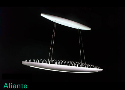
While I could take the easy route and choose the new iPod or G5 from Apple, or perhaps the yummy new modern AirStream, I’m sure ID has that covered for their annual. (Speaking of ID, I found this simple-yet-ingenious piece of furniture on their site.)

So nominate your favorite typeface, poster, household appliance, or anything else that made you think ‘damn…why didn’t *I* think of that?’ And feel free to cast a vote for the bomb of the year too. It sounds like the heavily marketed but severely flawed Nokia “e-Taco” will be making that list.

My personal favorite? The Octodog. Pure genious.

Maintained through our ADV @ UnderConsideration Program
ENTRY DETAILS
ARCHIVE ID 1679 FILED UNDER Critique
PUBLISHED ON Dec.04.2003 BY darrel
WITH COMMENTS
Comments
joy olivia’s comment is:

Great topic! And certainly appropriate. It will be interesting to read all of our responses at a later date to see just how right (or wrong) we all were. I guess the first things that came to mind are probably the best for me to initially list, no?

Best album cover(s) in that they have an eye-catching, could-be-posters, and are-definitely-memorable:

I'm torn between Radiohead's Hail to the Thief or the Dandy Warhol's Welcome to the Monkey House.

Most inspiring illustration/photography in an age of touch-ups and digital manipulation: For me, it has to be the illustragraphs of Samarra Khaja.

Best book... err, book jacket design (actually, both):

Mark Haddon's The Curious Incident of the Dog in the Night-Time

On Dec.04.2003 at 02:35 PM
E. Johnston’s comment is:

I second the vote for Radiohead's Hail to the Thief, not just for the cover, but for the typeface use in the liner notes, "Mrs. Eaves."

On Dec.04.2003 at 03:19 PM
Adrian’s comment is:

I second the Octodog.

On Dec.04.2003 at 03:23 PM
ps’s comment is:

well, tough topic. but what "design" has changed my daily routine... certainly Speak Up

has. its turned into the place to visit all day long. so it gets my vote. of course there is the appleMusicStore and iTuneswhich helped me eliminate my complete cd collection, which in return opened up more room in my studio. plus it seems to be another step in changing a whole industry. hmmm and i am addicted to those vitaminwaters... well, mainly the amazing writing on the labels.

On Dec.04.2003 at 03:37 PM
mrTIM’s comment is:

I give another vote for the Octodog...

On Dec.04.2003 at 03:57 PM
Darrel’s comment is:

Ah, yes, the iTunes store. It's quite nice. It fails in selection, but that's not necessarily Apple's fault.

As for Hail to the Thief, I can't remember where, but I believe I saw that cover compared to something else very similiar...maybe in Print? Anyone know?

And yea, Speak Up gets a nod too ;o)

On Dec.04.2003 at 04:33 PM
Armin’s comment is:

Thanks for the nods to the site.

I will try to focus on graphic design related stuff. This will be more like high and low-lights of the year. Also, I'm sure there is tons more, this is just what first comes to mind:

Best

1. Recrafting of the MoMA logo. Sure, nobody else besides designers gave a rat's ass, but now it's perfect

2. Aesthetic Apparatus' new web site and any work they did this year.

3. Penguin's redesigned classics

4. Whitman by Kent Lew

5. Unibody by Underware

6. Apple abandoning that darn Garamond Condensed

7. Jukebox typefaces

Worst

1. UPS rebranding (sorry David)

2. VH1 rebranding (sorry Nancy)

3. Home Depot not updating their brand yet

4.

I thought I was going to have more worsts� I'll think of something.

On Dec.04.2003 at 05:01 PM
Armin’s comment is:

RE: Octodog

Step 4: "...lightly shake the holder to allow the hotdog to drop out"

This sounds as smarmy, if not more, than Debbie's story about Barbara K on the Pretty Hammer thread.

On Dec.04.2003 at 05:22 PM
David W’s comment is:

Moma? Best? Really? How about most inconsequential.

UPS? Worst? Really? How about most significant.

On Dec.04.2003 at 05:23 PM
Darrel’s comment is:

Home Depot not updating their brand yet

Remember, good design can be butt-ugly. I think HD is a perfect example. It looks like what it is: a cheap, no-frills, warehouse full of stuff for building things. And it's orange. Always immediately recognizable and it seems to stand out just fine amongst the Sunday paper's stack of ad inserts.

On Dec.04.2003 at 05:47 PM
Armin’s comment is:

David, I'll give you MoMA but not UPS. And that's all I have to say 'bout that. Don't want this to turn into another 200+ discussion about UPS.

On Dec.04.2003 at 05:51 PM
David W’s comment is:

cool

On Dec.04.2003 at 05:58 PM
Anrdew P.’s comment is:

HP Brand Campaign

Link

On Dec.04.2003 at 06:14 PM
Lea’s comment is:

Worst: McDonald's I'm Lovin' It campaign. UGH.

On Dec.04.2003 at 07:40 PM
surts’s comment is:

Within the context of publications, these are some of the more memorable images from magazines that I own.

As for one image that stood out to me this year (for worse or better), below is it. Obviously there's tons of military images out there worth considering, though for me this sums up 2003. Disclaimer: I'm not endorsing this image or what it may represent.

On Dec.04.2003 at 08:30 PM
Armin’s comment is:

Andrew, good call, the HP + campaign is amazing. Even if it's kind of confusing.

On Dec.04.2003 at 08:42 PM
Bradley’s comment is:

Best, no particular order:

1. Fred Woodward's work with GQ

2. CORE's brandbook for Virgin Mobile

3. Temerlin:McClain's Nortel Networks campaign

4. Crispin Porter for MINI

5. Giovanni Bianco/Steven Klein for X-Static Proc=Ess

6. BMW Z4

Worst:

I really hate that stupid "i'm lovin' it" campaign. And pretty much everything done for AOL too. That's all I can think of.

On Dec.04.2003 at 09:10 PM
sergio’s comment is:

My vote for best typeface goes to Georgia. It's rapidly become the "choice of a new generation" of design-y sites all over the web (including this one). I feel it's very near to becoming overused and abused, though.

And I third the Octodog.

On Dec.04.2003 at 09:29 PM
ps’s comment is:

i kinda figured bradley would list a z4. it showed up in the thanksgiving post as well.

TT!

On Dec.04.2003 at 11:45 PM
Garrick Van Buren’s comment is:

Best:

Orbitz, their simplified site redesign still impresses me (and I worked on it).

Netflix, the mailer they use for shipping DVDs is smart and minimal.

Worst: Has got to be the new VH1 logo.

On Dec.05.2003 at 07:54 AM
Armin’s comment is:

Garrick, very good call too on the Netflix shipping envelope, it works to perfection.

About Orbitz though� they are the kings of the window pop-up and inventors of the pop-under (the majority come courtesy of one of my black-listed firms). Many bogus points for that.

On Dec.05.2003 at 08:28 AM
Paul’s comment is:

I nominate Hoefler Type's Gotham family this year. The more I use these faces the more I like them.

Also, the books published by McSweeney's.

On Dec.05.2003 at 09:15 AM
Juna’s comment is:

This is more like my wish list if a had some deep pockets.

Another car I liked this year was the RX-8

I also think theFord's Mustang Concept is a fine muscle car, which is refreshing.

And, Apple's new 20 inch iMac is sweet deal.

I'll keep thinking of more

On Dec.05.2003 at 09:26 AM
nancy mazzei’s comment is:

no sorry needed. my group and I did had a running “bet” I bet vh1 would be mentioned within the top 3 postings, unfortunately, I lost so I owe them lunch..rats!! I don’t do and best or worse lists, not my thing.

On Dec.05.2003 at 10:19 AM
jkottke’s comment is:

Surt, your favorite image of 2003...what is it and where is it from? The photo isn't big enough to adequately see what's going on with it. Is the woman tattooed like a Louis Vuitton handbag?

On Dec.05.2003 at 10:35 AM
Bradley’s comment is:

i kinda figured bradley would list a z4. it showed up in the thanksgiving post as well.

And I would have mentioned the 350Z if it came out this year! I'm tellin' ya, being shallow is really, really TOUGH dudes.

Oh, another one that I forgot to put on my best list:

Brad Cloepfil's Contemporary Art Museum in St. Louis. That thing's beautiful.

On Dec.05.2003 at 10:41 AM
laura’s comment is:

Sergio's comment on best Typeface: Georgia.

I've been laying that smack down quite a bit lately. Other designers don't appreciate my addiction to it though. And one of the first things I learned in typography class was that fonts named after cities are crap (huh?). But I think it's a beaut too.

On Dec.05.2003 at 10:43 AM
Darrel’s comment is:

re: Orbitz...I was alwasy suspect of them for a long time...being owned by the airlines and all.

However, the last time I helped my mom book a flight, I used the site and came across their 'flight matrix' (or whatever it was called) that showed a grid of all the flight options with prices and dates.

So, through good design...namely useful interface design, they won me over. Good pick! (Even with Armin's very valid point about the pop-ups...)

I don’t do and best or worse lists

Well, against her will, I have to nominate Nancy for 'best sport for putting up with harsh, sometimes over-the-top, critiques on Speak Up' for 2003. ;o)

And as much as I love Georgia, that's from 1994 I think...so, not technically in the running for 2003 ;o)

On Dec.05.2003 at 10:59 AM
Jose Nieto’s comment is:

This is more of a local thing (and an architecture thing) but I'd have to vote for the redesign of the Peabody Essex Museum in Salem, MA. It's the keystone of the ongoing revitalization of my home town, and beauty to boot. (Their new identity, however, is not really that inspired.)

As runner ups, I'd say:

VAS: An Opera in Flatland By Steve Tomasula and Stephen Farrell (I'm a sucker for inventive book design).

The new iPod campaign (pretty colors...)

As far as worst design, I'd say the new Hummer campaign, if only because I think the product is reprehensible. (It seems to be a pretty effective campaign, though. Oh well...)

On Dec.05.2003 at 11:43 AM
surts’s comment is:

Jason, the image is as you describe it. I have a slightly larger jpg of it that I'll email you offline. I noticed the image from an online book review of Hip Hop Immortals: The Remix. I can't remember where I read the review, but a quick search landed me to the books official site.

On Dec.05.2003 at 12:05 PM
Ginny ’s comment is:

Andrew: I second or I guess third HP Branding!!! The best I've seen in years from a big corporation, print and media!

VW commercials rock!!! Always!!! The boy with the one foot bigger than the other? How great is that?

I also really like those phone commercials with the text messenging where the guy is holding a sign that says "I'm an idiot" when his wife is in a meeting (but he's really not there)? Does anyone know who did those? or What product? The fact that I can't remember the product may mean that the commercials aren't successful, or that I just don't pay attention!

I like the packaging for the new Marc Jacobs perfume Essence.

Anything by Yee Haw Industries

Worst:

Has to be the McDonald's "I'm lovin' it campaign"...I mean, who are they trying to reach?

Verizon is still the worst logo I've seen for a large company. I cringe everytime I see it.

On Dec.05.2003 at 12:27 PM
Ian’s comment is:

I love it, I love it, I love it!

On Dec.05.2003 at 12:28 PM
sergio’s comment is:

About Darrel's comment: Yes, Georgia is quite old, but it's been only recently (this year particularly) that widespread adoption of it was reliable enough to use it as a web font. Traditional graphic designers tend to scoff at the notion of limiting themselves so much, but web designers must account for a wide variety of systems and provide design flexibility. Hence the welcome addition of new typefaces to the arsenal.

I think the advent of the blogging phenomenon has helped bring Georgia to the forefront (I feel it works on a very personal level, which leads to it being unused on Corporative websites), effectively introducing a wider audience to non-lining numerals (one of the best features of this typeface) and elegant strokes that go all the way to tiny font sizes.

Hell, I may even forgive Microsoft for Comic Sans because of Georgia. Mmmhh... On second thought...

On Dec.05.2003 at 12:41 PM
Jose Nieto’s comment is:

I love it, I love it, I love it!

I do to. In fact, 2003 was a banner year for long-overdue design books: Chip Kidd, Kyle Cooper Peter Saville, Rick Poynor's survey of post-modern design, Steve Heller's essays, and I'm sure I'm missing others. Maybe "Favorite design books of 2003" could be another thread...

On Dec.05.2003 at 01:14 PM
Tan’s comment is:

I agree w/ many of the votes (including all of yours, Ginny) -- but here's my list nonetheless.

Best

1. Annual Report: IBM, by VSA. Excellent example of corporate writing.

2. Ad campaigns:

Volkswagen. Their little vignettes are nothing short of brilliant. I love them all, especially the one for the new Beetle convertible, the one where you follow a guy through his work week.

HP. Their print ad campaign is inspired, as well as their "Picture of You" TV campaign. Who knew The Cure and digital cameras would work so well together?

NIKE. Their "Play" TV campaign is inspired.

TARGET. I've yet to see a commercial from them this year that I didn't like and admire.

3. Logo design: JEEP. I love their new logo -- the one with the front grill of a CJ-7. I especially love the little animation of the logo climbing up rocks to face you. It's iconic, conceptual, and authentic.

4. Automotive design: auto design has been stronger than ever before. Retro is back, as well as the utilitarian look. Some of my faves -- the Mini Cooper, the Honda Element, Scion (Toyota) xB, Nissan Cube, Ford GT, and yes, the Hummer2.

....

Worst

1. Annual Report: Microsoft. In fact, any company that chooses to put out a 10-K wrap instead of a real annual, including our own beloved Apple, is just fucking stupid, short-sighted, and spineless.

2. Logo: UPS. Sorry David, but looking back years from now, I believe that it will the most regrettable redesign of this decade. It marks a turn in the road for the corporate identity design business -- and I don't mean that in a good way.

3. Commercials: McDonald's "I'm Lovin It" campaign. Just horrible. I've never seen a more blatant, heavy-handed attempt at reaching the urban youth market. Bad execution in every way.

On Dec.05.2003 at 01:53 PM
ps’s comment is:

hey, at least they saved paper. maybe printed annuals will be a thing of the past soon. the serious investors seem to care about the 10K wrap anyway.

On Dec.05.2003 at 02:18 PM
Ginny ’s comment is:

ps

I'm an annual designer and we don't like that kind of thinking!!!

I agree with Tan, Microsofts annual was flimsy.

Printed annuals will never be done away with unless the laws change, which I don't think that's happening anytime soon.

10K schmen-K

On Dec.05.2003 at 02:25 PM
VIBRANIUM’s comment is:

best (other than what was mentioned already)

Paula's book. ("Make it bigger" - changed my life...design life that is)

The VW "square' spot(s)

Chris Ware Datebook (sketchbook, really)

Jimmy Corrigan Vinyl Doll

Worse

The crap I've been up to lately!! HA!! Tis the eason for self-deprication...

Oh, and the Hail to the thief referance someone recalled was featured in the "seperated at Birth" section of PRINT a month or so ago.

On Dec.05.2003 at 02:28 PM
Darrel’s comment is:

that widespread adoption of it was reliable enough to use it as a web font

Not to dwell on this, but this was the year that it actually became less reliable now that MS is no longer officially supporting them as individual downloads, and Apple is no longer shipping/installing IE by default on OSX machines.

Related to this, though, I have to nominate BitStream's Vera Sans and Serif as one of the great faces of the year. Not only is it a nice face, but it is open source. Any open source project can use them, and anyone can install them on their machine. Thanks, Bitstream!

any company that chooses to put out a 10-K wrap instead of a real annual, including our own beloved Apple, is just fucking stupid, short-sighted, and spineless.

Or perhaps cost and environmentally conscious? Oh...wait...PS already said that. ;o)

Am I the only one that hasn't seen these new McD commercials?

On Dec.05.2003 at 02:32 PM
Ginny ’s comment is:

Um...10K's don't necessarily save paper.

Most 10K's are longer than the actual amount of pages of financials in an annual. Yes, they're printed on lighter weighted paper...but really in the long run, I wouldn't say that's necessarily helping the environment.

That is..unless you're stating that company's should no longer do annual reports and just send out 10K's. Yes, that would save money, paper and it would be better for the environment.

But would it be better for the company? After all, annual reports and company reports are marketing tools. Used not only to inform the investor about the company, but to help make the investor feel confident about their investment and/or if it's a bad year for a company, to disuade investors from dumping their investments. It's also used to attract potential investors and employees.

Maybe I'm just justifying what I do...but I have to believe that we need them and that they are important, otherwise why do what I do?

On Dec.05.2003 at 02:49 PM
ps’s comment is:

Printed annuals will never be done away with unless the laws change, which I don't think that's happening anytime soon.

if i'm not mistaken, laws changed a few years ago and online annuals are acceptable. and yes, i design annuals as well, but i tend to think that companies allocate funds to different collateral. with the difference that not every shareholder might need to get one,the majority of printed annuals might be landing in the trash anyway.

On Dec.05.2003 at 02:51 PM
Armin’s comment is:

> Am I the only one that hasn't seen these new McD commercials?

Yes.

On Dec.05.2003 at 02:51 PM
Ginny ’s comment is:

if i'm not mistaken, laws changed a few years ago and online annuals are acceptable.

I don't think that's true. If it was true, no one would do a printed annual because they'd save a lot of money. And for that matter they wouldn't even print 10K's...they would just direct everyone to their website.

On Dec.05.2003 at 03:03 PM
M Kingsley’s comment is:

surts -

The image of Lil' Kim with the Louis Vuitton logos was shot probably in 2000 by David LaChappelle. The image was intended to be part of her Notorious K.I.M. album packaging (and to show off her brand new boobies), but eventually was not chosen. It was approved for press coverage and first appeared in Interview Magazine probably sometime in 2001.

The art director was Richard Bates and yes, those logos are really painted on her.

sorry, ya gotta pick something else...

On Dec.05.2003 at 03:06 PM
Zoelle’s comment is:

Tan - Excellent vehicle choices. I would add to the list the VW Touareg. The H2 is a guilty pleasure for me as well.

McDonald's

I saw the one of the commercials last night with (if memory serves) three guys of mixed races pushing an out-of-gas car in the inner city deciding that since they are out of gas and low on money they can still eat at McDonalds. Even if I was a poor inner city teen who could relate to that, I don't think I would like what they are saying about me. ???

McDonalds identity has evolved rather oddly over the years. You deserve a break today. > We love to see you smile. > Smile. > I'm lov'n it. The first three are related to customer service. The latest is just bad target marketing.

On Dec.05.2003 at 03:22 PM
Tan’s comment is:

Ginny -- I lament the truth, but I'm afraid ps is correct. New reporting rules by the SEC no longer requires a full annual report as we know it. Furthermore, for those companies that choose to continue to produce an annual, the disclosure requirements have added 20-30% more accountability regulations, which means higher production costs internally and externally, and higher liability.

I've talked this past year with a few very notable annual report designers (including many in NIRI) -- and we've all agreed on this sad truth: that unless something drastically changes in the next 2-4 years in the IR industry, the printed annual report as we all know it is going to die.

Now, the question is, what is going to take its place in IR communications? It's clear that a 10-K wrap is insufficient, and only a transitional solution. Web might be the answer, but I don't think so personally. Nothing replaces tangible information that you can hold in your hands. And for shareholders, there is still widespread skepticism in the impermanence of online information and dissemination.

So we'll see...

Sorry, I didn't mean to turn this into a 10K discussion...back to our regular programming.

On Dec.05.2003 at 03:45 PM
Jose Nieto’s comment is:

Strangely, the McDonald's "I'm lovin' it" campaign plays somewhat better in Spanish. They use the catchphrase "Me encanta," which sounds less stereotypically urban, and the agency has done a good job setting up cute family situations for some of the ads. It's still crap, of course, but not as irritating.

On Dec.05.2003 at 04:14 PM
Ginny ’s comment is:

Tan:

Well, if they do away with the printed annual report than company's will probably go back to doing corporate brochures to use as marketing vehicles because right now annuals are doing double duty in that department. So...all is not lost :)

By the way...I can't get the stupid McDonald's jingle out of my head now! I'm (not) lov'n it!

On Dec.05.2003 at 04:16 PM
David E’s comment is:

UPS? Worst? Really? How about most significant.

Defending the new UPS logo is one thing, but most significant?

It was significant that UPS got rid of Paul Rand's logo. What was created to take it's place is hardly significant.

On Dec.05.2003 at 04:29 PM
David W’s comment is:

UPS got rid of Paul Rand's logo

That's what it's all about

On Dec.05.2003 at 04:38 PM
David W’s comment is:

Speaking of UPS, did anyone go to the AIGA Atlanta UPS event? I believe there were about a thousand people there.

A whole event for one project? Wow, must be pretty significant.

On Dec.05.2003 at 04:51 PM
surts’s comment is:

M Kingsley -

sigh, I guess good design is timeless. To replace the 2001 Lil' Kim image I'll nominate the ipod packaging of 2003. It's a thing of beauty, I even think the styrofoam holding the ipod inside the box is sculptural... my wife last night suggested that I need to get a hobby.

On Dec.05.2003 at 04:56 PM
ps’s comment is:

The latest is just bad target marketing.

hat it too, but i think their numbers are up....sooooo...what we don't like might actually work...

On Dec.05.2003 at 05:27 PM
Tan’s comment is:

> A whole event for one project? Wow, must be pretty significant.

I agree w/ you there David. The redesign is significant, probably one of the most significant since FedEx. I would've liked to have attended the event. I bet there were some stong conversations there.

You know, to be fair, I acknowledge that it has a lot to do with the fact that it was a Rand mark. I'm a designer, so I can't turn off my bias.

But I think my feelings, let's be honest -- distaste, for the logo also stems from the slick, bs, corporate facade that it personifies. Stuff like synchronization, innovative solutions, e-this, and e-that, etc. The new logo embodies what I find to be manipulative and contrived in corporate design. Hell, it's the poster child for it.

To some degree, it's not any one specific design element that I see as failure -- there's nothing techniccally wrong with the form. It's the sum of the forced execution and the ardent, persistent, continued expansion and implementation of the brand message -- despite what people think or feel. The louder FutureBrand shouts to defend the mark, the more obvious the fact that the logo is a perfect representation of FutureBrand's motivation and approach to their work.

On Dec.05.2003 at 06:51 PM
marian’s comment is:

This is hard. Much of what I think of I realize is not from this year (eg. Safari; Underware's promo piece for Sauna with the thermal ink!)

Among the best:

Honda's two-minute ad, "Cog" (which I only ever saw on the 'net, not being a big TV watcher)

Speak Up (really, truly--it's changing my life, and not just by feeding a burgeoning internet addiction)

print ad: Mini + Poke Boat

AIGA tradeshow display: Adobe's display with the roses. I've never wanted to hang around a trade show display before and bury my hands and face in the wall. Plus it was (largely) biodegradable, and they gave the roses away at the end of the conference.

print: �cole Buissonni�re Annual School Book Calendar by Paprika, from Montreal (unfortunately only visible about half-way down the page here.

packaging: Paprika Chocolate Box: also by Paprika, Montreal (a v. cool chocolate box made out of hollowed-out multi-layered cardboard, unfortunately only visible way down the page here.)

and I do love the new Pantone chip books with the cloth binding.

worst:

orange- and raspberry-flavoured chocolate frickin' everything

UPS (Sorry about the dogpile, David, but it is a travesty)

I honestly have not seen the McDonald's ads.

On Dec.05.2003 at 09:35 PM
marian’s comment is:

Oh and

misc: Sam Javanrouh's time lapse photography of his Toronto view

On Dec.05.2003 at 09:46 PM
mrTIM’s comment is:

Well, what to add? what to add?

I second Surt's comments on the iPod. When I got mine in the mail it was the packaging that made me think "wow, this is just way to cool..."

Also, kudos to all those who are digging the newest VW adds/cars/everything. I have a few VW sales people in the family (thus my new pods) and it's always great to see support for them.

And just one more vote for the dreaded "Lovin' it" crap.

Although, here in the PNW we are being subjected to the "Tobacco is Wacko" adds every other commercial break.

Mcdonalds may be annoying but "Tobacco is Wacko" is just painful! But maybe Mcdonalds wins because it's national....

On Dec.06.2003 at 01:29 AM
Priya’s comment is:

i loved karim rashid's packaging for method products as well as the products themselves. such clean and yummy scents with no chemical smell! gotta love liquid soap bottles that eliminate that pesky build up around the nozzle.

On Dec.06.2003 at 11:38 AM
Joseph J. Finn’s comment is:

For those of you sill wondering, here's a large version of the L'il Kim cover.

On Dec.06.2003 at 12:58 PM
Caren’s comment is:

My vote for best new car goes to the Mazda6. I own a 2003, 4-cylinder manual in Glacier Silver Metallic and I can't stop gushing over its unique design, the way it handles and how beautiful I feel to be behind its wheel.

As far as I can tell, they didn't change much in the 2004 edition. Then again, they really didn't have to.

On Dec.06.2003 at 04:11 PM
Lea’s comment is:

Oooohh... for thumbs up on industrial design:

Jewelboxing!

Nice DVD case... :-)

On Dec.06.2003 at 05:33 PM
davek’s comment is:

Not a design, but Lil' Kim related. A great TV moment.

It's is an Television Ad for Old Navy.

At the end of the hoodie ad, lil kim smiles and says, "you in the hood now, baby." This is a great moment in TV advertising if you ask me. Lil' Kim captures it. Just watch her next time you see that ad. The phrase that pays by none other than Old Navy, who else would think to put Fran with a monkey!

On Dec.07.2003 at 12:25 PM
Jill’s comment is:

Also, the books published by McSweeney's.

Paul, do you mean the design of their list in general, or design and content together? I really admired the design of one McSweeney title I came across over a year ago, but was so disappointed in the writing that I sort of crossed them off my list of publishers to watch (I was not familiar with them prior to that).

Lately I've seen several positive comments about McSweeney's here and elsewhere, and wondered if you have a favorite McSweeney publication to recommend? I think I may have been too hasty.

On Dec.07.2003 at 07:32 PM
Paul’s comment is:

I meant in general, but I guess I say that based on the three specific examples I own, (Quarterly's #7 and #8, and You Will Know Us by Our Velocity) as well as the others I've seen in stores. I recently picked up a copy of their magazine, The Believer, and I'm really enjoying it as well. In all cases I think the content and the design are both very good, but I guess I agree that the design is more consistently solid. It's both classical and surprising at the same time, which I really admire.

On Dec.08.2003 at 11:21 AM
Darrel’s comment is:

Holy crap. DesignMaven clearly wins the longest SU comment post for 2003 award.

On Dec.10.2003 at 08:56 AM
DesignMaven’s comment is:

Don't particularly like doing Best & Worst list.

I sincerely think every Designer or Creative entity make an HONEST ATTEMPT to solve Design Problems based on their understanding of the inherent problem.

Best Corporate Identity

1. WACHOVIA, = FutureBrand

The merging of First Union and Wachovia Bank.

2. nwa, Northwest Airlines, = TrueBrand

John Diefenbach and Vince Carra' back together again after working at LANDOR twenty something years ago.

Vince Carra' was a Design Director at Bass Yager. Noted project United Airlines.

3. UPS, = FutureBrand

In spite of the criticism of FutureBrand's Brand Revitalization of PAUL RAND's forty two (42) year old Identity for UPS.

The new UPS Identity is simply a brush up of PAUL RAND's Original Identity with a touch Modern Flair.

Category Brands

1. Konica Minolta,

Retains the Equity of the Original Identity

Designed by SAUL BASS. The television application

of the Identity is 3 Dimensional. Have not seen

the print version.

Not a fan of 3D Identities, think they enhance and serve packaging better than Corporate Identity.

Minolta Identity to strong to be changed. One of maybe two Trademarks able to play a triple role. Working as an Corporate Identity, Trademark

and Logotype with the symbol substituting for the "O".

2. Jaguar, = Brand Revitalization

Retains the Equity of the Original Brand.

Not sure of Identity Consultancy Retained. However, Young & Rubicam are producing the media advertising.

Norelco, = Brand Revitalization.

After approximately twenty three years (23) Norelco finally has a new Identity.

Advertising, = Sierra Mist.

The media Campaign with the Baboons. I thought was FANTASTIC.

Print Media

Although not published. The BEST BOOK in 2003 and 2004 will be the Long Awaited Design BOOK

on SAUL BASS.

I am aware the BASS FAMILY is undertaking an MONUMENTAL and Encyclopedic Task of Chronolizing and Publishing the Career of The World's Greatest Designer.

Release Date Spring / Summer 2004

Can't Wait!!!!!!!!!!!!!!!!

Worst Identity Design

1. Brinks, = Identity Design, = TBA

The Original Identity Designed by Jack Hough is a TESTAMENT to Identity Design Godliness.

2. Gateway, = Identity Design, Repositioned itself in 2002 and 2003

Abandoned the Cow Spot Identity. Redesigned to reflect what appeared to be a Movie Projector with "G" in the middle.

Abandoned the movie projector Identity for childlike typography. Abandoned childlike

typography for straight serif typeface.

Abandoned serif typeface went to Cow Spots Again.

Agencies working on the Identity TBA and The Arnell Group.

Any Arguements, why Advertising Agencies should not engage in Corporate Identity.

3. Krispy Kreme Donuts, Not Designed in 2003 but Designed in the 1940s

Krispy Kreme has GOT TO GO. Enough Cops spend money there for Krispy Kreme to retain LANDOR, L&M, FutureBrand, InterBrand, TrueBrand, Siegle & Gale or any Identity Consultancy they want.

Krispy Kreme get my vote. It has got to be the Oldest Identity in existence TODAY. Approaching

sixty years old; if not already sixty.

In reference to UPS Brand Revitalization by FutureBrand.

I hate swooshes as much as I hate CLIP ART, 3 Dimensional Identities and david carson.

And I find no RELEVANCE of any of the aforementioned in the arena of VISUAL COMMUNICATION.

However, the UPS Identity has merit. It ascribes to the Identity criteria set forth by

the Founding Fathers and Leading Practitioners of Corporate Identity e.g. BASS, RAND,

Lippincott & Margulies, LANDOR, Chermayeff & Geimar, Raymond Lowey, Frank Gianninoto,

Peter Muller Munk,(others)

The Merit of Excellence in Logo and/or Identity Design

Please allow me to provide you with universally accepted criteria for Developing and Designing a Corporate Identity and/or Logos.

A professionally Designed Corporate Identity and/or Logo should be Designed with Brevity and Wit.

Capable of being blown up to the size of a Weather Balloon for storage tank and reduced to the size of a dime for advertisement.

Three criteria should be addressed and answered when Designing and choosing a Logo and/or Identity.

1. Is the Logo and/or Identity Proprietary ? (meaning) does it communicate the essence ot the business ?

Does the Logo represent the Goals and Asperations of the entity ?

2. Is it livable ? (meaning) longevity and comfort. Will the Identity be around for a while ?

Most Identities Designed by Professional Designers are Designed to stay in vogue ten (10) to twenty (30) years or longer.

For example CBS; ABC; BELL TELEPHONE; UNITED AIRLINES; IBM; RCA; AT&T. (many others)

3. Is it usable ? (meaning) versatility, adaptability, on stationary, envelopes, business cards, merchadise, will it look good in print, multimedia, one color, two color, full color. Can the identity successfully be reduced and enlarged.

Once these Universally Accepted criteria are met by the Designer. The Designers Job is complete.

At the same time, there are two schools of thought or two separte theories in reference to Logo Design and Corporate Identity Design.

Conceptualist vs Funtionalist. Conceptualism is how most Design Firms and Design Consultancies work without Market Research

and Communication Specialist.

In short, Conceptualist Design Logos and Identities with very little thought of Strategy (research) and properly leveraging the Brand for

Optimum Financial Growth.

The Functionalist, understand the Logo or the Identity is the tip of the ICEBERG. It is the most Visible Element in the Marketing and Communication Strategy.

However, other Communication factors are key. To properly leverage the Company for financial growth Analysis need to be completed e.g. Brand Strategy, Brand Assessment, Brand Research, Brand Positioning, Brand Measurement, Brand Management, Brand Valuation, Corporate Identity, Naming and Name Systems, Packaging Design, Print Literature,

Brand Architecture, Retail Environments.

The difference in the Old Days. Functionalist could take approximately one year to complete Research alone without executing Design. Two to five years to fully implement the Identity Program.

Conceptualist can take a few days weeks or few months to Conceptualize and Execute the Identity.

Most important both schools of thought follow the aforementioned Logo and Identity Design Criteria.

A Logo does not have to be Beautiful. Does not have to knock you off your feet; as some people believe.

It only has to be serve the need of Propriety, Livablity and Usablity.

The UPS Identity created by FutureBrand has met all these criteria. LIKE IT or NOT.

PAUL RAND (GODFATHER OF AMERICAN CORPORATE IDENTITY) stated an Identity good or bad, is a vehicle of memory.

Good Identity adds value of some kind and, incidentally, could be sheer pleasure; it respects the viewer-his sensibilities-and rewards the entrepeneur.

It is easier to remember a well designed image than one that is muddled. A well designed Identity, in the end, is a reflection of the business it symbolizes.

It connotes a thoughtful and purposeful enterprise, and mirrors the quality of its products or services. It is good public relations-a harbinger of goodwill.

It says "We care".

SAUL BASS (THE BEST THAT EVER DID IT) stated, many large corporations have become cross-cultural and multi-national.

This further defies specificity in the trademark.

There is also the frequent desire to project stability, trust, good solid management further pushing towards generalization.

The trademark has to be understood as simply one element in the communications strategy. In and of itself, it doesn't change anything.

SAUL BASS quoting Bill Bernbach, "An effective advertising campaign will kill a lousy product faster than no advertising at all".

If a promise is made that can't be fulfilled, it's worse than making no promise at all.

Whatever the manipulative power of Design and Identity the fact is that, if you aren't basically accurate in what you say about products and companies, you will fail simply because, in the end, the performance of the product or company is the determinate of how the product or company will be viewed.

Personal note, both PAUL RAND and SAUL BASS observations made in 1990 are emphatically accurate.

Which lend credence to the old adage. "The more things change; The more they remain the same".

In Defense of FutureBrand and PAUL RAND. Paul Rand wanted to make changes to the UPS Identity in the late eighties or early ninties. He recognized the Identity could be improved. This was befor Anspach Grossman Portugal created the

Globe that adorn the current UPS Vehicles before reBranding.

The CEO, nor Marketing and Communications would allow him to change the Identity. They thought it would be a bad OMEN to tamper with their Identity.

For all to PERUSE

PAUL RAND's comments on the FEDEX IDENTITY from my Identity Archives.

An HONEST CRITQUE by THE FOREMOST IDENTITY Design Phenomenon of our TIME.

Paul Rand: This little girl that came to see me on the FedEx, all she had to do is make this blue, so she could see it. Here they had the opportunity to eliminate one vertical and they did not. What would they do with all one color, there is no reason to split this, also there is a lot of letters. So they could use condensed letters and make it a lot more compact. Other than that it is great. It is very easy to make something good out of this but this ain't good.

Michael Kroeger: They have the F jammed into the lower case e.

Rand: That is not so bad. Then you have these styles mixed, which is ridiculous. You do not mix type faces. It's stupid. That is mannerism, trendy stuff, doing it because someone else is doing it. The only reason to do it.

Am I being recorded?

Rand: Now this is a problem (FedEx) that is not resolved, so what is wrong with it. I think you should give this as a problem or somebody. I mean what is wrong with it? Anybody?

Student: They try to make the typography too.

Rand: I think that is the least of it, I think it is legible enough. That is the least of it. What is wrong with it? That is psychological, that is not aesthetic. What about the design? What do you do basically when you have a logo to do. There are a lot of letters that you have to deal with. What is the first thing you have to do (look for relationships of one letter to another), well you always do that, but what else do you do ? What is the first thing you do if you have a very long name like Tchaikovsky (Peter Ilyich, 1840-93). You abbreviate it. Well, that is what they did, but that is not usually the solution because a client does not want his name abbreviated. It is easy, easy, easy, easy come on.

Student: You squish it together.

Rand: How do you squish it together?

Student: With leading.

Rand: Leading? It is this way, not this way. What do you do? Condense it. Right! You condense the letters, that is the first thing you do. I mean it not only reduces the bulk in area, but it is much more practical because it can be accommodated in small spaces, which is always a big problem with a logo. When you design a logo you think in terms not of how big but of how small, down to 3/16 of an inch. That is the physical process of designing a logo.

So the wider the form is, the more difficult it is to reduce it, but not only that, but in condensing it you -- what does that do when you condense it? What does it do aesthetically? Talking only aesthetics. What does it do aesthetically? What else you alter the proportions, you make it a simple object, something which is self-contained. The smaller it is, the more self-contained it is. That is the idea of a coin. You know, it is a little round thing. So your making it more; it also has more presence? Something that spreads has less presence? It has physical presence, but it does not have aesthetic presence, you do not concentrate, there is no bulls eye.

Student: It becomes more intimate.

Rand: Yes, exactly. These are how you have to think about these problems, and not think about design. The design is the product of your thinking. When you solved all these problems you just do it in a second. It is there. But before you have thought about all this in a particular manner, you are all over the place, because you are searching. You are feeling. You are looking for things. You do not know what you are doing. You are lost. You are in a maze. So thinking is number one in the design process.

Now there are people who can look at something and figure it out in a minute. I can do things pretty fast, but the problems that I have with process is how am I going to do it, not what, but how am I going to do it. See the how aspect of the problem was not an issue, only the what.

This arrow, for example, which I understand was a great idea for this thing is not even noticeable. Because the figure and ground relationship is lost. This arrow becomes part of the background, so you do not even see it. So obviously the easiest thing to do is make it blue in this context, just make it blue. Now I can not imagine that somebody did not try to do this, whoever did this. I just can not imagine that, but it is possible, that people avoid the obvious thing.

You know Geothe said and if I do not do it accurately it is in the epigraph of my first book Designers Art -- We do not see the things nearest to our eyes. (The hardest thing to see is what is in front of your eyes. Goethe). It is true, when you get an idea why didn't you get it yesterday, instead of today. You just did not, well with all this talk I can leave you with the notion that getting ideas is not easy. It is very difficult to get good ideas, and it is also very difficult to figure out how to do them. So you really got yourself a job.

Student: Which do you think is the hardest, getting the idea or putting the idea down?

Rand: It could be either one, it depends on the problem. Sometimes if you get lucky you might get a series of letters that lend themselves to interpretation very quickly. Then on the other hand, you get a word that has nothing but vertical lines. That is very difficult to deal with, but that in itself becomes the subject for an idea. You say it is all vertical lines, I need some round shapes, so you mix caps and lower case. There are more round letters in lower case than there are in caps. The problem is always derived from the subject.

The solution is always hidden somewhere in the problem, you know, somewhere, you have to look for it. You should give this as a problem, this is a very good problem (FedEx). I have talked enough about it.

On Dec.10.2003 at 10:59 AM
Tan’s comment is:

Student: I can't believe how long that post is.

Rand: You know I'm dead, right?.

On Dec.10.2003 at 01:47 PM
Brady’s comment is:

Holy crap! DesignMaven posted it nine times - with edits - and as he asked for a particular one to be psoted he still posted it twice! (Until Armin fixed it again.)

Anyways...

Darrel, it is the longest because he posted a 1091-word portion of an interview which - unless "DesignMaven" is Michael Kroeger though they do have different emails or he got permission to post it - could be a copyright violation. Which could ultimately mean that you, Armin, are also in violation because you are publishing it. All I'm sayin' is be careful.

Next time Design Maven, copyright issue or not ... you might want to use a link:

Paul Rand Critiques FedEx.

Just a tip.

Also, Interbrand did the Wachovia trademark, not FutureBrand.

And why is it the best corporate ID design of the year?

The other two you list are at the bottom of my list partially for design, partially for strategy but more importantly because they were unnecessary.

I'll speak specifically about the NW Air trademark. What was wrong with it? Why did it need to be "updated"? The old mark was dynamic; it had lateral motion in both directions. It denoted 'North West' with the compass icon while the 'N' shape of the N/W was right leaning.

Now, the new mark - what's so special about it? It's no longer dynamic; just the old compass icon with lowercase "nwa" followed by uppercase "NORTHWEST AIRLINES" in what feels like a very improper scale. What's worse is that new mark requires the livery design to have the compass icon reversed on the starboard side — pointing NORTH EAST! If it was not reversed, then the dominant left-hand motion would not flow with the right-handed directional of the plane as the old mark allowed.

Dear God! Is anybody thinking? Or are they just doing?

On Dec.10.2003 at 05:05 PM
Bradley’s comment is:

Now this is a problem (FedEx) that is not resolved, so what is wrong with it. I think you should give this as a problem or somebody. I mean what is wrong with it? Anybody?

I'm reminded of the "exotic menials" description of graphic designers after reading this. Technically I'm sure there are a number of things wrong with the FedEx identity, but, the fact is, they've been doing quite quite well (better than before the unveiling of the new logo) regardless of the typographical discrepancies that so irk Mr. Rand.

So while Rand has a problem with this, why don't I pick at the IBM logo? The rectangle formed by the negative space between the "I" and the "M" retards the speed he tried to convey with the mark, and the letters themselves feel awkward and chunky. The lines, probably used to communicate speed or efficiency, don't succeed so well in that area because of the enormous slab serifs in each of the letters which contribute to the gaping white spaces that irregularly break up the lines.

Of course, I love the logo and always have because while "technically" it might be so-so, as a piece of overall design I think its lovely.

It's not a problem if it really doesn't matter in the long run--I don't think the minutiae in FedEx matter that much.

On Dec.10.2003 at 05:11 PM
Tan’s comment is:

> The lines, probably used to communicate speed or efficiency, don't succeed so well in that area because of the enormous slab serifs in each of the letters which contribute to the gaping white spaces that irregularly break up the lines.

Good God, Bradley, are you that young?

The lines in IBM's logo is a reference to dot-matrix, mainframe, computer printouts from that era. It also harkens back to the original CRT monitors -- when screen resolution was 100 pixels. That line pattern used to symbolize high-technology -- similar to the conventions of Minolta's and AT&T'S logos. Think The Matrix type, but 50 years ago.

Go back to your Gameboy, son.

On Dec.10.2003 at 05:25 PM
Bradley’s comment is:

Go back to your Gameboy, son.

Yeah I AM that young--that's good to know, I always just "assumed," however ignorantly that the lines were meant for speed. A contemporary interpretation, apparently. What about BEFORE the lines were put into the logo though? That looked even chunkier. I get the reference better, for whatever reason, with AT&T and Minolta, and I like both of those marks because there's a real sense of motion to them because of how those lines are handled.

Still and all--the point is, you can find anything "technically" wrong with any design, much of it subjective, but sometimes...its not relevant. I still hate the rectangle that just hangs there in the IBM logo. Contrast that with the arrow slyly inserted into the FedEx mark, which I happen to like in spite of all of its perceived flaws.

Sadly I only vaguely remember the game boy--I was more familiar with the LCD games and then Sega Genesis, so I seriously was never exposed to (nor did I, oh, say, bother to look for) any of the stuff you mentioned. I'm not even 25 yet, maybe that's why....

On Dec.10.2003 at 07:16 PM
Tan’s comment is:

I'm just messin w/ you.

Most people will miss the old-tech reference of the lines just like you did. It's outdated -- but because the logo has become such a known icon, it doesn't really matter.

I still disagree w/ your critiques of the logo's form though -- and agree w/ Rand's critiques w/ Fedex's. In that case, I think the arrow is contrived and superfluous -- an afterthought attempt to inject some sort of meaning into a boring form. It feels forced, not sly to me..

anyway, I don't really want to get into a debate on logo forms -- too tired this week....

On Dec.10.2003 at 07:38 PM
Jerry Gerardo’s comment is:

Worst Industrial Design in Consumer Electronics

Sony and Aiwa. For taking retrogressive steps in the usability and manufacturing of their portables and Mini Systems. They designs is butt.

On Dec.10.2003 at 08:43 PM
Armin’s comment is:

> I still disagree w/ your critiques of the logo's form though -- and agree w/ Rand's critiques w/ Fedex's.

Tan, you don't need to kiss ass dude, Rand passed away ya'know?

On Dec.10.2003 at 09:23 PM
Michael B.’s comment is:

Sorry to be off-topic, but as long as everyone's channelling the spirit of the late Mr. Rand...

I believe Rand actually said the reason he used the horizontal stripes for IBM was to resolve the "narrow-thicker-thickest" sequence in the three letters, which he felt suggested a lack of resolution. The stripes were meant to bind the three letters together, and I guess "resolve" whatever was wrong with the I-B-M sequence. (I have to admit I don't see the problem, but far be it from me...)

Rand also mentioned a secondary association with the horizontal patterns used on computer paper, and specifically payroll checks. Supposedly at the presentation someone said they looked like the stripes on the uniforms of chain-gang prisoners.

On Dec.10.2003 at 09:57 PM
jonsel’s comment is:

the stripes on the uniforms of chain-gang prisoners.

I think Rand even did a sketch around this for fun. I recall it from Heller's book. If I can find it, I'll scan it and post it up.

On Dec.10.2003 at 10:42 PM
Dan’s comment is:

The quasi-pictograph "Eye Bee M" always looked stupid to me.

On Dec.11.2003 at 01:20 AM
Tan’s comment is:

> Tan, you don't need to kiss ass dude, Rand passed away ya'know?

Oh piss-off Vit.

On Dec.11.2003 at 10:11 AM
Sarah B.’s comment is:

I know, a little late - but here are some things I liked this year.

A new lighting fixture - actually proposed its use in our lobby at work... Aliante

I like the whole change to "Spike TV"

I have more, will post when not busy again - ugh

On Dec.12.2003 at 01:13 PM
DesignMaven’s comment is:

Many thanks for all whom commented and advised on my post Best & Worse.

Referencing the use of links.

Armin,

Sincerely was not aware of the Legalities of cutting and pasting the abridged Rand Article, Paul Rand Critiques FedEx with Michael Kroeger.

I did not provide the full text for the article, because I wanted to show the continuity of Rand's critique. The interview was very long. If you read

the complete article. All that read is aware, Rand begans the article discussing FedEX

then moves to other topics. The FedEx critique does not continue until the end of the interview.

At the same time, I thought it was to much text to get to the Critique of FedEx.

Thanks for your understanding of my multiple post and correcting my text flow. However, not intentional.

Brady

The Paul Rand Critique was posted to illustrate how Constructive Criticism can bring Dialog, Awareness and many different Ideologies, Philosophies, and Methodologies.

No two Designer(s) Firm(s) Consultancies work alike. In the search of TRUTH in PURE DESIGN i.e.

Identity Design the solution is inherent in the Design Problem.

I am aware InterBrand Designed the Wachovia Identity. Somehow I miscredited the Identity to FutureBrand.

Thanks for your observation.

Often times I get whats called Brandlexia similar to Dyslexia. Confusing the Identities of InterBrand and FutureBrand.

In the past, I was a regular contributer to Brandchannel.com They have gotten slick and limit the text you can submit.

No ideas ARMIN.

I enjoy the BARE KNUCKLE BRAWLS, SLAM DANCE and MOSH PITTexperience of SPEAK UP.

To answer your question of Why I chose Wachovia as Identity of the Year and others.

Wachovia is the most Distinct Corporate Identity Designed in 2003

Very much like the Helios Identity Designed by LANDOR for bp. (British Petroleum)

Wachovia's Identity embodies a Bauhaus Modernists Futuristic Quality.

Abstract in Design and Execution it incorporates the Elements of par excellence in Identity Design. Balance, Proportion, Rythm, Repetition, Harmony, Dominance, Economy of Space to provide Unity.

It's the perfect example of qualitative leap, from mediocrity to excellence, through design alone. Certainly, has a Interactive Human Factor Quality in Environmental Signage engaging the viewer to closer examine it's entity.

First Union possessed the stronger of the Identities Designed by Arthur Congdon for

Lippincott & Margulies.

The Wachovia Identity was straight typography and over time lost its Equity after being revitalized twice within a twenty year period.

The logo uses its solid shape to strengthen the name, adding a square and abstract elements for interest, distinctiveness, and any number of possible meanings.

Wachovia's new Identity cut through the Button Up Approach of typical Bank Symbols and Trade Dress. Wachovia's new Identity suggest these qualities Partnership, Strength, Responsiveness, Innovation, Dependability, with its customers, and global reach.

nwa

Very astute observaton of nwa's Brand Revitalization. No I did not see problems with the Compass Design until you pointed them out.

I'm sure it is a problem they can fix.

I don't make excuses for anyone. Won't make excuses now.

The 1989 Livery Design was Designed by my GOOD FRIEND Remowned Independant Identity Designer Joe Finocchiaro while working at LANDOR in 1989. I like to call him Joe Phenomenal. Because he is one of the last GREAT IDENTITTY DESIGNERS ALIVE.

Look through his symbols website, Logos, typeface and Graphics sections on his site.

http://www.joefino.com

My belief is Identity Design and/or Logo Design is a Dying Artform.

Thats another two hour conversation. Not many GREAT IDENTITY DESIGNERS ALIVE!!!!!!!

I agree, I saw no need for Brand Revitalization. Although the Identtity was fifteen years old.

I will share with you a partial letter to a friend referencing the Northwest Airlines Identity. Repositioning.

It is my understanding the new nwa Identity Brand Strategy was positioned as primarily a cost reduction exercise intended to lower future repainting costs by 20% - 40% (simpler design thus less masking, fewer colors, greater durability).

Most important, it's an assertion; We're global, not regional; very cool, like our customers

smart, sophisticated, and elegant. Livery design was inspired both Saul Bass' Design for

Air Macau and Roger van den Bergh's Design for Lippincott & Margulies.

http://www.airmacau.com

http://www.onomadesign.com

Jet Blue also incorporates this simpler Livery Design as well influenced by the aforementioned.

The new Identity Designed by TrueBrand is a streamlined version of Joe Finocchiaro's Compass Design enclosed by a "N" which turns into the letter "W" and compass pointing Northwest.

The new Identity in gray and red does not compete with with the initials (nwa). The name North West

Airlines will eventually be dropped.

The new Identity and Design is sleeker does not shout. Understated Elegance. Airline Identity Design is moving away from Bright Colors and overstatement of Livery Design.

Which was started by Tom Suiter of CKS in 1990s (former Design Director for Apple Computer) in repositioning of UNITED.

Partial letter to a friend. Referencing nwa.

Good to see Vince Carra' and John Diefenbach continue to excel in Airline Identity.

Although, I am more sympathetic to Northwest Airline Symbol and Trade Dress created by Joe Finocchiaro for LANDOR fifteen years earlier.

Perhaps, my favorite symbol for Northwest was created by renowned Identity Consultant/Designer

Clarence Lee.

TrueBrand's Livery Design Trade Dress is very similar to SAUL BASS's fuselage Trade Dress for

Air Macau. For my money the best Tail Fin Identity in the busniess. How appropo.

http://www.airmacau.com.mo/index.htm

As well, nwa's livery similar to Lippincott & Margulies fuselage Trade Dress for Continental. Created by our Good Friend Roger van den Bergh.

Not a criticism of TrueBrand. Just an astute observation.

Brady

You can see Brady we share similar opinions.

In spite of the mistake in Compass Design Identity.

I give "nwa" a thumbs up. Although akin to South Central and Compton.

On Dec.15.2003 at 02:47 AM
ian’s comment is:

just to those who called out radiohead's hail to the thief as best album cover of the year (a contender with the...dandy warhols?

take a look at:

lightning bolt's wonderful rainbow

one of the best album covers i've seen in a long time. has to be seen in person (and with the back) to be believed. not unlike the band.

cat power's you are free

very very smart all around design aesthetic that extends not only to the album itself, but the included lyrics sheet, the promotional stickers but also the little flipbook. it may only be helvetica-like but it gives radiohead's use of mrs. eaves (one of my favorite faces) a run for its money.

prefuse 73's one word extinguisher/extinguished outtakes

just beautiful.

matmos's the civil war

gold leaf+early medieval aesthetic+matmos=stunning. i had to get this in lp.

bonnie "prince" billy's master and everyone

pitchfork may well rubbish this album, but the aesthetic that emerged on i see a darkness is put to even better use with this amazing portrait. makes will oldham look like a punk rock whaling captain. or something.

r.e.m.'s in time line of products

best for last? it's just a "best of" collection and so not on my purchasing radar...but they managed to make it highly desirable anyway. the deluxe set with the color-cancelling plastic sheath was amazing.

On Dec.15.2003 at 08:25 AM
ian’s comment is:

i'm sorry...i don't really mean to disrespect the dandy warhols. i haven't heard the new album. but i've seen it. its a banana with a zipper. monkeys. i get it. does absolutely nothing for me.

On Dec.15.2003 at 08:29 AM
Armin’s comment is:

> Sincerely was not aware of the Legalities of cutting and pasting the abridged Rand Article, Paul Rand Critiques FedEx with Michael Kroeger.

I think it's ok. Next time just put up a link for where the original info came from. No big deal. And Brady, thanks for waatching out for us.

> In the past, I was a regular contributer to Brandchannel.com They have gotten slick and limit the text you can submit.

Don't worry, I don't think we'll ever limit the amount of text one can put in. Just consider that some� ok, a LOT of people will not consider reading your contributions because they are so long. Just a thought.

> I enjoy the BARE KNUCKLE BRAWLS, SLAM DANCE and MOSH PITTexperience of SPEAK UP.

Thanks. And you take it to the next level of extreme mosh-pitting!

Re: Wachovia

I seriously doubt this is a good logo. I used to bank with them when I was in Atlanta and I very much prefer their old logo.

They merged with First Union so I guess they had to change. The new logo says nothing to me. The old one at least had that old-southerner banker look.

On Dec.15.2003 at 01:23 PM
tom batoy’s comment is:

well, it is funny how surfing sometimes gets you to the strangest places in the net.

i'm the composer of the new mcdonald's worldwide campaign. reading all your comments about it, i have to put in consideration the fact that this campaign has to work for the world. that means china, russia, arabia and of course all the western countries with their standards in modern advertising. i doubted that it will work, but know i think it will, worldwide.

On Dec.16.2003 at 07:12 AM
Armin’s comment is:

I had no clue Justin Timberlake was the voice behind that sticky jingle. Makes sense though.

Tom, you did succeed in creating a little tune that stays in your head.

On Dec.16.2003 at 08:29 AM