Speak UpA Former Division of UnderConsideration
The Archives, August 2002 – April 2009
advertise @ underconsideration
---Click here for full archive list or browse below
  
The secret power of the Blue Square

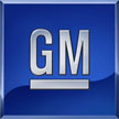
There are logos out there that you don’t need to love. They don’t contain elegant drawings or trendy swooshes or cute double meanings. Some companies like GM, American Express, GAP, Goldman Sachs and many others simply opt for the Blue Square. These companies use more than one Blue Square. These companies even named themselves Blue Square.

The Blue Square combines simple and powerful geometry with a calming and corporate color. The Blue Square focuses attention on perhaps the most important part of the brand, the name. The Blue Square is impactful. Lippincott Mercer has used the Blue Square for forty years selling five of them since the 60’s. Is the Blue Square Timeless?

What is the trade-off? Great logos can add meaning and personality to a brand. Does the Blue Square put too much pressure on other touchpoints to do this? Are these companies missing an opportunity or have they discovered the secret power of the Blue Square?

Maintained through our ADV @ UnderConsideration Program
ENTRY DETAILS
ARCHIVE ID 1780 FILED UNDER Branding and Identity
PUBLISHED ON Jan.22.2004 BY David Weinberger
WITH COMMENTS
Comments
Greg’s comment is:

I always thought that the concept of the Blue Square was kind of a copout....something so ultimately politically correct that no one could find meaning in it. But I see your point in the article, that sometimes these companies are so all-encompassing that they HAVE to be ultra PC so they can keep their name out and let others derive their own meanings.

On Jan.22.2004 at 09:30 AM
Armin’s comment is:

I like the fact that you have capitalized it David, Blue Square — like Modernism. It's almost a philosophy in itself… of course, that's the point you are trying to make.

Of the examples you showed, I think there are a few that pull it off really well, like GAP and GM. The type reinforces, complements and gives variety to the PCness of the blue square. As lame as it is, I can see why big brands resort to it, not that I encourage it or approve of it in terms of graphic design but it does work.

On Jan.22.2004 at 09:51 AM
Jason’s comment is:

For crying out loud.

Why don't these companies try and differentiate themselves?

On Jan.22.2004 at 10:29 AM
Jason’s comment is:

Oh, and by the way . . . who designed these identities? Is somebody out there running a Blue Square Factory (BSF for short), just pumping out Blue Square Revisions (BSR) with each new client?

On Jan.22.2004 at 10:32 AM
freelix’s comment is:

you forgot the blue NASDAQ square (Landor)

oh, and the green (H&R Block) square (again, Landor)

You could also make the same argument for the orange circle... and maybe the red triangle

On Jan.22.2004 at 10:39 AM
Alan Caplan’s comment is:

I, for one, like a well executed "blue square" style brand. Notice I said brand, and not logo. Gap is a good example; the logo sits there benignly and lets the company's image shine through everything that is done around it. That's the only way such a simple, meaningless logo can be successful - if it's purpose is to stay out of the way.

On Jan.22.2004 at 10:44 AM
marian’s comment is:

The Square, the Circle, the Stripes ... I've always wondered about the copyright issues with such things. How does one Blue Square keep from being sued by the other?

I once wanted to start a website for a ficticious company which would, among other things, hold the patent to all the simple shapes and many basic colours. We were going to have this great section of threatening legalese demanding royalties on every use of the square, the circle ...

To answer your question, I think they're missing an opportunity to differentiate themselves. I've always considered these simple logos to be cop-outs: usually indicative of a huge, slow-moving company that is incapable of coming to any consensus on something that may be open to interpretation or has character. A company so devoid of innovation that they can't even define themselves with a unique mark.

HOWEVER, I am not guiltless! I designed this Blue Square logo

for a company that makes flywheel power backups. Not only the Blue Square, but the Yellow Circle (of the energetic flywheel spinning smoothly and near-perpetually)! I actually quite like it, but it doesn't go in my portfolio.

On Jan.22.2004 at 11:47 AM
Tom Gleason’s comment is:

The AIGA logo is a particularly ingenious use of the Square.

On Jan.22.2004 at 12:03 PM
arturo’s comment is:

I'm more into red circles these days ;-)

On Jan.22.2004 at 12:16 PM
David W’s comment is:

I've always considered these simple logos to be cop-outs

Some logos show you what the company does. Some make you wonder what the company does. Others create a feeling. The list goes on. Logos can serve so many purposes. The Blue Square isn't a cop-out. It conveys, among other things, size and stablilty — very important to Amex, GM, New York Life, Goldman Sachs, TCW etc.

As lame as it is, I can see why big brands resort to it, not that I encourage it or approve of it in terms of graphic design but it does work.

Why is it lame. Don't you strive for simplicity in communication? In terms of Graphic Design, many of these are successful. Their goal is to present the name. The knocked out type makes the name stand out and the strong shape separates it from its surroundings. It can be very impactful on a page or surrounded by other logos. As long as the type is designed well, why not a Blue Square?

On Jan.22.2004 at 12:27 PM
Kiran Max Weber’s comment is:

They admit it.

On Jan.22.2004 at 12:29 PM
Greg’s comment is:

Ah, but David W.-

Is it still design? Or, as a teacher of mine is quasi-famous for saying, could my grandma do it? I imagine a conversation that goes like this -

AD: Still working on the (insert big brand name here) logo? We've got to get to the presentation in 5 minutes!

GD: I wanted to do something that really says what the company's about; something that really characterizes the brand. I'm stuck.

AD: Well, I have a solution, the Blue Square! It works for everything; you can read almost anything you want into it, and it requires no thought whatsoever!

GD: I dunno, I guess....But there's no way this goes in the portfolio.

And then at that point the design gods smite the poor hapless fiends. The End.

On Jan.22.2004 at 12:48 PM
David W’s comment is:

Is it still design?

Why is this so different from designing a wordmark for a company?

could my grandma do it?

If your grandma did it, it would look like your grandma did it. These (many of them) were done by professional designers with education and experience in typography and look as such.

On Jan.22.2004 at 12:55 PM
DesignMaven’s comment is:

David

Good topic:

The first squared Identity I remember is

J C Penny. Designed in the 1960s by Massimo

Vignelli of Unimark International Fame.

Continues to be in use today.

At or about the same time I remember seeing the Blue Squared Identity for New York Life.

Designed by my GOOD FRIEND Arthur King. Formerly

Design Director at Lippincott & Margulies,1960s.

Later transcended to Vice President Lippincott & Margulies, Creative Services. Arthur King, also Designed EASTERN AIRLINES Identity, Hertz,

CITGO. (others)

The Squared Identity is a Timeless Design.

Whether enclosed by Tyography or Symbol.

A Tried and True solution for creating a SEAL.

Like anything the overuse of a device make it redundant.

Alas, SWOOSHES, ARCHS, 3D, Translucent Color,

all useless Devices of an era.

Notwithstanding, every Brain Dead Designer that

can only come up with an ORBIT

to represent a dot com or information highway.

People twenty years from now will look at all the

Orbits, Swooshes, Archs, 3D and easily associate

those Devices from 1990s or early 21 Century.

The very nature of Timelessness in Design is the Originator of the Graphic Idiom.

The Forebearer of the Squared Identity was given

Birth by Massimo Vignelli for J C PENNY and Lippincott & Margulies with New York Life. (others)

Everyone else POST 1960s are Johnny Come Lately.

Embarking the Psychology of Color of the Blue

Squared Seal.

The Blue Squared Seal Represent, Spiriality, Nobility, Conservatism, Rationality, Tranquility, Continentment, Devotion, Justice.

I liked Gap's earlier Brand Identity Better

Designed and Implemented 1974 by Harry Murphy of

Harry Murphy and Friends, Mill Valley.

The earlier Identity was BAUHAUSIANRed Lower Case Sans Serif Typography. Devoid of any confinement.

Current,Identity created inhouse. For my personal

taste and edification a BASTARDIZED Identity Solution. Nothing Original.

Does anyone remember Sanyo's original Identity

was a Blue Squared Seal? Designed by Legendary

Japanese Identity Designer/Consultant/Evangelist.

SHIGEO FUKUDA, 1961.

Sanyo's Identity was changed to a Red Logotype by Anspach Grossman Portugal, 1986.

Designer, LEGENDARY, HOWARD YORK.

Historic Note:

In Grahams Topic Discussion 1-20-04

Mayflies, Timelessness of Design. Someone touched

base on the originator of the Swoosh.

The Modern Day Swoosh as we know it was Designed

by Carolyn Davidson for Phil Knight and Bill Bowerman at University of Oregon.

Legend has it, Carolyn Davidson was paid only thirty five ($35.00) dollars for her Identity.

She was a Design Student at University of Oregon. Friend of Phil Knight Bill Bowerman.

Nike has paid Billions to Consultants to Position and Leverage it's Brand.

Doubtful, if Carolyn Davidson has received another

Penny from Knight and Bowerman.

Earlier examples of the Swoosh before Nike can be seen in Chermayeff & Geismar's Identity for

Screen Gems. Continued to be in use today.

SAUL BASS' Identity for UNITED. Affectionately

called the "TULIP".

The oldest example of the Swoosh and Orbit is

the Identity for WIRLPOOL.

WIRLPOOL has never received any KUDOS or ACCOLADES for its Design. Combination of a Swoosh

and Orbit.

On Jan.22.2004 at 01:07 PM
freelix’s comment is:

About a year ago i worked on the ACLU logo.

Officially, its Din encased in a square which houses a picture of Lady Liberty. In this particular case the design firm, or designation firm, held the notion that they were responsible for its conception. In the end, no one was. They didnt design the typeface, or come up with the image.

Sadly, the blue square of the ACLU (to my eye) has little power and represents no one.

Yes, grandma may as well have designed it.

On Jan.22.2004 at 01:17 PM
freelix’s comment is:

Maven,

youre rattling off some big assertions. I seriously doubt Massimo was the originator of the blue square.

A deeper dig may fing Raymond Loewy in front of that pack. Who cares, really.

As mentioned previously, we'll never really know who can claim what due to the old school chain of credit/command.

A recent hilarious rpononcement from the kingpins at C&G: "The circle is dead".

We can also elaporate on the use of the red/blue/yellow circles for use in Television which I'm going to go ahead and guess was first introduced by CBS/ Saul Bass, then ABC/ Paul Rand, then Showtime/ C&G... and most recently Trio/No. 17.

Look at me with the credits. Urgh. I'm pathetic.

On Jan.22.2004 at 01:35 PM
DesignMaven’s comment is:

Speaking of Brain Dead:

Directed at myself. I forgot to mention.

Arthur King, Designed the Identity for Chrysler, Pin Star Identity.

Recently, changed by Identity Phenomenon

Joe Finocchiaro.

http://www.joefino.com

Freelix:

You may be correct. My point, is my early associations of the Squared Identity can certainly be traced back to Massimo Vignelli's work for J C Penny.

Certainly, Lippincott & Margulies work for New York Life.

Although, I stated The Forebearer of the Square

is Massimo Vignelli and Lippincott & Margulies.

Would love to include Raymond Lowey and William Snaith among the aforementioned.

Remember, I emphatically stated, Everyone else POST 1960s are Johnny Come Lately.

Don't make me Dig Out my Lowey Archives. (LAUGHS)

Freelix, Please inform me of the work of Lowey you are referencing.

Back to my Billie Holiday CD.

On Jan.22.2004 at 02:13 PM
Mr. Jones’s comment is:

To me the blue square has always said stability, finance, etc. I think the Gap blue square is a cop out. It says nothing about the brand. It has no personality. Actually maybe it is referring to the fact that their clothes are so simple.

The only good thing about the blue square is that it gives creatives more freedom to design around it. The blue square is a chameleon that can blend in to any surrounding.

On Jan.22.2004 at 02:27 PM
Greg’s comment is:

These (many of them) were done by professional designers with education and experience in typography and look as such.

Really, how much education and experience does it take to kern Helvetica? That was a project we did in Type 1 at school my first year.

And Maven-

Capitalization, Name Dropping, And Long Winded Speeches About History A Guru Does Not Make.

There, I feel better.

On Jan.22.2004 at 02:29 PM
jesse’s comment is:

Hooray, Greg.

I was Wondering if THE ABOVE STATEMENTS were Bothering ANYBODY ELSE.

Good. Lord. Maven.

On Jan.22.2004 at 03:10 PM
surts’s comment is:

maybe I'm in the minority here, but I like the intensity that the Design Maven brings to his posts

On Jan.22.2004 at 03:18 PM
jesse’s comment is:

I'm not digging on the intensity.

On Jan.22.2004 at 03:21 PM
David W’s comment is:

Lets not make this about Design Maven. That topic will come soon enough. Everyone is free to post with whatever intensity they wish.

Maven - Maybe a little less advertising of your GOOD FRIENDS.

On Jan.22.2004 at 03:35 PM
marian’s comment is:

Some logos show you what the company does. Some make you wonder what the company does. Others create a feeling.

Sorry, David, when I meant simple, I meant the Square/Circle/Triangle. Obviously there are times that such shapes are purposeful to the company -- meaningful even, like if they're named Something-Box, or they make concrete cubes ... but I'm talking about those many, many times when a company uses eg. a square and it has nothing to do with them. Stability? OK, but then everyone should have a square for a logo. We all want to appear stable don't we? Except maybe Lucent ... (btw, has anyone ever heard the "flaming asshole" story about that logo?)

I think back to our province's old telephone company, BCTel's logo. Frutiger bold italic (barf) caps, and 2 blue triangles. That's thoughtful.

I very nearly said something dismissive about the value of such designs, but I take it back before even saying it, because I don't really think that GiantBrandingCo sits around watching TV, then on presentation day puts down the Blue Square and writes up an invoice for untold thousands. Actually I suspect that GiantBrandingCo probably puts forward lots of interesting and innovative ideas and after months of gruelling, hair-tearing, clothes-rending deliberations comes down to the Blue Square and everyone agrees it looks solid and established. Then of course they have to gather their forces (those who haven't jumped off of high corporate towers) and implement the Blue Square yadayadayada before they get to collect their untold thousands (millions?).

Oh no, there is work in the Blue Square. Lots of hard work. But when I say it's a cop-out I really mean on the part of the company that orchestrates/accepts the logo, not the design team.

On Jan.22.2004 at 03:37 PM
Greg’s comment is:

I feel as though I should explain....

Maven, I apologize, first of all, because what I wrote seems more of a personal attack and I despise people who use the anonymity of message boards to level attacks at one another.

I wrote what I wrote however, because your argument reminds me of a teacher I had, who I used to go around and around with about the nature of swooshes and gradients and such. I belived that they were usable as design tools, you just can't rely on them to carry your design, and she would downgrade me for using them and telll me that a good designer didn't need them. I agreed with her point but didn't see why you couldn't use them, and we'd go on and on....hence my outlash.

I meant nothing personal.

On Jan.22.2004 at 03:42 PM
Armin’s comment is:

> (btw, has anyone ever heard the "flaming asshole" story about that logo?)

I had heard of it being referred as the Devil's asshole. I'd love to hear the original story.

RE: Design Maven

We've been over his writing style before and it's just part of the whole Maven experience. I'd suggest getting used to it. After a while it becomes kind of addictive — I find myself waiting for the next Mavenness to come up. Sorry, I don't mean to encourage it, it just is.

On Jan.22.2004 at 04:02 PM
marian’s comment is:

I'd love to hear the original story

Actually, not much of a story--I think I read it in either @Issue or &c (or was it Critique?) ... basically that when it was unveiled, Lucent employees referred to it as the flaming asshole. The amazing thing is I've never forgotten it, and when I see it, that's what I think of. How's that for some powerful, er, branding?

On Jan.22.2004 at 04:26 PM
graham’s comment is:

sorry to take a tangent-but the lucent logo . . . why is it so disliked? i like it-it's an enso (calligraphic circle, associated with zen-to do with emptiness and form), almost everyone has one in japan, almost as ubiquitous as a blue box or a swoosh . . . but so much hate . . . it's sad . . . one tiny tear . . .

no, but really-where's the love?

On Jan.22.2004 at 04:35 PM
Armin’s comment is:

I love the lucent logo. In fact, in my first job-getting web site I, for some reason, listed stuff I liked and I had lucent's logo in there. I share the sheded, tiny tear with you graham.

On Jan.22.2004 at 04:54 PM
DesignMaven’s comment is:

Thanks, David, Armin and Michael Surts.

To Greg,

You're a STAND UP GUY. Apology accepted.

Allow me to expound. The people I am crediting

many worked for Identity Consultancies where the Principals got credit. They never publicly receive credit.

In my own Politically Correct way. I am correcting History.

How many of us have read Identity Books where

the name of the Designer associated with the Identity is not mentioned.

This is in no way GLORIFYING DESIGNERS.

It is my way of RIGHTING A WRONG. I will continue to do so. Whether you like it or not.

I will accept the fact the PEOPLE bothered by the name Dropping don't posses my Knowledge and Capability. Your Short Commings!!!!!! Not mine.

Noteworthy, Identity Design transcend Graphic Devices. Many are over-used and meaningless.

In the GOOD OLE Days the WORLD Looked to SAUL BASS whom was the Trend Setter of Identity Design. PAUL RAND was the voice of Reasoning. With his writing and Teaching.

After 1996 when Bass and Rand Died Identity Design was in CHAOS.

There was no clear Trend Setter. The PACE SETTER

has always been Siegel & Gale.

During this time, POST 1996 Siegel & Gale moved heavily into Information Architecture and put Identity Design and Branding on the Back Burner.

The Trend Setter is now LANDOR. Whom has created

the most Swoosh Designs of any Consultancy.

I am tired of seeing Designer(s) Ripp Off LANDOR.

Get some Original Thoughts of your OWN.

Suffice it to say. I have never used a Swoosh,

Arch, or Orbit. Because of my training as an Airbrush Illustrator. I am guilty of using gradients. Because, I am assimilating the airbrush technique.

Greg, Dare I comment on you or your work. I don't know you. Never seen your work. How could I be possibly talking about you.

The Brain Dead Designer, I am referencing, are those with no other intention but to modify something another Identity Consultancy or Designer has done.

Referencing, the Designer(s) that steal from Graphis Logos, American Corporate Identity and

other noted Designer(s) work.

JESSE:

If you don't enjoy my Post. Offer something more Concrete and of Substance.

I've never read anything of SUBSTANCE you have written.

In the words of HOWARD STERN. Turn the Dial.

In short. DON'T READ MY POST!!!

You don't offer anything!!!!!

YOU ALREADY KNOW EVERYTHING!!!!!!!

Back To My John Coltrane CD.

On Jan.22.2004 at 05:12 PM
surts’s comment is:

I've rarely read anywhere about the actual implementation of marks. The genius behind some of the mentioned marks above are that they can work in any situation consistently. Aside from the brand attributes, implementation and management are important to keep in mind when judging the design.

On Jan.22.2004 at 05:20 PM
Tan’s comment is:

I've heard that it's actually a dragon or pheonix or something like that -- circling around its tail.

I like the Lucent logo too. Of course, it's been copied to death by every company that starts with "O".

...

but back to the blue square. I read somewhere that the Blue Box is iconographic representation of a window, a view into something symbolic -- like technology, innovation, assurance, health, or in H&R Block's case, green money.

Microsoft augmented the blue square by duplicating it, adding color, and putting it into motion -- for what else, Windows�.

The source of the blue box must have some historical significance. Perhaps it's a craftsman stamp, or an accounting seal, something vernacular-based in business that's translated itself to corporate iconographic language.

Of course, that doesn't make it timeless necessarily. The roman alphabet is iconographic language too -- but timelessness is an irrelevant issue.

Lastly, does anyone have a copy of a small Stora Enso book called "New Models for Growth and Profitability" produced by Cahan a few years ago? There's a brilliant section in the book that compares 8 pairs of corporate competitors with one common distinction -- their corporate colors are all blue.

IBM : Hewlett-Packard

Allstate : MetLife

Boeing : Lockheed-Martin

Ford : GM

Arco : Mobil

AT&T : Bell Atlantic

Chase : Citibank

Pfizer : Bristol-Meyers

It's amazing how prevalent blue is...and how stupid corporate branding can be.

On Jan.22.2004 at 05:30 PM
JonSel’s comment is:

I never was much bothered by these blue squares. Interesting to see so many of them put together via David's effort. And yet, I'm still not bothered like I am by the swooshes of the 90s. Maybe it's because most of these square logos are clearly the effort of a skilled hand? Most of those swoosh logos seemed such the product of a quick Illustrator filter.

The genius behind some of the mentioned marks above are that they can work in any situation consistently.

This is very true. Think of all the different ad campaigns the Gap logo has backed up. I was pretty shocked when I saw the H&R Block logo the first time. It is, after all, nothing but a green square. The type isn't even contained in it. But the implementation of it has been quite nice. It only further convinces me that when designing a logo, one must consider and demonstrate the logo's potential surroundings.

On Jan.22.2004 at 05:34 PM
damien’s comment is:

This has to be the worst blue-square logo I've ever come across. As Marty Neumeier mentions in his book (The brand gap), the trademark has little ties to the Nationwide name and could as easily be used with the brand name Polaroid.

On Jan.22.2004 at 05:55 PM
Shawn Wolfe’s comment is:

I have nothing much new to add here. I enjoyed this piece. I always enjoy seeing lots of embarrassingly similar designs in a police line up.

A blue square signifies stability, I suppose. Mostly though it signifies compromise and conservatism, as a graphic mark and also, especially, as the product of a committee that couldn't agree on anything and that managed (through its desire to please everyone, offend no one, disturb nothing, be all things to all people even while saying nothing and moving no one in the slightest) to wind up with the most innocuous, null and democratic symbol possible. It (the blue square) symbolizes "moving to the numbers", hedging, playing it safe, maintaining the status quo, playing the percentages, cultivating a pleasing yet profitable blandness.

It's what made this country great.

On Jan.22.2004 at 07:25 PM
Shawn Wolfe’s comment is:

You can try to build things into your identity, or foolproof it, but eventually (hopefully) it takes on a life and meaning of its own, over time. Ideally one's logo doesn't get in the way of that (my argument in favor of, say, a Blue Square)

On Jan.22.2004 at 07:56 PM
jesse’s comment is:

From Merriam-Webster:

ma�ven

Function: noun

Etymology: Yiddish meyvn, from Late Hebrew mEbhIn

Date: circa 1952

: one who is experienced or knowledgeable : EXPERT; also : FREAK

On Jan.22.2004 at 08:29 PM
freelix’s comment is:

Design Maven Rules.

Leave him alone, Jesse (pronounced hess-say)

Back to my Dwight Yoakum CD

On Jan.22.2004 at 09:54 PM
DesignMaven’s comment is:

To Jesse:

I'm all of the above.

HOWEVER, MY PERFORMANCE Level and MY Freakishness on the Level of ROCCO SIFREDDI and T T BOY.

Actually, what I know about Design and Identity.

You can put in a THIMBLE!!!!!

I am HUMBLED by Armin and Tan. Almost twenty years my Junior. Seemingly, more enlightened than I of certain Historic Facts of Visual Communication.

Knowledge is about Dialog, Sharing and Exchange.

When we cease talking, sharing and exchanging knowledge.

The Design Community is DEAD. Irrespective of our Discipline(s).

I'm for more Dialog. I have an Unquenchable Thirst for knowledge.

I hope it is Contagious on SPEAK UP. No one person knows

everything. I don't PRETEND to have all the answers.

Back to my LED ZEPPELIN CD

Sorry Tan:

Even you would have to agree, Stairway To Heaven Transcends Timelessness.

Apologies David W., didn't mean to steer away from your intended topic of discussion.

On Jan.22.2004 at 10:16 PM
Tom Gleason’s comment is:

maven, I honestly didn't like you at first; mostly because I kinda like what I see in Mr. FitzGerald and you went off on him really excessively (but I didn't say anything because he did ask for it), and I thought your posts look like sales letters (which I spent a lot of time studying and I think they can be very intriguing in the way they use psychology)...

But you're growing on me, like Armin said, I look forward to your posts now because of the references they either bring into play or at least bring into our subconscious minds.

On Jan.22.2004 at 10:34 PM
Tan’s comment is:

No apologies needed Maven -- totally agree. Rock on buddy.

Back to my Van Morrison CD

On Jan.22.2004 at 11:00 PM
saxophonejones’s comment is:

I agree with Shawn Wolfe.My favorite was when Debbie Millman exposed the two "Carefree"s and the Nike/Newport connection.

On Jan.22.2004 at 11:39 PM
Michael B.’s comment is:

Mild point of clarification: Unimark International designed the JC Penny logo by making it Helvetica and building a rigorous grid-based system around it. I don't think it actually got stuck in a square until much later.

Just like not every building can (or should) be designed by Frank Gehry, not every logo can (or should) be clever. Many of them do their jobs perfectly just sitting in a square. In doing so, they do not reflect well on the incredible imagination of their designers, but I'm not sure that's their primary function, is it?

On Jan.23.2004 at 06:49 AM
jesse’s comment is:

I'll be really amused if the mysterious Maven turns out to be Steve Heller.

Back to my time-consuming JOB.

On Jan.23.2004 at 07:52 AM
Armin’s comment is:

> In doing so, they do not reflect well on the incredible imagination of their designers, but I'm not sure that's their primary function, is it?

Big Blue Square corporations probably don't rely on the imagination of their designers to develop an imaginative logo (that is quite obvious), I guess for me the question is: are designers succumbing (for lack of a better word) to the time-tested tradition of the Blue Square? Or are they using it because it is appropriate for the client? Blue Squares can smack of laziness, yet they do represent everything that Shawn mentioned, which is not bad.

I don't get as up-in-arms about them as swooshed or the latest trend in 3dizing the shit out of anything… that's what we need, a 3dized Blue Squre, then we would be on to something.

> I'll be really amused if the mysterious Maven turns out to be Steve Heller.

Sorry to dissapoint Jesse, two different persons.

On Jan.23.2004 at 08:29 AM
David W’s comment is:

that's what we need, a 3dized Blue Squre, then we would be on to something.

On Jan.23.2004 at 08:53 AM
Armin’s comment is:

And there is the ultimate (good) exploitation of the blue square.

On Jan.23.2004 at 09:25 AM
Darrel’s comment is:

Maven is like my GOOD FRIEND Cliff Claven. A little annoying, but he brings some color to the bar and the place wouldn't be the same without him.

Back to my iPod! (really...who uses CDs anymore?)

On Jan.23.2004 at 09:31 AM
David W’s comment is:

Back to my iPod! (really...who uses CDs anymore?)

I would use my iPod but the battery died.

On Jan.23.2004 at 09:35 AM
Zoelle’s comment is:

Earlier this week I was in the process of working through some comps for a dental studio that handcrafts implants, partials, and such. I started with logos that contained a tooth or a tooth-like shape (just to get them out of the way while I looked for other directions to explore).

From that stage I auditioned several colors. I felt that blue was the best fit. It's calming, businesslike, and reminds me of hospitals and mint toothpaste.

Here are the words I was working with: Sieber Dental Studio. After some shoving around and stacking, it finally dawned on me that all three words contain six letters (hold the applause).

I then took the letters and stacked them so that I could express the idea of strength and precision. To further accentuate the square shape I placed an outline around the words. I intentionally created a shape that followed the ratio of 5:8; 5 being the virtual square of the type and 8 for the surrounding box. It seamed appropriate to me based off of how common the ratio is in the human form.

My strictly justified text combined with a surrounding fence seemed to be lacking substance. To resolve that issue I filled in the box and reversed the text out. I choose white for the text to relate the color back to teeth.

Here is the comp as it now exists:

So, am I a hack? Am I defaulting to a design I think has been successful for others? I don't think so. I think that I stayed true to myself. I feel no guilt for choosing the blue square. What do you think?

On Jan.23.2004 at 09:50 AM
freelix’s comment is:

I think Zoelle is actually Steve Heller.

Back to my Pixies CD

On Jan.23.2004 at 10:18 AM
Darrel’s comment is:

I would use my iPod but the battery died.

pick up a new battery

Zoelle: what is a 'dental studio'?

On Jan.23.2004 at 10:34 AM
Darrel’s comment is:

dental studio that handcrafts implants, partials, and such

I'm an idiot. You already told me what a dental studio is. Doh! ;o)

On Jan.23.2004 at 10:38 AM
DesignMaven’s comment is:

Tom Gleason:

Many Thanks Tom:

For the record. I would like everyone to know

I received a personal email from Kenneth Fitzgerald. Very Funny to me. I didn't Post it

because it would have betrayed his Trust.

Below referenced comments from Kenneth Fitzgerald:

At least I have the courage to express my criticisms publicly and sign my name to them.

Brought a smile to my face. Mr. Fitzgerald is

an Accomplished Fine Artist and Educator.

He has a Beautiful Family with two lovely children.

I AM EXTENDING AN OLIVE BRANCH TO

KENNETH FITZGERALD. I trust he will except.

Mr. Fitzgerald, you are WELCOME to post on Speak

Up anytime. Your opinions and views will be respected and takin UNDER CONSIDERATION.

I'll agree, I was a bit heavy handed my first post.

In my ZEST and ZEAL to imitate HOWARD STERN Ripping Stuttering John, Gange',

or Gary DelaBate', Ba Ba Boey, Ba Ba Boey, Fa Fa

Foey, Fa Fa Foey.

Sigmund Freud said it best.

Organism according to the Environment in which

they live will survive.

Survival Of The Fittest.

While discussing Sigmund Freud. I want to elaborate on Freuds "Looking Glass Theory"

We never see ourselves as other people see us.

If I came off POMPUS or seemed like an ASSHOLE.

Not my MODIS OPORANDI.

I love Design with a Passion unknown to any man.

My Passion for Design is only Rivaled by my love

for MISSONI SWEATERS and MONTICRISTI PANAMA HATS.

Love for my Family and God is First.

I ain't the Biggest Shark Swimming on Speak Up.

I can only comment on what I know, General Design,

Corporate Identity, Design History.

You will never read one of my Post in Discussions

of Animation=Shockwave=Flash, Information Architecture, Software Development, Website Development and Design.

Topics I know nothing about. I can only read and

Learn.

I don't tread water with Armin and Tan Lurking for a Fresh KILL.

I ain't STUPID

Last but not least,

I woke up this morning. Ready to write all parties concerned, Armin, Tan, Freelix, Brady,

Damien, Michael Surtees, and Steve Heller.

People whom I Respect,Trust, Learn from with their WEALTH OF KNOWLEDGE.

I was going to inform all of you. I was changing my Online Moniker to something else. Perhaps another made up name.

To the Speak Up Community. Not referencing aformentioned Luminares of Speak Up Community.

Please don't make the post about DesignMaven.

The moderators of Speak Up work extremely hard

to prepare their Topics of Discussion.

They are doing Serious Business on Speak Up

providing an Online Open Forum for Educational

Purposes. The information will serve all of us

well in our Real Life Occupations. Whether the

Board Room, or Formal and Informal discussions

with leaders of your respected place of employment.

Please Refrain from Ditracting from the

Moderator(s) Topic of Discussion.

It does the Speak Up Community a Dis-Service.

Please email the person(s) you have difference with directly.

Many Read Speak Up to Arm themselves to for LIFE.

Thank you

DesignMaven

Sorry for erratic text break. It's the

way my computer processes type when I Post.

On Jan.23.2004 at 11:11 AM
freelix’s comment is:

Maven:

I ain't the Biggest Shark Swimming on Speak Up.

Whah? Huh? I'd like to see what a design shark looks like. Can you grill it and mix it with vegetables and a nice chianti?

We've gotten off the blue square and gone into the deep blue abyss- so while we're here, Maven, if that is your real name, why dont you come clean? Drop Your name just once.

On Jan.23.2004 at 11:51 AM
Armin’s comment is:

> HOWEVER, MY PERFORMANCE Level and MY Freakishness on the Level of ROCCO SIFREDDI and T T BOY.

And for all youngsters out there, these are not Identity designers nor the usual Design Gods that Maven constantly refers to. Google at your own risk — Speak Up assumes no responsibilty.

On Jan.23.2004 at 01:03 PM
Michael B.’s comment is:

Zoelle, the fact that all three words have the same number of letters is what I call the Mathematical Imperative. This is God telling you what to do, and it can be used to justify all kinds of design solutions, many of which simply have to end up in squares, some of which may as well be blue. Don't worry about a thing.

DesignMaven, wanted to extend my props for namechecking TT Boy and Rocco Sifreddi, a couple of characters I wasn't expecting to have referenced here on Speak Up.

Back to "Whipped Cream and Other Delights" by Herb Albert and the Tijuana Brass

On Jan.23.2004 at 01:07 PM
DesignMaven’s comment is:

Freelix,

I LOVE YOU!!!!!!

Aren't names of little significance.

David W.

I am not in your League. Can't afford an ipod.

I so Desparately want to be among Armin, Tan,

and Brady.

Whom you extended the Courtesy to RUN WITH THE BIG BOYS AT FUTUREBRAND.

To The Legendary Design Icon Michael Bierut.

I Have followed your career FOREVER. And love your work. With your HUMBLE Beginnings with MASSIMO VIGNELLI. aka Unimark International.

You are CORRECTOMUNDO,in reference to J C Penny's Identity. The square was incorporated circa

1973. If memory serve me correctly I think

Massimo Vignelli was still handling the account.

Many thanks for your clarification.

Hadn't drank my morning HERBAL TEA.

Re-Read the point of Reference Michael B. made.

Said under my Breath. "Now who hell is correcting me"

Like a school girl all Giddy. Damn Near Defecatedon myself when I read your name.

Can't go Toe to Toe with you.

Mr. Beirut, I read somewhere where your are the KING of being able to name more

Designers names that anyone in HISTORY.

Someday, I would like to play the game with you

in person at an informal get together.

I am preparing to send MASSIMO VIGNELLI photogaphs of how Washington Metropolitan Transit Authority is Destroying his Swiss Designed

Metro Signage System.

It will bring tears to his eyes. The so called

Consultants Don't have a CLUE to what they are

doing.

Regards

DesignMaven

Back To My Clash CD

Sorry, David W. I don't make your kind of money to afford an ipod. And justify the expendure with my wife.

However, I am willing to relocate to New York.

I Desparately want to Run with the Big Boys.

On Jan.23.2004 at 01:21 PM
Armin’s comment is:

Michael, I guess my disclaimer was a bit late, huh? And I guess I need to clarify that this doesn't apply only to youngsters.

On Jan.23.2004 at 01:23 PM
David W’s comment is:

Cliff Clavin, TT Boy, Dwight Yoakum, iPods, Sigmund Freud. What is this thread about? Armin, sorry I'm not doing a good job keeping us on topic. Everyone sure is having fun though.

However, I am willing to relocate to New York. I Desparately want to Run with the Big Boys.

You and Armin both, Maven. It would be great to have both of you.

On Jan.23.2004 at 01:36 PM
Shawn Wolfe’s comment is:

Someone should start a porn site called BlueBox.

(Yeah, that's what the internet needs.)

Anyhow, at least the logo design competition would be interesting.

On Jan.23.2004 at 01:41 PM
David W’s comment is:

OK……………back to Squares.

I always thought Orange was cool. They seem to understand design. I believe Wolff Olins did the identity work. Good stuff.

On Jan.23.2004 at 02:00 PM
Mr. Jones’s comment is:

The blue square, Rocco Sifreddi & T T Boy (Armin, curiosity got the best of me and I googled where I shouldn’t have googled), and Massimo Vignelli all in the same post...all I can say is WOW! I am entertained but I can’t help but feel dirty. Where is David Lynch when you need him?

Good thing I have Yma Sumac and Claus Nomi in my ipod (the perfect sound track for this).

On Jan.23.2004 at 02:04 PM
freelix’s comment is:

Maven, Arminio Hall:

Please stay put. NYC is a wicked witch titty (cold, nasty). I'll be coming in soon for the Ford Jazz event there in Chi Town. Lets lift one (or 9) again.

back to my Art Blakey & the Jazz Messengers Bootleg

On Jan.23.2004 at 02:06 PM
marian’s comment is:

David, I was always dissapointed that Orange wasn't a circle ... and I was never sure if that would be just too obvious, or so incredibly obvious that it was genius--and if too obvious, perhaps a blue circle... but the orange square just seemed obvious without being wittily obvious.

For the record ... goin waaaay back in this thread, I like the Lucent logo, too -- but I like the aformentioned descriptor more. And for the record, it made me remember the logo, possibly forever.

On Jan.23.2004 at 02:57 PM
Steven’s comment is:

The stability and strength of the Blue Square can be a seductive draw for people in the corporate world. We designers may think it's boring, but maybe it "works" for the client and their customers. Isn't that what really maters. And I agree with others in that the implementation of a logo within a brand is as important its isolated form: great logos used poorly makes for ugly non-communicative design. A mediocre or simple logo used well can be extraordinarily effective. Context is everything.

Having said that, I'd take a pedestrian blue square over a swoosh ANY DAY!

I love DesignMaven's effervescent posts. They're like a Keith Moon drum solo, somewhat randomly punctuated and kind of all over the place but yet still working and pushing the beat. And yeah, the harmonica on "When the Levie Breaks" (LZ) has always blown me away.

Back to my 16 Volt CD.

On Jan.23.2004 at 06:47 PM
Tom Gleason’s comment is:

The swoosh and the square are good examples of what Dr. Labuz called, in his design history class the other day, "digital design". This is not "graphic design", when you just go on the computer and see what comes out of it.

I've often been tempted to make swooshes. It's so easy, because you start in illustrator with a rectangle to outline your logo. Then you round the edges...still boring. Then you make an oval, which is kinda cool (land rover), then you add a drop shadow. Then you white out the top oval and let the drop shadow of it frame your company name. Suddenly it starts looking cool, and you play around with how this swoosh can interact with the text. That's how it happens.

Sure the swoosh is lazy, but so are we.

On Jan.23.2004 at 06:59 PM
hildebrant’s comment is:

It was my understanding that the Lucent mark was based upon a 'coffee stain'. Yes? No?

Hildebrant.

On Jan.24.2004 at 01:48 AM
Nick’s comment is:

I went to a talk by FHK Henrion in the late '80s, a retrospective of his career.

It made an unforgettable impression, in particular the contrast between his early work as a poster artist (designer-illustrator), and his later work as a pioneer of modern corporate identities.

Representative of his early work: the Victory poster that was put up all over Europe in 1946 -- four hands (representing the four Allied Forces) pulling apart a swastika.

And then he showed how he had rationalized the diversity of trademarks and symbols that the Blue Circle cement company had acquired since the 19th century. Of course, it was a heaven-sent opportunity (like the dental logo), and the result was reductive, brutal modernism.

I found it strange (and inspirational) that the same man had worked in two such different ways.

On Jan.24.2004 at 11:56 AM
Gunnar Swanson’s comment is:

Just so I can get into the "who's on first" discussion: It should be noted that the first trademark registered was Bass Ale's red triangle. Or is that Red Triangle?

On Jan.24.2004 at 01:57 PM
Brady’s comment is:

Maven, Maven, Maven,

Freud... a naturalist?

While Freud wrote about the human drive to survive and that competition is a consequence of such, it was Charles Darwin who wrote about the propensity for a species to adapt in order to survive. And while popularly credited with the phrase "Survival of the Fittest", it was actually philosopher and sociologist Herbert Spencer - Darwin's contemporary and (some say) rival - who coined the phrase.

Are you setting me up Maven?   wink, wink

- - -

Back to the Blue Square issue...

With this and numerous other discussions concerning "originality" in design I always refer to the following ancient insight. I have always found it interesting, challenging, not to mention frustrating and yes, sometimes depressing.

All things are wearisome; more than one can express; the eye is not satisfied with seeing, or the ear filled with hearing. What has been is what will be, and what has been done is what will be done; there is nothing new under the sun.  -- Ecclesiastes 1:8-9 (NIV)

Ha! There is nothing new under the sun!

And to think, that was written thousand of years ago!

Gee, thanks God!

Back to my mortal life.

On Jan.25.2004 at 05:42 PM
DesignMaven’s comment is:

Steve,

Many thanks. Keith Moon one of my Favorite Drummers. Along with Jon Bonham, (Bonzo)

I've had a knock down dragout argument with a friend who insist, Tony Williams is the Greatest

Drummer in the world. I contend Jon Bonham is the Greatest. I've seen both Tony Williams and Jon Bonham when they were alive.

I've never seen a Drummer play with the intensity of Bonzo. Notwithstanding, playing for thirty minutes on stage with his BARE HANDS while their band members take a break.

Bonzo was the LED in ZEPPELIN. Which is why they no longer perform as LED ZEPPELIN. Bonzo could not be replaced.

Neil Pert for RUSH comes close to BONZO.

Brady,

I am writing extemporaneously. Knew you would

rescue me.

Actually got Darwin and Freud mixed up.

Darwin, Organisms best selected by

Genetics according to the environment in

which they live will survive.

Survival of the Fittest

Freud, Looking glass theory.

We never see ourselves as others see us.

Thanks for Correction.

Freelix,

Can't afford to live in New York. I can Telecomute.

Sunday 1-25-04 appoximately 10:16pm

Looking at Maurice Binder Film Titles for Thunderball.

Listening to TOM JONES sing the

Title Song.

David W.

If memory serve me correctly. I believe General

Motors Blue Seal like GAP was

Designed in house.

I agree with you in this respect the Blue Seal is a cop out. Most in house Design Departments don't have the Expertise of Analyst, Strategist,Identity Designers and Communication

Professionals.

Thus, opt for the easy and apparent generic solution.

It is cheaper to produce anything in house.

The result is not comparable to Legitimate Identity Consultancies work and/or Identity Designers. To include Design Firm(s.)

Most Identities created in house cannot compete

with Professionally Conceived and Executed Identities.

I think most Professional Consultants and Designers can tell when something is Designed in house.

Has anybody seen the Identity for Office Max.

Very Similar typeface used by Office Depot.

A Blatant Rip Off. (aesthetically)

On Office Max vehicles. There is no Seal or underline of Corporate Signature. Like on their

website.

When you see the Livery Design. It is identicle to Office Depot. You would think Office Max is

a sub Brand of Office Depot.

Don't think Office Max was Conceived and Executed

by Professional Designers. At least with any

Ethics.

On Jan.25.2004 at 10:30 PM
Todd W.’s comment is:

After reading all 28 pages of this post while riding the subway home the other night, I now cannot help but see square logos everywhere...

On Jan.28.2004 at 02:25 PM
David Weinberger’s comment is:

I just found another boring-type-in-a-square logo. I wonder what this company does and how their logo supports their brand.

On Mar.11.2004 at 09:11 AM
Armin’s comment is:

David, in their letterhead the logo is actually in a blue background.

How it supports their brand? Actually, having a neutral logo allows them to be, well, neutral in many aspects. I think if they had a more stylized, designy logo it would mean they are taking a stance towards "something". I'm not saying that is a good strategy nor that I approve of it, but I can see why they would avoid a less-boring logo.

On Mar.11.2004 at 09:27 AM
David Weinberger’s comment is:

You're right Armin, and similar to the original Blue Square logos, the AIGA mark presents their name clearly and effectively. However, I usually feel that it is better to have a mark that supports your brand or adds meaning to it. I'd also like to change the type in this one.

On Mar.11.2004 at 09:38 AM
Armin’s comment is:

I hate those slanted A's… and the G, ugh. The I is OK I guess.

On Mar.11.2004 at 10:02 AM
JonSel’s comment is:

Did Rand design the AIGA mark? I recall reading this a long time ago, but can't find anything about it now. I think the square is a recent addition but the type pre-dates it some time.

On Mar.11.2004 at 11:39 AM
debbie millman’s comment is:

Actually, I was under the impression that Michael B. designed the logo...but I very well may be wrong about that.

On Mar.11.2004 at 02:53 PM
JonSel’s comment is:

Where's Heller when you need him? He'll know this.

On Mar.11.2004 at 05:28 PM
ryan mcgrath’s comment is:

i would like to quote some comments you made about your "blue square" theory for the poster contents. i am a maryland institute college of art student,

thank you

ryan

On Sep.13.2004 at 09:11 PM
Mark’s comment is:

The Weather Channel has misused the power of the blue square.

On Aug.18.2005 at 01:47 PM
mike hill’s comment is:

hi i always thought those brands logos were too simplistic hacky and untelling of the company or its intentions or its work also too monolistic and minimalistic whatever happened too logos with cherubs garlands and vines with animals in them i just came across this forum on google do you guys get royalties from designing these logos or a lump sum do you get asked back too design again what do these companys do when they've designed a big logo for a large company what do they do with their other time

On Oct.14.2005 at 04:23 PM
jules’s comment is:

Freud actually did not create the looking glass theory,

about how we see ourselves as others see us,

it was Jacques Lacan, in his essay "the Mirror Stage",

but he WAS analyzing Freud's oedipus theory in that essay, so its easy to mistake them.

On Oct.14.2005 at 05:11 PM
jgeeoff’s comment is:

WOW, i must be in the minority, as i didn't read anything about the size and reach of some of those corporations that utilize the "blue box." These are companies that represent products and services for the entire population.

I was always under the impression the mark should speak to the audience while it speaks for the company. Silly me. You all sound so powerful that you can dictate how your client should identify themselves to the world.

And all the talk about shapes being cop-outs, redundant, and cliche. How many shapes are there? Eventually they'll be duplicated no matter how removed one is from another. You make it sound like all these designers intentionally copied. After reading all these posts, I get the impression that eventually organic shapes will be the new Blue Box, because everyone will be afraid to go there because of so much dissension--peer pressure can be very strong, especially come Award Show time.

I did a logo for a muffin company, and the client wanted something like either Nike or Lucent. How much sense does that make for muffins?

Unfortunately, most of the work I've done in 30 years has eventually been client-driven, no matter how much research or data supported the inital offerings. Seems like it's a minority of clients "get it." The MUCH larger majority prescribe to the notion, "I'm paying you, you'll do what I say." And although they may not say it up front (some actually do), at the end of the day, it's that comment being the coup de gras.

I must say this, however, this forum has been a nice exercise in the dichotomy between aspiration and reality. I have always hoped for the client to succumb to reason, but it doesn't always happen. So, I employ the shotgun effect when considering what i've done over the years--the more you do, the higher the percentage of decent work rises.

Kit Hinrichs spoke at a few local AIGA functions here in the past few years. At one of them, after presenting fine work, someone made a comment that it must be nice being with Pentagram, and being able to do anything he wanted. He flatly said we'll never see ALL of his work. Not everything we do is portfolio-worthy. But that doesn't mean we can't strive for it.

So keep blogging, and don't give up the dream...

On Sep.18.2007 at 05:10 PM
Darrin Crescenzi’s comment is:

Re: DesignMaven:

In 1983 Carolyn Davidson in fact received a hefty, though ultimately undisclosed, gift of Nike stock by Phil Knight in a ceremony honoring her invaluable contribution to the Nike's success. Also, she was a Portland State University student, not a University or Oregon student. The UofO doesn't have a print-based graphic design program. Go up the road to Oregon State University for that...

On Jan.02.2008 at 01:14 PM