Speak UpA Former Division of UnderConsideration
The Archives, August 2002 – April 2009
advertise @ underconsideration
---Click here for full archive list or browse below
  
Our Own Worst Clients*

If you take a quick look at Logo Smackdown or Logo Smackdown Deux, you’ll see a wide range of logos, but most of them have some kind of drawing, word play, visual play or pun … something that gives that company personality in some way. Most of us do this kind of work all the time, and let’s face it, it’s not that hard. It’s quite fun, actually.

And then there’s us. Us. Ourselves. Why is it so hard to work on our own identity?

I’m just going to assume that you know what I mean. That desperate, sinking feeling when the time comes to do or redo the identity for your own company. If you have no ideas, you have too many ideas; and more than any other design project this is the one most likely to fall into disfavour even before ink has hit paper. I myself am guilty guilty guilty of changing my company look (and OK, my company name) almost as often as I buy a new pair of shoes. It’s never good enough. It’s never right.

So I took a look around … on the web and through my business cards and I found a surprising pattern. Now, I did not solicit complete business sets from tens of companies and I’m aware of the limitations of that. Most of these examples are indicative of how they project themselves on the web and may not even be representative of their true logo or identity. But I have to work with what I’ve got.

So, is there some reason that so many design companies just set their name in a line (or two) of type?

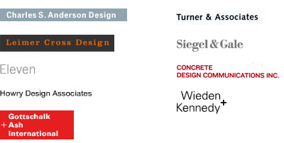
Is it that many design firms don’t want to project a strong personality? Maybe they don’t want to make a statement (other than Simply Professional) for fear of scaring those big corporations off. Maybe the message is that they are a blank slate on which an unlimited number of possibilities will be drawn. Or maybe … maybe this is an indication of the big Design Freakout.

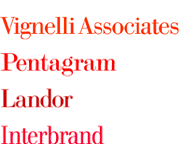
And, it seems the bigger they are, the less distinct their graphic persona. Is this because when you’re that big you don’t need to appear distinct (because you already are)? Or is it that the bigger companies have a gazillion partners who need to be represented collectively and so they just … you-know.

I asked Michael Bierut about Pentagram’s logo (note his response to the term):

I’m not sure I know the exact origins of Pentagram’s “logo” but I know it’s just the name written in the typeface Modern No. 20. The original five partners used the typeface in the book they published in 1972 when the firm was founded, and I think it was simply adopted as the standard way of writing the name thereafter. I do know, incidentally, that the name Pentagram was so hard to come up with that it may be that there was no energy to come up with a clever visual treatment for it; it may also be that the name itself was thought to be so distinctive (which it was in 1972) that the partners followed Bob Gill’s principle that interesting things should be written in boring ways (and vice versa).

I’m not sure I agree that “it is so hard to design for ourselves” as I prefer a line of well-set type to the self-conscious, frantic stuff that designers do to show off their moves. I do agree that when the only requirement is to be cool, you can never be cool enough, and that is hard. I sense that most of the Pentagram partners who have joined since 1972 have been a little relieved to not have to come up with a logo (or a name). It is not a task I envy.

So despite feeling a little self-conscious and frantic, I also feel a little brave. Michael may not have to endure this design freakout, but it sounds like things weren’t a lot easier in 1972.

But if a line of well-set type is the way to go. Which type? And what about that box?

And what if you really are cool? What if coolness is what gets you business? And what about those other criteria—location, history, wordplay, pets—the factors we take into consideration when creating identities for our clients? Can you tell how young a company is by how much fancy shit they put into their identity? Is it only the small, single-owner studios that have the (endless) time and (infinite) desire to represent their personal aesthetic? It would appear not.

I asked Steve Carsella about Vibranium’s logo:

From the gut: Um … This logo is one of my favorites. Now it’s like a pet … it’s scrappy. A fighter. It’s endearing. Flawed. Charming. Human … It’s ME! It doesn’t have the chiseled good looks of a male model … it’s a little dumpy. It would do okay on Jeopardy. It’s bright but not intellectual.

Those were the things I was going for. Well, that and my ongoing Machiavellian desire to merge “psychedelic” with “victorian”.

Did you hear that? He said, “it’s me.” Sounds like success.

Disturbingly, I’m beginning to think it’s all about confidence. Maybe the line is drawn between those who understand and are at peace with who they are, and those who aren’t.

Stefan Sagmeister says,

Yes, we have a logo, I had designed it 15 years ago as a student and have not worried about it since (even though an S in a circle has in the meantime been adopted by a number of other design companies).

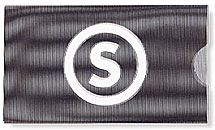
I am now in Berlin where the S-Bahn (the above the ground subway) has a similar one, and came from South Africa where the no parking sign looks smack the same (albeit crossed out).

Or maybe, if you nail it, you nail it and that’s the end of it.

Where some seem to have found themselves and stuck with it, others take the opposite approach. When I heard that Thirst doesn’t have a set identity, I talked to Rick Valicenti:

identities are ephemeral.

they are just moods, and emotional artifacts

identities should never linger too long for fear one remains locked in time defined graphically by who they once were … yes, change is good …

sadly, designers do not practice this truth and culture is contaminated with well intentioned branding that just rots along the side of the road.

There is truth there, too. People change, right? Our companies change and our work changes. It would be unreasonable to expect that we would have to come up with the graphic identity that will represent us for a lifetime, or even years, or … in my case, months.

So where does that leave those of us who still struggle? How do we find the balance between “personality” and “self-conscious”? As we get bigger, older and more established, do we trade our groovy logos in with our trendy clothes? When we understand ourselves, does the Design Freakout end? Do we eventually become so comfortable with who we are, we can just pick a good Bodoni and go for it? Are we all destined to end up in black cardigans with a single line of some classic typeface for our identity? Or maybe even …

*No aspersions are being cast on any of the logos (or lack thereof) represented here.

Thanks to Diane Witman for the topic.

Maintained through our ADV @ UnderConsideration Program
ENTRY DETAILS
ARCHIVE ID 1946 FILED UNDER Branding and Identity
PUBLISHED ON May.21.2004 BY marian bantjes
WITH COMMENTS
Comments
Darrel’s comment is:

identities should never linger too long for fear one remains locked in time

When will we insist that our canonized graphic design like landmark architecture be conservered rather than discarded.

Hmm... ;o)

On May.21.2004 at 09:30 AM
marian’s comment is:

Ha ha, yeah ... I split a gut yesterday when I saw that. But in Rick's defence, his comments are in two different contexts. Yesterday's little outburst was referring specifically to an established, dare we say "classic" logo.

Perhaps the ultimate answer to the design freakout is to get one of the greats to do it for you and weather it through the years.

On May.21.2004 at 09:44 AM
Greg’s comment is:

I think a lot of the time larger firms use simple typefaces as logos because they don't want to pigeonhole themselves, as many of their clients come from diverse backgrounds. The simpler it is, the more that can be read into it. Younger studios use more graphic tricks because they're still trying to grab hold of a niche market, either for monetary reasons or because of some conscious or unconscious "graphic ideal," or some combination of the two.

Of course, this is a theory I came up with five minutes ago, feel free to shoot holes in it as needed.

On May.21.2004 at 09:46 AM
Darrel’s comment is:

No need to defend Rick...just poking fun at him. ;o)

I think most firms use simple logos simply because there's no constraints with personal projects and graphic designers REALLY need constraints/project parameters to work effectively.

Design firms also aren't typically marketing themselves in the same way as companies that depend on brand recognition are.

The last design firm I worked for was a small 5 person firm and we spend a lot of time/money constantly playing with our identity system. While fun, it wasn't terribly productive. We finally just outsourced the whole thing to another firm...which worked great, actually.

On May.21.2004 at 09:53 AM
M Kingsley’s comment is:

1. The cobbler's children go shoeless.

2. Logo? I'm too busy working on the foil-stamped letterhead; the ironic company statement; the side-loading converted envelope; the system of stickers which will replace all other printing; the over-sized business cards!

On May.21.2004 at 10:09 AM
Tan’s comment is:

Most design firms want to make an impression with their work, not their logo.

It's more about the accomplishment of creating great work for your clients, not for yourself — ie, the collective essense of your clients, your work, and your services (print, web, strategy, etc.) is what makes up who you are as a firm, not your own marketing materials or the sign on your lobby wall.

Of course, your identity needs to fit the neighborhood you work in. It has to be in the same visual language. So for large agencies like Landor and Pentagram, their mark needs to reflect their predominantly corporate client voice. Smaller, more boutique shops can speak in more urban, non-traditional, distinctive tones.

But having said that, I still point out that most firms want to be known and remembered for their work and reputation, not their identity marks.

On May.21.2004 at 10:16 AM
marian’s comment is:

But Tan ... couldn't that be said of any company in any business? Why do we spend all this time and energy developing identities for our clients? Why would we have a graphic symbol for Unilever or UPS or United Way that we put all this effort into summing up their ethos, personality and status ... and not do it for ourselves?

I'm too busy working on the foil-stamped letterhead; the ironic company statement;

Heh heh. I met a guy from a new design company the other day (he, just spun off from a large, local firm). His blind embossed card had 4-colour faux make-ready one side PLUS a wraparound sticker ...

but

I always did love my 5/1 foil stamped digitopolis cards.

Greg, I'm not sure. I've seen examples of both minimal and not- in both big and small firms. Look at Duffy. Look at VSA -- that's not a scary, deeply personal mark, but at least it's a mark.

And Darrel, I'm very interested that your last firm hired someone else to do their identity. I've always wondered if you can. Is it acceptable for a Ferragamo to wear Gucci shoes? Would you ever be satisfied?

On May.21.2004 at 10:35 AM
Tan’s comment is:

>Couldn't that be said of any company in any business?

Not in this instance, because it is our business to create identities. When you hire a plumber, do you first ask to see the plumbing in his office?

>Why would we have a graphic symbol for Unilever or UPS or United Way that we put all this effort into summing up their ethos, personality and status ... and not do it for ourselves?

...again, because Unilever and UPS are not in the business of graphic design.

We do do it for ourselves. Our ethos, personality, and status, etc...is defined in the body of our work. That's the nature of a creative business, and not necessarily true for other industries who serve as our clients.

On May.21.2004 at 10:44 AM
Darrel’s comment is:

Heh heh. I met a guy from a new design company the other day (he, just spun off from a large, local firm). His blind embossed card had 4-colour faux make-ready one side PLUS a wraparound sticker ...

Going back to my last 'design gig'...the business cards we had come up with on our own prior to hiring it out were commercial shrink wrapped schwag items with a metallic ink printed metallic stickers wrapped around it.

I think those two examples sum up why firms keep it simple. It's either that or run-amok production. ;o)

On May.21.2004 at 10:45 AM
Alan C’s comment is:

I'm with Tan on this one. The simple line of type is the black board upon which to present our client's needs and desires. Plus, who wants a client to say "Your logo is so cool. Can Mine look just like that?

On another note, any chance of a logo smackdown REdeux?

On May.21.2004 at 11:05 AM
Armin’s comment is:

First of all, great post Marian.

The propensity of doing type-only logos by design firms is that we/they/us usuallly make up for it in their application. Specially in letterheads, business cards, envelopes, etc. We go the extra mile to use nifty printing techniques, fancy paper or unique materials. However, when stripped off their element, like Marian has done here, it is interesting to see how "bland" these logos look. I put bland in quotes because I don't think they are necessarily bland, rather sophisticated and simple. But they could be labeled bland because they don't have any icons or complementary elements (lines, boxes, circles and asterisks really aren't that imaginative).

But when you think of iconography that could be used on design firm logos you end up with computers, heavy-framed glasses, mice, crop marks and other non-exciting referential materials. Unless you want to end up looking like this:

On May.21.2004 at 11:07 AM
Tan’s comment is:

..and yes, forgot to mention earlier—excellent, excellent post marian.

loved seeing the brand mafia groupings!

On May.21.2004 at 11:18 AM
marian’s comment is:

When you hire a plumber, do you first ask to see the plumbing in his office?

No, but usually you hire based on reputation, no matter what the profession. If the lawyer is good, it makes no difference if his logo is a square or a doodad ...

I'm in severe danger of painting myself into a corner here so let me just say that I'm not saying that a simple line of well-set type is bad ... with a foil-backed letterhead (heh heh—kidding) ... it just surprised me when I started to look around.

And maybe it really is a growing up thing. But Tan, it was not so long ago ... on the first logo smackdown if I recall correctly, that you unveiled the new identity for your then-company Pop ... and it was not a Bodoni, no sir. So can you cast your mind back, way back and tell me what you were trying to express then, and why?

(and thanks, btw)

On May.21.2004 at 11:41 AM
Zoelle’s comment is:

loved seeing the brand mafia groupings!

That's funny coming from a "made guy". I guess I should watch I say, being just a "connected guy". Fa-get-a-bout-it. Gatta run. I've gotta go see a guy about some stuff.

( excellent post, by the way, Marian )

On May.21.2004 at 11:49 AM
Steve Mock’s comment is:

When you hire a plumber, do you first ask to see the plumbing in his office?

"I'll fix your logo if you fix my sink," never works.

On May.21.2004 at 11:56 AM
Rick’s comment is:

Most design firms want to make an impression with their work, not their logo.

Doesn't this sound exactly like the discussion from last year about "Now that I've graduated, what should my portfolio look like? Acetate pages? Foamcore boards? Etc..."

If memory serves, the consensus was: it's the contents, dummy!

I dunno... overdone identities look so cut rate to me. Mine is the absolute worst. But even good ones come across as work done while collecting unemployment checks, y'know?

On May.21.2004 at 11:57 AM
Gunnar Swanson’s comment is:

Designers’ logos have the same problem as designers’ websites—they can be viewed as a sort of catalog offering. If P&G’s identity system primarily consisted of pack of laundry detergent then someone might make unwarranted assumptions about the company’s capabilities. Since a trademark or a website appear to be the “product” of a graphic design firm, it is a serious risk that a distinctive visual image for a design firm will seem to define the probably result for that firms’s client.

On May.21.2004 at 12:13 PM
Tim Lapetino’s comment is:

Ha ha ha!

This post cracked me up, Marian! It's hilarious, b/c it hits me right where I live.

I've been freelancing on my own for almost a year now, and I'm about to add another warm body. But in all this time, I've switched my firm name *3* times, (my door still says the same thing, but in my head it's never a done deal!) and I've started the process of re/designing an identity probably 4 times. I just can't make the final decision--and so I put it off.

I put it off, because I want to "get it right". I put it off b/c I know I need to spend as much time/energy on this project as I would on a client identity. I owe it to myself. I put it off b/c it's not a "paying" job, and "The Identity" gets shifted to the backburner.

I don't feel good about just cranking it out in a weekend of all-nighters, either. The second-guessing on this identity is always a step behind. Is this too weird? Could I have done more? Pushed the envelope farther? Tweaked the concept more? Am I missing something? Am I *really* happy with this? Do I live in a little bubble? Should I care about what everyone else thinks about this one, if *I* feel like I hit the mark?

If this doesn't get classified as a Freak Out, I'm not sure what does. It's almost like it's harder to be my own client.

I can waffle between worrying about how some corporate clients will react to a "funkier" identity, to feeling the burden to create something that reflects *me*--my design sensibilities, the kind of work I do/like to do, and a mark that embodies the spirit of my firm.

Because of how difficult this process is, I don't want to re-do it every couple years. I don't want to create ephemera, but I'm not expecting to come up with the next IBM logo, either.

I think confidence is a big issue here--am I confident in my own ability to communicate *myself* accurately? Why is it, that I have very few problems representing other peoples' issues/needs/personalities/organizations, and yet, it seems harder to do this for *myself*?

Is it b/c this is such a *personal* thing--not just representing a brand or corporation we have little invested in, but it's more like putting *ourselves* out there to be seen visually...naked, perhaps?

Hmmm. And no, I wasn't just armchair-analysing myself on this thread. :P

On May.21.2004 at 12:17 PM
Tan’s comment is:

>But Tan, it was not so long ago ... on the first logo smackdown if I recall correctly, that you unveiled the new identity for your then-company Pop ... and it was not a Bodoni, no sir.

I'll preempt by saying that I prefer plain type logos a little more than fancy logos, but understand why both exist.

It's funny, up until Landor, I've been involve in the design of the identity for every single firm I've ever worked in. For Grip, I designed 3 different logos, and for POP, I must have created half a dozen good marks before arriving at the final solution..

For all of those marks, my first inclination was to just use type. Honest. My favorite Grip logo was just all-caps Trade Gothic bold condensed, in PMS 180.

In POP's case, I created an identity based on a few considerations.

1. It had to retain a hint of equity from their original logo (before my time...and it was just godawful)

2. It had to fit well within the interactive playground — which was still a predominant part of POPs business. The logo still needed to have a familiar voice for their audience. Meaning, it couldn't look completely austere like most print firms. It needed a bit more "pizazz!" (as I vomit from saying that).

3. POPs name was a challenge. It's only 3 short letters, and was easily confused with a bunch of web acronyms, none of which was related. Still trying to keep it simple type, I finally succumbed and added a symbol to give it purposeful meaning and distinctiveness.

If I had started POP, would things have been different? You betcha. For starters, I wouldn't have chosen that name. But I worked with the hand I was dealt. But considering, I still like the logo, and think it's appropriate to the context.

>That's funny coming from a "made guy"

Are you talking to me?! I said, are you talking to me?!

hey, I bet all of the Jersey wiseguys watch the Sopranos too.

I embrace and accept my stereotype with pride :-)

On May.21.2004 at 12:35 PM
marian’s comment is:

Well, Tim, I'm sincerely glad I'm not the only one. We should form a support group.

I think the "is it me" factor is what makes things difficult. I was so jealous when Steve Carsella said "its ME!" And it's not that it's impossible for me either. I loved a logo once. I loved the logo and the identity for my old company, Digitopolis. I want to feel that again--that satisfaction, that pride when you hand someone your card and you know it's great and they say "Wow." and they mean it in a good way. That's what I'm looking for, but I don't know why it's important to me.

Talk about therapy. Man oh man.

On May.21.2004 at 12:39 PM
marian’s comment is:

You're funny, Tan.

On May.21.2004 at 12:45 PM
Abby’s comment is:

Wonderful topic!

As someone just starting out, still with a pretty small portfolio, identity design for myself was incredibly intimidating. When you don't have a lot of work to show, the logo is your professional face and a sample of what you can do - like plastic food in the front window of a restaurant. :) Ideally, the logo/identity attracts whom you feel are your "ideal" clients without alienating others who could turn out to be your bread and butter. You want to represent yourself truthfully, but what if that truth repels clients? It can be a tortuous dilemma. :(

As Armin pointed out, context with these things is everything. You can't tell by looking at Marian's examples that they might appear blind-embossed on kid-finish paper or elsehow cleverly treated within the context of their format.

I admire folks who use text alone in their logos. It communicates confidence and an established position in the design community. The logos give nothing away. It gives the impression that the company is in a position to pick and choose clients. Text-only logos (of the conservative sort that Marian included) never appear to be trying too hard.

On May.21.2004 at 12:57 PM
Abby’s comment is:

Tim said quite eloquently and at more length what I was trying to say. It always takes me forever to post things.

The is it me? thing is a killer - but answering it's me! as well as do they like me? can be even worse. :(

Ay, confidence! I have to believe that the only way to attract the work I will like is to present myself truthfully. Hopefully, the only folks alienated by it would be folks I wouldn't want to work with anyway.

Does anyone else see their identity as a filter? Certainly, those all-text logos must act as one. Only clients confident in their financial reserves must approach them cold. :)

On May.21.2004 at 01:08 PM
steve carsella’s comment is:

ordinary. typeset logos look ordinary, hey if that's what you want. I can acknowldege their purpose and agree with the decision but I'll take seymour chwasts quirky type over bodoni for a logo ANYDAY. Confindence? It doesn't take confidence to be uninspired.

Good execution does not does not automatically grant it life - allow it to breathe.

Properly kerned type while technically correct is also fairly cold. The best people I know have warts. The most interesting people at a party are sometimes the least well dressed.

"As Sir Paul says: Live and let live."

"Uh, Apu...That's Live and Let Die."

"Whatever."

GREAT POST!!

On May.21.2004 at 01:26 PM
Miss Tiffany’s comment is:

Nice idea for a thread.

Darrel commented: Hmm... ;o)

I posted this in the other thread, even before seeing your remark. It was a knee-jerk reaction. I laughed out loud.

Marian commented: ... in Rick's defence ... two different contexts.

And I admitted this. Was it wrong to laugh? Life is difficult enough without having to keep track of what we can and cannot do.

---

Perhaps simple logos aren't so simple. Perhaps it is a trick. If you get clever in your own logo could you become pigeon-holed. But then again it could happen if you don't get clever. Hmm ...

The plumber analogy is a good one. I think the answer is yes. You may not ask to see the plumbing in his office, but because it is so expensive you've probably heard about him through a reference, and that reference told you he (the plumber) did an excellent job. After all, don't we show prospective clients our work so they can see what they are getting into? Don't they find us through word of mouth?

---

I've also started/stopped/started a website for myself so many times that I cringe just thinking about it. I will eventually settle on a typographic solution because: (a) I'm a type geek and (b) I feel typography is my strength. I'm not an illustrative designer so I wouldn't want to confuse anyone straight out of the starting gate.

On May.21.2004 at 02:40 PM
marian’s comment is:

Was it wrong to laugh?

Not at all. Believe me, I laughed.

Particularly as I did, and do agree with him both times.

I'm really leaning towards this "I can be whatever I want whenever I want" concept. I mean it's what I'm doing anyway, so if I can just learn to accept it ...

Like, if a lawyer can switch from corporate law to criminal law; if Ferragamo can switch from pumps to flats, if the architect can design houses one year and highrises the next, I can change my goddamned identity any time I want. It's what I do.

Now that's confidence.

On May.21.2004 at 02:56 PM
Miss Tiffany’s comment is:

Particularly as I did, and do agree with him both times.

This is why I always hate making statements that seem so black and white that there is no possible way out of it. Students have caught me in that. The best I could do is say "do as I say, not as I do. learn the rules and someday you can break them too."

Now that's confidence.

You go!!

On May.21.2004 at 03:08 PM
Tan’s comment is:

>After all, don't we show prospective clients our work so they can see what they are getting into? Don't they find us through word of mouth?

Exactly my point though. You hire the plumber based on the quality of his work for others, and his reputation through word of mouth.

You don't hire him based on the plumbing he chooses for himself in his own office. It's trivial to your decision to work with him/her.

It's the same with a designer's logo. It's your own execution for your own house. I think clients care less about what you can do for yourself, and care more about your plumbing work for your clients — as readily evident in your portfolio of work.

On May.21.2004 at 03:30 PM
Miss Tiffany’s comment is:

Ok, turns out you and I were thinking the same thing. I do agree with you.

On May.21.2004 at 03:38 PM
marian’s comment is:

Well y'know, getting and keeping clients is not just about the work--it's about relationships between people and personalities. Yes, sometimes people hire us (or we hire them) because they like us. Because something about us, the way we dress or maybe the presence we leave behind in our card appeals to them.

Imagine this. Client A is interviewing 4 firms. They come, they show their work, they leave their cards. All of them have good, but similar work. It's a bit of a blur. Three of the cards are restrained, dignified; one also has a flocked back; and one has a graphic of a guy standing on his hands (whatever)--it's a little different. Does it make any difference in who they remember? Do they equate the standing-on-hands card with that really relaxed guy who they just couldn't help but like?

We always told our clients that their cards were their ambassadors. They stood in for them on desks and in rolodexes everywhere. The identity served to jog the memory--make some kind of association between this little piece of paper and the person -- the person -- behind it.

What about that?

On May.21.2004 at 04:01 PM
Miss Tiffany’s comment is:

I think I'm talking out of both sides of my mouth. :^/

I do think that the designer's card represents them. However, I also think the clients work is more important. Hmm ... drat and blast! Can't we just have it both ways?

In the example Marian just shared it makes more obvious how important the card really is ... in this instance. But if one of the boring (ergo simple) cards was handed to the potential client by an enjoyable spitfire personality then what?

On May.21.2004 at 04:30 PM
steve carsella’s comment is:

Our logos have to be representational of us - not cuz we're designers, but becuase we're businesses. Our logos are about personality, no? sometimes a reputation out-shines the 'mark' (say...Pentagram) but amonst every other tier other then the top 1% it's about representation...brand.

A plumber would YES in fact be judged upon his branding, no? If 3 plumbers come with impeccable references and one has his branding in order - does that give him the edge? Does a interesting designers logo give them the design edge? I say thee Yes! C'mon, if we answer no then LANDOR and FUTUREBRAND and the rest might as well close their doors...

It's a REAL good chance a client may see your logo long before your book. food for thought.

On May.21.2004 at 04:43 PM
Tan’s comment is:

Steve, I think you're totally missing the plumber analogy now. Let's put that analogy to rest, shall we?

And clients rarely pick designers based on their logos. It's usually by referrals first, reputation second, and work they've seen third. They may briefly see a logo when researching online to see if the firm is legit, but it's a fleeting impression if anything.

Let me ask you this. If logos are conceptual and communicative, but the client has never met you or seen your work — then what exactly are you communicating? In that case, is it anything more than a distinct signature?

And if a personalized logo is just a signature, consider this — when was the last time you judged someone based solely on the style and execution of their signature? Would you hire them for work based on that lone signature? What, if anything, did the signature tell you about the person or their work?

See what I mean?

On May.21.2004 at 05:35 PM
marian’s comment is:

OK wait .. I don't think this is a debate over why clients hire us - the portfolio, our logo, our rep or our handshake. Obviously all things work together as a package. No one's going to hire a design firm based on their logo. It's a package deal.

But I still say that a designer's logo--or their full identity--says something about them. And that it's important. I believe that it is equally important for a designer's identity to represent the designer as it is for any of our clients.

Two nights ago I picked up a schwack of cards from designers. They run the gamut from the aforementioned cmyk/embossed/stickered number to Samata Mason's clean and elegant card. They're so interesting. I can tell quite a bit about these companies by their cards. I'm so glad they're not all simple line-or-two of type; I'm so glad they're not all whacked.

But mostly I wonder How did they get there? Was it painful? Are they happy? Does it say what they want it to say?

Ultimately we all have different messages that we want to project. Figuring that out and coming up with the right way to project it seems to be more difficult when you're doing it for yourself ... to me ... to many others ... but clearly, not to everyone.

On May.21.2004 at 06:02 PM
Justin’s comment is:

I've always found self-branding to be extraordinarily fun, because the only person you have to answer to is yourself or a team of (hopefully) like minded individuals. I suppose this is not the case in a larger firm. Anyway, where else can you pick a mark, a color, a typeface and legitimately use reasons like "squirrles are cute", "I like blue", and "it has a really good q". It is rather liberating.

On May.21.2004 at 06:03 PM
Brady’s comment is:

Marian,

I'm just dissapointed you didn't include our logotype in your little examination.

An excellent examination it is, by the way.

I must be honest and say that, while coming up with a name, it was more difficult resolving our feelings and ensuring we were meeting the strategy we had put together over weeks of research and personal exploration for our studio. And we are very happy for laboring over it with such scrutiny.

In some way, instead of being our Our Own Worst Client, we are probably Our Own Best Case Study.

But, before we even got to that point, somehow we just knew it would be a logotype.

So, there!

Oh, and the blue is a lot darker - for web use - than the printed blue. We love our cards but for some reason we keep giving them away.

On May.21.2004 at 06:35 PM
Jeff G’s comment is:

I was fortunate to have a name and logo appear out of thin air with almost no effort. I set the name in Claredon & added a lovely photo about a year later. I love it, & it works exceptionally well with clients.

The thing that constantly plagues me is what I use it with. I redesign my letterhead all the time. The latest thought to flit through my head is to print all my correspondence backwards on really clear paper. I probably won't.

I appreciate Rick V. saying, "...identities should never linger too long..." I like the idea of just letting my stuff reflect where I am now. At the very least it's more fun slapping a line of red Helvetica on a page.

Squirrels ARE cute.

On May.22.2004 at 03:23 PM
Steve Carsella’s comment is:

Let me ask you this. If logos are conceptual and communicative, but the client has never met you or seen your work — then what exactly are you communicating? In that case, is it anything more than a distinct signature?

Tan, Well stated. But...

What am I communicating with a conceptual and communicative logo? CONCEPT. and COMMUNICATION...and an inherant skill thereof.

Let me state for the record - there is room for both approaches...both solutions. Whatever works.

Your argument *against* conceptual and communicative logos argues against graphic design in general. Logos / identity are the essence, the distillation of graphic design in form and purpose, no?

Are you in short stating that logos serve no viable peurpose anymore? Or that anything other then typesetting a logo is redundant and pure folly?

Quite a position to take.

(I by the way *LOVE* the comparison of design and plumbing...we're not really that far apart on the career food chain, and I think a little more 'blue collar' approach / thinking and less hyper-theory in this field would do it alot more good...)

On May.23.2004 at 10:28 AM
Tan’s comment is:

>What am I communicating with a conceptual and communicative logo? CONCEPT. and COMMUNICATION...and an inherant skill thereof.

That's like saying that if you were a songwriter, you'd write and perform a song about writing and singing songs. And there would be thousands of other such songs from other songwriters. But yours would be special somehow, showcasing your "inherent skill" in writing songs about writing songs. How banal is that?

That's exactly what an illustrative designer's logo is, is it not? I'm saying that it's futile to concept and design a logo about concepting and designing. It's a simple argument.

Now I do agree that there are subtle things that can be communicated in a logotype. Attitude, style, personality, business approach — a voice. Those things are indeed relevant, and exists in most of the samples that Marian found. That's what I meant when I wrote "your identity needs to fit the neighborhood you work in. It has to be in the same visual language. So for large agencies like Landor and Pentagram, their mark needs to reflect their predominantly corporate client voice. Smaller, more boutique shops can speak in more urban, non-traditional, distinctive tones."

>Your argument *against* conceptual and communicative logos argues against graphic design in general.

Once again, you're missing the point. I'm not suggesting that logos are empty of concept — on the contrary, I'm saying that if a designer logo's concept is only about designing logos, then it's of little use. It's masturbatory.

>Are you in short stating that logos serve no viable purpose anymore? Or that anything other then typesetting a logo is redundant and pure folly?

Which thread have you been reading Steve? Again, your argument is misguided and irrelevant to what I'd said.

...

You know, fine, if you want to make a logo that embodies who you as a designer — go right ahead. Have fun.

On May.23.2004 at 12:43 PM
Steve C.’s comment is:

Odd analogies aside, I feel like we're saying the same thing...and maybe getting a little snippy while we're at it (apologies...tone is difficult to de-code in the written word)

You know, fine, if you want to make a logo that embodies who you {are} as a designer — go right ahead. Have fun

Exactly!!

...

I feel like designing a logo about a songwriting plumber and his sign on the lobby wall about writing songs while plumbing his own pipes...

On May.23.2004 at 03:48 PM
Tan’s comment is:

Yes, it's all good-hearted argument Steve. The kind of stuff you hash through while playing poker or watching baseball on tv.

I've been on both sides of the fence on this issue. Aside from creating identities for my own places of employment, I've also had a number of clients that were design firms (interior, interactive, architects) — and each had its own perspective and approach. No one answer works for everyone.

On May.23.2004 at 09:20 PM
Diane’s comment is:

Steve:

Exactly, we are businesses. As you said we are designers, we are people designing for a living. We are attempting to "sell" our services before they even know what we can do for them as designers and as people. Many clients today are interested in the quality of service. As a freelance designer my business depends upon quality service. Not just a smoothe transaction but a friendly attitude and confidence. Our careers are dependant upon our personalities.

Designing my logo for my freelance business has been transitional. I forced myself not only to really look at my business from a clients perspective but to look at myself from my friends and families perspectives. I had to expose myself. My personality, my goals, my hopes for my company was the research needed for the client, me.

As for the name game in the tornado of posts, mine is Witman Design. It is original in the sense that I am a Witman, I want my family name to go on in some way. Maybe this is my way of holding on to the family name. Is this why companies choose their names, tradition?

On May.24.2004 at 12:33 PM
schmitty’s comment is:

Now that I have digested all of the opinions, and reasons on why / why not / how to design your own self identity... and just when I thought I had a logo for myself that was pretty good, I feel that I should start over again!

Wish I hadn't read any of this! :)

On May.24.2004 at 01:57 PM
james’s comment is:

I have to say it is a pleasure to find a forum with well thought out and articulate discussions from everybody in general.

I just finished creating 2 identities this last month. Normally my time is spent on developing creative communications other than building identity. It’s an exercise in restraint, boiling down concepts to its austere representation. It takes a lot of energy to do this kind of work.. and I love it.

One of the identities is for a new company I am involved with. I say involved because I work as a free agent creative director that maintains my anonymity, while working my day job for a Fortune 500 corporate dinosaur. So in essence, this forum touches upon my experience, as I had to develop something that represents "me".. as well as "others" that I collaborate with. I was helped in this process by the fact the name of the company was already determined, and thus gave me the parameters to work in. Maybe because in the initial brainstorming process I was able to get many clues from my colleagues on what they wanted to communicate in the identity; the ideas for what possibly could represent the company were easier to flesh out. But I think what really made the process easy for me (I say it was easy but I really was racking my brain with several creative comps that I wrestled with, fought, and made love to) was the fact that my colleagues were a sounding board during the process of building the identity. I say this because in building identity for yourself, it is good to have the feedback of other peers to alleviate the chances for a design freakout . But then again, I think I have a design freakout with every important job I do. Being hard on yourself is part of the job. If the process was easy, we would all be great designers {insert snicker} and comic sans and dropshadows would rule the planet.

On May.24.2004 at 03:36 PM
James Bogue’s comment is:

I noticed my one sentence did not make any sense:

I should have clarified what I was saying. What I meant is the company has a descriptive name like "olive tree" or "burned out rubber tires" so that the identity needed to connect to the descriptors in the name. : )

On May.24.2004 at 04:13 PM
Jim’s comment is:

I've been losing some sleep over this very subject lately, which is how I happened across this article. I think the problem of designing our own identities has a lot to do with perfectionism - with our client work we always come to that point where we just have to finish the job to meet a deadline, so long as the boss is happy, wheras with our own logo/branding we only have ourselves to please - and we are far too self-critical. Still, I hope to get over this mountain with my next redesign.

This was another interesting read, thanks.

On Jun.15.2004 at 09:22 PM
tim’s comment is:

Because I can't think of anything new to add...

Tan's comment: That's like saying that if you were a songwriter, you'd write and perform a song about writing and singing songs. And there would be thousands of other such songs from other songwriters.

Actually, there are plenty: "We're an American Band" by Grand Funk Railroad; "Rock n Roll Band" by Boston; "Stay" by Jackson Browne; "Beth" by KISS; "Complete Control" and "Cheapskates" by the almighty Clash. Just for starters. :P

Actually, my own worst client is my wife.

On Jun.16.2004 at 08:09 AM
Tan’s comment is:

Don't forget Barry Manilow's "I write the song"

You know, I'm not completely against a unique ID for a designer. Not to paraphrase myself, but in general, I think you tend to see unique marks for smaller, boutique shops, while larger agencies usually opt for something more generic. That's why whenever I see a small shop use generic type, I always think it's a little pretentious, and vice-versa, when I see a big firm with an ornate mark, it looks like they're trying too hard. Anyone else think this?

On Jun.16.2004 at 10:22 AM
marian’s comment is:

Yeah, in a way. It goes back to that "graduation" idea ... that as you get older and earn your rep you also earn the right, or the need to just give up the identity to a simple type treatment.

... on the other hand, maybe this is all coming from the fact that the current established, older firms grew out of a more rigid, Swiss-influenced aesthetic and so unconsciously we're associating that style with experience. At a certain age our parents wore cardigans and so we think that when we get there it is appropriate for us to wear cardigans too, forgetting that the cardigans were of an era and not age-related.

It disturbs me to think that you could tell how young and inexperienced a studio is by the inventiveness of their identity.

On Jun.16.2004 at 10:39 AM
Armin’s comment is:

> That's why whenever I see a small shop use generic type, I always think it's a little pretentious

In this case I would tend to think more of it as the firm trying to mature and grow up. Maybe they are replacing their old "unique" identity. It's like when girls start wearing lipstick… or something.

On Jun.16.2004 at 07:03 PM
Abe’s comment is:

I think it has all to do with the "fear factor" thing. I mean, think about it, we tell the world, your identity stinks, I can do it better. Then, when it's time to show the world what we're made of, we fear looking like we're bluffing. We want to say, "I am designer, hear me roar," but are afraid of coming up with nothing but a non intimidating meow! (preaching to the choir here)

The solution lies within identifying your own personal identity and then visualizing that identity! Maybe its static, maybe everchanging, but all in all it has to be represented well. After all this is visual communication not pop psychology. When things get to complicated, bring it back to its simplest form. Its like irreducible complexity!

On Apr.26.2007 at 08:03 PM
MartinMarusinec’s comment is:

I think that the reason for design agencies and studios having simple logos is that they want to be different for the rest. No client would ever pay tens/hundreds of thousands of dollars for a logo that's a plain font in red on white background. So the agencies/studios always create elaborate logos and identities and invent new terminology - just to impress the client and get the invoice paid fast. So when it comes to designing their own logo, they certainly don't want to follow the same pattern. Hence the ultra simple no-bull approach.

On Aug.02.2007 at 08:38 AM