Speak UpA Former Division of UnderConsideration
The Archives, August 2002 – April 2009
advertise @ underconsideration
---Click here for full archive list or browse below
  
Let’s Paint the Town Purple

Beginnings of school years are usually accompanied by frantic trends that all kids try to adhere by; from Dukes of Hazzard lunchboxes to Trapper Keepers to hip-huggers to iPods. This year, it is teachers who are sporting a new trend: purple pens. In an effort to make failing papers less stressful for students, teachers are foregoing the time-tested red pen to grade and mark assignments, papers and exams.

“The concept of purple as a replacement for red is a pretty good idea, you soften the blow of red. Red is a bit over-the-top in its aggression.”

Leatrice Eiseman, Director of the Pantone Color Institute

“Soften the blow”? Failing is not a good thing, why should it be softened? Are red Fs scarring kids for life? I got plenty of them and I think I’m faring rather well these days. This is political correctness at its best. No, at its worst.

“It’s just too harsh, I will use purple or green, but never red. I think it’s very demoralizing for a child to have written a creative paper and to have it marked up all in red to show that it’s awful.”

Debbie Levin, 8th Grade Teacher

Life is hard, OK? And it gets harder as one gets older and has more responsibilities, no one will be softening any blows. And schools want to prepare kids for life (where disappointments and hardships abound) by dressing down Fs in purple?

“If I get something back covered in red, I think I’ve done a bad job”

Katie Daniel, 4th Grade Student, Tampa’s Roosevelt Elementary

Maybe this will create a future generation immune — or worse, with a strong aversion — to red. Red is passion, love, danger, blood. Red is Little Red Riding Hood. Red is Communism. Red is Mars. Red is PMS 180. Red is intrinsic to the visual development of our world. Red can not be ignored because it is too harsh on kids.

Can you imagine a world where purple replaces red? If, as designers, we had to resort to purple to grab people’s attention? What if we had to change…

(Rollover images to reveal its correct redness)

the magazines we read

the artists that stir us

the brands around us

the brands of those that create the brands
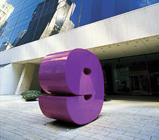
the icons of a city

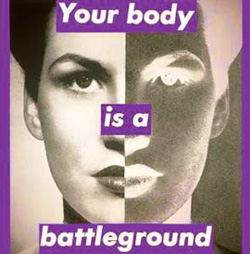
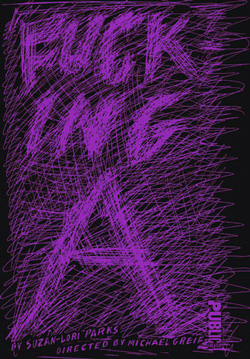
the essence of a poster

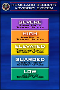
the signs that alert us

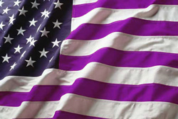
the colors of a nation

Red is essential. Red is strong. Red is harsh.

Red can’t be softened.
Maintained through our ADV @ UnderConsideration Program
ENTRY DETAILS
ARCHIVE ID 2140 FILED UNDER Miscellaneous
PUBLISHED ON Nov.13.2004 BY Armin
WITH COMMENTS
Comments
JonSel’s comment is:

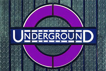
Maybe the Pentagon should look into this trend. I'm sure war would seem much more positive if our soldiers bled purple instead of red.

I can see 10 years into these kids' future. "I don't understand why I didn't get into Harvard. All my F's were purple, not red! I thought that meant I was improving."

ROYGBIV becomes OY GBIV. Oy indeed.

On Nov.13.2004 at 05:49 PM
lauren e.’s comment is:

As the sister of a third-grade teacher, I've had the inside scoop on purple for years.

But I find this purple trend even more interesting in light of recent election-outcome maps (written about here onSpeakUp) where purple removes the harshness implied by The Red States vs. The Blue States.

Overall, I think red will continue to stand for all those things we typically associate with it: Red is passion, love, danger, blood. Red is Little Red Riding Hood. Red is Communism. Red is Mars. Red is PMS 180. In this day of touchy-feely policital correctness, the use of purple to 'soften the blow' will only enhance the power of red.

On Nov.13.2004 at 05:52 PM
Gunnar Swanson’s comment is:

Like so much else that comes out of the self-esteem factories of our universities’ “education” programs, this is based on a basic misinterpretaion. The teachers may see red as aggressive or insulting and other colors as milder but that’s because their papers were graded down in red. If they’d written their assignments in red then black would have been the color of insult. Red may be traditional for paper marking but its utility is in its readability and contrast with the pencil, black ink, and laser printer toner of the assignment being marked.

Red is not insulting in and of itself. It is what linguists call an unmotivated signifier. The relationship between the signifier (red ink) and the signified (acknowledgment of inadequate school work) is in tradition/common use only. Had their teachers marked their papers in lavender they would find that to be the insulting color. If their paychecks came with a fifty dollar deduction for silliness and the i in “fifty” were dotted with a little flower they’d think daisies were a universal symbol of oppression.

On Nov.13.2004 at 07:30 PM
blair’s comment is:

Red is life. Red is death.

As an adjunct typography instructor at the local community college, I feel red is essential for grading, I love the fear it evokes. During our class critiques, I always have an uncapped red pen ready to rip apart my students’ work. Everyone cringes at the sight of it, and the gasps of disbelief when I start marking-up their layouts is music to my ears.

During my training weekend, the college tried to persuaded the new batch of instructors to grade with purple or green for all the same reasons you mentioned Armin, soften the blow and whatnot. I did use green ink for grading during my first semester. I didn't feel the class took me seriously, and didn't follow through with my suggestions. Next semester was totally different; true, it could've been my experience level increased, or a better class chemistry. But the red ink flowed pretty heavily, and I know I got better results.

Call me a sadist if you want but red is a powerful teaching tool. A bloody looking paper now will look better than a pink slip later.

On Nov.13.2004 at 10:48 PM
ahrum’s comment is:

Yeah, okay, but primary red is the loudest possible color on a black and white document. Not to take sides or anything, but I bet this movement has as just as much to do with the visual impact of red on black, even before we get to considering the color's signifiers. Overly cautious, for sure, but I bet a lot of those teachers just don't like red being the color of their voice.

On Nov.13.2004 at 10:49 PM
bDuffie’s comment is:

Being a current student, I wish my professors would use more red in their grading. It is hard to tell where mistakes are occuring if they arent' marked. What is the value in critique if it isn't covered in red? And it makes receiving a layout marked up in red from a real client or art director all that much easier to take. I have yet to hear about purple in the "real world".

On Nov.13.2004 at 11:59 PM
Rob’s comment is:

So, political correctness befalls even the grading of papers. Red is a color of action. It's loud. Brass. It gets to the point. It's wrong. It's dangerous. It's hot. It clearly commuincates its message by merely appearing in a certain context. Hence the reason you will seldom see if used in financial services marketing collateral. And the reason it's the only color I would ever use in grading any paper.

And if any of my kid's teachers give my some load of psychobabble about other colors being friendlier to my kid's ego or esteem, I will simply say, red instructs them that the world is a harsh and difficult place. There is no nice. And if you are wrong, you need to learn what is right. And the only way to do that, and make it really stand out and be remembered, is put it down in RED

On Nov.14.2004 at 04:01 AM
Jonathan Baldwin’s comment is:

Mmm... aren't we missing something here? Two points spring to mind.

Firstly, red is used for all comments, positive as well as (hopefully) constructively negative. So an 'A' paper could have as much red ink as an 'F' paper. It's used to distinguish the teacher's comments from the students and as students write in a range of colours (but never, it seems, red) then red it is. We use red for marking up corrections on proofs for pretty much the same reason - ease of recognition.

So there's no symbolic link between red and failure. Red should be linked to success as well. And 'okay' too.

Secondly, if the images displayed were normally produced in purple rather than red, then no one would notice because the concepts described (danger, authority, patriotism etc) are arbitrarily linked to the colour red. If purple had originally been chosen for the US flag, then purple would have the connotations implied, not red. The same goes for 'purple alerts' rather than 'red alerts'.

Red "means" nothing. If it did mean all those things then why do my red shoes not spark security alerts or fits of anger when I walk down the street? Why does entering a red room not fill me with fear or pride in my country? And why can I look at a US flag, which uses the same colours as the British flag, and not feel the same attachment to it? Why does the US flag still look like the US flag in black and white? And why can someone feel patriotic without having their flag in front of their eyes? It's because colours (and symbols) have no meaning in and of themselves...

But why does red "mean" failure when it shouldn't? And isn't the idea of changing to purple actually a rather clever one when you think about it? Because it's deliberately saying "this link between red and failure is stupid, it's making people jump to conclusions, it's potentially damaging educationally because instead of seeing constructive criticism and praise people are immediately assuming all is not right and focussing on the judgement rather than the critique."

Go ahead, change to purple. It's not the point. I think the focus on the colour change here is missing an important educational issue, which is: what are teachers' comments for? Not to criticise, not to instill fear, and not to blindly praise, but to develop understanding. But as students often do see a paper marked up in red as a bad thing, then why not change the colour if it means they will actually read the comments? And teachers who focus on turning students' work red as some sort of power trip, or shy away from it in case it hurts the student are really missing the point so getting them to change colour should (hopefully) get them to reflect on what they're doing.

I know some of my students want lots of comments. Some need specifics because they learn in a way that requires explicitness, while others will get the same out of a few queston marks and exclamation marks nd a couple of lines at the end of the essay. Others need verbal feedback. Because all students learn differently a conscientious teacher should use the red/purple/green pen appropriately to the student, not to themselves.

The day I get a thrill from reminding my students who's in charge and reach for the red pen as the only means I have of doing it is the day I'll retire.

On Nov.14.2004 at 06:20 AM
Jonathan Baldwin’s comment is:

I have to say I've never red a more depressing bunch of comments, particularly from a bunch of people who by their very presence here must be rather more visually literate and therefore open to the significance of the idea behind the move to change colours...

"There is no nice in the world"?

Links between red and damnation are just "psychobabble"?

"Life is hard"?

Using red is the only way to tell someone they are "wrong"?

Blimey, what a pessimistic bunch of people we are today. And aren't these comments proving my earlier point? Nobody really appears to have thought that teachers' comments can be supportive because there is some bizarre link in the mind that red equals bad, danger, hot, mistake. Presumably you'd suggest a teacher changes colours when praising? Or should teachers only ever criticise?

Call all this "political correctness" and "psycobabble" if you like but that, to me, is just a lazy phrase - the sort that used to get clever people burnt at stakes because it was easier than trying to imagine a world that was somewhat different from the one you imagine you're living in; language that allows you to ignore the more important point about the purpose of grading.

Thinking about all the research that's been done on assessment in the past few decades (including my own) there does appear to be a siginifcant problem in student attitudes towards assignments. Basically the prevailing attitude is that there is 'good' and 'bad', 'right' and 'wrong' with no amount of explanation to differentiate the different shades of grey (or purple!) in between.

But it's not the students who are to blame for this, despite what we may think. It's us. It's the way we set up assessment in such a manner that gets students (and us) to focus on the grade and not the reasons for the grade.

I could go on but I won't... ;-)

Life may be hard, but is there any reason to add to that? Don't we make our own crosses here, instilling this bizarre philosophy in our children and students and then wondering why the world is so damned miserable? Teaching used to be an idealistic profession, and here we are making it about being telling people the harsh truth - you'll never amount to anything so you might as well give up now. Screw or be screwed.

Seems to me the guy in the White House is a great advertisement for that particular system. Maybe a bit less red and a bit more purple would have been a good thing there?

Teaching is about support, not damnation. A student who fails one week may succeed the next - with the correct support and feedback. But not if they are made to feel condemned to fail for all time.

It's not political correctness - it's sound pedagogy.

On Nov.14.2004 at 06:44 AM
Greg’s comment is:

Hmmm... I think we're hard up for things to be enraged about on this ol' website. Teachers grading in colors other than red? Shocking.

I don't, however, disagree with the premise that red is a color with some meaning attached. I actually discovered that teachers don't grade in red a week or two ago, when I saw my wife grading her second graders' math papers with one of my blue sharpies. I asked her about that, and she said that it was something they'd done a study on, and found that red ink was a self-esteem breaker rather than a self esteem builder. The reasoning being that ANY color that would be consistently used to mark failure would be associated with that failure. She said that they were taught in college to use many different colors to grade papers.

I think it's important at that young age that egos aren't bruised. There are a lot of special needs kids out there that if told "that's the way the world is, suck it up," they will just quit. What a ridiculously dangerous philosophy to have, and to teach to kids! That's like saying "it's ok that the world is hardnosed and unfair, don't try to fix it." Sure you have to deal with failure and loss, but if there's a way to teach that to children where instead of just feeling bad about that loss they do something about it then great! Kudos!

On Nov.14.2004 at 09:57 AM
Rob’s comment is:

Firstly, red is used for all comments, positive as well as (hopefully) constructively negative. So an 'A' paper could have as much red ink as an 'F' paper.

But isn't interesting to note we rarely remember the positive comments in relation to the color red? And as I said in my earlier comment, red takes on meaning via the context with which it has been used and defined by society.

In the US, that implies:

Red in a finanicial report - negative numbers (lost money).

Written: The company once in the black with positive sales, spent the last quarter in the red, driving it's stock price down.

Red on a stop sign:

English: Signals that one must halt the motion of their vehicle at an intersection so as to avoid hitting other cars coming into the same intersection.

Dynamite is wrapped in red indicating the inherent danger.

This is not depressing as Jonathan put it. It's how we in the US have chosen to define the use of red. Jonathan says some bizarre link in the mind that red equals bad, danger, hot, mistake. I don't think the link is bizarre at all. It's our reality. When we think of fire, don't we think of red. Even though fire is a mixture of many colors, from yellow to green depending on how hot it is. Red in nature can be dangerous, hot lava, or attractive, a cardinal.

I may have mispoke when I used the word psychobable, for certainly the implication of the color red in terms of educational success or failure skews toward the negative side by most involved in this discussion. And while I'm all for empowering students and encouraging postive reinforcement, it is really not the way our educational system has evolved. And not our overall society as well. While we celebrate the extra-special, we somehow overlook the every day successes and seem bent on using the negatives in life in an attempt to inspire more positve outcomes. (Learn from your mistakes, another cliche). Why isn't it, "Learn from our successes and our mistakes"?

So there's no symbolic link between red and failure. Red should be linked to success as well. And 'okay' too.

Clearly, this statement is just wrong. It would be nice if it wasn't, but I think the facts show that there is as far symoblism goes, the color red is linked to the negative more often than it is to the positive.

On Nov.14.2004 at 12:41 PM
Randy’s comment is:

Basically the prevailing attitude is that there is 'good' and 'bad', 'right' and 'wrong' with no amount of explanation to differentiate the different shades of grey (or purple!) in between.

In the eyes of an infant, red will be a lovely 50% grey—how appropriate.

As others have pointed out, red is a choice based on its function and ability to be easily distinguished from black text on white paper. If it were black text on red paper, I suppose I'd use a white pen. At that point someone would argue that my marks would be divine or some nonsense.

The notion that the meaning of red in the context of patriotism, war, love, etc. has a profound effect on the reaction to grading and proofreading marks is grosely out of proportion in its influence on the scenario reported by Armin.

Does red carry meaning? Of course it does. Is that a subconscious association that is somehow a part of a student's reaction when receiving a grade written in red? Probably. Does that association have a negative effect on the students ability to process that feedback, learn something from it, and apply to that to future experience? I mean to ask, does the student somehow learn less because of this? I say no. If anything, it has a positive effect on the learning experience. Everything need not be candy-coated, politically-corrected, diffused communication.

Invigorating discourse. A+

On Nov.14.2004 at 12:55 PM
Adam’s comment is:

Yes Randy.

There's enough ambiguity, uncertainty and doubt in the world-- why should we add another layer of complication on to something as simple as communicating that a mistake has been made. Let's point out that something is wrong when it is wrong, and not pussyfoot around, passively implying that "Yes, you are wrong-- but hey-- it's not a big deal, let's not get too worked up about it."

On Nov.14.2004 at 03:23 PM
Dan Reynolds’s comment is:

Red IS all about context though (although I don't think that we can change our own context). In China, they have a few different associations for the color red. For instance, on the Chinese stock markets, when a company's stock price increases, it is listed in red (not the other way around, as in most western markets).

On Nov.14.2004 at 03:45 PM
Armin’s comment is:

> but if there's a way to teach that to children where instead of just feeling bad about that loss they do something about it then great! Kudos!

And purple markers do that?

> So there's no symbolic link between red and failure.

More from Leatrice Eiseman, Director of the Pantone Color Institute:

"A lot of studies have been done that show how colors influence people, and red signals danger and warning, and anthropologists have found this has been true down through the ages."

Granted it doesn't mention "failure" specifically, but many of the connotations associated with red along with danger and warning is that of being wrong. Picture any game show on TV, when time runs out or contestants get an answer wrong a red bulb invariably lights up.

> Secondly, if the images displayed were normally produced in purple rather than red, then no one would notice because the concepts described (danger, authority, patriotism etc) are arbitrarily linked to the colour red.

Well, yeah… But they are red for a reason. Purple does not have the "physical" power of red. Nor the symbolic power of red, which carries centuries of associations that we assign to it to this very day. Each culture differently, as you illustrate in the British/American flag example. Perhaps something closer to home?

> I think the focus on the colour change here is missing an important educational issue, which is: what are teachers' comments for? Not to criticise, not to instill fear, and not to blindly praise, but to develop understanding.

Jonathan, I do like how you are looking at this, more optimiscally and less sarcastically than me for sure. My concern is that America is already a "sensitive" country, things have to be soft and cuddly whether it is politics, economics, racial issues, war and now education. First they ban dodgeball, now they ban red pens. This does not help to develop understanding, it is more of a dumbing down of reality.

> … is grosely out of proportion in its influence on the scenario reported by Armin.

But it got us an A+!

On Nov.14.2004 at 05:26 PM
Gunnar Swanson’s comment is:

“and anthropologists have found this has been true down through the ages.”

And how are we to understand this? Ms. Eiseman believes that there have been anthropologists through the ages or she believe that anthropologists are the best sources of historical research or that when “color specialists” say something we should trust it as much as when teachers say “there was some study”?

But they are red for a reason.

They are red for a few reasons but most of them are similar to the reasons that you’re named Armin and I’m named Gunnar—some direct cultural associations, some luck of the draw, and almost nothing in the way of natural, inevitable associations. Is there significance in the fact that Jonathan spells it colour and I spell it color? Yeah. Does the choice affect how anyone reacts to color? Nope.

If American money were pink and the US flag were magenta, orange, and gray then some of the associations we have with green and with red, white, and blue would be associated with those colors. If the bully who beat you up everyday after school wore lavender cologne that smell would make you want to throw up. If Pavlov sat on a whoopie cushion before he fed his dog the dog wouldn't care one way or another about bells but would salivate if you farted.

So if you use blue ink to write “Why do you take up air that could be used by a worthwhile human being, you weasely little loser?” across the homework of a kid and use red to print “What a stud! I long to be even a bit like you” then people would tell you that red is the color of positive passions and blue is the color of cold thoughts and toilet bowl cleaner.

On Nov.14.2004 at 07:08 PM
Jason T’s comment is:

In some cultures, white denotes death. In others, red is celebratory, and brides wear red on their wedding day.

Color carries meaning depending on culture—and so many other factors contribute to its significance, either positive or negative. Gunnar starts us on the right path, the semiotics of color will help us understand how, why, where, and when colors carry meaning. I for one, would like to hear more from that angle. Let's take purple apart from a semiotic point of view; look at red beneath its surface.

On Nov.14.2004 at 07:34 PM
Valon’s comment is:

What a great post.

It's very coincidental that just recently I was working on a personal study on the relationship between countries with red in their flags and their level of aggression in military terms. And arbitrarily most countries throughout the history with red in their flags have been either occupiers, colonizers, empires, or all of the above.

Not to drift away from the topic, but even if color purple will be used for the next 100 years, it will never get the same attention as will color red. Unless Blood or Fire change their colors over time... In other words I think that our senses respond to colors based on their relationship to things in nature ~

blue (sky) = calm

nature (green) = soothing

fire/blood (red) = life, aggression, blood, passion...all that good stuff

On Nov.15.2004 at 12:05 AM
Armin’s comment is:

> some direct cultural associations, some luck of the draw, and almost nothing in the way of natural, inevitable associations.

That's where we disagree Gunnar, and I really don't intend to change your mind about it. I believe — and this is more liefy-philosophical than design related — that things happen for a reason; I do acknowledge that the meanings associated with red are mostly beacuse of cultural associations and luck of the draw, as you say, but I don't believe they are inevitable. Certain things demand certain associations. Of course, this is impossible to prove, we would have to start — right now — using, say, lavender on our stop signs, radioctive logos and flags to see if three hundred years from now lavender is associated with danger, power, passion, etc.

> If Pavlov sat on a whoopie cushion before he fed his dog the dog wouldn't care one way or another about bells but would salivate if you farted.

But he didn't (although that would get a lot of laughs at class)… how would you (me or anyone) know?

"What if's" are easy to conjure but hard to corroborate.

On Nov.15.2004 at 09:09 AM
Gunnar Swanson’s comment is:

Armin—The radioactive logo is usually yellow. I don’t remember ever seeing it in red. Is that an indication of the powers of red—it should have been red, they just screwed up—or an example of how any color bright enough to catch attention and stand out from most backgrounds does just about the same thing?

I once went to a lecture by a guy who did urban art installations that used a lot of black and yellow striped tape. The audience (an Orange County artists’ club) ended up in a discussion about how the brain must be hard wired for fear at the black and yellow pattern and that research must have decided that exploiting that for caution tape would be effective.

Red ink on papers and stop signs and yellow striped tape around open pits and crime scenes all take advantage of bright color and hues that are relatively uncommon in our human-made environments (thus get noticed) but the meanings are learned. If one meaning can be learned then a differnt one could have been.

I don’t dispute the idea of natural associations. It’s just that they are not universal and overriding. The Maya didn’t like gold (it’s said they thought it was the color of dead plants) and valued jade. If that naturally inspired cultural take weren’t more learned than hard wired, the Aztecs and the Spaniards were freaks with screwed-up circuitry.

All the research says that fluorescent yellow-green fire trucks get seen better and get into fewer accidents than red ones but firemen like them red. I think maybe they just like their jobs more than teachers like theirs.

"What if's" are easy to conjure but hard to corroborate.

In the case of Pavlov, the whole point of the experiment was that the stimulus was arbitrary and learned. Noting mystical about a buzzer and a whoopie cushion wouldn’t damage canine self-esteem.

On Nov.15.2004 at 04:21 PM
Armin’s comment is:

> The radioactive logo is usually yellow.

Gunnar, my apologies. I meant the biohazard logo that's on those creepy waste baskets at hospitals. (Incidentally, the biohazard icon is also used in yellow).

> Nothing mystical about a buzzer and a whoopie cushion wouldn’t damage canine self-esteem.

Nothing indeed!

On Nov.15.2004 at 04:32 PM
Gunnar Swanson’s comment is:

Armin—I’m sure it’s all generalized as Waste of Mass Destruction these days.

On Nov.15.2004 at 05:51 PM
Sholom S’s comment is:

On Nov.15.2004 at 05:55 PM
danielle’s comment is:

It doesn't seem to have been mentioned yet, but in addition to the associations of red to its application, there's a physiological effect of red on the body. I think the one class I paid more attention to than any was color theory, and the one color the instructor talked about the most was red. I actually kept my notes from years ago:

"When we see primary red, the pituitary gland tells the adrenal glands to secrete epinephrine. This causes the body to go into a state of arousal Emotions such as excitement, fear, and anger are enhanced by this secretion....Red can complicate some situations by increasing blood pressure." and on, and on.

Years ago, they used red blankets in the army to mask the blood of wounded soldiers. The effect was counterproductive since the soldiers freaked out much the same way the students do with grading criticism.

So why are students forming complexes after seeing lots of red corrections? I'm sure it's mostly about the psychological association, but the physiological effects don't help (of course, it could be vice versa if the teacher is using a paintbrush instead of a .05mm ballpoint pen).

What's the best solution, if there really IS one? What about getting a green pen and marking a note of commendation? That way a student deducts "you're doing good work, but there are a few things to work on" - instead of - "your work is full of mistakes" and concluding that they are a failure. What about rotating colors, using a new color each week?

After all, they started out their school years with a box of 64 colors!

On Nov.15.2004 at 06:35 PM
danielle’s comment is:

That way a student deducts "you're doing good work,...

-10 points. Correct word is "deduces"

haha, sorry!

On Nov.15.2004 at 06:38 PM
john logic’s comment is:

"Raising a purple flag."

"Better purple than dead!"

"The angels want to wear my purple shoes."

In skool daze red got my attention, forced me to refocus, and if my feelings were hurt i can't ever remember that being the case.

In the present day red marks on layouts are easier to read, don't make make me tiptoe around writing "make the logo bigger" in purple. Pleez.

On Nov.16.2004 at 05:33 PM
Bryony’s comment is:

Red is good and bad, a chosen color for many flags and for many warnings. Personally, I love red. To me red is the beginning of something good. As I read previous comments, I begin to realize that each individual sees red in a different way. And I don’t mean darker or lighter or whatever. The reason I see red the way I see it is due to my parents, my siblings, my teachers and my experiences. When I was in school I remember looking forward to my documents becoming red with comments and markings - this was the beginning of something that could become really really good. It also meant that somebody was paying attention. Somebody cared enough to look at the details, think of some alternatives and possible solutions, or provided a few suggestions.

All of this, of course, has to do with the way I was raised. Never did I hear red was bad in my house. It was always good. A happy face sometimes helped, or a cute star, but in the end it all simply demonstrated a growing process.

On Nov.18.2004 at 02:08 PM
Michael H.’s comment is:

To start off, I agree with Armin. They should keep the red ink. Where I worked last, our Editorial staff made their (proof-reader) marks in green, purple, blue, black... and seldomly red. When I inquired about this (2 years ago) I was told red is percieved as being hostile. I took that as "egotistic/sensetive designers over-reacting" and messing up a perfectly good system.

Red is for corrections. Simple as that.

Danielle was in the right track, there are psychological reactions to different colors. Here is a great study completed, where individuals were placed in red rooms. Red rooms! No other color in sight. Do you know what happened to the individuals in these rooms? It's a lot like what Danielle described, but follow my link as it's very enlightening.

On a side note, you ever wonder why the seats on children's school buses are that ugly green? To sedate the kids so they don't start acting up in a metal barrel weighing over 10,000 ilbs. traveling up to 55 miles per hour with no seat belts.

Red is a stimlant, green is a relaxant.

On Nov.19.2004 at 12:23 AM
Bryony’s comment is:

Red is a stimlant, green is a relaxant.

And which one is, may I ask, the one we wish upon our students?

On Nov.19.2004 at 12:03 PM
Armin’s comment is:

Red!

On Nov.19.2004 at 12:06 PM
Michael H.’s comment is:

Hahaha... yes, red. I really don't think the red ink is the real negative connotation with failing grades. I think it's the fact that they are failing grades. If they want to change the grading system so it's more constructive, they'll need to do something bigger than use purple ink.

On Nov.19.2004 at 08:15 PM
Jane C’s comment is:

Here is a great study completed, where individuals were placed in red rooms. Red rooms! No other color in sight. Do you know what happened to the individuals in these rooms? It's a lot like what Danielle described, but follow my link as it's very enlightening.

What, that there was no significant difference between them?

On Nov.25.2004 at 07:01 PM
Michael H.’s comment is:

> What, that there was no significant difference between them?

Jane, with that kind of vague comment I can only guess at what you're trying to say. It sounds like you're saying that I'm saying the same thing Danielle was saying. In fact, I was providing supplimental information to further the point Danielle was making, with a scientific study containing substantial documentation reinforcing Goldstein's theory of color. That kind of thing usually goes a log way.

If I'm wrongly interpreting your comment, feel free to come back here and clarify.

On Dec.01.2004 at 12:36 AM
Jane C’s comment is:

Hi Michael,

Thanks for your reply. I certainly appreciate scientific proof where it applies but that study concerns me. The small sample size, the fact that the experiment only performed once, and perhaps most importantly there was no 'blinding' of the subjects (by putting each subject in all 3 coloured rooms the aim of the experiment is made clear to them and this can bias the results - people do tend to try to give you the result they think that you're looking for!) all reduce the power of the study. Just look at their own conclusions - " the results of this study are inconclusive to differences between red and green", "there were no significant differences found for the main hypothesis, of red versus green environments ". Talking about a "trend towards significance" is meaningless as there is *no* mathematically significant difference to be drawn from the data.

On Dec.11.2004 at 07:58 PM
delaina’s comment is:

the color red is linked to the negative more often than it is to the positive.

Perhaps it is more often negative than positive, but red is ALWAYS used for stimulation rather than relaxation. Compared to purple, the wavelengths of red scatter much less when bouncing off an object and toward the human eye. This is why red stands out, and purple does not. So red cannot be painted with a wide brush of negativity. In some contexts, such as heartsand valentines and rosy cheeks, red is a positive color.

On Jan.27.2005 at 06:22 PM
aspAddict’s comment is:

When I first heard about this, I had to check my calendar to make sure it wasn't April 1st again. My personal belief is that we are worrying too much about coddling today's youth for fear of damaging their psyche.

How much more damaging is it going to be when they get out in the REAL world and perform poorly on the job, only to get fired instead of a pat on the back? Red marks on a paper (in my day, anyway) meant that I had screwed up. I got something wrong. I probably wasn't paying attention in class. It motivated me to do better and get fewer the next time, and up until high school (when my LOVELY doctors decided to put me on barbituates) it worked. I ALWAYS had good grades, thanks to my aversion to the dreaded "red marks of doom".

We have governments and countless other institutions telling us that we can no longer spank our children, that we have to talk to them when they act out rather than punish them, and now the teachers are being told not to use tried and proven methods that have worked for years. Keep in mind, these children are going to be the leaders of tomorrow - they are going to run this country, and I'm honestly afraid that if we continue to shelter them and try to convince them that the world is a place full of gumdrops and sunshine, where even the failing children are allowed to succeed, then we are in for a very sad future.

On Apr.05.2005 at 12:45 PM
Tori’s comment is:

As a 10th grader that is both a perfectionist and a very lazy person, when I get back a bad grade on something I get upset because I was stupid or lazy enough to get a bad grade. The marks on the paper may be annoying, but only because I know I screwed up that many times. It has nothing to do with the color red.

After all, a big, fat and red A+ is nothing but great. Don't hate the pen when it's your fault you didn't do something right.

On Dec.08.2008 at 08:32 PM