


Surprising those two men, who were publicly naked and privately linked, wasn’t part of the plan. My aim was simply to challenge the rules. If this included a walk in the park at night, so be it. I had enough of those warnings. I was tired of being afraid. As the sun was setting nature beckoned. What I discovered in the deep woods of Brooklyn’s Prospect Park were brothers in arms, quite literally, who heard a similar call of the wild.
It’s a perverse lifestyle.
I speak not of the young lovers, but of myself. The goal is to move forward by living backwards. I boycott the news to feel less afraid, and consequently more aware. I live without health insurance, yet in the best shape of my life (by redirecting insurance money to yoga and basketball). And unlike most of my friends, I dream of owning nothing.
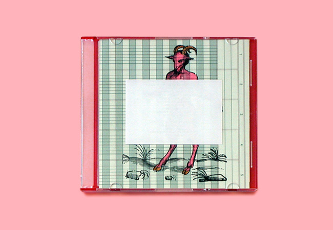
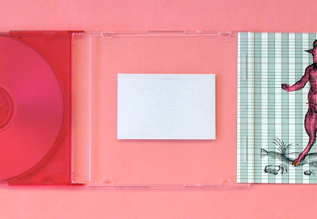
CD ONE: Here is a satyr, fluorescent pink, sporting an erect penis (trust me on this one). Made by Field Study’s Matthew Peterson, initially for his sister. Designed for a girl who is discreet about nudity. An incongruity, you ask? Perhaps. The image itself is quite attractive, but the functionality of the design is brilliant. You see, a white rectangle sticker on the inside front cover contains the song list. This clothes the satyr, so to speak. Phew. In order to read the song list, however, one must pull out the insert, thus exposing the penis.
REASON TO KEEP: Inspiring design and peep show, all in one.
It’s hard not to own anything in America.
It’s hard not to own anything in America, especially if you live in a big house, in the suburbs, and like to shop. The bigger the pan, the bigger the pie. This is my family. Their overstuffed life equals success to them, suffocation to me. If a house I must buy, it will be no bigger than the punch line of a tornado joke: trailer-sized. Luckily, I don’t live in the suburbs. My perverse lifestyle, like most, started in New York City. It grew profoundly in the last four years when I moved eight times. True. (All of which occurred in Brooklyn). There’s an inverse relationship between material and motion. The more you have, the less you move. Or, the more you move, the less you have. After all, you don’t find a piano in the marching band. Mom, the mathematician, fractionalized this sentiment by stating, “Every move is like having a fire: it cuts your stuff in half.” Each time I’d ask myself, “KT, do you really want to lift that heavy box of records when you don’t even own a record player?” And poof, it was gone.


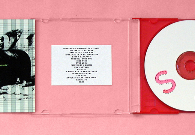
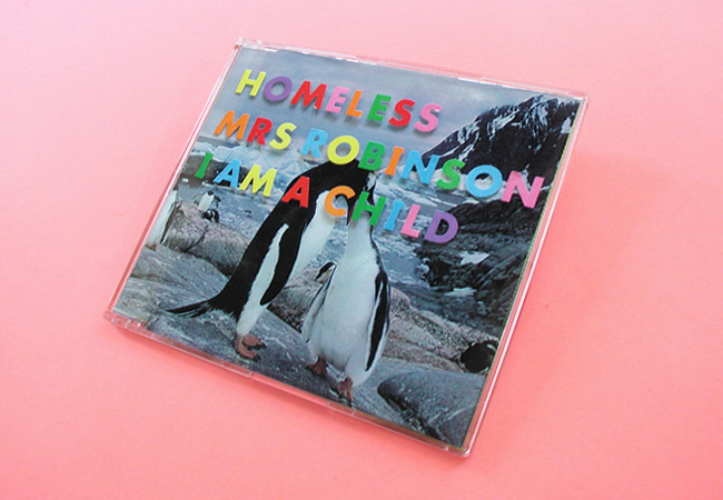
CD TWO: Bob Dylan, compiled from a set of outtakes from his Blood on the Tracks sessions. Always a good theme: the dead bird (cover), who has fallen prey to some lip-licking cats (tray). Cage lines from tray peek through to front which relate nicely to the line art. Disc painted acidic yellow and “NYC,” stenciled in white, atop. On the back cover are genotypical groupings of dead birds that list track names.
REASON TO KEEP: Design is stronger than the original. Sorry, Mr. Dylan.
In a place that wants to super-size you, as Morgan Spurlock discovered, I’m compelled to simplify. A preoccupation that is admittedly porous. You see, I often break the rules I’m breaking: I lied about the records. That bundle of bricks remains at the bottom of a storage closet. Momentary justification: it builds muscle. I need strength, as music is my weakness. And in the early moments of downsizing, I had difficulty slimming down my cd collection. Problem: they took up too much shelf space. Solution: recycle the plastic sheaths and place the naked discs in a binder. Resistance: cd’s are oh, so attractive, whereas binders are not. After all, my career launched the moment my eyes lunched at the record store. It was 1984. No, not Van Halen — an Elvis Costello cover. This kind of graphic fulfillment continued in college: Tortoise’s use of varnish on a school of fish caught both the light and my eye. Exciting. Moreover, Stereolab designs were like opening a box of Cracker Jacks: eco-friendly cardboard containers, including a surprise in the packaging. Who was that designer? Even a weak design — Jonathan Richman’s awful 80’s collage on the cover of the Beserkley Years — resisted recycling. Perhaps it was those puppy dog eyes?
Alas, sentimentality always gets in the way of simplicity.
Eventually the cd’s received the same torture as my old mix tapes: dismemberment. And when they broke down (into piles of plastic and paper), so too did I. In the end, the simple life won. My music, like the elderly, now retire — in “Caselogic” groups of 60. (Where was Muji then?)
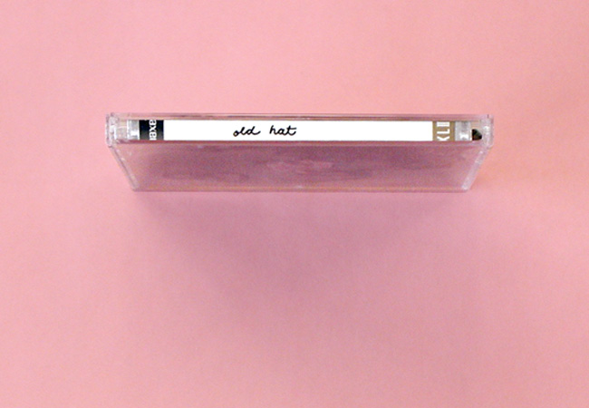
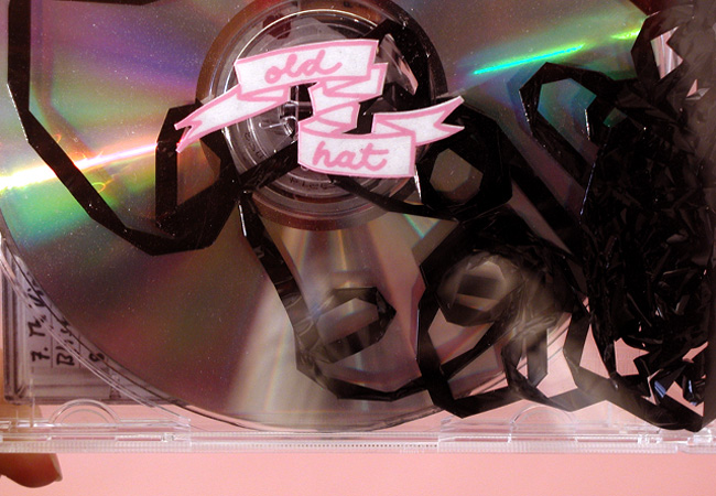
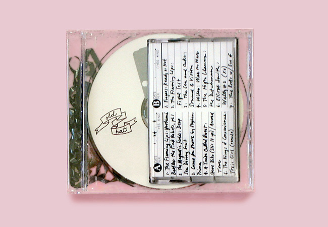
CD THREE: Old Hat; mix tape turned into a mix cd. Actual analog tape fills the cd plastic tray.
REASON TO KEEP: A great idea! Video kept the radio star.
For those who wear white headphones, it’s actually easier today to own less. iPods can digitally store up to 10,000 songs (a fact researched by one who has no white headphones). Ironically, the new music collector has no (physical) music collection. Translation: owning digital music is equivalent to owning nothing at all. A sentiment I can support. But do I? Not entirely. I was born with a smile that is wide and a surname that is Meaney; therefore, contradiction is my constant companion.

CD FOUR: Hip-hop mix. This design is strictly typographic. Matt plays off of the transparent cd case. All text printed on clear acetate, bands in the reverse of song titles, sharing the same baseline. They mirror each other. So, type is read when case is both open and shut.
REASON TO KEEP: Thematically, the design plays off the word “word”. Word!
Digital music is naked. So as the “course of industrial history has taken us before, the notion of decoration [is] becoming more and more distinct from the overall plan of production.”1 But, that notion of decoration is effectively package design. And when you take away the container that holds the music, you lose design altogether. Which begs the question:
CD FIVE: Remember, the container that holds the music is indeed a container. Fill it up: blue paint for Valentine’s day — makes sense? Insert is a grid of perforated squares — bands on front, songs on back — to eventually be torn apart (like you and your valentine).
REASON TO KEEP: No reason; unless you enjoy paint seeping out and staining your hands. Thanks, Matt.
How important is design to music? The explanation lies where I lie: in the apartment of a conga drummer. When my friend Brian is on the road, I reside in his Cobble Hill home, amidst a healthy collection of music. A misused adjective, perhaps, but the music keeps me feeling good. The bedroom comes furnished with an old, and, when I live there, dusty record player, surrounded by some old and dusty records. Most are stacked on shelves; some on the floor; others are stacked on the stacks. A Felix Unger nightmare. Though alone, I feel quite surrounded by people: I wake to see Keith Richards whispering in the ear of Mick Jagger (on the cover of the Rolling Stones’ Black and Blue). I mutter profanities while exiting the bed (my morning exercise), and notice the same expression manifest on the Court of Crimson King cover. At this hour, my company loves misery. And at night I put on Simon and Garfunkel, stare at the typography on Ole Coltrane — Olé! — and sing out loud, “Hey, I’ve got nothing to do today but smile, do de do, do de do.” I’m happiest right before sleeping. (Bri, I was tempted to shatter a rock star’s image and cite your Sound of Music record but sympathetically reconsidered.) Those 12-inch cardboard cases work! They inspire. They label. And for fading memories like mine, they link: I see four fellows crossing the street, front one in white, and think Abbey Road. Here I hum, “Here Comes the Sun”. Compare this to a digital file, like the recently downloaded Damien Jurardo mp4. I’ll listen to it a hundred times and still wonder, “Who is this, Palace?”
Digital music sticks in my computer’s hard drive without sticking in my human hard drive. For me, it’s a game of concentration without cards.
Let’s recap, html-style: life without excess < good > life without music < bad > music without excess < good > music without design < bad >.


CD SIX: Mix-zilla! Disc acting as a rotary dial. Song titles are matched up with corresponding musicians. Bonus: when revolving, die-cut on back exposes a new series of images.
REASON TO KEEP: It spins!
I believed in this Bauhaus notion until I befriended a present-day William Morris. Name: Matthew Peterson. Disposition: painfully shy. First conversation we had, Matt described his day gazing at pretty ponies (while gazing at his shoes) found on the My Little Pony website. Why? I wondered. Stet. Gay? I wondered. Gay? he wondered too, as I later found out. Apparently, we were heading “Uptown” with Prince. It’s where I want to be.
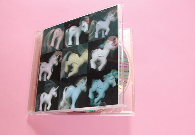
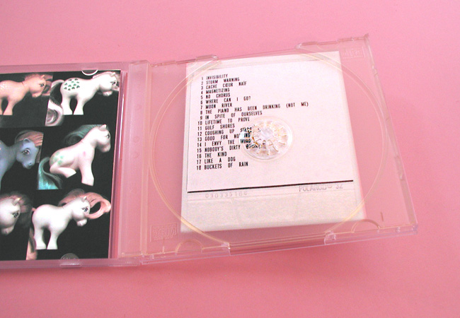
CD SEVEN: Pretty ponies collage. Inside cover displays the band (big pause) list. Tray includes a Polaroid picture with track (big pause) list, typeset exactly as band (big applause) list, then scaled down. The cd itself has a rainbow painted with marker (to keep up my suspicions, it seems).
REASON TO KEEP: 1. Awkward word-spacing. 2. Swiped images from the internet. Two reasons for designer jail-time. Both good reasons to stay indoors designing, which in itself, is an imprisonment of sorts. Why? You see, mix cds equal creative freedom. The client, your friend, will love anything you compose. After all, this is a gift. Therefore, no please-make-it-blue-because-that’s-my-favorite-color restraints apply. You can do anything here. And your audience won’t sue you. Here, Matt rejected all typographic rules of wordspacing. And those same kind of (word) pauses occur between songs — quite necessary when you line up Andy Williams singing “Moon River” near Dr. Dooom’s “No Chorus.”
Let the truth be told. Unlike Morris, Matt doesn’t reject of the “increasingly mechanized urban world,”2 he just has few friends. And, consequently spends undue weekends making mix cd’s. They fill the void. The results are hand-crafted objects of beauty made strictly for others, specifically his sister, and more recently, me. In the sitting room of my borrowed apartment, I live amidst an unlimited cd collection — all left here thanks to the new 10 googol-bit computer brought on the tour bus. I’ve noticed that cd’s are the pennies of our day. Once precious, now tarnished. Most sit logoless, colorless, imageless; used only to transfer and trade. Marked with markers and strewn about, burn side down without fear of scratches. No longer one-of-a-kind.
If all this is true, then why are there so many of us breaking our backs on Saturday? No, not from manual labor; rather a bad ergonomic chair. Is making a mix worth it, when this form of music is a thing of the past? The process is attractive, I gather.
In grade school, designers were artists. And, subsequently, cool: we could draw Garfield! Our interest in reading, however, prompted a professional path that combined text with image. Did we know the limitations beforehand? Did we know how hard it would be to work within creative compromises? (Did any of this really matter if you had some good tunes playing?) Lookeehere: the cd is that place for creative exploration. Showcase your design talent and show off your music collection. Hence, for those suffering from mix-making addiction, cd’s are priceless. It’s more like a penny saved is a penny burned.
Moreover, it’s fun. Order blanks from the internet, free of logos and full of color (on both sides no less). Then, find just the right plastic case. It’s so exciting, you might even get a chubby (ahem, a case that holds two).
CD EIGHT: Hand-lettered “Meow” on cd face. Beautiful orange-colored cd, bought online.
REASON TO KEEP: I’m a dog lover!
Time to design. Matt thinks thematically: One cd grouped beer songs together. “The Hymn for the Alcohol” by Hefner, “Bad Liver and a Broken Heart” by Tom Waits, “I Would Have Liked Me A Lot Last Night” by Arab Strap, were all on tap. Then take a trip to the brewery in order to fill up the jewel case with pretty green hops. Time to drink (it’s all part of the job).

CD NINE: Rainbow letters affixed to the top of the plastic case equal raised type. Colorful and tactile. Listed (listened) here are tracks one through three. CD is placed in the tray backwards so that the cd face can be seen from the outside.
REASON TO KEEP: “Hide it in a hiding place where no one ever goes. Put it in your pantry with your cupcakes.”
Just like those men in the park, naked music needs some clothes! Since the graphics aren’t included, designers make their own. It’s a white canvas with only two limitations: 5.5 and 4.75 inches. Plus, there is something magical in displaying under glass — er, plastic.
In over 6 months, I’ve received nine mix cds (some displayed here). All from Matt. And, much to my dismay, I can’t throw them away. I don’t want to keep anything, and here I have these keepsakes, in the form of cds — or, shall we say, dust collectors — stuff I will inevitably move a thousand times.
I still dream of owning nothing, but things are changing. I have my own apartment now, filling up with things again (mostly pennies — why must we roll them?). I now have health insurance (Mom, rest assured). I still walk in the park near dark, but now with Matt (we go back to the waterfall, where I first spotted the lovers, this time to say “boo!”). And, like Paul Simon, I get the news I need from the weather report.
Am I changing my tune? I wish. The problem is, I’m keeping it.
Notes
1. Ellen Lupton, J. Abbott Miller, The ABC’s of Bauhaus, The Bauhaus and Design
Theory (New Jersey: Princeton Architectural Press, 2000).
2. Ibid.
![]()
KT Meaney is a designer from Terms and Conditions;
Matthew Peterson is a designer from Field Study;
Together, they make nursery posters at www.therethere.us.
Beautiful.
The design and the prose.
I love the sentiment that you present here. Music (and the mix cd) and design being two of my passions, I instantly relate.
I am also a collector. More accurately, I horde. So I must ask how does one "own nothing?"
The mix cd's that you are so gracious to share with us are exceptional in their uniqueness. I am in love with the thematic aspects of them and the way that every part of the case is used to it's fullest potential (the cassette tape inside the case! the paint! the strategically placed tracklist sticker!).
Thank you for sharing. And stimulating. My brain is percolating.
On Nov.30.2004 at 09:38 AM