Speak UpA Former Division of UnderConsideration
The Archives, August 2002 – April 2009
advertise @ underconsideration
---Click here for full archive list or browse below
  
The New Competition

Every once in a while I notice a change in the competitive landscape. Here are a few examples:

1. TheKey is a new brand consultancy headed by Philippe Starck. Yes, that Philippe Starck.

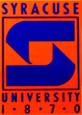
2. Syracuse University Athletics has recently adopted a new logo designed by Nike. “Syracuse is the fifth school to work with NIKE in its identity redesign program.” Here is one of the others for the University of Washington. “Previously NIKE has worked with the University of Oregon, the University of Miami and the University of Kentucky.” Wait, whuh? Nike has an “Identity Redesign Program?”

3. More ad agencies are forming branding groups internally to handle all of their clients needs. “Why would we send them somewhere else for something we can do?” Ogilvy’s Brand Integration Group (BIG) and Grey’s G2 both handle large scale branding work.

Competition can mean many things. Maybe your biggest client just hired their very first in-house designer. Maybe it means a new shop in what used to be a one-shop town. Maybe an existing, competitive firm just revamped their website. Maybe they changed their descriptor from “design firm” to “brand consultancy” and then back to “design firm”. Maybe you have no idea who your competition is.

How do you adapt to the changing competitive landscape in order to keep your existing clients and win new ones?

Maintained through our ADV @ UnderConsideration Program
ENTRY DETAILS
ARCHIVE ID 2180 FILED UNDER Business
PUBLISHED ON Jan.05.2005 BY David Weinberger
WITH COMMENTS
Comments
Chris Raymond’s comment is:

Two random comments:

1. Why on earth would a high-end branding firm like The Key set all of their copy in tightly leaded, all caps? Doesn't say much for their design skills when you can barely read the content, IMHO

2. Am I the only one to think big yip over the Syracuse "identity."? Really, did they need NIKE for this? Am I missing something?

On Jan.05.2005 at 10:45 AM
Jason T.’s comment is:

1. Is it just me or is The Key something like Dreamworks SKG?

Three masterminds come together.

2. Not much of a re- in that design, Chris.

They just carved a sharper lockup. It's been swooshified.

On Jan.05.2005 at 10:52 AM
Pete Ankelein’s comment is:

From my experience, you just have to constantly push yourself and not get complacent. If you build up a solid rapport with current clients and continue to meet their needs – or exceed their expectations, rather – then, more than likely, they will stay with you. If you just repeatedly crank work out that's less than steller in order to get things done and the client sees work from another person/agency that does it better....why should they stay with you? The same goes if you're constantly butting heads or making excuses. It's common sense.

IMO, it's about the psychology of the relationship. Personal attention to the client; going the extra mile to make them feel included in the process rather than like they're dealing with a big nameless agency. Quick turnover times. Little things like that can go a long way.

As Joe Dirt would say, "Ya gotta just keep on, keepin' on, man!"

Btw, I have to say this, am I the only one that finds Starck's "TheKey" and Ogilvy's (BIG) sites to look like someone's first Flash project? You'd think they'd want something as well-designed as their reps are wont to be.

On Jan.05.2005 at 11:15 AM
JonSel’s comment is:

Really, did they need NIKE for this?

I think that's exactly David's point in this posting. My assumption is that Nike doesn't charge much for this service (certainly not as much as a large branding agency) but sees it as a value-added offering to its athletic team customers to keep them in the fold. I can see the pitch: "Hey, we've been supplying you uniforms for a few years. We think you'll look even sharper in these new designs. And, we won't charge you much for it." University gets a better-designed identity and uniform, and Nike's products look better via the updated graphics.

So, back to the main question, how does one compete with this? Skill and experience? Certainly not cost. If branding has taught us anything, it's that price wars erode brands. Commodities have to work incredibly hard to re-establish an emotional link beyond being cheaply priced. Nike's always had a very good in-house design group. So perhaps it's time for a design studio to try to partner with Reebock or Adidas in selling services together. Your school gets a hot new uniform from Adidas with graphics from SuperDesign Inc.

Only companies that can support the resources to maintain a good in-house studio will be successful in ventures like Nike's. In the end, quality of the work will determine where the jobs (and money) goes. If Nike starts to turn out really bad IDs, then the opportunity opens up for someone else. Organizations have to stick to their core competencies at some point. It's the reason Kraft hires outside agencies for its packaging design instead of bringing it in-house. The money they spend on outside design is a lot, but the cost to achieve the same level of quality (yeah, yeah...) in-house would be more, both in hiring and oversight.

On Jan.05.2005 at 11:17 AM
Tan’s comment is:

I think Jonsel said it well — it's about providing value-added service for your client wherever you can. The truth is, in today's world, branding firms are creating ads and direct-mail campaigns too, once the territory of ad firms and CRM firms. How is BIG any different from the Fallon/Duffy union or the plethora of Omnicom/WPP/Interglobal Network agency relationships?

The larger world of network agencies is different than the stand-alone shops. The line between branding/design/advertising/CRM/etc. begins to blur, and all that's important is that the client and their products are managed, developed, and maintained from end-to-end.

And btw, I didn't know it was Nike that was responsible for the new UW identity. I think they did a terrific job — I'm not sure Landor or any other branding firm could've done better. It just goes to show you that Nike knows their market and have the capabilities to capitalize on that knowledge. Very impressive.

But keep in mind that Nike's internal group is unique in the fact that marketing and branding is a primary part of what the entire company is all about. It's a core competency. It can be argued that sportswear and shoes are just byproducts and vessels for their marketing work. Other in-house groups with the same capabilities that come to mind is Fossil and Herman Miller.

On Jan.05.2005 at 12:49 PM
Tan’s comment is:

Come to think of it...Herman Miller really isn't a good example. Please strike earlier post.

On Jan.05.2005 at 01:29 PM
Darrel’s comment is:

The key: pop-up, flash-based, non-resizable home page split in half on my two monitor display utilizing all caps, poorly-spaced, poorly-hinted typography = CRAP

As for the Nike thing, apparently they designed the new mascot for the UofOregon and it has been the target of much ridicule at the university.

Really, when our education system starts paying the likes of Nike to design logos, something is wrong with our priorities.

Dammit...a new year and I'm still cynical. ;o)

As for strategy, I see the smaller niche firms and freelancers the way to go these days. Outsourcing is the new mantra. Bloated all-encompassing firms seem to be the lumbering dinosaurs these days.

On Jan.05.2005 at 02:16 PM
Armin’s comment is:

> Bloated all-encompassing firms seem to be the lumbering dinosaurs these days.

Actually…

A recent article in Fortune — speaking about WPP's CEO (CEO, if I remember) Martin Sorrell who own Y & R and Landor — mentions how some large corporations like HSBC and otehrs are more inclined to place their multi-million budgets in the hands of one-stop "lumbering dinosaurs" like WPP, Publicis and Interpublic for all their marketing/branding needs. This is why David's post makes a lot of sense, specially in regards to places like BIG and Grey, so why shouldn't NIKE get in on the game of one-stop shopping.

On Jan.05.2005 at 02:57 PM
Todd Radom’s comment is:

Nike and Reebok have been doing this for years, both at the collegiate and professional levels. Nike's deal with the University of Michigan is valued at about $28 million (over appx 8 years) and the Reebok licensing arrangement with the NFL means that they will be paying $250 million (over 10 years) for exclusive rights to manufacture and sell authentic uniforms and other apparel.

Given the staggering numbers involved, it makes sense that the Nikes of the world are going to try to impose their design sensibilities whenever possible. Unfortunately, more often than not, they also impose a "one size fits all" approach to the process, and since their work is apparel-driven, it often comes across as cookie-cutter when viewed in the context of overall identity.

The powers that be at the pro leagues and at the universities that partner with the Nikes and Reeboks have no choice but to listen when they come calling; they are full-fledged business partners and, as with everything, money talks.

My own solution is to keep banging away and selling myself as a craftsman who can service the client in a way that the big boys cannot.

On Jan.05.2005 at 03:20 PM
Tan’s comment is:

There's a place in this industry for big and small. Let's face it, the supercorps with multi-million dollar budgets are never going to trust all of their branding work to a small boutique shop. Never have, never will. Trust me, the playing fields aren't remotely even, Darrel. And if anything, the giant mega-agencies are growing, not shrinking. None of them are struggling, unlike most small and medium-sized agencies.

But the truth is, small shops are going to continue to be sourced on a project or campaign basis by clients, as well as the mega-agencies — because of their specialization, their fresh thinking, their flavor-of-the-day status. But the big bucks will always go where the greater capabilities have been proven.

And small correction, it's Sir Martin Sorrell. He was knighted.

On Jan.05.2005 at 04:05 PM
Darrel’s comment is:

more inclined to place their multi-million budgets in the hands of one-stop "lumbering dinosaurs" like WPP

Well, sure. Bloated corporations hire bloated consulting firms. That's how it's always been and probably always will be...until the outsourcing trend catches up with the marketing department, at least. ;o)

so why shouldn't NIKE get in on the game of one-stop shopping

From a business standpoint, they absolutely should. They're good at it, plus they can offer 'buy 5,000 nike Sweat Shirts, we'll throw in a free rebranding!'.

By beef is with the colleges paying for it when they can often get the same results for a lot less. ;o)

On Jan.05.2005 at 04:05 PM
Tan’s comment is:

So, David, is there an underlying suggestion that Nike/BIG/G2 shouldn't be messin w/ branding? If so, why?

And Darrel, why do you think small shops are so much better equipped to manage regional branding? Other than a sense that it just isn't "fair". Is it a protest against the idea of a mega-"one-stop-shop" being competent, or is it just an inherent rooting for the smaller underdogs?

Why is the local DesignDog boutique shop a better partner for a college than Nike?

On Jan.05.2005 at 04:33 PM
David Weinberger’s comment is:

So, David, is there an underlying suggestion that Nike/BIG/G2 shouldn't be messin w/ branding? If so, why?

No, not at all. If you can do it and do it well, then by all means. The point was just that often, the same companies are up against each other for work. Once in a while though, there's a company on a short-list that makes you go, "who the…?" I think its great. FutureBrand is a fairly new company as far as brand consultancies go.

On Jan.05.2005 at 04:48 PM
Darrel’s comment is:

or is it just an inherent rooting for the smaller underdogs?

Uh...I do like that reasoning. ;o)

I'm not saying smaller can do it better. I'm saying smaller can do as good if not almost as good for a lot less money.

A logo should never cost 5-figures IMHO. But that's just me. ;o)

Granted, a lot of times, a larger firm is hired simply because they have more 'muscle' and can push a change like this through the organization much better. Change is always more accepted if it comes out of the mouth of a consultant than if it comes out of the mouth of internal staff. And in terms of overall value, perhaps that's justifiable reasoning to spend more with the big boys.

(Do note that I have an aversion to the term 'branding' as it's hyped in our profession, so take everything I say in that perspective. ;o)

On Jan.05.2005 at 05:40 PM
marian’s comment is:

How do you adapt to the changing competitive landscape in order to keep your existing clients and win new ones

Once upon a time I got into a little, uh ... heated debate on this site with Michael Bierut and Mark Kingsley. I was arguing more theoretically than personally so I didn't take it too badly when i was eviscerated, but I'll always remember something Michael said, which is

in fact

the answer to your question.

"Do great work."

Thanks, MB.

On Jan.05.2005 at 06:38 PM
THRASH’s comment is:

Well ... hand it to Nike to improve on a tired old logo, but I don't find it to be that much of a push (the Washington one is no big whoop either). It's all tied to the athletic equipment anyway. Certainly not to any part of Syracuse's world class communications and design prorams, not to mention the faculty which could have assisted. What a shame ... I mean sham.

On Jan.06.2005 at 01:45 AM
Steven’s comment is:

"Do great work."

Marian, I completely agree with you and, uh, Michael Bierut. To this I'd only add:

Keep an open mind and look beyond the surface.

Yeah Darrel, I'm really tired of a lot of the Brand Babble I've heard. It's an abused term.

On Jan.06.2005 at 03:48 AM
Feluxe Socksmell’s comment is:

I'm working on a new Nike campaign with TAXI for the Canadian market. I'm a one man shop - they are huge and just expanded to NYC. While I've had a relationships pairing with firms, I think the way to "keep while expanding" is to roll out new work that people find interesting and perhaps hire a publicist or PR person (if youre so inclined- I am not)

In the case of Starck, its more style than substance- thats why the only image on his website is his ugly mug... along with the horsey, unreadable bio.

Who next? Trump? You get what you bark for.

On Jan.06.2005 at 10:24 AM
Don Julio’s comment is:

Yeah Darrel, I'm really tired of a lot of the Brand Babble I've heard. It's an abused term.

True enough. The word “brand” has become an unfortunate part of corporate speak - but at least it is having a positive effect on the visual landscape.

If this opens the door to broaden awareness of good design, than I will gladly endure the misuse of the term.

In simple speak, universities understand that they will sell more cool apparel than lame apparel. They at the very least are comprehending that branding has something to do with a visual image - even if that is just the part of the iceberg that lies above water. The NFL started this movement and it is finally trickling downward. Every season more old dogs are fading away from the logoscape.

Design still mystifies people who need to assign immediate value, while branding is a more digestable term that can be used to justify a budget and investment. It's in the news, it's this thing they need to have. They can comprehend and justify that it is a differentiator.

Let's continue to educate them, but for sure make the most of the opportunity to put great work out there and keep the fire burning.

In the news section that should be validating experience of “The Key” team (a bit like Key Bank?) is mostly a collection of Starck editorials. However, style driven or not, at least his work is contributing to a positive public awareness about design.

There is room for big and small alike - and fer sure - great work is the key.

On Jan.06.2005 at 11:20 AM
Rob ’s comment is:

Come to think of it...Herman Miller really isn't a good example. Please strike earlier post.

Then let's replace them with Disney's Yellow Shoes which handles all the design for Disney World's advertising, promotion, and direct mail projects out of Florida.

But back to the original question, I definitely agree it's about doing good work. If you do good work consistently then more work should follow. In some ways you can't worry to much about the other guy and just worry about doing the best you can. Why distract oneself by something that you may or may not be able to match.

No matter how the field shakes out, if stay true to your own goals, needs and desires then you should be successful. That doesn't mean you are going to be or lead the next Landor, unless of course that's your goal. But it's also important not to get complacent. I always try to find ways to constantly challenge myself and my abilities, and in the process, improve on the quality of the work that I do.

So, flexibility and doing good work are a great start to being able to adapt to an everchanging work environment.

On Jan.06.2005 at 11:30 AM
Steven K.’s comment is:

"In simple speak, universities understand that they will sell more cool apparel than lame apparel."

I guess this is why I have stopped buying university athletic apparel. It all looks too similar now - right down to the NIKE label.

On Jan.06.2005 at 12:55 PM
Doug F’s comment is:

Does anyone else agree with Chris (and I) that the new SU logo is butt-ugly? Whether Nike is going to be putting small design firms around the country out of business is irrelevant when we you see what they've done to my poor Orange!

Doug Fuller (class of '90)

On Jan.06.2005 at 01:52 PM
David Weinberger’s comment is:

Does anyone else agree with Chris (and I) that the new SU logo is butt-ugly?

Maybe they should bring back one of their previous identities. : )

On Jan.06.2005 at 02:17 PM
Don Julio’s comment is:

I guess this is why I have stopped buying university athletic apparel. It all looks too similar now - right down to the NIKE label.

Agreed - although I don't think I'd buy athletic apparel anyway. Some sports teams seem to losing sight of the distinction that should be built into their identities (exception: the Jets who tapped Pentagram). Although overall the logos are a marked improvement they are starting to feel generic due to the similar stylistic execution.

Does Nike = One style fits all? Have we been Swooshified?

Patriots were early in the mix and did a great job along with some expansion teams - then along came the imitators, because these strong design solutions blew away the aging team logos.

And Yes - the SU logo is Butt Ugly. Compared to the new one the middle belt buckle option above is probably better. But I'd bring back the old UPS logo too ;).

On Jan.06.2005 at 02:20 PM
ben’s comment is:

i think it all comes down to people who care about design or don't. there are thousands of people who have crummy logos and need new ones who may not be able to afford to pay for a designer to make them one. so if nike were adopting the less fortunate to bring them up to a better level, that would be great. but it seems nike is "fixing" logos of more prominent schools. (like nike needs recognition.) i'm all for people updating their logos if their is a need. i think everyone should adopt a small business and choose to help them out for free.

it is crazy what happens when a brand turns around. like target. can that be said about an athletic program too? i mean if people like the new logo, and buy more clothes from nike and then they support their team more and go to more games equalling more money??? but the support staff for all of this merchandising would be non-existent unless nike wanted to do a bunch of side work. nike is stealing clients, or wait, maybe creating them...

if you were offered a job by nike would you take it???

to answer the direct question: decide if you care.

On Jan.06.2005 at 03:49 PM
DesignMaven’s comment is:

How the Hell did I miss this, before I posted in Gunnar's Editorial this morning ???

Silence Broken, Finally.

In the case of Starck, its more style than substance- thats why the only image on his website is his ugly mug... along with the horsey, unreadable bio.

I'm trying to asses who's the biggest GRANDSTANDER Starck or MAU ???. Haven't heard Starck's name in a Month of Sunday's. Best Designer in the World. Laughable at Best. Self Promotion is a MotherFu...er !!!!!!

But the big bucks will always go where the greater capabilities have been proven.

Correctumundo, all knowing and all seeing. Any Firm and/or Consultancy owned by a Mega Communication Consultancy e.g. OMNICOM, WPP, Dentsu, Interpublic, Gray Global Group, Incepta Group. The advantage of being owned by one of these Mega Consultancies. You never have to look for work. You work for all of Daddy's Clients.

The drawback is, will Daddy leave you alone. Or will Daddy suddenly change your mandate and impose his ideology and methodology for better or worse.

Often times there's a bias with internal research and development of Mega Conglomerates.

BTW, TAN, your biggest mistake in life was informing Gunnar your television was BIGGER.

Those are Fighting words and Akin to Penis Envy. I died laughing at the Melee. I was on the floor.

Almost certain, Gunnar has a few choice words for his Favorite Nephew.

In reference to Nike. There's room for everybody. The person person that does the most Sports Identity is a guy named David Kelly.

http://www.brandsoftheworld.com/authors/33425.html

or

http://www.davidkelley.com/

If you scroll down the first link I provided you will see Daivd Kelly is credited with the Design of New York Knicks Identity.

At the same time, World Renowned Designer and Hand Letterer, Michael Doret is credited with Design of New York Knickss Identity.

The work looks like Michael Doret's style and hand. I credit the work directly to Doret.

Bierut and Felix, I'd appreciate your opinion. Often Designer(s) collaborate.

Everybody has stolen work from Felix either directly or indirectly.

I mean that affectionately compadre'.

http://www.michaeldoret.com/doret/artwork/knicks.html

There's another company who's name excapes me at this writing that does a lot of Professional and Team Sport Identities. Armin and Bierut was discussing them a couple of years ago.

Hey I heard last year P. Diddy was redesigning a Professional Baseball Uniform. My reaction, is there not anything Sacred anymore ??? What the world doen't need is another aweful Identity and Team Sports Logo.

Great Editorial David.

Hey Debbie, I can Sing, Dance and Juggle.

Tell wonderful Designer War Stories.

Congrats, hope you wind up on Sirius. Once Howard leaves Clear Channel next year. FM Radio will never be the same.

He will RULE Satellite Radio.

JonSel, your the Seasoning that add Spice to Speak Up. As preusual, an Aire of Respectability.

On Jan.06.2005 at 03:53 PM
Todd Radom’s comment is:

Maven-

Mr. Kelley has simply vectorized all of these logos (the Celtics logo dates back to the late 1940s). Michael Doret's stylish Knicks logo is an update of their previous identity, which dates back to 1964.

On Jan.06.2005 at 04:42 PM
Don Julio’s comment is:

Cross referencing another Speak Up thread on Veer’s designer-friendly goods:

More from Michael Doret

On Jan.06.2005 at 05:06 PM
DesignMaven ’s comment is:

Todd

Many thanks. Apologies for the oversight.

Not trying to be arguementive or correct.

http://www.brandsoftheworld.com/

click on authors bottom of page. You'll see work by various Designer(s) and Consultancies.

http://www.brandsoftheworld.com/authors/

Landor is listed as well, InterBrand, FutureBrand, Monigle Associates, Gregory Thomas Associates, Haines Design, Frog Design, Nolin Design.(CANADA) Minale Design Strategy (Europe) formerly Minale Tattersfield.

All of these Identity and Design Consultancies I'm thoroughly familiar. Landor has the most entries 145 and some of them are credited wrong.

Landor is credited with Design of Arco. Arco was Designed by Carol Lipper. With Herbert Bayer, John Massey, and Lou Danziger. Acting as Identity Council for Atlantic Richfield Company.

Landor is also credited with Design of Amoco. Amoco Identity was Designed and/or updated by Sandgren & Murtha. In 1918 an oval was introduced for the Standard Oil Company. Revitalized in 1932 an oblong oval red, white and blue. Introducing the name Amoco. 1961 the name was changed to American with slight modifications to the Identity.All the while in certain cities and states either the name was Standard or Amoco. American was dropped. Circa 1971 or before Sandgren & Murtha modified the existing Identity for Standard Oil and Amoco.

Landor didn't Design the original Computer Associates Identity or Alamo Car Rental Identity, to my knowledge.

It's easy to upload the wrong information on the Vector Sites. Especially if the Designer or Consultancy is not directly responsible for uploading the work. I remember sending the Brands of the World page to my mentor Michael Bierut. I asked Michael to upload his Identities along with Pentagrams.

Quit certain Bierut said to himself. "Maven, you're out of F...ing Mind".

Fact of Matter, most of the work is accurate on this vector site. Doubtful, if any of the Consultancies I mentioned are directly responsibe for uploading the work. The site is not hosted in the United States.

The vector site disclaimer is on everybody's page.

I think David Kelly credited some of the Identities. Obviously not all the sixty six (66) Identities listed.

Landor

http://www.brandsoftheworld.com/authors/33435.html

I've been frequenting Brands of the World, formerly Logo Nino for a couple of years. Thanks to Tony Spaeth.

Another Team Sports Desinger is Eric Rickabaugh.

http://www.logolounge.com/articles/default.asp?Archive=True&ArticleID=107

Hornall Anderson, Designed the Identity for Seattle Supersonics. One my Favs.

Michael Doret, Daniel Pelavin,

Gerard Huerta bring tears to my eyes.

I wish I had that kind of Talent with letterforms.

Handlettering is definitely a dying art.

DON JULIO, many thanks for the additional information on Michael Doret and Veer.

Gunnar, I couldn't resist !!!!!

On Jan.06.2005 at 07:24 PM
Todd Radom’s comment is:

Maven-

Although I seldom post here, I have to say that I often lurk here, and I am consistently impressed at the depth of knowledge and appreciation for Design history that you possess.

Many (if not most) of the vector logos posted on Brands of the World are poorly drawn and are often downright inaccurate. It looks like some zealous "vectorizers" post gobs of their handiwork as a hobby. An author named "Roland of Gilead" has vectorized and posted an eye-popping 561 marks, including my logo for the Brooklyn Cyclones baseball club, so I would approach any and all art here with a whopping grain of salt.

On Jan.06.2005 at 08:08 PM
madlen’s comment is:

Stark is definitley getting boring.

Boooring.

On Jan.07.2005 at 03:23 PM
Armin’s comment is:

> Many (if not most) of the vector logos posted on Brands of the World are poorly drawn and are often downright inaccurate.

Todd's right on this one Maven, I have downloaded a lot of logos from that site, for reference, and most of them are just approximations. Although once, I downloaded the old Travelocity travesty of a logo and I thought, "Man, what a piece of crap someone uploaded to this site". Then, I eventually got my hands on the "real" logo and it was so, so poorly rendered… probably even worse than the one on BotW. Lesson learned? None.

On Jan.07.2005 at 04:41 PM
Feluxe Socksmell’s comment is:

Lesson learned: things are often poorly drawn and credited there- yes. But I will not and youl will see Lnador take credit for the Coca Cola Logo, Disney and everything else under the sun on logolounge.com and in the new book.

Makes me wanna puke but hey who gonna sue the bastards? All the original designers are dead.

Lesson: copyright every year.

and dont die.

On Jan.07.2005 at 06:10 PM
Feluxe Socksmell’s comment is:

since wer're still hovering around in Nikeland... remember that thing I told you I was working on? well here it is, for "Run TO" - a 10K run in Canada. The TO is short for Toronto. The logo I threw in for shits/giggles...

verdict: they hate it. hardcore.

lesson: none. probably have to kill this one.

On Jan.07.2005 at 06:22 PM
DesignMaven’s comment is:

Hey, Hey, Guys I'm in no way hoisting Brands of the World on my shoulders. As the Holy Grail of Preeminent Vector sites.

The owners of the site have contantly asked people to stop uploading poorly drawn Logos. Hasn't worked.

It is a Good alternative to pay vector sites.

Of course, YOU GET WHAT YOU PAY FOR!!!!!

I usually get the vector files of Identities to showcase as comparison and contrast for research of similar industry sectors I'm consulting.

Remember, I emphatically stated. Doubtful, if any of the Consultancies I mentioned are directly responsibe for uploading the work.

Were on the same side of the FENCE.

Todd, many thanks for your complement.

Perhaps, we can get TAN and DAVID to investigate whom from Landor and FutureBrand uploaded the work.

On Jan.07.2005 at 08:42 PM
Feluxe Socksmell’s comment is:

well, i can definately say Bill at Logo.lounge uploaded Landor's stuff. Perhaps it has been corrected since...

On Jan.07.2005 at 09:27 PM
JonSel’s comment is:

And did someone really need to upload all 8 million FedEx brand signatures?

Ha, Maven. The seasoning. Thanks. I think I may add that to my work bio.

Felix, can you share why they hated the illustration? Was it the use of the logo? I know, non-germane to our discussion, but I'm sure others are curious.

Landor take credit for the Coca Cola Logo, Disney and everything else under the sun

That's an age-old trick. You tweak it, you own it. I don't necessarily agree with that, especially when work gets presented out of context.

On Jan.07.2005 at 10:15 PM
DesignMaven’s comment is:

Felix

BLAME CANADA, BLAME CANADA !!!!!!!

Great Illustration, sad it wasn't accepted.

At the same time, interested to see the alternative Design. Hopefully, the alternative won't be a cityscape and ingenious use of the Nike Swoosh to cross the "T".

I'd be interested to see what turned up in CANADA for the Identity Contest I passed around.

Felix, in the first Logo Lounge Book which features a showcase of your work. Gardener also mis-credited Ken Cato with the Design of all those Channel 7 Identities.

Ken Cato, only Design one. The other was Designed by a Designer in the Washington Metro Area. And the other Designed by a Historic Significant Designer. Now deceased.

I meant to contact Bill to make a correction or properly credit the appropriate Designer(s).

On Jan.07.2005 at 10:28 PM
DesignMaven’s comment is:

Clarification and Follow Up.

At the same time, interested to see the alternative Design. Accepted by the Canadian Olympic Committee.

JonSel, more than welcome.

On Jan.07.2005 at 10:45 PM
Michael Surtees’s comment is:

BLAME CANADA, BLAME CANADA !!!!!!!

DM: clarification on the blame, it should be forwarded to T.O. not Canada good buddy.

On Jan.07.2005 at 11:06 PM
DesignMaven’s comment is:

Thanks, Michael:

If you get any image of the Identity for the recent Olympic Identity Contest in Canada. I'd be interested in seeing how the contest turned out. If you can direct me to a link. Or send me an image.

Thoroughly, aware GDC Members had no interest in participation.

On Jan.07.2005 at 11:56 PM
Michael Surtees’s comment is:

DM: Rumor has it that one logo has been chosen for the Olympic pageant in Vancouver, however to this date nothing has been publicly released. I suspect the committee has requested some “enhancements” before its exposed.

On Jan.08.2005 at 12:41 AM
DesignMaven’s comment is:

The Sports Identity Consultancy I credited Armin and/or Bierut with referencing is

SME Branding.

http://www.smebranding.com/

Many thanks to BlueStreak for remembering the thread from 2003.

Found under Gunnar's current Editorial.

Michael, please pass along the final refined Identity after implementation and rollout of CANADA'S Olympic Identity Contest. Perhaps some background information of the Designer or Consultancy.

On Jan.09.2005 at 01:46 AM
Feluxe Socksmell’s comment is:

Cant show the other approved Nike logo (not mine to show) but would love to see your Olympic shame-nanigans.

Also, would love to see Jason (or someone) do a write up and discussion of Neumier's Brand Gap. - the first refreshing take on the old hat swap-visual-for-verbal design blatherisms.

On Jan.09.2005 at 12:24 PM
Darrel’s comment is:

I really like the fuzzy orange SU mascot thingy. I'd wear that.

But maybe that's more indicative of my total lack of fashion sense.

On Jan.10.2005 at 11:06 AM