Speak UpA Former Division of UnderConsideration
The Archives, August 2002 – April 2009
advertise @ underconsideration
---Click here for full archive list or browse below
  
Wednesday Variety

In our first ever Wednesday Variety, we look at brands in popular music, an MP3 player, an airline’s identity and a government agency on the current world stage.

1. That’s hot

Cad_Logo.gif

A recent study by Agenda Inc. tracked the use of brand names in popular music. Topping the list of brands referenced in lyrics from the Billboard Top 20 singles chart are Cadillac (70 mentions), Hennessy, Mercedes, Rolls Royce and Gucci. In 2004, of the 105 songs that were on the list, 42 mention at least one brand. The performers that used the most brand references were Kanye West (19 brands in 4 songs), Twista, Lil’ Jon, Chingy and Ludacris. “Only one brand in 2004 was mentioned in a non hip-hop song; Levi Strauss in With You” by Jessica Simpson.”

2. Horizons are so last year

Delta_Changes.gif

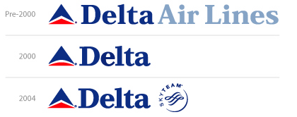
In 2000, Delta redrew their logo to include a horizon. Recently, they have changes back to the angular version. Why you ask? Darned if I know.

3. Congratulations

CreativeZen.gif

Congratulations for the success of your truly unique product. Also congratulations for winning the just-made-up award for, “Most Ironic Company Name.”

4. Can you read me now?

USAidAll1.gif

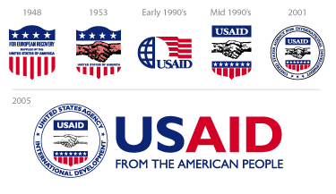
“In the midst of a massive relief effort in South Asia, the U.S. Agency for International Development released a redesigned logo Monday that is easier to read and to reproduce.”

When speaking of the price tag, Joanne Giordano, a senior adviser to the USAID administrator said, “The U.S. government spent $14 billion in aid on foreign assistance through USAID in 2004. We’ve spent $100,000 to ensure the people in the countries where we operate know that the schools, roads, clinics, and computers they are using are from the American people …. I did a lot of the work in-house. This one was very cheap, very cost-effective.”

Here are the online guidelines.

Maintained through our ADV @ UnderConsideration Program
ENTRY DETAILS
ARCHIVE ID 2185 FILED UNDER Miscellaneous
PUBLISHED ON Jan.12.2005 BY David Weinberger
WITH COMMENTS
Comments
Al aka El Negro Magnifico’s comment is:

In reference to name-dropping of brands in rap music, that was one of the things that drew me to it back in '88. It was so "matter-of-fact", and there was no thought of endorsements or any of that. "My Adidas" was just about shoes.

On Jan.12.2005 at 10:51 AM
graham’s comment is:

and it's still for the love.

On Jan.12.2005 at 11:54 AM
DesignMaven’s comment is:

Variety is back.

Hip Hip Horay.

Word is Rappers are paid when the mention brands in their lyrics. Either they get free merchandise or some kind of PAYOLA.

Disseminating advertisement via SPOKEN WORD is not FREE.

P. DIDDY and BIGGIE sold more Versace. Than Versace could ever sell on their own.

I wish one of my children would ask me to buy them a $ 600.00 dollar belt.

If only I could get paid for the times I mention BASS, RAND, and BIERUT.

I did send my people to talk with BIERUT about my royalty checks. Nothing has resulted, as of late.

Delta, I always loved the Widget. Initially Designed by Landor, in the 1960s.

Goverment Seals are the worst.

Government Graphic Designer(s) just don't understand. Neither do their interim Chief of Departments.

Kudos for the RED, WHITE and BLUE, Logotype.

I'll allow Gunnar, TAN, and Armin Lambast the typography.

Yes, the seal is more legible. Legibility for the sake of poor execution is no excuse.

Everybody is a Fucking Identity Designer these days. I'm sick and tired of the Bullshit. We did it ourselves. Saved us a whole lot of money.

The GOVERNMENT SETTLES FOR MIDIOCRITY !!!!!!!!

The GOVERNMENT SETTLES FOR MIDIOCRITY !!!!!!!!

The GOVERNMENT SETTLES FOR MIDIOCRITY !!!!!!!!

When it come to Design !!!!!!!

On Jan.12.2005 at 12:33 PM
Darrel’s comment is:

"The GOVERNMENT SETTLES FOR MIDIOCRITY !!!!!!!!

When it come to Design !!!!!!!"

Eh, we have a lot of problems that need to be resolved in government before we get new logos for every agency. ;o)

On Jan.12.2005 at 01:14 PM
Tan’s comment is:

>The GOVERNMENT SETTLES FOR MIDIOCRITY !!!!!!!!

No kidding Maven. A while back, I redesigned the crest/emblem for US JobCorps, updating an outdated mark that few understood because it had been photocopied and/or reproduced badly for over 40 years.

The local office approved it, and used it, but the national office could not cut through enough of the red tape of bureaucracy to adopt it. Shame.

I'll see if I can hunt it down.

As to the stuff for discussion — I can't believe Apple hasn't filed a lawsuit with the Creative player. I hate it everytime I see one of their billboards. Shit, they can't even be original with their ad photography.

Delta...eh. The kerning is better in the current iteration. Don't miss the horizon. The SkyTeam mark is totally derivative and forgettable — though the name has legs.

On Jan.12.2005 at 01:14 PM
JonSel’s comment is:

The SkyTeam mark was done by DesGrippes Gobe about 5 years ago. Not sure who handled the latest "update" of the widget. What a confused organization... they focus on the widget instead of coming up with more unique communication (ads, collateral, in-flight experience) that may actually affect their business.

On Jan.12.2005 at 01:19 PM
JonSel’s comment is:

When did Blackberry get a new logo? I know it was done by Landor.

I don't mind the mark. It's certainly an improvement on the old swooshy envelope. The type is a bit iffy. Some letters fit, some don't. Those 'r's are going to date quickly, and the 'a' is out of place.

On Jan.12.2005 at 01:42 PM
Daniel Green’s comment is:

USAID: Now this is an interesting identity strategy. An illustration on a shield in a seal in a signature. Keep repeating your name, and hope to heck someone pays attention.

On Jan.12.2005 at 02:09 PM
Rick’s comment is:

That "ry" is killing me.

That is all.

-R

On Jan.12.2005 at 02:10 PM
Kelly’s comment is:

$100,000 to recreate the USAID logo? There's an effective use of money for you.

On Jan.12.2005 at 02:13 PM
Tim Lapetino’s comment is:

Congratulations for the success of your truly unique product. Also congratulations for winning the just-made-up award for, “Most Ironic Company Name.”

Okay, I feel like I've just been given license to open up my can of whupass to combat the iWorship seen around here lately.

Sure, Creative's Zen Micros look similar to the iPod minis. But it also improves on it too. 5GB storage instead of 4GB. FM tuner and sound recorder built in. All for the same price. (Not that Apple has ever had a problem overpricing their hardware...)

Besides, this totally ignores the fact that Creative has had an excellent set of MP3 players that are beautiful and unique, not to mention more affordable per GB than the iStuff. (The Nomad Zen Extra is $299 for 60GB!)

I've owned the 20GB Nomad Zen for a couple years now, and I absolutely love it. I have a couple friends with iPods, and I wouldn't trade them at all.

It seems like there are a certain class of people who can't just enjoy the nice-looking, functional Apple products. The deify them, so that the iPod ceases to become a product within a category (like one in a long line of MP3 players) and transforms into THE ONLY player.

There are a lot of other great options out there. Creative is one of them. End of iRant.

On Jan.12.2005 at 02:34 PM
DesignMaven’s comment is:

Thanks for editing the post. I did get carried away. Was going to send a private email. Got involved with a post of DO.

TAN, Please find it and post if possible.

Going out, will be back around sixish.

The use of Seals in Government, State, local and City is an Act of Congress. They are un-neccessary and Government Image need to be brought in line with Reality.

On Jan.12.2005 at 03:16 PM
ben’s comment is:

i thought it was spelled, Mediocrity? Anyways the usaid logo would be better if it had no seal and the delta logo has too much too. it seems people won't let go of every little thing dealing with their values. They want to see every aspect of everything they are in their logo in the most elementary ways. i think the new ipod shuffle is more cost effective and useful than its precursors. anyways, can any give me some peanuts?

On Jan.12.2005 at 03:37 PM
Albert B Jr’s comment is:

Well, I guess the kind folks at USAID really DEMAND foreigners to know that their new schools, roads and computers came "From The American People." I'm bombarded by too many elements American.

How about this idea:

1. Logo: a graphically symbolic handshake on a r/w/b shield similar to the 1953 design, stylized of course; sans USAID and its complete name.

2. Logotype: USAID, nuff said; no tagline; no Gill Sans, ugh!

Why not just keep the logotype? Gill Sans? You gotta be nuts!

And to the iRant, iGet it. I'm not ashamed to be one of Apple's iSheep. I applaud Nomad and Creative (smart name) to toughen the market, but I'm not giving up my god that is iPod.

On Jan.12.2005 at 04:05 PM
Feluxe Socksmell’s comment is:

Lets not overlook another recent logotastrophy: the CitiGroupSmithBarneyTravelers keep the type lose the concept mark.

Also: United Way representatives (according to today's mail) never got the FutureBrand redesign memo.

Speaking of cheapskates- lets not pass it all off on beauracracy. A few years ago a (terrible) design firm representing the Nat'l Wildlife Fund asked me to redesign the 100th anniversary logo for a whopping $150. No! not joking.

I asked why. Apparently they spread the duties thinly; 13 illustrators were involved. Again, I asked why. "It was the only they would award the job" said the art director.

I shouldve taken the job and let my 7 yr old neighbor draw it. Hey, thats tax-free!

On Jan.12.2005 at 04:07 PM
Darrel’s comment is:

"Sure, Creative's Zen Micros look similar to the iPod minis. But it also improves on it too. 5GB storage instead of 4GB. FM tuner and sound recorder built in. All for the same price."

Some people put value in good user interaction design.

On Jan.12.2005 at 04:13 PM
Tim Lapetino’s comment is:

Some people put value in good user interaction design.

Hmmm. As an interactive/web designer, I'm aware of this. Very aware. The iPod doesn't have the market cornered on subtle, easy-to-use interfaces. The Zen has a very simple, intuitive interface, and the interaction with its controls are also very straightforward.

Maybe the iDisciples in the crowd need to remember there are more ways than your ways.

In other words: Think different.

(Boy, I'm feeling saucy today!)

On Jan.12.2005 at 05:17 PM
Baron’s comment is:

Re-design is pivotal to the success of businesses...right. Right???

On Jan.12.2005 at 10:10 PM
Stuart McCoy’s comment is:

Creative MP3 player: I really hate to get into these stupid Mac v. PC arguments about innovation and what not but I would like to point out the lack of creativity on Apple's part with the iPod Shuffle. Creative has had various models of the MuVO MP3 player out for years now. The iPod shuffle comes along and the Mac faithful proclaim it to be the next best thing since the second coming of Jobs. All I'm trying to say is balance your contempt with a little dose of reality and realize that Apple does not always do things first. People seem to want different color MP3 players, who really gives a shit if Apple or Creative started the trend?

Government logo: Is it just me or does the redundancy in this logo just seem ridiculous? Where else would US Aid come from? And have they really made the logo clearer simply by placing a word mark next to the logo? I still don't know US Aid is the U.S. Agency for International Development without dissecting the logo itself, which hasn't changed since 2001 and all this change provided was the circular badge with the text around it.

On Jan.13.2005 at 12:11 AM
Nick Douglas’s comment is:

I love the variety. As a dabbler, I appreciate quick notes like this sometimes. Is there enough material out there to run a variety more than weekly?

On Jan.13.2005 at 12:29 AM
Casey’s comment is:

About the Creative vs. Apple thing...

Congratulations to Creative on selling 2 million.

Congratulations to Apple on selling 4.5 million.

So the Creative device has a FM radio. I bought an iPod so I wouldn't have to listen to the radio. Commercials? No thanks. Clear Channel & Infinity controlled playlists dominated by Pay-for-Play? I'll pass. That's why I never turn it on in my car. Although that portable satellite radio thing is pretty nifty, I hear it doesn't work too well.

Sound recorder? Hey, my cell phone has one and records to 3GGP. Have I ever used it? No.

No WMA support? WMA can shove it. OGG? Oh please, you're reaching here.

And after using an iPod, nothing feels as good and intuitive as the UI that the iPod has. I've used Sony Minidisc players, a few RCA 64MB flash players, and even one of Creative's little devices, the UI just didn't kick it for me.

Different strokes for different folks I guess.

On Jan.13.2005 at 01:55 AM
Armin’s comment is:

> I love the variety. As a dabbler, I appreciate quick notes like this sometimes. Is there enough material out there to run a variety more than weekly?

Hey Nick, I think it's possible and actually necessary. Every now and then we come across interesting things that don't "deserve" a full post and we just let them slip by. We'll work on it.

On Jan.13.2005 at 09:33 AM
Darrel’s comment is:

Maybe the iDisciples in the crowd need to remember there are more ways than your ways.

I can't believe how much of this 'iWhore/iDisciples' name calling I've been hearing since the announcements. What is it? Jealousy? It sounds like last November and the political name calling.

Listen, if you like the alternative, great. Apple simply makes very consistent, well designed (all around) products. To ridicule a company or those that choose to support it for that reason is simply absurd.

The iPod shuffle comes along and the Mac faithful proclaim it to be the next best thing since the second coming of Jobs.

Who said that?

I think what bothers people is that they have an aversion to simplification. Go into any electronics store and look at the products. PCs with 24 ports scattered across the front of the box. Keyboards with 20 'special' buttons across the top. Boomboxes with knobs, dials, lights, and widgets galore. Car stereos that look like lazer light shows. Cellphones that take a PHD to figure out. Digital Cam Corders with more built-in-special effects than a spielberg movie.

We, as consumers, have some how trained ourselves to equate feature bloat = 'better value'. We shop at the big-box grocery chain not to get 'better' food, but more quantities of 'adequate' food. We shop at Wal-Mart not to get a couple of good products, but a cart load of plastic made-in-china products. We don't hire craftsmen to build us a cozy, solid, well built bungalow, but rather we hire McConstruction company to build us a big vinyl box. We don't hire photographers, but buy stock-photo CDs.

Apple, bless their heart, is shunning all of that. They keep on pushing through and insist on selling elegant simplicity. Will their market share ever grow? Probably not...as it seems only a small subset of the population posses the genes needed to appreciate the KISS concept in design. ;o)

Now there's nothing WRONG with other MP3 players. At worst, they simply suffer from 'averageness'. And, at best, I bet some of them offer a really nice interface. But I have yet to hear anyone complain about the iPod's interface.

I, personaly, would probably have never purchased my first iPod. I, too, looked at price and feature comparisons and felt it overpriced. Then my wife bought me one and I picked it up and I went 'aha!' and have been sold since.

The apple store is a pretty amazing place. For better or worse, it's really the only way for Apple to sell it's KISS concept. You have to touch it before your mind 'gets' it.

On Jan.13.2005 at 09:45 AM
Darrel’s comment is:

Sound recorder? Hey, my cell phone has one and records to 3GGP. Have I ever used it? No.

FYI, if you do own an ipod and want to record sound, just install linux on it:

http://ipod.hackaday.com/

(it's surprisingly easy)

On Jan.13.2005 at 09:47 AM
Don Julio’s comment is:

In other words: Think different.

It takes research, time and investment to consistently produce products that are well designed, with people in mind.

It is easier for the alternatives to emerge once someone is willing to take the risk, lead the way and prove a market exists. I never quite understand the “Apple-bashers.”

Apple rocks and continually changes the landscape. Let the imitators line up. At 3% of the PC market they can hardly be considered “the establishment.” There are many intangible built-in values and usability considerations with their products, all besides the damn good design.

Being different has it’s price - and in this case it’s worth it.

As for USAID - U SAID what? At least the gung ho image is not being delivered on the side of bomb casings and military tanks. I think it is important to remind the world that we are not just about regime change. Yes it’s a photo op - there’s even a page in the branding guide for using the logo as wallpaper in TV backdrops - but on an international level, we could do worse.

On Jan.13.2005 at 11:23 AM
Rob ’s comment is:

US AID....dump the seal, kill the tagline (why restate the obvious) and well, you've got a nice place to start....

IPods vs. the World...to each his own. If it works for you, then that's what counts. Apple does what it does and has a special talent at doing in a way that really counts and challenges the marketplace (ie, Mac Mini) to really 'think different.'

Delta...how many problems can one company have and still, we're discussing their logo as an issue? Personally, I feel that the angular version is a stronger mark. Now, about thoses new fares...

On Jan.13.2005 at 04:14 PM
Darrel’s comment is:

Regarding the name-dropping in pop-music, I assume they did not count the gigantic 'christian rock' segment. Perhaps one of the biggest 'brands' hyped by the music industry?

On Jan.13.2005 at 04:55 PM
Steven’s comment is:

1.) Hip Hop's referencing brand names seems consistent with the "bling-bling" orientation of many of its followers. While I'm obviously biased, I'm always sort of saddened by what Cadillac has come to be: ugly, plastic, crappy, cheap-ass imitation luxury. The Europeans, and to a degree the Japanese, really are so much more sophisticated and elegant, IMHO.

2.) I like the angle better, although it would be interesting to see a version with the red arched horizon and an angled blue "v", just for giggles. SkyTeam is a good name, but the logo looks like it belongs to a hotel chain.

3.) Very derivative, but whatever floats your boat.

4.) They spent $100,000 just to stick some justified Gill Sans next to their old logo. Very cost effective? What a joke. And yeah, redundancy does not equal clarity. But it does represent the efficiencies and creativity within govermental bureaucies. ;-) They were on a better path with the early 90's version, although the USAID text needs some form of separation.

On Jan.13.2005 at 05:41 PM
Zak Jensen’s comment is:

It was so "matter-of-fact", and there was no thought of endorsements or any of that. "My Adidas" was just about shoes.

The thought of endorsements in Rap was not far away. DMC admits that initially "My Adidas" was simply about the shoes they wore. Although, with the song's success it wasn't long before RUN DMC was happily accepting VIP treatment from Adidas.

Here's an excerpt from an interview by Miguel D'Souza with Darryl McDaniels (DMC) from 1998:

M: There’s alot of firsts in your career, you were the first to fuse rock and rap, you were also the first crew to get a serious shoe sponsorship.

D: By adidas.

M: Nowadays clothing sponsorship and hip-hop are virtually synonymous, even underground crews, who haven’t even got a major record deal, haven’t even sold a record, are already sponsored or they might have a shoe contract or something like that. You started all of that, how did it work in your day, has it changed much?

D: No it’s still the same, because the companies realise that...but see it’s not...it’s funny, because the fans are wearing the clothes anyway, so it’s not like it’s making a big impact. People in my neighbourhood, in the Bronx, in Boston and places like that were wearing adidas anyway. But I think giving the artist a contract and giving them free stuff is basically you know another medium of promotion. See we really didn’t understand that because we made My Adidas way before we even got the deal with them. So it wasn’t like it was something big to us, it was �aah cool, we got the deal...

On Jan.13.2005 at 10:17 PM
ben’s comment is:

true hip hop opposed to rap isn't mainstream. the rap you hear all time is what to companies want you to hear. lets face it, everyone knows most of this companies are just part of a larger conglomerate. the same company that owns atlantic records owns kraft owns time owns whatever. whatever it is they own everything and if they can throw some products into movies and music its going to happen. why does everyone own an ipod? i'm really just annoyed that they picked U2 to sell the ipod, they should have picked, oh wait thats the music white people listen to and they're the ones who will mostly by this? lets face it folks there is something much deeper here, and thats the digital divide. people are talking about how their ipod isn't running linux or if someone has a new skin for it, but ummmm aren't their starving people out their or something?

On Jan.15.2005 at 12:25 PM
Michael Lewis’s comment is:

Yet another comment from an iPod apologist...

They say that imitation is the most sincerest form of flattery, but the thing that makes Creative's blatant rip-offs so incidiary is their CEO's personal war against Steve Jobs. While Apple takes the high (-priced?) road by selling ingeniously simple products with innovative design and mold-breaking marketing, Creative CEO Sim Wong Hoo acts like a whiny, insecure, name-calling kid on the playground. "[The iPod Shuffle] is worse than the cheapest Chinese player. I think the whole industry will just laugh at it," he said last week. Rather, I think Apple will just laugh all the way to the bank. See Engadget's coverage of the Creative/Apple war of words, and this truly ridiculous example of style over substance.

P.S.: I noticed Delta's flip-flopping branding over the summer at their Atlanta hub, but couldn't figure out if they were just lazy implementing the "horizon" logo or had ditched it. Now I know; thanks.

P.P.S.: FWIW, it looks like Cadillac is trying out a new logo of sorts. Did anyone else catch the sloped metallic bar thingie with bits of the existing Cadillac shield in ads that aired during the football playoffs this weekend? I don't know what it's for, but you can apparently buy a polo shirt embroidered with it here.

On Jan.17.2005 at 12:51 AM