Speak UpA Former Division of UnderConsideration
The Archives, August 2002 – April 2009
advertise @ underconsideration
---Click here for full archive list or browse below
  
The Yellow Ruth

I had lunch yesterday with Beth Tondreau; and as it usually happens when meeting a designer at their studio, I found myself waiting for her to get that one last file out. In this case, it was a PDF file of a cookbook cover.

Making small talk, I asked her if she was familiar with The Gourmet Cookbook; to which she instantly replied, “The yellow?”

Yes. That notorious yellow.

kingsley_gourmet_cover.jpg

For six glorious decades Gourmet magazine has been a major element in the definition of American cuisine — featuring notable food writers like James Beard and M.F.K. Fisher. To celebrate their 60th anniversary, the editorial team — lead by patron saint Ruth Reichl — whittled down an enormous library of 50,000 recipes to 1200 and published The Gourmet Cookbook.

This was a huge project. Gourmet staffers spent three years refining their selections, and publisher Houghton Mifflin reportedly paid a million-dollar advance with a promise of another million in publicity. For the first edition a quarter million copies were printed in time for the Christmas 2004 shopping season.

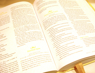
Well… every design project has a tragic flaw, and in this case it is the color of the highlight typography: pale yellow. In daylight or strong, direct light, it’s readable. A bit pale, but still readable.

kingsley_open_gourmet.jpg

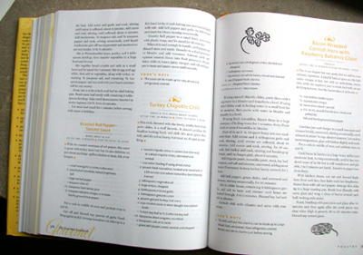
Under a yellowish, incandescent light, the names of the recipes disappear.

kingsley_gourmet_in_kitchen.jpg

Almost instantly, reader reviews on Barnes and Noble and Amazon were complaining about the unreadable color. In the Washington Post, Reichl said it was a “horrible surprise” and claimed it was a printing mistake.

One can easily see how such an error can appear, considering the state of the standard American design workflow. Colors which are selected on bright white Pantone stock, have body and saturation on computer screens (most-likely uncalibrated), and are proofed on ink-jet printers filled with opaque fluorescent ink. Meanwhile in the real world of presses and paper, inks are transparent — a condition further aggravated by dryback — and, unless specified, not fluorescent. The press proofs were probably viewed in a proper 5000-degree Kelvin MacBeth environment instead of a typical incandescent-lit kitchen.

Given the significance of the color problem, I also wonder whether ink drawdowns or press proofs were submitted during the production stage. Our studio recently completed an exhibition catalog for an art gallery. The printer printed every spread from the whole book — on a press — with ink — instead of making “soft proofs” on an Epson. That set of press proofs then became the quality-control when the forms were printed. The Gourmet Cookbook was printed in the USA. My printer was in China, which is significantly less expensive; thus we could afford to do the press proofs.

The Gourmet yellow serves as an object lesson for designers at any level of experience. It is so easy to get caught up in the weightless world of the computer. Mental constructs become “real” in an instant, and the crispness of what is on the screen can easily erase all doubt about the final product.

I appreciate the logic behind choosing yellow. It is the color of two basic ingredients in cooking: butter and eggs. Except, in this case, it probably would have been better to go with the color of Italian egg yolks rather than American ones.

kingsley_yellows.jpg

Typical American egg yolk color on left, typical Italian on right.
Egg yolk color represents the hen’s diet. Italian hens are farm raised and have
more vegetable matter in their diet. American hens eat processed feed.
… … … … … … … … … … … … … … . .

The editors at Gourmet promise to change the color in the second edition. This has the potential to create an instant collector’s item — the invisible cookbook. In the spirit of the rare stamp known as the Inverted Jenny, I propose the first edition be called the Yellow Ruth.

Who knows… if you keep your copy clean, it may be worth something someday.

kingsley_marking_ribbon.jpg

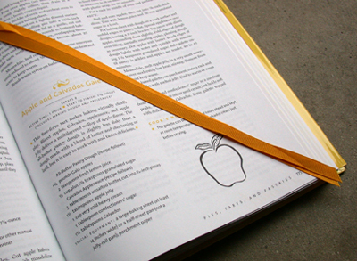
Finally, since the Gourmet staff is makng changes, I would like to humbly suggest two others. First, improve the index. It is not as comprehensive as it should be. Second, please add a half inch to the place-marker ribbons. The current length is too short, making it difficult to slide past the diagonal corner. (See above)

Happy cooking!

Maintained through our ADV @ UnderConsideration Program
ENTRY DETAILS
ARCHIVE ID 2190 FILED UNDER Critique
PUBLISHED ON Jan.20.2005 BY m. kingsley
WITH COMMENTS
Comments
sam r’s comment is:

The culinary world saw red. But I can vouch for the fact that whatever the color, this was no yellow peril. My wife got no less than four copies for Christmas. Four. While difficult to navigate the titles and subtitles, the Gourmet cookbook still has the best recipes. Yellow is not the best color to have selected, but its not the wurst (sorry). At least it wasn't blue. Now that would have been nauseating.

On Jan.20.2005 at 05:20 AM
Feely B Suckswell’s comment is:

Interesting. I suppose Red reeks Betty Crocker Boring... perhaps Burnt Umberish Orange? We recently repainted the dining room orange- has a nice Italian thing goin on

On Jan.20.2005 at 09:29 AM
Darrel’s comment is:

We recently switched to all organic eggs. Haven't noticed the yolk color being different. Will have to check that out tonight. ;o)

On Jan.20.2005 at 09:43 AM
Jeff Gill’s comment is:

My wife gets our eggs from a guy who gets them from local farmers (dung & feathers at no extra charge). The yolk is very orangey--a lot more so than grocery store free range organic. The taste difference is amazing too.

On Jan.20.2005 at 10:08 AM
debbie millman’s comment is:

I just got my copy of Ruth's book from The Good Cook book club (which is a great deal, btw, if you collect cook books the way I do). In any case, I don't mind the yellow. I think it is rather pretty, actually.

On Jan.20.2005 at 10:29 AM
sheepstealer’s comment is:

I say keep the yellow but use it differently. It's a good color. It feels "tasty." But in looking at the page I see illustrations, dingbats, bullets and a couple other valuable-to-the-design-but-not-crucial-to-the-function elements that could be a nice buttery yellow without crushing the usability of this book.

To anyone who uses typesetting as their craft I recommend a couple of tricks.

1) Use the "squint and see what jumps out" method of checking visual hierarchy

2) Throw a proof on a copy machine. If anything disappears, you ain't dark enough (That's a trick we always use in the financial sections of our annual reports—clients love to hear we're so obsessed with the functionality of thier projects)

3) I'm in full support of the idea of having each large press having the monster-sized, color correct light, right next to a crappy desk lamp in a dark room. That way press sheets can be viewed in correct light AND real light.

Now do any of my friends here own this book? The stuff in here looks DELICIOUS, and I know I'm never going to have time to cook any of it. Name the time and I'll bring my notorious "Cowpie Cookies" for dessert. I'm free after 6 every day but Sunday and Thursday.

ss

On Jan.20.2005 at 11:31 AM
marian’s comment is:

Recently, I designed a piece that i wanted a "perfect" primary red for. Viewed under incandescent vs. daylight, the colour shift was significant. Wracked with indecision, I finally decided to go with the way it looked under incandescent. When i saw it on press I was shocked at how magenta it was, but decided to stick by my original decision.

It does seem odd to me that we go to lengths to choose colours for daylight conditions when surely most materials will be viewed indoors under predominantly incandescent light or (god forbid) flourescents.

On Jan.20.2005 at 11:48 AM
Michael Surtees’s comment is:

I don't cook as often as I would like, but having friends that can at an expert level are great to have. Over the holidays I bought Anthony Bourdain's Les Halles Cookbook for a friend that has introduced me to some interesting dishes over the years. Obviously the recipes and design (typography + photography) of the book are great, however I would recommend it to anyone for just the editorial from Tony. It's hilarious and very educational.

On Jan.20.2005 at 03:30 PM
marian’s comment is:

And on another note, does anyone know of a design piece that has value due to its being the "error" edition of the piece? There must be numerous books in this vein ...

On Jan.20.2005 at 04:05 PM
debbie millman’s comment is:

it wasn't an "error," per se, but the original cover of the Rolling Stones "Some Girls" had images of celebrities like Marilyn Monroe and so forth intermixed with images of Keith and Mick, etc. Copyright lawsuits ensued and the band ultimately had to reissue the album with different cover art. Now the original is a collector's item.

On Jan.20.2005 at 04:21 PM
M Kingsley’s comment is:

The Beatles slaughtered babies cover for Yesterday and Today.

On Jan.20.2005 at 04:27 PM
Rob ’s comment is:

I have yet to see the book in question grace my kitchen bookshelf but certainly it won't be hard to find in the neighborhood B&N.

It's interesting how few people take the time to ask for ink draw downs on the stock on which they will be printing. Maybe I'm more old fashioned then I think, but it's still a standard request when I'm using a PMS on an unfamiliar stock, especially if a project involes both coated and uncoated papers. And we've even gone so far as press proofing the covers dictated by new—now dead—brand standards to ensure the level of consistency in the heavy ink coverage, to look for finger printing issues and other concerns when working with a color that never 'dries.' Of course, that was a mere three years ago, when there was enough concern for the brand to invest in it. (And we were't printing in China so it wasn't as inexpensive as M. Kingsley's project).

I find it amusing that Reichl actually blamed it on a printing error. Had it truly been an printing error, I would've expected them to ask their vendor to reprint the job.

In any case, when the substrate is a bright white, a pale yellow is not a good color to choose. That's it, it's the paper's fault. Too white. Like the impending snow.

On Jan.21.2005 at 06:31 PM
Armin’s comment is:

> While difficult to navigate the titles and subtitles, the Gourmet cookbook still has the best recipes.

This is an example of good content truncating bad design. While also showing that bad design decisions can be overcome by the user putting a bit of extra effort to decipher low-contrast typography (or whatver the bad design decision was) if they are interested in the content. Which should make a pretty good argument in favor of 9 pt. type instead of 10.5 or 11 pt type in some bodies of text — but it doesn't.

On Jan.22.2005 at 09:06 AM
M Kingsley’s comment is:

> While difficult to navigate the titles and subtitles, the Gourmet cookbook still has the best recipes.

In general, yes. But for me, there's the issue of their Tarte Tatin recipe — my particular bette noir — which is similar to half of all the recipes out there, with the apples standing up. The other half has the apples lying down on their side, overlapping.

I'm convinced that there's a secrect to making the Tarte Tatin. Apples are very juicy, and that quality tends to thin the caramel. Thus, when one cuts into their tarte, you have apples everywhere — esp. when they're all standing on end.

When I eat a Tarte Tatin made by a professional — apples standing up or lying down — it sticks together.

So in general, yes, it's a wonderful resource. Yet... yet... there are a few chinks in their culinary armour. Is this reflected in their choice of yellow for the highlight color? Perhaps.

Most importantly, can anyone tell me the secret behind a Tarte Tatin that holds up to the fork?

On Jan.22.2005 at 02:18 PM
Michael Surtees’s comment is:

the secret behind a Tarte Tatin

Mark, have you tried reading up at epicurious?

On Jan.22.2005 at 02:40 PM
M Kingsley’s comment is:

> Mark, have you tried reading up at epicurious ?

Michael, you bet I have. In fact, it's the same recipe that's in The Gourmet Cookbook — many of the recipes on the site are from Gourmet. I've even gone back to http://www.tarte-tatin.com/page/recette.html" target="_blank">Tarte-Tatin.com — both to practice my French and to visit "the source". Alors, je suis en train de cherceher le myst�re. C'est pas encore clair!

I'm not alone. Here are two other comments from the epicurious site:

> Apart from substituting pears for apples, I followed this recipe exactly--and it was incredible. No need for ice cream or whipped cream, just the tart, trust me. One caution: whether due to my overripe pears or some other mystery, when I flipped the tart, caramelized juice oozed everywhere and made a big mess.

> Ick. What a mess. When mine came out grey-brown and wet, I went back to Julia Childs' recipe to see what went wrong here. I think she has the right idea in exuding the apple juices first by letting them soak with some lemon juice before starting. She also carmalizes the sugar before adding the apples. Since this recipe skipped those steps there was WAY too much water/apple juice for the sugar to carmalize. I will go back to her methods.

Branding experts, take note. It's the smallest thing that will degrade your efforts.

On Jan.22.2005 at 04:34 PM
Michael’s comment is:

Did you contact the designer? Making assumptions is easy enough, but a book like this has a committee standing behind almost any important decision. The designer may well have resisted this color.

On Feb.01.2005 at 05:00 PM
M Kingsley’s comment is:

> Did you contact the designer? Making assumptions is easy enough, but a book like this has a committee standing behind almost any important decision. The designer may well have resisted this color.

Michael, this was a critique; not reportage. In case you missed it, it even says "Critique" at the top of the post. I specifically did not mention the name of the designer to avoid embarassing future Google results. This person's identity is also jejune to the critique of a color choice, not a designer.

Why do you think I was making assumptions? Contrary to what most designers think, a proper critique is not the random spouting of opinion; but a clear description of the object and its context. From there, I presented an appreciation of the color choice, and gave possible reasons for why it happened; which led to my thoughts on the current state of (increasingly paperless) design workflows and the economics of printing such a large project — followed up with a minor object lesson that we all can learn from.

If you don't believe my photographs, by all means, let's set a lunch date. I would be happy to show you in person what I'm talking about — but lunch is on you.

On Feb.02.2005 at 01:20 AM
Five’s comment is:

The color mix-up may not be the designer's fault ...

For a 2-color job, most printers refer to the Pantone number. Screw it up on the paperwork, by putting 224 or 422 instead of 242 and that blue you wanted (and saw in all the proofs) can easily come back from the printer in orange.

On Apr.02.2008 at 10:54 PM
Samantha’s comment is:

> It does seem odd to me that we go to lengths to choose colours for daylight conditions when surely most materials will be viewed indoors under predominantly incandescent light or (god forbid) flourescents.

You do know that incandescent light will be taken off the market come 2014, right? Fluorescent lighting will rule and so will those eco-friendly people. It's depressing.

On Jan.13.2009 at 06:10 PM