Speak UpA Former Division of UnderConsideration
The Archives, August 2002 – April 2009
advertise @ underconsideration
---Click here for full archive list or browse below
  
Recent Rebrandings

In this edition of Recent Rebrandings, we look at two examples of destination branding and a popular cable television network.

1. Unbridled Spirit(s)

I was born (and this is just between you and I) in Kentucky. I didn’t live there for very long so I really don’t know much about the state other than they host the Kentucky Derby and make Jim Beam and good fried chicken. That’s about it. Well, recently, the state of Kentucky unveiled a new branding program consisting of a horse logo combined with the tagline, “Unbridled Spirit”. There is plenty of information about the rebranding here, on The Official State Government Web Site of the Commonwealth of Kentucky.

KentuckNew.gif

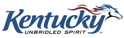
As always, someone criticized the cost of this effort. “The amount is “a lot of money to create some bumper stickers and a new logo,” said Rep. Brent Yonts, D-Greenville.” Thanks Brent, very insightful.

Destination branding really seems to be taking off. A few we’ve seen in the last year or so are the new Bahamas identity, Australia, Mexico, and countless others.

Destinations.jpg

Thanks to Von Glitschka for the tip

2. New Milwaukee

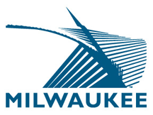
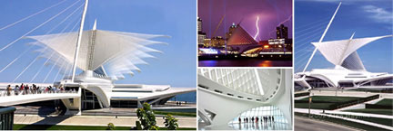
No, not a new Old Milwaukee, just a new, old Milwaukee. Attempting to capitalize on the “highly praised Santiago Calatrava addition to the Milwaukee Art Museum,” The city of Milwaukee has unveiled a new logo, which is a translation of the museum’s architecture.

MilwaukeeNew.gif

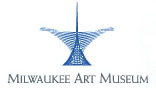
The Milwaukee Art Museum
MAMMuseumPics.jpg

WARNING! What follows is a horrible branding practice and should not be attempted at home or the office.

On Metro Milwaukee’s website, it clearly states that the logo was:
“Created to be “community-owned” and available at no cost, all entities that call Milwaukee home are encouraged to use the mark how they see fit
from placing it at the end of emails to putting it on web sites to adding it to stationary. As individuals, people can show their pride by wearing a “Milwaukee” shirt or temporary tattoo.” Hmmmmm…that must mean that THIS is OK. Fine.

What I also find disturbing about this logo is the fact that it is based on the architecture of the Milwaukee Art Museum, but so is the museum’s logo.
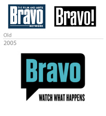
MAMLogo.gif

3. Bravo!!!

The popular television network that brings us “Queer Eye for the Straight Guy”, “Inside the Actors Studio”, and “Celebrity Poker Showdown” unveiled a new, speech-bubble logo on January 3rd. Bravo to Bravo.

Bravo_evolution1.jpg

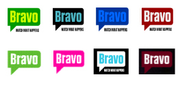
There seem to be lots of color variations of the logo, which we’ve also seen recently with the new GE program as well as VH1. Is “Variety” the new “Consistency”?

BravoVariations.jpg

On a side note, is it just me or is Heidi Klum completely worthless on “Project Runway”?

Thanks to Danielle Bravaco for the tip

Maintained through our ADV @ UnderConsideration Program
ENTRY DETAILS
ARCHIVE ID 2193 FILED UNDER Branding and Identity
PUBLISHED ON Jan.24.2005 BY David Weinberger
WITH COMMENTS
Comments
Darrel’s comment is:

"Unbridaled spirit"? Blech.

Our own city recenly 'rebranded' ourselves too with an equally bland slogan: "Where Goodness Inspires Greatness".

Some things shouldn't have tag lines.

As for the Milwaukee logo...it looks like a corrupt EPS file ;o)

On Jan.24.2005 at 10:29 AM
Armin’s comment is:

For some reason, I really like the lettering in Kentucky's logo. The ligaturing en's are a nice touch and seems to be an indication that someone knew what they were doing. The horse… meh, it's OK, it's too sportsy. (It also reminds me of Landor's identity for Hong Kong)

The Milwaukee logo fails miserably, beginning with the conflict with the actual museum's logo. The logo does nothing to reflect Milwaukee's self-ascribed characteristics: Innovative, Pioneering, Dynamic and Expansive. Sure, the Calavatra addition is innovative but the chunky and stale Gill Sans does nothing to express, well, nothing. Plus, it's freakin' cold up there.

The Bravo logo looks like a loudspeaker. The rounded edges on the right side seem odd. I mean, I see why the left end is square and the right-end is rounded (they match the letter) but it just looks clunky. I like the chunkier type, even though it looks a bit Sopranoish. Pretty colors though, surely look nice on screen. It's a nice, fresh update without being risky… which would actually be a better angle for Bravo to take.

On Jan.24.2005 at 11:49 AM
ps’s comment is:

bahamas. i think its a nice execution. i like the fresh approach. but i just don't think it fits a "destination."

milwaukee. wow, all milwaukee is... an art museum. i thought they were all about beer.

On Jan.24.2005 at 11:50 AM
szkat’s comment is:

about bravo, i look at it and i think, "do i ever actually say 'bravo'?" i don't think i do.

On Jan.24.2005 at 11:55 AM
Armin’s comment is:

It's definitely an under-used term. It works great when you want to be ironic, sarcastic and/or smart-assed.

> i thought they were all about beer.

Where the identities for Bahamas, Mexico and Australia succeed is where Milwaukee fails. These three identities take figurative and experiential elements of the destination and translate them into a logo that leaves room for interpetation. Milwaukee's logo is too literal. And it picked up the wrong thing to be literal about. Like ps says: beer. Or cheese.

On Jan.24.2005 at 12:24 PM
Aaron’s comment is:

The Bravo logo is a bit to close to this for my tastes...

On Jan.24.2005 at 12:51 PM
Rick’s comment is:

I like the Bravo logo, even though the speech bubble is totally overused. Logo Smackdown, where are you? It fits the brand and medium; that's good enough for me.

Though it reminds me of this toy (of which I have two, and they're the greatest things ever!)

Milwaukee: I uh, wouldn't want to print it. Or reduce it. Or use it. Or maybe ever even look at it again.

Kentucky: Armin, that EN makes me crazy. The N looks forced. I can get behind the lower case K, but on the whole, something about it seems very Minion Italic "I-dunno-it's-just-what-came-on-my-computer" to me.

There's my cent-and-a-half.

On Jan.24.2005 at 01:13 PM
Zoelle’s comment is:

Milwaukee — I understand what the attempt was here, however the execution has missed the mark.

While I was attending college ('94—'98) I noticed Milwaukee’s struggle to shake their “old” image. Changing the perception of Milwaukee as an old industrial city, to one of a progressive modern city was painfully slow as first. Many of the buildings downtown were rundown and abandoned back in the early 90’s. Tattooing was still illegal until about 1999. A 10pm curfew which had been in affect downtown just prior to my college years had been lifted. The nightlife was dismal.

The new Brewer’s stadium was the first big hope that Milwaukee could shake it’s elderly fa�ade. Slated to be the first dome with a retractable roof, the stadium received quite a bit of press. Along with the good press — bad press was quick to follow. A crane accident, then a leaky roof, followed by an embarrassing losing streak kept the stadium from becoming the modern icon it was thought to become.

Prior to the building of the new addition to the museum, real estate investors began to take an interest in the old buildings downtown, eventually renovating them into stores and upscale lofts. The nightlife received a much needed shot in the arm by designers such as my dear college friends at Flux Design . The museum was the first large scale Milwaukee project that received the acclaim which was so badly needed. This new branding attempt is a bit pathetic. I see it as looking too desperate. There are so many good things about Milwaukee now, that to latch onto this one piece of architecture really makes the city look shallow. I would not appose a new logo which incorporated elements which echoed the MAM. The museum’s logo itself is well crafted and rightly reflects the update, the city logo is just embarrassing.

On Jan.24.2005 at 01:37 PM
Daniel Green’s comment is:

When I first visited the new Calatrava addition to the Milwaukee Art Museum several years ago, I immediately thought of how this stunning structure (photos are great, but don’t do complete justice) will become a symbol for the city of Milwaukee in the same way that the St. Louis Arch, Empire State Building, Golden Gate Bridge, and the Eiffel Tower are symbols for their respective cities. However, it is the structure itself, and the ensuing associations, that acts as the real symbol here. I fear that making a 2-D representation of a structure -- at least one this new -- merely makes a visual reference to the structure itself, and falls short of capturing and radiating a symbol’s real (and potential) power.

On Jan.24.2005 at 01:51 PM
DesignMaven’s comment is:

David

Why not save these for Wednesday. So we can have a regular Wednesday Variety.

Peter:

We're not supposed to be critiquing the BAHAMAS Identity, Mexico, or Australia.

I think David used them for comparison and contrast. Sought of a measuring stick for par excellence.

Remember, I gave BAHAMAS, my highest rating for Best and Worse 2004. Developed and Designed by Joe Duffy.

Insofar as, Milwaukee. It's an Honest Attempt to create Kinetic Energy with using opticle illustion. Similar to Bass' AT&T, Andre Seroglia's, Wool Mark, Miles Runyan and Jim Berte's, Olympic Star in Motion. The execution of Milwaukee's Identity is amateurish.

In the hands of a more skilled Designer. It could've been pulled off.

I think what the Designer was trying to accomplish is what Seattle did with their most recognizable architectual. structure. Incorporated in the Basketball Uniforms, many years ago. Seattle's was a pictogram not optical illusion.

While I understand the Designers attempt to create Kinetic Energy with Optical Illusion.

Just goes to show. Optical Illusion is not for amateurs. You've got to know what you're doing. Again, if you don't know how to draw, understand how to create depth, and illusion of light and shadow with converging lines. The results are DISATEROUS. The computer doesn't help.

Resolution: I don't usually offer resolutions without my usual

$ 100.000.00 dollar price tag.

A properly lighted black and white photograph. Transformed into a high contrast photograph properly manipulated and Vectorized will work better.

A little trade secret. (Terminology and Design Speak; Generation X and Y has never heard.)

FYI, If my Idea is used. I will file suit.

If I find something in my archives, I'll have Armin post it.

The other Identities are OKAY. (Passable) Without any critique.

On Jan.24.2005 at 03:42 PM
Seth’s comment is:

Aw geez, you all really think the new Milwaukee logo is that bad?

Um, yeah, coming from this great city on a great lake (wait, that's been used already), I think this is just awful. Come on, there are no gradients or drop shadows anywhere on that thing! And they didn't style the brise soleil (that's what the whale-tail/wing/whatever is called) in an aggressive enough stance. And what gives with no tagline? I submit for your review the following:

Milwaukee - Enter at Your Own Risk

Milwaukee - We Ain't Got No Subway

Milwaukee - Calatrav-a-gogo

First a cow head and cheese wheel on our state quarter, now this.

On Jan.24.2005 at 04:50 PM
JonSel’s comment is:

I want to commend Milwaukee for attempting to define themselves instead of letting themselves be defined by others. Time and again, a new logo is introduced and the great hue and cry goes up, "That's not who they are. How dare they?" But if anything —�a city, a company, a product — is ever to break away from past perceptions, it needs to be done directly and convincingly.

I agree the logo is lacking in execution, but, to help symbolize Milwaukee's goals and aspirations of becoming more than "cow heads and cheese wheels", this is a good move. All identities need time to build up in value. If the museum serves to increase tourism and more people discover and embrace the "new" Milwaukee, then the symbolism won't seem so far-fetched.

On a practical level, someone in Milwaukee needs to be spanked with t-square for their typographic naivete. Text typefaces, like Gill, were designed to be read at small sizes. When using a text face for display purposes, especially in a logotype, the characters need to be re-drawn substantially to reduce character variations in width and spacing. The "W" should not be the most visible letter here, and it is only exacerbated by its juxtaposition with the left base of the mark.

On Jan.24.2005 at 06:01 PM
lauren e.’s comment is:

Being a native Milwaukeean (yeah, that's really the word we use), I've found this discussion interesting. At first, I began composing an inflammatory response that ran a little like this between the lines: How dare you criticize my hometown with your cheese and beer cheap shots; we're way more than blue collar these days, so go suck it.

But really what I wanted to say, JonSel put in a more constructive manner. (Thank you!)

I readily admit the execution of the new Milwaukee logo is poorly constructed, but I disagree with the notion so many of you have expressed here that it missed the mark in concept, or that use of the brise soleil as an icon is "shallow."

The previous logo and PR campaign of the visitors bureau (from 1995) held strong to those blue collar, Harley-Davidson, industrial ties to the city's past.

Milwaukee has tried very hard in the past decade to change its image into that of a technologically and culturally savvy city. Though the changes have come in many ways (free WiFi access in public parks downtown, for one example), the changes in our recent architectural projects show the shift on the grandest and most public scale: Miller Park, the Milwaukee Art Museum, the 6th Street viaduct, the soon-to-come Pier Wisconsin. Currently, the Calatrava addition to the art museum holds the greatest brand cache for the city, so its use in the tourism push makes perfect sense.

If you haven't noticed, being sandwiched between two Great Lakes, Wisconsin's not really a "drive through" state that gets visitors just because it's halfway between point A and point B. That makes our tourism strictly destination oriented. And frankly, unless you're from Wisconsin, you're probably not planning your vacation around great beer and cheese. Milwaukee has much more to offer than that, anyway. (Our "Up North" areas receive their fair share of outdoorsy tourism, but our urban areas suffer on the destination ticket).

---

JonSel: [S]omeone in Milwaukee needs to be spanked with a t-square for their typographic naivete.

Direct your frustrations with the execution to the design team at Laughlin/Constable, please.

---

And just to be picky:

The logo posted on SpeakUp is the official one for a non-profit organization called The Spirit of Milwaukee, Inc. which strives to promote growth in the metro-Milwaukee area.

Spirit of Milwaukee is not the same as the official Greater Milwaukee Convention and Visitors Bureau, which used the Genuine American logo. The GMC&VB has since adopted a version of the new "Calatrava" logo, with altered type, seen here.

On Jan.24.2005 at 07:01 PM
lauren e.’s comment is:

Whoops.

Forgot to close my emphasis tag properly. Sorry.

On Jan.24.2005 at 07:02 PM
Feluxe Socksmell’s comment is:

Didnt Scott Stowell (Open) design the new Bravo logo? Pretty nice. Not radically nice but nice nonetheless...

On Jan.24.2005 at 07:40 PM
Sal’s comment is:

The only guy that would say bravo is the speech bubble 90 degrees clockwise. They could've done without it- the type is strong enough. Then again, the R reminds me of the sopRanos gun. I think the original letterforms have more class and integrity, although this new one is better drawn. Anyone catch a glimpse of the horrendous new BET mark?

On Jan.24.2005 at 08:43 PM
DesignMaven’s comment is:

Lauren e.

Thanks for your clarification and insight into the Milwaukee Identity. The link you provided doesn't improve the Identity. The Design does not properly create the illusion of depth, light, shadow and contrast. Something a properly lit black & white photo. Tranformed into a high contrast photograph and Vectorized would show, properly manipulated and refined. Several angles should've been explored. The angle of the structure and rendering choice optical llusion illustrating Kinetic Energy creating converging lines are incorrect. The lines don't properly converge. Nor create the proper illusion.

Also I find it interesting Laughlin/Constable have no Identity Credability according to their website.

As I said before. It is an Honest Attempt. In more capable hands. The Identity would've excelled.

Laughlin/Constable expertise is:

Print

Broadcast

Public Relations

Outdoor

Design

Interactive

Direct Marketing

Design category, doesn't neccessarily constitute Identity Credibility.

On Jan.24.2005 at 09:08 PM
Greg’s comment is:

Kentucky - I like the typographic treatment, I like the placement of the "unbridled spirit" tagline, but what's up with the camel hump on the back of the horse? Maybe that's the spirit unbridling. And how is it that no one else has picked up on the nearly blatant resemblance to the Denver Broncos logo? Also, I think due to the length of the word, and the descending "K" and "y" the whole thing looks like a 1890's version of a stretch limo. A stretch limo with a hump. Driving to Denver.

I like the Milwaukee illustration. I think it's more visually interesting than the MAM version. Unfortunately, the type mangles the whole thing. They needed something that could flow with the implied lines of the archetecture, not something that would stand rigidly against it. Like maybe an italicized serif. I also think that the "unbridled spirit" tagline would fit here too.

Bravo's new one is so-so. I do like the idea that it can be almost any color without losing anything, but I'd stay away from the white-on-maroon-on-blacks, and the blue-on-blue for that matter. "Unbridled spirit" would not work well here. Well, maybe for Queer Eye...

On Jan.24.2005 at 09:39 PM
Steve M’s comment is:

"...[A]ll entities that call Milwaukee home are encouraged to use the mark how they see fit"

I've never been there, but if I lived there, would this be OK?

On Jan.24.2005 at 10:24 PM
Seth’s comment is:

Didn't know so many folks from Milwaukee were on here...

Building on Maven's comments about various links not improving the identity, I have to say that I'm somewhat disappointed that it seems that the new logo was rolled out with little accompanying guidance to the end user. Yes, it's great to make it publicly available and encourage its use "how we see fit." Creativity is definitely welcome here. However, we all know how much of an identity's value can get lost in its application by amateur hands.

From the few examples I've seen posted already, it seems that the only thing that's critical to the identity is the brise soleil image. Color, as long as it's blue (for now). Typeface, Gill is preferred, but anything in chunky caps is good enough. My previous post was tongue-in-cheek, but truly, it can't be long before we see some decked out beveled rainbow version of this thing.

In the end, will that really succeed in helping to change the perception of our city?

On Jan.25.2005 at 12:22 AM
Bill’s comment is:

I'd love to be positive on Kentucky's Unbridled logo but it really starts to fall apart for me at more than a glance. This is one of those solutions that appears to be the work of two designers married together because one had a decent horse and the other had a respectable type solution.

Yes it does smack of the well crafted Bronco's logo. Even if I had wandered into this solution inadvertently, I would have pulled it from contention as soon as derivation was suggested and it probably was. The craftsmanship of the horse is not in question to me but the thin, pointy, tapering licks that compose the unbridled beast are no match for the bold stroke weight, and softened serifs on the letterforms.

Kentucky has a nice online identity guide but as soon as the logo is taken down to business card application the pairing becomes pretty suspicious and the lack of parity becomes pretty evident. And what's up with the colors on the logo? What's the meaning behind the color breaks? Someone told the designer it was a four color job, and it was taken literally.

The Australia and the Bahamas logos are two of my favorite. See the Joe Duffy Bahamas story on LogoLounge.com archives.

The Australia logo was crafted by Ken Shadbolt and team at FutureBrand Melbourne. This isn't the logos best lockup option but take a look at how well the type works with the kangaroo's line work. This is the same group that developed the 2000 Sydney mark for the Olympcs and they have also developed a great logo for the 2006 Commonwealth Games in Melbourne.

I don't know why, but I've always had a soft spot for the unconventional approach to logos taken by some of Australia's better design firms. Who told Shadbolt you could stick a sun flare in the middle of a country's logo? In the end, it's what welds the mark together.

Ken Cato's group with Cato Purnell Partners, headquartered in Melbourne are pretty unconventional thinkers as well. I think their work with "spiro lines" like used to create their Energex or their ClearView logos would have inspired the designers of the Milwaukee logo.

The art museum addition appears to be pretty breathtaking. Looks to me like if you really wanted to you could find some angle that made the Calatrava look like a big old letter "M". And finally, from what I could see, I thought the Milwaukee Art Museum handled the Brise Soleil much more effectively in their own logo, though at a distance, am I the only one that see a pair of fallopian tubes?

On Jan.25.2005 at 02:53 AM
Armin’s comment is:

> Didnt Scott Stowell (Open) design the new Bravo logo?

Felix. Yup, you are correct.

> How dare you criticize my hometown with your cheese and beer cheap shots;

Lauren, you are right. My apologies. Stereotypes are just so tempting, specially if it's beer and cheese!

> The GMC&VB has since adopted a version of the new "Calatrava" logo, with altered type, seen here.

[Emphasis mine]

Who needs beer and cheese stereotypes with that typography! Hey, Kmart called, they want their K back.

> Ken Cato's group with Cato Purnell Partners

Bill, thanks for that link. Their work is amazing.

> As for the Milwaukee logo...it looks like a corrupt EPS file ;o)

Oh, Darrel, if it were a corrupted EPS you wouldn't be able to open it… just sayin'.

On Jan.25.2005 at 08:56 AM
Dino’s comment is:

Kentucky’s logotype is an interesting approach in describing a high level image of the state. But what if we replace the word Kentucky with one of the following states: Wyoming, Montana, Arizona or Texas, keeping the same tagline for each state name and the speeding horse, does the meaning of the logotype change?

On Jan.25.2005 at 09:21 AM
lauren e.’s comment is:

DesignMaven: The link you provided doesn't improve the Identity.

I didn't mean to imply that I thought the altered type was an improvement. In fact, I agree that the artwork itself is highly flawed (type and illustration - all versions). I mearly meant to address the theory that the concept was "wrong."

DesignMaven: The Design does not properly create the illusion of depth, light, shadow and contrast

This is because it's probably not meant to. The wings of the brise soliel are made up of "fingers" which open and close to cover sections of skylights in the atrium. The lines are a more literal interpretation of the structure, not quite an attempt at optical illusion to show depth (like in Saul Bass's AT&T logo). I realize none of the photography on the MAM Web site shows a close-up of the wings, so if you've never seen the structure in person it would be difficult to know this.

Seth: In the end, will that really succeed in helping to change the perception of our city?

Good point.

Bill: Looks to me like if you really wanted to you could find some angle that made the Calatrava look like a big old letter "M".

Funny, but not possible.

DesignMaven: It is an Honest Attempt. In more capable hands. The Identity would've excelled.

I agree.

Eh. I think my hometown pride just ran out of steam. Back to work!

On Jan.25.2005 at 10:32 AM
gregor’s comment is:

Of the varous logos in the article, the one I would like to comment on is the Milwaukee rebranding. Being a native Madisonian (that's what we called ourselves in Madison), we don't partucularly like Milwaukee, or Milwaukeans -- unless "they" give us reason to. So naturally I wouldn't care for the logo resulting from their rebranding.

But all joking aside, (you Milwaukeans know what I mean), the interesting aspect of the Milwaukee logo is that it is brutally honest about the process of rebranding many mid-sized cities are continually going through-- via architectural monuments.

While the City of Seattle (where I transplanted to) hasn't gone through any recent formal rebranding efforts that I am aware of - or perhaps care about - it is continually rebranding itself through architectural monuments, the most recent being the new Koolhaus library here. Prior to that - and not necessarliy in this order - we have a sinfully ugly Getty for the EMP museum, two new sports stadiums and so on. Each one of these backed by city dollars and in effect marketing tactics to draw business and tourism to the region. This aspect of monumental architectire in mid-sized cities needs to be acknowledged as a rebranding through visual channels other than graphic design, and then in some way reflected in graphic design.

As I mentioned, I'm not particularly fond of the Milwaukee logo from a aesthetic standpoint - no offense to the designer, but it looks like a tweaked freehand symbol (although I'm sure the designer did in fact spend a lot of time with this) - but I applaud the insight this reflects on how cities are in a constant state of rebranding though architecture. The issue of course being when the next new and great building comes along in Milwaukee, this logo will be dated.

Nonetheless it speaks to how we as designers need to have a keen awareness of the many ways our clients are in a continual rebranding cycle and how our efforts require designing toward a universal VI for them that is not time capsulated.

On Jan.25.2005 at 10:35 AM
Feluxe Socksmell’s comment is:

Watching Bravo last nite... I couldnt help but notice how well the tag works with the name.

Wonder if if the design team (Open) helped develop content as well (in Open's case, they usually do)... also wondered if, after absorbed, the wordmark could morph into:

This:

may have been OK, but the "!" is gone, which was uneeded but fairly reccognizable.

On Jan.25.2005 at 12:26 PM
Daniel Green’s comment is:

It occurred to me from some of the above comments that my earlier entry may have seemed negative to the idea of using the Calatrava structure as a striking symbol for Milwaukee. Actually, I believe Calatrava’s Brise Soleil will be a striking symbol for Milwaukee. I believe it already changes people’s perception of Milwaukee for those who experience the grandeur of its form.

I also believe, however, that as cities use architecture to re-brand themselves, they need to understand that associations between a building and a city develop best over time. A building goes from being a building to being an icon representative of something greater only when the collective experiences of people with that building transform their perception of it. This can be aided by such things as a significant event happening at the site (like the Olympics), or by inclusion in a movie classic (King Kong),

The Statue of Liberty has become an icon in no small way because of the wave after wave of immigrants who gazed upon it on their arrival in New York. This collective memory give this statue an incredible power that goes far beyond its sculptural form.

Once a piece of architecture goes from being architecture to being an icon, it will have a timeless quality that will never tire. Will the Eiffel Tower ever seem “old”? No. It will always be associated both with the Paris of the Belle Epoch, but also the Paris of today.

Unfortunately, I have no magic formula to predict when a building becomes an icon that timelessly represents an entire city. There is nothing to say that you can’t help the process by making a 2-D representation of it for the city’s logo. But it may not have the immediate results that you hope for.

Congratulations go to Milwaukee, however, for having an encredibly beautiful structure to work with.

Hey, Armin -- have you ever considered using the topic of "re-branding a city through architecture" for a Speak Up essay?

On Jan.25.2005 at 01:21 PM
Tan’s comment is:

When I think of Milwaukee, I think of the neon signage you see in dingy bars and pool halls.

I can see how the city might want to distance themselves from that.

The logo has technical problems and is horribly kerned, but there's nothing wrong with the fundamental idea behind the mark itself. The architectural shape is arresting, and if you ask me, has some Native American references.

The Kentucky logo looks like it's for a brand of recreational vehicles. The horse is amateurish, and the calligraphy is almost downright ugly. Mixing it with what looks like Bank Gothic Italics just worsens the mistakes.

I would've been fine if their logo looked more like Jim Beam's. Hey, go with what you're best known for I say. There's nothing to be ashamed of.

On Jan.25.2005 at 01:24 PM
DesignMaven’s comment is:

Lauren e.

Many thanks for your comments. I thoroughly understood what you were doing with the links.

Thanks for the explanation that the wings of the brise soliel are made up of fingers. Now I better understand the Identity. Correct rendering style.

Optical Illusions and/or Converging lines are extremely difficult to pull off. Other than Bass, the other Greats at this technique were Roger Escoffon, and Franco Grignani.(the unchallenged master) The execution is purely mathmatical.

Before I forget there is another Designer extremely proficient at optical illusion worked for Bass. The Designers name is Vahe Fattal, reside in California. Worked for Bass in the eighties.

Truth be known, I've tried to master optical illusion for the last umteen years. Not an easy task.

If memory serve me correctly, Robert Miles Runyan

said Jim Berte and his staff created over 1700 Designs before they arrived at the Stars in Motion 1984 Olympic Identity. After arriving at the solution. There were several hundred drawings of the Stars in Motion Identity before it was refined.

The Design Team at Laughlin/Constable should've explored at least 50-75 finished drawings. Ten at various angles before they did a final rendering. Again, nothing a high contrast photo would not improve.

I found some imagery in my archives of optical illusion in Identity. If I have time. I'll send them to Armin to post.

In the meantime, off to pay minimum balance to my Preditors.

SAL:

I guess the BET Identity flew over everybodies head. I've seen it. While not an anomoly. I prefer it to the original Identity. Which is Grossly outdated. And outgrown its use. I've been trying to find out for ten years who Designed the original BET Identity. I've talked to Designers in their Graphics Department.

No one seems to have an answer or willing to give an answer. The new Identity may have been Designed inhouse. It has that Staff Designed feeling.

Could it be VIACOM Designers have Designed the New BET Identity ???

Time will tell.

On Jan.25.2005 at 02:02 PM
Armin’s comment is:

> Hey, Armin -- have you ever considered using the topic of "re-branding a city through architecture" for a Speak Up essay?

Not personally, but yeah, there's an idea.

> also wondered if, after absorbed, the wordmark could morph into:

Felix, that's starting to look like E!

And for those wondering what the BET logo looks like: here.

On Jan.25.2005 at 02:08 PM
DesignMaven’s comment is:

Arm:

Still no Identity Council credited. It actually looks better on TV.

eh, I swear there's a WRENCH between the Ligature of the "T" and "E". No need to form a Ligature.

Is the WRENCH tweaking and/or kerning the type ???

I dunno, I may be having second thoughts on earlier comments of endearment.

Suppose to be gone. Paying bills later this afternoon.

On Jan.25.2005 at 02:36 PM
Scott’s comment is:

Watching Bravo last nite... I couldnt help but notice how well the tag works with the name. Wonder if the design team (Open) helped develop content as well (in Open's case, they usually do)...

We did work on the tagline, but the (excellent) final selection--"watch what happens"--was developed by The Ad Store.

On Jan.25.2005 at 05:20 PM
Michael Holdren’s comment is:

Armin: Who needs beer and cheese stereotypes with that typography! Hey, Kmart called, they want their K back.

That... was too funny! Thanks for the laugh Armin.

I like to watch Bravo a lot, and I've always associated them with showing quality shows, mostly drama (their venture into reality was, to me, risky but worthy). The word balloon says nothing of this to me. But it looks great, the esthetics of it are really nice.

The Kentucky logo could have been so much worse, but I really like it except that "Unbridled Spirit" needs to be centered better between the descenders of the "K" and the "y" better.... or the y's descender could come out just a little bit more.

Enough has been said of the Milwaukee logo, I don't want to be kicking it while it's down.

On Jan.25.2005 at 06:15 PM
Michael Holdren’s comment is:

Wanted to add that even though I do like the new Bravo logo, I liked Felix's tweak on the typeface even more... it gives it a bit more personality. But keep the whole word and exclamation mark. I'm attached to them.

On Jan.25.2005 at 06:37 PM
Stephanie’s comment is:

In response to Bill's comment:

am I the only one that see a pair of fallopian tubes?

Yes, fallopian tubes were the first thing I saw too. Glad I'm not cra..z..........y?

On Jan.25.2005 at 07:37 PM
wes’s comment is:

The Bravo logo—remind anyone else of the closed-caption symbol?

On Jan.25.2005 at 10:44 PM
Feluxe Socksmell’s comment is:

Good call, Arm. Sans the "!"- that'd be E!'s territory.

btw- wonder why E! now TSE before the mark?

On Jan.26.2005 at 10:29 AM
Zoelle’s comment is:

I readily admit the execution of the new Milwaukee logo is poorly constructed, but I disagree with the notion so many of you have expressed here that it missed the mark in concept, or that use of the brise soleil as an icon is "shallow."

In retrospect I agree with you. The brise soleil is unique, modern, and memorable. My initial reaction to the mark was based more upon emotion than contemplation. I think I just felt short-changed. I expected more.

On Jan.26.2005 at 12:11 PM
Doug F’s comment is:

The new logos for Kentucky and Milwaukee bring up an interesting issue: how the public (mis)perceives the work of designers. The comment by the politician in Kentucky

about their new logo sounds very familiar to what was said recently here in Virginia about the city of Arlington's new identity Link and about a new logo created for a Connecticut governmental agency (as discussed on Design Observer).

It seems whenever a new identity is created for a city, state or governmental agency the only guarantee is that it will produce some sort of outcry and designers (and the image of design in general) will take a beating.

On Jan.26.2005 at 12:31 PM
gregor’s comment is:

>> The Bravo logo—remind anyone else of the closed-caption symbol?

'spose so.

if i squint my eyes it looks like and old movie camera

if I squint my eyes harder it looks like an oval

if I close my eyes I can't see it at all

does the Bravo logo or any of these viewing points create a memorable identity i could recognize from my peripheral vision? no.

On Jan.26.2005 at 04:00 PM
Feluxe Socksmell’s comment is:


does the Bravo logo ... create a memorable identity? no

said the squinting-reclining rage-o-holic.

look, grampah- it aint easy seeling a new logo to a huge cable tv company. (i know, i've tried and failed). they succeded by most standards.

The type is much improved and the new dual-shape is unique to the category; a squared voice bubble and a rounded television screen. I didnt see it at first but I presume thats what Scott was after...

On Jan.26.2005 at 05:13 PM
gregor’s comment is:

>> said the squinting-reclining rage-o-holic

look, grampah-...

jimminy crickets there young feller, that put me in my place.

still doesn't make Bravo a memorable logo. we've all had projects succeed and fail. client acceptance isn't always the benchmark -- that's a paycheck.

On Jan.26.2005 at 05:42 PM
Jason T.’s comment is:

Bravo's logo is more playful than memorable. I immediately think of comic books when I see that thought balloon, but don't know that I'm prepared to associate it with a channel that's taken the lead in alternate programming. I find it funny that each show just sticks its logotype in that balloon to cobrand with Bravo—another sub-brand lurking in the shadows of a sub-brand within the shadows of a sub-brand...

On Jan.26.2005 at 07:14 PM
Feluxe Socksmell’s comment is:

Time will tell I suppose.

Hey, I was wrong about the VH1 logo... its seems to work rather seamlessly. Perhaps I'm the ole codger that needs replacing.

On Jan.27.2005 at 10:01 AM
Jamie javier’s comment is:

As a Ky native born and raised- i'd rather be an “Unbridled Spirit" with a horse on fire than the creepy happy sunshine face on our licence plates with the line "KENTUCKY ITS THAT FRIENDLY" :)

On Jan.27.2005 at 05:42 PM
CactusJones’s comment is:

Dammed ol Gregor's 'bout the only wons got it right. The M'waukee logo is jess the hot arn waht hits the cow's ass. The real brand is the damm steak on the table.

On Jan.27.2005 at 10:25 PM
Armin’s comment is:

> The real brand is the damm steak on the table.

Best. Description. of. Branding. Ever.

On Jan.27.2005 at 10:35 PM
Danielle Bravaco’s comment is:

I have noticed the Bahamas branding attempt on the subway, a nice change from the herendous Dr. Zizmore ads. It's pure modernism - pure design.

The Kentucky logo does look a bit sportsy, like it could be for a University. But I do like the Calligraphy and the horse.

I went to a lecture by Milton Glaser about a year ago and he spoke about how communication can actually be stronger when

things are left open to interpretation.

I found this fascinating and the more I actually thought about it, I feel it applies to the current trend in branding and identity.

When I first saw the new UPS logo, I was embarrased. Once were the days when the Rand's and the Bass's made logo's that had meaning and character, today's identities seem to be taking on a tone of Big K's

and polished nothingness.

As for the Bravo logo, I created an identity for them in grad school and I tried to focus on the essence of the network, and then worked from there. The mark I came up with retained the dignity of the programming. It just seems too generic now. I can understand that the network has introduced fun, lighter programming but it's core audience will still tune in for the more serious shows like Actors Studio, Circque, and the MOVIES. They should of found a middle ground. When I look at the dialogue box, I see boring and common-and way too literal. The tag line is decent, but its a dialogue box, the line should relate to that.

On a side note, is it just me or is Heidi Klum completely worthless on “Project Runway”?

Yes, she definitely is.

But how great is Project Runway...

On Jan.27.2005 at 11:10 PM
JonSel’s comment is:

Dr. Zizmore ads

There's something so great about their awfulness! That photo of him must be 20 years old.

Image stolen from Gothamist

On Jan.28.2005 at 01:44 PM
DesignMaven’s comment is:

Danielle Bravaco:

Once were the days when the Rand's and the Bass's made logo's that had meaning and character, today's identities seem to be taking on a tone of Big K's and polished nothingness.

Those were the days when Marketing Played a Minor role in Identity Development.

Rand, used no Marketing Research at all. Just good ole fashioned common sense, know how and ingenuity. Thoroughly understood Semiotices and Semantics.

Bass on the other hand used Marketing. However marketing's role was incorporated only for research. Design was the overwhelming precedent that drove final solutions. Without question, BASS was a leader of Semiotic Driven Identity Solutions. Look at any of his Identities. Most have a second or third level image within it. Pure Genius, Celanese, Minolta, Warner Communications, National Film Registry, Lawry's. (the rams horn)

many others.

Problem, Marketing's role is far more significant than it need to be in order for Identity and Design to excel. Now it's Marketing meeting with the client instead of Designer(s).

Pentagram, is the only First Tier Consultancy that allows Designer(s) to interact with clients first. That's the way Design should be practiced.

The other overwhelming problem. Semiotics and Semantics are no longer a part of Design Curriculum. If Semiotics were still being taught in Design Curriculum. You would see Identities that rivaled or equaled BASS and RAND.

Truth be known, there's only a handful of Great Identity Designer(s) living.

Perhaps that is the problem.

On Jan.28.2005 at 01:47 PM
Haig Bedrossian’s comment is:

If i were just commenting on the aesthetic/functional quality of these logos (the destination logos), i would say: they are all attractive mainly because they position each country by a distinctive idea, that i am familiar with. there is something to communcate visually, i can engage with my semiotics analysis and find meaning - feel emotion.

as far as the milwaukee, i have always hated logos that represent (or appropriated) architecture as a mark. the fact that the building becomes the icon is a kind of cop-out. although, saying this now i need to figure out why i dislike this approach so much.

the bravo logo. it is saying something - Bravo (verbal). i think that is about it. the speech bubble is mearly illustrating the action of saying the word bravo, or indexical to speech. i don't know what else it is saying. not to blame the designer, it is probably just a mix of stylized channel programming and unknown positioning. what is a designer to translate? maybe that is why they opted for the candy colors - style, fun, etc.

On Mar.05.2005 at 11:15 PM