Speak UpA Former Division of UnderConsideration
The Archives, August 2002 – April 2009
advertise @ underconsideration
---Click here for full archive list or browse below
  
Deconstructive Typography Captches up

Standing avidly in two-thousand-five and reminiscing fondly on typography — you too reminisce on typography from time to time, no? — the deconstructive days of yore seem far behind, even possibly, as Steve Heller said, appear as a “blip in the continuum of graphic design history”. A loud blip, but a blip now quieted by trends based on the reappraisal of wood type,Victorian letterforms and dingbats as well as a global bent towards bright and bold sans and large and elegant serifs. Deformed, scratched and rogue layouts and typography rarely elicit excitement in the new millennium — unless coming from Martin Venezky. Grunge fonts are now bottom-sellers compared to fanciful scripts and comprehensive type families. Its major exponents — Ed Fella, Neville Brody, Jeffrey Keedy, Katherine McCoy, April Greiman to name a few — have not titillated our sensitive retinae in some time. Yet, deconstructed typography is alive and well and… you, nor I, would never guess it: Functional.

captcha_hotmail.gif

During the day it is common to find yourself filling online forms for a variety of online errands: buying a book on Amazon.com, ordering theatre or movie tickets, paying utility bills or signing up for a gym you will never attend. With the advent of the evil spambot — software programs that perform repetitive functions capable of indexing e-mail addresses and information as well as promoting Viagra and poker on open-ended blogs and forums — has prompted more and more web sites to require entering verification codes at the end of a form. Basically, verification of your belonging to the human race. Most come in the form of loosely stretched and oddly letterspaced words, others, in more intricately deformed, rearranged and obscured random words and letters, and, like everything else on the internet, they come with a catchy title: CAPTCHAs.

captcha_theater.gif

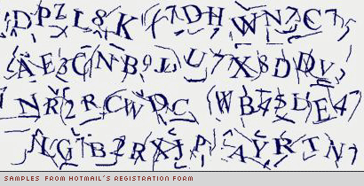
A CAPTCHA, which stands for “Completely Automated Public Turing test to tell Computers and Humans Apart” is a really simple test that, presumably, any human can pass and determine that it is in fact a human with good intentions and not an automated computer with bad intentions submitting a form. CAPTCHAs may seem fairly new, but they have been used since 1997 when Altavista faced the problem of random web sites submitting their URL for its search engine. In 2000, Yahoo! contacted researchers at Carnegie Mellon University after bots invaded their chat rooms. Luis von Ahn, Manuel Blum, and Nicholas J. Hopper of CMU, and John Langford of IBM developed the first self-labeled CAPTCHA, called GIMPY, which required the user to enter three of seven random selected words — from a dictionary of 850 words — distorted and layered on a colorful background.

captcha_yahoo.gif

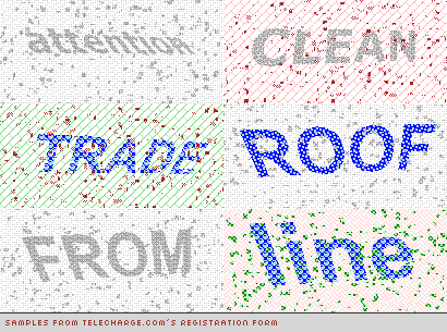
For Yahoo! CMU Professors implemented a simpler version, called EZ-GIMPY which selected a random word, distorted it slightly, placed it on a busy background and asked the user to identify the word. These original CAPTCHAS were simple and easy to solve — perhaps too simple. Greg Mori and Jitendra Malik of UC Berkeley’s Computer Vision Group found an automated procedure to decrypt EZ-GIMPY’s CAPTCHAs. Here, they describe the process through which they reconstruct the deconstructed. Regardless of EZ-GIMPY’s hackability, the method is still in use by Yahoo! and many other web sites. However, today’s CAPTCHAs are visually harder to decipher by bots and sometimes even humans. (If you are wondering how visually-impaired people handle CAPTCHAs, there are spoken CAPTCHAs — good luck with that).

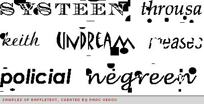
Another iteration of CAPTCHA research and development was conducted by Xerox’s PARC (Palo Alto Research Center) where two different CAPTCHAs were created. The first, BaffleText, generated random nonsense words rather than real words people can understand and it also took more liberty in the deconstruction of the words finding comfort in Gestalt psychology and trusting that the brain would be able to fill in the gaps. The second, Pessimal Print, took “a word (from a fixed list), a typeface (from a fixed list), and a set of image-degradation parameters (from fixed ranges)” to generate its puzzles. These two applications prove that even though we read best what we read most we read pretty good when we put in a little effort.

captcha_baffle_text.gif

CAPTCHAs pass unacknowledged amongst most users, they are simply one last step after hitting the auto-fill button in a browser. During the past years they have become more complex in keeping with evil-doers’ ability to crack them and in doing so are pushing the boundaries of readability just like David Carson did… does. However, there is no theory, no pretense, no old guard clamoring the misuse of type, no posters to be hanged. In CAPTCHAs, deconstructive typography has found its place. Blip.

Maintained through our ADV @ UnderConsideration Program
ENTRY DETAILS
ARCHIVE ID 2196 FILED UNDER Typography
PUBLISHED ON Jan.26.2005 BY Armin
WITH COMMENTS
Comments
Mitch’s comment is:

interesting!

The idea of post-structuralism and specifically deconstructivism and how they relate to the graphic design object (type, page, book, etc..) is what i am planning to explore for my thesis (i am pretty sure anyway) - so i find this article to be especially on-topic for me. Now then, i might be completely wrong in my forthcoming statements, and i certainly mean this will all due respect Armin, but i think i want to disagree with your use of the word 'deconstruction' in this context - i do not think these are examples of deconstructed typography, i think these are more degraded or possibly even decayed typography.

i would consider a deconstruction of typography to (as an example) oppose that which is the primary purpose of type: to communicate. these examples clearly do communicate; e.g. they are readable and in normal conventional english - and they work the same way type works - (somewhat) regular forms combined into groups that then formulate words that have meaning. (even the yahoo! type codes do this - its just that the word happens to be a bunch of random letters) These examples are certainly altered (some highly altered) and often degraded, but not really deconstructed.

now, i most certainly do not have the answer for what is deconstructed type (in fact, i am not sure it would even be a useful answer at that) but after my thesis i will let you know if i figure anything out.

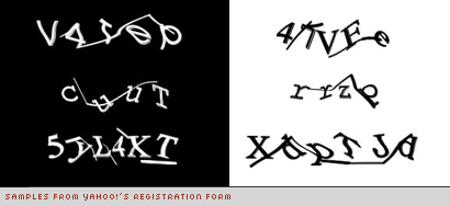
one thing i do find particularly enjoyable about these is the almost Dada-like nature of the Yahoo! CAPTCHAs - they really do their own kind of private tribal electronic dance in their little electronic boxes.

On Jan.26.2005 at 11:51 PM
Michael Holdren’s comment is:

Great post. If anything, for calling out deconstructive (or whatever Mitch and Armin decide it should be called) typography for what it is. It's always bugged me as being a direct contradiction for typography's intended purpose: communication through legibility... and how the movement even became a blip.

By the way Armin, congrats on being a presenter for the AIGA Y Design Conference. Wish I could go.

On Jan.27.2005 at 12:09 AM
graham’s comment is:

oooh naughty armin. from appollinaire to stanley donwood (and beyond) a blip? ignorance. laughable frightening naughty ignorance.

mitch- strong point on deconstruction; there is really no such thing as deconstructive typography-it's sort of impossible. whoever gave typography of a certain kind at a certain time that misnomer should be . . . blamed.

michael: typography's 'intended purpose'? that's a touch pompous. understanding is no predicate of communication, nor does communication (particularly legible communication) absolutely guarantee understanding.

On Jan.27.2005 at 03:04 AM
Armin’s comment is:

> a blip? ignorance. laughable frightening naughty ignorance.

Dear Graham, I'd be the last to decry this as a blip, hence, my "even possibly" disclaimer in that sentence, perhaps too subtle and too dangerous as you have proven. I would have not fallen in love with design were it not for that blip. Which it is not…

> i think i want to disagree with your use of the word 'deconstruction' in this context - i do not think these are examples of deconstructed typography, i think these are more degraded or possibly even decayed typography.

Honestly, I debated whether to call it deconstructive, file it under post modernism or just call it that-cool-stereotypical-shit-mostly-assigned-to-Cranbrook. I claim no expertise in this complicated semantic matter and because we have had such a hard time coming to agreements on what is what in regards to this style/movement/ism I just went with deconstructive as in anything that distorts the original design of the type to the point of unreadability.

> these examples clearly do communicate; e.g. they are readable and in normal conventional english - and they work the same way type works

This is why I found these things so interesting. They communicate and function in this context. Where your attention only has to focus on one word and in order to make a purchase or sign up you have to make the effort to read the word, decipher it and enter it in the little text box. Take, the first example, Hotmail, can you imagine that type in a book cover, a poster or a CD? It would be "hard to read", the client would be concerned about recognizability. Using Hotmail again as an example; on their own, they are beautifully bizarre, in a common-object application they would fall under the subjectivity of ugliness.

> By the way Armin, congrats on being a presenter for the AIGA Y Design Conference.

[shyly] Thanks

On Jan.27.2005 at 08:39 AM
marian’s comment is:

Gee, I'm not registering online inthe right places. The CAPTCHAs I've seen have been interesting to be sure (and I have noticed them and at times been quite delighted with them), but none as far-out extreme and beautiful as the samples you have here.

Surely these and the distressed typefaces have come about through similar routes: basically to subvert the standard letterform. Both are, in a way, a reaction to the machine. Both, I think, are intended to make you look a little harder, use your brain and interpret to understand.

Interpretation is something that computers are still not very good at ... and, it would seem, many humans as well.

On Jan.27.2005 at 10:55 AM
Nick’s comment is:

Great essay, Armin.

On Jan.27.2005 at 11:16 AM
graham’s comment is:

marian-'Interpretation is something that computers are still not very good at ... and, it would seem, many humans as well.'

nice point: interpretation (both as an art and an instinct, from translation to reading and on) is often neglected in terms of being a valid and valuable way to appreciate situations, objects, ideas.

i'm not sure about subversion so much-the use of word as object/image/texture often comes from the desire to infuse text with, at the very least, texture-mallarme, in 'the book a spiritual object', suggests this when comparing newspaper content with the content of, say, a novel. this was of course prior to film and mallarme's intentions seem to be to want to infuse text with movement which is now (in a literal sense) far easier than it was in 1880.

coming back to recent work, i do think that the notion of tradition (in taking on the past and infusing contemporary work with those sensibilities that seem useful to the maker) is very important: when i read this 'the reappraisal of wood type,Victorian letterforms and dingbats as well as a global bent towards bright and bold sans and large and elegant serifs' in armin's article it seemed to me to describe at least partly a process that people from piet zwart to jonathon barnbrook may have been through-and perhaps these new secret glyphs are another step along the road.

On Jan.27.2005 at 11:21 AM
Michael Holdren’s comment is:

Oh Graham... I should have known you'd pick that apart.

I did use the phrase "intended purpose" because that is what communicative language is, even in it's written form: to be understood. I wouldn't say that I was being pompus when I said that.

> understanding is no predicate of communication...

Here I couldn't disagree with you more. However, In the "understanding" part I'm referring to the recognizability of individual letter forms which produce words which produce sentences which produce messeges, blah blah blah... The understandability of the messege is another set of issues.

The "deconstructive typography" that I have issues with are the ones in pieces that say "hey look at me I look all cool and grungy and all fucked up and if you want to read my words you better break out a magnifying glass and a mirror because there's no way you're reading my shit the normal way". Which is all fine and well if that's what the messege is supposed to be. But I've seen pieces whose messege is obviously not supposed to be that, but deconstructive typography is used because some designers think it looks cool (or whatever reason).

On Jan.27.2005 at 11:40 AM
Doug Bartow’s comment is:

I don't think the CAPTCHA's became 'deconstructed typography' until Armin re-assembled them to form letterforms/images which engage human viewers. In their native form, the CAPTCHA is a tool to fool computers. The use of letterforms or numbers is ancillary to the purpose of forcing a human eye to decode the text and re-type it, foiling the spam-bots etc...You could easily set up a similar question/answer to defeat the machine, such as fill in the missing shape, or "why did the chicken cross the ----" etc...

It's interesting to define typography for the 'human eye' as opposed to the 'automated eye'.

On Jan.27.2005 at 03:44 PM
Armin’s comment is:

> I don't think the CAPTCHA's became 'deconstructed typography'

But basically what CAPTCHA software does is deform type… it takes away pieces, it blurs, it adds noise, it distorts horizontally, vertically and even, through illusion, it distorts the depth of the type. The premise — and this is quite similar to that cool shit that came after the Mac took the profession by storm — is that software is used to deform type randomly through a set of parameters. This is no different than an Illustrator or Photoshop filter. So, no that I wan't to be stubborn in my position, but I do think that CAPTCHAs, in principle, are deconstructed typography.

On Jan.27.2005 at 04:45 PM
Gunnar Swanson’s comment is:

Its major exponents — Ed Fella, Neville Brody, Jeffrey Keedy, Katherine McCoy, April Greiman to name a few

How did April end up on that list? If I had to associate one typeface with her it would be Univers.

On Jan.27.2005 at 04:58 PM
Armin’s comment is:

I'm sorry… the list is not meant to list type designers but designers who liked to mess with type.

On Jan.27.2005 at 05:17 PM
Ahrum Hong’s comment is:

'if you want to read my words you better break out a magnifying glass and a mirror because there's no way you're reading my shit the normal way'

There are few works I can think of where the intention is for the reader to not read. Distressed type, for me, was always much more about tangibility than it was about illegibility. Even those high-minded cranbrook fellas seemed more interested in designing messages that were clearly crafted by humans (and not by some robot in a skyscraper) than they were in fucking shit up because almost illegible=cool. Maybe I got it wrong, but going along this train of thought, the recent Victorian/woodtype fetishism seems a natural progression; when not used mindlessly, this 19th century-ism becomes another way of invoking actual objects (decorated/ornamented ink on paper, painted signs)

On Jan.27.2005 at 06:48 PM
Doug Bartow’s comment is:

Armin’s comment is:

> But basically what CAPTCHA software does is deform type...

Therein lies the rub...deformed by a computer program to fool other computer programs is not 'deconstruction', it's 'deformity'. Semantics? Of course, but an important differentiation. K. McCoy's concept of 'typography as discourse' was based on the premise of the designer becoming more active in the messaging sequence between author and viewer. If you substitute the CAPTCHA software for 'designer' in that equation, the concept becomes sterile, and lacks the human (designer) premise the thesis is based upon.

On Jan.27.2005 at 07:46 PM
Ryan Pescatore Frisk’s comment is:

Armin,

What a tragedy it is when deconstruction is misconstrued as destruction, unconstruction or thought of as an applied theory. Also, please be careful (and extremely knowledgeable) when trying to label the collective efforts of any one institution.

Maybe its a case of sheep mistaking all other four legged neighbors as wolves, as I don’t think CAPTCHAs have any relation to the first paragraph, however interesting they may be as objects or process.

Here’s a good place to start:

http://www.designwritingresearch.org/essays/deconstruction.html

On Jan.27.2005 at 07:59 PM
Armin’s comment is:

Ryan, points well taken.

As I pointed out earlier in response to Mitch, my understanding of Deconstruction may be an insult to those that practiced it — if practiced can even be used. I — ignorantly? Stubbornly? —�take the liberty of using "deconstructive" in its more immediate, less charged meaning. Perhaps my mistake is in trying to tie that with the people I mentioned in the first paragraph in that it reduces what went on behind the scenes… And I'm also guessing that no one ever will get it, not even Poynor's No More Rules.

However, could we agree that the visual manifestations of the ism in question do not revolve around clean typography and layouts? In the article you pointed me to (thanks):

A study of typography and writing informed by deconstruction would reveal a range of structures that dramatize the intrusion of visual form into verbal content, the invasion of "ideas" by graphic marks, gaps, and differences.

Of course, this is just half of a paragraph in a lenghty essay.

> Also, please be careful (and extremely knowledgeable) when trying to label the collective efforts of any one institution

I hope my sarcasm came across more clearly. But, yes, I will try to be more careful.

On Jan.27.2005 at 09:11 PM
gregor’s comment is:

intentional or not, I think the browser title bar for Armin's essay is a lovely example of what could potentially be called deconstuctivist typography.

for those who do not now the purpose of the em tag, it's appearance creates an irreconcilable rupture, leaving the indivual reader to create a meaning where the text supplies none.

On Jan.27.2005 at 10:05 PM
gregor’s comment is:

>> for those who do not now the purpose

should read as "for those who do not know the purpose..."

terrible typist - sorry

On Jan.27.2005 at 10:07 PM
Armin’s comment is:

Oh, yeah, thatthis one is my favorite though.

On Jan.27.2005 at 10:39 PM
gregor’s comment is:

I love those types of "mistakes." They're always just so gorgeous!

On Jan.27.2005 at 11:17 PM
Darrel’s comment is:

Nice overview, Armin. Very thorough.

Alas, while these, for now at least, are a necessity, it's also bad design. It puts an annoying hurdle between the end-user and the end-user's task. It also is far from fool-proof, and has all sorts of accessibility issue.

But, it is an as an abservation on type, and a good debate starter on decontstruction.

On Jan.28.2005 at 11:54 AM
Matt Waggner’s comment is:

Every time you talk about "deconstruction" or "postmodernism," I understand what Pearl Jam must feel like when fat hairy dudes scream the lyrics to "Jeremy" around them in public.

On Jan.29.2005 at 01:22 AM
Armin’s comment is:

> fat hairy dudes scream the lyrics to "Jeremy" around them in public.

Which I'm sure happened all the time…

Let's skip the metaphors, I prefer "you are full of shit" (with some commentary to support it) a la graham. I'm happy to learn.

On Jan.29.2005 at 09:17 AM
Su’s comment is:

Well, since it is Graham, how about using when people screamed, "Lager, lager, lager" at the Underworld boys?

*ducks*

On Jan.29.2005 at 11:30 AM
Gunnar Swanson’s comment is:

Its major exponents — Ed Fella, Neville Brody, Jeffrey Keedy, Katherine McCoy, April Greiman to name a few — have not titillated our sensitive retinae in some time.

Sorry to dwell on this list, Armin.

I think your overall point—connecting a technological fix with an aesthetic—is interesting. It’s particularly interesting in the light of many people’s assumptions that the whole Studio Dunbar/Cranbrook/CalArts/David Carson thing was somehow the “result” of computer usage. The captcha/“deconstructive” comparison points out that the computer is later on the time line than the “computer influenced” work.

But back to the list: All of those people had something to do with doing then-weird stuff to type. There’s the implication here that they have a lot in common. Ed, Jeff, and Katherine have Cranbrook in common (although McCoy was more of the host of the party than an active type assaulter.) As much as I tend to slur the Cranbrook/CalArts mafia as a group, it strike me as a mistake to assume that they have much in common philosophically and it’s too easy to assume aesthetic uniformity that really isn’t there.

Brody is the one on the list I don’t know. Perhaps that’s the reason that he’s the one I have the least clue about but I think it’s because he was the one with the biggest denial of his formalism. He did a bit of messing around with type in a way that fits the captcha mode but I don’t think that describes much of his work. April messed around with type but in ways that were very respectful of traditional typographic form. Even Jeff hasn’t shown much of a tendency toward the sort of letterform distortions that Ed and Hotmail registration love. Degraded type in the sense of “Hard Times”—crude Frankensteinian letterforms—but he seems to like ugly and crude more than twisted.

I guess I’m going on about this because I found myself in the strange position of seeming to be a defender of the Cranbrook heritage a few months ago. Someone was talking about Cranbrook/CalArtian stuff all looking alike. I argued that it is alike only in what it is unlike. Even if you take a narrow time span to three years or so of the Bloomfield Hills gang, it doesn’t take much stylistic insight to be able to identify the difference between, say, a Ed McDonald, a Scott Makela, and a Jeff Keedy piece. There’s objectively more variation there than between Emil Ruder, Armin Hoffmann, Max Bill, and Josef M�ller-Brockmann’s work and I’d claim that anyone who said they were interchangeable was either blinded by ideology or is a buffoon. Maybe that’s all a perspective problem. I get some of the French Romantic painters confused and am not too concerned by that.

Maybe this is degenerating into just one more cautionary note about making assumptions about commonality in work or about seeing “movements” and such.

Yumanti—“Pop ya colla, baller; time to get hyphy”? Does it sound as sweet as Belizean creole? “Ya da fo we Belize.” The first time I heard it I waited politely until everyone but the proprietor of the store left and asked him what language they had been speaking. He laughed and said English. It’s been a while since I hung around Oakland but if ya popped a cola back then it was cuz you wuz thirsty. Outasite, bro. Gotta jam.

On Jan.30.2005 at 11:54 AM
Matt Waggner’s comment is:

Sorry for the snarkyness, but I was actually remembering back to that meta-review of the Poynor book you linked to, and started getting the shakes. And I agree with Ryan that Lupton and Miller are a great source for understanding deconstruction: all their "Design Writing Research" essays seem to take a deconstructive approach to the usual design issues, and present it in a natural-sounding way.

The thing that drives me crazy about how you present this topic is that you describe it as a purely visual style, which then can be applied to things which have nothing to do with deconstructive ideas. From that point, many people (and many very prominent design writers) ball the whole project up and toss it in the bin – "too confusing" – and use that as a pre-emptive justification to reject complex forms and ideas wherever they might appear. One aspect of "deconstruction" that I think remains pretty constant in practice is the assumption that readers are pretty smart, and can make sophisticated connections between form and meaning based on what they already know from participating in society.

As a comparison, what does "modernism" look like? What does "branding" look like? I could say "grids and helvetica," or "graphic form in a rounded shape," and while the stereotypes might have some basis in historical fact, all of these attitudes get wrapped up in how we decide to make design charged with meaning – and will stay with us long after Muller-Brockmann, Ogilvy+Mather, or Cranbrook drift back out of fashion.

On Jan.30.2005 at 11:56 AM
owen’s comment is:

for those of you in the Bay area, there's still a month and a half to catch the "Belles Lettres" exhibit -- which is almost entirely composed of deconstructive experimentation from those days of yore. I bet the curator of that show is slapping himself on the forehead now: "how could I have been so behind the trends?"

There's some beautiful (and I think, lasting; I think, fresh) work in there, including a few pieces not by Mr. Venezky. And rather than plotting 'Cranbrook-style deconstruction" as a blip, it plots it on a continuum by beginning with a few predecessors: dada-esque woodtype experiments, Moscoso Fillmore posters with psychedelic type.

...Then it goes and calls the show "The Art of Typography" which I admit is sort of ridiculous.

-o__n

Oh, if you do go, check out the 2004 SECA Art Award -- Simon Evans does pretty geat work with obsessive graphology.

On Jan.30.2005 at 11:13 PM
Armin’s comment is:

A few reasons why I named who I named in comparison with the CAPTCHAss, which my help my cause or further enrage those who are already enraged.

Keedy: Have you seen the Keedy Sans booklet?

Ed Fella: I guess it would be self-explanatory

Neville Brody: Even at its most "commmercial" he took a lot of liberty with type.

Katherine McCoy: More an instigator as you say Gunnar, but still.

April Greiman: I was thinking of this poster with the textures and randomish lines.

So, that's what was going through my mind in terms of that.

In terms of "understanding" deconstructivism, fine, I may not "get it", I'll do more reading, no sweat. But what I do get baffled about every now and then is the propencity to deny the visual manifestation of it, regardless of the process behind it. Yes, yes, it is essential to understand the thinking behind it and how designers arrive to it through this "process" that unless you practiced it, it seems like you can't talk about it. But, c'mon, let's not deny that it created a very recognizable visual style. Is it fair to label it as just a style? Maybe not, but to not even consider it seems odd to me — that's denial.

On Jan.31.2005 at 08:36 AM
Zoelle’s comment is:

In my opinion, CAPTCHAs fall into a category that I would most comfortably call “exclusive” typography. The intent of this style of modification is not primarily aesthetic, but rather to exclude an audience. In the case of CAPTHCHAs the audience is mechanical. Exclusive type has the characteristic of filtering audiences.

This style of type is related to niche based applications such as: death metal band names, rave flyers, and graffiti tags. These styles exclude the mainstream public. I think that for the most part, if you are not a graffiti artist or familiar with reading tags the literal message is cloaked. The style interpretation is more visceral than literal. Even though I can’t read the message, I “feel” the message.

On Jan.31.2005 at 12:06 PM
Isaac B2’s comment is:

That was fascinating - thanks!

On Jan.31.2005 at 02:28 PM
Gunnar Swanson’s comment is:

a category that I would most comfortably call “exclusive” typography. The intent of this style of modification is not primarily aesthetic, but rather to exclude an audience

I’m not trying to sell copies of Graphic Design & Reading (it’s never going into a second printing so I’ll never see any more money from it) but Kenneth FitzGerald’s “Seen and Not Seen” does a nice job on this subject.

On Jan.31.2005 at 04:59 PM
codeman38’s comment is:

As someone with mildly dyslexic tendencies, I'm going to have to speak up on the legibility of these things.

I don't have much difficulty reading normal text in extremely distorted typefaces much of the time, at least when it's a few words at a time and not a huge block of text. But these Captchas always manage to throw me off. I got to thinking about it, and based on the samples in the article, it occurred to me why this is the case.

The Telecharge.com samples are perhaps my favorites. They're actual *words*, which makes it much easier to decipher them in a Gestalt sense; and while distorted and low in contrast for OCR programs to have difficulty with, they're clearly enough distinguished from the background for humans to decipher.

My next favorite is Baffletext. Except for the right-middle word (is that 'meases'? there's too much missing data to be certain), I can figure out all the nonce words that have been used in that sample for precisely the reasons PARC describes: they follow the same patterns as regular English words, and what's blurred is just clear enough to identify what an ambiguous character actually might be.

The Yahoo and Hotmail samples, on the other hand, give me trouble every time I use them-- I often have to reload the page several times just to get a combination of random characters I can actually make out. The problem with them is the lack of redundancy: when a character is ambiguous, there's no context that allows you to eliminate possibilities for that character. It's just as likely that a weird scribble could be a 7, a T, or an S. Take the lower-left example from Yahoo: is the second-from-the-last character a K or an X? And the added lines don't help, since they often end up exactly where a real line would be in one of the possible characters; the Hotmail example is particularly cluttered and difficult to process in that respect.

On Feb.01.2005 at 10:42 AM
Ravenone’s comment is:

Captches?

On Feb.03.2005 at 03:39 PM
Art Chantry’s comment is:

i only read the first paragraph of this essay and lost interest, i never thought much of "deconstructive" typography (whtever that is.) the whole look is sort of tossing information into a paper bag, shaking it up , and spilling it on the page and calling it "deconstructive design". it's over-rated and pretty bogus.

however, i must point out that 1) deconstruction and approriation is the hallmark style of the last 50 years in graphic design. we are all deconstructivists by virtue of being alive right now. we are all copycats to some extent. and 2) 'grunge' is not not a style. grunge is a marketing term coined to sell punk rock music. it's completely bogus. it's like saying 'new' is a style, or 'pretty' is a style or 'retro' is a style. they are not attributes or anything of note descriptively, they are adjectives used to push product on the ill-informed. grunge' is COMPLETELY bogus as a term. stop using it.

On Feb.13.2005 at 12:10 PM
Gunnar Swanson’s comment is:

Art—You can’t stop me, you fascist: Grunge! Hear me? Grunge!

I don’t remember ever having ever used the term but I will defend its use. But first, I’m not sure what an actual “style” is. Can you name one?

“Grunge” got used to describe the music of several musicians. The music and the musicians had some basic things in common. That doesn’t mean they had Tuesday night lodge meetings or gave tests for stylistic purity (or that they liked, appreciated, or even knew each other.) The same term was applied to an equally disparate bunch of typeface and graphic designers that also arguably had stylistic elements in common.

Even movements that adopted a name themselves, organized, printed manifestoes, and hung out together didn’t become a single organism like a termite colony. Dada arguably demonstrated more individual difference than grunge (either the musical, graphic design, or type design variety.) Yes, it’s irksome when someone hangs a label on you but if you want people to talk about you they are going to have to use words so get over it.

I would balk at calling “retro” a style but I would claim that the word does a reasonable job of describing a cluster of not-unrelated styles and practices.

I’m among those who object to the “deconstructive” (or the repulsive coinage “deconstructivist” or, worse yet, “deconstructionalist”) moniker because the specific term causes confusion: it conflates stylistic trends and largely-unrelated philosophical ones and gives some hollow, formalist graphic design an undeserved implied depth. I suppose someone could fret that the grunges imply too much about a confluence of hot-in-the-’90s music and design but the confluence of taste and trend was real and observable, unlike the imagined confluence of the various deconstructions.

On Feb.13.2005 at 09:00 PM
art chantry’s comment is:

gunnar -

huh? that last paragraph turned into gibberish. please clarify what you said.

as for 'grunge", i assume then that you also believe in "beatniks"?

- art

ps - sorry about using the word "bogus" three times in one statement, but i really do think the terms "grunge" and "retro" are totally bogus. i oughta know.

On Feb.14.2005 at 04:00 PM
Gunnar Swanson’s comment is:

Art—

that last paragraph turned into gibberish. please clarify what you said

You’re nice.

Deconstruction: the term implies things that aren't true so it confuses conversations about graphic design and style.

Grunge: the term doesn’t seem to imply very much that isn’t true. Other than being a generally dumb word, I can’t figure out how it’s objectionable.

Does that clear it up?

I wouldn’t use the term “beatnik” seriously just because it never got beyond being a silly put-down. But are you implying that you wouldn’t ever talk about “the beats” as a group? (Or is that “the Beats”?)

Are you objecting to labels and descriptive terms in general, just particular labels and descriptive terms, or just labels and descriptive terms of anything you have to do with?

On Feb.15.2005 at 03:11 PM
art chantry’s comment is:

thanks for your "clarification". honest to god i could not figure out what you were saying. no joke. there is a tendancy for designers who went to design schools to talk a language that i can't understand. you talk that language very well, and i have a very hard time figuring out what you are saying. your 'clarification' is still not clear to me.

i've had several occasions to have conversstions with all of the famous deconstructionsits mentioned - ed fella, cathy mccoy, jeff keedy (not neville brody. i've never met him). i've found them to all be very interesting, intelignent clever and charming people. however, when i've asked them to explain a piece to me, they go into the process of explaining what "this piece means over here. that icon means over there, what this respesents over here..." basically what i get is a whole mess of little half considered ideas tossed into a grand salad of partial ideas with the hope that the viewer with make associations into a big overall idea. now, i always thought that the porcess was a trifle strained and more than a little self-indulgent. the "logical" outcome is david carson style chaos and a confusion of vague little ideas. it's the antithesis of clear communication - the very thing these folks all seem to think they are doing. so, i've always strived my best to do the opposite. i admire their minds and personalities, but their method and theories are very pretty but, well, a waste of effort to my mind.

when the design culture world labeled punk design "grunge graphics" it was cute, but every bit as insultingly blind and stupid as the word "beatniks" as a label. retro is even a larger insult to huge efforts. by your definition "modernism" is just another retro style. in fact anything that is not instantly of the (vague) "now" is retro and "old school" (another stupid term). the problem is that contemproary ideas in a post modern world (aka - a classic decadent style) are by definition appropriated and therefore "retro". there is no NON retro. or can't you see that?

grunge and retro are just plain stupid terms that have no definition. so please don't use them as if they are. that's my point.

this was an attempt at 'clarification".

On Feb.15.2005 at 05:25 PM
Gunnar Swanson’s comment is:

Art—Design schools are to blame for many horrible things but my way of thinking, talking, and writing are not among them.

It’s not clear to me what’s not clear to you so it would help if you were specific.

I’m specifically not clear about your stance on labels like “deconstructionist,” “grunge,” “retro,” “new wave,” etc.

I can’t tell if your reference to “all of the famous deconstructionsits mentioned” was meant as irony or sarcasm or was serious.

There are several reasons to reject particular labels. One is because there are problems in classifying anything and some people inflate those problems into a prohibition. If all labels or classifications are prohibited then we can’t talk about a lot of important things so I’ll assume that nobody here is making that claim.

The most common objection to specific labels is not to the grouping that the label suggests. It is to the word used as the label itself. Someone could think the word "gay" sounds silly or "homosexual" too clinical or "queer" too rude but accept one of the others as correct and proper. They believe that the classification is legitimate but the specific label is unacceptable. Your “beatnik” example seems to fit here. The word “beat” (shortened from “beatific generation”) served well but after a Russian space launch someone wrote that “the beats are higher than Sputnik” and “beatnik” caught on. The term seems pejorative and it is unneeded since “beat” serves its legitimate purposes.

Another reason for objecting to a label is a challenge to the accuracy of the grouping. I had a Croatian student who objected when I called his language Serbo-Croatian. He claimed that Serbian and Croatian were separate and “that was like saying Japanese-Spanish.” Of course his claim was politically motivated bullshit but the grouping objection was his stated objection.

My objection to the variants of “deconstruction” (especially as applied to Armin’s list) covers both types of objections. I think it is a badly chosen name because it implies a connection between graphic design and philosophy/literary theory. I think that connection is tenuous at best and implying its importance confuses people.

I also object to the labeling because the grouping is wrong. April Greiman and Jeff Keedy have little in common other than both being graphic designers that did their best-known work during the time they have lived in Southern California. Giving them the same label implies something in common that doesn’t exist or a distinction from other designers that doesn’t exist. (I know better than to speak for either but I think I know April and Jeff well enough to say that they would both be mystified by being classified together.)

You seem to object to the use of “grunge” because, like “beatnik,” you find it pejorative or dismissive. Do you also object to it on the basis of it being a false grouping? You suggested it be called punk but the music “grunge” is not the same as the music “punk.” We can argue whether it’s an offshoot or a subset but, for example, the Sex Pistols are clearly not “grunge.”

Do you accept the idea that the subpopoid music formerly known as grunge is a legitimate grouping or do you think it was just a marketing scam? If the grouping makes some sense, what name would you prefer?

Do you accept the style(s) of graphic design often called grunge make up a legitimate classification? If so, can you offer a better label?

How about “retro” design? I would argue that the term is useful to talk about a phenomenon but it may be better thought of as multiple styles or movements. The Chuck Anderson “retro” may have some things in common with the Paula Sher “retro” but in some ways their use of recycling forms that had faded from use are quite different. There are, however, many practitioners who approach this recycling in ways very similar to one or the other of them.

(The questions of the relationship of some of your work—the work that has some formal similarity to some of Anderson’s—to the CSA branch of “retro” and of much of modernist graphic design to his practices are too much to deal with right now but I’d love to engage you in that conversation sometime soon.)

So, is “retro” like “beatnik”—dismissive but a valid class (or valid classes) or is it an illegitimate grouping of unrelated stuff (as I claim “deconstructionist” design is)?

On Feb.16.2005 at 04:17 PM
art chantry’s comment is:

well...

you insist that everything you say is correct without variance. ok. that's fine. i say something different. that's ok and fine, too. i seem to have a hard time believeing what i read, but tend to give more creedence to what i observe and experience.

so, go ahead. use "grunge" and "retro" and all those happy little inaccuracies. it's OK. honest. the world will continue to turn.

but, you won't find me reading what you say with any interest if you do.

is that ok by you?

On Feb.16.2005 at 04:31 PM
Gunnar Swanson’s comment is:

Art—Maybe you are answering my questions covertly. Does “all those happy little inaccuracies” mean that you are rejecting the classification (see Serbo-Croation in my post above) rather than the specific moniker (see beatnik)? You accuse me of some sort of design school babble but refuse to grant me the luxury of knowing what, specifically, you object to or don’t understand. You make broad proclamations but refuse to defend them other than insisting that we all have faith in what you “observe and experience.” What’s up with that?

BTW, when did I “insist that everything [I] say is correct without variance”? And why do you think I should care how much interest you have in anything I write if you blow off other people’s sincere work at understanding what you’re saying and choose instead to insult them after making no attempt at understanding on your part?

On Feb.16.2005 at 07:41 PM
art chantry’s comment is:

whatever.

On Feb.16.2005 at 07:52 PM
Armin’s comment is:

Now we are getting somewhere…

I have to say, this has been a very interesting exchange. And I don't mean interesting as in look at these wackos going at each other. Some good points have been made.

On Feb.16.2005 at 07:58 PM
BlueStreak’s comment is:

I contend that some good points are being made and they are a couple of wackos going at each other.

On Feb.16.2005 at 09:06 PM
art chantry’s comment is:

isn't "wacko" gibberish for "grunge"?

On Feb.16.2005 at 11:33 PM
BlueStreak’s comment is:

AC, I am, in fact, fluent in gibberish.

A "wacko" is one who is sanity impaired.

The purveyor of "grunge" is much more. That is one who is not only sanity impaired, but also sanitarily challenged with an irrational fetish for flannel.

On Feb.17.2005 at 02:59 PM
art chantry’s comment is:

oops. i guess i wound up on gigposters.com. my mistake. my sanity must be impaired.

On Feb.17.2005 at 05:44 PM
Shahla’s comment is:

Here's a visual that’s like the captchas posted here. While browsing through the AGI members’ pages it was interesting to see the single work sample each member decides to make available on their page. Some members haven’t made their selection yet. It’s a hard one. I imagine they may be asking a friend or partner to help narrow it down to one piece. Some might have known right away which to submit.

So who’s the first (in history, before Brody, Fella, Greiman or McCoy) designer to have deconstructed type (in the general sense of the word) in a manner that inspired you most?

On Feb.21.2005 at 12:34 AM
Ravenone’s comment is:

Gunnar gets super-bonus points for mentioning DaDa.

On Feb.21.2005 at 02:14 AM
Shahla’s comment is:

Missed Gunnar’s mention -yes, Schwitters and his �Merz’, specifically.

On Feb.21.2005 at 02:29 PM
art chantry’s comment is:

dadists were deconstructionists?

hubris.

On Feb.21.2005 at 03:51 PM