Speak UpA Former Division of UnderConsideration
The Archives, August 2002 – April 2009
advertise @ underconsideration
---Click here for full archive list or browse below
  
Subtítulos en Acción
(SUBTITLES IN ACTION)
On occasions I strangely fall in love with a movie — it is not necessarily the “quality” of the movie, rather an odd trigger lurking beneath its surface that grabs me. To list a few for the sake of let’s see what this guy means: Madhouse (John Diehl and his elephant) , Terminator 2 (Guns N’ Roses in the soundtrack), Best in Show (Fred Willard), Natural Born Killers (interesting violence), Forrest Gump (what can I say?) and Amores Perros (everything about it).

This past weekend I watched Tony Scott’s Denzel Washington and Dakota Fanning vehicle — I have always wanted to use the term vehicleMan on Fire. There are a few reasons why I am adding this movie to my list: It is one of the few “mainstream” American movies that correctly depicts Mexico City’s grittiness, beauty and its contradicting lifestyles; without much dramatization — sadly — it captures the fear of the ongoing kidnappings, corrupt policemen and government officials; its jittery, burnt visual style, while nothing new, is apt for the movie and quite engaging; and, lastly, the wildcard, the subtitles.

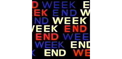
Because the film takes place in Mexico translations are certainly needed. As far as subtitles in movies go, there is not much one can say, they are purely utilitarian. White or yellow sans serif (serif if you are unlucky) sentences pop at the bottom of the screen, always interfering with the beautifully framed and considered shot of the director and scurrying away as soon as the non-English speaker has delivered his or her lines. In Man on Fire, Tony Scott turns its obligatory subtitles into visual stimuli for the movie, intertwining — sometimes gently, other times abruptly — typography into its scenes. The subtitles, rendered most of the time in Franklin Gothic, are not confined to the top layer of the film, they have depth and perception, they wait for their turn and they, like their real-life actors, hit their mark as told. This, however, is not groundbreaking, many movies have used typography better and many of the visual puns in Man on Fire are reminiscent of Typography 101 exercises (How do you make type scream? You make it big and bold, silly). Nonetheless, Man on Fire achieves small, visual victories that add charisma and personality to commonly bland and uninspiring subtitles.

The film did not do well: Metacritic lists a score of 47 for it, not even high enough to encourage rentals, it seemed like it was in theaters for no more than a week and, as much as I enjoyed them, critics blasted its subtitles. Brian Gallagher of MovieWeb warns “If you want to know how NOT to do subtitles, this is the movie to watch…”. For The New York Times A. O. Scott starts “[Scott] flashes subtitles across the middle of the screen, in a variety of sizes and type faces [sic], not only translating the Spanish dialogue but also spelling out some choice lines of English as well,” and concludes, “This is mystifying, but also typical of the garish, extravagant literal-mindedness that governs ‘A Man on Fire’”. In an interview with UGO, Scott confided “I thought that subtitles are boring because they’re there generally to serve us with information to make you understand what people are saying in a different language. I just thought they should be kind of a character in the scene. I started to examine and look at another way of doing it, and I stole what I did from old kung fu movies [laughs].”

With all its downfalls — and critics list many if you care to keep digging — Man on Fire is now on my I like it because I just did list. Here are some of the subtitles with — what are these? — overtitles for your convenience:

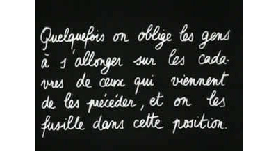
The film starts with simple subtitles


The subtitles quickly start playing with the pans of the camera, coming up as the scene evolves


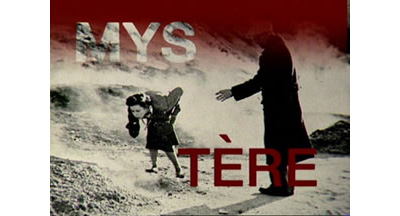
In one single scene, the subtitles waltz into the screen, fall in place and then hide behind a bad guy


Famed actor, Giancarlo Giannini, is equally prone to subtitles even when he is speaking in English


It was this scene when I first noticed the subtitles; what looks like a technical error or mistake is a visual reference to the desperation in the actors voices… and, yes, that is Marc Anthony


In one of the must wrenching scenes, the subtitles add plenty of drama


Switching slightly to a faux-italic Chicago for effect… I guess


In another exchange, a pin number is, well, exchanged


And again


When you don’t know who’s the boss, you know you have to make the type uppercase and bigger


An interesting detail, when the old man speaks, a fuzzy halo surrounds the typography


Some other typefaces are used, like Emigre’s Base Nine


And plain old Courier


Some more exchanges in which, you can bet, there is plenty of screaming


And the subtitles were never in the same place


All images are screen shots of the DVD and are property of 20th Century Fox
Maintained through our ADV @ UnderConsideration Program
ENTRY DETAILS
ARCHIVE ID 2231 FILED UNDER Typography
PUBLISHED ON Feb.28.2005 BY Armin
WITH COMMENTS
Comments
M Kingsley’s comment is:

Armin, I had once heard Tony Scott intended to make a feature film that was only typography. What a possibility...

On Mar.01.2005 at 12:56 AM
agrayspace’s comment is:

Great post!

I have often obsessed about the infinite possibilities of typography as a story telling device in film. I have not seen A Man on Fire but while clumsy and a little heavy handed this seems like a step in the right direction, though with all the criticism it probably won't gain traction as a good dramatic device. I will definitely have to check it out.

One recent example of motion graphics and typography that actually informs the story and doesn't just look cool is in the Bourne Identity when all the assassins are being called up to get Bourne. Really good stuff. I just wish there was more of it.

And on a subtitle side not, for all its typographic praise, The Pillow Book is the most infuritating example of irresponsible and just plain mean use of unreadable white-on-white teeny-tiny serifed typography.

On Mar.01.2005 at 09:31 AM
Mitch’s comment is:

i totally agree with you armin - its not a great movie, its in many ways highly contrived and visually excessive (more shaky camera than you can, well, shake a camera at), hyper saturated colors and the like - but at the end of the day it is in many ways a very cohesive vision of the kind of chaotic downward spiral the protagonist is on, while heavy-handed yes, even the expressive subtitles help to add to this. I did like it - after seeing the DVD the 1st time around i went thru it again just to some of the more visually compelling scenes (some of which you have here) and it feels like Tony Scott was attempting to be expressive with more than just his actors, and in that respect i give him credit - i actually quite enjoyed watching the little dance of the subtitles.

On Mar.01.2005 at 10:11 AM
Lenny’s comment is:

My initial reaction when I saw this film was the same as you, Armin. Love the saturation, grittiness, etc. But one thing I found was that the over done typography in the subtitles took me out of the experience of the film. The grittiness that pulled me into Mexico City was immediately taken away as soon as I felt like I was watching a cheezy flash intro screen for two and a half hours.

On Mar.01.2005 at 10:30 AM
Diane Witman’s comment is:

I was never tempted to see this movie...but Blockbuster, here I come!

On Mar.01.2005 at 10:43 AM
sheepstealer’s comment is:

We all know that type can have many functions. I love that this director has recognized the expressive nature of typography, but I don't think being this tricky is appropriate for the purpose of subtitles.

In logos and posters it's great to take a Lubalinesque approach and tell the viewer something typographically even before the type is read.

I think a subtitle should take more of a Fred Goudy approach and be clearly read—nothing more.

The ultimate subtitle typography should deliver the dialogue so clearly that it would leave the viewer unable to even remember what the titles looked like.

On Mar.01.2005 at 11:07 AM
Armin’s comment is:

> The ultimate subtitle typography should deliver the dialogue so clearly that it would leave the viewer unable to even remember what the titles looked like.

Well, yeah, if you are striving for the ultimate subtitle typography. Clearly here the idea was to not make it subtle. It then becomes part of the movie, it is not meant to cruise on the surface, you are obligated to notice it. Is it distracting? You bet.

One thing I should add is that I grew up with subtitles. Every American movie I saw — and I saw a lot — in Mexico had subtitles so it's quite easy for me to tune them out but at the same time pay attention. Perhaps that is one of the reasons why I enjoyed this subtitles so much, because it was a visually interesting shift from the subtitles I was used to. And as an aside, if you are looking into learning a new language, subtitled movies are the way to go.

> I was never tempted to see this movie...but Blockbuster, here I come!

Just throwing caution at the wind: The movie can be a bit unbearable, many of the critics' curses are not without fault.

On Mar.01.2005 at 12:09 PM
mahalie’s comment is:

Just got back from Netflix...this is worth examining, entertainment value aside. Subtitles are a necessary evil - wait, do they have to be evil? It seems like it sometimes! I have had two recent evil encounters with screen type - the first I'm almost too embarassed to admit watching. Hey, I like Milla. Anyway, the intro text to The Messenger: The Story of Joan of Arc was set in a gothic blackletter font that was absolutely unreadable. Really, we paused, we squinted. I have no idea what the majority of it said. Who approves these things?! Second was Ong Bak's theatrical release. Okay, this isn't the type itself (I'm getting a little off the subject), but I feel compelled to warn lovers of foreign action movies that the American release cut out a whole sub-plot and the subtitles are COMPLETELY different and really removed a lot of genuine goodness from the original.

Back to the subject at hand, how about a post examining the greatest successes and failures of subtitle type?

On Mar.01.2005 at 12:32 PM
Tan’s comment is:

When I watch DVDs, I usually turn on the English subtitles, even if it's an English-speaking film. I prefer this b/c I don't want to miss any of the dialogue, plus it allows me to enjoy the sound mixing and score of the movie more.

In letterbox format, the best subtitling is unobtrusive, legible, and secondary information. Bad subtitling impedes into the image frames, violating the boundaries between both worlds.

What Tony Scott has done is use subtitling as another layer of visual dialogue. While it seems new, it really isn't. Lots of movies throughout the decades layer typography over the screen image in order to segment chapters or scenes. And let's not forget the most famous use of blocks of text in this relatively recent series of movies.

On Mar.01.2005 at 07:49 PM
Tan’s comment is:

One of my favorite typographic treatment for titling was Ridley Scott's short-lived cable series The Hunger (about modern-day vampires). The treatment was beautiful in its simplicity — bright flashes of type exposed by a mechanized, moving bar of light. Like if you'd placed your face on a Xerox machine, except more creepy. Each passing flash would expose new type out of the darkness, and then recede. It was cool.

...and sorry, one last thing. I thought Soderbergh's Traffic did a better job and did it first before Scott's Man on Fire.

On Mar.01.2005 at 08:21 PM
Valon’s comment is:

Ahh...great movie, great typography, great cinematography, great characters, great everything. A must see, despite low ratings and short theater life.

Oversaturated reds and greens, shaky cameras, and out of focus shots, invite the viewer to be part of the story.

Images on this post don't do justice to the actual typography execution.

On Mar.01.2005 at 09:30 PM
Derrick Schultz’s comment is:

I think the earliest example of good typography being integrated—but not being overdone or being the primary focus— into a film that I have seen is Jean-Luc Godard's "A Woman is A Woman." The poetic sections that use type in that movie are some of my favorite "design" scenes in any film. I'm sure you can trace it back to earlier films, but thats one of the big ones that I can recall.

On Mar.02.2005 at 12:31 AM
M Kingsley’s comment is:

Derrick, that's actually a pretty well-known Godard-ism; often found in his work — beginning with that particular film, Une femme est une femme. More recent films like Histoire(s) du cinéma and �loge de l'amour use these inter-titles in a much more stylized manner; sometimes one word at a time or sometimes superimposed over other language fragments. Towards the beginning of his career they acted as either chapter heads (Masculine Feminine) or as a running commentary — like in Les Carabiniers; where they're written in a typical French student's handwriting:

This is from the opening of Weekend...

... and one of the interstitial cards (with a modernist suggestion that the film is making itself as you watch it)...

...and something from the much more stylized Histoire(s) du cinéma.

His inter-titles are often formally graceless, but they certainly add to the power and depth of the films; which demonstrates good "bad" typography.

What strikes me most about the film you saw (Une femme est une femme) is how the opening credits are only last names: Godard, Legrand, Ponti, Brialy, Belmondo, Karina, etc. If you knew cinema at that time, you also knew each person's first name and their profession. Definitely something that would almost never happen today.

On Mar.02.2005 at 02:59 AM
Derrick Schultz’s comment is:

Kingsley-

Thanks, I will have to go back to a few of those and revisit them. I have seen quite a few Godard films, but a majority of them were his earlier ventures (I'm still searching for a good version of Week-End to watch).

I also found the opening titles of Une Femme interesting for the fact that it was over the top, screen-filling type—again, something you would never see nowadays. It's an interesting contrast to his opening of Le Mepris—where the credits are spoken—but achieves the same feeling.

As for his good "bad" typography, if it were any other director it most likely wouldn't work. But from the Godard films I have seen, his concept and approach are beautiful, but not always technically proficient. I would say his type usage fits perfectly in those cases.

On Mar.02.2005 at 12:06 PM
Armin’s comment is:

> While it seems new, it really isn't. Lots of movies throughout the decades layer typography over the screen image in order to segment chapters or scenes.

No debate there. However, movie chapters, "locations", character names (a la Tarantino) are a different animal than subtitles. Subtitles run along with what is ocurring in the plot; these other shorter typographic jolts are part of the narrative. I actually don't think there are many movies where subtitles are as animated as in Man on Fire.

> I thought Soderbergh's Traffic did a better job and did it first before Scott's Man on Fire.

I can't remember what they looked like… wasn't it just like yellowish subtitles?

On Mar.02.2005 at 12:14 PM
Rob’s comment is:

This is quite an interesting post. I for one have found most subtitles to be a nuisance in viewing a movie rather than really helping as much. Having to move my eyes away from the action to quickly view the English dialogue seems to take me out of the movie and I quickly lose interest most of the time.

I will have to see if this typographic treatment of the subtitles has a different affect on my viewing and attention span. (Keeping in mind the somewhat low entertainment value)

I do think that type can be used effectively in the movies without its being limited to the bottom of the screen and being just one sans serif type face. And it's nice to see, even though not welcomed by the critics, someone actually attempting to move the use of interesting type beyond the opening credits.

On Mar.02.2005 at 12:33 PM
Tan’s comment is:

>I actually don't think there are many movies where subtitles are as animated as in Man on Fire.

You're right — they're not many. Traffic had a few scenes where surveillance dialogue was subtitled on screen, somewhat stylized for the context. But that's not what I was referring to exactly. You'd mentioned that MOF was accurate in its depiction of Mexico City's grittiness without overdramatization. I thought Traffic was the same, but even more true-to-life, IMHO.

On Mar.02.2005 at 12:53 PM
Tan’s comment is:

>Having to move my eyes away from the action to quickly view the English dialogue seems to take me out of the movie and I quickly lose interest most of the time.

At first, it is a little distracting, but you get used to it quickly, at least I do. It's sort of a cross between reading a good book, and seeing it manifest visually at the same time. To me, the type can make it more immersive.

One of my favorite films of all time is Cinema Paradiso, which is entirely subtitled in Italian. It's funny, but every time I watch it, by the end I'm convinced that I understand Italian perfectly.

But I'm getting off topic...sorry.

On Mar.02.2005 at 01:06 PM
rock hudson’s comment is:

Sheepstealer said:

The ultimate subtitle typography should deliver the dialogue so clearly that it would leave the viewer unable to even remember what the titles looked like.

This is the ultimate subtitle movie

On Mar.02.2005 at 01:19 PM
graham’s comment is:

just you wait until my first feature . . .

On Mar.02.2005 at 01:25 PM
Valon’s comment is:

I for one have found most subtitles to be a nuisance in viewing a movie rather than really helping as much. Having to move my eyes away from the action to quickly view the English dialogue seems to take me out of the movie and I quickly lose interest most of the time.

Growing up in Europe I watched all American movies with subtitles in them. It becomes a second nature I guess; you watch the movie - you read the subtitles. It's all one experience.

After living in the states for the past couple of years I found out that almost everyone hates subtitles here. I couldn't get my girlfriend to watch Crouching Tiger in chinese because she hated subtitles.

On Mar.02.2005 at 05:58 PM
heather’s comment is:

you know, i saw this movie and didn't even remember how those subtitles were done until reading this post. i guess that means they didn't distract me much. now that i think back i really did enjoy the way they were treated.

On Mar.03.2005 at 10:43 AM
Albert B Jr’s comment is:

> It becomes a second nature I guess; you watch the movie - you read the subtitles. It's all one experience. After living in the states for the past couple of years I found out that almost everyone hates subtitles here.

I find the same conclusion with almost everyone I meet. In general (about foreign films), Americans hate to read…subtitles. The most common excuses: "I can't read fast enough" & "It's taking me away from the action. Can't this (insert nationality here) speak English." Well, I say, "Tough. Stop being narrow-minded and appreciate the beauty of the foreign language."

It certainly does take time to get used to subtitles, maybe after 2 or 3 movies. I know, because I've watched my brother's collection of Hong Kong action flicks, and it only takes at least a few seconds for me to read the line of Mandarin Chinese and view the entire scene afterwards. A rhythm develops between reading and watching, and I don't notice the stress and agitation that the "subtitle haters" feel.

Think, would it be strange if I were, for instance, German-born living in Germany, and I watch a German-made movie based in America with characters intended to be Americans…speaking German. I assume it's happening. Who knows.

I believe that the font of the subtitles should, at least, reflect the essence of the film.

A week ago, I watched the Karate Kid Part 2 (Daniel-san and Mr. Miyagi go to Okinawa) and I thought, "Can't someone speak Japanese, please."

On Mar.03.2005 at 02:46 PM
Linda Malie’s comment is:

Albert B: You are right on about Americans hating subtitles. My husband and I enjoy foreign films much more than the good deal of schlock that hits the screens courtesy of Hollywood.

I see reading subtitles and watching the action as a fluid motion, not unlike dance. You just learn to flow and you never miss a single detail.

Watching subtitled anime and Japanese films helped me when taking a basic Japanese language course. I wouldn't have had the same language introduction if I had insisted on watching an English dub.

I feel the same applies to double-language movies and shows. I suppose I show my immaturity when I quote PBS Kids' Maya & Miguel as an example. Much of the dialogue is spoken in Spanish, and immediately repeated in English. I'm on the hedge as to whether or not I enjoy the show, but my Spanish word power has increased quite a bit regardless.

On Mar.23.2005 at 10:55 AM