Speak UpA Former Division of UnderConsideration
The Archives, August 2002 – April 2009
advertise @ underconsideration
---Click here for full archive list or browse below
  
Bridging the Gap Between Hip Hop, Sports and Youth Culture

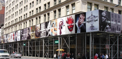
This past February a giant scaffolding went up (and) around the International Toy Center, a building that occupies the full corner of Broadway, 23rd and 24th Streets — a big edifice, in a big location, no doubt. One heavily snowy morning soon after, walking down on 23rd on my way to work, the scaffolding had been covered up — overnight it seemed — and first Jay Z, then Allen Iverson and 50 Cent, followed by Lucy Liu and finally Yao Ming were staring down at me, daring me not to slip (myself or my coffee) as I peered upwards back at them. The combination of celebrities was interesting enough to grab my attention, despite the piercingly cold snowflakes in my eyes, but it was the type style that finally tripped me: Blackletter.

rbk_01.jpg

Blackletter is the only style — that I can think of — that is a crossover. In its similarly diverse variations — texturas, frakturs, rotundas, and schwabachers — it is equally appropriate on beer labels and fashion labels; similarly kitsch on the facades of quaint bed & breakfasts and covers of heavy metal albums; thoroughly serious on newspaper mastheads and diplomas or certificates; and as recognizable as the identifier for Pushpin’s Monthly Graphic and the regime of Nazi Germany.

There is a default association between blackletter and the Nazis, further enhanced by period pieces (posters, video games, books) created today that employ blackletter when referring to WWII, Nazis, Germany or a combination thereof; as well as the adoption of blackletter by Neo-Nazis. In 1941 through a memo from Martin Bormann — Hitler’s “most faithful party comrade” — the Nazi Government officially denied blackletter, or Fraktur, as theirs, taking the opportunity, even, to pass the type style’s origins and blames to the Jews. Additionally, in that same memo, they proclaimed Antiqua, a serif, as their official typeface. Regardless of their efforts to distance themselves from the oppressive and emotionally aggressive use of blackletter it is a tough task to disassociate blackletter from the atrocities of World War II.

And it’s easy to forget that Gutenberg’s Bible was set in blackletter. But this is not about Nazis or Bibles.

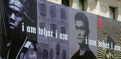
Today, younger generations hardly associate this style to that period or that book. To GenYers blackletter stands for dangerous, edgy, hip and daring. It is an optimal and fine choice for a tattoo — “mom” set in blackletter is cool. Rock stars, actors (the baaad ones), professional athletes and rappers have chosen blackletter as their type of permanent self-expression. So it comes as no surprise that Reebok, looking to bridge the gap between hip hop, sports and youth culture would use blackletter in their recent worldwide, multimillion dollar “I am what I am” campaign.

rbk_02.jpg

This campaign focuses, as stated on a press release, on individuals “who stand out from the crowd because they are true to themselves, challenge the status quo and do things in their own unique way,” and who ultimately represent what Reebok wants to stand for: Individuality and authenticity. The complete roster of celebrity endorsers are hip hoppers Jay-Z and 50 Cent; super athletes Allen Iverson, Andy Roddick, Kelly Holmes, and Yao Ming; skateboarder Stevie Williams and soccer star Iker Casillas who are sure to provide strong authenticity due to their niche sports. And finally, the oddest choice to fill the actor slot, Lucy Liu, as if at the last moment Reebok decided it needed to appeal to a female audience or, alternately, cashing in on Liu’s beheading Kill Bill appeal. (Trust me, if it were intended for a purely male audience, more suitable — read, and pardon the objectifying, hotter — actresses would have fit the bill).

The choices — at least the ones with the more popularity: Jay Z, 50 Cent and Iverson — have a stronger allure, and a more important message to impart, than “challenging the status quo”. These are boys who grew up in impoverished neighborhoods with every card in their deck sharply against them. Jay Z’s ad reads: I got my MBA from Marcy Projects. His TV spot then shows him in a fitting with a bespoke tailor. The message is clear: If he can do it, so can you — so why not do it in a pair of Reeboks?

The campaign — created by mcgarrybowen — has many things in its favor. Large budget. Smart — okay, more like obvious — ad placement (large urban areas, subways and TV spots that aired initially during the NBA All-Star Game). A famous-by-relationship director in Jake Scott, son of Ridley Scott. International appeal, which explains the soccer and tennis stars. And lastly, the best typeface for the job. Linotype’s Fette Fraktur. I am sure many typefaces would have done a good-enough job but not a single one would have been able to embody so many things all at once. With blackletter Reebok is speaking to the various groups in its audience. It talks to the kids playing one-on-one on a wet, cement court. It talks to the guy who keeps a beat in his head constantly. It talks to anyone who dreams of making it. It even talks to the young girl who can stand on her own. Few of the communication elements we work with, as graphic designers, can do that. Blackletter can, at least for now.

Maintained through our ADV @ UnderConsideration Program
ENTRY DETAILS
ARCHIVE ID 2273 FILED UNDER Typography
PUBLISHED ON Apr.09.2005 BY Armin
WITH COMMENTS
Comments
Dan Reynolds’s comment is:

Armin, what a great post!

A lot of type designers and graphic designers (including myself) sit and around and spend (way too much time) bemoaning the disappearance of Blackletter styles from the visual landscape (especially as a book face… the holy grail of fine type setting).

This a great example of how Blackletter can be used in a contemporary manner.

There is so much about Blackletter type that could be said additionaly here. Instead, I'll link to a few great threads on Typophile and Typographica.

Nazi Taint; Overused Typefaces?

Where is the Blackletter?

Blackletter Special Interest Threads

Bello Logo Discussion on Typographica

I agree that Fette Fraktrur is a good face for this job, but it is important to remember that there are many other great Blackletter faces, and many other styles of Blackletter aside from Fraktur. Fette Fraktur gets so much relative use that it is practically the "Helvetica" of Blackletter faces!

On Apr.09.2005 at 04:00 PM
marian’s comment is:

I have long been a big fan of blackletters, and due to the commonality of Fette Fraktur, I ignored it for a while until I realized how incredibly beautiful and well crafted it is. I come back to it time and again (and chose the "S" for my coffin lid in that other thread).

Recently I set the annual report for the Socety of Graphic Designers of Canada (BC Chapter) all in blackletter typefaces ... 10 of them. It's a goddamned beauty if I do say so myself.

I was thinking about blackletters on certificates just the other day, as I waited in the doctor's office, and stared at his various framed certificates ... all using blackletters of some kind: many of them hand drawn.

Sometimes I think that surely we must have enough fonts to cover every single need, but there is a dearth of blackletter styles and I wish someone would get on it.

On Apr.09.2005 at 09:53 PM
Rob’s comment is:

Armin, a great post and for me, an educational journey away from my inherent biases against using blackface (my own emotional connection to the Nazi era) as a typeface.

I must say that at first glance I was alarmed but as I read your essay, I thought more about it, and agree. The form is perfect for conveying the meaning intended and addressing the needs of the audience without offense. And clearly the target audience has far less knowledge and emotional connections to the horrors of WW II and the tainting of blacktype by the Third Reich.

Interestingly I'm currently working with a client who's trying to reach vary diverse clients. On the one side, the public they serve is very familar with the hip-hop culture and, for lack of a better term, street smarts. Potential donors on the other hand, are more corporate types who for the most part know more about the Beatles and 50 Cent to them is bad grammar for half-a-dollar. Inspired by this essay, I may just see if playing with blackletter helps bridge the gap on some our communications to both audiences. Thanks.

On Apr.10.2005 at 12:59 PM
Dan Reynolds’s comment is:

Rob, there are several different things to think about when looking at Blackletter's relationship to Nazi design. In Germany, before 1941, lots of Government documents were produced using Blackletter types, but just as many were produced using classical serif faces, serif newspaper faces, sans serif typefaces, slab serif typefaces, and typewriters. When we look at German documents from before the 1940s, we only "remember" the Blackletter, because it is the only one of the above styles that we don't see everyday today.

In an other metaphor, think about film reels: most WWII film reels were black and white. This makes it feel more removed. When we watch them, we think, "whoa. heavy. but it least this nasty stuff happened in the far away past." But there are color reels from that time as well. When we see these reels, they are far more erie… the evil and the horror of it all seems so much more real and present.

There are some typefaces that are more tainted than others. For instance, I would never set a flyer for a Jewish fundraising group with Tannenberg. Why? Tannenberg was created by a German foundry during the Nazi era, and its forms seem to incorporate a certain ideology. The straight, over-simplified elements seem to goose-step along the line.

Fette Fraktur is just as German, but comes from a wholly different era—the Victorian era. Unless one subscribes to the historical school of thought called Alles war Falsch (it was all wrong—i.e., the entire scope of German history led up to Nazism, and was therefore always doomed and evil), then it is difficult to assign anything Nazi-like to this typeface. Sure, the Nazis used it. But the Nazis used a lot of other typefaces that we use today without any regard.

Lastly, there are other Blackletter typefaces that, unlike the above two, aren't German at all. Avoiding them to stay on the safe side of the public is like throwing the proverbial baby out with the bath water. Two good examples of non-German* Blackletter are Clairvaux and Duc de Berry.

But I'd be really happy to hear from someone who *disagrees* with all of this, or from someone who thinks that any contemporary use of Blackletter is just plain wrong! This thread is getting so little response :(

* OK… these two faces are indeed a little bit German… they were both drawn about 15 years ago by German calligraphers… but they are based on medieval French writing styles.

On Apr.10.2005 at 02:20 PM
Armin’s comment is:

> Instead, I'll link to a few great threads on Typophile and Typographica.

Dan, I read all of those threads — and your comments specifically — to get a better sense of the typographic background. I also meant to consult Peter Bain and Paul Shaw's Blackletter: Type and National Identity, which seems like an amazing resource for this topic — but falling pray to the blog's immediacy, I got eager and posted this.

> I may just see if playing with blackletter helps bridge the gap on some our communications to both audiences. Thanks.

I'll take 10% percent of any fundraising if it works. If it doesn't work, neither I nor Speak Up are responsible or liable for the inspiration to use blackletter : )

> This thread is getting so little response

It's a weekend… there are lawns that need to be mown, meats to be bbq'ed and clothes to be laundered.

On Apr.10.2005 at 02:49 PM
Dan Reynolds’s comment is:

It's a weekend… there are lawns that need to be mown, meats to be bbq'ed and clothes to be laundered.

Sorry… I'm just a nerd; I get too excited about things like this thread…

On Apr.10.2005 at 03:36 PM
freelix’s comment is:

It shoujld be noted that this Reebok campaign smacks of another successful Nike street "King" tourny held in urban areas across the country, culminating at the west 4th stop, NYC

On Apr.10.2005 at 09:54 PM
ryan hurry’s comment is:

Fette Fraktur, hmmm....very ironic this post is to me because (I kid you not/well it's not a HUGE surprise either) I just used the same exact Typeface for an interactive project for teens ages 9 - 15 which encourages them to get off the couch for the summer and participate in sports. The project was for VERB (VERBnow.com) and is a summer promotion targeting teens; code name "HOTSPOT"...Client LOVED the use of the Fette Fraktur type face, though used very minmly, spoke very loudly.

Great typeface in my opinion!

Very nice post Armin!

On Apr.11.2005 at 04:36 AM
Daniel Green’s comment is:

Good post, Armin.

When I was a little kid, I thought blackletter was absolutely the coolest letterform on earth. Then when I was in college, however, my eyes were opened to how often it was used on bowling alley and bar jackets. While one could make a case for a common European cultural connection between blackletter and beer, it was the execution that was the real problem. The letterspacing was usually horrible, the words were often set in an arch, and it was often accompanied by cheap clip-art of bowling pins, beer steins, or northwoods imagery. Every since then, I haven’t considered using it. (Appropriation by the heavy-metal/goth rock scene didn’t exactly help, either. My clientelle has mostly been health care, engineering, and environmental science.)

It’s a beautiful, powerful style of type, however, and very much deserves to be re-incorporated -- where appropriate -- into our typographic language.

On Apr.11.2005 at 08:28 AM
Pesky Illustrator’s comment is:

The letters/cap initials A,O,Q and S always bothered me about Fractur when I used it more extensively long time ago. I wished that they had made an "English" set of alternates. One additional font selection, not mentioned, is Emigre's Sabbath Black designed by Miles Newlyn, which has Gothic sensibilities with legibility in the letterforms mentioned above. It's perhaps more suitable for text type, but I like it.

Fractur, on the other hand, is a favorite among Southern biker tattoos and heavy metal band logos.

On Apr.11.2005 at 08:28 AM
Kris’s comment is:

Odd. This ad campaign came up in reference to the "i am" in several conversations with local NY collegues. The font didn't enter into the conversation but the content of the Ad and the ideals it tries to protray did.

We did a similar campaign with high school students. iamtheproject.org

Both campaigns are about individuality and try to convey the subject through their cultural references.

I'm a bit prejudiced, but I like the students' work better.

On the type front, it's gimmicky. They're obviously going after the 12-24 year-olds. And while I enjoy it's use, it doesn't relate to the subjects in the campaign. It does try to make a case for Reebok's individuality. Unfortunately I am seeing straigt through it (their concept is showing).

Good try at least.

On Apr.11.2005 at 03:19 PM
Kurt’s comment is:

Reebok's campaign looks like something from the mid-90s. The blackletter grab is obviously a reference to East L.A. style. It's a crib of, most recently, the graphics for Grand Theft Auto. But the crib would have seemed truly hip about 12 years ago, when the film "Mi Vida Loca" came out and Chica (and Chicano) style first hit the fashion press.

Myself, I learned to appreciate blackletter from my dad's Oktoberfest records. They always featured blackletter -- in a German context --without any self-consciousness.

On Apr.11.2005 at 11:29 PM
R agrayspace’s comment is:

Great Post. Your argument is convincing and I want to believe that the use of Black Letter was a conscious effort to bridge audiences through the modernification of a rich historical reference.

On the other hand...

Call me a cynic but this still smacks of irony. The "its-so-bad-its-good" mentality of the younger audience that actually championed things like black letter 3 years ago (and doubtfully without an honest appreciation of its historical significance and formal beauty but concerned more with the taboo associated with Nazi-ism). The big agencies are just now cribbing it.

The drive behind the championing of the new fresh look seems to be disconcertingly motivated by "the uglier the better" mentality that gave us celebrity harley shirts and trucker hats and that makes me skeptical about the honest use of Black Letter in "hip" graphics. Get in line Hobo.

On Apr.12.2005 at 09:55 AM
Elizabeth’s comment is:

Ha ha ha Armin! I walk by that intersection every morning on my way to work and I totally sympathize--I too dribbled my coffee a little when it first went up. I love the blackletter and really enjoyed your post. It would be nice to see more complex uses of it, though--presently we do seem to see a lot of it in headlines and the title fonts of hip hop CDs...

Thanks!

On Apr.14.2005 at 03:46 PM
Danny’s comment is:

Here is another interesting example using Fette Fraktur in a more appropriate context ... I definitely just bought one.

On Apr.20.2005 at 10:23 AM
Armin’s comment is:

> It would be nice to see more complex uses of it

One example that I have wanted to share is regarding The New York Times. So, basically, like any good stately newspaper, The NYT uses blackletter for its masthead. It looks dignified and serious. Good. Now, take The NYT's T: Style Magazine. It simply takes the "T" from the masthead, slightly redrawn for heft and, voila, you have a sophisticated, lifestylish logo. This example again shows the felixibility of blackletter to be many things when used correctly in different contexts.

On Apr.20.2005 at 10:58 AM
Mark ’s comment is:

Armin,

Using back your search engine this is the only posting that appears rergarding Blackletter. I can't believe it. You end you post with:

"Few of the communication elements we work with, as graphic designers, can do that. Blackletter can, at least for now."


It is now 9 monthes later and Blackletter is bigger and badder than it ever was. It is everywhere and on everything. I think it would be interesting for you to revisit this topic. Maybe we can get some insight as to where and why this phenomenom started.

On Nov.16.2005 at 08:57 PM
Armin’s comment is:

Mark,

Blackletter has made its way to an Ashlee Simpson CD cover. Blackletter is at its peak on mainstream, it can, sadly, only go downhill from here. It became too trendy for its own good.

On Nov.16.2005 at 10:07 PM
Zenophon Abraham’s comment is:

Speaking of this, check out the video blog "The Monte Poole Show" at http://www.themontepooleshow.com
....First show, September 8th 2006

On Jul.27.2006 at 06:49 AM
Mark’s comment is:

What I find amazing about the Blackletter font is that its the first type of font ever that hasn't been called "outdated".

Even though its design been around since the middle ages.

Perhaps because it evokes more than just a time period,it evokes a since of style,griddyness,and pehaps emotion.

Furthermore unlike such seemingly antiquated fonts like Cooperblack and Montotype Corsiva this font has old style embellishment but keeps the letterforms simple and readable.

Unlike any other vintage font this ones timeless and due to its recent increase in popularity I do not see it going away anytime soon.

Basically this font just works well in todays culture.

what more can I say?....it fits!

On Jul.29.2006 at 10:45 AM