Speak UpA Former Division of UnderConsideration
The Archives, August 2002 – April 2009
advertise @ underconsideration
---Click here for full archive list or browse below
  
And the Winner is …

This post goes over some already-well stomped stomping grounds, and yet I still think it’s worth telling. It’s the story of a logo, a nation, a contest and a princess. Ok, well, maybe no princess. We’ll see.

By now most of you are semi-familiar with the story of the logo contest for the Vancouver 2010 Olympics, and the furor it provoked last year. Tan covered it in brief here.

And by now, most of you have seen the resulting logo; a contest “winner” chosen out of 1,600 entries submitted by:

Canadian design, advertising or creative professionals, firms, agencies, organizations and individuals engaged in the development of brand identities, visual communications, marketing and imaging strategies. Canadian students enrolled in recognized post-secondary design programs are also eligible. All entrants and individuals involved in the creation of a submitted design must be Canadian and at least 19 years of age as of the date the Entry Form is completed.

Part of the design brief, from the Submission Guidelines follows:

  • Capture and reflect the unique image and spirit of Canada, Vancouver and Whistler
  • Capture both Canada’s passion for winter sport, and the energy and excitement of the Olympic Winter Games
  • Reflect Canada’s love and commitment towards our spectacular natural environment
  • Embody Canada’s values and aspirations, celebrating our diversity and inclusiveness
  • Provide a broad symbolic platform for interpretive storytelling – an emblem that can convey a range of meanings

[…]

OUR CONCEPT
From Sea to Sky
Where the sea meets the sky, Canada invites the world for the XXI Olympic Winter Games and the X Paralympic Winter Games. From the sparkling oceanfront skyline of Vancouver to the soaring snow-capped peaks of Whistler’s Coast Mountains, Vancouver 2010 offers a breathtaking theatre for the world’s greatest event. Set between sea and sky, our Games will be a natural reflection of the Olympic journey – from the depths of motivation to the heights of aspiration. In 2010, we hope the beauty of our home will inspire athletes and fans as they live their Olympic and Paralympic dreams.

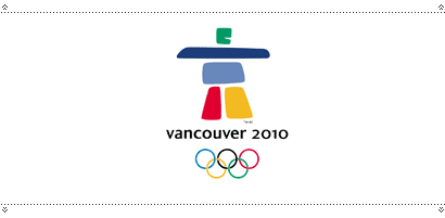
The new mark for the Vancouver 2010 Olympics was designed by Elena Rivera MacGregor and Gonzalo Alatorre (who often does not get credit for the design).

My first reaction? “Gee, I didn’t know the Games were taking place in Nunavut.” Where’s Nunavut? It’s up north, where there’s lots of snow and not a whole lot of landmarks. The Inuit used to build these things called “inukshuks” which were erected, as arctic ethnogeographer Norman Hallendy puts it, to represent “that which stands in the capacity of a person.” Commonly interpreted as a guide to help people find their way through the wilderness, they stand to instruct others about all sorts of things (Mr. Hallendy said that a Stop sign is a kind of inukshuk).

However, the exact semantics surrounding an Inuit artefact is one of the details of the surrounding furor over this logo. The logo, which all of us are calling an inukshuk, is actually an inunnguaq—a pile of stones in the shape of a man, with, apparently “all the spiritual gravity of a tombstone.”

The distinct connection with northern Canada (and ice and igloos) is the dominant reaction from those who object to the logo. That and remarks about “PacMan,” “Gumby,” “Frankenstein” and a host of other unsavoury characters.

A number of the contest judges had hoped for a West Coast native influence (of which there were many), and as ripping off native art while ghettoizing the actual people is a common practice here, I was slightly surprised the logo didn’t go that route.

The cultural appropriation of native (or First Nations) art is a big issue in Canada, particularly on the West Coast where, in particular, the beautiful and symbolic Haida art has become emblematic of the region. However, there are, apparently, tribal rules that “prohibit those who are not of Haida ancestry from working with the sacred Haida designs and symbols.” That doesn’t seem to stop people though.

The fact is, we seem to have trouble identifying ourselves without turning to the cultures that existed here before “we” arrived. Aside from many other accomplishments, the First Nations people seem to have achieved, hundreds of years ago, what we cannot: a distinct cultural graphic identity.

All of this leads from design to some very sticky politics, and the First Nations peoples seem to be split on their verdict of the Olympic logo. Despite the fact that there was a Haida artist on the panel of judges, many are ticked off that it’s not a West Coast native design, with one Squamish hereditary chief, Gerald Johnston, denouncing the inukshuk (whatever) symbol as an “act of aggression against our sovereignty” and likened it to “Russians planting their flag on the parliament buildings … without permission.”

One person notes that had the games been scheduled to take place in Iqaluit, and the logo was a Haida design, it would seem odd. True enough. Others note that the designers are not even Inuit (they are, in fact, immigrants from Mexico); true again, though Nunavut’s Premier Paul Okalik is just pleased to be represented.

Presumably those who are unhappy that it’s not a native design would be equally unhappy if it were, and weren’t designed by a native person. Not that some of the submissions weren’t. A Squamish Nation artist, Wade Baker, is after-the-fact upset that upon entering the contest, he had to sign over all rights to his designs to VANOC. His designs are, um … family crests. Doh! Incredibly, he knew what he was doing before submitting them. Now he wants them back, and good luck to him is all I have to say.

Entrants and all other individuals involved in creating a submitted design must sign and submit an Intellectual Property Rights and Confidentiality Agreement which irrevocably and unconditionally transfers to VANOC all right, title and interest (including copyright) in and to the submitted design and waives in favour of VANOC and its licensees and assigns all non-transferable rights (including moral rights) in and to the submitted design.

Many are calling for a return to the Vancouver Olympic bid logo, the icons for which were mired in their own debacle: the Haida-inspired designs were drawn by a native artist, but deemed irreproducable and had to be redrawn by someone else. More fur flew.

But those in favour of the new logo say that it is a symbol of hospitality and friendship (among other, less believable interpretations), and that it is uniquely Canadian—although, actually it appears in many far northern regions across the world.

“I think it is one of the warmest, most welcoming, friendliest emblems seen in the history of the Olympic Games,’’ said Timo Lumme, the IOC’s director of television and marketing services.

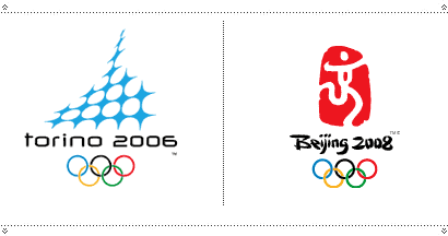
In the end, this was a contest you can’t win. The Turin Olympic logo has been likened to a piece of Swiss cheese, the Beijing logo has been criticized for having wobbly legs. Here, and no doubt in other countries, citizens are calling to be allowed to see all the logos (or at least the top 3) and vote on their favourites. Lord have mercy.

Ultimately, I have to wonder if the problem isn’t in what we call this mark, and the criteria surrounding it. To attempt to come up with something that is meant to represent a nation, even for a brief time, is not really a logo in my mind. It’s more of a mascot or a flag (and apparently we had quite the uproar here in 1967 when we got our maple leaf flag, but I think I can be forgiven for not remembering that), and if it’s going to be some democratic process with voting and everything, maybe you should take it to National ballot. Seriously.

Or maybe it’s a money-generating unique identifier (a logo?), and should be described as such “… to create a uniquely loveable character which will compel people to buy t-shirts …” in which case it should not be a contest, but should be heavily focus-group tested. Then at least we won’t have to go through all this “national pride” and “representation” debate. (And will this mark sell t-shirts? Answer = yes.)

As for the princess … well, all of this disturbs her, like something uncomfortable under her mattress.

Thanks to Matt Warburton for the info, and the pile of newspaper articles.

Maintained through our ADV @ UnderConsideration Program
ENTRY DETAILS
ARCHIVE ID 2312 FILED UNDER Branding and Identity
PUBLISHED ON May.16.2005 BY marian bantjes
WITH COMMENTS
Comments
Tan’s comment is:

Sorry, marian — the thread you linked to is when I covered a UN logo competition, not the VANOC logo. I don't remember whether or not we had an actual thread about the VANOC on SU, though we probably hijacked a semi-related thread at the time.

I did forward a request for everyone to submit a protest letter to VANOC on the issue — which many of us did. Matt ended up spearheading the issue at a press conference, got covered by the paper, and the rest is history.

On May.16.2005 at 10:14 AM
Michael Surtees’s comment is:

Here's a link to some of the letters on the GDC web site:

Letters: Olympic Logo Contest

On May.16.2005 at 10:47 AM
DEE EM’s comment is:

Oy Vey

It's Monday Morning. I just put our Leader Monsieur Vit on semi BLAST as a no show on the other critque.

I remember sending you, Michael Bierut, Felix and Michael Surtees the information surrounding the contest.

Of course you and Surtees already had the information because you're Canadian and members of the noted Professional Design Organiazation of that locale. The name excapes me at this writing.

Felix we were HOODWINKED out of

$ 25.000.00 dollars.

Marian Galant effort. If TAN didn't comment I won't either.

An example why Identity Design should be left to PROFESSIONALS. Understandable why your organization didn't participate in this SPEC WORK.

All in All an HONEST ATTEMPT.

On May.16.2005 at 10:48 AM
Patrick C’s comment is:

I've already put my 2 cents in elsewhere. And that's all it really was—2 cents. Because I agree with almost all the criticism that has been leveled against this logo.

If you look at the submission guidelines (which are sort of like asking for a ship that will get you to Pluto inside of two hours) you will have a difficult time figuring out which of those this logo met. Maybe the last one? Maybe a little on a couple others? So what were they judging? Cool it's an Inukshuk. Inuskshuks are cool. The Library and Archives Canada use one. And it doesn't mean anything to them either. So let's use it.

These things shouldn't be competitions.

On May.16.2005 at 10:57 AM
Robert L. Peters’s comment is:

Well stated, Marian... ''a contest you can't win."

Sort of like playing tennis with the net down.

On May.16.2005 at 11:00 AM
Tan’s comment is:

Landor loyatlties notwithstanding, these are still two of my favorite Olympic host-city logos. In my opinion, they are the modern-day ones to beat. VANOC's isn't even close.

On May.16.2005 at 11:26 AM
marian’s comment is:

Tan, actually that link to your UN piece ... you did mention the Vancouver 2010 thing further down, and provided links to the various debates surrounding it.

Originally, my post was going to be focussed around those issues, because there's still a lot of backstory regarding the issue of a design contest. But, been there, done that, right?

(FWIW, this May, the GDC closed the loophole in our Code of Ethics which allowed our members to take part in this competition, on the basis that VANOC was a "non-profit" organization. Our code now states, in part :

37. A Member shall not take part in or conduct, either as a judge or an entrant, open competitions for commercial purposes on speculation.)

In the end, it was the aftermath of accusations that I found most interesting.

My ultimate verdict is that it is a good emblem to sell t-shirts, but it did not satisfy the design brief, and it does not make a good national icon.

On May.16.2005 at 12:26 PM
marian’s comment is:

Oh, and Tan, yes, the Salt Lake City is my fave. Especially after seeing a presentation of how all the parts sortof came apart and fit together.

That was a logo that was designed as much more than a logo: it was a system. It had a lot of thought put into how it would be used across all the various applications. It was kindof a Transformer of a logo. Really smart. And the kind of thing that is just too smart to win in a contest arena. That's what you get when you pay the big bucks.

On May.16.2005 at 12:35 PM
DEE EM’s comment is:

If memory serve me correctly.

And correct me if I'm wrong. Salt Lake City did have a host contest and were not satisfied with the outcome. And hired Landor based on its reputation and Design of the Atlanta Olympic Identity 1996

Legend has it the local Consultany in Atlanta assigned to Design the Identity couldn't get beyond the Design of the placement of Stars in their initial Design. Landor was called in. The rest is Olympic History. Landor more than any other Identity Consultancy has has a MONOPOLY on Olympic Identity Design.

My FAV hands down. Robert Miles Runyan Stars in Motion, 1984 Los Angeles California.

Do I need to POST IT, TAN.

Instead I'll post Felix NY 2012 Identity that bested SAGEMEISTER, and PENTAGRAM.

JonSel please Chime In you were at Landor at the time.

On May.16.2005 at 01:05 PM
Michael Surtees’s comment is:

Near the end of Marian's essay: Ultimately, I have to wonder if the problem isn’t in what we call this mark, and the criteria surrounding it... if it’s going to be some democratic process with voting and everything, maybe you should take it to National ballot. Seriously.

The design process should be collaborative, but not democratic. Ultimately people should be hiring designers to think and make choices for their best interest.

On May.16.2005 at 01:40 PM
Mark Notermann’s comment is:

The letters to the VANOC seem to state the designers’ case eloquently enough; was there ever an official reply?

On May.16.2005 at 02:02 PM
marian’s comment is:

(Furthermore, Michale Surtees sent me this by email:

"I hope you're joking about suggesting that the process should be democrized by allowing one person, one vote etc.")

No, Michael, I'm not joking. Here's the thing: I think it's ill defined what it is exactly that is being designed for an Olympic Games.

I agree completely that in the realm of "logo" as we understand it, in that a logo represents a company or organization, that it should not be a contest, that it should be a working partnership between organization and designer.

However, this ... thing ... that is "designed" for the Olympics seems to embody some kind of national spirit. This controversy over what the logo looks like erupts in every single Olympic Games host city/country. And people really care ... they seem to care more than they do about politics, in fact. So I'm saying if the thing is a national emblem, and it's so damned important, maybe it should be a truly democratic process ... not a design driven by the criteria we're familiar with.

At that point it really is a popularity contest.

On the other hand, it could be overtly stated "This is not the nation's mark, it's the Olympics mark, and it needs to sell t-shirts." In which case we're firmly back in the professional design arena; the organization should make the informed decision with qualified designers, and the country should just butt out.

On May.16.2005 at 02:04 PM
marian’s comment is:

was there ever an official reply?

Yep. Officially it was "We disagree." Unofficially it was "Step in line, or your members will be blacklisted from working on any of the Olympic contracts."

On May.16.2005 at 02:34 PM
DEE EM’s comment is:

A CRUDDY way of doing business.

Something US AMERICANS already know.

THAT'S THE NAME OF THE GAME.

The late MARCELLO MINALE; of World Renowned Identity Consultancy in EUROPE expounded in his book on this very topic.

Multinational Corporations in Europe would contact First Tier Consultancies for SPEC WORK. And outright THREATENED them and BLACKLIST

them of any FUTURE WORK. If they did not comply.

Many businesses did not survive.

The GDC and AIGA are correct in their vigilance of none commitment to SPEC WORK.

It is BIG BUSINESS and Global Organizations that are corrupt.

On May.16.2005 at 03:01 PM
Tan’s comment is:

I still think the NYC2012 logo looks like something for a musical, but it has grown on me a bit.

Why do so many Olympic logos have human figures in them? To me, that seems too obvious of a solution — to show a human figure running, or skiing, or whatever.

I think the idea of the Olympics is so much more than just sports competition. It's cultural nationalism. It's the human spirit. It's heritage and history. All of those things are embodied in the more successful Olympic logos like SLC and Nagano's (and yes, Atlanta's too).

>So I'm saying if the thing is a national emblem, and it's so damned important, maybe it should be a truly democratic process.

Good gracious, that would be awful. Look what happened when we got to choose our president.

On May.16.2005 at 04:05 PM
marian’s comment is:

Let's get down! Marian advocates design by democracy while Tan advocates a political dictatorship! Smash the State! Turn over all preconceptions! Go team go!

On May.16.2005 at 04:14 PM
Tan’s comment is:

And welcome back Maven. We've missed you.

On May.16.2005 at 05:13 PM
kris’s comment is:

Having grown up in the N.W.T. and currently living in B.C. I have to say I look forward to the day that the Windsor, Ontario Olympics unveil their "orca-swimming-over-west-coast-rainforest" logo. Because that's about as far as you have to go to get an equivalent to this mark.

Bad choice on so many levels.

What really annoys me is that I doubt that we'll be able to see all the other concepts. I've seen a few "unofficially" - it would be very educational to me as a junior to compare all the different approaches.

On May.16.2005 at 05:31 PM
Mark Notermann’s comment is:

I would imagine that the members the design panel (below) are actively engaged in their respective communities, if not the GDC or AIGA. Perhaps one of them could explain this process and shed light on their rationale.

As a design student I am very interested in this process. I have heard the reasons against it, but have yet to hear the counter arguments beyond “opportunity for great exposure.”

How does the client benefit from this complicated and time-consuming process? The VANOC hires professional design firms and architects for the many countless associated projects. Why an open contest for the most visible one?

* Dr. Ron Burnett, President, Emily Carr Institute of Art and Design. (Vancouver)

* Terry Chui, Art Director, Electronic Arts Canada (Vancouver)

* Brad Copeland, President and founder of Iconologic, an Atlanta-based brand design firm specializing in identity, communications design, interactive media and advertising for corporate and Olympic clients. (Atlanta, USA)

* Scott Givens, Vice President of Entertainment for Disney Entertainment Productions. Led creative and ceremonies teams for the 2002 Salt Lake Winter Games. (Los Angeles, USA)

* Dorothy Grant, Designer and traditional Haida artist. (Vancouver)

* Rod Harris, President and CEO, Tourism British Columbia (Victoria)

* Theodora Mantzaris, Manager of the Image & Identity department at the Organising Committee for the Athens 2004 Olympic Games (Athens, Greece)

* Steve Mykolyn, Creative Director of design and interactive at Taxi Advertising and Design. (Toronto)

* Wei Yew - Designer and author of The Olympic Image - The First 100 years. (Edmonton)

On May.16.2005 at 05:42 PM
Michael Surtees’s comment is:

Here's some additional letters, the last one from Mr. Tan himself...

+ MORE

On May.16.2005 at 05:57 PM
Hex’s comment is:

HA!

I've been waiting for this one to show up here at Speak Up ever since it was unveiled weeks ago.

I'm actually surprised that more wasn't said on the uproar that was caused by the local design community and the GDC about the initial selection process.

What a bunch of hypocrites - "We denounce your contest and refuse to participate (until we change our bylaws, that is)".

I've spent way too much time and energy bitching about this whole sad affair (a black eye for Canadian Design) elsewhere, so I will go back to lurking and watch it unfold.

Regardless - Well said Marian. “Gee, I didn’t know the Games were taking place in Nunavut.” Exactly what I said! And I have clients in Nunavut (Iqaluit - actually).

On May.16.2005 at 06:31 PM
JonSel’s comment is:

You mention a few dates there, Maven, so I'm not sure on what I should be chiming in. I'm also not sure how my past employment factors in, but I'll give it a go.

Shouldn't the vote for a national symbol such as an olympic logo be done in the reverse from how it is typically handled? Instead of letting anyone design something that a few chosen people will judge, have a few design firms design the marks, and then let the public vote. Of course, this never works either, but on theory, all the work would be of a certain caliber.

I agree the Nagano logo is one of the most beautiful of all time, and it directly led into the system of individual sport icons. I may have seen the same presentation as Marian regarding the Salt Lake City logo and it was great. Told a nice story, but the symbol was easily understood as a dual representative of the American west and winter.

I did some concepts for the Athens games several years back (not through Landor). Hardest darn project ever. It seemed liked everything that made a decent mark was based on some clichéd view of Greece. Turns out that's sort of what they wanted!

I'm not really sure how an olympic logo concept could be more than cliché. Even the LA logo, which Maven loves so much, is pure American stars and bars. Really, is that telling a new story of America for anyone? Should it? Could it? The best of the Olympic logos rely on a bit of what we know and expect, then create something more wonderful through the skill of craftsmanship. The flower is a pretty obvious symbol of japanese culture. Incorporating the athletic figures into it is brilliance. I never cared much for the Atlanta logo, because it said absolutely nothing about the U.S. or Atlanta. It was solely about the Olympic centennial. Sure, meaning could be ascribed to the choices of colors —�yeah, Georgia green... — but it was hardly an image that could be embraced by the national populace. Maybe that's why Atlanta '96 is known for commercialism before athleticism.

On May.16.2005 at 07:01 PM
marian’s comment is:

What a bunch of hypocrites - "We denounce your contest and refuse to participate (until we change our bylaws, that is)".

Well, I can't let that one go. Actually the opposite is true. The GDC (of which I am a Board member) met with 20 leaders of the Vancouver design community and we were unanimous in our condemnation of the contest. We came out strongly against it, but

a) our Code of Ethics allowed members to partake in open competitions for non-profits, and VANOC was technically a non profit (a loophole which I mentioned earlier, we have now closed)

b) we got threatened.

So we denounced the contest, most of us refused to participate, but those who wanted to, did (the winner is a GDC member). Then we changed our bylaws so that our position in the future at least, is very clear: we do not take part in open, unpaid, speculative competitions.

On May.16.2005 at 07:28 PM
Hex’s comment is:

Well, I can't let that one go.

I knew you wouldn't. I just felt like stirring the pot a little. I'm well aware of the VANOC/GDC situation and I followed the story with interest. I apologize for my crass tone, but I have "issues" with the High and Mighty GDC (not only because of this "contest" thing) and this is not the time or place to get into it - I won't waste everyone's time or space and piss anyone off further.

Let's just say that there are many Designers here in town who choose not to volunteer for the "Club". yeah, yeah yeah... not part of the solution, part of the problem.

On May.16.2005 at 07:52 PM
Derrick Schultz’s comment is:

The thing that seems the most irrational is the idea that melting pot cultures can be succintly made into one cultural mark. Of the three or so modern-day Olympic marks that most people seem to like most (Osaka and Salt Lake, with Los Angeles or Atlanta less so) none of them are super specific to one subculture (Osaka's flower comes close, but if you didnt have specific knowledge, it could look like many other flowers). Thats what baffles me most about the Vancouver mark. While it is really nice of Canada to respect its past history, aren't they in return denying their current period and future? And even with that, this "respect" from outsiders feels like lip service. Its asking for disaster to design this kind of symbol for one culture, no matter the amount of intended respect. I'm reminded of the Lillehammer "stick figures" (for lack of a better word) that were supposed to be an homage to very early norwegian culture, but in the end appeared to be making fun of them with silly looking rough-drawn characters

Regardless of what many of us might like it to be, the Olympic mark is best when its controversy is least. So as much as I agree with JonSel about the cliche designs, cliche's dont offend anyone (well beyond those that dislike cliches, and even that is usually just annoynace).

On a similar note, why has every new Olympic logo been a mark and simple type (This Site seems to prove my point)? The Mexico '68 mark avoided a lot of cultural/symbolic issues by integrating the type into the mark. It seems like too much emphasis has been put into the mark (possibly because of t-shirt sales, as Marian points out) without thinking about the benefits of pure typographic designs. I'd love to know if these designs were simply shot down by Olympic committees (I wouldn't be surprised).

If it works for corporate design, it probably would work for the Olympics (the anti-corporate implications of this are only half-intentional)

On May.16.2005 at 07:54 PM
Derrick Schultz’s comment is:

Sorry, maybe that last comment is a bit overgeneralized and sweeping. I hope my intention is clear, but maybe its best taken with a grain of salt.

On May.16.2005 at 08:03 PM
Andrew Twigg’s comment is:

Whew! Marian, for a minute I thought you forgot about the princess.

And, since when is Pac-Man an "unsavoury character"?

I know this is about Canada, but I wanted to add:

I don't really care for the Turin mark (it's looks a bit too much like a mark for a downtown discotheque) but I will say this: at least it's not 'weal' and cartoony, and it should stand out in the field of Olympic logos for a long time. Leave it to the Italians.

Oh, will this Vancouver mark sell tshirts, or will all the tourists/sports fans/nostalgists just buy a shirt anyway?

On May.16.2005 at 08:27 PM
marian’s comment is:

And, since when is Pac-Man an "unsavoury character"?

Lady-killers. He and Gumby together.

I actually like the Turin mark, but I also think my "opinion" doesn't much matter.

Oh, will this Vancouver mark sell tshirts, or will all the tourists/sports fans/nostalgists just buy a shirt anyway?

To be honest, I think it's very appealing to many people. It's kindof cute; it has some sort of personality. On that basis I think it will further t-shirt sales. Sure, lots of people will buy a t-shirt no matter what's on it, but they won't buy extras for the folks back home unless it appeals to them on some other level. This is the level on which I think this is a very successful mark, but it's also a no-brainer to make a soft-rounded creature, put a smile on it, and have mom 'n' pops everywhere say, "Aww, I like that."

On May.16.2005 at 08:44 PM
Andrew Twigg’s comment is:

but it's also a no-brainer to make a soft-rounded creature, put a smile on it, and have mom 'n' pops everywhere say, "Aww, I like that."

True dat.

On May.16.2005 at 08:49 PM
Nick Shinn’s comment is:

It should also be pointed out that eskimo boy is wearing baggy pants and is obese. (Sorry, wrong thread.)

On May.17.2005 at 05:49 AM
Nick Shinn’s comment is:

Here's what the real thing looks like.

On May.17.2005 at 05:54 AM
Andrew Twigg’s comment is:

Nick,

Very helpful. Hmmmm....

On May.17.2005 at 08:21 AM
Nick Shinn’s comment is:

On May.17.2005 at 09:52 AM
feelicksockwl’s comment is:

then a few years later...

On May.17.2005 at 12:22 PM
marian’s comment is:

Yeah, well that truly is one of the great things about this logo ... really, really easy to make fun of.

On May.17.2005 at 12:59 PM
Andrew Twigg’s comment is:

I couldn't resist:

On May.17.2005 at 04:58 PM
Matt Warburton’s comment is:

Interesting comments folks. When Marian first talked to me about this article I thought she was going to focus more on the appropriation of aboriginal images by designers. Given the "European" immigrants' treatment of our native peoples it not surprising we're as paranoid as we are about using anything "native". The Aussies certainly had no problem using their boomerang character! I do love the way Salt Lake City integrated plains indians patterns into their mark. A beautiful solution, that looked modern yet still paid tribute to the heritage of that region of the US. I truly wish the 2010 folks had come up with something as sophisticated, rather than the tourist trap on English Bay.

My favourite games' identity were for the Munich games in 1972. That whole identity could be pulled out of mothballs and be just as effective today as it was then.

Of course the whole process for the 2010 logo was flawed from the outset. Their rationale that "contests are how the last 3 games did it" just doesn't hold water, given that the Chinese are not known for their ethical business practices, nor respect for intellectual property rights; the Athens games logo while cute, didn't really say much (plus spec proposals are standard business procedure for design firms in Europe); and Turino is being slammed before people see the applications (they were shown at the 2010 Design Conference here in Vancouver last fall).

We (the GDC) did what we could to raise peoples' awareness of the flaws, and unfortunately many designers did not heed them. Plus it sounds like VANOC is planning on the same procedure for the Paralympic games identifier!

And they still have the sports icons to sort out. Will they now be tasteful rock arrangements?

One more thing. if you flip the logo upsidedown, it's a bunny on a snowboard!

Cheers, Matt

On May.17.2005 at 07:17 PM
Von Glitschka’s comment is:

Don't forget possible endorsements he could gain after the Olympics.

On May.17.2005 at 07:42 PM
marian’s comment is:

Hmmm. The thing is, this story just has so many angles, but if you skim it again Matt, you'll see that although the preamble reintroduces us to the contest and the "design brief", the guts of the article is about native art and cultural appropriation.

I couldn't really take a harder line on the First Nations issue, because that community itself is split. Some Inuit are crying cultural appropriation while others are pleased to be represented. Some West Coast natives are hopping mad, others are not.

Ultimately it comes down to "who are the stakeholders" in an identity of this sort, how we go about representing national or regional identity, and whether we should even try.

But the cultural appropriation angle is maybe largely a Canadian issue, that I'm guessing the Speak Up readership can't really relate to, which is why the ensuing commentary has focussed more on the contest and the in/appropriateness of the logo itself.

On May.17.2005 at 08:00 PM
DEE EM’s comment is:

Just Chiming In.

TAN:

Many thanks heartfelt appreciation.

Its GOOD TO BE BACK. Officially will not use my pen name until June.

JonSel:

Many thanks for Chiming In. I wanted someone to

comment on the Olympic Identity employed at Landor during the Atlanta, Salt Lake City, or Nagano, Games. Insightful information you shared. It seem the Olympic Identity since Stars in Motion, (1984) must embody the spirit of the games, the host/city and the United States. A Monumental Task with Aesthetic Philistines and Unrealistic Deadlines.

Derrick:

Both TAN and JonSel are Landor Loyalist. Current and former employer. TAN now with Landor's Parent Company Y&R.

I'm Loyal to Robert Miles Runyan, no secret.

Drew:

I concure, Canada is so associated with the Maple leaf. The Inuskshuk embodies Canadian Culture and Rich Heritage.

Matt:

Check over at Design Observer. Michael Bierut wrote a Great Editorial on the Olympic Games. Incorporate much of the Games History.

The Graphic Design Olympics. Link below.

http://www.designobserver.com/archives/000191.html

Marian:

Irreverant Humor aside.

It's amazing they didn't mention Stonehenge, or The Flintstones, Bedrock. Which were my initial impressions.

Notwithstanding, it too reminded me of Lippincott & Margulies Identity Design for this Corportion.

Try both links. Same information. One of them may or may not load.

http://cases.lippincottmercer.com/cgi-bin/WebObjects/LMCases.woa/wa/viewcase?Household

http://cases.lippincottmercer.com/caseImages/1000434/Household.jpg

On a more somber note. I'm Glad Designer(s) from the GDC won the competition. It shows the Professionalism and level of expertise of GDC Members.

Sorry, Felix and I didn't have a Canadian Address to compete.

I'd like to touch base on your comment. No critism. I think all Designer(s) Struggle with the Brief. I'd like to share with you and others what Marcello Minale (now deceased)World Renowned Identity Consultant and co-founder of Minale Tattersfield. The Landor equivalent in Europe.

My ultimate verdict is that it is a good emblem to sell t-shirts, but it did not satisfy the design brief, and it does not make a good national icon.

For your perusal.

Interpreting The Brief by Marcello Minale.

Design without a brief is like a game without rules. If you're playing tennis without a court and without baselines, you become bored in five minutes: there is no meaning and no challenge. So it is with design. The brief defines the challenge. But as a young professional designer, you are also drawing up a set of rules within you own minds eye-rules you will play with for the rest of your life.

When you take on a design project, you have to obey both sets of rules-one determined by the client, the other dictated by your own head and heart. To extend the tennis analogy, your own creative conditioning means the rules are already fixed but the brief decides which racket and what tactics you will play with. Sometimes the two sets of rules come into conflict. The client brief may request trendy, flavor-of-the- month with pastel squiggles; your own creative conscience will fight against such a solution. So the trick of interpreting the brief is to find common ground. So the solution satisfies both client imparatives and your integrity as a designer. After all you can question the client, even resign the account, but you can't resign from your own deeply held professional beliefs.

The best brief are those which the clients sums up what is needed in one sentence. You know you're in trouble when a thick document lands with a thud on your desk for a relatively small project. Distilling the information is a skill you learn through experience. Early in your career there is a tendancy to put heavy emphasis on the wrong aspect of the brief. Later on you know instinctively what to disguard and how to interpret the data so that complex phraseology

is translated into usable phrases. For instance, clients will resort to the most obscure and long winded explanations to tell you something like 'don't use black in Italy because it is the color of death'.

Subtext is important. Often the client want the polar opposite of what is written down in the brief. (This is not as strange as it sounds: the nearest thing to a design solution is its exact opposite). Often the brief is aspirational, glamourizng context and object so that the designer is divorced from reality. Clients talk of making the housewife the queen of the kitchen

when they want to redesign a brand of sink cleaner. I once got a brief which said. " We want something that looks like a Rolls Royce and drives like a Ferrari". The job was an Industrial Design for a heating firm.

Sometime the mainspring for a design solution can come from what is left unsaid. One of the best briefs I ever received from a client was in the form of a half-hour conversation which I did a spot of mind-reading. Nothing was written down. Indeed some jobs, a letterhead for instance need scarcely more than a phone call. New rolling stock for a train, however, will demand volumes on the technical and economic parameters within which the designers must work. It all depends on the size of the project.

In whatever shape the brief arrives the first job of the designer is to verify it by researching the market and collecting information to determine the objectives laid down are achievable. Often the brief will have to be reworked in part or whole so that it corresponds more accurately to reality.

There is a tendancy for the client to overbrief the designer, to flood the design process with so much irrelevant information the design process is paralyzed. I always believe you should read through these super-briefs, combing them for pearls of wisdom that will act triggers for the design solution. Once you have extracted the pearls cast the rest aside.

On May.17.2005 at 09:44 PM
Michael Surtees’s comment is:

On a more somber note. I'm Glad Designer(s) from the GDC won the competition. It shows the Professionalism and level of expertise of GDC Members. Sorry DEE EM, you know how much I enjoy your posts, but I have to disagree with you here. Every time I hear that comment, I don't know whether to cry or go into a fit of rage. It was a complete fluke that they won. It was a contest. It's embarrassing and disgusting that a GDC member won, and for a while it seemed to me that it hurt the credibility of the GDC... However I'm a little more relaxed about the credibility issue now. A friend suggested that I should send those designers a letter to let them know what I think - but the problem is that I would need to send 1599 other letters. They are no more guilty than the rest of those who entered. They're only 1 of 1600 symptoms.

On May.18.2005 at 04:50 PM
DEE EM’s comment is:

Michael Surtees:

Our admiration for one another is mutual.

In order to effect change. There is no compromise. You either stand up and fight for what you believe. Or fall by the wayside.

United we stand, Divided we fall. When you send those 1599 letters to the Winning Designer(s) and other GDC members. Provide member(s) of the GDC With copies of, The Art of the Deal, The Art of War, and The 48 Laws of Power.

Reading those books, they'll understand. The first person that make a concession has lost.

Instead of the GDC making a concession to change their position and provide pro bono Design Services to none profit organization(s).

Writing letters is the beginning of a process for both parties to engage in effective dialog.

When that entity you are contacting doesn't comply. You have no other recourse other than

educating the masses and informing the public.

With full cooperation from all members.

If it were my organization that was being told to get in line and threatened with being Black listed.

Believe me there would've been a Press Conference, Meetings with Vancouver Political Leaders, Acquiring permits to Protest and Boycott of the Vancouver Design Competition and Olympic Games.

In as much as we believe the Olympic Games is a not for profit organization. The IOC, International Olympic Committee has mucho deinero.

What I'm not hearing or reading, other than writing letters to the Olympic Committee. What other measures were taken to resolve this issue?

Certainly from my perspective, Coming from a family of Freedom Fighters and Activist. If the GDC felt that strong about none Speculative work. Why wasn't more accomplished from a Grass Roots Level ? To bring attention to Vancouver's Olympic Committee Practice and approach to acquiring Design Services and Graphic Support.

Of course IOC practice and approach is universal.

Not being a member of THE AIGA, by Conviction.

I'm sure AIGA mantra is the same as GDC.

AIGA leave such matters to the discretion of Designer(s), Firms, and Consultancies.

On May.19.2005 at 05:23 AM
Michael Surtees’s comment is:

DM - as per usual, you give a lot to consider.

On May.20.2005 at 03:03 AM
David Glover’s comment is:

This sounds like a replay of the design competition for the Sydney Olympics which included court actions by one design group who felt their design had been ripped off; complaints about appropriation of indigenous art and the obligatory "looks like something my three year old daughter could do" comments on talkback radio.

Personally I don't know how the Olympics continue to hoodwink people into thinking it's some kind of charity. It's a business. A dirty great big stomp-on-you-if-you-disagree-with-it business.

They tried to get various professional performers and other entertainment professionals to perform without payment at the Sydney Games. The unions stepped in and said "no way". This was somehow settled behind closed doors (as were most Olympic disputes here).

In fact I'm not even sure I am allowed to us the "O" word without approval. They had the Australian law changed making it illegal to use the word Olympic in a business name or trademark. Funny, everyone else has to register (and use) their mark in the different trademark categories (with the exception of "Royal" and "Anzac").

Rant mode off. In short, these comps are inevitably a shitfight. So you need to go into them with your eyes open. Yes, there's a lot of work and "prestige" associated with the games. But this is part of the price.

On May.25.2005 at 04:10 AM
David Glover’s comment is:

Just a quick follow up on the issue of the Olympics "not for profit" status.

They are "not for profit" only in the technical sense that they don't distribute a profit to shareholders. The profits (or "surplus") is ploughed back into the Olympics - and is very directly beneficial to the senior IOC members.

However they are very much a commercial enterprise. They charge very large fees for their product - the broadcasting rights for the Games, sponsorships, catering concessions, merchandising and, of course, tickets. And they are absolutely ruthless in enforcing their many and varied rights - enlisting, as I noted above, special laws to enforce them.

Granting them special status is, to me, quite inappropriate. They charge the full commercial rate for what they produce and should pay the full rate for everything they get. If it's a children's choir then payment in tickets is fine. But when it's professional design, writing, production, performance - whatever, they should be paying the very highest rate, as the highest profile event in the world.

Justifying free work for them ("pro bono" just isn't accurate) on the basis of the exposure is the start of a slippery slope. On this logic we should do free work for Time, National Geographic etc.

On May.25.2005 at 07:44 PM
Michael Sater’s comment is:

Hello all,

just a small follow up note. Though the Atlanta logo was a tribute to the Olympic Centenial, the supporting graphics (aka the leaves, aka the kudzu) was a tribute to the American south and to Atlanta, the home of the New South.

I lived in Atlanta at the time (still do). So, I am sad to say that, yes, it was overtly commercial:

http://www.beer-steins.com/budsteins/P004701_jp50.jpg

I believe that the leaf motif may have been the inspiration for the Salt Lake City Olympic Identity.

On Jun.28.2005 at 05:58 PM
Mark’s comment is:

OH! can I get in the fun?

seriously, if Canada wanted to embarass themselves they should of copied New York's 2012 logo

On Nov.08.2005 at 04:47 PM
E H Thomas’s comment is:

I'm wondering what the Canadian athletes think about the logo, or what other country athletes think about the design. Somehow, it looks something like what a 1st grader would draw, & doesn't look so professional to me.

On Jun.06.2007 at 11:57 AM
Yael Miller’s comment is:

You know what all the above winning-logo parodies say to me? That the mark doesn't connect with who Candians FEEL THEY ARE.

People won't want to associate with a mark shaped like a human form with un-graceful parts. Olympics are about physical excellence, agility, grace and power. The icon shows slowness, fixedness and crudeness.

I think if you wanted a mark that portrayed Canada's rich heritage, there should have been a less anthropomorphic icon used. Something less close to an individual's own self-image.

The 'friendliness' factor seems forced, too. Ancient things are not friendly. They're powerful and mysterious, more likely.

On Jun.07.2007 at 01:30 PM
Yael Miller’s comment is:

You know what all the above winning-logo parodies say to me? That the mark doesn't connect with who Candians FEEL THEY ARE.

People won't want to associate with a mark shaped like a human form with un-graceful parts. Olympics are about physical excellence, agility, grace and power. The icon shows slowness, fixedness and crudeness.

I think if you wanted a mark that portrayed Canada's rich heritage, there should have been a less anthropomorphic icon used. Something less close to an individual's own self-image.

The 'friendliness' factor seems forced, too. Ancient things are not friendly. They're powerful and mysterious, more likely.

On Jun.07.2007 at 01:58 PM