Speak UpA Former Division of UnderConsideration
The Archives, August 2002 – April 2009
advertise @ underconsideration
---Click here for full archive list or browse below
  
Quipsologies
~ Vol. 14 ~

Many, pretty pictures in this edition of Quipsologies.

~ ARMIN ~

Separated at birth:
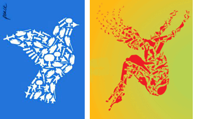
Luba Lukova’s Peace poster and Lincoln Center Festival 2005’s identity.

quipsology_separated_01.gif

~ BRYONY ~
Adobe Systems Inc. and its branding partner, San Francisco-based MetaDesign, won a 2005 ReBrand Distinction Award for redesigning the packaging of Adobe Creative Pro.

For more on the rebrand awards…

~

How much of a geek are you? The ultimate disdainful act by means of… Qwerty?

~

A group of students from Marymount Manhattan College wants to change the way you tour MoMA, by providing free podcasts that you download and listen to while cruising the galleries.

~ M. KINGSLEY ~

The next time you find yourself pulling a week of all-nighters to meet a deadline, consider this: crunch mode doesn’t work. [Via The Farm]

~

Last week, it was announced that the Voyager 1 spacecraft (launched September 1977) reached a significant point in its journey beyond the solar system — it reached the termination shock. This represents the heliosheath, a band of the heliosphere where solar wind piles up as it begins to encounter the interstellar wind. Once Voyager leaves the heliosphere, it will truly be an interstellar spacecraft.

Onboard are a series of records which function like LPs, but carry both sounds and pictures. Among images of the solar system, scientific and mathematical definitions, biological diagrams and sociological genre scenes is this intriguing image; meant to describe licking, eating and drinking.

~ MARIAN ~

Please read the following from right to left, as I did when I came upon it in a Winnipeg public washroom.

And the following are posted without comment:

Maintained through our ADV @ UnderConsideration Program
ENTRY DETAILS
ARCHIVE ID 2321 FILED UNDER Miscellaneous
PUBLISHED ON May.30.2005 BY The Speak Up Authors
WITH COMMENTS
Comments
Teddy’s comment is:

I'm obviously missing something: what's so interesting about reading the labels on the washroom liquids dispenser from right to left? I tried reading the words in reverse order, and even tried reading it literally backwards, but I'm not picking up the secret satanic messages... ;)

On May.30.2005 at 09:34 AM
Armin’s comment is:

Teddy, if I read it correctly myself, I think Marian has a rather dirty mind…

On May.30.2005 at 10:14 AM
Agrayspace’s comment is:

I guess her point was that it was interesting that mouthwash follows lotion? A dirty mind could read something into that, I guess.

The thing that struck me was how the hell do you get the mouthwash into your mouth?!! Sip it out of your hand?

On May.30.2005 at 10:50 AM
Patrick C’s comment is:

The more important question is who on earth would use that thing? It looks like a bacteria transfer device.

On May.30.2005 at 11:18 AM
DesignMaven’s comment is:

Luba Lukova’s PEACE POSTER is a DIRECT DECENDANT of MILES NEWLYN Identity for Uniliver.

This will certainly raise Miles Newlyn Stock as an Identity Designer.

Imitation is the sincerist form of flattery or rip...

Revisit Miles Mewlyn Identity for Uniliver. Link below.

http://www.logolounge.com/articles/default.asp?ArticleID=198

While I appreciate the originality of Newlyn's Identity. Not sure I want to see the market place flooded with this aesthetic.

It works for the poster; as a one time solution. Yet the communication of the poster evoke semiotics. That's difficult to accomplish without semantics(linguistics).

On May.30.2005 at 11:29 AM
Armin’s comment is:

Maven, Luba's poster (2001) predates Miles' logo for Unilever (2004). Also, Unilever's logo is comprised of much more stylized icons, whereas the examples I made are very "simple, as-is" shapes. Which is why I didn't include Unilever in the graphic, which I considered.

On May.30.2005 at 11:40 AM
DesignMaven’s comment is:

SUPER BOY finally grace us with his presence.

YOU WORK WITH SUPER MAN. (inside joke)

I can say that, I've got you by twenty. And mild mannered by one or two.

Great hearing from you.

Many thanks for the correction. GEZ Armin,

you may have lowered Newlyn's stock. (Kidding)

Anyway both are GREAT Designs. Difficult now-a-days to know which was first. And where Ideas come from. Unless you know where the bodies are burried. Meaning Design birth timeline.

It would've been nice to show Newlyn's Identity

with the Poster. I think they are excellent contrast.

On May.30.2005 at 12:07 PM
marian bantjes’s comment is:

SIGH.

The funny thing is, whenever I tell people about the (in my mind) bizarre dispenser I found in the washroom, when i get to "mouthwash" they burst out laughing (and usually say, "No f*king way, you're kidding me, right? ...").

Maybe it's a Canadian thing.

We're used to seeing soap dispensers, but this was the first time I'd ever seen one that dispensed more than one thing, and that the final one in the read (being back in the corner of the sink area) is, yes suspiciously disgusting and invokes an image of ... what, tipping your head under the machine or ????

is this not funny?

huh?

huh huh huh ha ha ha hahaha ha ahhhh.

On May.30.2005 at 07:24 PM
m. kingsley’s comment is:

Armin and Design Maven, before Luba Lukova there was Pierre Bernard (ex-Grapus, not the Recliner of Rage guy) and his logo for les Parcs Nationaux de France; done in the early 1990's.

Before M. Bernard, there was British artist Tony Cragg; who, since around 1980, has been assembling bits of plastic detritus into wall collages. An argument could be made for the influence of Richard Long on Cragg's work. While Long arranges stones into circles; both have an ecological subtext.

Tony Cragg New Figuration, 1985

Colored plastic construction

106 x 208 in.

Currently in the Hirshhorn.

On May.31.2005 at 12:39 AM
DesignMaven’s comment is:

Mark:

Many thanks, both excellent examples. Without question the evolution of influence on the Artist and Designers work.

I will visit the Hirshhorn before week end. To view Tony Cragg exhibit.

On May.31.2005 at 02:02 AM
m. kingsley’s comment is:

Maven, the piece I presented is part of the permament collection.

Check the lower level.

On May.31.2005 at 02:38 AM
Armin’s comment is:

Mark, right, right, I know… that sun thing, with nothing new under it and such. But not the same premise. Similar but not separated-at-birth-same.

On May.31.2005 at 09:13 AM
m. kingsley’s comment is:

Armin, the premises may be different but the formal approach is exactly the same. Even when comparing the Dove poster and the Lincoln Center "swimmer" — different premise (peace vs. recreation), similar formal methods.

Luba Lukova is better known for her highly stylized figures than the many-pieces-make-a-whole collage. Compared to the rest of her work, her poster is an idiosyncratic formal detour.

On the other hand, Tony Cragg is quite well-known in the art world. I've known about his work for a couple decades, and I wouldn't be surprised if Lukova or the anonymous designer* for Lincoln Center did too.

* Lincoln Center's policy is not to allow design credits on their material. Photography and illustration credits are permitted.

On May.31.2005 at 11:17 AM
DesignMaven’s comment is:

Mark:

Again, many thanks.

I hate going into Hirshhorn. The Guards follow

me when I stare at the Chuck Close to long. (LAUGHS)

I owe myself an original Chuck Close.

I'll have to buy one off eBay. (LOL)

Hope its not an ELMYR.

Even an ELMYR is worth a lot of money.

BETCHA, ELMYR couldn't reproducd Chuck Close large format AIRBRUSH PAINTINGS.

Going Friday to Hirshhorn. Lord Willing.

On May.31.2005 at 01:28 PM
Seffis’s comment is:

1. Dispense Mouthwash into dirty hand. Somehow get it into your mouth and swish around and spit.

2. Lotion up that fresh minty hand.

3. Wash off that damned lotion with Soap. Hand is now clean, mouth is now (kind of) clean.

4. Put Gel somewhere. Maybe your hair? Ha ha, now your hand's dirty again.

Those Canadians and their sense of humour, I'll tell ya...

On May.31.2005 at 03:40 PM
Lorenzo’s comment is:

About the dispenser:

First, just the thought of dispensing mouthwash in a public washroom is absolutely disgusting! Secondly I did imagine myself bending under that mouthwash dispenser to catch in my mouth what I could. Seems as if you’d need to ask someone for help, to push the button for you while you bend over to catch it in your mouth.

I say the gel dispenser is the winner.

One other thing, I don’t know what it is or if anybody else has the same thought/experience but when I read anything from M. Kingsley, I find myself reading it as if it’s HAL talking, the AI supercomputer from 2001: A Space Odyssey.

On Jun.02.2005 at 12:36 PM
Tselentis’s comment is:

There is Kubrick sensibility to this whole dispenser thing. Looks like something from Clockwork Orange or 2001...definitely more 2001.

On Jun.02.2005 at 08:25 PM