Speak UpA Former Division of UnderConsideration
The Archives, August 2002 – April 2009
advertise @ underconsideration
---Click here for full archive list or browse below
  
Recent Rebrandings 4: Financial Services

OK, so I’m playing a bit of catch up here. I have a boatload of Recent Rebrandings piled up and some aren’t so recent anymore. Here is the first grouping: Financial Services.
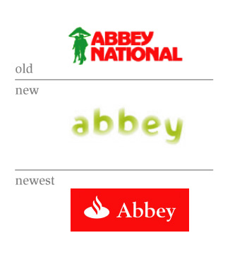
Abbey (again)

It has been labeled as, “one of the biggest rebranding disasters in corporate history.”

“The exercise — which brought an end to Abbey’s famous “couple under an umbrella” logo — was overseen by brand agency Wolf Ollins at a cost of some �11 million…Last year, pre-tax profits in Abbey’s core retail business shrank by 20% to �814m compared with 2003 and there was another big slump in market share. New mortgage lending is also down year on year from 9.9% to 3.1%, reducing its overall mortgage share from 10.7% to 8.6%. It should, therefore, come as no surprise that, a mere 17 months after the last rebrand, Abbey’s new owner, Banco Santander Central Hispano, is changing the look yet again.”

AbbeyOld_New1.jpg

Bank of New York

Bank of New York will still use the trusted, maroon square for retail banking in New York, but will use the new “pattern” symbol for the corporate entity and all other services and markets.

“Our new symbol captures the visual language of the stock certificates and currencies that we move and manage on our clients’ behalf - instruments that are made distinctive through intricate engraved patterns.”

BNYOld_New1.jpg

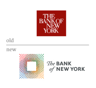
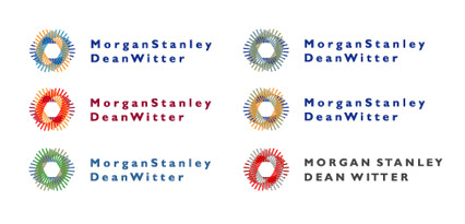
The new one reminds me of a mark that Landor proposed for Morgan Stanley a few years back, seen here from Joe Fino’s site
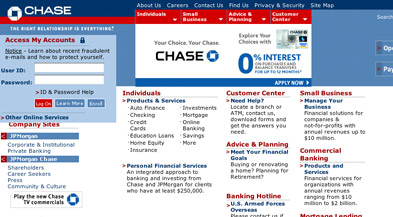
JoeFinoMSDW.jpg

Chase

Not much going on here. An ad agency wants to get into the logotype game. OK, I guess.

“The trademarked Chase octagon, first introduced by David Rockefeller in 1960, has been updated to reflect a more fresh and contemporary look.”

ChaseOld_New1.jpg

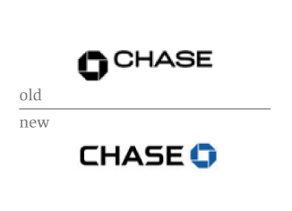
You can still see both marks on Chase.com.
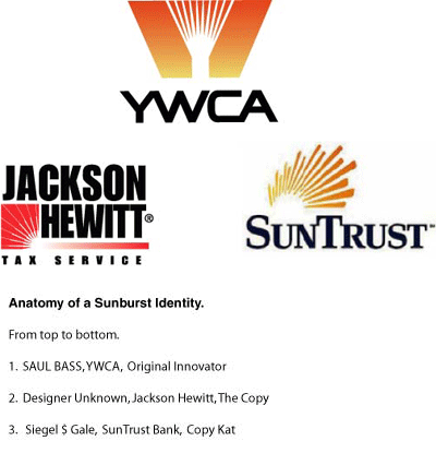
ChaseWebsite.jpg

SunTrust

SunTrust Banks, Inc. is one of the nation’s largest commercial banking organizations with branches and services in over 1,700 locations in the southeastern U.S.

“It provides a more complete representation of the character of our company - warmth, energy and a comprehensive financial services institution. The new logo will be more visible and distinctive in our highly competitive marketing environment, and will invite a new focus on the breadth and depth of SunTrust’s capabilities.”

SuntrustOld_New1.jpg

DW

The last (although unrelated to financial services) rebranding is my own. As some of you know, I have recently left FutureBrand and taken a position at CBX. Things are great. Critique away, although there are no visuals.

Bill Gates then went on to say, “and I do agree with Harvey Weinstein, Richard Branson, Calvin Klein and Oprah—David Weinberger may very well be the most important designer/writer/thinker of our time.”

Maintained through our ADV @ UnderConsideration Program
ENTRY DETAILS
ARCHIVE ID 2347 FILED UNDER Branding and Identity
PUBLISHED ON Jun.22.2005 BY David Weinberger
WITH COMMENTS
Comments
Tan’s comment is:

>An ad agency wants to get into the logotype game. OK, I guess.

My young Jedi, don't forget that in the old days, corporate brand development was seen as more the territory of large ad agencies. These small upstart firms that call themselves "Branding Agencies" are relatively new.

And don't be so sure you know which way the pendulum is swinging now.

>rebranding is my own

Congrats on the move. But Calvin Klein??

On Jun.22.2005 at 11:10 AM
Darrel’s comment is:

One gets a nice red box, the other looses one.

On Jun.22.2005 at 11:50 AM
David Weinberger’s comment is:

My young Jedi…Congrats on the move. But Calvin Klein??

Thanks Tan. But a Star Wars reference?? Seriously, what makes CK worse than any of the other individuals I included?

Back on topic, Tan, which of these do you "like" the best?

On Jun.22.2005 at 12:36 PM
Tan’s comment is:

Ok, fine.

1. Don't like any of the 3. The newest one looks like steaming pile of...

2. B/NY — I like the new logo. Despite its similarity to MS/DeanWitter's, the reasoning behind the pattern rings true. It's not as visually strong as the old mark, though.

3. Chase — the new mark is a nice evolution. But they can probably change it a dozen times in next few years, and nobody would notice. Why? Because they can.

4. SunTrust — the new mark has more dimension, and is a little more original. But it's peculiar that a bank that's primarily located in the Southeast has a logo that's very indicative of the Southwest.

On Jun.22.2005 at 01:07 PM
DesignMaven’s comment is:

David:

Excellent Editorial. Better late than never. Last Comments of your Editorial, Hilarious.

I always thought because of Style Joe (Phemon) Finocchiaro Designed the Identtiy for New York Bank. He works with Lippincott & Margulies as well other First Tier Identity Consultancies. Any Idea whom at Lippincott actually Designed the Identity ?

Everyone who writes an Editorial in reference to this Identity except you, credit the Design to appearance of a Stock Ceritificate. Many thanks for having the foresight of not making that mistake. They're half write. The origin of this Identity Design owe its root to the OP ART Movement, Optical Illusion of the 1960s. Which incorporated repetition of simple forms and colors to create vibrating effects, moiré patterns, an exaggerated sense of depth, foreground-background confusion, and other visual effects resulting in Kinetic Energy

Chase: The typography is HORRID !!!!!!!!!

Abbey:

Actually, Gateway has been the most problamatic Identity to date. They went through three or four incarnations. Another reason why Adverting Agencies shoud stick to what they do best. Most Identity revitalizations after 1970s by Ad Agencies have resulted in DISASTER. Sorry TAN.

The revitalized ABBEY Identity looks very similar to an Identity Designed by FutureBrand and Landor. I'll have to find the Identities after I eat lunch; and have them posted.

SunTrust Bank:

I wrote Tony Spaeth in 1999 after the launch of this Identity. My concerns are the same.

SunTrust Bank, initially launched this Identity without the Arch or Rising Sun, if I must. It always Baffled me. In the televisiion commercials it always incorporated the Rising Sun or Arch. In the Printed Material, as well, Signage, Bank

Interiors, ATM Machines. Only the Logotype was incorporated. I checked almost every SunTrust Bank in Washington D.C. None of the SunTrust Banks I visited for research incorporated the Rising Sun or Arch Visual Element. I'm Baffled, and continue to by mystified.

The new Sun Burst isn't really and improvement. It maybe more asthetically pleasing. I don't really understand how the Corporation will use this to leverage the Brand, Motivate Employees and Attract Investors and/or Shareholders.

The revitalization reminds me to much of Jackson Hewitt, the Income Tax Preparer Identity. I wonder if this visual element or device will be incorporated within the Nomenclature.

Any Idea, which Consultancy is responsible for the SunTrust Identity and the revitalized Identity ???

On Jun.22.2005 at 01:39 PM
elliot100’s comment is:

I always thought because of Style Joe (Phemon) Finocchiaro Designed the Identtiy for New York Bank. He works with Lippincott & Margulies as well other First Tier Identity Consultancies. Any Idea whom at Lippincott actually Designed the Identity ?

Looks like he did

On Jun.22.2005 at 01:42 PM
DesignMaven’s comment is:

Vegetarian Cusine Calling, Stomach Growling and Rushing.

Typographic Corrections: I meant to say...

Advertising not (Adverting)

half right not (half write)

On Jun.22.2005 at 01:52 PM
DesignMaven’s comment is:

elliot100

BLESS YOU !!!!!

I haven't lost my TOUCH. My VISCERAL reaction when I first saw the Identity. It was Joe Phenom's Identity.

I hadn't visited his site in a Month of Sunday's.

Good Looking Out.

Off to Lunch !!!!!!!!!

On Jun.22.2005 at 01:59 PM
JonSel’s comment is:

Let's add another financial rebrand, shall we? Formerly American Express Financial Advisors, now Ameriprise. Done by Lippincott.

I find it a bit close to a competitor, Genworth. Genworth's identity was done by Landor.

Chalk up another one for Marian's list of clichés run amok.

On Jun.22.2005 at 02:10 PM
JonSel’s comment is:

My opinions of the reviewed marks:

1. I hated, hated, hated (did I mention hated?) the Wolff Olins logotype for Abbey. No order or rhyme and reason to it. Just awful. The newest is simply Banco Santander's logo next to the Abbey name. This suggests that within a year or two, the Abbey name might go away.

2. Nice new mark, albeit a bit complex. Very classy. A conservative idea executed with a little bit of panache. The Morgan Stanley logo was executed better, enabling it to achieve meanings beyond just stocks and money. Alas, not sold.

3. An innocuous bit of type for Chase, but it does make the whole thing feel a bit more contemporary, especially when seen in context of a branch. The old ID was a bit stodgy, considering what Citibank, Wachovia and Bank of America were doing. This is one of those housecleaning moves, nothing much to see or convey beyond maintaining freshness in the marketplace.

4. I didn't get a southwest vibe from SunTrust's new logo. I think it's nice and vibrant. And it certainly ditches the ol' horizon swoosh (is that in Marian's list?). The gradient doesn't bother me so much because the mark is interesting enough as a form. Siegel and Gale did this one.

On Jun.22.2005 at 02:24 PM
Jeff Gill’s comment is:

Abbey:

I tried so very hard to like this. I failed. One of the biggest problems was the signs on their branches--high tech glowing glass things that often were too tall for the facades they were hung in front of, about six inches in front of & as out of place as a dandy waxed moustache on my grandma's top lip. And thanks to the fantastic British weather they were grungy & dirty about 10 minutes after they were hung.

The Bank of New York:

I love it. It's just so pretty.

On Jun.22.2005 at 03:53 PM
DutchKid’s comment is:

The Abbey logo seems a bit too similar to the logo of the Dutch police:

On Jun.23.2005 at 06:02 AM
DesignMaven’s comment is:

JonSel:

Many thanks for your insight. It helps to know Siegel & Gale revitalized SunTrust Bank. I respect their work and one of my HEROS, DON ERVIN worked for them.

Without question, the Greatest Living Identity Designer.

Perhaps, my uneasiness with SunTrust is the non use of the Symbol in Nomenclature. Why incorporate a Rising Sun for Television Ads. And not build on that Equity within the Identity System.

The Logotype wasn't changed. Guess, they're building on the Equity of the Logotype.

Now that, Siegel & Gale is involved; I'm sure the Identity will be properly rolled-out and extend across all Identity and Brand touch points. Integrating the customers experience in Media and Reality.

Great Identity for Ameriprise by Lippincott.

I can see the similarity between Ameriprise and Genworth.

For my personal taste, Ameriprise is more successful in execution. Both are compass rose. I'm partial to Gradients.

Injecting BRAND Humor.

On Jun.23.2005 at 08:37 AM
r agrayspace’s comment is:

Jeez

Does knowing who made the mark really change whether its good or not? For crying out loud thats annoying.

HERO WORSHIP. NAME DROPPING, BLAH BLAH BLAH.

Its a graphic mark. Judge for its GRAPHICS!

And I'm sorry but everything Bass touched was not gold. IMHO the YWCA mark is not very good and has not stood the test of time.

Maybe I'm just grumpy this morning.

But I love the new New York Bank logo. Its utterly beautiful and classy and makes me trust them with my money. I see little similarity to the Morgan Stanley identity. At least not enought to affect my opinion of the mark.

Footnote: I based this opinion upon looking and evaluating the actual mark and not who made it.

On Jun.23.2005 at 09:30 AM
Jonathan Hughes’s comment is:

Is it just me or is the kerning on the Morgan Stanley logo horrendous? There's huge spaces between the letters in "Morgan" and a tight space between the "n: in Morgan and the "S" in Stanley.

UGH.

The all caps version is a lot better.

On Jun.23.2005 at 10:01 AM
DesignMaven’s comment is:

r agrayspace

I'll suggest in the Future. If my post cause you to make inflammatory remarks.

DON'T READ THEM !!!!!

Please read with understanding.

My feelings about the Siegel & Gale Identity have not changed. Please pay attention.

Something you're notoriously guilty of not doing.

Furthermore, DON ERVIN is Retired from Siegel & Gale for almost thirty (30) years. He didn't create the SunTrust Identity.

I'm paying Homage to DON ERVIN because of his inspiration on my Career.

The Bass YWCA Identity Lasted for Eighteen Years. Which will be longer than the current Landor ywca Identity will Last.

Please, spend some time reading and understanding before you comment.

Bass' YWCA Identity is shown to illustrate the Origin of Originality of Concept. Sunburst Identities were not illustrated in this manner before 1978. SAUL BASS' YWCA started the TREND. The Jackson Hewitt and SunTrust are derivative of Saul Bass' Ideation and lend credence Marian's Editorial referencing CLICHE' Driven Identities.

Apologies, David for veering off topic.

On Jun.23.2005 at 10:51 AM
Meryl Friedman’s comment is:

I just wanted to agree with DutchKids comment above, about Abbey looking like the Dutch police. When I first looked at the logo, I swore it looked very familiar. That's because my father has a collection of international police hats, including one from the Netherlands.

On Jun.23.2005 at 11:18 AM
marian’s comment is:

This is a great and well-researched post, David, sorry I'm late to the discussion.

The 2nd Abbey logo is a graphic shock. Stunningly incompetent and completely meaningless (except that the company is fading away). I simply can't believe it got out of the starting gate. I sincerely hope I don't know the designer who did this.

The latest rendition is a clear corporate backlash and as dull and predictable as you'd expect.

I really like the Bank of New York mark, but that swash italic really bothers me. It just adds an extra unnecessary element to the mark, causing the whole thing to not hang together too well.

As for SunTrust, I'm not really certain what they've gained here, (except to get rid of a swoosh) by changing one representation of a sun for another (and sorry, Maven, but it's not a cliché if it's representing itself: that's just descriptive. It's only a cliché when it's used as a common metaphor).

On Jun.23.2005 at 11:55 AM
Adrian Repasch’s comment is:

When I first saw the new SunTrust logo I saw the Flash 5 logo and some of the colors from the Shockwave logo

On Jun.23.2005 at 12:02 PM
DesignMaven’s comment is:

Marian, Darling.

Disriptive, Yes, of Course.

My inference of CLICHE', A trite or overused Identity and/or Graphic Expression.

Based on the Originator.

Stomach Growling.

I'm putting the Vegetarian Feedbag on.

On Jun.23.2005 at 12:59 PM
Jeff Gill’s comment is:

Its utterly beautiful and classy and makes me trust them with my money.

r,

I'm totally with you on loving the NY Bank logo, but did you really mean that or were you just writing in a hurry?

On Jun.23.2005 at 04:41 PM
feelicks sockwl jr’s comment is:

Maven/ Adrian/ DutchKid:

Dont rush to judge those marks as rips. They are so generic they have to be similar to other marks.

on Chase:

agreed- the type is a bit trendy and not symbolic of a financial institution. The employees of Chase (my bank) also agree. They should have just modified Gotham wt. Its perfect.

Joe Fino (phenom? hardly. just really smart!) has some nice marks on his site. Too bad Landor and its bevy of attorneys will never see he gets credit in a press release. Thats where he and I go south. Wonder how much he gets paid for a Landor mark.

Alot, right? WRONG! They offered me 2k to redesign the secret mark 3 yrs ago. Cheapskates or just good business? Jonsel?

On Jun.23.2005 at 06:20 PM
landorlover not futurebrandfighter’s comment is:

now this guy knows how to kiss some landor ass...

On Jun.23.2005 at 06:27 PM
feelicks sockwl jr’s comment is:

totally.

what an ass this guy is.

On Jun.23.2005 at 06:28 PM
Yumanti’s comment is:

Sort of unrelated to the topic and hand, but can someone please tell me who designed the new sprint-nextel (sprint bought out nextel) identity? More importantly, what do you think about it?

new sprint logo

On Jun.23.2005 at 06:29 PM
feelicks sockwl jr’s comment is:

that, is a much better mark for Sprint.

nice movement, tho not incredibly ground-breaking.

reminds me of Nikon and a few others...

On Jun.23.2005 at 06:33 PM
JonSel’s comment is:

I like the Sprint mark alot. I'm more thankful that they didn't use SprintNextel as the formal brand name. I had the same Nikon flashback as Felix, but I'm not really bothered by it. Still, I'm hopeful for some interesting graphic language to come out of this.

Cheapskates or just good business? Jonsel?

Umm...I probably should leave it at "no comment". But I won't, entirely.

Here's where the problem lies. You have to bill that additional cost for Joe Finocchiaro or Felix Sockwell, etc. back to the client somehow. Otherwise, it just comes out of your fees, and who wants to take a cut in design fees? Then the client asks, "why did you have to hire an outside designer for my project?" I'm not supporting this logic, but it seemed to be the way things operated. There were many times when I would have loved to hire a fantastic typographer to finesse an idea I had, or a great illustrator for a package design, but the money was rarely there for it.

On Jun.23.2005 at 10:39 PM
DesignMaven’s comment is:

Jonsel:

I can't believe you were writing when the GAME was on. Perhaps, a different time zone other than the east coast.

Felix:

That fee you quoted, 2K from Landor is laughable. Those are SLAVE wages. The fee defies LOGIC. Landor get an average of 3.5 ml for Fortune 500 work. That's very conservative. We know they're making a killing.

The fee they quoted I'll have to assume was for Identity Exploration.

Tell me I'm correct. And not Final Execution.

With exploration you can hire several Designer(s) to conceptualize.

Here's the Deal with Joe Phenom. Don't know him personally, he's a friend of a friend. I never ask a Designer(s) Fee. For me a Cardinal Sin. For others that are guarded it can end friendships. In that respect I'm a bit of an OLD SHOE. Mentor and Friends usually tell me what a particular Luminare received for a project. In the case of Bass I know, millions for certain projects. Rand, more money than he let on in Design Periodicals. Like Bass, Rand also died a millionare.

Joe Fino, is one of few Designer(s) that First Tier Consultancies go to for outside assistance. Joe, not only create Identities for Landor, he creates them for Lippincott & Margulies, Siegel & Gale, Enterprise IG. As well, a host of other Consultancies. All of the Identity Consultancies mentioned Joe Fino has been employed. Except Enterprise IG, He did work for its predecesor, Anspach Grossman Portugal. Joe Phenom is making TOP DOLLAR.

Joe also Finalizes Identity Design. He actually craft, execute. Meaning make better a Consultancies Design. At the same time, create final art for output on disk. Staging is an aspect of Identity Design a lot of Designers can't do or don't understand. Joe posess the unique ability to create and/or assimilate defunct typefaces. Such was the case with ExxonMobil, and ChevonTexaco. Which he did for Lippincott & Margulies.

Joe Phenom is conncected.

He's a MADE GUY. Meaning, he's worked for most of the First Tier Consultancies. Busom Buddies with the Hierarchy. Most important, said Consultancies TRUST Joe Fino Implicitly.

That TRUST is worth more than its weight in GOLD.

Recently, I learned Miles Newlyn is being courted by First Tier Consultancies such as InterBrand, Wolf Olins etc. No disrespect to Miles. I don't put him in the same class with Joe. I have an appreciation for the Identity he Designed for Unilever. Mixed emotions about the HONDA Identity.

Load this link into your browser. And you GUYS acuse me of naming names. I can't begin to utter as many names as Miles Newlyn, or can I !!!!!

http://www.logolounge.com/articles/default.asp?ArticleID=198

This practice of hiring outside Identity Designer(s) is relatively new. Most of the Old Guard Identity Consutancies; just possessed KICK ASS Identity Designer(s).

On Jun.24.2005 at 02:38 AM
Paul Riehle’s comment is:

Abbey

Abbey for sure made a good move to rebrand so quickly. The faded uncertain look of the "new" one definitely is not what a banking/financial company should be showing its public.

Bank of New York

I think that bank of new york does work nicely for what it is, but wow, I was not aware of Landor's approach for Morgan Stanley. Although since it was never taken up, I guess it is acceptable for the public to see, but not so hot for the design community to see.

SunTrust

I guess rays are more warming than a shape of a sun. Who knows. When I look at the rebrand it gives me the feeling of being way off balance. I dont think its the fact that its not centered over the typemark, I think its just the relationship of the height of the rays and the length of the typemark. Anyway, I dont see any real improvement.

I hope everything is going well at Coleman Brandworx, David, and tell them to hurry up with the website =P

On Jun.24.2005 at 02:57 AM
DesignMaven’s comment is:

Actual Photo of Brian Street Smarts. The Apprentice.

But wait, read the TEXT in the Photo.

On News Stands now. You'll need at least a "C" Note, a Couple of Hamiltons and a Jackson to purchase this baby.

On Jun.24.2005 at 08:55 AM
Adrian Repasch’s comment is:

feelicks sockwl jr

I wasn't judging, just stating that when I was driving and spotted the new logo out of the corner of my eye, the first thing that popped in my head was the old flash logo.

On Jun.24.2005 at 09:09 AM
Armin’s comment is:

I was going to prepare a quick post about Sprint but we are already talking about it, so might as well keep it here. I'll just add an image for quick skimability:

In terms of "merging identities" this is one of the most succesful I have seen in a while. Sprint's previuos typography was anything but memorable and its icon anything but sophisticated or indicative of a leading mobile communications company — and Sprint's most recognizable element was the pin drop. On the other hand, Nextel built a unique brand around the color yellow and the attributes of reliability and a certain ruggedness. This logo captures a bit of both brands. I think it's very effective. And by stepping away from the black/red/white color combo they differentiate themselves from Verizon, so now all the major mobile players have a unique and distinct color palette.

In terms of execution, the icon which is meant to represent the pin drop is slightly clunky for a pin. It looks more like a wing or a feather, which is not entirely bad as it represents something like freedom to take your calls wherever you want — even in the John. The typography is quite alright, simple yet has some distinctive features. The "S" could have been redrawn to make it a little stronger.

The icon also reminds me more of Cingular's bars in motion. Or Weinberger's SunTrust. Or Flash. Or Nikon. Even Acela. So, yeah…

On Jun.24.2005 at 09:18 AM
justin powell’s comment is:

Below is an excerpt regarding some of the strategy and decision making with the new look.

What research did we conduct to arrive at the new�logo and brand positioning?

Focus groups of employees and executives, as well as research conducted with customers and prospects, revealed surprisingly more similarities among Sprint and Nextel than differences, including: a focus on the customer; history of innovation and entrepreneurialism; results-oriented organizations; integrity; cultures that promote open, transparent leadership; and teamwork. When it came time to create the logo, over 200 designs were explored and reviewed as possible options for the new company.�The selections were then narrowed down and our agencies conducted further research to help determine the final design.�

What does the new logo mean?

We are creating a forward-moving, energetic, dynamic new brand. This name and logo are intended to convey that the new company will deliver the outstanding products and services our customers expect with smart, savvy innovative and useful product choices. The new logo blends elements of Sprint’s signature “pin drop” — representing clarity — and Nextel’s bold yellow and black colors — which command attention. The result is a powerful symbol for the new Sprint as a forward-moving, energetic and dynamic company. The new brand will position the company as the one that possesses the ability to innovate and execute a new generation of telecommunications choices — choices that bring together a powerful combination of wireless and wireline voice, data, video and multimedia on an intelligent network.

What agencies did Sprint and Nextel work with to develop the new logo identity and go-to-market brand positioning?

Lippincott Mercer, a leading brand identity firm worked on the new logo identity and positioning along with TBWA/Chiat/Day and Publicis & Hal Riney, our incumbent advertising agencies.

Will the “Sprint Guy” go away?

The�marketing and brand integration�team is currently working with our ad agencies on the brand launch campaign to announce the new Sprint to the marketplace after the merger closes. Stay tuned for announcements on the details of this campaign.�

Why doesn’t the new logo incorporate the Sprint Diamond?

While the Sprint Diamond�has�equity in the marketplace, it was agreed that the combined Sprint and Nextel needed�a new identity to represent the expanded benefits the new company will deliver to the marketplace.

Will other secondary colors be permitted in conjunction with the logo?

A secondary color palette has been established and is included in the new Sprint brand identity guidelines. These colors will only be used in retail and online communications. As well, you must have permission from the Corporate Brand Management team to use these colors.

Will our new company brand have a tagline?

The marketing team is currently working with our ad agencies on the brand launch campaign to announce the new Sprint to the marketplace after the merger closes. Stay tuned for announcements on the details of this campaign and a new tagline.�

On Jun.24.2005 at 10:16 AM
neha’s comment is:

With all the sun burst talk, I wanted to share this from half way around the world.

Bank of Baroda, (a bank in India) announced their new logo about 2 weeks ago. [I wasn't sure how to add an image so you can take a look at their new logo at www.bankofbaroda.com]

I personally don't like it and when I saw the huge logo plastered all over the city (Bombay) it got me wondering about whether there are any good bank logos out there. I can tell you for a fact there aren't any good bank logos in India yet!

On Jun.24.2005 at 02:24 PM
Kev Leonard’s comment is:

My only (quick) comment is that I can't believe that Abbey paid someone to design the second logo. It doesn't look professionally done. And the company that did it probably didn't apologize.

On Jun.24.2005 at 04:59 PM
Derrick Schultz’s comment is:

I think more Amtrak than Acela with the sprint mark, Armin.

On Jun.24.2005 at 07:38 PM
DesignMaven’s comment is:

neha

That's actually not bad. Quite innovative.

Perhaps, a little to Flashy for a Bank Identity.

I'm certain in India a one-of-a-kind Identity.

The animation does it JUSTICE.

Ony hope there's similar motion graphics for the television commercials.

DM

On Jun.24.2005 at 08:52 PM
neha’s comment is:

DM,

I haven't seen any TV commercials for it yet, but will let you know if I do. I know Indias like the extra jazz but I still don't like this logo. Even the size it was used at through out the bill boards, hordings and bus stops was too big and too lound.

We've been getting an overdose of the color orange here as well. Because of the Orange (phone company) branding, which was very well implemented throughout the country.

The only thing I appreciate about the Bank of Baroda logo is the fact that the name of the bank in Hindi (which is the other language you see on the site) was also italic. I'm sure for all the designers here its a challenge to work with two languages and keep it consistent.

On Jun.25.2005 at 02:24 AM
marian’s comment is:

wondering about whether there are any good bank logos out there

I have always been partial to the (Canadian) Royal Bank's logo. The current one is not my favourite, though. I prefer the 1962 and 1974 versions, which were much stronger ... despite the globe.

On Jun.25.2005 at 03:34 AM
JonSel’s comment is:

I agree Marian, the previous Royal Bank logos were classics. Now that I look at the new one a bit closer (thanks for the link), I realized that the drawing is totally inept. The drawing styles aren't consistent. It looks like they took the old lion's head and paw, and drew a new mane and globe around him. For the new elements, they varied line weights and made the elements curvy, while the older pieces remained angled, sharp, with a consistent weight.

I also have issues with "RBC" as the brand name. I'm just not a fan of initials, unless the real name has become meaningless (think IBM).

On Jun.25.2005 at 08:49 AM
DesignMaven’s comment is:

JonSel and Marian:

The Canadian Royal Bank Identity was Designed by Lippincott & Margulies in the 1960s

The 1970s revitalized Identity was Designed by

Gottschalk + Ash a Canadian Worldwide Identity Consultancy, Fredi Jaggi is the Designer of the 1970s revitalized Identity.

Fredi Jaggi is now with Brand Logic. Links below.

http://www.brandlogic.com/CRE/02/05/

http://www.brandlogic.com/CSS/17/01/

The RBC Royal Canadian Bank Identity was revitalized and Designed by my BESTEST FRIEND, Sir David Weinberger's former employer FutureBrand.

If the links don't work I'll try to correct them later.

My three (3) year old is giving me the Death Look and asking me "Daddy are you writing Arnie and TAM ????

Yes, I confess, She smirks, Gotta Go. In their minds eye I spend more time on Speak Up and Design Oberserver than I do with them.

No question, I'm Guilty as SIN.

I can name other Great Bank Identities but I'm afraid all of you will be mouring my untimely demise or sending GET WELL CARDS.

Another time.

P.S. I wonder what you guys will do now that David is no longer with FutureBrand.

On Jun.25.2005 at 09:45 AM
JonSel’s comment is:

P.S. I wonder what you guys will do now that David is no longer with FutureBrand.

Oh Maven...I've got sources all over NY's branding landscape. We will persevere.

On Jun.25.2005 at 10:27 AM
Reno’s comment is:

I like the B/NY logo, although I do kinda feel like the old one was pretty iconic. Oh well, if you have to change something, you might as well do a good job. While my first impression on the new logo made me think "Spirograph!!". Now that I've had a bit more time to think about it, I see the colors of foreign currencies. If that was intentional, bravo. If not, what a beautiful coincidence.

As far as the Sun Trust logo goes: I really like the dimensional quality and the complementary blue. (That is blue right?) As far as I'm concerned, the fewer "shwooshy" things, the better

On Jun.27.2005 at 01:04 AM
Tom B’s comment is:

My biggest gripe with the Wolf Ollins logo for Abbey was that, for no reason, it appeared in about five different colours.

I remember a friend of mine telling me he'd spent all afternoon wandering round central London looking for a branch of Abbey, before realising that they weren't all green - he'd walked past a few pink, blue and orange branches without realising they were the same bank.

Making most of your branches invisible to your customers is a pretty stupid thing for a brand to achieve.

On Jun.27.2005 at 07:48 AM
Keith Damiani’s comment is:

Am I the only one who sees this??

On Jun.27.2005 at 03:47 PM
Von Glitschka’s comment is:

I just worked on a brand logo for GM and yes the exploration was about 3k but total buyout was only about 5k.

Von

On Jun.29.2005 at 02:32 AM
Unnikrishna Menon Damodaran’s comment is:

I can tell you for a fact there aren't any good bank logos in India yet!

Neha, you coluld have dome a small research before making such general statement. I am just wondering what measuring device you are depending to judge a logo good or bad that matter.

I have managed to see some popular Indian bank logos while residing in Saudi Arabia. By the way Futurebrand has done some good work in Saudi Arabia include banks.

Hello creative people, if you have time please tell your comments about these Indian bank logos.

Thank you

Unnikrishna Menon Damodaran

www.hdfcbank.com

www.icici.com

www.idbi.com

www.pnbindia.com

www.utibank.com

www.centralbankofindia.co.in

On Jun.29.2005 at 10:04 AM
Scott’s comment is:

A little off topic of the current financial rebrandings, but you cannot help but consider what will happen now that this merger is underway. And this is ony a few months after MBNA announced their new logo. Will there be another new logo? What will it look like?

On Jun.30.2005 at 10:51 AM
Reno’s comment is:

Sorry "Unnikrishna Menon Damodaran", but I think Neha is right. The links you provided didn't really impress me very much. I'd say, after looking at those pages, that India's banks are also very much in need of some web design that doesn't look like a remnant of 1994.

On Jul.03.2005 at 02:30 AM
Unnikrishna Menon Damodaran’s comment is:

Sorry "Unnikrishna Menon Damodaran", but I think Neha is right. The links you provided didn't really impress me very much. I'd say, after looking at those pages, that India's banks are also very much in need of some web design that doesn't look like a remnant of 1994.

Reno, Thank you for your comments and i really appreciate your effort. you do not need to say sorry.

I respect your likes and dislikes as well as Neha's.

But that doesn't make a logo good or bad. What makes it bad or good is the creative brief and the strategy behind it. However those are top performing banks in India.

But i would agree with your comment on web design. Some of them need to have a proper funtionality and end user testing.

On Jul.03.2005 at 02:58 PM
DesignMaven’s comment is:

There is a CURRENT MISCONCEPTION Logos have to be beautiful or nicely drawn for them to work.

That's BULLSHIT, there are some UGLY Logos the communicate excellently because of the inherant Communication and Marketing Strategy.

Identity Design is not an Excercise in Graphic Design, soley.

Three operating components make up the nucleus of Corporate Identity. Communications, Marketing, and Graphic Design.

Graphic Design, the Identity itself is the TIP of the ICEBERG.

What Drives an Identity is Communications and Marketing. The Identity alone or by itself is utterly useless and has no function.

Identity Design is an Exercise in Communication !!!!!!!!

There is no measuring stick to accurately judge the performance of an Identity; either qualitatively or quantitatively.

The only way you can accurately judge a Corporation is by its SERVICE. How they treat you when you walk in the door. Or pick up the telephone to communicate.

Critquing Logos, and Identity is an excercise in CRAFT aesthetics. Ultimately, has not bearing on a Corporations Performance.

DM

On Jul.03.2005 at 06:24 PM
design_girl’s comment is:

The new SunTrust logo is reminiscent of the hairdo of the villain from The Incredibles; or Mr. Heat Miser if anyone remembers that.

; )

On Jul.14.2005 at 01:13 PM
Brend�n Murphy’s comment is:

Are there no pub's open in your neighbourhood? Jesus!

On Aug.03.2005 at 05:59 PM
Mark’s comment is:

Very recently Webster Bank has changed their logo from "blue abstract W" to "yellow more abstract W within blue circle line"

Old:

New:

Personally I think the logo is bold yet I'm still not going to think differently about Webster just BECAUSE they have a new logo!

Neither I or my parents are going to change back to Webster because in the past Webster has "Found a way" to put extra charges on what we owe to them so they can get more money from us!

I'm sorry Webster your new logo is nice but until you change your ways we're not switching back to you anytime soon.

My version of Webster's slogan is "We find a way to take more of your money."

On Sep.26.2005 at 08:35 PM
Mark’s comment is:

Recently Banknorth has changed its logo.

Seemingly it merged with TD Bank Finacial Group

Old:

New:

Kind of like what Kroger did with its convenience stores kept the names changed the logos:

aboutourcompany.htm

scroll down to the bottom to see what I mean,the convenience stores are the ones with colorful diamond logo with the abstract United States outline(They're in the center).

Now compare this websites technique of showing ownership to this website,s technique.

Link

similar huh?

Personally I don't mind the logo change, the old logo made no sense to me.

was the two triangles supposed to symbalize an "N" ?

Who designed the old logo?

What was the premise/main idea for it?

anyone have answers?

On Sep.27.2005 at 03:28 PM
Mark’s comment is:

Kind of like what Kroger did with its convenience stores kept the names changed the logos:

aboutourcompany.htm

scroll down to the bottom to see what I mean,the convenience stores are the ones with colorful diamond logo with the abstract United States outline(They're in the center).

edit: sorry the link I provided goes to the front page of Kroger so you'll have to click on the "About our Company" section THEN scroll down to the bottom to see the convenience stores in the center again they're the ones with the colorful diamond with white abstract U.S. shape.

Sorry for any inconvenience.

aboutourcompany.htm

On Sep.27.2005 at 03:58 PM
Mark’s comment is:

Why did First Union change its name to Wachovia?

What was wrong with the name of First Union?

First Union as a name sounds much more bolder than Wachovia, Wachovia sounds like a "new age bank" or a bank for old people or some weird,crazy,soft,techno type of bank.

and for the logo? what the heck is that supposed to be? waves?

Old:

New:

The answer to all the above questions:

http://www.firstunion.com/(please copy and paste into address bar)

and about the logo:http://www.sptimes.com/2002/03/15/Business/A_new_look_for_the_ne.shtml(please copy and paste into address bar)

On Nov.08.2005 at 12:09 PM
Kanustep’s comment is:

The Abbey logo is the same that a big portuguese bank use for more than 10 years:

http://www.santander.pt/

See the similarities!

On Apr.27.2006 at 10:18 AM
Marie S.’s comment is:

SUNTRUST IDENTITY INSIGHT by THE ACTUAL DESIGNER
I just came across this chain of dialog which dated awhile back but make an exception to participate. Anyone of you who have worked for BIG branding/design firms should know that there are strategic, budgetary, client deficiency reasons for an identity or a piece of design to look a certain way. Of course there are good designers and better designers but take into consideration that we are not Michelangelo and Diego Rivera who did not comprise their artistic integrity, we work collaboratively with strategists and business consultants whose positionings drive the program 9 of 10 times.

Everybody is valid to have an opinion but before voicing your opinion so critically, perhaps think "there must be a reason behind it" or "what big design program I've done recently".

FYI, all 1700 banking locations and 2500 ATMs will carry the new SunTrust identity by the end of 2007. Similar to the UPS brand revitalization program, it just takes time and money to achieve a complete change-over.

On Aug.01.2006 at 09:42 PM
maurice mahler’s comment is:

Does anyone have a good TD Banknorth logo they can email to me I have to make a presentation and need good copy
thanks
Maurice

On Aug.22.2007 at 05:14 PM
maurice mahler’s comment is:

Can anyone please email me a good copy of the
TD Banknorth new logo
I need it for a presentation.
Thaks
mauricemahler@aol.com

On Aug.22.2007 at 05:19 PM