Speak UpA Former Division of UnderConsideration
The Archives, August 2002 – April 2009
advertise @ underconsideration
---Click here for full archive list or browse below
  
Typowhimsy

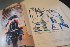
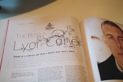
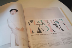
Sure, it’s only one page, but while flipping through GQ’s August issue I found something delightful on page 104. Who’s responsible for this playful juxtaposition? Will the designer(s) please step forward.

While we wait for the culprit(s) to reveal their identity, let’s ponder something: What newsstand publications showcase typographic whimsy? (Please leave design magazines out of the picture.)

Maintained through our ADV @ UnderConsideration Program
ENTRY DETAILS
ARCHIVE ID 2380 FILED UNDER Typography
PUBLISHED ON Jul.31.2005 BY Jason A. Tselentis
WITH COMMENTS
Comments
Randy’s comment is:

He must be saying "ouchie!"

On Jul.31.2005 at 04:44 PM
Jason Tselentis’s comment is:

It looks painful, but knowing Knoxville it probably hurts so good.

On Jul.31.2005 at 04:46 PM
feelicks sockwl jr’s comment is:

Its a great piece of type and image- agreed- but i dont understand why you ask these designers need to "come forward"? did they do something unreasonable?

the "culprits" are listed right there in the magazine:

Fred Woodward

Ken DeLago then

Anton, Sarah, Thomas & Chloe

David Sims (photos)

On Jul.31.2005 at 06:49 PM
Michael Surtees’s comment is:

TOKION's typography has been interesting for a while now

On Jul.31.2005 at 07:13 PM
Jason Tselentis’s comment is:

Michael, can you share any images? I'm not familiar with that pub, and presume it's out of Canada. Yes?

Feelicks, why not invite them to the party so they can... ahem, Speak Up.

On Jul.31.2005 at 09:14 PM
Michael Surtees’s comment is:

Jason, how can I say no to such a request. Hopefully th creative commons police don't give me a call after this post (or TOKION's lawyers). Ironically the location of the mag's editorial + advertising comes from NY, while distribution heads out of sunny NJ.

On Jul.31.2005 at 11:17 PM
Tselentis’s comment is:

Very nice, Michael. Thanks for uploading. The type itself seems to steal the show with some radical looking faces.

On Aug.01.2005 at 09:58 AM
DC1974’s comment is:

Um. I'm pretty sure that TOKION has editorial offices in both New York and Tokyo. Early issues in particular were often written in both languages, although that has subsided, I think. It's been a year or so since I took a look at it.

On Aug.01.2005 at 10:45 AM
Tselentis’s comment is:

The reason the GQ page caught my eye was because I didn't expect something like that from the magazine, which tends to be traditional in its approach to type, image, and publication design. Tokion seems rather progressive overall. Where have you seen radical, whimsical, or over the top page design in the likes of newsstand publications? The kind you can get at a grocery store? ESPN has done some amazing design in the past, following the steps of Ray Gun and Rolling Stone.

Are we in the midst of a rennaissance for publication design? Or are the Conde Nast magazines just playing catch up?

On Aug.01.2005 at 12:05 PM
Ricardo Cordoba’s comment is:

Jason, Fred Woodward, formerly at Rolling Stone, has been manning the art helm at GQ for a while now... If you have a chance, check out the last two SPD yearbooks for some of his outstanding work...

On Aug.03.2005 at 04:01 PM
Tselentis’s comment is:

SPD?

On Aug.03.2005 at 04:09 PM
Ricardo Cordoba’s comment is:

Oops. Sorry! The SPD is the Society of Publication Designers. They publish an annual book, which you can get from them or at bookstores, too.

I guess I should also amend my above statement about Fred Woodward’s GQ work to include all of the design staff at GQ...

On Aug.03.2005 at 08:21 PM
Rusty’s comment is:

Ricardo,

Yeah, good catch. I don't know how Gail Anderson would feel about you giving the typographic credit to Woodward.

On Aug.09.2005 at 01:10 AM