Speak UpA Former Division of UnderConsideration
The Archives, August 2002 – April 2009
advertise @ underconsideration
---Click here for full archive list or browse below
  
“Progress” in Current On-Air Graphics

Several days ago, a newish “non-fiction” channel debuted in the upper digits of my cable television service. I say newish because it is really a revamped NWI (Newsworld International); which used to be the international extension of the Canadian Broadcasting Corporation. Back in May 2004, a team lead by former Vice President Al Gore and entrepreneur Joel Hyatt purchased NWI with the intention of extending the interactive nature of the internet* to a television network.

In April 2005 Gore and Hyatt presented Current, the first (non-public access) television network to program a large percentage of viewer-created content. In his announcement, Gore said, “Until now, the notion of viewer participation has been limited to sending a tape to America’s Funniest Home Videos, calling an interview show, taking part in an instant poll, or voting someone off an island. We’re creating a powerful new brand of television that doesn’t treat audiences as merely viewers, but as collaborators.”

Each pod (“segment” in Current-speak) fits within one of several categories and is anywhere from three to ten minutes in length. There are no regular “shows” other than a Google Current segment each half hour which presents the top searches for a particular subject and quickly puts them into a larger context.

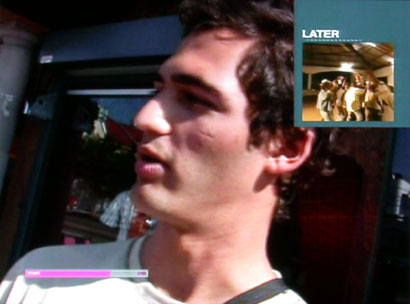
Those that be hatin’ on the bugs may find Current more annoying than other networks; but considering the target 18-34 year-old demographic, the on-air graphics feel appropriate. For such a young channel, there are rough spots: some of the pod category title cards are often reminiscent of MTV or VH1, and there is the occasional awkward overlay of a preview box in the upper right corner and someone’s head. But all that pales in comparison to an astounding graphic device: the progress bar.

This is a network of non-fiction aimed for people (supposedly) with short attention spans. When presenting the obstacles to making music in Sierra Leone (war, famine, missing body parts, no electricity…), one way to get viewers to settle down is to constantly promise that it’s almost over. To that end Current has placed an internet standard, a rectangular “loading” graphic, in the lower left corner. It grows from left to right; and when the segment is over, it changes color, and sometimes you hear a little “ding”.

The progress bar is nothing new. It’s a constant feature in internet audio and video, and is often used as a countdown for quick info-tainment features on shows like Entertainment Tonight. But Current’s use is an abstraction of their stated mission: a subtle reminder of the internet link between viewer and network, and a reminder that there are no shows — only pods in continual shuffle. Combined with content that is refreshingly interesting, real, and human; I find myself impressed with the whole enterprise.

~ ~ ~
current_logo.jpg
On-air, the Current logo resembles the time and date stamp on home videos, which will make up much of the programming. The four ellipsis squares after the word act as a secondary symbol which morphs into a menu of upcoming pods.
current_bug.jpg
The logo in situ and, in the lower left corner, the progress bar.
current_four_boxes.jpg
Here, the wordmark is replaced by four gridded boxes…
current_next_four.jpg
…which partway through the pod, turn into a preview of the next four pod categories.
current_upper_right.jpg
If producers want to feature a specific upcoming pod, a larger box in the upper right corner appears. Unfortunately, it has at times covered the head of someone who was speaking.
current_finished.jpg
When the segment is finished, the progress bar changes color and all other graphics disappear; with the occassional sound of a ringing bell.
current_religion.jpg
One of Current’s interstitial features is a quick question and answer on current events. The superimposed double bar slowly drifts across the screen.
current_scientology.jpg
There is a general sense of tolerance about Current — one of the hosts is Gotham Chopra, son of New Age figure Deepak Chopra. (So, no mention of aliens or exploding volcanos)
current_day_night.jpg
The iPod-shuffle quality of Current makes for a few jarring transitions. It’s common to see the California landscape in the window behind the hosts go from daylight one moment to darkness the next.
current_fetish.jpg
Title graphics for pod categories are the weakest link in Current’s on-air look. They often resemble VH1 graphics and often have nothing to do with the category subject. Above left: title graphic for Current Issue category. Above right: Fetish: The Magazine of the Material World — designed by Doublespace from 1979-81.
current_webpage.jpg
Here’s a feature of their webpage guaranteed to disappear soon. When you first go to the site, the phrase “Current serves up a real slice” appears under the logo. This phrase is editable and open to visitor contributions. Recent lines have read “Current all your base belong to me”, “Current majored in mass communications”, and mine above.
~ ~ ~

*Thanks, but there’s no need for any “Gee, I guess it’s a good thing he invented the internet” jokes.

Maintained through our ADV @ UnderConsideration Program
ENTRY DETAILS
ARCHIVE ID 2386 FILED UNDER Critique
PUBLISHED ON Aug.04.2005 BY m. kingsley
WITH COMMENTS
Comments
Randy’s comment is:

A couple of months ago, you could upload flash files that built in the logo, and they would swap out randomly on all of the pages. I can't seem to find information about it, much less an archive. Sad to see that one go.

On Aug.04.2005 at 06:46 AM
Bradley’s comment is:

Coooooooool. I don't really have anything more articulate to say than that.

On Aug.04.2005 at 11:54 AM
Kevin Lo’s comment is:

Reminds me a bit of our (canadian) show Zed, where users upload all-manner of "indy" content for broadcast. Good stuff, though issues of intellectual property are bound to spring up...

On Aug.04.2005 at 12:44 PM
Kevin Lo’s comment is:

Zed.

On Aug.04.2005 at 12:47 PM
Oscar’s comment is:

Sorry about Tipper and the PMRC? That's hilarious.

I'm not sure how they're going to keep worse things off that banner if it's editable by anyone.

On Aug.04.2005 at 12:52 PM
Tselentis’s comment is:

m. :

Thanks for introducing this channel, and its attention deficit method of programming. Considering how other channels handle the overwhelming content—MSNBC and ESPN come to mind—I appreciate the emphatic typography the use for the Q&A sections. Things seem well considered overall, but I still look forward to the day when you can turn these items on or off through the TV remote or prefs, just like you can toggle their headline (“edit me”) and sound on the website.

On Aug.04.2005 at 01:36 PM
marian’s comment is:

A friend of mine, Corey Holmes, worked on the identity with Peter Saville and Meta Design. He tells me also that a lot of the on-air graphics were done by Alexei Tylevich, many of which are viewable at his site, here.

On Aug.04.2005 at 04:53 PM
Rob’s comment is:

Now if only, with a click of your remote, switch from one pod to the next.

it's quite interesting that the MTV generation continues to push the envelope on the design of news—beginning with of course, the (in)famous design of USA Today (tv comes to print). One wonders if we will ever return to a place where people are looking for more than just a snippet of information and where time is something to enjoy and not just burn.

What's most amazing is how certain elements of web design have crossed over to television and become de facto standards in some situtaions. While I appreciate Fox News scrolling sports scores in the morning, I detest and am distracted by most scrolling news feeds (at bottom) on the evening news, most riddled with typos.

Now, it's off to leave my mark (no pun intended) on the Current site, for posterity's sake and to say how cool it was just to do it.

Thanks for the write-up m., always a pleasure to read your work.

On Aug.05.2005 at 06:52 AM
David Hartman’s comment is:

I really like the breakthrough quality of the video and on-air graphics - the ones that don't look like VH1 promos. I'm hopeful that they'll be a return to more of these kinds of "authentic" graphics, rather than the sort of proliferation of the MTV/VH1 aesthetic popularized by Brand New School. I think even they've moved on from that at this point. Its hard for anyone else to own that aesthetic at this point.

On Aug.22.2005 at 02:53 PM
Janus Wyndhall’s comment is:

OMG... I HATE CURRENT TV

On Jul.13.2008 at 11:55 AM