spacer
Speak Up
A Division of UnderConsideration
spacer

AuthorsAboutContactspacer
Updates, News and Announcements
Pattern
Quark Reloaded
Branding and Identity

Admit it: If you are a print designer who practiced design during the ’90s you would have not been able to get anything longer than one page done without the software we all love to hate to its death, QuarkXPress. With its funky key commands, stubborn interface and legendary — mythical? — poor customer service, Quark has made award-winners, exceptional vendors and trusted consultants out of a large percentage of designers. Yet, at the smallest fault, like failing to export a simple document to PDF, all we can say is "Quark sucks." With a new identity, unveiled last week, Quark hopes to, well, not suck so much.

quark_old.gif

Old iterations of QuarkXPress' identity over the years

“It’s radically different from our old logo," says said Glen Turpin, Quark’s director of corporate communications in a press release, "That’s why it’s the perfect symbol for the new Quark. Our company has changed dramatically. Like our new logo, once people catch a glimpse of who we are today and where we’re going, we’ll be impossible to ignore.”

quark_new_logo.gif

New logo, designed by SicolaMartin

Clearly, it's radically different from the old logo. Unfortunately, it's not radically different from a dozen-plus logos that use the circle-with-a-square-corner design element.

quark_various.gif

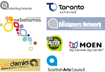
Since Quark is the latest to the hip shape party, it is easy, and expected, for some of the holders of these logos to be concerned of plagiarism and condemn Quark for "stealing" their logo. But, seriously, how original is this shape? And how is it different from a circle or a square, heck, how — as a branding element — is it different from a blue square?

This shape has a certain designerly edginess to it: is it a circle? Is it a square? What is it by golly?!

It has a simple dynamism that makes it a comfortable shape for designers, clients and consumers alike — all can cope with its offbeat attitude that does not really challenge much. In most of the cases shown above the shape is a "holding" or decorative element, it neither adds nor substracts meaning from the logo, it is not crucial to the representation of any of these companies. In Quark's case, it's different: It has a reason for being — a modest and literal reason perhaps — it's an abstract "Q", it translates. Surely, they could have opted for a different design element, one not as commonly used, but why should they stop when no one else has?

I would skeptically accept any reasoning from the above, varied logos as to why they chose that shape, other than it looked good. Quark is not stealing anyone's logo — despite claims on forums like The Designers Network — they are simply putting intention behind a geometric shape — not much different from a circle, a square or a triangle — that anyone could use. Quark may or may not suck, but complaining about plagiarism — creativity and originality aside — in this case, does suck.

Thanks to Von Glitschka and Michael Holdren for their weekend alerts.

By Armin on Sep.11.2005 Link Comments [135]

Start Comments

Jump to Most Recent Comment
Comment Divider
Garrett Lubertine’s comment is:

I tend to agree that Quarks new logo works in this instance. It seems to abstractly support the company through a famaliar visual representation. (Hip, cool and sleek come to mind, not always words I favor for logos.)

However what troubles me is their reasoning behind choosing it in the first place. Are there not other ways to better abstractly represent the Q in Quark without treading on logos that have since been created? (Originality perhaps?) The Scottish Arts Council logo, aside from the name and color... looks far too similar for comfort. Quark to me should represent the behemoth figure of publishing software, since that was its rightful place long before Adobe entered the fray with their ever evolving InDesign.

I certainly do not wish for this thread to become the Quark vs. Adobe thread, however I do feel with Quarks new "facelift" it appears to me that they are desperately trying to make up for lost ground in the creative publication software battle. Jumping on the hip "fresh, inviting and open" bandwagon does not necessarily mean fresh inviting better software. Yes they are making an attempt to cover lost ground, to appear fresh, setting themselves apart from the competition.

I am dissapointed that they chose THAT new mark, not because it doesnt work, (I do feel it fulfills what it originally had set out to do) or that some have accused it of plagiarism, but that Quark IS a huge figure in the creative publication world, and it should have been given a UNIQUE identifying mark that embodies everything the name Quark should represent.

On Sep.11.2005 at 03:08 PM

Comment Divider
gahlord Dewald’s comment is:

Ok folks this is probably old news but....

Check this out and then tell me why designers and others who are concerned about IP or creativity should support Quark.

Scottish Arts Council

Quarkl

On Sep.11.2005 at 05:16 PM

Comment Divider
DesignMaven’s comment is:

"Quark may or may not suck, but complaining about plagiarism — creativity and originality aside — in this case, does suck".

I'll use none of those words and emphatically state the new Identity Lacks

VISION, IMPACT,UNIQUENESS, and MEMORABILITY

All words associated with GREAT IDENTITY DESIGN.

Upon First Impression I thought of Sterling Brands.

Isn't successful Identity Design supposed to give the impression of something we've NEVER SEEN BEFORE.

The Quark Identity is Successful on Many levels that you iterate Arm. Only if the other Identities didn't exist.

Given, Nobody owns a Square, Circle, Triangle etc. They are all Generic Devices. What you do with said Devices to Develop, Design and Create your Identity is what differentiate you from your competition.

Honest Attempt, Falls short on VISION...

DM

On Sep.11.2005 at 05:41 PM

Comment Divider
Kyle Hildebant’s comment is:

I dead man dressed in pretty cloths is still a dead man.

They had better drastically rethink their business model, or it's over.

On Sep.11.2005 at 06:00 PM

Comment Divider
Tan’s comment is:

Nice writeup, Armin.

The logo is very derivative. Yes, it's an improvement, but what's the point?

I loved Quark. I was a staunch diehard. I once said that Hell would freeze over before I switched to an inferior desktop publishing poser like InDesign. Well, apparently Hell did freeze, cause I was finally forced to switch over. To this day, I still believe Quark is better and imminently more intuitive than InDesign, but it doesn't really matter any more.

I think the tide turned a couple of years ago, when Adobe released CS1 and its aggressive pricing—and it seemed like the design world all switched to ID overnight. Sure, there are still a few holdouts and large publishing houses that cling to Quar. But the vast majority of small to medium-sized firms that I'm aware of have all switched.

How did that happen? Well, Adobe did it by aping Quark's best features and UI structure, and seamlessly integrating it with their other products (Open type) and platforms (pdf). They made it as easy as possible for Quark diehards to step over and accept the change. And they gave away tens of thousands of copies to schools in an attempt to convince naive students and gullible faculty that InDesign was the new leader in the industry.

In the meantime, Quark raised its price per single box to almost $900, and refused to offer any significant student/educational discount. They didn't make any attempt to reach out and retain their legions of loyal customers.

It's no wonder Adobe won. What a bloody shame.

On Sep.11.2005 at 07:15 PM

Comment Divider
Kyle Hildebant’s comment is:

My biggest problem with the symbol is that it reads much more of a lowercase 'a' glyph, than a 'q'. As seen in the Scottish case. Fountain has a type face that even uses such a glyph.

http://www.fountain.nu/catalogue/girl.asp

On Sep.11.2005 at 07:38 PM

Comment Divider
Daniel Schutzsmith’s comment is:

I am really torn now. At first, I was completely floored at the new logo's infringement upon obvious pre-existing identities well-known in the very industry they cater to. Then after reading Armin's thoughts I realized that we are only talking about a circle with one right angle corner. Now, the comments above make me realize that no matter what we may think, it is ultimately up to those companies with similar logos to decide the fate of this new one.

Personally, I'd expect that Quark's logo will stay and this will become the topic of discussion at the cocktail party's and snack carts later this week at the AIGA conference!

On Sep.11.2005 at 09:00 PM

Comment Divider
feelicks sockwl jr’s comment is:


this story - like Quarck- is so

yesterday

its not even funny.

actually, OK, it is kinda funny.

On Sep.11.2005 at 09:14 PM

Comment Divider
Chris Rugen’s comment is:

Ah Quark, how I loved thee. We had our differences, but you were my first and my only. We worked through all of it.

Then came InDesign with its sleek features, close ties to the right players (OpenType and its pal PDF), gifts of classic fonts, and the tab was so much easier on my meager lifestyle. And always striving to meet my needs!

Now I run with the in crowd. I do things with InD I never could with you. It's long nights partying with old friends that can talk to InD in ways you never could. Granted, we have new difficulties to deal with (no! I didn't want to apply that style sheet there! Why can't I get rid of that spot color, we don't even use it in this document!) but I'm happier. And besides, InD tells me what a good typographer I am.

So now you're wearing something new, Quark. It's nice, but I've seen it around before you came strolling in wearing it. I'm happy, and even though your grass is undeniably greener now, you still aren't compatible with my new business partner, PDF, amongst other things. Too little, too late. If you'd just have tried a little harder to keep growing earlier on, you wouldn't have to do this to yourself to get me to notice you now. It's not the clothing, Quark, it's the whole package.

Call me next year, maybe we'll do a demo together.

On Sep.11.2005 at 09:17 PM

Comment Divider
KevinHopp’s comment is:

I identify with Chris Rugen - no matter how you dress it up, I'm over Quark.

From a design standpoint, I wouldn't be surprised if everyone winces after seeing the list of logos previously designed using that same 'squircle' as we called it when deciding on FRAMES FOR THUMBNAILS - oops, my logo looks like a design element, who the heck do they think they're kidding?

On Sep.11.2005 at 10:32 PM

Comment Divider
Michael Holdren’s comment is:

That's too funny Chris. I think any application will have it's shortcomings, but to me I don't think Quark as a company would be doing any of this had Adobe not tried to hustle in on their territory with InDesign and therefor threatening their very survival. Of course, Quark did the same to PageMaker (or so I've heard) first a while back, but at least Quark could have had better customer service skills during it's period on top of the hill.

I guess my point is, let's suppose that Quark does a good job of winning back the hearts of designers and brings out incredible features with Quark v7, and InDesign goes back to playing second fiddle... how do we know that Quark won't return to it's old evil ways?

In regards to the logo itself (the point of this discussion), should we not hold the designers (at SicolaMartin) "responsible"? I mean, they pitched it (with many others, I'm sure) to Quark in the first place, right? Sure Quark approved it but I'd bet that they trusted SM to do the research and verify that it was indeed a unique mark. Sure, Quark makes an easy target for anything ("Damn, my monitor just died. Must be Quark.") but if we're going have a discussion about this, shouldn't we at least follow the trail backwards and see how it came to fruition?

On Sep.11.2005 at 11:40 PM

Comment Divider
DesignMaven’s comment is:

"Quark did the same to PageMaker (or so I've heard) first a while back, but at least Quark could have had better customer service skills during it's period on top of the hill".

You're absolutely correct Michael. Since I'm apparently the only person OLD enough to remember. PageMaker was owned by ALDUS. Aldus folded and Adobe bought PageMaker. Quark aggressively marketed it's word processor to kill the competition. Creative service industries, e.g. Design Firms, Consultancies, Ad Agencies, Communications, Public Relations bought into the Quark Mystique.

A few LONE RANGERS such as myself never bought into the Quark Mystique. I've always used PageMaker and use it until this day along with In Design. Reason, PageMaker merged better with Adobe Products. In Design with Quark Features is Flawless.

I don't do any Print Design except for Poster Design, an occasional ad. My work in Identity Manuals have been significantly reduced. The craft aspect of that work is delegated.

Quark essentially survived because the Design Industry was using it.

None Designer Industries were using PageMaker.

Smart in-house Design Consultancies, Firms, Agencies, purchased both.

In 2003 I went to just about every Seminar Abobe advertised for it's new In Design product. Adobe invited Quark Fanatics, the Design Industry, Creative Decision Makers, to witness the wonders of their new product and they were SOLD.

What killed Quark was Lousy Customer Service. Bugs in the software they were unwilling to correct. They did not listen to Designer Needs, Adobe did.

Old saying, What's Good for the Goose...

Until Quark begin to listen intently to Designer Needs, Change and their Customer Service Practice. BASS, RAND, and Landor can't bring them back with a new Identity, neither Package Design.

BTW:

SicolaMartin after checking their site have no Credibility in Identity Design.

DM

On Sep.12.2005 at 08:31 AM

Comment Divider
marian bantjes’s comment is:

I love the girl in a new dress analogy. And let's face it, Quark is a Grade A Bitch. And that the bitch chose a knockoff dress to come impress us with is just so predictable, cuz you know what? She's always been a lazy bitch to boot. Yeah, sure I had my torrential love-hate relationship with her the same as everyone, but hate won out, and I don't care what she's wearing, she'd have to work super hard to win my trust back again.

refused to offer any significant student/educational discount.

Why am I not surprised? "Refuse" has to be one of the more prominent words in this company's vocabulary. This is a classic case of a company that has lost the confidence of their market base and is trying out a new identity to indicate some sort of change. I simply can't imagine switching back. This company would have to come to me personally, give me a free copy of the software, listen to every single criticism and response I had, and fucking implement it before I'd consider leaving InDesign. Then they'd have to call and wish me happy birthday (on my birthday, thanks), send me presents at christmas, and convince me that they really gave a shit. Oh yeah, that's going to happen.

I would be very, very interested to hear from the 5 actual designers still in thrall to this mistress, whether anything has actually changed. Does she bring you coffee in the morning? Has she sent flowers lately? Has she given any indication that you might matter, or does she still talk about herself incessantly and hang up on you when you try to suggest she's not all perfect? And does she still invite you out to dinner at a restaurant of her choice and expect you to pay the bill?

Stupid fuckin lazy bitch: how appropriate that your new identity says absolutely nothing about you.

On Sep.12.2005 at 09:24 AM

Comment Divider
marian bantjes’s comment is:

On a more technical note ... I notice there's a little "TM" next to the mark ... can someone educate me as to the significance of that as their legal claim on the mark?

On Sep.12.2005 at 09:32 AM

Comment Divider
Darrel’s comment is:

Hmm...we're overpriced, have pissed off thousands of users with crappy upgrade policies and lack of any real support, we haven't been innovative in about a decade, Adobe is kicking our ass...hmm...I KNOW...WE NEED A NEW LOGO!

On Sep.12.2005 at 10:32 AM

Comment Divider
Patrick C’s comment is:

I have not read any other commentary on the new logo so excuse me if this has been said.

Armin, I disagree with your comment that Quark is "not stealing anyone's logo." How so? The shape has been used before (as the examples show) and so have many other shapes. But in this case the Quark logo is, for all intents and purposes, identical to the Scottish Arts Council logo. IDENTICAL. To me, that's stealing.

On Sep.12.2005 at 11:22 AM

Comment Divider
Armin’s comment is:

Patrick, sure, it's IDENTICAL, but I strongly — really strongly — doubt anyone at SicolaMartin said "Check out this cool Scottish Arts Council logo, what if we rip this off?", how many here had even heard of the Scottish Council at all before this Quark debacle came up?

On Sep.12.2005 at 11:30 AM

Comment Divider
Rob’s comment is:

A quite voice peeps from among the crowd...

I'll still use Quark. InDesign may have some bells and whistles but I can still do what I need to do, and have a better way of dealing with laying out type, with Quark.

Besides that, isn't the firm that designed this logo really the one that should be catching all this flak and not the client? For that one would only have to go hereto see (borrowing the caps from DM) that an ADVERTISING agency was responsible for this IDENTITY work.

Not an identity firm with the knowledge and experience that it takes to create a logo that is clearly something new, not used by others and unique.

Oh, and if you really want to know what's up next for Quark, you can read about it for yourselves.

On Sep.12.2005 at 11:32 AM

Comment Divider
Chris Rugen’s comment is:

A new identity makes sense, ultimately, because they're essentially trying to lay down a scorched earth policy on their old persona.

However, customers who left probably aren't going to change back as long as Adobe's customer service can manage to stay better than Quark was at its worst. I'm sure Adobe knows this. But Quark is still a major part of the print design world, and I think if they can come back swinging with real power, then they can retain a place in the market.

QX 7 is very crucial strategically and tactically, and right now they're using the MS vaporware tactics: promise big on future releases to stall people from purchasing your competitor's product. They just need to keep leveraging their installed base to stay competitive. If enough of your clients/vendors insist on QX7, then what can you do but upgrade? I wonder if they'll allow 4.1 owners to upgrade to 7? It seems like the smart move.

On Sep.12.2005 at 11:44 AM

Comment Divider
Patrick C’s comment is:

Armin, you're right. I was going to add a paragraph to my reply to that effect—I had never seen the Scotish logo before and I doubt the design firm did either—but didn't feel like typing it. So "stealing" really isn't the right word and my apologies to the design firm—I don't believe they "stole" it or would have used it if they had known about the Scotish logo.

But, like any common symbol (and this one is obivously common) if you're going to use it, use it in an original way. They failed to do that when compared to Sterling Brands and the Designers Network (two logos I imagine would have been familiar).

On Sep.12.2005 at 11:55 AM

Comment Divider
Michael Holdren’s comment is:

> SicolaMartin after checking their site have no Credibility in Identity Design.

SM has experience in developing Freescale Semiconductor's identity. Freescale is the spun-off division Motorola Semiconductor Product Sector (SPS), which happened last year. They may not tout it, but I think they have *some* experience with this.

Question: would a 1st Tier firm have been able to catch the Scottish Arts similarity? The research those guys conduct is still legendary, right?

On Sep.12.2005 at 12:23 PM

Comment Divider
fatknuckle’s comment is:

In answer to Michaels question, yes they would have. Identity designers usually have a pretty vast knowledge of marks that they have seen (just ask Maven) and It would probably at the very least have set off the "i think ive seen something similar" bell, questioning its originality. Maybe not a specific example would have been called but it at the very least should have been questioned.

Its that knowledge and historical perspective that sets identity designers apart.

On Sep.12.2005 at 01:16 PM

Comment Divider
Darrel’s comment is:

Oh, and if you really want to know what's up next for Quark, you can read about it for yourselves.

I only made it through the first page, where it appeared the thesis was "we're really sorry we were assholes before, but we promise to actually support our product now and yea, we're outsourcing everything to India too, but c'mon...so does everyone else, so forget about our past...just by QXP 7!"

They still seem a bit naive.

As for the mark, I dunno. It's pretty generic. I don't see it as being a rip-off as much as just vague and generic. I'm pretty sure I won't confuse Quark with a Scottish Organization.

On Sep.12.2005 at 01:54 PM

Comment Divider
Kelly Munson’s comment is:

I would really appreciate it if Quark's would attack their EPS preview problems with as much vigor as they did their new identity.

On Sep.12.2005 at 02:18 PM

Comment Divider
David E.’s comment is:

The form of the logo isn't as bad per se as the fact that it's not a good form for Quark. This is probably more the fault of Quark than the agency that designed it, but they have to share the blame for not steering them in a different direction.

The fact that the new Quark logo is derivative of this or that logo doesn't bother me as much as it's obvious attempt to be "edgy", which Quark is not. Macromedia is edgy — that's their positioning. Quark's new logo should have positioned themselves differently somehow. A more subtle change — something that reflected a pride in the heritage of their product would have been better.

For an established product, especially one that's been the industry standard for a very long time to say "Look, we're brand new too!" makes them appear somewhat desperate and not cutting edge at all.

On the other hand, derivative or not, its a much better looking logo than any of their previous logos — and I have to say I'd rather look at that one when I launch the software every day (Yup, I'm still using it).

On Sep.12.2005 at 02:48 PM

Comment Divider
Kim Siever’s comment is:

So, what happens when some other new trendy logo treatment comes up in a couple of years and Quark's logo become bland? Are they going to change it again?

It looks nice, but if you want to differentiate yourself from your competition, how does jumping on some other bandwagon accomplish it?

On Sep.12.2005 at 03:52 PM

Comment Divider
Rusty’s comment is:

What's funny is that Quark's clients are designers, the very people who create logos and know the identity industry inside and out. Nobody understands better than us that this is an attempt to polish a turd.

On Sep.12.2005 at 04:04 PM

Comment Divider
Diane Witman’s comment is:

I've seen it here, I've seen it there. I recently found it in my e-mail through the HOW Design Newlsetter in their Hottest Links section to Ashby Design.

Look at this website under Branding, scroll down to click on "Various logos and marks". See for yourself, it's a been there done that mark.

On Sep.12.2005 at 08:39 PM

Comment Divider
gregor’s comment is:

While the new mark is by no means exceptional, I think that in a certain way quark is not trying to position itself in the same way as adobe is - by appealing to the 'artist' designers often times view themselves as. This juxtaposition of the two companies can be seen in their recent print advertisig campaigns. Adobe likes to envision itself as provider of the tools for dreamers, quark is positioning itself in what it sees as the reality of design: most design work is not the next new throw away masterpiece and is more often than not dictated by fairly narrow confines of client specs. If you have clients that allow you to dream, sit back and count your blessings. The new mark reflects that perspective as does the messaging of their recent campaigns. Pleasing, possibly, but not a huge imaginative leap.

Personally, I love Quark - use it over Indesign when I can, which these days usually means for myself as most clients have migrated to Indesign when CS came out. Some when v2 came out. This is me personally: with quark I feel like a craftsman. With Indesign I feel like I'm cutting cookies. But whatever tribe you wish to belong too is fine with me, I'd just rather hear people talk about the difference between the two objectively and not just jumping on the Quark nay-sayer bandwagon 'cause everyone else is.

I don't feel an allegiance to Quark, Adobe or Macromedia (in the case of freehand) - if it works for me and my clients, cool. If not I'll use something else.

But the bottom line is Quark as a company has never been really design savvy in relation to their own collateral and brand assets. The recently revived from the dead X-Ray magazine is more or less a testament to this. But I ask is this seeming lack of design savvy intended and meant to appeal to your basic day to day digital proletarian or just plain bad design? Consider it: "bad" design as a strategy....

DM, I think I may still have a copy of Aldus pagemaker, boxed and all, kicking around in the storage closet next to Illustrator 4 - ah back in the days when software could be installed off a floppy...

Now in the software debate - another thread perhaps - a new features versus processor power and ram to run Indesign CS2 or PS CS2 would be interesting. Quark has never brought my machine to a crawl the way Photoshop CS2 has.

On Sep.12.2005 at 08:55 PM

Comment Divider
gregor’s comment is:

Question: would a 1st Tier firm have been able to catch the Scottish Arts similarity? The research those guys conduct is still legendary, right?

Micheal, I may be wrong (and I'm too lazy to check) but wasn't SicolaMartin aquired by Y&R a couple years back? If so what would that make SicolaMartin? Tier 1 - B Squad, or Junior Varsity, or...?

That particular mark has been used almost identitically in a multitude of identities, many of which Armin included in the post. Anyone know who used it 1st?

What I do find interesting is the trademark and how this passed through trademark lawyers seemingly w/o a hitch.

On Sep.12.2005 at 09:44 PM

Comment Divider
joya’s comment is:

This is my first posting on Speak Up, happy to be here and appreciate the past year's articles and postings when I've had the late night time to browse.

I have been a diehard and loyal Quark user for 10 years. I patiently waited almost 2 years to upgrade to OSX simply because of Quark was not ready for it. I preached Quark's superiority over PageMaker (yes, I remember that one) for years. I worked at a commercial printer for 3 years and saw nothing come even close to Quark's capability in the prepress department - PageMaker users were called amateurs in our world.

Sadly, no more. In the span of one week last month, I had three clients request that I use InDesign (since they need the final files upon completion). Luckily, InD CS2 was on the shelf since I purchased the suite for Illustrator and Photoshop upgrades. I anticipate that I will be using both programs for a year or so until everyone makes the switch, but Quark is slowly sliding out the door.

My point is this: I feel I have no choice but to switch. As I am a partner in a two-person firm where cash flow is a constant issue, Adobe has simply made it too easy for me to stop paying the exhorbitant amounts for Quark upgrades. By purchasing the suite, I pretty much use InDesign for free. Add to that the client requests and printer confidence, and it's not a question in my mind, no matter how much I am committed to Quark.

Quark lost a huge opportunity at a critical time and they absolutely cannot recover - unless they make their upgrades $199 so it's worth keeping around. Adobe jumped in, took the reins and, as I said above, simply made it too easy for me to let go of Quark. I can't say that InD has wowed me yet, but it's only my first month. I'm willing to give it some time.

As for the logo, I agree with tan that it's a moot point. However, as a calligrapher and designer, I can think of a lot more interesting shapes to make with a Q to keep the logo distinctive and unique from other ones out there. Ah... hardly a logo exists that doesn't look similar to something else. That's the nature of the beast: the simpler you make a shape or design (i.e. the goal of a logo), the more chance there is that it will be repeated somewhere out there.

On Sep.12.2005 at 10:58 PM

Comment Divider
DesignMaven’s comment is:

Gregor:

"Michael, I may be wrong (and I'm too lazy to check) but wasn't SicolaMartin acquired by Y&R a couple years back? If so what would that make SicolaMartin? Tier 1 - B Squad, or Junior Varsity, or..."?

Correctomundo, SicolaMartin are owned by Y&R. And who owns Young & Rubicam?

WPP

Quark reviewed by Maestro Spaeth. Please load link in your browser.

http://www.identityworks.com/reviews/2005/quark.htm

Landor they are not. They are Junior Varsity compared to Landor.

I'll explain the differences between Ad Agencies and Corporate Identity Consultancies.

Michael Holdren:

Thanks for the 411 on the Semi-conductor information.

My point of contention of Identity Credibility SicolaMartin does not have a HISTORY OF EXEMPLARY Identity Design.

Advertising and Corporate Identity are different species.

Corporate and Brand Identity involves Strategic issues, Identity Design must last 20-30 years or longer traditionally unlike Advertising, which is more often Tactical in nature.

Today because of take over, buy-outs, mergers and acquisitions an Identity may only last five to seven years.

Advertising is Tactical because you do campaign one year and you may need to do something else the following year, perhaps even six months later.

You also have the option to re-examine, adjust, eliminate, etc.

With Corporate Identity, Consistency and Repetition are crucial. You begin with a modest franchise of Recognition and Understanding, and that Value become Greater and Greater as Recognizability increases, as it gets attached to more and more events, more and more Products and Services. After time, it begins to take on Layers of Meaning and Reassurances and Recognition, that together become almost Irreplaceable after a period of time.

You have to be Damn sure that what you started with was right, because as the years go by it becomes more and more difficult and COSTLY to Rectify a Mispositioning or a Miscommunication.

Advertising and Corporate Identity are essentially incompatible businesses with wholly different relationship dynamics. Agencies are in the long-term relationship business, while identity work is inherently episodic and healthily so. Agencies focus, properly, on the message of the moment while identity focuses on the enduring. And no one agency contains a big enough client base to afford, on staff, world-class identity design and consulting experts.

Many thanks, Rob and Fatnuckles.

Marian

"On a more technical note ... I notice there's a little "TM" next to the mark ... can someone educate me as to the significance of that as their legal claim on the mark"?

That simply implies Temporary Mark. To indicate Law Suits will soon follow.

Seriously, Marian the Identity should've never got passed Trademark Attorney's as Gregor said. Providing a Trademark search was commenced.

USPTO issued a Trademark License perhaps because Quark is a Reputable Corporation whom also owns a Patent.

In that respect Quark's New Identity Flew Under the Radar.

DM

On Sep.12.2005 at 10:59 PM

Comment Divider
BlueStreak’s comment is:

Marian:

"On a more technical note ..."

Maven:

"USPTO issued a Trademark License perhaps..."

Maven, I now have to question your experience with trademarks. There are no federal regulations governing the use of the designations "TM" or "SM" with trademarks. That is a nearly exact quote from the USPTO.

Anyone can apply the TM to anything. And the only people that seem to care are lawyers that insist on it. Only after a mark has passed USPTO review does it receive the coveted ®. The Circle-R signifies that it is a registered trademark with the United States government and that has legal significance.

On a Quark note, does anyone remember having to disconnect network connections to start up bootleg copies of QXP on multiple machines? Then you could reconnect the old phone-net to the printer and you were good to go. At least that was an old rumor I heard.

I increasingly wonder what Quark would've been like today if the company had invested the antipiracy effort in customer service and product development instead.

On Sep.12.2005 at 11:47 PM

Comment Divider
justin ko’s comment is:

Actually this new logo fits Quark perfectly...... Always 3 steps behind...

On Sep.13.2005 at 12:45 AM

Comment Divider
DesignMaven’s comment is:

BlueStreak:

"USPTO issued a Trademark License perhaps..."

"Maven, I now have to question your experience with trademarks. There are no federal regulations governing the use of the designations "TM" or "SM" with trademarks. That is a nearly exact quote from the USPTO".

"Anyone can apply the TM to anything. And the only people that seem to care are lawyers that insist on it. Only after a mark has passed USPTO review does it receive the coveted ®. The Circle-R signifies that it is a registered trademark with the United States government and that has legal significance".

Am I not allowed to make mistakes? I'm as close to GOD as you can get but I'm not infallible.

Just typing fast, allow me to clarify. USPTO is half correct if they told you anyone can use a service mark ("SM) or trademark ("TM"). Understanding said use is limited to respective industries.

If USPTO is implying any business can register a trademark then they are emphatically wrong.

The "TM" or "SM" is adopted to distinguish their repective entities. Realistically there's no need to display the "SM" once the Identity is copyrighted. The Service Mark offers no protection from infringement. It indentifies the business as a service oriented business.

Please refer to my post a couple weeks ago when I made the distinction with Debbie, Byrony, and Marian manufacturing Cosmetics. (TM")

Armin, Felix, and myself owning a conglomerate of hair salons. ("SM")

My point was clear and concise with no Gray Area.

In the words of Ric Flair. "Now we GO TO SCHOOL".

A Trademark is any word, name symbol or device adopted and used by a manufacturer or merchant to identify his goods and distinguish them from those manufactured or sold by others e.g. iPod A Service Mark Identifies a Service e.g. Apple itunes online service. A Tradename Identifies a business e.g. Apple Computers.

Trademarks are acquired by adoption and exclusive use. Once established by use, they may be registered with either the State or Federal Government or both.

Adoption of a Trademark by itself gives no right to its protection. The right is acquired by use and will be lost if discontinued or the mark ceases to serve the function of distinguishing the owners products or services. Loss of distinctiveness will occur if the owner fails to use the mark properly or lets others misuse it. To be of value the mark must be treated in such a way as to maintain its distinctive nature by proper use in advertising, in tariffs, and trade, technical and other journals.

License or Registration we're playing with semantics. There's no doubt if there is no legal repercussions of infringement the Quark Identity will be registered.

It should be understood that the combination of Logotype and Symbol together is the Corporate Signature. However with manufacturers the Corporate Signature can serve a duality acting as the Corporate Identity and Trademark.

The "TM" which is adjacent to the shoulder of the last letter of the mark is simply an indication the mark is an identifier of the Brand in the process of being registered.

For more information on Trademarks and Service Marks. Load the link below into your browser.

http://www.identityworks.com/issues/issues5.htm

Ask your contact at USPTO, how Sinatra Trademarked his last name?

He was the only person to my knowledge in history able to accomplish that.

I already know the anwser, see what they tell you.

DM

On Sep.13.2005 at 03:37 AM

Comment Divider
DesignMaven’s comment is:

Correction:

"The Service Mark offers no protection from infringement. It indentifies the business as a service oriented business".

Typing fast again. The Service Mark does add protection against infringement.

Examples of trademarks: Pepsi, Mercedes Benz, Dell, Apple, IBM, Avery, Addidas

Examples of servicemarks: IHOP (restaurant services), Geico (service mark of Insurance Co.), K Mart (retail business) and Sprint (telecommunications) and United (service mark of United Airlines).

As stated in my earlier post a couple weeks ago only manufacturers can Register a Trademark.

Service Marks are not Trademarks. You provide a service however are not a manufacturer.

Business that provide a Service can register their Service Mark. In that respect USPTO is wrong.Because they did not inform you BlueStreak Service Marks can be Registered.

DM

On Sep.13.2005 at 04:35 AM

Comment Divider
Paul Livingstone’s comment is:

Hogwash!

The Quark logo is a blatant rip of the Scottish Arts Council logo. I don't care how you choose to dilute the argument, it plagarism and that's a fact.

On Sep.13.2005 at 04:53 AM

Comment Divider
Splashman’s comment is:

Armin, I just wanted to point out that that Quark's case is different than the Scottish Arts Council only if you fail to see that the image translates not only to "q", but to "a", which relates to the emphasized word in SAC's logotype.

I have a hard time believing any design firm worth their salt would fail to unearth SAC's logo in the review process. They had to know that such a simple form would already be in existence somewhere. It seems to me the only reasonable explanation is that Quark determined that it simply didn't matter that SAC's mark was identical. And frankly, if I were in their position, I'd reach that conclusion as well.

The only complicating factor is that Quark's execs had to know (assuming they had at least one functioning brain cell between them -- hmm) that someone would dig up SAC's logo about 5 minutes after Quark announced their makeover. And blatant logo clones don't go over real well with their target market. So wtf were they thinking? It smacks of the same old Quark arrogance.

I don't think I wanna know how much Quark paid for this mark. If v7 costs $1500, you'll know why.

On Sep.13.2005 at 06:56 AM

Comment Divider
Mark’s comment is:

... and?

On Sep.13.2005 at 08:02 AM

Comment Divider
Bryony’s comment is:

Welcome Joya.

If you forget for a minute that the logo is identical to so many others, if you put aside the fact that there are so many similarities between all of them and look at the logo on it’s own, what do you think?

Personally, I think that the typography is weak and generic. I think the “icon” and the “a” are fighting each other, not only in shape, but location, the “r” looks wimpy as it ends and the “k” is a kick on the behind to end it all. Finally the first letter. The “Q”. What where they thinking? Is it supposed to mirror the “icon”? bold it and close the right side and listo!

Could they not come up with a more interesting lockup than this?

On Sep.13.2005 at 08:57 AM

Comment Divider
BlueStreak’s comment is:

"I'm as close to GOD as you can get but I'm not infallible..."

What a way to start a day. Toto just pulled the curtain back on the Maven of Speak Up.

We haven't mentioned that slogans are frequently trademarked too, like FedEx's "Absolutely Positively Overnight," or Nike's "Just Do It." And even service companies sometimes use a TM with their slogan until it's registered.

Just like the Circle-C isn't required legally anymore, the USPTO isn't concerned with the TM or SM indicia. Their only concern is the Circle-R. But lawyers think that the Circle-C and the TM and the SM all give them a better argument for a claim even though there is no statutory basis. So some ads have these little symbols all over the place.

Quark's use of the TM is nothing more than a dog taking a leak on a tree to claim ownership. A tree that dozens of dogs have already pissed all over. The mark is so generic though that protection by the USPTO may be possible for their industry. Meaning that another non-software company could register a nearly identical mark as long as they don't sell software or related goods.

As Design Maven ™ stated though, it's commercial use of the mark that matters most. ©

On Sep.13.2005 at 09:50 AM

Comment Divider
JonSel’s comment is:

Armin, Felix, and myself owning a conglomerate of hair salons. ("SM")

That may be the most hysterical thing I've ever read on SpeakUp. Oh the visuals that come to mind...

On Sep.13.2005 at 10:01 AM

Comment Divider
DesignMaven’s comment is:

BlueStreak:

You read to much into my words. Clarification again. I meant Close to GOD Spiritually, In Belief and Conviction and Practice. I understand how those comments can be misinterpreted. =-D and ='(

Thoroughly aware the comment was a Double Entendre.

Thanks for the Toto Reference and the Great and Powerful Oz.

Thanks for your astute observation of taglines and slogans. I must of had a Senior Moment and forgot.

Paul and Splashman:

They're correct Arm. Not Ganging up on you!!!!!!!

Both of you are to include Von Glitschka who brought this to our attention is correct. It is very difficult

to pull that Generic Shape from then air without a VISUAL REFERENCE.

The problem, this is where Trademark Law and Infringement get tricky. The Scottish Arts Council may not be able to file Suit. Because they're in the United Kingdom.

I'm not sure how International Trademark Law is applicable in this situation.

Sterling Brands and the other Corporations in the United States can file a Law Suit. They only have to show evidence of who was the first to use the Identity.

Generally the court does not rule on such matters unless the two entities are competitors in the same market sector.

If a Corporation is large enough they have the financial resources to stop any semblance in the use of their Identity.

Kellogs, (Frosted Flakes) has sued Exxon for the use of the Tiger. Because Tony the Tiger was born first.

http://www.eura.com/steffen/jura/aktuelles/texte/tony_kellogs_vs_exxon_tiger.htm

Krispy Kreme Donuts has sued another smaller company for using the name Krispy Kream different spelling and unrelated business. The smaller business is an ice cream company.

http://www.corante.com/copyfight/archives/2004/11/01/krispy_kreme_goes_after_36yearold_ice_cream_stand_for_tm_infringement.php

McDonald's sues a Scotland man from using his last name (birth name) MacDonald's.

DM

On Sep.13.2005 at 10:14 AM

Comment Divider
DesignMaven’s comment is:

JonSel:

And of Course you know who will be trying to

portray Warren Beatty in Shampoo

if he wasn't Married.

He's already GOT the Hair thing GOING!!!!!!

JonSel, would you kindly weigh in on the new Quark Brand Mark.

And Express your observations and concerns.

As well, as Trademark infringement.

DM

On Sep.13.2005 at 12:10 PM

Comment Divider
Kyle Hildebant’s comment is:

DM,

"Since I'm apparently the only person OLD enough to remember. PageMaker was owned by ALDUS"

I started using Aldus PageMaker along side Aldus Freehand. Granted I was young, but I did use them. ;)

On Sep.13.2005 at 12:39 PM

Comment Divider
Von Glitschka’s comment is:

Article about Quark logo on MacWorld.

On Sep.13.2005 at 01:03 PM

Comment Divider
DesignMaven’s comment is:

Kyle:

My profound apologies. BlueStreak had the OLD MAN against the ROPES. Devoted much time to his concerns.

Many, many thanks for your research and Astute Typographic knowledge providing the link of Designer Dirk Uhlenbrock Typographic Design. And relating the Glyph to the new Quark Brand Identity.

Your Research of the "Q" and "A" was affectionately iterated by World Renowned Identity Designer Jerry Kuyper on Maestro Tony Spaeth's website.

Scroll down to other comments. Under Quark Commentary. Link below.

http://www.identityworks.com/reviews/2005/quark.htm

DM

On Sep.13.2005 at 01:13 PM

Comment Divider
Robynne Raye’s comment is:

SicolaMartin designed the new Quark logo in InDesign. That shouldn't have really come as a shock but it did.

On Sep.13.2005 at 02:27 PM

Comment Divider
Robynne Raye’s comment is:

SicolaMartin designed the new Quark logo in InDesign. That shouldn't have really come as a shock but it did.

On Sep.13.2005 at 02:27 PM

Comment Divider
Tony Spaeth’s comment is:

Pissing on a tree? excellent analogy. Yes, you can stick a TM or an SM (if it's more service than product) on any logo design and/or name. What it says is simply "We regard this as our property, so hands off." You may or may not also apply to register it at your patent office, in which case you can replace the TM with a circle R when granted. In the meantime the TM might actually warn somebody off, and if you do wind up in court anyway it can strengthen your ownership claim simply by documenting your intentions. At least you pissed on your tree.

Thanks, Maven, for the links to identityworks

As for Quark's me-too logo, to me the more important incompetence is the denigration of the richest brand asset, a truly distinctive name, by change to a symbol in preference to a new wordmark. I would like to think a qualified design firm would avoid this error.

On Sep.13.2005 at 03:12 PM

Comment Divider
Jethro Lyons’s comment is:

"This is me personally: with quark I feel like a craftsman. With Indesign I feel like I'm cutting cookies. But whatever tribe you wish to belong too is fine with me, I'd just rather hear people talk about the difference between the two objectively and not just jumping on the Quark nay-sayer bandwagon 'cause everyone else is."

A tool is a tool is a tool. A tool that is easier and quicker to use will not make you less of a craftsman. Nor will a tool that is difficult to use make you more of a craftsman. I want to use the tool that allows me to get my ideas down in the quickest way possible. I don't need a tool that is irresponsibly convoluted to give me and my work a feeling of self-worth. Much in the same way I wouldn't deem a carpenter using a shoe to drive nails to be more of a craftsman than one using a hammer.

Regardless, I don't see why we get so bent on proclaiming which of these are better as neither are shoes and are only hammers to their respective users. I prefer ID because it is more like the other tools (Photoshop & Illustrator) I use and gets out of my way when trying to complete a job. It's not the same for everyone.

Now back to the original topic.... Quark's new logo is uninspiring at best. It looks to be a derivative of mid-late 90s neon simplicity look. It tells me nothing of them as a company (All though a figure with an arrow through the head might not be the story they want to tell). They essentially sell one product aimed at a specific group. I would think there are many more avenues to explore in reference to identity work.

On Sep.13.2005 at 03:13 PM

Comment Divider
BlueStreak’s comment is:

"BlueStreak had the OLD MAN against the ROPES."

Sorry for the distraction Design Maven.™

You are still my identity hero based on your

Knowledge and Wisdom but most emphatically

for your Passion.

On Sep.13.2005 at 03:44 PM

Comment Divider
Rose’s comment is:

I just want thank the heavens that Quark didn't stoop to what Artworkers did with their horrendous Flash movie, making the logo (similar to the Scottish Arts Council) blink in and out, grow and jump around. The only things that turn me off more than crappy, slowly spinning logos and text in Macromedia Flash are the old farts in the White House.

On Sep.13.2005 at 04:20 PM

Comment Divider
gahlord Dewald’s comment is:

Does anyone know which typefaces the company names are based on, respectively? The Quark seems pretty square/even x-height vs the SAC. But I'm just curious, aside from the mark similaritie what else is happening in these.

On Sep.13.2005 at 04:53 PM

Comment Divider
David’s comment is:

It's my shape! One day I was staring off into space and I imagined a circleish-square shape. I'm suing everyone!!

I'm kidding, btw.

On Sep.13.2005 at 05:18 PM

Comment Divider
DessignMaven’s comment is:

BlueStreak:

Many thanks, I stand in a very long line behind many more qualified than me Michael Bierut, Debbie, Gunnar, JonSel, Weinberger, TAN, and Felix.

Its just nice to call Speak Up Home have a Forum to raise a little HELL, Laugh, Cry and most important learn.

Inasmuch as I give, I get back three fold from Armin, Byrony, Marian, Peter, Graham, J.T. and all you guys the Speak Up Community and Patrons.

Maestro Spaeth:

My Mentor and Friend. Simply Royalty in the World of Identity Consultancy and Design.

Many thanks for Gracing Speak Up with your Presence.

DM

On Sep.13.2005 at 06:01 PM

Comment Divider
Geleg’s comment is:

People people people ... I don't get it? Why is it that when something is created, produced, designed, etc ... people always have something negtive to say about it. Or they say the design concept was stolen. How many products on the market, including this logo design have the same design? Thousands do, but yet there is always a blog or news post about it all.

I agree that one should be able to create something without it being stolen. But also, I would find a compliment if it was done to me. How many exercise machines, kitchen tools, books, cars, homes, and the list goes on that looks the same? How many website are built off the same code layout, but yet look different?

The dozen other companies that are using the same logo design are not in long lengthy legal battles. Nore, are they making any kind of fuss. So, what's the point!

On Sep.13.2005 at 06:11 PM

Comment Divider
DesignMaven’s comment is:

Follow Up:

Last and certainly not least. It needs to be said. If I possessed the Publication Design Skills and Information Architecture Skills of Michael Surtees I would definitely be working at a First Tier Consultancy.

Such is Life. Can't teach an OLD DOG new tricks.

Unfortunately, I'm only one Dimensional.

DM

On Sep.13.2005 at 06:20 PM

Comment Divider
gregor’s comment is:

Jethro:

Moi:

"This is me personally: with quark I feel like a craftsman. With Indesign I feel like I'm cutting cookies. But whatever tribe you wish to belong too is fine with me, I'd just rather hear people talk about the difference between the two objectively and not just jumping on the Quark nay-sayer bandwagon 'cause everyone else is."

et Moi:

"I don't feel an allegiance to Quark, Adobe or Macromedia (in the case of freehand) - if it works for me and my clients, cool. If not I'll use something else."

et encore:

Whatever works for you and your clients.

Now, let's see the thread was about what? Oh yes the new Quark mark.

On Sep.13.2005 at 08:37 PM

Comment Divider
Eunice Ockerman’s comment is:

Bryony’s comment is:

Could they not come up with a more interesting lockup than this?

Tony Spaeth’s comment is:

As for Quark's me-too logo, to me the more important incompetence is the denigration of the richest brand asset, a truly distinctive name, by change to a symbol in preference to a new wordmark.

Geleg’s comment is:

How many products on the market, including this logo design have the same design? Thousands do, but yet there is always a blog or news post about it all.

********

Hello hello,

I'm an infrequent reader and less frequent poster. I found this thread very interesting. Above are the comments that I felt were appropriate to an assessment of a mark.

I think Bryony's comments are very much on topic regarding the relationship of logotype to logomark. I'll add that the letters Q & X are very distinctive when set in body copy yet their character, which is unavoidable when set in type, are in conflict with the soft and squeeshy logomark. (Soft and squeeshy are fine but they battle the dynamism of a Q and an X. Not to mention a K. These are kung fu letters!)

Tony Spaeth nailed it in terms of brand identity. Quark, despite it's customer support quirks, had/has cachet. This new mark doesn't build on that strength. Nor is a logomark necessary as Quark is the brand and the producet. Moreover it resembles the Adobe logomark in style and application.

And of course Geleg's comments are on target. It's not the mark, it's the implementation of the mark that makes it successful. Men's clothing is a good parallel. Men work with a fairly restricted vocabulary compared to what women have to work with. Still some men have an identifiable style while othes don't.

While this discussion isn't Quark vs Adobe, it does strike me as involoving brand identity and positioning. And Quark does need to win back designers if it is to survive.

Eunice

On Sep.13.2005 at 08:38 PM

Comment Divider
JonSel’s comment is:

SicolaMartin designed the new Quark logo in InDesign. That shouldn't have really come as a shock but it did.

Maybe that was tongue-in-cheek and I'm slow on the uptake, but if true, that's really awesome.

On Sep.13.2005 at 08:44 PM

Comment Divider
Jerry’s comment is:

New logo aside, I'm just glad it's over. R.I.P. Quark.

On Sep.13.2005 at 08:48 PM

Comment Divider
JonSel’s comment is:

JonSel, would you kindly weigh in on the new Quark Brand Mark.

Maven, pretty much everyone has said their share and I'm not sure if I have much new to add. But that won't stop me from trying.

Essentially, they are proclaiming "a new Quark." If so, then a logo is a good place to start, but it's a horrible place to end. Time will tell if this is just some prettying up or if they are really embarking on a more open and customer-friendly future. Perhaps Quark 7.0 will not cost an arm and a leg. Maybe it will be truly revolutionary in page layout, although I'm not sure what more there is to add to these programs. However it manifests, that'll be the criteria to judge whether this is really a good move for them or not.

I agree with Tony that the Quark name is very valuable. I also think they've misused the name, because everyone calls their program "Quark" and not "XPress". They are tying their corporate and product brands together in a way not easily separated. Aldus survived for as long as it did because it had FreeHand when PageMaker started to falter. Quark doesn't have another major product, so if Xpress dies, the company will most likely die.

To touch way back on Armin's point regarding plagiarism, he's right that there isn't much weight to that argument. I blanched at first when I saw the mark, knowing of Sterling Brands' logo, but plagiarism implies a direct knowledge of the existing marks and then appropriating it. Good luck proving that. Incidental duplication is a fact of life when you have a symbol that's so simple. I've tried to use the shape before. I'm sure you all have. That doesn't make us all plagiarists, perhaps only lazy.

On Sep.13.2005 at 09:06 PM

Comment Divider
Kyle Hildebant’s comment is:

As I have said in other forums, and as Tony said: The biggest issue here (design wise) was Quark abandoning their wordmark. The name is where the value lies, the symbol only serves to fragment it.

On Sep.13.2005 at 11:14 PM

Comment Divider
thecat’s comment is:

SicolaMartin designed the new Quark logo in InDesign. That shouldn't have really come as a shock but it did.

could you please verify that statement for us?

share a link, whatever?

my two cents:

target market - the design industry

quark failed miserably

but at least they are consistent in their continued arrogance

On Sep.13.2005 at 11:45 PM

Comment Divider
gregor’s comment is:

SicolaMartin designed the new Quark logo in InDesign.

Not sure why this would be an issue, except fodder for those who dislike Quark. I couldn't even begin to count the number of Microsoft projects I and many of my colleagues have done on a Mac.

On Sep.13.2005 at 11:52 PM

Comment Divider
thecat’s comment is:

issue or not, it'd be handy to find out where the comment came from.

when someone throws something like that out it's handy to have a url or a whatever to go with.

On Sep.14.2005 at 01:39 AM

Comment Divider
Jeff Gill’s comment is:

Quark put out a thing a while back about how the InDesign User Guide (don't know which version) was done in Quark. I also remember reading about Cahan+Associates (I think) doing a big project for Macromedia in Illustrator.

When you hire designers, you hire brains, not software.

On Sep.14.2005 at 04:31 AM

Comment Divider
Kevin Cannon’s comment is:

Armin, your argument basically seems to be that, just because they didn't intend to create something the same as the Scottish Arts Council, that it's okay.

I think that makes it understandable that someone created this logo, but it doesn't make it okay.

If someone wrote exactly the same song as someone else, and came up with independently, and then released it, they wouldn't get away with it. This isn't any different imo.

On Sep.14.2005 at 07:35 AM

Comment Divider
Kyle Hildebant’s comment is:

"SicolaMartin designed the new Quark logo in InDesign"

The real question is: Why would you do illustration in InDesign? Wouldn't you do this in Illustrator? Maybe I'm crazy.

On Sep.14.2005 at 11:48 AM

Comment Divider
Pablo Rivas’s comment is:

I find incredibly interesting this trends tha put certain shapes in the spotlight. They`re suddenly so fresh that one can`t avoid thinking "wow, that`s cool". But, like everything in life, eventually fades out. Like the elipse in the mid ninties in my country.

Since I am Chilean, most of our nationald design issues are almost completly separated form global discussion...but untill now. Please visit www.smartcom.cl if you want to behold the thirdworld approach to the issue. We are cool too!

On Sep.14.2005 at 01:24 PM

Comment Divider
Robynne Raye’s comment is:

Hey Peeps - It was a joke. I have no idea what software program SM used.

On Sep.14.2005 at 01:54 PM

Comment Divider
Armin’s comment is:

> The Quark logo is a blatant rip of the Scottish Arts Council logo. I don't care how you choose to dilute the argument, it plagarism and that's a fact.

Paul, if it's a fact, I would love to be proven wrong. But I doubt your claim can be remotely backed up.

Before anyone thinks I am fighting on behalf of Quark, I am not. I find it incredibly shortsighted and misinformed that this logo even got into a presentation to Quark. This shape is too generic to be considered a differentiator for Quark, it was a poor decision by SicolaMartin to have even offered it as an option. I still stand strong on my comment that this is not a ripoff; just a poor idea that was unfortunately picked by Quark. Both SicolaMartin and Quark should have been aware of the propensity of this shape to appear anywhere. But, ripoff? Never. Unoriginal and uninformed? Ever.

On Sep.14.2005 at 02:34 PM

Comment Divider
fatknuckle’s comment is:

File under design cliché.

On Sep.14.2005 at 10:39 PM

Comment Divider
Von Glitschka’s comment is:

Armin is correct. It's not a rip-off in the truest sense it's more of a documented failure of creative process and methodology. In a nutshell they offered something to the client they shouldn't have.

On Sep.15.2005 at 01:37 PM

Comment Divider
Peter’s comment is:

Ok so I hate to even mention this but the thought is just gnawing at me for a while now.

With all the recent debate over the evils of LogoWorks and how they rip off logos across the board I have to say, how is this any different. Understandably SicolaMartin is a much more reputable agency, perhaps not a Landor as Maven pointed out, but even so.

Speakup has been used to rant about the evils of LogoWorks, who seemingly rips off everything they do. Yet SicolaMartin is somehow blessed with the argument of ignorance to the SAC logo, there is seemingly some sort of design hypocrisy there, which can't be avoided in my mind.

Anyway, to take my turn on the trumpet, a new logo does not a better product make. Especially when it is less than inspirational.

On Sep.15.2005 at 01:45 PM

Comment Divider
Armin’s comment is:

Yet SicolaMartin is somehow blessed with the argument of ignorance to the SAC logo, there is seemingly some sort of design hypocrisy there, which can't be avoided in my mind.

Peter, you are absolutely right in smelling a whiff of incongruency and, in retrospect, I should have cleared a few points in my position:

Ignorance, when designing for highly visible companies — or for anything, really — is as dangerous and evil as blatant ripoffs. Apologies for the confusion.

> Understandably SicolaMartin is a much more reputable agency

Also... I'm not sure about this, I don't think I implied that... I have to say that I had not heard of SicolaMartin prior to this, and based solely on the identity work on their web site I don't find they are either reputable or appropriate for designing the logo of a company that targets so many designers.

On Sep.15.2005 at 03:30 PM

Comment Divider
DesignMaven’s comment is:

Peter:

Well said !!!!!

Arm:

You've undoubtedly Redeemed yourself!!!!!

Have fun in BOSTON. Don't let Big Willi and Biertut show off to much. =-D

DM

On Sep.15.2005 at 05:49 PM

Comment Divider
CactusJones’s comment is:

I caint speak fer Our Man Vit even tho I do keep my one good eye own tha boy. Butt I thank thad's his point. Quark cudda jes got LogoWorks to givum a logo turd like at'n en saved tha thousands they pade Sick Ole Martin.

On Sep.16.2005 at 10:56 AM

Comment Divider
Ben’s comment is:

Hope those geniuses in suits at Quark headquarters didn't pay too much for that logo. Coincidentally, the word of the day is: schadenfreude. It's well-deserved considering the hoops I had to jump through two years ago to get that piece o' shite otherwise known as QuarkXPress 6 installed with no less than 4 calls to India, natch. Thankfully, I'll never have to do that again. Praise be the joys of InDesign CS.

Artworkers

Scottish Arts Council

Alcone Marketing

Sterling Brands

On Sep.18.2005 at 11:23 AM

Comment Divider
feelicks sockwl jr’s comment is:

Hope those geniuses in suits at Quark headquarters didn't pay too much for that logo

Oh, you neednt worry. Any client who dials up a forgotten marketing agency in TX for identity services is going to ride that horse into the sunset- and on the cheap.

On Sep.18.2005 at 01:05 PM

Comment Divider
fatknuckle’s comment is:

clop clop clop clop clop! yeeeeee hawwwwww!

On Sep.18.2005 at 03:53 PM

Comment Divider
DUBZ’s comment is:

OK, SM did not "steal" the logo from Scottish Arts but assuming SM was ignorant of all the other logos that are strikingly similar if not identical in absurd. How was Quark able to trademark this shape? I think I will trademark air or the sky and then say..."oh, I didn't know" I can hear the SM jingle now.."Mine is not an "A" its a "Q" and it is green not blue!" Nice try SM. Back to the drawing board. This is just like Quark...bunch of losers. InDesign Forever!

On Sep.21.2005 at 03:58 PM

Comment Divider
Armin’s comment is:

DesignMaven just pointed me to another of these similar-looking shapes that we missed...

And two more I found today:

One

Two

On Sep.26.2005 at 06:23 PM

Comment Divider
Brian’s comment is:

Let's break Quark down just a bit, not only from the "stolen" logo, but the technical aspects as well, then we'll determine how much Quark really sucks...

First, the logo...

I'm SERIOUSLY disappointed in Quark, whether or not they, as Armin stated "planned" on ripping off the Scottish Arts council logo. Let's remember, if you steal a car and get caught, you can't get out of it by by using the excuse that you didn't PLAN on stealing it or SAY that you were going to steal it before actually stealing it.

The fact is that you DID steal it and should answer to and be held responsible for that theft. Identity is a BIG thing, for any company. Look at Nike, Coca Cola, FedEx, etc... Companies spend a LOT of money, time and energy on their identities... an why? Because those identities are what they ultimately become recognized by.

Therefore, theft of an identity piece is a HUGE thing in my books, be it planned or unplanned. And I can GUARANTEE that SOMEONE at Quark has seen the Scottish Arts Council logo LONG before designing this logo... I GUARANTEE it. Were one to take a look through the IP logs of their servers, the smart money says there are numerous hits to their site from Quarks design computers, or