Speak UpA Former Division of UnderConsideration
The Archives, August 2002 – April 2009
advertise @ underconsideration
---Click here for full archive list or browse below
  
Designers: New York Commuters Need You!

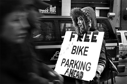
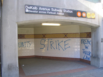
On Tuesday morning, around 6:30 AM when we woke up, we immediately checked the news to see if the Transport Workers Union had launched a strike that would leave New York City without mass public transportation. And so it was. No subways. No buses. Cars only with four people minimum would be allowed into Manhattan. Biking, walking, skating and HOVing would be our only options. Coming from Brooklyn, none too appealing. These past two days we have webommuted to work and watched on TV thousands of people walk across the bridges in freezing temperatures, cram Grand Central and Penn Stations and, people standing at major entry points to the city, waving handwritten signs that specify their needs and wants. These men and women could use the help of a designer.

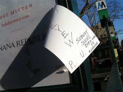
Most people have surely improvised their signs with whatever materials they found on the spot or before leaving home and clearly, none of them had InDesign or Illustrator and an at-the-ready printer. The Red Cross has set up stations at heavy arteries and are handing out free coffee and cookies. Could a designer set up a makeshift studio, with a laptop, a printer, some magic voltage from somewhere and start whipping out highly legible signs for these commuters? Maybe, maybe not. As sarcastic as this post may start to sound, when we talk about the “power” of graphic design, I think this would be it. I’m positive people would get picked up quicker if their destination were more clearly legible by the driver of a moving car. In a situation as chaotic as this, clear communication could cut through the noise. Typesetting, an activity we do every single day without much thought, would be as welcome as a warm cup of coffee.

Rollover images to see designification.
(Update 1/5/06: Images were culled from Flickr and The New York Times, credits were not added at the time of original posting due to… hmmm, anger at the strike? Credits will be added when possible)

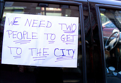
If I were doing this — which, in all disclaimerity, I’m not — I would only use Hoefler & Frere-Jones’ Gotham (with its condensed version). Besides being thematically fitting, it has enough presence to stop a pigeon from pooping on your morning bagel. In this example, I would use the number 2 rather than the word two, as it allows for more room, specially in Gotham Condensed. Since TO GET TO THE CITY is a given, it’s OK to make it small.

Another excellent option, would be, again, from H&FJ’s collection, Champion Gothic with its slimming condensed styles that would allow for maximum coverage of a letter-sized page. Here, Champion Gothic Bantamweight knocks out the other commuters.

ITC Garamond would be a good choice for this shy sign.

And, if it were my last option, I would even use the system’s Impact.

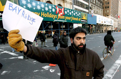
Some don’t actually need any help. Good job!

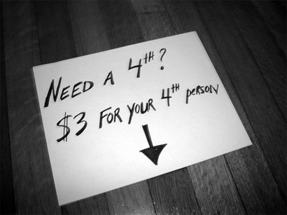
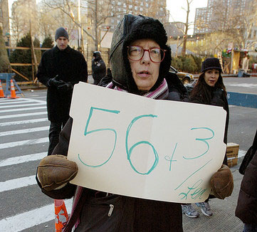
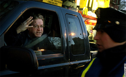
Others need help understanding what “four” means and might be better served by the finger than any sign.

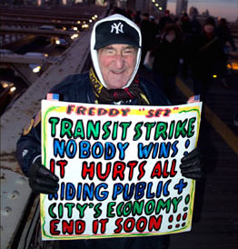
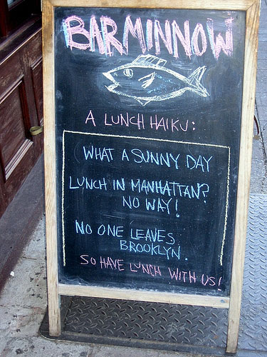
And at the end of the day, it’s still a strike and people need to express themselves.

I might make it into the office tomorrow. My printer is not hooked so I might end up with a scribbled sign trying to get into the office where a copy of Gotham awaits me.

Maintained through our ADV @ UnderConsideration Program
ENTRY DETAILS
ARCHIVE ID 2497 FILED UNDER Typography
PUBLISHED ON Dec.21.2005 BY Armin
WITH COMMENTS
Comments
Steve’s comment is:

This whole thing has really blown me away. haha, maybe that new paper display technology would be helpful here.

Some of the signs would be sooo unreadable from three meters or so, do these people realize that? I'd definitely spring for a jiffy marker and bigger paper, even if it was out of the way.

On Dec.21.2005 at 11:45 PM
Michael Surtees’s comment is:

Maybe this is an anomaly, but some people aren't having too bad of a time getting to work. Between limo's and jeep's, Tina isn't doing too bad.

On Dec.21.2005 at 11:57 PM
Ricardo’s comment is:

Thanks for some much-needed laughs, Armin! Although so far, I have been pretty lucky with the daily commute into town (thanks, Rebecca!).

On Dec.22.2005 at 12:14 AM
beth’s comment is:

Thanks for this - it is great to see what is really going on down there...the papers are not showing much. As a Bostonian, I can sympathize, and understand public transit is used even more there than here.

On Dec.22.2005 at 12:39 AM
Chris Rugen’s comment is:

Great stuff, Armin. Thanks for bringing us a bright side of this mess. I think the novelty of walking and biking wore off pretty quickly for most people. This post is a good argument for people to license more fonts, too.

As for me, I'm staying out of the city today and telecommuting. I had to trek 70 extra blocks on Tuesday. And with the holiday travelers flooding the train stations today? No more, thank you.

On a related note, I actually designed a sign for a special transit strike line.

On Dec.22.2005 at 07:45 AM
Eric’s comment is:

It seems like the Cheese Monkeys would be ready for this particular situation.

On Dec.22.2005 at 10:48 AM
melissa’s comment is:

haha! Yes. The Cheese Monkeys. I think they would be ready in this situation for sure. We were all Cheese Monkeys at some point though right?

RIDE+ME=FREE SMILES!

Maybe some cheer would perk up some of the most stressed New Yorkers

On Dec.22.2005 at 12:41 PM
Tan’s comment is:

A joke to ease you New Yorker's pain...it helps if you read it with an Irish accent.

A man who smelled like a distillery flopped on a subway seat next to a priest. The man's tie was stained, his face was plastered with red lipstick, and a half empty bottle of gin was sticking out of his torn coat pocket. He opened his newspaper and began reading. After a few minutes the disheveled guy turned to the priest and asked, "Say, father, what causes arthritis?"

"My poor friend, it's caused by loose living, being with cheap, wicked women, too much alcohol and a contempt for your fellow man."

"Well I'll be damned," the drunk muttered, returning to his paper.

The priest, having second thoughts about what he had just said, nudged the man and apologized. "I'm very sorry. I didn't mean to come on so strong. How long have you had arthritis?"

"I don't have it father. I was just reading here that the Pope does."

On Dec.22.2005 at 01:57 PM
Luke’s comment is:

I just have to jump in here and say I like the hand-drawn ones better. There's an immediacy, warmth and honesty about them that only these kind of 'tough' situations bring out in people. I'd be skeptical of ones that were too considered. And legibility wasn't too much of an issue, the traffic was hardly moving!

I'm not convinced that graphic design makes the world a better place, and even though we're probably doomed to always bogged down in modernist salvation narratives, I think this is a really good example of where graphic design could learn to leave good enough alone.

I didn't notice but did anyone just try sticking out their thumb I wonder?

On Jan.05.2006 at 01:01 PM
Armin’s comment is:

Luke, sure, the hand-drawn ones are "better" and more emotive and whatnot. But when it comes to readability in a situation like this, where grabbing someone's attention is the most important thing and not touching their heart with some scribbles, I'd very much rather have a chunky sign that can be seen five, seven cars back.

> I didn't notice but did anyone just try sticking out their thumb I wonder?

Yes. And it only slowed down the process. On Thursday I crazily tried to catch a cab going back to Brooklyn and pretty much every car and cab-with-passengers-already slowed down, rolled down their window and asked where I was headed. With a nice sign, there would have been no need for anyone to stop, ask, negotiate and decline or accept.

> I'm not convinced that graphic design makes the world a better place,

I'm not convinced either, but, unless you are a hell of a letterer, a ballpoint pen will be less visible and less comprehensible than a well typeset sign. It's not about modernist "salvation narratives", it's about clarity and impact.

On Jan.05.2006 at 02:02 PM
Luke’s comment is:

It's that "slowing down the process" that I appreciated though. You'd be late, but no one was really gonna bust your chops. Most people were relatively 'understanding' (for New Yorkers anyway), and there were more random interjections, meetings, and conversations in our everyday routines (esp. if you were trying the good ol' thumb!). I like it when big cities break down because it always changes the way people communicate with each other. Blank faces turn into possibility.

On Jan.09.2006 at 10:21 AM