Speak UpA Former Division of UnderConsideration
The Archives, August 2002 – April 2009
advertise @ underconsideration
---Click here for full archive list or browse below
  
And… Logo Action!

From September of 2004, when we first moved to New York, to September of 2005 we had no cable TV in our home. By choice, I think. No NBC, no Bravo, no HBO, no ESPN no E! Just a TV with a DVD player. I even relinquished my Playstation. This was a bold move for me. As a child, teenager and young adult I could watch TV longer than Nick and Jessica could deny their split. But at this juncture in our lives going sans TV distraction, in a city where every minute counts, would be the right thing. Boy was I wrong.

I missed the series finale, the whole final season actually, of Six Feet Under. I wasn’t able to even get hooked on Lost or Entourage. I missed the NBA season — I had to watch the Pistons-Pacers brawl on espn.com. But what I missed the most, I noticed, after reinstating cable TV in our home this past September when we moved out of our first New York apartment, was ads. That’s right. Those poor Tivo’d-to-hell-ads. I found myself looking forward to commercial breaks and rather than go pee or channel-surf I would stay put. I watched the ads, not because I thought they were clever or funny or well-produced… no, I watched to see their final second or two. The moment when the logo of the company, product or service materializes itself unto the screen. In most cases logos are introduced through a simple fade-out/fade-in effect from final scene to logo. In other cases, it is lazily slapped at the end, like that splat noise food makes in movies when it is served on a metal tray to prison inmates by a smileless cook — no joy, no effort, here it is, enjoy. Or not. In very special instances, and when I least regret the seventy-dollars-a-month cable subscription, the logo is weaved into the final seconds of the ad’s action. Integrated. Cared for. Thought through. Brought to life from its print applications.

Most of the time we design logos to go on business cards, letterhead, web sites and packages. We consider its reproduction at different sizes under different circumstances and we rarely build a logo to suit animation, even though we may tout its potential animationability to a client if appropriate. If it ends up on TV, good luck to the broadcast designers charged with the task, we’ve done our job. More often than not, they do a damn good job with the static logo we (or them) have created. I take special interest when a logo is literally, not theoretically, deconstructed: Each of its parts animated separately and brought together in climatic unison to its original, static form. Capturing the essence of a logo and transforming it into an “action sequence”. I’m equally delighted when a logo appears as if from nothing, with its pieces, or all of it together, magically appearing on screen. I would even go as far as deeming these extremely short bits of animation as one of the strongest ways — even one of the most critical, given the amount of exposure logos get on TV — to build a brand’s personality and add a complex layer of meaning to their identity in one or two seconds flat. Fast and Furious.

I have always enjoyed logo animations and when I have had the chance to do some myself I have taken it very seriously — albeit humbly through Flash and with small clients’ clients as an audience — and spent an extra 8 to 10 hours of the job just on that but I was really surprised that after my year of TV rehab I would find such delight in these branding short-shorts. Here are some, not all unfortunately, memorable ones.

All screen shots (except Ford’s) are courtesy of AdCritic.com. Rollover still images (give it a second to load) for a jumpy and sketchy animated GIF version (leave your mouse over and it will loop) of the originals, which, if you haven’t been as silly as me in opting for a year without TV, you can catch at home later tonight.
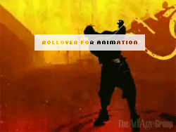

Jeep

Perhaps one of my all-time favorites, Jeep’s animation captures the ruggedness of the vehicle. The sound (missing here) is of a Jeep climbing up a rocky terrain, with the Jeep logo falling into place as it settles from what one assumes has been a long and arduous journey.

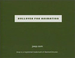
Unfortunately, in the latest version of the Jeep ads, the logo is now lazily and awkwardly revealed as being a mountain
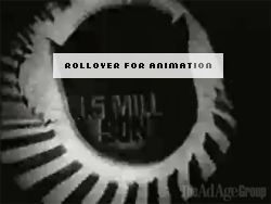

Expedia

One of my current favorites is Expedia. The latest ads are not available online, so it’s hard to make a case for its swoopy, swirly graphics. However its premise — the orbiting plane around the globe — remains intact since its first public appearance. Below is the first, not-too-clever animation of the logo.

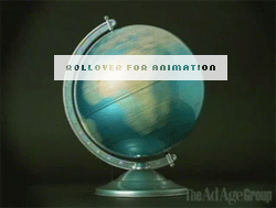
In the second round of advertising, the logo really comes to life, with the plane zooming into the picture and orbiting the globe. This is a perfect example of a static logo being broken apart and brought back together through a simple animation.


Ford, Life in Drive

For its Ford Fusion campaign, Ford brings its motto, Life in Drive, to, well, life by illustrating the slogan shifting to drive. What would sound like a cliched idea during a brainstorming session is well pulled off by a simple animation.

HP

Over the past two years HP has created some of the most visually attractive commercials since introducing their plus sign campaign and have since extended their graphic loving care to the way the logo reproduces on screen, from the geometrically strict to the utterly groovy.

<


Apple

Normally untouchable and prissy, the Apple logo is sprayed with attitude in this ad for the iPod featuring the ever-rebellious eminem. The reveal of the logo in this ad is one of my favorite, it meshes perfectly with the splattery dynamic of the ad and it literally explodes in your face. Quite cool.


Napster

In another rough-and-tumble, underground motif are the short-lived Napster ads. The whole end-of-the-world/the-revolution-will-be-televised typography and animation with the logo being equally disrupted in the end only extend Napster’s no-care attitude.


Sprint

In case I haven’t been persistent enough on how much I appreciate the identity redesign of the Sprint/Nextel merger, I offer one more piece of evidence. The original Sprint commercials ended with the what the hell does that have to do with anything? pin drop, which became a highly recognizable brand asset that then became the basis of the new logo. In the new commercial the Sprint logo comes to life by mimicking the old pin drop, sound effect and all. Boldly colorful, elegant and alluding to its origins. A++++.


Xbox

This is totally a made for TV logo and highly on target. When Xbox originally launched it built its appeal on violent and dark games, and its rumbling-from-the-deepest-confines-of-the-earth logo animation was a perfect match. With the new, slicker look Xbox has shifted to the light side. Thank you for the original.

As mentioned above these are but a fraction of well-developed closing logo animations and do not represent the breadth of possibilities and variety of examples of how a static logo, even the most stationary of them, can be brought to life with a little imagination and trump those logos that have been specifically designed to take advantage of all the new media applications: AT&T recently launched its TV campaign; the other night Bryony called me to come see the ad and being the nerd that I am, I dropped my toothbrush and ran with a mouthful of toothpaste to watch it. In the closing sequence the old AT&T and SBC logos literally merge, giving way to the uninspired appearance of the new logo that slightly and dumbly rotates on its axis. Terribly boring, unsatisfying and not once supporting the premise of the update of the logo. If this is the future of logo animation as envisioned by the New School of Identity™ I might just cancel my cable subscription. Again.

Maintained through our ADV @ UnderConsideration Program
ENTRY DETAILS
ARCHIVE ID 2519 FILED UNDER Branding and Identity
PUBLISHED ON Jan.17.2006 BY Armin
WITH COMMENTS
Comments
christina’s comment is:

I really enjoy reading these posts about aspects of our field which I had only thought of in passing. And there is nothing more pleasurable than seeing a few quality pieces, not to mention having my own geekdom validated.

As for the at&t debacle, it just shows that an uninspired marketing and design team can destroy things for a company across the board, no matter the format.

But hey, at least they're consistant.

On Jan.17.2006 at 09:22 AM
Jason B.’s comment is:

Good topic Armin.

Like christina I never really gave much consideration to how a logo was animated, though I know that I have appreciated particularly well executed ones.

The Jeep animation that you cite was one of my favorites as well, the logo bounding up a hillside is so spot on, it repesents the brand perfectly.

I, personally, always look for the MasterCard "priceless" logo transitions. The way that the logo is integrated with some object from the commercial is almost always clever and gives a nice send off to the spot.

As for the at&t, I was not that thrilled with the new logo but held out hope that perhaps when animated it might get new life or depth. Sadly, that has not happened yet for me.

On Jan.17.2006 at 09:53 AM
JAbbott’s comment is:

Thanks for a great article. It really made me think about an overlooked logo attribute.

On Jan.17.2006 at 09:55 AM
Randy’s comment is:

For year's (5 and going), I've lived without a television. To this I can relate.

Is "reasearch" a valid reason to purchase a television? It must be when we now have assignments for broadcast graphics.

On Jan.17.2006 at 11:22 AM
Dana O’s comment is:

Great post!

With the Apple logo, their new blue ad has an even cooler animation of the logo. I won't ruin it for those that haven't seen it yet. :)

On Jan.17.2006 at 12:14 PM
ps’s comment is:

armin,

you brought a new dimension to Speak Up -- pretty cool.

i gave up tv over a year ago and i don't miss it. not even the ads. however, when in dallas last week for a tradeshow, i took advantage of the tv in the room and took in a good dose of bad tv just to see what is outthere.

i question if animated logos are really an afterthought. i don't think that is the case anymore. might have been, but as soon as animated gifs and flash came along, i think that changed. not only for the big spenders that can afford tv ads, but also for small firms that have a web presence. of course, an animation is not always desired or necessary.

On Jan.17.2006 at 12:22 PM
Diane Witman’s comment is:

I am surprised that many people don't think about the different ways that our marks or logos will be used. I always end up imagining how my logo could be animated.

I think this is very important to keep the different uses in mind when designing and not only for logos but for many projects. When developing a brochure I think "will this be able to go up on the web in a PDF if the client wants it to be downloadable?" "and if it is, how will it print from a home printer?" I always like to keep these questions in the back of my mind...just in case. You never know.

As for boycotting TV, that is a wonderful idea. Unfortunately, I haven't gotten to tha place yet. One can only dream.

Armin, this is a great discussion as I am realizing how many designers continue to think in only terms of print. My current employer doesn't understand the many differences between print and web and that makes it very difficult for him to design for the web. Many projects may come to life and this should probably be considered or at least kept in the back of all of our minds.

You had great examples and I, too love the Jeep motion rather than the appearance in the mountain.

Unfortunately, I watch more tv than I should and I was already aware of the connection between the Nextel and Sprint merged logo.

Thanks again for a great topic and for opening some eyes.

On Jan.17.2006 at 01:09 PM
Rick’s comment is:

Hear, hear on the Jeep animation. The first time I saw it I was overjoyed, and I'm sorry they don't do it anymore. Perfect.

Just about everything HP is doing blows my mind these days. Those :30s where the guy at his desk makes pictures of everything leaves advertising and borders on art.

Dana O - thanks for the post. The Marsalis Apple ad is sweet.

I can't really feel you on the new Napster stuff, Armin. Maybe it's my own negative associations with the brand getting in the way here, but this stuff looks very played out to me. Their original logo was beautiful... I remember how thrilled I was when the beta was finally released for the Mac not because I cared so much about downloading as that I got to see the splash screen and dig on the logo. I appreciate they're carrying it through, but the execution leaves me wanting.

Lastly, the way the Sprint logo animates absolutely takes it up a notch.

On Jan.17.2006 at 01:21 PM
Jason Tselentis’s comment is:

We will see a whole new generation of Pablo Ferros in no time. He really laid the groundwork with his animated ads and logos in the 50s/60s.

On another note, who's seen the new Aquafina ads with Eric Idle's voice (from Monty Pyton, "Know what I mean? Say no more"). That whole ad looks like a Monty Python spoof, and makes me wonder if he's got a creative agency, or was hired as a consultant for the ad.

On Jan.17.2006 at 03:43 PM
Tan’s comment is:

I'll never understand designers who have a disdain for TV. That's like someone who loves to sing, but hates listening to radio. Television is both mass media and mass culture — and to ignore or condemn it universally is to isolate yourself from both.

As far as animated logos go — it's been used for decades in movie and television show intros and bumpers — Fine Line cinemas, Paramount, 20th Century Fox, etc. For the most part, I think it's superfluous whizbang that's nothing more than moving billboards. Animation doesn't really improve mediocre logos, animation just adds fleeting interest. It's just more chrome and pinstriping — which at a certain point, becomes ridiculously unnecessary.

The Jeep animated logo is a rare exception — but the static mark is already strong in the first place. Both the animation as well as the mark are conceptually strong.

On Jan.17.2006 at 03:43 PM
marian bantjes’s comment is:

Armin, what a brilliant post. I've been (mostly) without TV for a lot longer than you, and I do miss it ... to a certain extent. Now you've made me miss it more. I guess because of my lack of TV watching, I'm not familiar with any of these, except Jeep, which I remember from somewhere, some time.

But what I do notice are the animation sequences of logos in movies. I enjoy those moments of logo reveals just before the show. [I started trying to describe some here, but checked on the web and discovered I have all the companies mixed up, so uh ...]

But they're in the motion business, so obviously this would be quite probably one of the first considerations in logo development. In fact, they might have the opposite problem: "Now, how do we get this onto business cards?"

On Jan.17.2006 at 04:03 PM
Jason L.’s comment is:

So much to say, so little time. When done well, adding motion to a logo is far more than pinstriping and the like. Certainly that exists, as it does in almost everything. But putting the logo in motion allows it to tell it's story over time. And time for a logo to get across it's essence (essence is a creepy word) is something we rarely get in print.

Also, while most people find the typography and design of TV clunky and unrefined, there is a lot of great work being done. And the best of it is being done by designers who cut their teeth in type design.

Check out www.brandnewschool.com Jens Gelhar is a great guy and they are doing some wonderful things.

Keep the Faith

On Jan.17.2006 at 04:23 PM
Tan’s comment is:

Just remember waay back to the dotcom heydays — when animated logos were rampant. How many people here laughed and ridiculed flaming logos, spinning logos, morphing logos.

Technology has improved, and the animation is slicker. But has the basic need and conceptual value of an animated logo changed? Why is a flaming, spinning logo today more acceptable somehow?

Like everything else, it's about the concept behind the animation. There has to be relevance. Just because you can do it, doesn't mean that you should.

With the Torino Olympics coming up, it'll be animated-logo-heaven for two weeks. We'll see the logo swooshing in and out from every angle possible. But hey, at least w/ the Olympic logo, flames will make sense for once.

On Jan.17.2006 at 04:30 PM
Stacy Rausch’s comment is:

Loved the post and I agree with most everyone that the Jeep animation is way cool. I know I have seen it before, but I think I tend to ignore commercials and the subsequent cool things happening with logos, etc. Guess I need to pay more attention.

Marian-

I think I know what you are talking about, and Dreamworks comes to mind (after seeing Chronicles of Narnia this weekend- great movie BTW)

I also love when movies animate the title of the movie. Does anyone remember the movie Catch me if you Can? LOVED the animation at the beginning of the movie that turns into the title.

(total geek moment) I remember turning to my husband (who is in the military and very non-artistic) all excited and like OMG did you just see that? And he of course looked at me like I had two heads....

On Jan.17.2006 at 04:37 PM
r agrayspace’s comment is:

I guess hating TV is the new black. or the new pink? I can't keep up.

As if spending all your time on the web, is inherently smarter or more useful. Its all in how you use it. I won't give up my mass culture. I won't give up LOST.

Brilliant post Armin. What a nice suprise this morning. I feel refreshed.

I am reminded of how the revitalized broadcast graphics for UPS (before the rebrand) really made me feel differently about the brand. It was a wonderful refresh. When the "What can brown do for you" thing first started, I thought the animation did wonders for the UPS image.

When they rebranded, I couldn't help think that it didn't do anything that the broadcast graphics and design didn't already accomplish.

On Jan.17.2006 at 05:30 PM
Armin’s comment is:

> As far as animated logos go — it's been used for decades in movie and television show intros and bumpers — Fine Line cinemas, Paramount, 20th Century Fox, etc.

> But what I do notice are the animation sequences of logos in movies.

I purposedly left out logos from production and film companies in movies for theater or TV. As they are slightly different animals — same area of the zoo, different breed if you will. First off, these animations are usually preceded by nothing but a black screen and helped by the sudden burst of attention from movie watchers when a movie is about to begin. Plus, there is a heavy expectation for those logos to be animated. And some are pretty amazing — Imaginary Forces' logo for Marvel, for example, is simply amazing, and simple. Anyway, these logos are usually independent little movies, while closing logos for commercials are, well, closing logos for commercials and all that that entials which I already described (or tried to) in the original post.

> For the most part, I think it's superfluous whizbang that's nothing more than moving billboards. Animation doesn't really improve mediocre logos, animation just adds fleeting interest. It's just more chrome and pinstriping — which at a certain point, becomes ridiculously unnecessary.

Tan, I strongly disagree. Along with the tiniest details that make up a brand (from the way a store is lit to the way a customer rep treats you) this little gesture of animation can add plenty of meaning to the overall attitude and personality of a brand. To dismiss it as superfluous whizbang is a little too extreme. I do agree that mediocre logos can rarely be improved with some spinning but I'm sure there are many that can actually be salvaged. In fact, I have a good example. A couple years ago, RE/MAX had a really beautiful animation where the balloon magically appeared out of a swirl of red and blue silkish puffs over a black background; it was very elegant and dynamic, making this most horrible of logos somewhat attractive.

> Just remember waay back to the dotcom heydays — when animated logos were rampant. How many people here laughed and ridiculed flaming logos, spinning logos, morphing logos.

Another different animal. These animations were bastardly because of the overall context in which they were created. This was the swoosh-age, where every logo was brightly colored and had a swoosh of some sort that could be crudely animated with Flash. And Flash had just come out, so very few people dominated the software enough to create meaningful logo animations. This was a case of the tool wagging the dog and it no doubt created easily mocked logo animations, along with those dreadful, never-ending web page intros. So the comparison is not quite on par.

> On another note, who's seen the new Aquafina ads with Eric Idle's voice

Yup. Great ad. Nice typography and coloration.

On Jan.17.2006 at 06:32 PM
Tan’s comment is:

>making this most horrible of logos somewhat attractive.

Yes, but in the end, the ReMax logo is still a dog. The animation was in itself, an effective piece of communications, but is it really a part of the overall brand or is it just window dressing?

It's like watching a commercial w/ a bad tagline that's read by a sexy woman's voice. Or sexy man's voice for that matter. It's still a bad tagline, but it's briefly made more palatable.

>rudely animated with Flash

Like I said, it seems like this is an issue of better technology enabling better animation. That's fine, but I have reservation about whether or not it brings any real value to a so-so logo like Expedia or an outright bland one like HP. It's not a different beast, just a shinier one that does tricks.

I can see how in 10 years, we'll have these same mediocre logos appear as projected holograms — or whatever the next trick is.

Look, I'm not discounting this type of animation Armin. I think it's neat too. And for the record, I raved about the Jeep animation in a post last year — cause I had a TV and you didn't. So I'm just as much of a sucker for shiny, moving logos as you all are.

But let's recognize that most of them are just superficial tricks, like lenticular printing, or scratch-n-sniff.

On Jan.17.2006 at 07:33 PM
Timothy’s comment is:

Great topic. I find myself watching out for the Taco Bell logo to 'ring' at the end of each ad, even though I'm not a huge admirer of the mark (or the food)

As perhaps the latest extension of the 'cool' site intros and animating web logos from the recent past, I've had two recent clients whose entire focus during their identity project was the favicon that appears in the browser window. Their interest in that li'l 16 pixel vixen was unshakable-- how the mark would work on exterior signage or their letterhead seemed a much less absorbing topic...

On Jan.17.2006 at 10:52 PM
Pesky Illustrator’s comment is:

I used to think that a logo was like a fur coat: I didn't want the handsome thing squirming around on my back. But now I see that it's a new dimension to the new identity future. Everything moves, talks incessantly, shows up in front of you 24 hours a day in glorious morphing color and there's nothing stopping it from its omnipresence.

As my metaphor slowly goes awry: Better to let the fox keep his own coat and get runnin'. I just don't want to be a part of this future. The last good thing I saw on TV was the HBO series "Rome", and that had some very cool opening sequences of moving grafitti. Other than that, I just don't find the Box my personal addiction. Try Absinthe.

Call me crazy, but it's overstimulating when I want solitude sometimes...

On Jan.18.2006 at 07:08 AM
Feldhouse’s comment is:

I agree with Tan 100%. I have even been involved with animation for quite some time (since the whole animated gif craze) and think a logo deserves to be solid and if the potential of animation comes along, so be it, but it doesn't enhance any mark at all, even the Jeep logo. The Jeep logo is a nice mark, not my favorite, but with the animation it becomes somewhat palatable. I look at the ABC logo and remember way back to watching my parents old tapes when the ABC logo tried to have these crazy lines coming from it. It was like the whole 70's to early 80's line phase. It was like they tried to trick you into thinking you were entering into another dimension. And that's exactly what this animation does as well: trick you into thinking you're getting into another dimension of design. I live in Atlanta and when I go downtown I see the CNN building. For those who are not familiar with this building, the CNN sign fills in the white line of the logo then blanks out again and fills back in. This doesn't ever make me think "wow, there's some animation that blows this logo past it's static state!" In fact, it actually makes me miss that small white line surrounded by the red all the time.

My whole hang up with animation is that we live in a world where everything HAS to be animated. Look at where we are at: DVD players in cars? Animated logos? Scrolling stock prices on AIM? Blinking lights on the back of cars when it stops? Just because it can be animated doesn't make it legit. In my Electronic Media class we were REQUIRED to have 5 different animations for one website. This is a tad excessive especially if your concept didn't need 5. Just because you can do something doesn't mean you should. I wish my professors would have remembered this but I really wish advertising agencies would remember this too.

On Jan.18.2006 at 10:19 AM
Steve Mock’s comment is:

A couple more: the "civic" flipping the c on the end and morphing in the Honda mark. The blooming BP flower. Those are nice.

I have to think someone at Nike is vehemently resisting animating that swoosh. Or has it been done? If any mark was ripe for animating, that one is.

But then again, the logo police (brand managers) sometimes don't want these things messed with. At all.

On Jan.18.2006 at 10:22 AM
Rick’s comment is:

Hold on a minute.

The Olympics are a mind-crushingly boring, endless parade of flag-waving and smug atheticism. Actually, that sounds a little like MTV, doesn't it?

I dunno... I can see the need for a hyper-animated NBC logo just to cut through the crap. Blah blah, design purity, whizbang, yadda yadda... but the unfortunate reality is, television doesn't look the way it did twenty years ago, and the reactions we have to it are different. Maybe the sad new reality is logos HAVE to move, flash or otherwise slap us upside the head just to get noticed.

On Jan.18.2006 at 11:52 AM
jenny’s comment is:

Great topic. We've been cable-less for a while now, and when i was home for Christmas, I found myself ad-watching, too... I love the Apple and HP ads.

I've had two recent clients whose entire focus during their identity project was the favicon that appears in the browser window. Their interest in that li'l 16 pixel vixen was unshakable-- how the mark would work on exterior signage or their letterhead seemed a much less absorbing topic...

One of my recent clients had two overriding concerns for their logo: that it look good as a favicon, and that it would animate well...

On Jan.18.2006 at 12:05 PM
Kyle Hildebrant’s comment is:

Great post, Armin.

The (first) Jeep example is a perfect example of animation reinforcing positioning. Jeep is a great brand. They haven managed to show restraint -- and focus.

On Jan.18.2006 at 02:47 PM
Mr. Frankie L.’s comment is:

Would it be fair to say,

A well animated logo may not be able

to improve the quality of a logo, BUT it

can help to further promote the Brand?

On Jan.18.2006 at 03:22 PM
Kyle Hildebrant’s comment is:

Well animated is all and well. But if it does not support positioning, i venture to say it is pointless. (excluding really simply things like a fade)

On Jan.18.2006 at 07:13 PM
fatknuckle’s comment is:

Welcome to the add generation. We're in charge now.

Tan & Feldhouse I totally agree as well. A strong mark doesnt need to be animated at all. Its just gravy if it does (old at&t, mcd's, nike). The mediocre marks stand to benefit the greatest from the visual slight of hand.

I think it speaks more to the quality of the work (new at&t anyone?) that it relies on the visual crutch to accomplish its task of making an impression and reinforcing the companies brand message.

Animatability (is that a word?) shouldnt be the primary driving force behind any mark.

On Jan.19.2006 at 09:58 AM
Kyle Hildebrant’s comment is:

Fatnuckle:

>Animatability (is that a word?) shouldnt be the >primary driving force behind any mark.

What about a trademark for an animation studio?

On Jan.19.2006 at 01:41 PM
fatknuckle’s comment is:

Kyle

umm yeah of course. But how many of those do you see on broadcast media? id venture to say none.

Movies studios, animation houses, networks etc: yes. go crazy.

But when you ar paying a crapload for ad time these days that extra 3 seconds of whizbang movement seems like a bad roi. (The apple example not withstanding, because its actually the context thats animated and not the logo itself.)

My theory go big like overstock.com did back in the day. Simplicity is the new black, right?

On Jan.19.2006 at 02:37 PM
Rick’s comment is:

Armin-

Was this all just pump-priming for this year's HOW Conference? From the website:

"27. Beyond Print: Leveraging Your Print-Based Design Assets in Video and Animation

Many traditional graphic designers are looking to motion graphics to sharpen their competitive edge. Explore the possibilities of motion design..."

Talk about timely posting!

On Jan.19.2006 at 03:22 PM
JT3’s comment is:

one of my favorite logo animations features my favorite animated show. Anyone ever see the Simpsons themed mastercard commercial where the two donuts merge to form the mastercard logo? Try to find the commercial on the internet if you haven't seen it cause it's pretty great.

On Jan.19.2006 at 08:58 PM
Feldhouse’s comment is:

I know this doesn't fall into the "logo animation" category, but I was watching TV tonight and saw a beautiful VW commercial with the phrase "on the road of life there are passengers and there are drivers" then some screetching wheel sound effects came in, then the words are all smushed together except "passenger" & "driver." It was really beautiful and just a great play with typography. This is the sort of animations companies should be doing and not animating the logo. This gets the point across much better than the at&t spinning globe, the expedia plane flying in, or even the hailed jeep ad.

On Jan.20.2006 at 12:58 AM
dan’s comment is:

jt3 - a lot of the mastercard animations are great! The Simpsons especially. The MC identity on TV really comes to life with the 'themed' animation to support the adverts message. Others lack this cohesion and merely use the wiz bang flashy techniques others have talked about here. Go Mastercard. Again if they add meaning, they develop the brand proving how adaptable the logo is - that it can be animated in so many different ways is a credit to the identity and the 'clever' ad teams or animaters.

On Jan.20.2006 at 07:34 AM
Armin’s comment is:

> This is the sort of animations companies should be doing and not animating the logo.

> ...animation to support the adverts message. Others lack this cohesion and merely use the wiz bang flashy techniques others have talked about here.

Animating the logo at the end of the commercial is not required by the FCC and it is not making or breaking any company's bottom line and no one is putting a gun to anyone's head and saying "animate this, motherf---er". Just like no one is telling Apple to dress their geniuses in the superbly ironic t-shirts that say "genius.", nor is the health department telling Sephora clerks to use a black glove only on the hand with which they are showing the product to a customer, and surely no one is forcing Martha Stewart('s empire) to pay so much attention to detail. It is about going the extra mile, about adding personality at every turn of the corner and adding excitement where possible. A logo animation is icing on the cake, and just like icing, it can bring cake to a whole 'nother level.

On Jan.20.2006 at 08:46 AM
Jeff Gill’s comment is:

Yeah, that's nice, Armin.

But how will the logo look at two millimeters square on a thermal fax?

THAT'S WHAT IS REALLY IMPORTANT HERE.

THAT'S WHAT WE SHOULD BE CONCENTRATING ON.

BACK TO BLOODY BASICS!

THAT'S WHAT I SAY!

On Jan.20.2006 at 09:36 AM
fatknuckle’s comment is:

Armin-

thats freaking hilarious. I can't tell you how many times I heard that working in the music business...and Jeff, I'm behind you 100%.

I think the major point you make, Armin, is right on, in that when used to enhance the message it can be memorable, but when it becomes the integral part of the mark or a primary influence on its design and conception, then its simply a crutch for poor design as Jeff just stated.

On Jan.20.2006 at 12:05 PM
dan’s comment is:

Just because > no one is putting a gun to anyone's head and saying "animate this, motherf---er" it doesn't mean they are not having their arms twisted... “It’s what everyone else is doing so it must be good!?” From my minuscule point of view It seems they all (gross generalisation I know) just want to be on the bandwagon and have an identity that is able to move, its just a pity that if the icing is bad it often ruins the whole cake... And what happens when the icing isn’t enough to make the cake taste/look better?

On Jan.20.2006 at 01:46 PM
Jason L.’s comment is:

Why does everyone seem so offput by bells and whistles? There are certain things as communication designers that we must hang our hats on, legibility, target audience, organization of information and so forth. Beyond this, is an attention to aesthetic detail and a certain "cool" factor. This can also be known as style, or bells, or whistles even.

Some of this is derivative, some is ugly, some is beautiful and makes you say, "I should have done that!" But certainly, the thought that Armin put forth of going the extra mile, and the idea of styling a logo that is "whiz-bang" when it moves is not a crutch.

Going back to basics is a good idea. And now one of the basic applications of a logo is to put it in motion. Which might well be as important as a fax, or an email or it's web use and on down the line.

Much Love

On Jan.20.2006 at 04:30 PM
danny’s comment is:

I wouldn't mind if every logo in the future was designed with a timeline. The Expedia logo captures a plane in motion, and the jeep logo represents a vehicle that can climb rough terrain. It would be interesting if you thought about your next logo as a story that can be frozen in one frame when it needs to be prinited.

We wouldn't want to be too stuck in our ways to assume that logos will forever be primarily "printed" pieces ... would we?

On Jan.21.2006 at 03:32 PM
Jeff Gill’s comment is:

Animation is a fad!

Heck, Television is a fad!

Logos on a timeline? Ha!

IF YOU CAN'T FAX IT DON'T DO IT!

Backwards the Revolution

&

Three Cheers for Luddism!!!

On Jan.21.2006 at 04:00 PM
Pesky Illustrator’s comment is:

Jeff, my good friend:

Commericalism isn't a fad. It finds new avenues all the time.....

Identity IS a timeline...but a mark is a mark and wiggling doesn't make it brilliant, so I agree with you there. Back to bloody basics...

If ya can't fax it, stomp it til it stops moving.....

THERE IS NO REVOLUTION. IT'S BEEN EATEN FOR BREAKFAST.

and now it's lunchtime.

On Jan.22.2006 at 01:39 PM
Armin’s comment is:

In case anyone is curious... I was cleaning up my computer and clearing up some space and found a logo animation I did about four years ago. For an engineering firm. I would probably speed it up quite a bit if I had done it recently.

On Jan.22.2006 at 06:45 PM
Bradley’s comment is:

Personally, I like the way Nike's been doing it lately: commercial ends, cuts to "just do it" and then cut to swoosh. Chop, chop, chop. More often than not the animation of a logo is a desperate reaction to cover up or "improve" lousy concepts or scripts for the TV spot. In any of the commercials that I've art directed, screwing up the logo placement means screwing up the entire spot.

And I agree with Armin about the Sprint animation. That's great, it really ties the spot together. On the other hand, that AT&T stuff truly is wretched, from the horrendous bastardization of the logo to the unimaginative animation and "blending" of it, all of which makes the totally bland and contrived spots themselves that much worse. Of course, the agencies involved in making those ads are great agencies--gotta be an instance of incompetent brand managers directing the creatives.

As for the whole question of the relevance of logo animations...I'd just say that sometimes form IS function. For an unknown brand, capturing some attention for a previously overlooked logo isn't a bad idea. While Nike ads handle the logo in a really cool way, its also Nike and they can get away with it.

But just as a good titling sequence won't save a shit movie, good logos and good logo animations won't save sorry-ass concepts.

On Jan.22.2006 at 08:26 PM
Mason ’s comment is:

That apple ad is actually a rip off of a 2002 spot done by Psyop. Here's a side by side comparison of both ads. It prompted a heated debate over at mograph.net. Also, the paint dripping at the end has been done so often that it's become a joke among motion designers.

I like all of your other pics though Armin.

On Jan.23.2006 at 07:33 PM
Haig Bedrossian’s comment is:

I love all these examples Armin.

In 2001, I conducted some design research to reveal dominant conventions of channel identity design internationally. It covered 500+ channels around the world. (...500 channels and still nothing to watch on tv)

The result was a:

"Classification of Logoforms�"

There are 6 classes.

01. Keyed

That would mean it is static. It doesn't move.

02. Animated

The graphic and typographic elements animate on their own.

03. An object

The logo has 3 dimensional qualities that enable it to live in space and different environmental contexts.

04. Variable/Flexible

There is a constant element and a variable element that allows for infinite change.

05. Short-hand

A unique and distinguishable element(s) is used to reference the

full logo. In some cases, the foundation of a total on-air design

package.

06. Interwoven

The graphic elements of a logo interact and fuse with live action.

Some notes:

The quality of the logo design itself can effect how well a designer can bring it to life in motion. If there are limitations in the logo design, it may effect the brand's ability to express positioning and character. Often it results in a logo redesign, to make it "work" better in motion.

On Feb.25.2006 at 10:36 PM