Speak UpA Former Division of UnderConsideration
The Archives, August 2002 – April 2009
advertise @ underconsideration
---Click here for full archive list or browse below
  
Quipsologies
~ Vol. 44 ~

Many stories of dubious similarities in this edition of Quipsologies.

~ M. KINGSLEY ~

Following up on a previous Quip about strange book-binding materials, it seems Le Corbusier really loved his dog Pinceau. (via The Gutter)

~

An on-line collection of rare books on calligraphy and penmanship.

~

Motel Hell

~

Keep up your drawing skills! (via Boing Boing)

~

Before computers, graphic design was more “material”: 072 vs. Letramax 2000, one-coat vs. wax, rapid-o-graph vs. ruling pen. Perhaps this can explain my current obsession over the Aerogel-based collection system of the recently-returned Stardust spacecraft. Aerogel is, at 99.8 percent air, the least-dense solid known to man and is 39 times a better insulator than the best fiberglass insulation. More amazing Aerogel facts can be found here.

~

From the Annals of Strange Branding Bedfellows: Johnson & Johnson’s Acuvue (now with Hydraclear) + a Swedish women’s curling team (world champions) + the heavy-metal band Hammerfall = the epic video Hearts on Fire. (via The Curling News)

~

On the art of Tootsie Pop wrappers.

~

quip_tahiti_ad.jpg
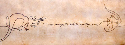
Backlit ad for NYCtoTahitiNonstop.com from March 2005. Agency: Saatchi & Saatchi. Illustrator: Dennis Clouse, Cyclone Design

quip_hilton_ad.jpg
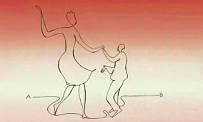
Still from Hilton Hotel television commercial, January 2006. Agency: Young & Rubicam

Over the past several years idle heiress Paris Hilton’s activities have certainly contributed to an overall distaste for the family name. Recently, the hotel chain founded by her great-grandfather has released a series of television commercials created by Young and Rubicam. In each spot, a line which connects letter “A” to “B” morphs into various figures.

Unfortunately, AdCritic.com does not have an illustration credit for the Hilton spots, so we can’t yet say for sure who drew this. Yet, given that the NYC to Tahiti campaign featured a line which signified travel between two spots; you have to wonder why the folks at Y&R applied the same metaphor and the same technique for a client in the same kind of business.

~

But what if you steal from yourself? The current Intel chip ad for Apple is a shot-for-shot copy of a music video for The Postal Service’s song “Such Great Heights”. Both were directed by Josh & Xander.

~

Finally, if you’re going to steal, at least make it funny.

~ ARMIN ~

Very awesome map of the North America showing only subway systems. Oddly peaceful. [Via Gothamist]

~

Next generation barcodes. They actually work. [Thanks to d.u.menon for the link]

~

Separated at adolescence:

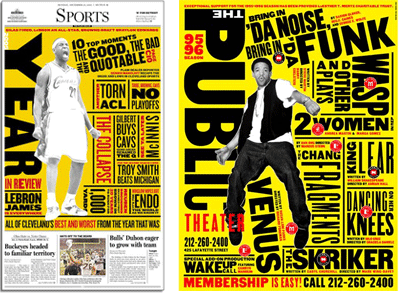
To the left, a year-in-review spread for the Cleveland Plain Dealer, designed by Emmet Smith. To the right, Paula Scher’s poster for Bring in ’Da Noise, Bring in ’Da Funk for the Public Theater, ’95 season.

~

A new, thought-bubbly identity for the Czech Republic, which apparently has caused a ruckus. [Thanks to Jan Sabach for the link. He is Czech]

Maintained through our ADV @ UnderConsideration Program
ENTRY DETAILS
ARCHIVE ID 2522 FILED UNDER Miscellaneous
PUBLISHED ON Jan.23.2006 BY The Speak Up Authors
WITH COMMENTS
Comments
felixxx’s comment is:

Mark-

not surprised you couldnt find the illustrator credit on that Hilton crap. It was most likely the art director (no, they didn't call me to get a quote).

But, Tahiti did, and its not surprising that he doesnt include that work on his website (I helped this guy Dennis sue Landor 7 years ago when they sent me his work and asked to copy it for Skyy Vodka. I guess that the thx you get for being ethical).

On Jan.23.2006 at 11:10 AM
m. kingsley’s comment is:

Felixxx - actually Dennis does include this work in his self-promotion. Perhaps the sign of a busy person is an out-of-date website.

On Jan.23.2006 at 12:07 PM
Ralf’s comment is:

Mark, there was a campaign for the Mercedes G-Class in 2004 with the same idea. By Springer & Jacoby (www.s-j.de). They won several gold medals at the german ADC contest. So ... who stole?

see: http://www.spiegel.de/img/0,1020,466765,00.jpg

On Jan.23.2006 at 01:37 PM
m. kingsley’s comment is:

Thanks Ralf.

The plot thickens.

But still... similar industries in the same market?

On Jan.23.2006 at 02:16 PM
felicks suckwell’s comment is:

the sign of a busy person is an out-of-date website.

yeah. somehow i forgot upload all my micheal scwab rips this year. Hmm... still waiting on Judge Wapner's subpoena.

On Jan.23.2006 at 04:48 PM
christina’s comment is:

Armin,

I'd hate to be that girl but the subway map has Canada on it as well. All tucked away up there, we've gotten used to people passing over us a bit...

Oh, and I loved that bar code link. Few elements in printed matter have yet to be impacted by our trade, and when industrial design meets graphic design, some very interesting things emerge.

On Jan.23.2006 at 08:28 PM
Derrick Schultz’s comment is:

By far, my favorite "barcode as art" usage was the first Boom Bip album done by ehquestionmark. no weblink will do it justice.

On Jan.24.2006 at 09:24 AM
Armin’s comment is:

*blush*

Thanks Christina...

On Jan.24.2006 at 02:49 PM
Bennett Holzworth’s comment is:

Is it me, or has the creative use of functional barcodes been in use for years now? I can't remember where, but I know I had seen many different variations on the creative bar code theme several years back. I don't think they were done by this company either. This doesn't seem like the next generation of anything, and I have a hard time believing that they will get a patent on this sort of thing (which they mention on their website).

Although. Just like the others I have seen, they are fun to look at and well done.

On Jan.24.2006 at 03:36 PM
Daniel Green’s comment is:

Is it me, or has the creative use of functional barcodes been in use for years now? I can't remember where, but I know I had seen many different variations on the creative bar code theme several years back.

I believe Mr. (Rick) Tharp was creatively playing with barcodes quite a few years ago. He was the first that I was aware of, although I don't know if anyone preceded him.

On Jan.24.2006 at 04:26 PM
Daniel Green’s comment is:

Just a follow-up to my last entry:

Thumbing through an old issue of Critique that focused on wit, I found a barcode graphic for a pasta company that was done by Rick Tharp. It was dated from 1987.

On Jan.25.2006 at 09:01 AM
Mark Notermann’s comment is:

That Scher poster thing had me thinking (the audacity!)... then I saw this the other day in an old magazine. I didn't have to go far to find these image links, right here ar SpeakUp.

Herbert Matters

Paula Scher

A closer inspection (sorry no images) reveals that Scher not only used the layout, but actaual graphic elements from the original.

Hmmmm.

On Feb.03.2006 at 11:27 AM
m. kingsley’s comment is:

Mark, Paula Scher's Swatch poster is a proper (capital A) appropriation. It was designed in 1984, the high-water mark of postmodern appropriation/media critique in the art world.

The work of mid-80's appropriation artists — like http://www.temple.edu/photo/photographers/spring03/photographers/heatherduffy/levine/sherrielevine.html" target="_blank">Sherrie Levine, http://www.artnet.com/artwork/424196719/sarah-charlesworth-united-we-stand--a-nation-divided-march-3-1979.html" target="_blank">Sarah Charlesworth and http://www.paolocurti.com/bidlo/bidlo.htm" target="_blank">Mike Bidlo — gained recognition after a 1977 exhibition at Artists Space: http://www.artistsspace.org/exhibitions/2001/pictures01/pictures.html" target="_blank">Pictures.

Appropriation is a charged, critical act which called into question various linguistic, philosophical and epistemological concerns of that era. The strategy was influenced by French post-structuralist writers like Roland Barthes, Jacques Derrida and Jean Baudrillard.

It may look like stealing, but it's more than stealing. Scher's Swatch poster reflects the context and spirit of the mid-80's better than all the pretty pictures found in all the AIGA annuals from that time.

On Feb.03.2006 at 04:33 PM
Mark Notermann’s comment is:

My understanding of appropriation is that by recontextualizing something familiar, an artist can communicate a nuanced message which calls attention to the context as much as the text. In order to appreciate this, the audience must be familiar with the original work.

You seem to be suggesting that the “Bring da Funk” knockoff fails to use the form to communicate anything other than form, while the Swatch poster uses the form to make another statement altogether. I neither doubt nor deny this, but still fail to grasp it (the message in the Swatch poster).

I appreciate your unpatronizing response. I think this is what educators refer to as a learning moment. I learn visually and now have an excellent case study to research. Don’t be surprised if I post again here a while from now with a question or two....

On Feb.04.2006 at 01:44 PM
m. kingsley’s comment is:

Mark,

Paula Scher's visual identity system for the Public Theater takes it's cue from 19th century wood-type broadsides (here's an example), and has a theatrical/historical connection too.

The Public Theater is located steps away from where the Astor Place Opera House once stood. In 1849 there were two productions of Macbeth in New York: one featuring the American actor Edwin Forrest, the other Englishman William Macready. A mob of Forrest's "fans" — encouraged by a jingoistic press, jingoistic broadsides, post-war(s) contempt for the British and upper/lower class division — attempted to disrupt Macready's performances. The demonstrations escalated into a full riot which didn't subside until the police fired into the crowd, injuring over 150 people.

So when placed in an historical context, there's at least a plausible rationale for what Scher's Public Theater work looks like — typographically, that is.

Now let's turn to the Cleveland Plain Dealer. In the linked interview, designer Emmet Smith says:

"With these things that roll around every year I think the challenge is to figure out how to go about them.

Themes seem to be the default solution but I'm a bit wary of them because I feel like sometimes the theme or the joke gets in the way of the content, even if it is just the same story you wrote last year with new names.

So I've been trying to get our department to go with very loose themes. This year in review package was based around an old Paula Scher poster.

We took strong color, type and design cues from that and blended those with the Plain Dealer's style and used that to display our writer's take on the year that was."

There's no critical act and no essential transformation other than swapping out the word "Year" for "Public". So yes, I am suggesting that this knockoff "fails to use the form to communicate anything other than form." And for a profession that, at it's best, concerns itself with the ethics of proper attribution, the Cleveland Plain Dealer should know better.

Now, your thought that appropriation "can communicate a nuanced message which calls attention to the context as much as the text" is close, but not quite accurate. To use a very broad brush, appropriation puts the whole issue of originality and essence into crisis; and thus is a postmodern strategy.

...which brings us to the problem of finding an adequate definition of postmodernism, which can't be done briefly. But let me posit a quick proposal that as modernism was a theological (in the spirit of Derrida's "logocentrism") project to define to the quantum level ideas like essence, being, etc.; then postmodernism's project was to critique whether there was an essence.

(please forgive all the words sous rature, but I'm working in broad strokes)

One of the great thoughts of postmodernism was that our identity is fluidly taken from experience and environment rather than being something immutable and pure.

Scher's Swatch poster takes a well-known piece from graphic design history, a poster for a Swiss vacation, and detourns it into a poster for a Swiss watch. The core values of both posters are leveled — whether it's an expensive ski vacation or a cheap watch, both are equally fashionable — and the designer admits her own role as someone who mines history for forms that she can use today.

And as I mentioned earlier, in the context of the mid-80's, this piece was also a shout-out to all the fine artists who appropriated mass-produced objects in a game of High/Low. It's both a "me too!" and a suggestion that there's more to the story than High Art/Low culture.

I seriously doubt that any of this was in Paula Scher's mind when she was designing the Swatch poster, but that doesn't really matter. In Pierce's Sign, the designer's intention makes up only a third of the process; and the Sign isn't complete until it's placed in context and interpreted — or even mis-interpreted. Even if she stumbled on this solution, Scher's poster still has a powerful effect.

On Feb.04.2006 at 06:07 PM
Mark Notermann’s comment is:

On Feb.06.2006 at 04:35 AM
Mark Notermann’s comment is:

Mark,

I get the context-of-the-sign part of the equation, which could be tricky but makes sense, based on what we know about the Plain Dealer piece.

I think I was stumbling on the intention part of the equation, which you correctly anticipated. Even through the filter of postmodernism (and its inherent problems with explaining anything), intention seems to have some merit in your judgement, as much as context.

Since context is a subjective quality, does that not open the door for anything to be called “appropriation?”

On Feb.10.2006 at 04:20 AM
ted’s comment is:

Hi, this thread seems to have gone quiet so I hope that no one will mind if I drag it back to the bar codes. I was wondering if someone might be able to point me in the direction of Rick Tharp's barcode for the wine bottle. I am having a bit of difficulty in locating this image. Im currently researching a paper on barcodes and this could prove to be an interesting image.

Many thanks

Ted

On Feb.17.2006 at 06:58 AM
Mark Notermann’s comment is:

I stumbled on this looking for something else, and was reminded of the fact that it was exactly this thread which started a personal quest to better and more personally understand design (and other) history. It has taken me through philosophy, semiotics, architecture and then some.

Its been a great ride, and I'm just scratching the surface.

Thanks to M. Kingsley for holding the bar high, and your regular contributions to this site. They provide an enriching addition to my growth and education as a designer.

Cheers,

Mark

PS: and your Monday quips links are funny as hell!

On Sep.29.2006 at 01:15 AM
Mark Notermann’s comment is:

PS: and your Monday quips links are funny as hell!

Of course hell isn't usually very funny, depending upon how you define it.

Inappropriate colloquialism noted.

On Oct.03.2006 at 03:57 AM