


As I mentioned previously, I’ve been taking a design class. Our most recent assignment calls for us to create a heraldic crest. Now, heraldry is something I’ve always avoided, partly because I associate it with genealogists—the amatuer kind, who are, imho, geeks—and partly because I associated it with mediaeval recreationists who are also … geeks. And while I may be a geek of one sort, I’m not that sort.
Many of us, in the course of our illustrious careers have had the occasion to deal with an institution that has a crest (often in aid of getting rid of the crest, and “updating” their identity). And you know, all crests look pretty much the same, don’t they?
Well, the interesting thing I discovered, as I plunged into the geeky world of heraldry, is that here is one of the things I’ve been looking for for a while: a distinct graphic language. All crests look the same to us just as all Chinese characters look the same to those of us who are not Chinese. They’re not all the same, we just can’t read them.
Basically, heraldry is a lost vocabulary. Every symbol, shape, colour and arrangement of colour means something. You can’t just say “I’d like to have a castle/rose/lion/boat on my sheild …” each of those symbols has meaning, and you’re not allowed to just slap them on at whim. Not only is each item symbolic, but there is a wealth of terminology used to describe graphic material in a way that could actually be quite useful. This language of heraldry is called Blazon.
(I promise: no dwarves, no wizards, no unicorns, no escarbuncles.)
Also, there are rules about how colours are used—rules which were designed to allow maximum visibility: Very practical, as these crests were often seen on battlefields and you really needed to be able to see and read the graphics at a distance.
For instance, colours are called “tinctures” and come in three categories: metals (gold [yellow] and silver [white]), furs (a spotted look, usually reminiscent of ermine), and colours (red, blue, black, green and purple). On a shield, a metal icon may not be placed on a metal background, but only on a colour; and similarly a colour icon may only be placed on a metal or fur background. So you can’t have a green gryphon (I did not promise “no gryphons”) on a blue background, it must be on white or yellow. And you can’t have a yellow lion on a white background, it must be on one of the colours. Visibility. (Rules which, if followed would not have resulted in The Yellow Ruth.)
The background of the shield is called the “ground”, and it can be divided up in a number of different “divisions”. Divisions don’t have to follow the metal-colour rule as they are considered to be beside each other. Plus, there are “ordinaires”, which are basic shapes and they do follow the rule. Here’s a few divisions and ordinaires:
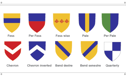
A horizontal bar is an ordinaire called a “Fess”. A horizontal division across the middle is called “per Fess” (the way of the Fess), and things that run across the middle in a horizontal row are called “Fess wise”. A vertical bar is a “Pale” (ordinaire), a vertical division in half is called “per Pale”, and things that run in a column down that line are called “Pale wise”. Got it? A “V” bar is a “Chevron”, and if you turn it upside down it is a “Chevron inverted”. A diagonal bar is a “Bend” (leading to “Per Bend” and “Bend wise”), and if it goes from top left to bottom right it’s “dextre”, and if it goes the other way it’s “senestre”. There are more.
There are also names for the shapes and edges of the ordinaires:
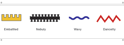
There are many other divisions, ordinaires and edges. I will spare you.
OK, you got the ground, you got the division and/or the ordinaires, and on top of that you have a whole shitload of little symbols, called “charges”. These range from simple shapes like “lozenges” (diamonds), “roundels” (circles), stars, crosses, etc. to animals. All of which have various symbolic meanings, or sometimes include a graphic pun on the name of the bearer (which are called “Canting Arms”). Furthermore, the animals take various positions, all of which are named, and even have names for the positions of their body parts (especially heads).
“Rampant” is an animal on its hind legs, “passant” is in a walking position, “passant reguardant” is walking but looking back, “passant repassant” is when two animals are walking past each other in opposite directions, “rampant sejant” is sitting with the forelegs raised. Honestly, it goes on and on.
As tedious as this may sound, it is of course no more tedious than learning any language, and once learned it is invariably useful. Many of the symbols are named for antiquated weaponry, garb (yes, I just said “garb”), and terms no longer in use or in French, or both. But in a world where such things matter, it’s much easier to say “reboundant” than “a lion’s tail when it forms the letter �S’ with the point outwards,” when you need to.
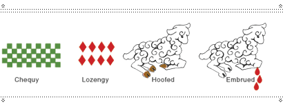
“Chequy” describes a field covered with small squares of alternate tinctures. Similarly “lozengy” refers to a field covered in lozenges (cute, huh?). When animal parts are coloured differently from the animal, they are called “hoofed” or “maned” or “legged,” etc. “Despectant” is used of animals looking downwards. “Embrued” refers to drops of blood falling upon or from something. And here’s a handy one: “decked” is when the feathers of a bird are trimmed at the edges with a small line of a different colour from the rest of the body.
That, too, goes on and on.
But imagine being able to say “Give it a division senestre per bend, red over black and arrange the stars fess-wise on the black field. Add an embrued Cow Couchant Guardant above it and you’re done!”
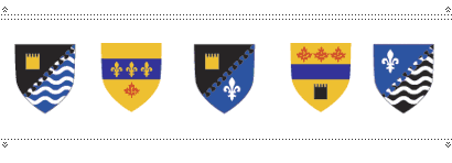
So all shields are not the same; in fact, they’re very different. They are readable, and describable, and most importantly, they mean something. Not only do they tell us something when they are first constructed, but shields and Coats of Arms change and evolve over time as the family or institution changes, specifically to reflect those changes. When people get married, or if they go on a long voyage, or move, their shields might change to reflect those things. Each significant change is registered on the shield so that it is always relevant.
Now, if you can’t see where I’m going with this, you don’t know me very well.
Here we are in the 21st Century, and we have very little graphic vocabulary that we can count on and read in a precise way. Corporate logos are most often completely meaningless, or they try to portray something quite complex without having a language to express it. They are quite often designed based on the whim of a CEO or a marketing department. They are vulnerable to fads, egos and stupidity. Colours are applied largely according to taste. Old logos are thrown out and new ones ushered in with little or no regard to history or story. It’s mayhem.
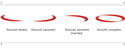
But what if … what if we had a graphic vocabulary that actually meant something? What if it were a hard fact that, say, an open swoosh = transition, and a closed swoosh (halo) = transition completed. What if, say, rows of dots indicated franchisement, underscores indicated automation, bevelled edges indicated … god-knows-what … ?
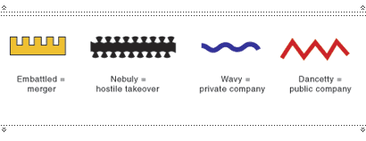
What if various types of lines indicated mergers, takeovers and other states of corporate structure?
What if even the gradient had meaning? Or the drop shadow?

What if there were a fixed range of symbols for industries?
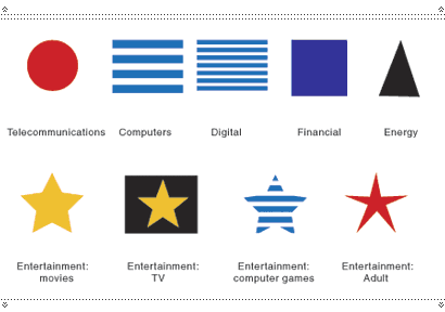
Designing logos would be an act of science: careful symbology applied in, yes, a creative and pleasing manner, that tells the tale of mergers, takeovers and change of business. At least then it would all mean something. Anyone could look at a logo and read its history. Logo changes would indicate what had changed. And it wouldn’t matter if the CEO did or didn’t like green; wanted or didn’t want a dog; loved or hated the shape. Then at last, we could look at a new logo and understand, “Ah, a young telecommunications company with sales over $100 million/yr which has merged with a digital company and is transistioning into the entertainment industry. I see.”


Best article ever - I am so going to
stealborrow this.Suddenly designing logos becomes easy. What a great idea.
Heraldry has always interested me - it seems to have a logic and a simplicity that belies the amazing range of designs it can produce, something I think we need to remember when we try to abandon 'restrictive' rules.
On Apr.05.2006 at 04:00 AM