Speak UpA Former Division of UnderConsideration
The Archives, August 2002 – April 2009
advertise @ underconsideration
---Click here for full archive list or browse below
  
Laura Fields and the Page Three Sutra

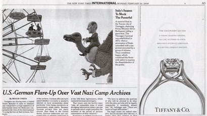
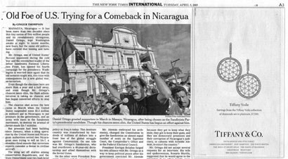
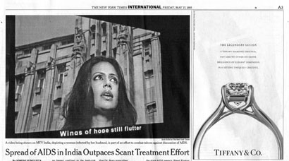
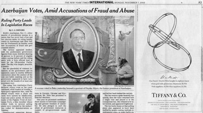
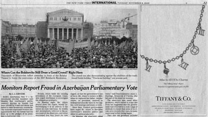
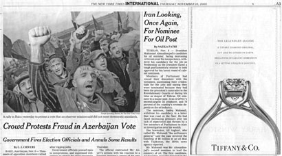
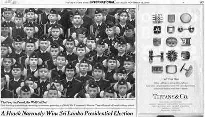
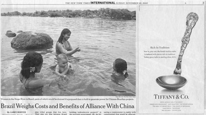
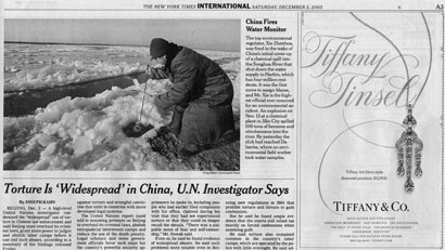
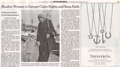
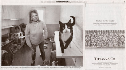
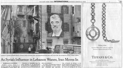
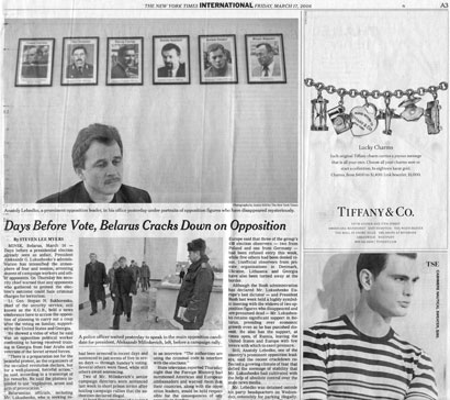
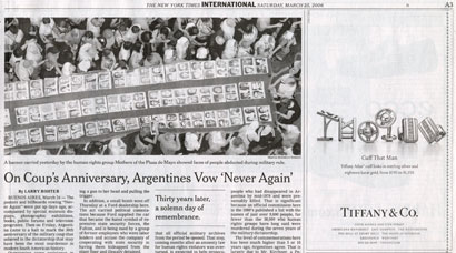
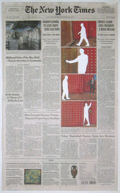
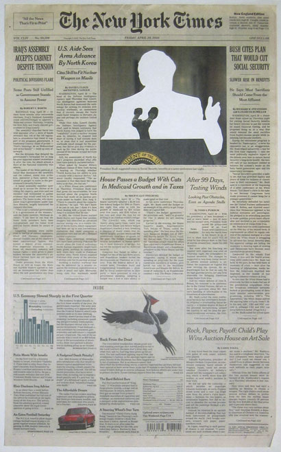
As a daily practice, the first thing I do with my New York Times is take a look at the top of page three in the A section. There, every day, a Tiffany & Co. ad appears in the top right-hand corner, right next to a lede international story.

Tiffany has been an advertiser in the Times since the 1920s, and over time, has come to “own” that particular piece of real estate. They seem to maintain a limited range of ads which change seasonally, and these are rotated with a few new ones thrown in for special occasions: holidays, the new Frank Gehry line, etc.

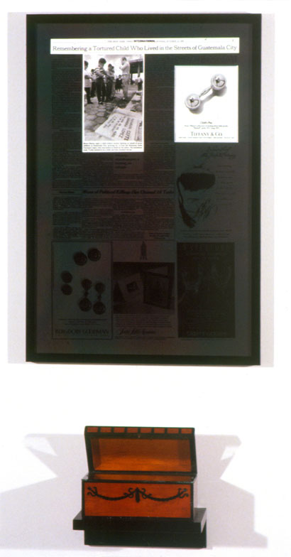
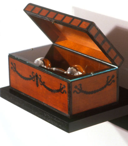
I never paid much attention to this space until the fall of 1991, when I went to see a group show at the New Museum entitled “The Interrupted Life,” in which artist Laura Fields contributed a piece titled Child’s Play that still resonates in my head to this day. It consisted of a New York Times page three, framed, with the glass darkened everywhere except over the international story — headline of “Remembering a Tortured Child Who Lived in the Streets of Guatemala City” — and the Tiffany ad — for a silver baby rattle, headlined “Child’s Play.” Beneath the piece, as a pendant, Fields displayed the rattle in a wooden box.

fields_childsplay.jpg

Laura Fields, Child’s Play


fields_childsplay_detail.jpg

Laura Fields, Child’s Play — detail

The collision of rich baby/poor baby is the kind of random, but charged, occurrence which captured the attention of many artists working from the late 1970s to the early 1990s. Today the galleries are full of either doodles or porn, but back then you could count on seeing some kind of media appropriation or commodity critique. It was the time of the seminal “Pictures” exhibition and a time under the influence of critic John Berger.

In his BBC television series and companion book Ways of Seeing, Berger built upon the work of Walter Benjamin and Roland Barthes while describing the collision of advertising and news images in popular media.

The entire world becomes a setting for the fulfillment of publicity’s promise of the good life. The world smiles at us. It offers itself to us. And because everywhere is imagined as offering itself to us, everywhere is more or less the same. The contrast between publicity’s interpretation of the world and the world’s actual condition is a very stark one, and this sometimes becomes evident in the color magazines which deal with news stories.

(snip…)

The shock of such contrasts is considerable: not only because of the coexistence of the two worlds shown, but also because of the cynicism of the culture which shows them one above the other. It can be argued that the juxtaposition of images was not planned. Nevertheless the text, the photographs taken in Pakistan, the photographs taken for the advertisements, the editing of the magazine, the layout of the publicity, the printing of both, the fact that advertiser’s pages and news pages cannot be co-ordinated — all these are produced by the same culture.

It is not, however, the moral shock of the contrast which needs emphasizing. Advertisers themselves can take account of the shock. The Advertisers Weekly (3 March 1972) reports that some publicity firms, now aware of the commercial danger of such unfortunate juxtapositions in new magazines, are deciding to use less brash, more somber images, often in black and white rather than color. What we need to realize is what such contrasts reveal about the nature of publicity.

Publicity is essentially eventless. It extends just as far as nothing else is happening. For publicity all real events are exceptional and happen only to strangers. In the BanglaDesh photographs, the events were tragic and distant. But the contrast would have been no less stark if they had been events near at hand in Derry or Birmingham. Nor is the contrast necessarily dependent upon the events being tragic. If they are tragic, their tragedy alerts our moral sense to the contrast. Yet if the events were joyous and if they were photographed in a direct and unstereotyped way the contrast would be just as great.

Publicity, situated in a future continually deferred, excludes the present and so eliminates all becoming, all development. Experience is impossible within it. All that happens, happens outside it.

The fact that publicity is eventless would be immediately obvious if it did not use a language which makes of tangibility an event in itself. Everything publicity shows is there awaiting acquisition. The act of acquiring has taken the place of all other actions, the sense of having has obliterated all other senses.

—Berger, Ways of Seeing

My early exposure to this “way of seeing” was first viewing the BBC series as a freshman in college, and then as a junior designer in New York. Even though they didn’t speak the language of intertextuality, the art directors above me often would tweak layouts whether one image was “looking” at an image across from it or not. And from that moment on, inspired, I began collecting magazine covers based on their overall narrative effect.

So ever since seeing Child’s Play, I’ve looked at page three of the New York Times differently: always looking for a correspondence between the narratives of news photo and Tiffany ad, a correspondence between text and image, or simply a correspondence of shapes.

It’s become a daily observation exercise and a daily affirmation of the artists, critics and essayists whose work I loved as a young designer and who — whether they knew it or not — affect my daily outlook.

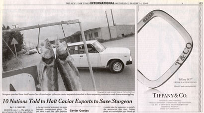
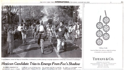
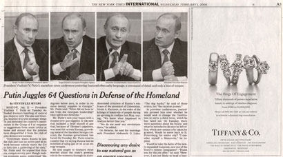
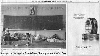
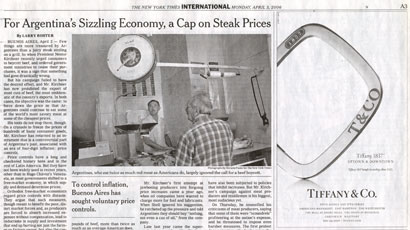
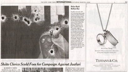
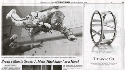
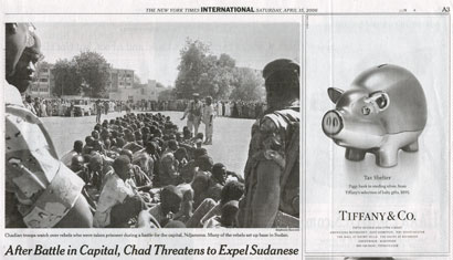
As a way to convey either how easy it is to make connections, or how frequently such combinations occur, here are thirty examples collected over the past year:

02_20_05.jpg

February 20, 2005 — One shape echoes another.


04_05_05.jpg

April 5, 2005 — The symmetry of the clockface above Daniel Ortega is matched in the voile earrings. The arrangement of Ortega’s head with the man to the right, is similar to the earrings.


04_08_05.jpg

April 8, 2005 — Chinese sailors’ hats, with a decoration at the front.


05_11_05.jpg

May 11, 2005 — Again, hat shapes and ring shapes.


05_19_05.jpg

May 19, 2005 — Jumbled I-beams, jumbled pens… and a desk accessory that resembles an I-beam.


05_26_05.jpg

May 26, 2005 — Trees, buildings, signposts, earrings.


05_27_05.jpg

May 27, 2005 — An Indian actress, on screen, with a faraway look. The subtitle under her reads “Wings of hope still flutter.” And across the page, an engagement ring. This is the second time the “legendary Lucida” ring appears in my page three collection.


11_07_05.jpg

November 7, 2005 — Oval frame, oval Elsa Peretti bangles.


11_08_05.jpg

November 8, 2005 — A string of pro-Bolshevik banners and flags continues into the Atlas charm bracelet.


11_10_05.jpg

November 10, 2005 — A raised Azerbaijani fist is the same size and shape as the “raised” Lucida diamond.


11_19_05.jpg

November 19, 2005 — At the center of this assembly of girls from a Moscow military school, one is noticeably looking off to the right — towards the collection of cuff links.


11_20_05.jpg

November 20, 2005 — This is one of the more amazing correspondences in the past year: Brazilian women in the Xingu River illustrate an article about the debate over a Chinese company’s proposal to build a dam. One of the points made in the article is how much profit will go to China. The headline of the Tiffany ad reads: “Rich in Tradition.”


12_03_05.jpg

December 3, 2005 — On the left, a Chinese environmental field worker collects a water sample through a hole in the ice. Its resemblance to ice fishing is underscored in the Tiffany ad.


12_29_05.jpg

December 29, 2005 — The headline reads “Muslim Women in Europe Claim Rights and Keep Faith” while the charm pendants resemble the Mogen David, a cross, and the Islamic crescent.


01_02_06.jpg

January 2, 2006 — Two faces in rectangular frames.


01_04_06.jpg

January 4, 2006 — Two rectangular frames at an angle.


01_26_06.jpg

January 26, 2006 — Wheels and wheels.


02_01_06.jpg

February 1, 2006 — Repetition and repetition.


02_21_06.jpg

February 21, 2006 — Vertical rectangles over horizontal rectangles.


03_05_06.jpg

March 5, 2006 — Cats’ eyes.


03_13_06.jpg

March 13, 2006 — Lattice support along the corner of a building in Syria with the circular symbol for Amal, a Shiite militia, against a gold chain with a round toggle at the end.


03_14_06.jpg

March 14, 2006 — Birdcages in Afghanistan, triple-drop voile earrings.


03_17_06.jpg

March 17, 2006 — By now, this should be self-evident — hanging pictures and hanging charms — but notice how the framed portraits look down at Belarussian opposition leader Anatoly Lebedko, who, in turn, looks down at the TSE model in the striped sweater.


04_25_06-cuff_that_man.jpg

March 24, 2006 — Argentine mothers carrying a banner with the faces of people abducted during military rule against an ad with the headline “Cuff That Man.” Plus, we have another collection against a collection.


04_03_06.jpg

April 3, 2006 — Like the January 4, 2006 image, strong rectangular forms, but the headline — “For Argentina’s Sizzling Economy, a Cap on Steak Prices” — is underscored by the caliper-crop of the “Tiffany 1837” bangle.


04_04_06.jpg

April 4, 2006 — Bullet holes and shell casings.


04_08_06.jpg

April 8, 2006 — Astronaut through the Tiffany Atlas bangle.


04_15_06-tax_shelter.jpg

April 15, 2006 — Captured Chadian rebels being kept… and a tax shelter.


04_24_06.jpg

April 24, 2006 — Some may think this is a stretch, but I can easily draw a link between a picture of a Nepalese doctor treating a patient’s forehead and a representation of the third-eye chakra.


04_28_06.jpg

April 28, 2006 — The Frank Gehry line’s shapes echoed in the shape of the hand on Maysoon al-Hashemi’s coffin.

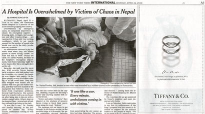
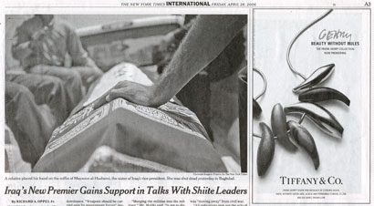
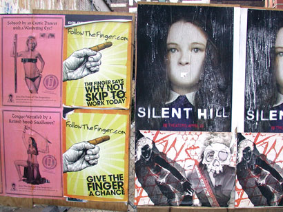
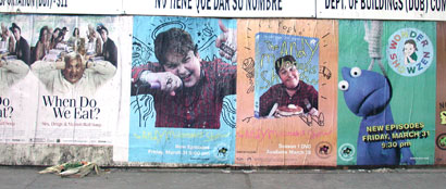
One doesn’t have to read the New York Times to engage in this exercise. For example, I often find myself looking at street snipes the same way I do page three.

nyt_pg_3-snipes_937.jpg

This collection around the corner from me has an obvious pointer towards Silent Hill and a more subtle “foundation” in the Vans poster underneath.


nyt_pg_3-snipes_936.jpg

Left to right: When Do We Eat?, two for MTV’s The Andy Milonakis Show on DVD, and MTV’s Wonder Showzen.

As I mentioned earlier, this way of seeing the world — and the world of images — was “in the air” and continues to this day. One of the more notable John Berger followers is Lawrence Weschler, who’s most recent book, Everything That Rises: A Book of Convergences, follows a similar path — there’s even a convergence of convergences contest on the McSweeney’s site.

Besides the continual presence of this observational strategy, one final point remains to be addressed. And that is the issue of Ross Bleckner’s claims to the page three phenomena.

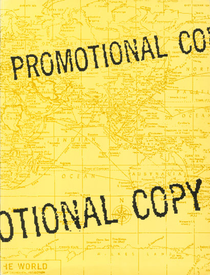
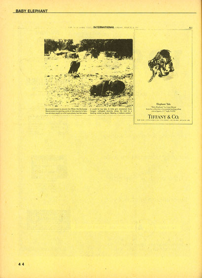
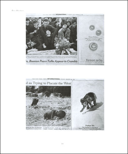
In 1993, two years after “The Interrupted Life” exhibition, Robin Kahn edited a collection of artist projects for Mimi Somerby, S.O.S. Int’l and B.R.A.T., an Arts Organization called Promotional Copy. On page 44, Laura Fields contributed a page three convergence entitled Baby Elephant, which paired an image of a starving Sudanese girl and waiting vulture against an ad for a sterling silver elephant figurine.

promotionalcopycover.jpg

baby_elephant.jpg

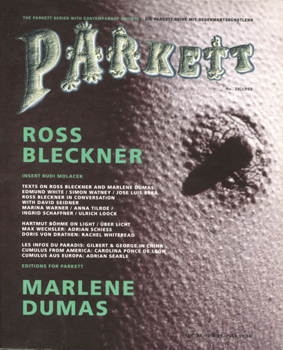
Also in 1993, Bleckner contributed a project to the contemporary art magazine, Parkett, entitled Tiffany’s. It also appeared on page 44 — some convergence! — and also featured the Sudanese girl/vulture/silver elephant image.

parkettcover.jpg

parkettpg2.jpg

Twin Palms published Bleckner’s book Page Three in 1998 and in 2000, the Checkerboard Film Foundation released director Barbara Wolf’s film Ross Bleckner: Remember Me; in which there’s a sequence of him flipping through the Times and, again, meditating on page three.

Fact is, Bleckner has gotten a lot of mileage out of Laura Field’s initial observation. Yet I’m not making this point to spite him — actually, I adore his work. But we need to correctly give credit where credit is due.

Artist Victor Hsieh once asked asked Bleckner about his piece Remember Me; to which he responded: “That’s what all artists whisper beneath their work. It’s a mark you make that you want to leave on the world. It’s what you want to be thought of, and your work represents you. It is you when you’re not you anymore. When you’re gone.”

So in that spirit, I remember Laura Fields. One rarely knows how a passing remark or one piece out of a lifetime of work will affect others. But in the case of her Child’s Play, I think about it every day. It colors how I use images, look at images and see the world in general.

: : : : : : : : An epilogue of sorts : : : : : : : :

Fields continues to mine meaning from the New York Times. A recent series Bush Erased involves cutting President Bush out of the paper, putting the clippings in a bag and displaying both together.

bush_erased_11-21.jpg

bush_erased_4-29a.jpg

bush_erased_bag.jpg

bush_erased_install.jpg

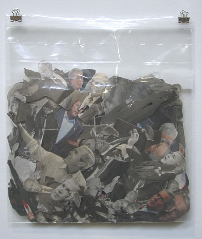
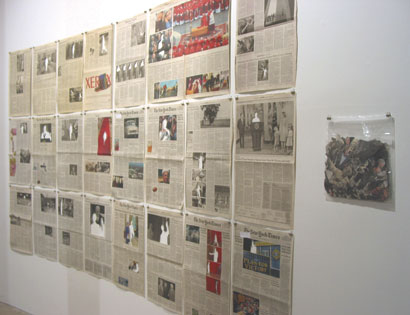
The work has a formal resemblance to John Baldessari but maintains the political edge that drew me to Child’s Play. Fields counters the simplistic language and symbolism of the Bush administration with an equally simple and opposite gesture. And like my “Page Three Sutra,” Bush Erased is a daily visualization exercise: a visualization where the wrongs of the world are erased in hopes of a better future.

Maintained through our ADV @ UnderConsideration Program
ENTRY DETAILS
ARCHIVE ID 2676 FILED UNDER Essays
PUBLISHED ON May.01.2006 BY m. kingsley
WITH COMMENTS
Comments
Armin’s comment is:

Mark, this is the posterchild of M. Kingsley posts. Very amazing.

All of the observations between the international stories and the Tiffany ads is exactly what designers need to do more of these days. While it's evermore easy to create nice-looking things, it seems increasingly harder to see design that is working on more than one level (which is usually the aesthetic level). Design that alludes and connects to other stories that people can interpret based on their experience and knowledge seems something worthy to aspire to. Sorry, this seems to be veering slightly into some other discussion. Anyways, one word: connections.

On May.01.2006 at 09:21 AM
felixxx’s comment is:

Nice post Mark. Youre not only a New Yorker collector, but a Times tape and stapler. (adjacent advertisement: She goes straight for arts and leisure. I like the Sunday Magazine)

On May.01.2006 at 10:10 AM
Robynne’s comment is:

Wow Mark, I don't think I'll ever be able to look at Page 3 the same way again. Thank you.

On May.01.2006 at 10:14 AM
Pesky Illustrator’s comment is:

Mark, I've been told that there are stacks of newspapers (Times-Picayune, unfortunately) piling up at my abandoned house back in Louisiana. Send your pet dog to "go fetch" and they're yours......

On May.01.2006 at 11:51 AM
Dimitry Saïd Chamy’s comment is:

Beautiful post. It's the spatial corollary to Neil Postman's critique in How to Watch the TV News where he explains that by its very nature commercial TV ( any media Ads? ) allows any tragedy no matter how horrifying to to be absorbed quietly with the phrase "...and now this..."--followed by an ad or a switch to lighter fare. As he cautioned, TV can turn us off but we can't turn it off any more than we could stop breathing. It's part of our cultural ecosystem.

The very structure of the newspaper with its reassuring texture, organized grid, and promise that there will be another edition (with ads) tomorrow morning undercuts the urgency of a starving child half a world away.

On May.01.2006 at 02:30 PM
ps’s comment is:

excellent post, mark. thanks for sharing. ever tried to calculate how much money tiffany & co spent on these daily ads since 1920? pretty amazing in itself.

On May.01.2006 at 11:25 PM
Mark Notermann’s comment is:

Thanks for the great post, and backing up the story with generous visuals.

I am reminded of a day in a convenience store where space was at a premium and odd couple of items were being promoted with shelf hangers adjacent to each other.

If only I had a camera. This will have to suffice:

On May.02.2006 at 04:49 AM
Ravenone’s comment is:

Nice post. :) IT certainly got me to thinking and looking closer at things again.

On May.03.2006 at 10:19 AM
Mr. Khan’s comment is:

If you are interested in Robin Khan's "Promotional Copy" you might want to check this out:

http://www.fineartadoption.net/artworks/show/98

On May.03.2006 at 10:39 AM
Jason Tselentis’s comment is:

The final images in your 'epilogue' remind me of Hans Rudy Lutz's work, when he looked at all the print media during Elvis' death, and reduced the front pages down to black and white in order to see if a pattern existed. But with the Bush clippings, all we get to see is a man, who loathes intellectuals, trying not to look smart and doing it well.

On May.03.2006 at 11:55 AM
Snake’s comment is:

Oh, puh-leeze! This is the same as laying on your back and staring at clouds looking for different shapes.
Oh wait, maybe God is into intelligent design.
Get a life.

On May.03.2006 at 12:01 PM
jenny’s comment is:

Great post! I used to love to look at poster juxtapositions this way but got out of the habit...

On May.03.2006 at 12:27 PM
marian bantjes’s comment is:

Mark, I agree with Armin, this is one of the great M. Kingsleys.

A couple of years ago a friend of mine was laying out an awards catalogue. The pages went together in order of category/alphabetical but still some interesting things happend with paired images ... it was hard for us not to believe it was planned that way. This year, I laid out the catalogue and again, these remarkable combinations ... pieces that matched in colour , shape or content—page after page of reflective echoes that quite frankly made me look rather brilliant in my "choice" of pairings, and yet I did nothing to manipulate these marvelous sequences.

And of course when the pairings are political or cultural as they happen to appear, that is even more interesting.

Thanks for this.

On May.03.2006 at 08:33 PM
Monkeylittle’s comment is:

Wow, Mark. I really love your collections. They are so profound.
You brought me to the different views when I saw these ads on NY times:)

On May.06.2006 at 10:57 PM
Amy Proni’s comment is:

Brilliant. Thank you for sharing. I appreciate the intellectual stimulation. ~Amy

On May.09.2006 at 02:42 PM
elpida tselenth;eric la brum’s comment is:

there is a great deal to be said


in toto for these perceptions drawn

upon by professional artists

On May.09.2006 at 09:27 PM