Speak UpA Former Division of UnderConsideration
The Archives, August 2002 – April 2009
advertise @ underconsideration
---Click here for full archive list or browse below
  
Careful Design

Last night, a friend of mine went to see the movie United 93. Out of curiousity, I decided to check out the website, and I was struck by a number of things.

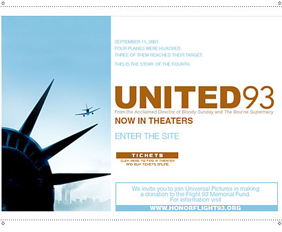
Firstly, the movie poster and site style is the most tastefully restrained I can remember seeing in a while—perhaps ever. Simple but very strong imagery combined with simple but very strong typography; common in our world of design, very rare in the world of Hollywood. Furthermore, while I confess I didn’t know what the movie was about before I went to the site, I did immediately upon seeing that imagery.

Now, I want to emphasise that I have not seen the movie, and I have read no reviews or heard a single thing about the movie itself (yes, I live under a rock), so this post is not about the movie and is completely uninfluenced by whether it is good or bad, or what emotions the movie itself has stirred up.

But what I noticed throughout every aspect of the website for the movie was a carefulness of design that I found to be unique and striking, coming from the Hollywood industry. There are many ways that a movie about heroism in America could be portrayed, but the overriding sense I got from this promotional material is caution and respect. It’s as though from every level the producers, director and designers are walking on eggshells. Judging by the website, this is not an action film, but perhaps more of a memorial.

The site music—a haunting choral—gives an overtone of religious sorrow. In fact, it feels exactly like stepping into church, where suddenly you leave your boisterous talk behind, and despite any opinions you might have about the Church (the movie/the issues), you are immediately compelled to calm down and show some respect.

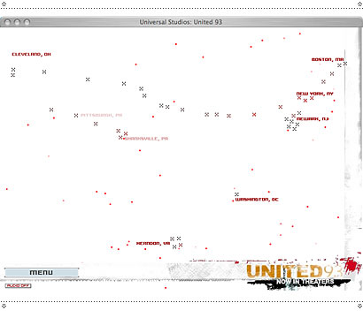
After the very short, atmospheric intro, which shows us only one scene of the passengers in the plane, we rest on a map-like page showing the names of several US cities around which float and fade numerous dots. Are they airplanes, or are they souls, which fade in and fade out?

The only fast action on the page is in the distressed typography of the movie title in the lower right corner. The site is a good lesson in how to use typography to convey content: much of the type on the site is in a pixel-font, which to me alludes to what will presumably be computer-screen action. (However, the site does suffer from some difficult to read text, set in light blues and greys.)

When you select from the menu, the words “Never Forget” (which seems to be the closest thing this movie has to a tagline) fade on and off the screen.

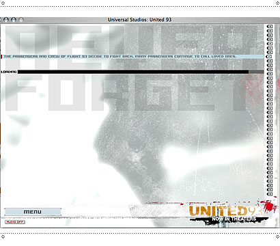
Down the right-hand side of the screeen, is a series of little + icons. It didn’t take me long to figure out that this was a timeline (it did take me a while to figure out it begins at the bottom and ends at the top), and again, each segue between images contains the words “Never Forget.”


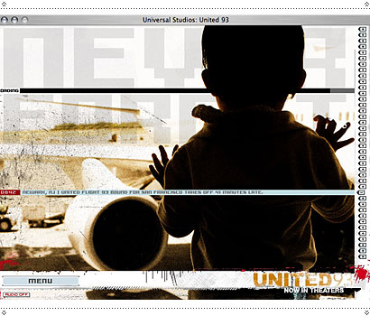
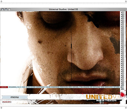
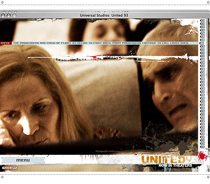
The imagery is another striking aspect. Throughout the site, most of the images are realtively calm and serene; it is the treatment, the light exposure and the distressed effect of the images which give us the sense of action, not the content of the images themselves. In all, this borrows strongly from the titling of Six Feet Under: the graininess, the serenity, the fade to white.

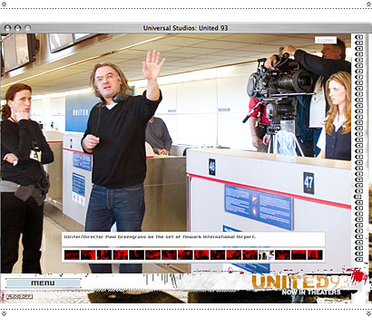
In the “Photos” section of the site, these effects all but disappear: these photos take us out of promotional images into either “real time” (photos on set) or “movie time” (shots from the movie).

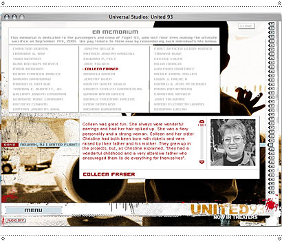
The site also contains a section of memorials, with photos and small bios (seemingly individually written) of the actual people from Flight 93. This real-world inclusion into a promotional piece furthers the impression that what is on offer is not mere “entertainment.” (Similarly, there are direct links to memorial and donation pages.)

Interestingly, they chose to use unknown actors for all the roles. This in itself is a tactical move which negates the usual grandstanding, and creates an aura of depiction rather than star-driven entertainment. It’s also probably the reason the poster is so tasteful.

I can tell a lot (I think) about this film from this website, but I can tell more about the sensitivity of the topic. How to make a movie about 9/11 without showing what we’ve already seen in reality (and thus having the serpent eat its tail in entertainment imitates life which imitates entertainment); without having Bruce Willis busting down the doors to save … no one? How do you depict terror, when the terror is real? In the marketing of this movie we are shown an uncommon restraint and consideration which has resulted in a remarkably tasteful and respectful set of materials.

Maintained through our ADV @ UnderConsideration Program
ENTRY DETAILS
ARCHIVE ID 2687 FILED UNDER Critique
PUBLISHED ON May.11.2006 BY marian bantjes
WITH COMMENTS
Comments
dan’s comment is:

Great review of a movie site Marian. I also didn't know anything about the movie content and don't live under a rock.. just another part of the world - stil not an excuse.
But with that said I feel there are quite a few 'different' design elements trying to fight for attention. The choice of typography is my first example of this. The treatment of the content was successful but the type wasn't that well thought out - in my opinion. Despite that, a refreshing change to the gloss seen in the majority of other movie sites. I look forward to what others think about this and how the way the site deals with the movie.

On May.11.2006 at 04:31 PM
beto’s comment is:

Interesting observations Marian.

Just spent some time viewing the actual site. Since I learned there was to be a major film about 9/11 this year, for me it just smacked of pure Hollywood opportunism, always trying to wring a buck out of anything, sensitive issues be damned. Besides, there are still a lot of mixed feelings worldwide about the whole 9/11 event, so I'm not sure how it will fare on foreign theaters once it begins to be shown there.

Anyway, in regards to the website's design, you kind of summed it up on the phrase "walking on eggshells", for they are certainly doing so with this subject. I agree the pixel font is not the best choice for this design - can't help it either I presume: Pixel fonts are still the "rage" with tons of web designers who will look for any excuse to use them. The set of Helveticas (?) they are using for the movie logo and the copy would have been a better choice.

Other than those tiny issues, I like the way design manages a bold, yet tasteful, showing of what can certainly be a tough subject to display without recurring to played-to-death cliches and gratuitous fear-inducing gore. Hats off. Let's hope the film plays along the same lines.

On May.11.2006 at 05:16 PM
Justin Powell’s comment is:

I agree with a majority of the observations and insight you shared marian. I also feel there are a lot of "different" elements. The initial screen has a clean, well-concepted image. straight forward type.

but, once inside it feels completely diferent. it'd be nice if they had a more gradual transition into the distressed type treatment etc. Maybe if they told a story through that too.

On May.11.2006 at 05:17 PM
Armin’s comment is:

The key phrase here is "coming from the Hollywood industry" where making it bigger, poppier, flashier, rounder, scarier, and other adjectives conjugated in "er" is the norm. Most competent and considerate designers can pull off the "Careful Design" Marian is talking about – the real victory here was the design/advertising firm along with Universal realizing that this was no time for a typical campaign pow-wow and showing the necessary restraint to not turn this into a three-ring circus.

On May.11.2006 at 06:28 PM
Armin’s comment is:

At the same time, it would actually be very interesting to know who did the pulling and who did the pushing. From some of the design elements it seems like the creative agency wanted to do something a little more "edgy" and maybe had to be pulled back by the studio. The flip side would be the agency putting down their foot and telling the studio to keep it subtle. Knowing designers, my bet is on the former.

On May.11.2006 at 06:33 PM
Jake’s comment is:

I found your review of the site to be very informative and I could really tell that it moved you. Emotionally and professionally. Thank you for sharing this with us.

Are you planning to see the movie, now?

On May.11.2006 at 08:35 PM
marian bantjes’s comment is:

Jake, I would say the site moved me professionally. I noticed it—it gave me pause and sent me thinking about a lot of things surrounding movies, marketing, 9/11 and America.

Will I go see it? Maybe one day, but I'm in no rush. I'm still catching up on the past 5 yrs worth of good movies on DVD.

On May.11.2006 at 09:13 PM
JonSel’s comment is:

Nice review, Marian. It's very refreshing to see Hollywood resist the urge to hype HYPE HYPE this movie.

My first reaction to the restrained design is to think of Milton Glaser's Road To Hell. The film depicts one of the most horrific events in our history (certainly recent history), yet there's this understated look to the whole thing that belies that nature. If you (really) lived under a rock, you might think this was a travel movie (Statue of Liberty, Plane, skyline). If you don't look close, you don't catch the towers on fire. I'm not saying that this crosses the line, but it is still a moneymaking enterprise, so one wonders about motivations behind the messages.

I don't really think they had much choice in the matter, though. The sensitivity level, especially in the New York/Pennsylvania/DC area, is just too great. The careful touch in the marketing materials suggests to me that the film is handled the same way, and if you read any of the interviews with the directors, he has said that in so many words.

I often wonder what those who don't live in this area (northern NJ) think of 9/11 and if you even think of it often. I can't not think of it since I see the skyline on a daily basis. But what about Marian off in the backwoods (sorry...) of Canada? What about those in Oklahoma or even Germany? So while I will not see this movie – I feel sad even thinking about it – I wonder how this choice in marketing will play to those not overwhelmed on a daily basis by this story.

On May.12.2006 at 12:02 AM
Daniel Green’s comment is:

Just an added note on the subject of sensitivity: I heard that the director apparently would not make the movie without first getting the input/approval/blessings from family members of all the victims. That act alone no doubt set a tone for the whole production.

On May.12.2006 at 09:34 AM
Pesky Illustrator’s comment is:

Marian, thanks for pointng this website out. Maybe the scale of this tragedy makes us humble and for once someone in marketing this movie decided that restraint was a worthy strategy since all of us have strong emotions about September 11, 2001. I haven't seen the movie, but after looking at their web site, I might want to.

On May.12.2006 at 11:19 AM
DutchKid’s comment is:

Pixel fonts are still the "rage" with tons of web designers who will look for any excuse to use them. The set of Helveticas (?) they are using for the movie logo and the copy would have been a better choice.

In Flash sites, there's a very good reason to use pixel fonts: normal fonts (including Helvetica) tend to get very blurred - a well-known Flash anti-aliasing problem. I think the decision to use a pixel font is based on this. Helvetica wouldn't have worked in the body copy at all, at worst it would be hardly legible.

On May.12.2006 at 11:35 AM
Dado Queiroz’s comment is:

I may be able to bring a foreign perspective, as I live in Brazil.
After getting home from Design School that day, at lunch time, I remember spending most of the rest of the day watching new angles of the tragedy, over and over again.
There was a sense of absolute impossibility turned to fact, that was very fascinating. Beeing so far from the incident, at first I wasn't horrified or scared, I was blank. Blank stare, blank thoughts.
In the following months, it kind of irritaded me to see people giving explanations to the fact. To try to rationalize such absurd event seemed to me like a statement of the arrogance of our kind (human, that is). Like Columbine.
This movie doesn't need Bruce Willis or Vin Diesel or whatever. The people that put down that plane were real life heroes. The situations everyone who were victimized, in any level, lived that day are extreme enough. No need to "spice" the script.

It's hard to tell for sure if the respect shown is only a way of marketing the film better, or if it's for real. Anyway, it's nice to see it happen, since the death of innocent people seem to be so unimportant these days; since it became so mundane — how could it?

––––

Now I better write what I was supposed to, from the start:
· not casting well known star actors is a good way to give the film a more realistic feel, as we had probably never seen those people before. This was said by some guy about some movie somewhere. Perhaps it's the case here;
· besides the technical Flash problem, it seems to me that pixel fonts are also a good way to allude to airplane radars and companies' computer terminals (although I realize we're not in the 80s anymore).

On May.13.2006 at 10:13 AM
Milan’s comment is:

So the design of the site is tasteful, the approach to a lot of the film's marketing materials subtle...but WHY make this film? Is it too soon?

There are a slew of other 9/11-related films either in production or already released (most made for television). In fact, there has already been a TV movie titled Flight 93, which I imagine is relatively similar to the bigger budget production.

Personally, I'm not sure I can respect the decision to turn these events into feature films just yet. Regardless of approach, millions of dollars were still put into these films. $15 Million was put into United 93. What would United 93 be like if its budget were cut in half? Probably a lot like its little brother, Flight 93. More money means more marketing, right? I can't help but make the assumption that all these filmmakers are making these films for the wrong reasons.

On May.14.2006 at 12:04 PM
Harry’s comment is:

What is the name of the song featured on the website?

On May.18.2007 at 04:21 PM
Harry’s comment is:

Does anyone know the name of the song featured on the website?

On May.18.2007 at 04:25 PM