Speak UpA Former Division of UnderConsideration
The Archives, August 2002 – April 2009
advertise @ underconsideration
---Click here for full archive list or browse below
  
Typography 26

If You can Make it Here…Then why make it anywhere else?
A new design annual portrays local prejudices at work.

By Isaac Gertman

They say that in New York, the world is at your fingertips. Drink your morning coffee from a Greek paper cup, buy dazzling chinoiserie and knock-offs in Chinatown, and eat an unforgettable meal at one of Second Avenue’s indistinguishable Indian restaurants: Walking through this city, I see a miniature version of the entire planet, a planet situated at the center of the universe.

Dialogue 
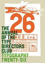
Approximating my everyday experience is the 26th annual of the Type Directors Club’s Typography 26, released this month. The publication’s design is a tour of New York’s tribal artifacts: The cover features a posterized silk-screened image of a daily Chinese calendar, with pages torn off to reveal the 26th of the month. Endsheets include tightly cropped scans of ornate Indian and Chinese food packaging. Section dividers are close-ups of printed ephemera and food packaging in Arabic, Russian, Japanese, Korean, Thai, Ethiopic, Greek, and Laotian, picked up from convenience stores and specialty shops. The exotic characters and dazzling printing remind me how fortunate I am to be living in such an international city, looking at a book with such an international view of typography, from such an internationally minded organization.

But the design also reveals something about the jury selections: A smorgasbord of New York ethnicities does not a worldwide cross-section of typography make. Indeed, the majority of the book’s entries come from New York—nearly double Germany’s 30-odd entries; German typographers double the wins from the United Kingdom and Japan. The remainder of Europe (sans Germany) and Asia tally 16 entries each. Australia and New Zealand garner three entries each. Africa has one, and both of South America’s come from Sao Paulo.

Could it just be that New York City is the center of the typographic universe, too? The overly tidy numbers suggest otherwise. Could Typography 26 be nothing more than an exercise in filling quotas?

As much as annual competitions encourage achievement within the discipline, their sponsoring organizations depend on them for income. Submissions cost about $40 per entry; winners pay another $40 or so to appear in the book, and then that sum once more to have work hung in the accompanying exhibition. In addition, each entry form usually includes an area to join or renew yearly membership: $100, give or take.

Before judging begins, most organizations have a budget goal in mind, and with it, a hope for that the judges will select at least the desired minimum number of winners (hopefully with a meritocracy in mind). Striking a balance between member and non-member winners is of the highest importance. If the existing local membership base feels marginalized, there will be fewer membership renewals and fewer entries the next year, jeopardizing the future of the organization. Acknowledging international entrants is an easy way for an organization to expand its earning potential without alienating existing members.

As an aside, here’s how not to grow revenue: I remember one competition where, assisting in tallying scores, I was instructed to round up marks to hit target dollars. (The judges thought it unscrupulous. Perhaps not coincidently, the organization’s Executive Director has since been charged with grand larceny, to the tune of $150,000.)

The Type Directors Club does not suffer from a tarnished reputation. In fact, even though their number of winners increases annually, they receive complaints that their judges are too selective; unlike other competitions, judges are not allowed to enter work; and Carol Wahler, Executive Director of the TDC, informed me that more than half of next year’s Typography 27 winners are from outside the U.S., and that “there aren’t that many winners from New York.” While this is seemingly a step towards internationalism, I am more skeptical. The numbers tell a different story depending on point of view: Looking outward, this year’s winners were evenly split between the United States and abroad. Looking inward, they mostly came from New York.

Typography 26, is particularly unique, because it also reprints the first Type Directors Club catalog. In a time before annual budgets clouded judgment, it was okay for New Yorkers to claim all the winning entries. The contest pushed forward the discipline, and geographic identity just happened to be a telling coincidence.

As a designer living in New York, it’s easy to confuse diversity and internationalism. But Chinatown is not China: New York could not be what it is without the rest of the world. To celebrate the finest typography, the TDC’s jurors should have been instructed to possess a truly global vision—or better yet, a blind eye. In Typography 26, their suspiciously methodical attempt to de-emphasize local talent accomplished just the opposite.

Isaac Gertman is currently pursuing his MFA in Graphic Design at the Rhode Island School of Design. His thesis work is concerned with typography in the cityscape.

Divider

Book Information

Typography 26 by Type Directors Club
Hardcover: 336 pages
Publisher: Collins Design (2006)
ISBN: 0060847301
Maintained through our ADV @ UnderConsideration Program
ENTRY DETAILS
ARCHIVE ID 2689 FILED UNDER Book Reviews
PUBLISHED ON May.16.2006 BY Speak Up
WITH COMMENTS
Comments
felixxx’s comment is:

Being informormed/ aware about the subtleties of lettering (ie: Chinese calligraphy) is a luxury even for those of us who live in New York and have time research/ peruse old bookshelves/ take photographs. Maybe if I had an art director job at National Geographic (like Isaac) I'd see more of that... along with the standard floppy African chesticles.

This just in... Bride Whelan catches up on lettering skills in Attica state prison... colored chalk: its making a comeback!

On May.17.2006 at 09:35 AM
Armin’s comment is:

The TDC annual is consistently one of the best in the US. Far more eccentric and interesting than the AIGA's 365 or Graphis Design Annual. While the low number of entries may appear dubious to some, it actually produces a very tight compilation of work.

And the typeface design competition component of the TDC annual is extremely international. This year's only has about 3 or 4 typefaces done in the US

On May.17.2006 at 09:35 AM
Nathan Philpot’s comment is:

How many times are we going to talk about design competitions. They are businesses. It is a business. Design competitions are businesses. They exist to make the organizer money.

If you want a good design competition, this is how it should be done.

First the cost of entries should be minimal, only to cover costs.

The judges, there should be about 18 or so. 6 design judges from different areas of the country and of with varying experience, and 6 judges from the business world from different areas of the country and difference sized businesses ( not just CEO's from Apple, IDEO, 3M, etc. ), non designers, and 6 random people. Give each group certain criteria to rank. The designers could judge the formal criteria, the business people could judge the business qualities, and the 6 random people could judge whether or not the message is communicated ( this last group is the most important, so maybe it could have a heavier weight on the scoring) .

And make the entries anonymous. Have a number assigned to each entry as it comes in. But the judges cannot know who has been assigned to each number. So the judges do not know who it was designed by. And then after they have chosen their winners, match the numbers back up to the assigned designer or design agency.

Tally the scores and there are your winners.

On May.17.2006 at 09:36 AM
felixxx’s comment is:

Not a bad idea, Nate.

But you just tripled the airline/ hotel fees to be billed to the competition (ie: you, the entrant). One new, innovative thing that was successfully tried by a large "contest" was the American Illustration show. All entries were submitted via e mail and judges were given the luxury of working from home. THis idea may or may not have gained traction from logolounge, who has always done it this way.

Costs are then passed on (in lounge's case reduced) , so its no surprise that $99 a year has effectively wiped out Graphis Logo.

AIGA 365, unfortunately, has given their full attention to "real" work from corporate design firms like Landor, Futurebrand and Enterprise IG. Sooner or later that alienates the little guys (ie: me) who spy the commerce trumping the art.

On May.17.2006 at 10:04 AM
Armin’s comment is:

> AIGA 365, unfortunately, has given their full attention to "real" work from corporate design firms like Landor, Futurebrand and Enterprise IG. Sooner or later that alienates the little guys (ie: me) who spy the commerce trumping the art.

Felix, you've been beating that drum a tad too long now. The last time Landor was included for corporate work was in 2002 (for their work for NCAA), and in 2004 they were included for a Skyy Vodka bottle which is so lame that, really, who cares? Enterprise IG and Futurebrand have never been included. And this year's winners in the brand and identity systems categroy are far from being corporate design firms. I would even go out on a limb and say that little and semi-little guys are very well represented in the past 5 years of AIGA 365.

Nate's idea has been put to effect... I can't remember the name of the contest but it launched last year and it had 3 designers, 3 writers and 3 regular Joe's as judges. It was in London I think. And the Triad Awards – recognizing annual reports – are judged by a panel of designers and by a panel culled from members of The Investment Analysts Society of Chicago.

> All entries were submitted via e mail and judges were given the luxury of working from home.

I just judged the ADC's Young Guns competition. It was all done online. While judging from home might sound like a "luxury", it isn't. It is cumbersome and slow. And you can't even begin to judge graphic design from JPG reproductions. All pieces look exactly the same and it becomes really hard to judge a piece by its physical attributes that could make the piece a completely different experience. Also, judging online suffers from a lack of conversation between the judges and the fact that when you are clustered in a room with hundreds of entries there is nothing to distract you from looking at the work; while judging the Young Guns I found myself petting my cat, answering client calls and watching Desperate Housewives… all luxuries for the judges, but not for the participants' chances.

On May.17.2006 at 10:36 AM
felicks suckwell’s comment is:

Felix, you've been beating that drum a tad too long now.

I know. It's pathetic.

Landor..for a Skyy Vodka bottle which is so lame that, really, who cares?

Me. I worked on it. (serious!)

Enterprise IG and Futurebrand have never been included.

Partially true. What I meant was that 365 was giving attention to (aka: positioning themselves for) corporate hackery dollars. I recall the last time I entered their show (4 or 5 years ago) I dropped off my envelope at their headquarters on 21st St. "Just put it over there" the reception says. So I go over and lay my paltry 2 entries on top of a huge box (large enough to fit a Rotweiler in). On the outside of the box: Futurebrand. The next week I wrote an article on this site AIGA: Sold Out.

The rest is herstory.

On May.17.2006 at 11:50 AM
sock sockwell’s comment is:

Arm,
Since you brought them up, notice who the ADC's Myrna Davis chose to chair the Illustration Category this year? I'll give you a minute. Ready? Her husband!

And guess who entered and judged their own work only to receive 2 out of the 11 accolades? Need a minute? Her husband!

This sorta nepotism/ cronyism makes me ill. Call me the little drummer boy all day long- if its going on I'm here to Speak Up.

On May.17.2006 at 12:06 PM
Armin’s comment is:

> Partially true. What I meant was that 365 was giving attention to (aka: positioning themselves for) corporate hackery dollars.

Felix, you are right on that. For the 2003 (2002?) 365 there was a category for comprehensive brand programs (where Landor got the NCAA recognition) where the purpose was to distinguish efforts like Landor's from efforts like a logo for poetry reading or something. A separate category for logos/marks was also included that year. I think they dropped the comprehensive brand program category a year after that. So the hackery dollars didn't quite make it.

On May.17.2006 at 05:32 PM
Elizabeth’s comment is:

Yeah, I hardly ever submit stuff to contests because, well, I make a designer's salary. I know we've played this topic enough here, but I still can't afford memberships to the trifecta of design organizations and that my company can't either.

And you know what? I'm proud of the fact that I work for an independently-published, all-women-staffed magazine that's been around for 12 years. I get a lot more exposure for my typography this way anyway than I would being published in yet another annual.

On May.18.2006 at 12:42 PM
Jordan’s comment is:

Design competitions are a peculiar part of our profession, one that I don't think will ever get ironed out. I've heard stories of firms spending tens of thousands of dollars a year on competitions, just to promote themselves. It seems all business to me, but if I want to see aesthetic, creative, and unfiltered work I look at zines. However, zines have their own set of problems. For example they’re often unfocused in theme or idea, and as a result they have trouble holding a viewers interest for long (or at least my interest).

I’d like to see a venue promote more academic work. Not to be confused with “student work,” academic work is work that is fueled by research and process. In academic design a designer has a specific goal in mind, and is attempting to answer a question, explore new methods, push old methods, or critique design history (the list goes on). It’s very different from selling a product or promoting an event.

The viewing and understanding of academic work is also different from professional work. The intricacies of academic work require it be observed rather than evaluated, the way professional work is. An Indian philosopher, J. Krishnamurti once said, that observing without evaluating is the highest form of human intelligence. Think about that for a while, and next time you see a piece of work try observing rather than evaluating.

On May.19.2006 at 09:52 AM
Tom’s comment is:

Another thing you could only find in New York

On May.19.2006 at 04:08 PM
Tom’s comment is:

Another thing you could only find in New York.

On May.19.2006 at 04:09 PM
haynie’s comment is:

I think by now we all know that New York is not the center of the design universe. Who knew great stuff would be coming from Minneapolis or Alanta.

As for compititions, whats the reward? A pat on the back? Fame? Recognition? More money? There are few compititions that I respect. CA for one is at the top of my list. Why? Look at the exposure. Most design profesionals pick up a copy of the awards annuals. Then look at the cost, relatively low compared to other award shows (one costing $500 last time I checked).

Another place for great exposure is adcritic's new print and design portion. Cost? There is none.

As for judging pieces online or in person. Think of how the audience finally sees the awarded entries. In a hardbound book or glossy magazine? Not much different than seeing a jpeg online.

On May.20.2006 at 05:51 PM
Pesky Illustrator’s comment is:

I was going to say something concerning that comment about New York not being the center of the design universe too, but you, Haynie, beat me to it.
Just the same, I like it when a city says it's the center of something in the universe. There's vitality and crazy loyalty that makes this boast resonate. God bless their grouchy little New York hearts. Still, when I do see New York design it has a robustness unlike anywhere else. I admire it.
I'm in Atlanta now (having left my New Orleans area) and I don't particularly see any big design trends here. CNN and Cartoon Network, probably, but no others that have any strong standout identity.

Is regionalism gone? The mega mall culture is adding to my sense of displacement. It's like cannibals eating my design brain...

On May.21.2006 at 12:21 AM
Pesky Illustrator’s comment is:

Oh, nevermind.

On May.23.2006 at 12:46 AM
raymond’s comment is:

And the U.S. is not the center of the universe, either. Suprise.

On May.23.2006 at 03:27 AM
raymond’s comment is:

trends? they get boring really fast when everyone gets on the bandwagon. Remember vector graphics? Still cool, but not as cool as hybrid vector/hand drawn graphics. What flavor tomorrow?

Who cares? Aren't we solving problems with the best solution, and not necessarily the trendiest?

On May.23.2006 at 03:30 AM
raymond’s comment is:

as for clubs, well, of course they're going to appease the locals first, then fill in the gaps with everyone else. clubs have always been exclusive, not inclusive. who needs them and their incestuous ways? Look around. The best being done can be found in all sorts of places. We should really stop caring about so much self-affirmation. It dulls the mind.

On May.23.2006 at 03:34 AM
Pesky Illustrator’s comment is:

Eep. You're so right, Raymond. Ray? May I call you Ray? Rest-of-the-world? Hmmm. I'll Google that later after I drink my coffee.
The point I was making, Ray, was that design competitions show collective work - regional, national and international - and something emerges out of that. Seeing good designers showing good work is interesting. It's not some bloated ego self-affirmation, it's business. The flavor-of-the-month doesn't interest me.

On May.23.2006 at 11:35 AM
Thomas Jockin’s comment is:

I agree from a design trend point of view NYC has become less of a epicenter, as a result of globalization.

I have seen work done in LA, China, India, Eqypt and NYC that at times the orgin of design isn't espcially clear in my oppion. I'm reminded of the Design Observer post about the Print US annual that kinda goes down the same route of thought as I am.

However, from a business pont of view, I think NYC is still king. Why else is all the big firms, let alone Wall street, here in NYC?

On May.23.2006 at 05:15 PM
Thomas Jockin’s comment is:

I agree from a design trend point of view NYC has become less of a epicenter, as a result of globalization.

I have seen work done in LA, China, India, Eqypt and NYC that at times the orgin of design isn't espcially clear in my oppion. I'm reminded of the Design Observer post about the Print US annual that kinda goes down the same route of thought as I am.

However, from a business pont of view, I think NYC is still king. Why else is all the big firms, let alone Wall street, here in NYC?

On May.23.2006 at 05:16 PM
Robert Raines’s comment is:

This to Felixx. You sound like nothing but a smart ass kid. Bride Whelan has done more for real design over the last twenty years than you will EVER do. Do you have any idea how many $100+ a year art director jobs she has lined up? Pic a masthead and if it has talent, she had a hand in helping someone on that staff. I don't know what happened here and neither do you. What I do know is that when you grow up a bit you might come to realize that we all make mistakes. Some of them are stupid, some are sad. This is not a funny subject. Show some respect for a person that has helped the design community so much and try to see if you have any compassion in your heart. Don't worry, you can still be cool if you have compassion. It might also improve your design, who knows?

On Sep.15.2006 at 05:39 PM