


I was recently in Atlanta, the city that first knew me when I moved to the U.S.. Upon arrival I was informed about the newest addition to the city, the Georgia Aquarium that opened on Pemberton Place (named in honor of the Atlanta pharmacist, John S. Pemberton, who invented Coca-Cola). This is supposed to be the largest aquarium in the world (as of today), with more than 8 million gallons of marine and fresh water, and more than 100,000 animals of 500 different species. We decided to go as early as possible on a Friday to avoid the weekend rush.
Before I proceed with my review I will give you a little background history for context. Pemberton Place will occupy a total of 20 acres, located across from Centennial Olympic Park and within walking distance from Philips Arena, CNN Center and The Children’s Museum of Atlanta. Prime location, if ever there was one. Within it, the new World of Coca-Cola slated to open during the summer of 2007 (on their 121st anniversary) is currently under construction. The aquarium is a 20 million dollar gift to the city by Bernie Marcus, co-founder of The Home Depot, and his wife Billi, through the Marcus Foundation—to whom The Coca-Cola Company donated nine acres for the building. As you can imagine, as each animal arrived, the city was glued to the news cast getting to know them and waiting for the chance to meet them, as in the case of Casper the sick beluga that was rescued from a pool near the house I grew up in, in Mexico City.
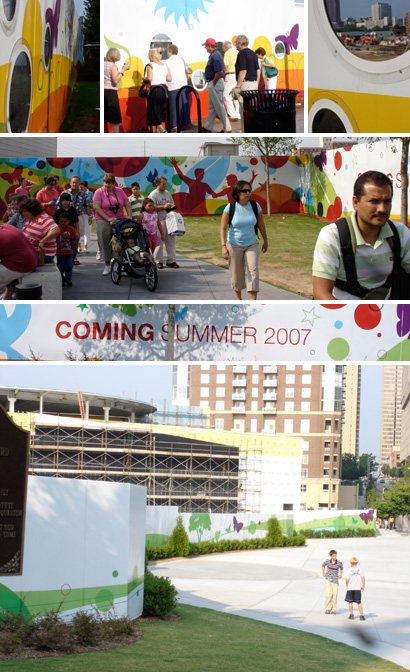
The World of Coke viewing wall and construction (July 2006).

And now, for the Aquarium, a few images to get us started. For the most part I will show you lots of images, with short commentaries here and there—I want to recreate the experience for you, so that you can express your opinions and draw your conclusions.
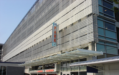
The parking side of the building, which is pretty much the same all around.
The walk from the parking lot to the main entrance.
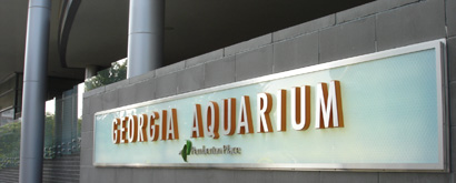
Another sign along the way.
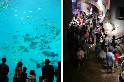
Once inside, this is one of the main attractions.
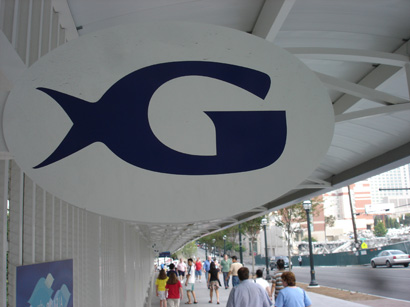
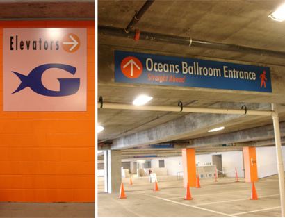
The logo, as stated in the Atlanta Business Chronicle, “resembles a tail of an aquatic animal attached to a bright letter ‘G’”, was developed by Grey Worldwide Atlanta. It conveys the spirit of “fun” that guests will experience—in the words of Bernie Marcus, “we were looking for something very simple, with an identity that speaks to the name of the Georgia Aquarium, and also encapsulates the 55,000 animals that will soon call the Aquarium home.”
As I moved from the parking lot, to the main entrance, the building itself and finally the gift store I could not help but notice the assorted styles and uses of the logo and the typography:
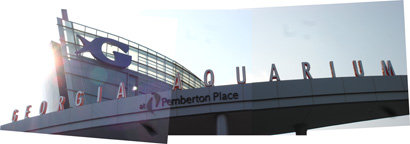
The main entrance sign.
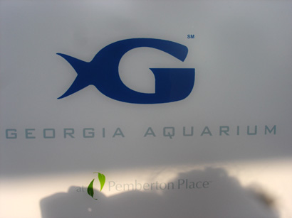
The logo, as shown on doors and posts.
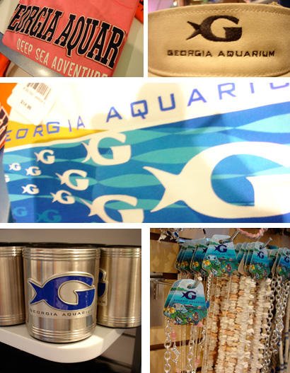
Assorted items at the gift shop. Outlines, no outlines. Typefaces? we are open to suggestions (or so it seems).
Am I the only one that is bothered by the different treatments of Georgia Aquarium? Did the architects not talk to the designers, and the designers to the designers?
When you enter the aquarium, you find yourself in one central room. From there you can select which of the 5 areas to explore, and in which order. While I like what they did with the lettering and tanks for each one of the shows, I am not so sure about the colored lights.
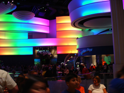
Main room.
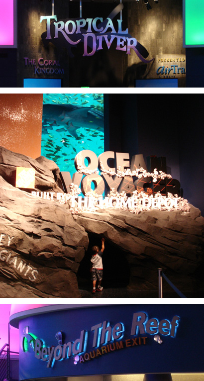
Two shows, and the exit.
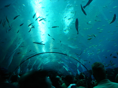
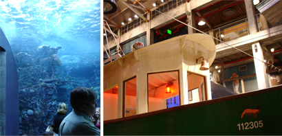
The way the tanks are placed, and the interaction that is achieved between viewer and “species” is beautiful.
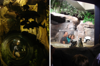
Kids find crawling tunnels that place them in the middle of the action.
Are we that different?.
From the simple, to the cumbersome.
At intervals I felt like a little girl in this beautiful and exciting place, staring at the sharks and gasping at the sea horses. I also felt like a parent in some instances as I watched kids interact with the show and the screens devoted to them, as I looked at warning signs and emergency notices. I felt like a teenager testing the limits and, finally, as a senior citizen when I was done with the noise, the amount of people and the lack of seating. This got me to thinking if the signage was developed with these groups in mind, or by different groups within Gray Worldwide…Or maybe it is all a simple result of lack of communication.
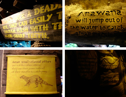
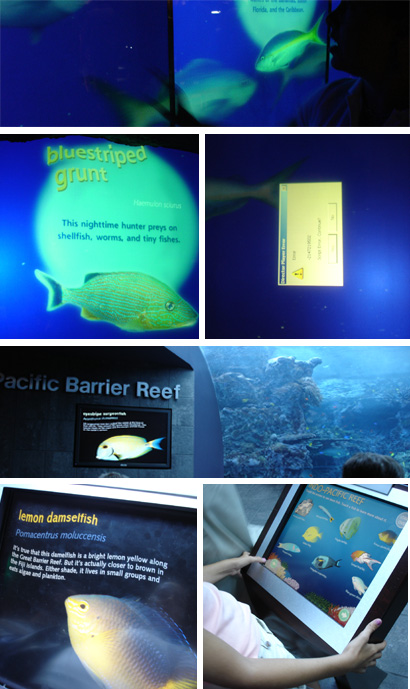
Nicely integrated snippets that tell you them most interesting fact about that species.
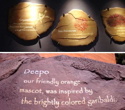
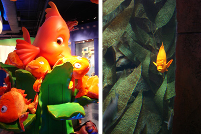
Using the “rocks” from the show as a canvas, while introducing the different species or characters. Deepo, as you might have guessed, was named after Home Depot.
Touch screens are to be found in most rooms, but I can’t get over the typography usage—it sends shivers down my spine. (And yes, that error screen was on its side).
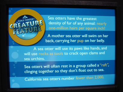
Oh, this interactive screen it completely different from all the others!
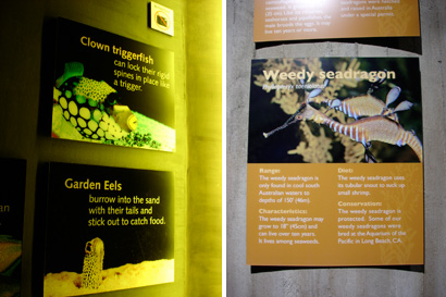
Upon close inspection, these boards are expensively made, durable, etc. Too bad they are hung above eye level, mostly on curved surfaces and loaded with glare spots. They feel like an afterthought.
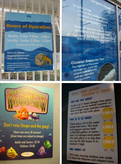
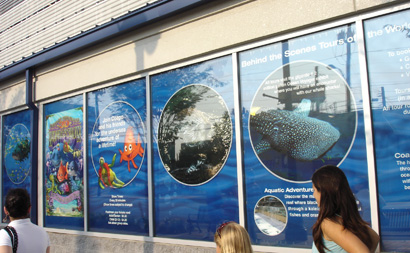
These posters abound, both inside and outside of the aquarium with important information about shows, hours, the glass they use…
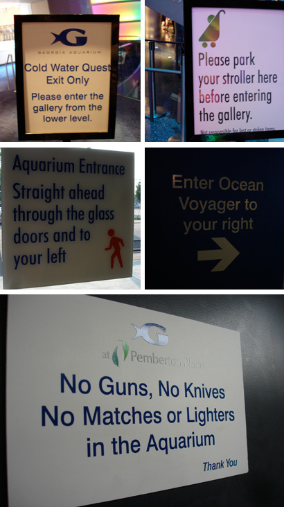
Wayfinding signage feels disjointed not only from the aquarium and the “fun” aspect of it, but within itself by using different styles and typefaces..
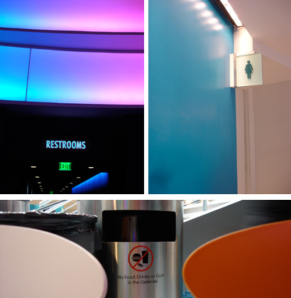
I guess it is OK to go generic for these…
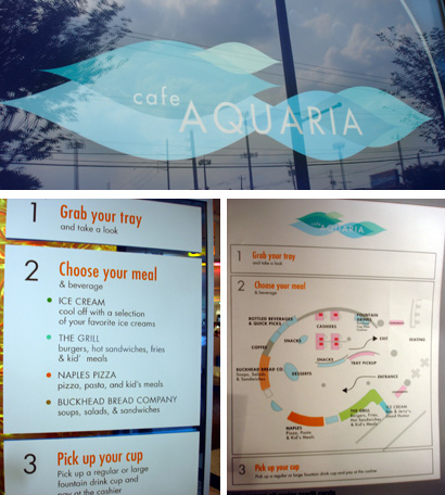
From the main room it also possible to reach the cafeteria, which was a great dissapointment for me. Granted, I am not one for “museum food”, but they missed an opportunity to be truly innovative and creative. As it is, you could place it anywhere in the world and it would blend right in. Better at least, than the logo with the rest of the aquarium’s so-called identity.
Logo, as featured on the outside of the aquarium. Signage within the cafe.
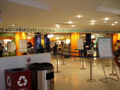
The view as you enter the purchasing area.
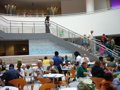
The seating area, with views to the main room and all the action.

Column detail.
As with any institution of this kind and magnitude, the space would not be complete without the sponsors and benefactors. Divided in two main sections:
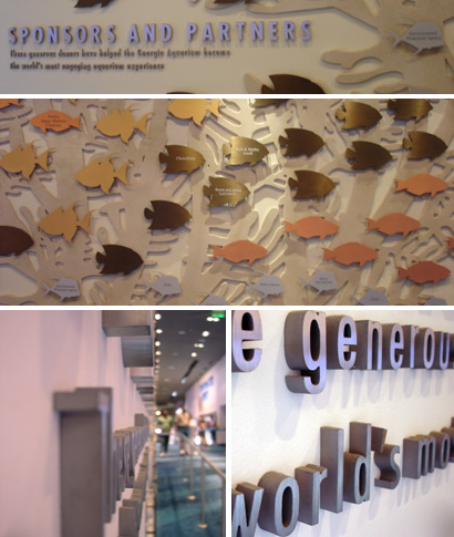
The big shots. Lots a money, equals a big fish.
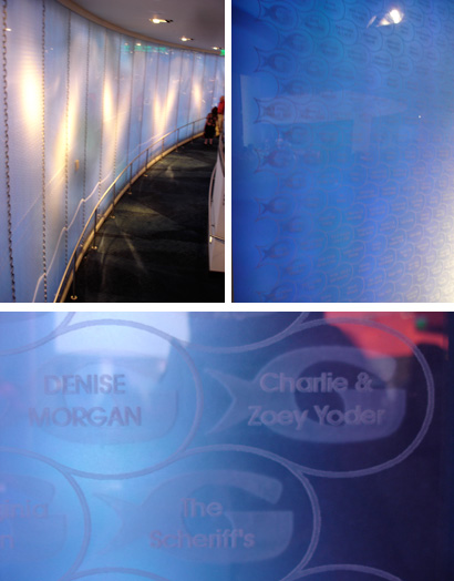
The individuals who wanted to participate and believed in the project. A spiraling wall made of plexi glass with each name etched within a tiny logo-shaped fish, with the logo screened behind it. Subtle changes in lighting keep the wall in motion.
Now, I want to believe that the two fire alarms placed within the wall, surrounded by names, could have been avoided. Columns on the other side of the path, or even the ceiling would have been better options…
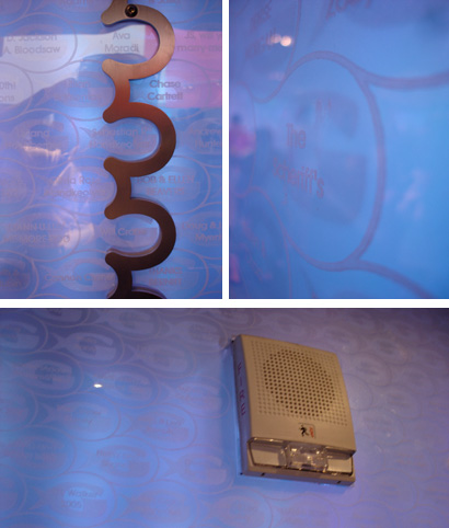
How to seam two pieces of plexi together, without cutting the names in two?
After a couple of hours we headed back to the parking lot. This time around I was ready for it, since I had noticed a few horrors on my way in.
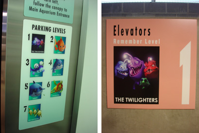
Each parking floor is represented by one of these funny fellas. Too bad the only signs with their picture is right next to the elevator (and nothing near my car or thoughout that floor).
Oh, right… The wayfinding style should be used here as well.
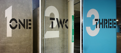
I can’t even begin to imagine the pain those letters in number three felt as they were squished to fit. Thankfully, this is the only place where they are used or the letters could have sued the designers.
Now that I am reviewing the images, and recalling the experience I notice that my feelings have not changed. This is a beautiful project, one that is successful for kids and adults, across cultures and preferences. It is not for designers. It is torture for designers, unless they only look at what lies behind the glass. The amount of typefaces, of styles, of voices that are meant to speak to the guests is confusing and distracting. It is hard to learn what communicates what kind of information, it feels disjointed and sometimes careless. Did they run out of steam? Did they run out of money? Resources? Interns? Was the problem based on the amount of people involved? Or the lack of one key overlooker in charge of consistency?
And well, the logo itself leaves much to be desired, as much as the outside of the building – it could easily house a Costco instead as seen from the outside. And so could the logo be equally interchangeable, it could be used by the local pet store. But it shouldn’t. They don’t deserve such mediocre representation.
Say bye-bye Deepo!

The different type treatments for Georgia Aquarium on the logo and the big-ass signage that welcomes visitors and acts as billboard is unapologetically sloppy and careless. I don't understand why, if the big expense was made to get the letters done, it wasn't done with the right typeface. But at the end of the day, I wonder if anyone will notice.
On the other hand, I find the overall wayfinding system lacking some wayfinding-feng shui. I doubt anyone will get lost or pee their pants because they couldn't relate the bathroom pointing to the signage to the overall look of the museum. But I do feel that some considered harmony in wayfinding signage goes a long way in helping people feel more comfortable in an environment they have never been in. Even if it's not pretty, consistency of visual cues goes a long way.
> Each parking floor is represented by one of these funny fellas. Too bad the only signs with their picture is right next to the elevator (and nothing near my car or thoughout that floor).
In Chicago, the parking garage for Millenium Park is big. Huge. Each section of each floor is tagged with an icon and the icon is plastered everywhere... By the time you get to the elevator you have to be pretty aloof to not remember your icon. So it can be done.
Also, when identity systems like the Walker Art Center's (that span from signage to business cards) are developed it is even harder to comprehend why a big aquarium with a budget to match can't perform on a similar level – of consistency at least.
On Jul.18.2006 at 08:32 AM