


During a typical weekend mix of productive procrastination and procrastination save the qualifier, I indulged in my regular sources of visual satisfaction. I’m sure you know it. It’s the indulgent eye candy fix that satiates what desires arise during a tireless work schedule which training has shaped into a content-over-form logic-fest. Having work that has been called “cerebral” (is that a criticism or a compliment?), a good, self-satisfying morning with bright colors, beautiful shapes, pages uncluttered by casestudy copy does my analytical mind well.
Often I turn to publisher’s sites, especially those in Japan and Europe, to uncover stimuli yet unseen. One such discovery was the playfully vibrating texture-type of Wirefox. A conversation with designer Alexander Tibus revealed the parallel pleasures of the font to be anything but simple graphic gratification. Wirefox may very well be a workhorse for the work week.
Tibus was born in Southern Germany in 1978. From 2000 to 2005 he studied at FH Mannheim and FHTW Berlin. In 2006 he released Wirefox, his first font. Following is an interview with Alexander about the development of Wirefox.
RJH Can you start by telling me about the origins of Wirefox?
AT I got an assignment from a client to design a flyer and they didn’t have a large budget but wanted and needed something with a powerful visual appearance. I came up with a typographic solution, where the numerous flyer designs when lying next to each other formed a certain texture. This was the birth of a basic Wirefox-like typeface. I was so happy with the result that I had the idea to develop the concept and create a font which connects its letters automatically while typing.
RJH Under what conditions was it developed?
AT I aimed to come up with a complete font that could be used internationally and started to work out two fonts with 195 characters each. This took me four months of intensive work. I was a bit afraid of my eyes turning mad at first… Later, I optimized different font details from time to time. And, all together, it took about a year to make Wirefox a working font.
RJH What were some development challenges or hurdles?
AT The grid Wirefox was built on is too simple to design complex accents. It was necessary to find shapes that break the grid but fit with the rest of the font. Having thought about this and designing in a fixed pattern for weeks, it was quite hard to break out of this and to come up with a convincing solution.
RJH So some of the characters had to be exceptions. That’s pretty common in type design. I remember Ed Benguiat insisting that no matter what rules you make for yourself, in the end you have to “feel it.” What were some of the characters that needed extra attention?
AT Some characters, like “@”, became much too big when they were built on the grid. I had to find ways to simplify their basic shapes in order to work out a homogeneous typeface. Others, for example the “&” sign, are formally too rounded for the edgy style of Wirefox. In this case, I spent hours on type research until I found an ancient form fitting the font concept.
RJH Were there any happy accidents in the development process?
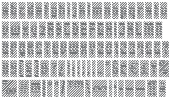
AT There was an important one. It was the birth of the development process. For the flyer assignment, I made different sketches of grid-based fonts. One of them looked attractive to me but it was not legible at all. Having already worked out another one, I entered my room and saw those sketches hanging next to my screen. It was the first time I looked at them from a distance. It was then that I realized that I could actually read those letters which had never been legible at close distance. The sketch which I had almost thrown away was the early basis of Wirefox. The final font developed into something different from the sketch but you still can see that it becomes less legible with growing size.
RJH Whether written, cut, drawn, or digitized letter forms are almost always derived from a “kit of parts.” How would you describe, formally and/or conceptually, the parts that make up Wirefox?
AT The basis of Wirefox are two simple diagonal grids, one for Wirefox-Up and the other for Wirefox-Down. The characters are modeled by a couple of modules which are arranged on the grids. The concept of Wirefox: A single character looks unformed and hardly attractive. While typing, its characters generate text as well as complex patterns with high visual potency.
RJH It seems that we’ve reached a point when novelty fonts can be less cliche and have less historical reference, yet still be more versatile than their predecessors. Have you seen or do you foresee some unexpected applications where Wirefox will be an appropriate choice?
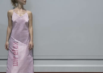
AT During the design process, I discovered Wirefox for fashion design and my friend Nastassia Bichan had the idea to design a dress consisting mainly of Wirefox-blanks.
Together with Westiform, a Swiss company which deals with illuminated advertising, I worked out different application studies for the font. One of the studies researches the usability of Wirefox on large LED screens, the second shows its usage as corporate font for trucks and buildings whereas the third one analyses the application of Wirefox on airports. This study is quite interesting — it shows how information for pilots can be integrated in marked areas that look like stripes when you’re standing on the ground.
Wirefox also has a high potential for animated media. But these were only some ideas of how Wirefox could be used and I am very curious what designers are going to do with it.

Wirefox is available from Die Gestalten Verlag.
A special thanks to Lina Kunimoto for her translation assistance.
This typeface reminds me of "Overtow Industry" by Camm Rowland... unfortunately I can't find an example of the face anywhere, but the face reads like a transparent ribbon folding over itself from far away; when you get close, it's actually a series of very thin parallel lines that overlap each other on curved corners.
I'm going to keep looking for an example. I think there was one on CranbrookDesign.com but the site doesn't seem to be working at the moment.
On Sep.07.2006 at 10:22 AM