Speak UpA Former Division of UnderConsideration
The Archives, August 2002 – April 2009
advertise @ underconsideration
---Click here for full archive list or browse below
  
The Hardest Working Presidential Candidate Logo

Late last year, a slide show in The New York Times, “Reading Tea Leaves and Campaign Logos” took to the blogwaves like wildfire. In it, illustrator Ward Sutton passed mocking judgment (to great effect) on all of the 2008 presidential candidate logos, commenting on anything from the type choice to the relative size of the R in Rudy Giuliani’s logo (“Extra large ‘R’ to remind you just how Republican he is”). But in his zeal to mock equally, he certainly got one critique wrong: Obama ‘08.

Illustration by Ward Sutton

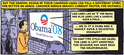
Illustration by Ward Sutton for The New York Times.

[Disclosure: I’m not a partisan of Obama, and this post is not an endorsement of his campaign or big smile, just a post commenting on a logo.] From the day this logo was unveiled I received many e-mails asking whodunit and commenting how much they liked it and how different it was from all other Presidential candidate logos. Ever. The logo was designed (jointly or separately, depending of what you read into each firm’s blurb) by Chicago-based Sender LLC and mo/de: “We were looking at the ‘o’ of his name and had the idea of a rising sun and a new day,” explains Sol Sender, “The sun rising over the horizon evoked a new sense of hope.” Sutton at least got the sun rising part right. “Undefined”, on the other hand, might be this logo’s strongest asset and the result of clever designers not someone “too inexperienced”.

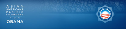
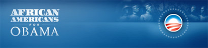
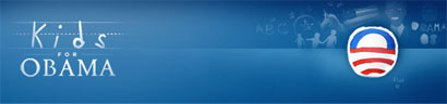
I hadn’t visited Obama’s web site in a long time, until last night when a nice designer from Nike e-mailed me pointing out the “ridiculously nice” (as he put it) implementation of the logo under the “People” section of the site. And, indeed, they were ridiculously well done. For each segment of people, the logo changes accordingly, tip-toeing a fine line between cliché and clever, and never crossing to the former’s dark side. The iterations are quickly identifiable and feel genuinely concerned with connecting to the people they are talking to, without pandering. The executions are rather flawless and work perfectly on screen with the detailed gradients and subtle background illustrations. Even the typography is lovingly handled, with each segment changing ever so slightly and unified by the use of Gotham in most of the applications, and using other typefaces as fitting — even the “kids” typography looks finessed, despite the looming pitfalls of faux child-drawn typography. This kind of playful flexibility is typically reserved for the likes of MTV, VH1 or Nickelodeon and the breadth of this kind of brand architecture for global corporations with endless divisions.

Obama Logo Alternates

Obama Logo Alternates

Obama Logo Alternates

Obama Logo Alternates

Obama Logo Alternates

Obama Logo Alternates

Obama Logo Alternates

Obama Logo Alternates

Obama Logo Alternates

Obama Logo Alternates

Obama Logo Alternates

Obama Logo Alternates

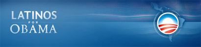
A painstaking task, but the flag element of the logo is applied to each state.

Obama State Logos

Obama State Logos

Obama State Logos

Obama State Logos

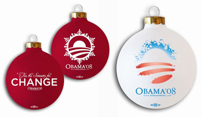
Even the holiday edition looks great. Christmas tree ornaments are on sale, to boot.

Obama Holiday Decorations

The effect of design on political ambitions is likely more important than political advisors would think, but certainly less important than the actual policies of the candidate. Nevertheless, it’s encouraging to see design and identity innovation in an otherwise stale category.

Thanks to Darrin Crescenzi for the tip.

Maintained through our ADV @ UnderConsideration Program
ENTRY DETAILS
ARCHIVE ID 4262 FILED UNDER Branding and Identity
PUBLISHED ON Jan.03.2008 BY Armin
WITH COMMENTS
Comments
md’s comment is:

I agree, everything seems to be handled really well.

The only ones I have a problem with are the typeface choice for "African Americans" which seems almost an attempt at mixing tribal/civil rights era typography. And the "Obama Pride" rainbow seems the most clichéd implementation.

But I am from neither of these groups, so I can't comment on the effectiveness in that way.

If only there was a way to measure its actual effects on his campaign. It'd be interesting to see the influence it does or doesn't play in swaying voters.

On Jan.03.2008 at 10:38 AM
ammre’s comment is:

md-
The rainbow may be cliche, but it makes it very obvious what it's representing, which shows he LGBT community he's not going to be shy or weak in his alliance. Where that one lacks in fancy design it makes up in message.


In general I really like what they did with the logo. I just wish the Asian American, Pacific Islander title was a little closer in width to the rest of them.

On Jan.03.2008 at 11:03 AM
Joe Moran’s comment is:

Man, those Obama folks really worked hard on all their marks. Nice stuff.

And really liked this treatment for Paul. But it doesn't look like they followed through with any other applications or variations.

Wonder if anyone really votes for someone based on their logos though? Except graphic designers. Ha!!!

Bring back the Bull-Moose Party! Or the Whigs!!! Oh, the possibilities then.

Alright, back to you Armin.

VR/

On Jan.03.2008 at 12:14 PM
Darrin Crescenzi’s comment is:

...tip-toeing a fine line between cliché and clever...

Exceptionally well put. Though my favorite interpretation of the mark is perhaps the most clichéd, I can't help but look at the "Kids for Obama" logo and find it terribly endearing. Maybe I'm just a sucker for sidewalk chalk.

On Jan.03.2008 at 12:44 PM
Prescott Perez-Fox’s comment is:

Wow, if he didn't already have my vote, he's got it now!

Will someone please make a "Graphic Designers for Obama" using dark-framed glasses, somehow.

On Jan.03.2008 at 12:48 PM
Jim’s comment is:

I agree that this is a pretty slick campaign, but i'm disappointed that something done so well would miss some of the details. in the examples above, Obama appears in the serif type except for in the Asian American and Veterans categories where it appears in Gotham. How does something this basic get missed?
I went to the campaign website, which is very nice, but was appalled when i clicked on the store and found t-shirts saying Got Hope? i would have thought the campaign could have come up with it's own slogan, rather than rehashing the decades old milk slogan.

On Jan.03.2008 at 01:31 PM
one of them’s comment is:

why did they go sans on the OBAMA typeface for the veterans I wonder? Perhaps too "Flags of Our Fathers"

I guess for the Asians too. Though that may just be to resolve the small serifs on the seemingly-ridiculously-long-category name.

LOL @ Graphic Designers for Obama... How about Blog Posters for Obama using the O as the middle of LOL!!!!

On Jan.03.2008 at 02:19 PM
Jw’s comment is:

I hope it works for them!

I can't find a picture of it, but this morning I saw him on a morning talk show with a poster behind him that said "Change"- it's the first time I've seen a campaign poster and thought "Hey, that looks fantastic."

On Jan.03.2008 at 04:07 PM
see no evil’s comment is:

Maybe it's too obvious, but I wonder why no one has capitalized on the letter 'O' and the number '8'.

'O8' or something like that...

Americans love their brands, why not elect one to run for office, eh?

On Jan.03.2008 at 05:18 PM
Mark Notermann’s comment is:

@ md,
The only ones I have a problem with are the typeface choice for "African Americans" which seems almost an attempt at mixing tribal/civil rights era typography.

This typeface looks like LTR Federal from Letterror If mixing tribal and civil rights-rea typography equals Federal Reserve Bank, it might be telling more of a story than it intends to......

On Jan.03.2008 at 05:52 PM
Pesky Illustrator’s comment is:

Oh, politics do get in the way of logo design don't they?

It's actually hard to comment on the effects without getting someone's hackles up. (Is that correct? Hackles? Huckles?) I kind of like the man Obama (to the extent that all politicians are silver tongued devils to some degree), but I don't like his logo set whoever designed it. It has that sun-over-a-plowed-field cliche to me. Which means that it says nothing and pleases committees.
To the extent that politics has been reduced to all-encompassing fakeness, I guess this takes the cake. Logos tailored to subdivided groups based on ethnicity, gender and whatever.
I only worked on one set of campaign graphics and the candidate hated the lower case "g", didn't want to change typefaces, just wanted a mangled bastard version inserted instead. She lost and my belief was that it was instant karma for angering the typography gods.

On Jan.03.2008 at 06:28 PM
Al’s comment is:

"Enviromentalists for Obama"???

On Jan.03.2008 at 06:58 PM
Michelle French’s comment is:

I just like the big "O!"

On Jan.03.2008 at 08:00 PM
Tselentis’s comment is:

There's one 'Obama people' logo they didn't do, Cubs Fans for Obama. Whenever I see that logo of his, I think of the Cubs. Call me crazy.

On Jan.03.2008 at 08:50 PM
Gareth Walker’s comment is:

I like how Edwards is *also* using the Gotham font:

http://www.typography.com/ask/index.php

Any idea who came first?

On Jan.04.2008 at 09:00 AM
Tselentis’s comment is:

The irony in Obama and Edwarads using Gotham is that they came in 1st and 2nd (respectively) at the Iowa caucus.

On Jan.04.2008 at 09:39 AM
Prescott Perez-Fox’s comment is:


On Jan.04.2008 at 11:47 AM
adam’s comment is:

haha, that was a good catch ... "enviromentalists"

anyways, last night i was watching some of the primary speeches, and i actually consciously noticed obama's logo. i thought it was very clever but still very low-key and classic.

i like the white ornament, also.

On Jan.08.2008 at 01:20 PM
JasonP ’s comment is:

Candidates are brands now more than ever. Utilizing the original logo to spawn many variations is an ideal way of marketing a brand (candidate). I think what Obama and others are doing is fantastic

On Jan.09.2008 at 09:17 AM
Mike’s comment is:

Haha nice one Prescott!

On Jan.09.2008 at 11:30 AM
Bendy’s comment is:

Too many logos. Just flat out too many. The problem with this is that catering to groups with logos will leave many of the other groups feeling left out and unimportant.

My question is: where does the line stop with these logos?? Is there a $3 million donation cutoff for getting you a logo? Seems like a good way to get people upset.

On Jan.09.2008 at 01:23 PM
Jester’s comment is:

When I first saw it, I thought Bank of America has a new logo. I'm not very impressed.

On Jan.09.2008 at 02:39 PM
calen’s comment is:

@ Michelle French

Solid gold, I'm also a fan.

On Jan.10.2008 at 03:19 AM
vmos’s comment is:

Isn't Obama Pride in the new transformers cartoon?

On Jan.10.2008 at 05:32 AM
MikeJ’s comment is:

Bendy's obviously never seen a campaign before,or has some axe to grind with this candidate. Every campaign is going to have affinity logos. The good logos will look like this. The bad ones will just slap the word "veterans" or "women" on the stock logo, and the designers will then hit the bar. Which is a valid use of time too, I guess.

On Jan.10.2008 at 05:38 AM
Heidi ’s comment is:

So I checked on his site this morning, "environmental" logo was still misspelled. As of now, it's correct! Wonder if this site had anything to do with it.

On Jan.10.2008 at 12:58 PM
Graham’s comment is:

@ see no evil

months ago at Coudal's pinsetter I think someone set "O8AMA." Less perfect application would go to Sen. Clinton's initials: "H8C."

On Jan.10.2008 at 01:36 PM
Sam’s comment is:

Obama's site does, as you've discovered, look terrific. At the start it was a little underwhelming, but as time has passed -- and more funds have become available, I imagine -- the site's gotten very dressy and is full of useful content, from banners to buddy icons, as well as the usual campaign-y stuff.

On Jan.10.2008 at 01:40 PM
Brad’s comment is:

They also fixed the san-serif issue on the Veterans page and the Asian page. It looks like someone is listening.

On Jan.10.2008 at 02:03 PM
Scott’s comment is:

Ears open! Thanks for the tips ; )

On Jan.10.2008 at 06:02 PM
Nick’s comment is:

Very interesting that a candidate actually has such a tasteful website, unlike some that I have seen in the past.

On Jan.10.2008 at 06:46 PM
Ingrid’s comment is:

I love the logos, but as a Latina I wish the Latinos for Obama had more punch. It's OK, just kinda boring.

On Jan.11.2008 at 07:18 AM
Sam Pratt’s comment is:

// Maybe it's too obvious, but I wonder why no one has capitalized on the letter 'O' and the number '8'. //

Actually, Obama did capitalize on that with one of the t-shirt designs. A high-contrast photo of his face in profile appears inside the "O."

On Jan.11.2008 at 07:45 PM
jay’s comment is:

Nice design, but he's not going to be our next president.

"...just a fairytale..."

On Jan.12.2008 at 01:17 PM
piratemedic’s comment is:

It's always reminded me of the Bank of America logo with a circle around it...

On Jan.12.2008 at 04:38 PM
dav’s comment is:

If Obama doesn't make it all the way, ExxonMobil can pick up the identity as is...

"Environmentalists for ExxonMobil."

On Jan.14.2008 at 03:09 PM
g_saliaris’s comment is:

It looks like it could be a logo for some kind of fat-free sugarless organic wholewheat granola cereal bar.

On Jan.14.2008 at 11:13 PM
Randy’s comment is:

Looks kinda like the Bank of America symbol.

On Jan.17.2008 at 12:32 AM
Josiah’s comment is:

On Jan.21.2008 at 02:46 PM
Alysia’s comment is:

Yes, g_saliaris, a fat-free sugarless organic wholewheat granola cereal bar that I'd vote for!

On Jan.24.2008 at 07:29 PM
Tyler’s comment is:

Hey guys, excellent review ... however Sender & mo/de have had nothing to do with the campaign since creating the initial mark, and the old wordmark.

A friend of mine knows the Art Director over there, John Slabyk … his portfolio is down, but used to be available on humanot.com … now its only available here: http://www.celsiusdesign.net/humanot … from what I understand its basically him and another designer, Scott Thomas who carried almost all the code work on his back, his portfolio: http://www.simplescott.com .. these are the guys responsible for all the branding and design seen for the campaign.

On Jan.26.2008 at 03:17 AM
dada’s comment is:

Very nice article.
I agree with it, Obama's one of the best worked out solutions on the campaigns out there on last years.
Maximum efficiency plus flexibility. No one else of the candidates have taken up the risk of using circle-shaped forms as a leading resource.

On Jan.31.2008 at 07:22 AM
Bryant’s comment is:

EXCELLENT POST!!! I, too, was so impressed by the design of Obama's media that I spent time looking through each and every page. The treatment of both his "People" and "States" sections, each with their own, individualized logos, is superb. I'm so glad you wrote on this topic!!

Also, you may note that they have corrected the spelling of "Environmentalists." :-)

On Jan.31.2008 at 09:06 PM
James Kirkup’s comment is:

This work is stunning, surely the best work for a election race to date

On Feb.04.2008 at 08:10 AM
Geoff’s comment is:

At the beginning, after announcing his candidacy, I was impressed to see that they'd paired Joanna with Gill. The second treatment of his name set in uppercase is a nice move (not a radical change, but more 'presidential'.) Up to now, given the corporate nature of American politics, you might think more thought would be given to the visual communications of a campaign... but not really, other than the effective and diabolical-looking W.

I may be biased but Obama's branding is refreshing and effective. Nice work.

On Feb.04.2008 at 10:25 AM
Sham Deluxe’s comment is:

I cannot help but stare at the Veterans for Obama logo. It is VERY nice in my opinion - and I'm not even a member of the military. Even as I type this message I find myself scrolling up repeatedly in order to get another look at it. There is something about the 5 stars that just sets it off.

On Feb.12.2008 at 11:02 PM
telecom’s comment is:

Sham Delux, I agree entirely about the Veterans version: it really does something wonderful in that it evokes both daybreak and night — which dawn ought to do — as well as fulfilling the "flag" effect that the red and white bars originally promised.

I wonder if those five stars should have been included in the original logo? I'm beginning to think so. They really resolve the piece beautifully.

On Feb.13.2008 at 04:03 PM
Armin’s comment is:

And it just keeps getting better and better:

Get your St. Patrick's tee now!

On Feb.28.2008 at 09:37 PM
Mark’s comment is:

Really impressive, great article.

The executions are pretty much flawless, the only thing that bothers me is that the Obama name isn't in the same typeface in all iterations which would help with unity.

Other than that, it looks like these graphic designers have done their homework.

On Feb.28.2008 at 10:39 PM
K9Doris’s comment is:

I was looking at an Obama bumper sticker and just now noticed the design. I'm not an Obama supporter so I hadn't really looked at his bumper stickers that closely. Anyway, it troubled me. There's something about the design that just gives me a bad feeling. After reading this blog, I'm even more disturbed. It's kind of like someone is mixing up too many flavors of Kool-Aid. Believe me, I don't drink the Kool-Aid, no matter who makes it. I'm scared of what will happen if he gets elected...Anyway, I'm not really familiar with this website, but had to add a comment just for fun!

On Feb.29.2008 at 09:58 PM
ruth’s comment is:

I am absolutely aghast that ALMOST NO AMERICAN FLAG APPEARS IN THE PRESENCE OF OBAMAnation ever...He has absolutely no regard for the history of america or freedom...Personally I prefer the good old American flag with the stars and stripes that represent our history....Obamas logo is an insult to americans.
Does the absence of stars mean we cease to be the 50 states but, will be the one world ruler..
The nero broken cross symbol commonly called peace symbol is also used as Obamas logo on pins and posters.. this broken cross was originally called antichrist symbol because nero used it as a symbol for killing christians...wake up sleepyheads..before a new nero finishes the job...

On Mar.06.2008 at 11:28 PM
Max Heim’s comment is:

Um, Ruth seems to be unaware that Mr. Obama is a self-described practicing Christian. From a branding standpoint, she seems to believe that all candidates are required to standardize on the stars & stripes. Not really a useful contribution to the discussion, which up to this point was remarkably intelligent.

On Mar.11.2008 at 05:23 PM
Ed Kelty’s comment is:

Nothing for the Scottish-Danish minority group?

On Mar.12.2008 at 12:37 PM
Ed Kelty’s comment is:

Nothing for the Scottish-Danish minority group?

On Mar.12.2008 at 12:37 PM
ruth’s comment is:

The Obama logo is beautiful and original..But I am wondering if it wasn't plagiarized from the seal of Ohio...It is very similar in design..

Also it appears to me Obama is attempting to replace the American flag with this logo.. He wears it on his lapel.. It appears on all his posters.. ALMOST NO USA FLAGS associated with obama or his campaign.. unless you count the foreign flags displayed at his campaign offices' in florida ..I think maybe Obama's logo is like Obama.. not what it appears to be..

On Mar.19.2008 at 12:43 PM
ruth’s comment is:

The Obama logo is beautiful and original..But I am wondering if it wasn't plagiarized from the seal of Ohio...It is very similar in design..

Also it appears to me Obama is attempting to replace the American flag with this logo.. He wears it on his lapel.. It appears on all his posters.. ALMOST NO USA FLAGS associated with obama or his campaign.. unless you count the foreign flags displayed at his campaign offices' in florida ..I think maybe Obama's logo is like Obama.. not what it appears to be..

On Mar.19.2008 at 12:44 PM
ruth’s comment is:

unnn Max only a self described Christian would sit under the blows of Rev. Wright's assults on USA, whites and 9-11..A real Christian would have corrected this man or ceased association with him..Not to mention the fact Rev Wright used the pulpit to campaign for Mr Obama.. Mr Obama is a state senator , doesn't he know the law or does he think the law doesn't apply to black churchs.

On Mar.19.2008 at 01:05 PM
Theresa’s comment is:

Hmm... seems we have ourselves a troll, folks. *puts up DO NOT FEED sign*

At any rate, this is a great post. I stumbled upon this blog because I actually was Googling for information about Obama's logo! I love his whole corporate package and wanted to know what other people think of it. The basic mark is one of the most versatile marks I've ever seen -- it really earns its keep. I am impressed by his current website and his affinity logos, as well as his peripheral fun stuff (like the O'Bama identity for St. Patrick's Day). The subtle images that allude to each group combined with sensitively handled type just feel *good* to look at. I love how completely unambiguous the LGBT logo is. What a way to convey respect for a group! My most favorite, though, is the First Americans logo. It's just beautiful work. :)

I'm a student of graphic design, and it has been really cool to see the design analyzed in this way. Turns out the things I was thinking are are shared by a few people. :D

On Mar.20.2008 at 07:56 AM
Dan Rubin’s comment is:

@Ruth (and anyone else who's interested) - it does no good to characterize a logo as something it's not. You can apply whatever symbolism you wish to see in any shape or combination thereof, but that doesn't mean that those shapes were designed with (or have any association or intended meaning) what you choose to project onto them.

For reference, the CND logo (the "peace symbol") history has nothing to do with inverted or "broken" crosses and the like, but rather semaphore symbols for N and D (for "nuclear disarmament"). See the CND logo history for more.

It's great that the Obama folks are following along and making adjustments/corrections based on this article and its comments. Kudos for being aware as designers, and open to change.

On Mar.31.2008 at 06:43 PM
James’s comment is:

I was wondering why they changed their original pride logo. This was featured when pride.barackobama.com was first launched and still hides out on their servers:

If you take out the incorporated text and put it on a white background, I think it's a more elegant treatment than what's being used currently, which is a bit busy:

Was there concern about "replacing" the American flag or some such nonsense? (As an aside, I do dislike how the rainbow symbol looks rather childish — all that's needed is a unicorn — but I suppose it's better than the pink triangle, a Nazi brand.)

By the way, I don't know if there's a public directory of them, but there seem to be cleaner versions of each logo. You have to play with the URLs. For example, here:

http://origin.barackobama.com/images/vets/

You can see that there is an image called vets_logo.jpg:

On Apr.01.2008 at 11:15 PM
James’s comment is:

Ok, here's a trove of logos. They all have a background behind them, but the ones ending in "_small" are ready to use anywhere:

http://www.barackobama.com/images/people/

On Apr.05.2008 at 11:32 PM
Rich’s comment is:

@James: My take on the Pride logo switch would be that they probably felt that the red and white horizon stripes are probably "core" to the Obama brand, and wanted to find a way to get both the pride rainbow, and their main identifier into the same logo. In any case, I actually prefer it as it is now, but that's just my opinion! (Not that that it particularly matters as I'm English anyway.)

From a general web design point of view, rather than a branding one, I thought I'd like to point out the Obama Results Center. I don't know why, but I'm drawn to the nice, clean implementation and presentation of what is, essentially, a big table with a bunch of numbers. Beautifully done, in my opinion.

On Apr.17.2008 at 06:12 AM
James’s comment is:

Another:

On Apr.24.2008 at 07:15 PM
mwangi’s comment is:

The amount of work done for the obama campaign is phenomenal. Recently had elections in our country and they were nothing to be compared.

www.kibaki.co.ke
www.raila07.co.ke

On Apr.28.2008 at 07:56 AM
Jessi Long’s comment is:

So, I agree the design is slick, the type is good, it reaches people, it's personal, bla, bla, bla. But it seems to me that they're spending a lot of money, they shouldn't have too. Wouldn't the campaign be stronger if you didn't have to change it for every audience? I mean, isn't this Warhol's tomato soup can or Elvis or the Madonna? It will be interesting to see this placed in a museum one day right along side these other pop icons. But I've lost the presidential candidate in all the hype. I'm not sure I actually even know what he plans to do as president. But his campaign sure is pretty.

On May.09.2008 at 12:17 PM
James’s comment is:

Holy cow, talk about a campaign that listens! They've clearly been following this thread (See Scott, Jan. 10 at 6:02), but I didn't expect them to redesign the pride logo. Check it out.

Although I admit, I like both of the designs now.

If I can bother them with another slip of paper in the suggestion box, that Generation Obama logo isn't as cool as the others. I'm not sure why they don't use the trademark O. The Obama-head-as-shroud-of-Turin thing with the incongruous G isn't working for me. It could just be me, though.

On May.27.2008 at 03:07 AM
patrick’s comment is:

socialism has never looked (or sounded) better!

On May.28.2008 at 05:24 PM
Joseph’s comment is:

The guys over at Substance have put together a site called Logobama which allows the public to create their own version of the Obama logo. Donations from the site go to the campaign.

Also, there is a section on the Obama site called Artists for Obama. Designers Shepard Fairey and Scott Hansen have already taken an active role in the campaign. Some pretty sweet posters are available.

On May.28.2008 at 07:11 PM
Liam Sionnach’s comment is:

Everything about the Obama campaign attempts to sell us salvation, and I have no idea what Obama means by any of this. This is incredibly efficient design. Sort of terrifying when you think of how much a politician is now brand, and especially as noted by others, when in reality the design isn't particularly talented.

I feel quite a bit of embarrassment when I think of how much grass-roots support designers and culture-producers have contributed uncritically to his campaign - which is apparently "hope" that I can "believe in."

You think Obama will "hope" away climate change or the economic crisis?

On Jun.06.2008 at 04:29 AM
CRK’s comment is:

One done from scratch using free tools and fonts for all the Ubuntu nuts. :P (Im not happy with the motif though)

Sources will be availiable here HERE.

On Jun.10.2008 at 10:50 AM
mcMüller’s comment is:

The Obama logo, upside down, looks like a cartoon pirate head.

On Jun.11.2008 at 10:14 PM
mcMüller’s comment is:

viz:

On Jun.12.2008 at 05:56 PM
patrick sutton’s comment is:

My first reaction to the Obama logo was that it evoked Van Gogh's "The Sower" crossed with a Thomas Hart Benton depression-era farm life painting. To me, that makes it evocative of bedrock Democratic party values.

On Jun.15.2008 at 12:11 AM
Naomie Keys’s comment is:

Rising Sun logo so over done and not original. Japan is known as "The Land of the Rising Sun" and the “rising sun” flag is the military flag of Japan. So, this symbol may be new to the US, but not a new symbol. It doesn’t show respect to the US disparaging our flag and recreating another countries emblem.

On Jun.23.2008 at 11:38 AM
Laurie’s comment is:

Obama has a GREAT advertising firm -- the branding is equal to that of Coke! No wonder his supporters have been duped into believing a man with no relevant experience, Marxist leanings and questionable friends is qualified to be preident.

On Jul.29.2008 at 04:29 AM
Lee’s comment is:

Just a question. Why would anyone with any sense say that they are going to vote for someone based solely on what a graphic designer produced? As if Obama had any thing to do with it. It just shows how easily some people can be swayed by anything.

On Aug.11.2008 at 10:22 PM
Mark Notermann’s comment is:

So is the new Dell Laptop placing a vote?

Un-canny.

On Aug.12.2008 at 11:46 PM
Armin’s comment is:

Comments to this thread have been closed.

On Aug.18.2008 at 08:38 AM
Duval’s comment is:

Makes sense, most Obama supporters are unemployed and have plenty of time on their hands to hang around at the Mac store or do all this design work.

On Aug.20.2008 at 02:59 PM