Speak UpA Former Division of UnderConsideration
The Archives, August 2002 – April 2009
advertise @ underconsideration
---Click here for full archive list or browse below
  
The Ritzilhouette

In the past few days our 9-month-old daughter has developed a perplexing obsession with books: We’ll throw over a pile of a dozen books on the floor and, one by one, she chooses them and asks us to read them to her. This wasn’t always the case. Since early on we showed her books and she didn’t find them as interesting as the multi-colored Fisher-Price thingamajigs that we have slowly amassed. There was one book in particular that she kind of hated and would not tolerate more than 5 seconds of exposure to, Black on White. A 12-page book that, as its name implies, is black stuff on a white background, with iconic images of things like a knife and fork, a bucket, a bib, a butterfly and a Ritz cracker. Yes, not any other cracker, a Ritz cracker. I remember mocking it out loud when I first saw it. Why would the author choose, among a zillion things, a Ritz cracker as something that a 3-month-old should familiarize his or herself with on par with a fish? Regardless of intentions, I recognized the cloudy-edged, tiny-holed shape immediately. And that’s exactly what Nabisco hopes that everyone does with their new campaign: Open for Fun.

Black on White by Tana Hoban

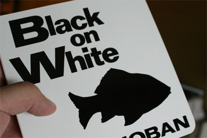
Black on White by Tana Hoban.

Page 8 of Black on White, a baby book

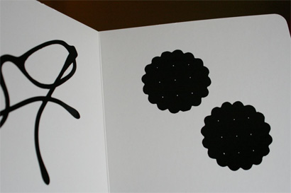
Page 8 of Black on White showing two Ritz crackers.

Black on White predates this campaign, launched at the turn of this new year, by fifteen years, which is not to say that anyone plagiarized a baby book, but that there is indeed equity to be built upon the iconic shape of the 74-year-old cracker. The campaign revolves around the silhouette of the Ritz cracker deployed in a variety of lively hues and sizes, both in print and on TV. The agency in charge of the project is EURO RSCG, who were awarded the account back in June of 2007, after Kraft (owner of Nabisco) snapped the business away from JWT. I first saw the campaign while walking down the street about two weeks ago and was quite amazed by the simplicity and impact of it. With all the colorful, in-your-face poster sniping that happens in New York, Ritz’s stood out quite nicely, specially on the sun-less day I took the pictures:

Ritz on the Street

Ritz on the Street

Ritz on the Street

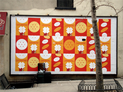
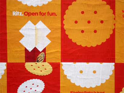
The print campaign uses an amazingly restrained three-color palette punctuated by bold bursts of white, specifically (and maybe even brilliantly) the X formed by the open pack of Ritz. As reward to any New Yorker that dares to slow down to read the copy, the ads feature above-typical copywriting for a mass consumer product:

Ritz on the Street

Ritz on the Street

Ritz on the Street

Ritz on the Street

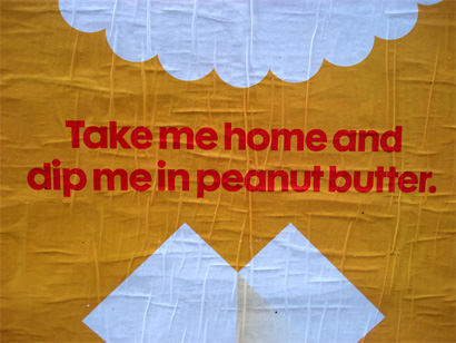
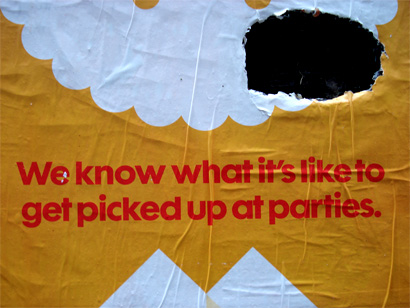
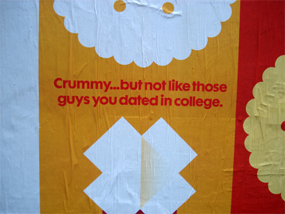
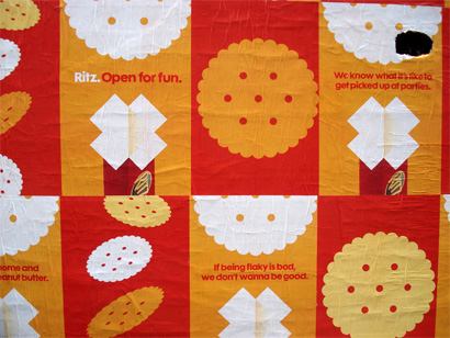
It’s not groundbreaking, but you can’t argue against the craving and erotic urges that the first line (mmmm, peanut butter) might trigger — or maybe that’s just me. You also have to love the tight tracking in that copy. But where this campaign truly becomes relevant is in the elevation of the silhouette of the product to icon status. Only time will tell if Ritz can achieve the same instant recognition as something as ubiquitous as the Coca-Cola bottle or those pesky iPod dancers, but in the cracker shape they have a beautiful and simple visual that could easily do so.

Coke Side of Life

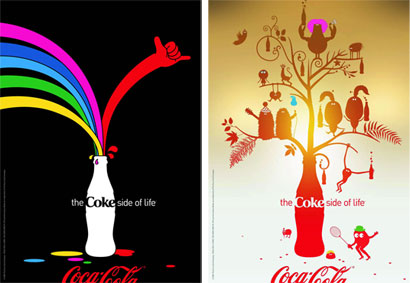
The Coke Side of Life campaign by Wieden+Kennedy.

iPod ads

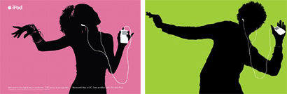
iPod campaign by TBWA\Chiat\Day.

Absolut ads

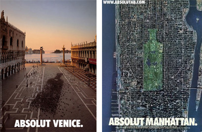
Absolut campaign by TBWA\Chiat\Day.

The TV advertising, produced in collaboration with Brand New School, also utilizes the cracker shape to great effect, making it lively and fun. The first commercial, with its flat graphic look is the best of the bunch, as the others start to get too corny but, as might you expect, the animation at the end gets me every time.

Open for Fun commercials embedded from AdGabber.

TV ad from the 50s. Not bad.

As a kid in Mexico, I don’t recall anything special about Ritz, they would just be there at kids’ birthday parties and at my parents’ friends’ houses on weekend brunches. They seem like a staple of life. Having not been around that time, I understand that Ritz is considered a Depression Era staple as well, something simple that could be pretentious and unpretentious at the same time, and the cracker has had a hard time surfacing from the stigma associated with this period. So I find this campaign to be highly effective in introducing (or, well, re-introducing) Ritz to a new generation of consumers through a fresh approach that shakess off any preconceptions about the beautifully tanned cracker — and if it starts with showing your infant silhouettes of the cracker on a baby book, then all the better.

Maintained through our ADV @ UnderConsideration Program
ENTRY DETAILS
ARCHIVE ID 4423 FILED UNDER Branding and Identity
PUBLISHED ON Feb.12.2008 BY Armin
WITH COMMENTS
Comments
jj’s comment is:

Armin - it's nice to see an old, stodgy packaged goods brand embrace design - and do it in a smart way. They OWN that shape and they are finally using it correctly. Done well, in ten years that shape could replace the logo entirely (maybe it could even do it today?!?) So smart. Well done. Funny copy. It may not be in a sexy category, but the degree of difficulty in grocery store goods is far greater than most. I love seeing stuff that I can really like. (It sure beats feeling like everything done is crap and being all negative.) When I first saw the spots - not long ago - I reacted to them animating that shape. Glad you brought it up and wrote about it. Bravo.

On Feb.12.2008 at 09:23 AM
diane zerr’s comment is:

I saw the second tv ad a few weeks back and knew it was something good the moment I saw it. I love that they are taking the brand of the Ritz to the next level. The orange, red and white color combo is amazing for those print ads and I love the animations in the motion.

I'd like to see if they are going to implement this in other ways. They haven't completely embraced it on the web but if you click on the "open for fun" module you get to see more of it.

On Feb.12.2008 at 09:31 AM
John Mindiola III’s comment is:

this is awesome. pure genious. what's more fun than futura bold in orange and red?

On Feb.12.2008 at 10:27 AM
Doug Bartow’s comment is:

what's more fun than futura bold in orange and red?

..a modified version of Ray's Cafe in orange and red.

The x-height is too tall and the capital W is too extended for Futura. Close, though.

On Feb.12.2008 at 11:27 AM
Rob’s comment is:

Mmmm...maybe it was the book. My kids love Ritz (and they were always around the house when I was growing up) crackers. The new campaign is both clever and colorful. Two things that certainly won't hurt. Now the question remains, will they dare to change the color of the box. I hope not.

On Feb.12.2008 at 11:41 AM
Chad K’s comment is:

I used to eat Ritz crackers by the sleeve with Easy Cheese. Sooo good! The cheese from those pressurized cans is about the same color as the yellow in the campaign. Yum.

On Feb.12.2008 at 01:29 PM
diane zerr’s comment is:

Chad, right you are! I too loved eating Ritz with the canned Easy Cheese. Hmm...I think I'll stop by the store and get some on the way home.

The orange/yellow color is very close to the Easy Cheese color. Great observation!

On Feb.12.2008 at 02:17 PM
pnk’s comment is:

This is cool and all, but that ain't no Ritz cracker in your baby book.

The depth and quantity of the scallops on the edges, and the number and configuration of the holes in the silhouetted baked confections's interior, suggest a cookie more than they do a cracker. Perhaps a teething biscuit?

Definitely not a Ritz cracker, though.

On Feb.12.2008 at 03:04 PM
Armin’s comment is:

Paul, would you consider it an artist's interpretation of the Ritz cracker? I doubt anyone involved in this book want to fact check the quantity of scallops and the number and configuration of the holes... Teething biscuits are all about the solid monoliths to withstand the chewing.

Still... Close enough.

On Feb.12.2008 at 10:04 PM
felix sockwell’s comment is:

nice write up arm.

from a distance the pattern's colors allude to 3 things: Cheese, Butter and perhaps a spicy red Dip. The ads smartly place you inside the party 3 floors above.

I cant help but think back to the Snapple redesign I worked on (pitched) some time back... We had a similar notion of using the shape of the bottle to inform the packaging, animation and logos. Everything died, of course and CBX thought it smart to rely on focus grouping and place them right smack in the middle of the action; that is nowhere, that trite veritable branding Idiocracy.

This work on the other hand is quite refreshing.

On Feb.13.2008 at 09:06 AM
Josh’s comment is:

I love this campaign. I love Futura!

Unfortunately i just stocked the shelves with Keebler's Town House and Club crackers, so no impulse buying for me.

What I'm quite surprised by is the two minds of Nabisco to pursue this. While they invest in a local firm around here to create its nasty, beveled, "pop it" packaging they let the advertising side break away from the flock.

With these foods companies being known for being demanding and sometimes short-sighted it refreshing to know that someone on the inside worked hard for the agency to not provide cheeseball work for once.

On Feb.13.2008 at 10:22 AM
pnk’s comment is:

I dunno Armin, maybe you are right. Your point about teething biscuits sure makes sense (and I don't doubt your knowledge is a bit more current than mine on the subject.)

I just hate to think you and Bryony are out there teaching your wee bern that visual details don't matter. What a truly sad, sad state of affairs that would be.

(Then again, I still have that birth announcement y'all sent out set in letterspaced Comic Sans... I guess I should have seen it coming.)

On Feb.13.2008 at 12:00 PM
pnk’s comment is:

I've been corrected: I meant "wee bairn".

On Feb.13.2008 at 12:09 PM
Able Parris’s comment is:

The animated parts at the end remind me of the Dunkin Donuts campaign, "America Runs on Dunkin." Maybe it's the colors and the silhouettes.

I'm with you on the peanut butter, tho. Delicious. And I've also found that peanut butter goes wonderfully with coffee, although I am not a fan of DD's coffee. (just a thought)

Great post!

On Feb.27.2008 at 09:52 PM