Speak UpA Former Division of UnderConsideration
The Archives, August 2002 – April 2009
advertise @ underconsideration
---Click here for full archive list or browse below
  
Flexible Consistency, Consistent Flexibility
Guest Editorial by Jon Hewitt

In late 2006 I went to see Alan Fletcher’s retrospective at the Design Museum in London. It’s the only exhibition, before or since, where I’ve read every word on every caption for every piece of work. It was a masterclass in design. The piece of work that struck me most, more than the witty collage work or the posters written in Fletcher’s trademark handwriting, was a rub down sheet of Reuters logos. What I realised, whilst I was looking at that rub down sheet, are the massive technical restraints that limited identity design forty years ago. There was one logo and it only physically existed in a handful of sizes. The rules were kept simple. Apply the logo in the set position at the set size and don’t ask questions.

Forty years later, identity is referred to as brand and we use media banks to download brandmarks instead of using sheets of rub down logos. It comes as no surprise that people have started to question the “Consistency, consistency, consistency” mantra. In the last couple of years, more and more high profile projects have rejected this mantra in favour of a flexible approach to identity. In a world where some brands are seen on screens more than in print, flexible identity is a logical development. It’s also a development which changes the identity design process. We need to start considering why an identity is flexible, how it can change and what this communicates.

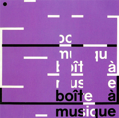
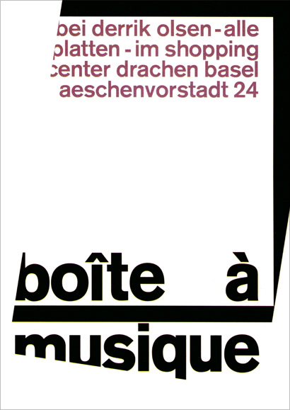
Michael Johnson recently suggested that flexible identity solves problems associated with multi-channel, multi-lingual brands by allowing them to flex and adapt to different circumstance. It’s true, today’s brands need to be used in many different ways across many different medium. This makes it nearly impossible to prescribe a fixed solution for every possible situation. One approach is to build in a level of flexibility so the identity can adapt to best suit the situation it’s in. Thinking like this sounds like a recent trend in design, so it may come as a surprise to learn that its roots are in Swiss modernist graphic design: Karl Gerstner’s identity for Boîte à musique, a record shop in Basel, in 1959.

Boîte à musique

Boîte à musique from Karl Gerstner: Designing Programmes recently republished by Lars Müller Publishers.
[Click image for a larger view.]

Even though the system is somewhat basic, Boîte à musique is undeniably a flexible identity. What’s more interesting than how this flexibility looks is how Gerstner describes it. He explains its ability to change, adapting to functional requirements, as its signature and style in one [1]. Instead of being remembered by its consistent appearance, Gerstner was interested in his identity being remembered for something less tangible like its overall style, tone or mood.

Skip forward 22 years to August 1st, 1981 and the worlds first video music channel starts broadcasting. In the words of VJ Nina Blackwood, all day, all night, in stereo. Designed as a blank canvas for creativity the MTV logo has changed innumerable times over the past 26 years. Yet in each iteration, it has remained fundamentally the same. Unlike Boîte à musique, MTV doesn’t change for functional reasons. MTV adapts on a purely stylistic level changing its look to match the latest graphic trends. The logo was conceived to embody a rock ‘n’ roll attitude that totally rejected corporate design. It took on the attitude of the audience it was broadcasting to and, to this day, it continues to change, constantly aligning itself to its audience’s taste.

MTV Logos

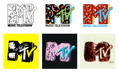
MTV logos, old and new.

The thing that the Boîte à musique and MTV identities have in common is the same characteristic which seems to appear in all flexible identity schemes — the brand as content in itself. This shift from the identity as a badge to the identity taking centre stage can be seen in brands where the content, service or product isn’t unique. For example, MTV’s content is indistinguishable from any other music channel so it’s important that the identity is somewhat entertaining in itself. Identities which remain rigidly consistent stop being entertaining after you’ve seen them once. Conversely, brands with strong, recognisable and unique products often don’t need flexible identities because they would add little or nothing. Apple is one of the most exciting brands of recent times yet the excitement comes through its products and philosophy of innovation, not through its static identity.

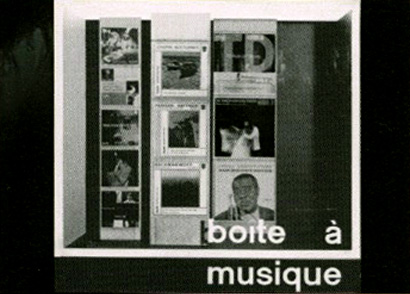
Karl Gerstner did something very interesting with Boîte à musique. He says that he didn’t feel bound to the identity for very long [2]. And so, after developing it to change to functional requirements, Gerstner added a second dimension to the flexibility: Playfulness. These two characteristics, functionality and playfulness, created a tension which manifested itself in visually arresting work. Boîte à musique didn’t always look the same. Instead, the tension generated by trying to be simultaneously functional and playful became the recognisable and consistent element of the identity. Gerstner started to think about identity operating on more than a visual level. He started thinking of identity communicating personality rather than simple communicating consistently.

Applying the Boîte à musique identity in a playful way. From Visual Language by Karl Gerstner.

The identity becomes a showcase. Also from Visual Language by Karl Gerstner.

Even though this work is nearly fifty years old it contains important lessons for people developing flexible identity schemes today. Gerstner considered the personality he wanted to convey and then developed a system to express this personality. The identity didn’t look different every time for the sake of looking different. It looked different to communicate a very specific, highly considered thing. It communicated a personality, an identity in the human sense of the word identity. Something which is only possible by showing change over a period of time.

When we develop flexible identity schemes we need to consider how and why the identity changes, and even if it needs to change at all. This should be as important as the choice of colour palette or typeface. It’s a design decision in its own right and, like colour and typography, its choice is loaded with meaning.

Back to my Design Museum visit in late 2006 and it’s worth remembering the technical limitations that constrained an identity like Reuters forty years ago. These limitations are disappearing faster than ever and the notion of brand and identity is fundamentally changing with it. The possibilities for identity schemes of the future are exciting but in this excitement we shouldn’t lose sight of design fundamentals like understanding what we’re trying to communicate and why.

[1] From Karl Gerstner: Designing Programmes. Published by Lars Müller Publishers.
[2] From Visual Language by Karl Gerstner. Published by Hatje Cantz.

Jon Hewitt is a designer who works in London for brand specialists Moving Brands.

Maintained through our ADV @ UnderConsideration Program
ENTRY DETAILS
ARCHIVE ID 4431 FILED UNDER Branding and Identity
PUBLISHED ON Feb.13.2008 BY Speak Up
WITH COMMENTS
Comments
Jose Nieto’s comment is:

Thanks, Jon, for bringing Karl Gerstner into the flexible identity discussion -- the way Wally Ollins talks about it, you'd guess that the approach was just invented. I did have a couple issues, though:

The thing that the Boîte à musique and MTV identities have in common is the same characteristic which seems to appear in all flexible identity schemes — the brand as content in itself.

I disagree: in both examples (as well as in some Wolff-Olins recent work in the same vein), the brands work as structures for content -- filters, as it were. That's one of the more intriguing aspects of this flexible identity trend: these marks can only be fully understood in conjunction with context: they meld, synthesize, rather than overwhelm. They're almost literal interpretations of the idea of brand as cognitive virus.

This shift from the identity as a badge to the identity taking centre stage can be seen in brands where the content, service or product isn't unique.

Strictly speaking, content, services, and products are rarely unique, though our perceptions of them can be. In any event, the theory falls apart even with the examples given: when MTV came into the scene, it was unique (at least at the national level), but it's identity has been flexible since pretty much day one.

Again, thanks for the article.

On Feb.14.2008 at 03:41 PM
Peter Whitley’s comment is:

I'm struggling with this topic and I'm not sure if I'll be able to articulate my confusion accurately.

A brand identity and, namely, the graphics that reflect it are categorized in this editorial as "flexible" and "static." My understanding chokes on the notion that lasting identities are universally dynamic...it's merely the pace in which they're reinterpreted that expresses the nature of the brand. A mark that has little consistency says something quite different about a brand than one with a constrained appearance.

The appropriateness of a dynamic mark being rooted in the unique qualities of the brand's service/product/etc. is interesting. I'm not sure if I intuitively believe it though. Eddie Bauer offers not-so-unique products based largely on lifestyle considerations...but would they be well serviced by a flexible identity? Probably not.

It seems to me to have more to do with the expression of fast-paced urban life. What do brands with dynamic identities have in common? They seem to embody that on-the-go-so-hip lifestyle of city dwellers.

I realize I'm being a bit obtuse as I don't fully comprehend the nature of identity. Still, the topic is really interesting and I appreciate the article (and Jose's thoughtful response as well).

On Feb.14.2008 at 06:17 PM
Peter McRae’s comment is:

I've attempted, with varying degrees of success, to create flexible identity systems. So I appreciate this discussion.

Does anyone have other examples of successfully executed flexible identity campaigns?

On Feb.15.2008 at 11:16 PM
Ben Weeks’s comment is:

Right on Jon!

On Feb.16.2008 at 05:46 AM
Peter Whitley’s comment is:


The few national brands that I can recall are Jones Soda with its user-submitted images and the short-lived OK Cola...Coke's failed attempt to address Seattle's gen-x crowd.

Skateboard companies, especially those that make the deck portions (the maple part with the graphics), seldom have a consistent brand look. Logos, if there is one at all, are often cropped, skewed, hand-drawn, and run through all manner of creative abuses. And these companies are in fierce competition for a customer that prides itself for its brand loyalty.

On Feb.16.2008 at 10:31 AM
jan’s comment is:

Thank you for this article, Jon.

An interesting topic I'm interested in since a longer time. The boite a musique example you mentioned is a great to show qualities of as you call it 'flexible' identities.
But is it really a flexible identity? Isn't it just a flexible logo as part of a normal identity?
You point a good part of these identities (and Jose comment as well). The changing background and environment of identities.
In my opinion contemporary identity design is doing the mistake that it is still thinking in rules of former graphic design. A pity. A flexible identity could be so much more than just a flexible visual 'logo'.

Another step.
Does we still need logos? Or more than ever before?

On Feb.16.2008 at 02:11 PM
Armin’s comment is:

It's important to differentiate between a logo that can take on different permutations, yet still be the same logo and an identity — which is a kit of parts including the logo, typography, color palette, visual elements — that can adapt and change based on context and application.

The MTV is a flexible logo. There is no real identity, other than the flavor of the moment that can surround the logo and content. Whether it's the flying orb or some other cute animations/graphics package developed for each season or program. You could say that MTV's identity is having no identity, but that's not the point. There is no set of persistent elements that tie one MTV phase with the next, other than the logo and the coolness factor. The latter being more of a brand statement and positioning than an identity.

On the other hand, something like the Walker Art Center's identity — both old and new — is an evolving, common set of elements and applications that are used consistently across a wide range of applications that together form a flexible identity: recognizable no matter where or how you see it.

The London 2012 identity is flexible. The GE identity is not, this one is a strict identity system, always applied nearly in the same way, even if you have a dozen pretty colors to choose from.

As far as the more philosophical question of whether the brand acts as content or not is... well, weird. Branding is the associations we make based on things like the identity, the performance of the product or service, our interactions with it, the advertising, etc. so the question becomes rather implosive as everything makes one or the other work. The brand has to be in place so that different associations can be triggered through an identity; and an identity has to be well developed to help trigger those associations... So... um... yeah. There is probably a better way to frame Jon's thoughts and Jose's remarks into a less semantically confusing way.

On Feb.17.2008 at 04:35 PM
Grez’s comment is:

Nice work on the article Jon. The recent branding for channels five and E4 spring to mind, from my understanding they fall under the same category. The only immediate dilemma (and I'm talking from experience here) is actually trying to convince a prospective client to have a 'dynamic' identity, or indeed make their existing identity a dynamic one. The very term simply scares them off. It seems nobody likes change, especially when it comes to their logos.

On Feb.18.2008 at 08:43 AM
Armin’s comment is:

Grez, many times it isn't that clients are afraid to change or to embrace a flexible identity, it's simply a matter of facing the question of WHO will implement the identity once it's been established. Most often, a firm will set up the principles of the identity and an in-house team follows through, or a smaller design firm. This is usually the breaking point for accepting a flexible identity: The prospect of who will actually flex it.

On Feb.18.2008 at 09:24 AM
Neil McGuire’s comment is:

Thanks for the article and comments, which raise some interesting questions - In terms of flexibility, different organisations have different needs. One thing which puzzles me is the rigidity with which many 'creative' cultural organisations approach branding. Surely the most forward thinking and appropriate response here is to have no brand/identity and approach things with creative people/individuals at the fore, as per Zak Kyes and the Architectural Association in London (particularly their approach to printed materials) http://www.aaschool.ac.uk/

On Feb.18.2008 at 09:36 AM
Danny Tanner’s comment is:

To often it seems we discuss visual
identity in terms of static and flexible,
yet rarely are systems that black
and white.

A visual identity is not simply a sum
of its parts. An identity tool kit of a
logo, typeface, color palette, and other
assorted visual elements is only
designated raw material. It's how those
materials are used that really
give an organization its visual identity.

Usually, it only takes a few basic
rules about handling those elements
to effectively create a malleable
system appropriate for nearly every
application. Very simple grids
that leave a good deal open for
interpretation can work well if
there are enough other simple
rules in play.

Determining how much an identity
can be left open for interpretation
depends greatly on how large
the organization is, and their quantity
of communications. Smaller
organizations (like many museums)
can much more easily and effectively
negotiate very flexible systems,
where say, massive corporations such
as GE could not.

Smaller organizations tend to have
either a single design studio/agency
developing all their communications
on an in-house department, where
mega-global companies may have fifty
agencies developing their collateral.
When you have fifty cooks in the kitchen,
consistency and quality control can
nose dive unless very strict rules
are in play.

Gerstner's Boîte à musique identity
may have been ahead of its time.
It relied on a simple flexible element
(along with stationary ones) when
most folks at that time considered
stamping a logo on something
"identity." Let's also note the size
of Boîte à musique and the amount
of communications they required.

On Feb.18.2008 at 12:45 PM
Ali Gibbs’s comment is:

Nice one Jon, "Let change be your constant". AG

On May.21.2008 at 02:12 PM