


Lately, I have given myself over to a particular type of thought; my mind wanders the fields of the iconic, thinking about the ingredients of legend, those qualities that separate the wheat from the chaff for all time. Icons, I have come to realize, transcend their original purpose. This is the essence of timelessness. Looking at the book covers of Alvin Lustig or the posters of Josef Müller-Brockmann, I do not concern myself with their original intent. Though they may proffer products that ceased to exist many years ago, I am entranced by the power of their message, the timelessness of their design.
For a student, these are dangerous waters to tread. As the saying goes, one should walk before they run, and pondering the nature of design icons can have a deleterious impact on one’s work. Yet, I cannot help it. It is, no doubt, a remnant of my studies in philosophy, where I was encouraged to wander in the land of the abstract, measuring the nature of things by the intellectual shadows that they cast.
This all began on a sunny winter day in Atlanta during 2007. Having recently completed the first year of my design education, I was about to take a rather cold and unexpected dip in unknown waters. I met a former instructor for coffee, and he encouraged me to join a project. The project was steeped in excitement. A new not-for-profit was working to save a design icon of magnificent proportions. For a student, this is the stuff of which dreams are made. I might actually pass within the shadow of an icon, instead of simply relying upon the work of Meggs, Heller and others to educate me.
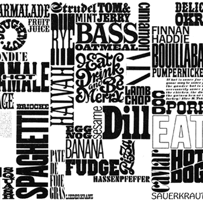
The icon in question was the Gastrotypographicalassemblage, the wall from the CBS cafeteria that was conceived and designed by Lou Dorfsman, the legendary art director. Though many designers are aware of its existence, few understand the magnitude of the achievement that it represents. The Gastrotypographicalassemblage, commonly referred to as “the wall,” is enormous; it is 33 feet in length and 8 feet in height, give or take a few inches. The piece is a mélange of food-related words and objects, a perfectly orchestrated collage of appetite. At last count, more than 1,450 letters converge to create this experience. No doubt, you have seen similar orchestrations, walls of words in restaurants or shops that were composed with vinyl letters; yet, the Gastrotypographicalassemblage is the first of its kind. It is the icon to which others owe their existence.
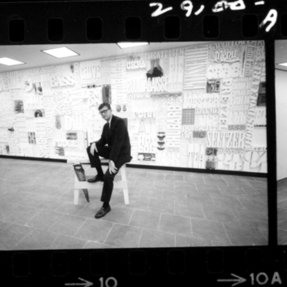
Lou Dorfsman sits in front of the completed Gastrotypographicalassemblage.
Completed during the mid-1960s, the wall occupied the CBS building that was designed by Eero Saarinen. Lou Dorfsman was the Director of Design for CBS, Inc. at the time. Upon hearing the interior design plans for the new CBS cafeteria, Dorfsman was “compelled” to offer an alternate solution. He envisioned a wall of solid type, similar to a typesetter’s tray turned on its side. He quickly created a series of sketches and showed them to Dr. Frank Stanton, the President of CBS, who approved the project and gave Dorfsman license to design.
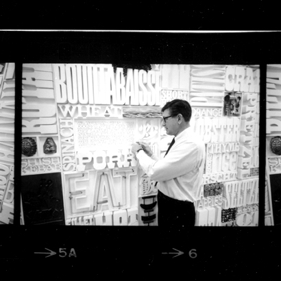
Tom Carnase meticulously hand lettered the final comps for the Gastrotypographicalassemblage.
Dorfsman created the initial comps and commissioned the creation of the first panel. Once the first panel was completed, Dorfsman enlisted his lifetime friend Herb Lubalin, the legendary designer and typographer, to concept the remaining panels. Tom Carnase meticulously hand lettered the final comps, and a team of carpenters and sculptors set to work. Each letter was hand milled out of thick pine. In addition to words, the Gastrotypographicalassemblage is dotted with food imagery, from sausages to seltzer bottles to loaves of bread. Upon its completion, Dr. Frank Stanton said of the Gastrotypographicalassemblage, “The wall never ceases to excite the imagination. To me, it represents one of the most arresting design creations to be seen anywhere.”
Lou Dorfsman inspects the Gastrotypographicalassemblage after its completion.
And, for twenty years after its completion, the wall inspired all who saw it. It graced the CBS cafeteria, and like so many pieces of design, went about its quiet mission. Yet, the wall’s future was called into question during the late 1980s after a change in leadership led to the inevitable, change for the sake of change. The wall was unceremoniously removed from the cafeteria and, save a call from a building superintendent, Richard Spiro, the wall would have been lost forever.
After receiving Spiro’s call, Lou Dorfsman called Nick Fasciano, a decorated designer, who rushed to Blackrock and collected the discarded panels. Fasciano took the panels to his Long Island home, where they sat in storage for more than 20 years, safe and dry, but slowly deteriorating.
It wasn’t until Eve Kahn wrote an article for I.D. magazine, titled “Recipe for Trouble,” that the potential destruction of the Gastrotypographicalassemblage emerged in the public’s imagination. The Center for Design Study, a newly minted not-for-profit in Atlanta, Georgia, became aware of the wall’s current state through the article, and after many discussions, The Center for Design Study became the wall’s steward, seeking to restore this magnificent piece to its original glory.
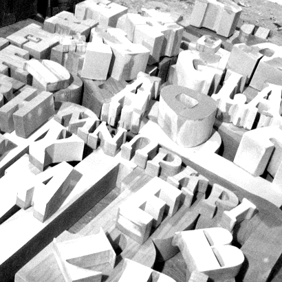
The restoration of the wall is an enormous task. More than 1,450 letters must be individually restored.
Yet, the restoration is an enormous task. The letters were originally glued to the panels, and over time, they came loose. Many of the letters were damaged beyond repair. Fasciano, who created several sculptures for the wall, is working with a team of craftsmen to repair each letter by hand: stripping, sanding, patching, sealing, and repainting more than 1,450 letters. More than 25 percent of the letters were damaged beyond repair and must be completely re-milled. Then, there are the sculptures and food objects. From the soup cans, which legendary illustrator John Alcorn developed, to the seltzer bottles, each piece must be recreated by an artisan.
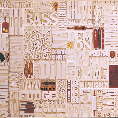
The Gastrotypographicalassemblage in color, an arresting and timeless design creation.
As I learned more about the wall and the task of restoration, I was forced to consider my original thinking from a different perspective. The wall is, without question, an icon of design; what, then, is our obligation to it? Not so long ago, design history was merely a footnote in the meandering expanse of art history, a simple nod to the commercial application of art. Meggs and others worked tirelessly to carve a niche for design history and, only now, do we understand the significance of these labors.

If you would like to support the restoration of the Gastrotypographicalassemblage, please make a donation to The Center for Design Study.
Jim Schachterle is a design student at the Portfolio Center in Atlanta, Georgia. Before returning to school, he worked in professional publishing for eight years. Jim is interested in the intersection of design and communication, focusing on how design decisions can empower organizations. His work can be viewed at unstrungstudio.com.
just a complement | best regards
http://www.typogabor.com/cbs-dorfsman/index.html
On Mar.03.2008 at 04:31 PM