


Wednesday 5.21
. . . . . .
7 Questions with Chris Sickels
. . . . . .
Doug Bartow: Chris, The Look Book’s cover appears to be a children’s book on the shelf, but the narrative has more mature themes. Was there any push-back from HOW Books to give the cover a more adult look and feel?
Chris Sickels: Honestly, no, and that was a bit of an oversight on our part. We were talking about it last night, and decided we probably should have made more of an effort to make the cover appear less like a children’s book. I think the bright colors, die-cut, and having the 2 main characters on the cover holding hands didn’t help. I know there have been a few reviews of the book critical of the cover, and I realize there are some deeper themes in the book, but I don’t think they’re beyond what children can handle. I lost both my grandfathers and my high school art teacher during the time I was making The Look Book, and talking about that with my two-and-a-half year old son at the time made the subject matter very current in my household.
. . . . . .
DB: The hand-drawn lettering in your book is beautiful. Do you have any plans to digitize those glyphs and create a typeface from them?
CS: I looked into that a few years back, and was trying to find to way to inject a certain amount of randomness into the project, so a lowercase ‘e’, for example, would appear differently in consecutive uses. Some of the ‘e’ s fill in when I draw them with a quill pen due to the tip grabbing the paper. I’m still interested in this idea.
. . . . . .
DB: The short videos you showed in the lecture really appear to have huge potential, and the audience loved them. Do you have any longer form motion projects currently planned?
CS: We’ve got a couple of television episodic projects that we are currently pitching, but we haven’t found the right market to fit that yet. It’s so labor intensive that it’s hard to keep pushing on those projects without some results. The number of people involved in a spec project like that is huge, and I can only ask so much of people in the process. Personal satisfaction can only go so far in that case.
. . . . . .
DB: You’re a trained painter and illustrator, but you’ve mastered model making, lighting and photography. How do you define yourself creatively?
CS: I usually just tell people that I’m an illustrator, and I do paintings for books and magazines. I really do think of my work as painting, because they’re usually an image to accompany text. I don’t consider myself a photographer, because I don’t have the training to do what photographers do. I feel like the photography that I do is a lot of trial and error, trying to photograph like I would paint.
. . . . . .
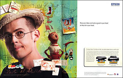
DB: The Epson campaign (image above,) which featured you and your work, was widely seen in the creative magazines. How did that collaboration come about?
CS: DDB was the agency behind that, and the campaign was “Now your ideas can look as good in your hand as they do in your head.” So, it was targeted toward graphic designers. The previous ad was the same concept but featured illustrator Richard Borge. Richard also does 3-dimensional illustrations, so they wanted an illustrator who works in that hand-made style to show that the printer is multi-dimensional, and can handle line work, flat work, digital work, photography, etc… Epson approached me and a few graphic designers to submit comps with an open-ended concept revolving around a fictional shoe company.
. . . . . .
DB: The Epson ad is a double-page spread in this month’s CA, and your face takes up a whole page, but your name is buried in what looks like 7- or 8-point cmyk text running vertically and overprinting part of the photo near the gutter (it took me a while to even find it!). Whose idea was it to make your name so small and indistinguishable?
CS: DDB was really worried about the title they were going to give me. They didn’t want to use “Chris Sickels: Illustrator” because they thought that wouldn’t resonate with graphic designers. It was really strange. They ended up using “graphic artist.” They asked me what font I’d like to use for the ad, and I told them, “Well, I’m not sure, I’m not a graphic designer.” There was dead silence right after that. I guess Richard got involved at that level, because he does graphic design as well. I ended up helping the creative director pick some fonts, and it turned out to be really collaborative.
. . . . . .
DB: Where are we going to see Chris Sickels next?
CS: I have a children’s book coming out in 2010 titled “The Garbage Barge.” It’s written by noted children’s author Jonah Winter and published on a relatively new imprint of Random House called Schwartz & Wade Books. This book is definitely geared towards children! (Chris laughs.)
. . . . . .
DB: Thanks, Chris.
. . . . . . . . . . . . . . . . . . . . . . . . . . . . . . . . . . .
11:15am
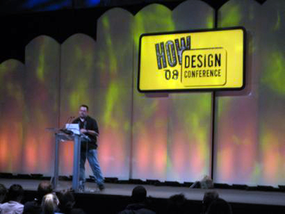
The Art of Leadership
Bill Strickland
CEO, Manchester Craftsman’s Guild
How session link
Alas, all good things must come to an end. I had to miss the closing keynote and just got back to home base in Troy, NY around 3pm. Hello, deadlines. If anyone caught the closing, please post some details by leaving a comment. I have 2 more interviews to transcribe (one with Chris Sickels, one with 2 seniors in the BFA program at Purdue University) and will add them to this entry post-haste.
Congrats to Bryn Mooth and her team at HOW for a great 4 days, everyone I spoke to had an amazing time.
. . . . . . . . . . . . . . . . . . . . . . . . . . . . . . . . . . .
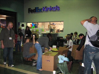
Image above: What do you do when you have to fly home and you’ve been collecting every T-shirt, swatch book, and free poster stuck in your face for 3 straight days? A: You line up in a long queue at the conveniently located conference FedEx/Kinko’s and ship it to yourself.
. . . . . . . . . . . . . . . . . . . . . . . . . . . . . . . . . . .
9:45
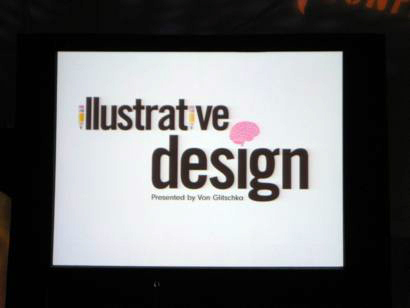
Illustrative Design
Von Glitschka
Illustrative Designer
Glitschka Studios
Salem, OR
How speaker link
How session link
Von is mad busy, here are his multiple www sites:
Glitschka Studios
Keyboard Characters
Vonster
Illustration Class
Three Thumbs Upward
Happy Afro (hilarious)
Von’s podcast
Von’s new book: The Texture Book (How, 2007)
Von has taken the podium. I’m sure many SpeakUp and BrandNew readers know ‘vonster’ from his witty posts and hilarious animated gifs that he seems to be able to create in no time whatsoever. Von has been given the honor (read: awesome responsibility) of the last programming session in the large auditorium before the closing keynote by Bill Strickland at 11:15am. Von states his is a bit nervous (it doesn’t show) and that imagining all of us naked is not working! He tells us that he’s going to go fast, but that the entire presentation will be available in a few days for download at his Illustration Class site. Nice.
Von will be showing a lot of logo designs, so he can speak to the entire creative process. He’ll keep the projects in the ‘small business’ category, since small business makes up so much of the workload that most of us do everyday.
Von’s method:
Project preparation & research
Not glamorous, but required. Gauge client’s expectations and understand their purpose. Define the client personality through a creative brief. Use photo references, know what to draw.
Anyone can draw a cat.
Von asked 7 friends who are not illustrators to draw cats, he shows some pretty good examples, as well as some not so good. Point: drawing from memory is not effective.
Visual sources
use flickr, yahoo! images, stock photos, movies, your own digipix etc.. to reference images you want to draw. Von is showing the custom “Barry Bonds” Photoshop filter he used to beef-up the muscles on an image of a Roman Centurion. He phonied up a Photoshop pull-down menu to show a selection of the “Barry Bonds” filter. Too funny! Also, ask the client for visual references…but that doesn’t always work. The best use references, so should you. Von is showing stills from Disney’s The Lion King, and how Disney artists went to zoos and drew live lions as studies for the animated feature.
Style selection
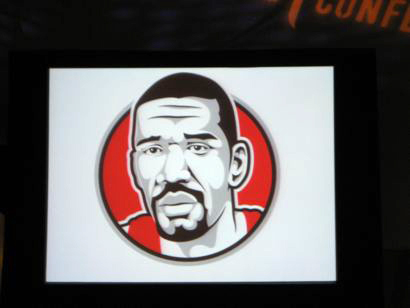
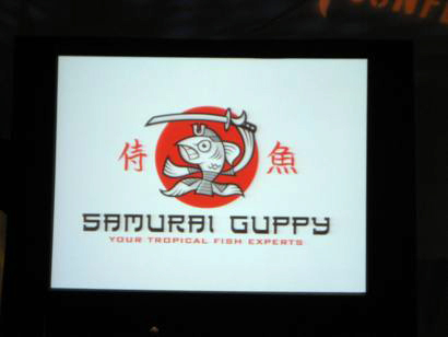
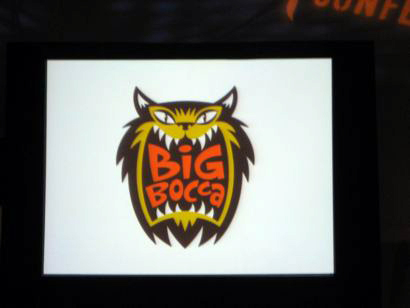
Determine a style, as illustration is style driven. It’s really important to select the right style for the particular job. Von is scrolling through a bunch of his illustrative marks, images below. He’s speaking to the particular visual style of each of the images, and how he arrived at choosing that particular style for each slide. Q: can you pick a wrong style? Von says yes, then shows Wolff Olins 2012 London logo on the screen, along with an English tabloid front page with the headline, “London Logo Causes Epileptic Seizures.” Crowd howls!
Thumbnail sketching
Do a ‘brain dump’ and get your ideas down on paper. Von keeps a ‘file of lost ideas’ at his studio, and occasionally he can reuse some of them. Thoroughly work out your concepts in advance. Isolate your strongest directions.
Refinement
Learn to art direct yourself, ie: when in doubt, redraw it. Use the ‘fresh eyes’ effect: when you like something, set it aside for an hour then come back and take another look. Chances are you’ll find something you want to fix. Avoid visual tension. Von uses some simple geometric examples to show us how to avoid this, or how to augment it. Think in shapes, and work until you have a final refined sketch. Know when you’re done.
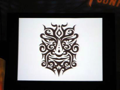
Image: Umm, yeah, Von can draw…
Building your artwork: a road map to success
If you can think in shapes, refining vector artwork is much easier. Leave no room for guesswork. Become a Bezier-point jedi master. Von recommends Leslie Cabarga’s book The Logo Font & Lettering Bible. Symmetry is your friend, draw half a shape, then copy it and flip it. Pay attention to the details.
Final art and beyond
Only show your strongest ideas. If you show a client a version you don’t like, there’s a good chance it might get selected. Stay creatively consistent. Von is showing a few examples of some of his failures, and telling the hilarious Upper Deck logo foil stamp story about making the logo 400% bigger.
Loud applause!

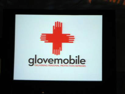
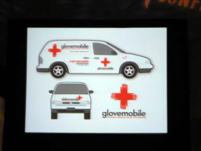
Project above: Copeland Safety Products. Mary Copeland delivers surgical gloves to local doctor’s offices. She had no identity to speak of, but her clients referred to her service as the ‘glovemobile.” Von latched on to that immediately, and convinced her to change her name and identity.
. . . . . . . . . . . . . . . . . . . . . . . . . . . . . . . . . . .
8:30am
Continental Breakfast
According to Mr. Breakfast, the presence of meat is a primary distinguishing factor between a “regular” breakfast and a continental one. I did not know this. Of course, I didn’t know there was a www site called Mr. Breakfast either…
. . . . . . . . . . . . . . . . . . . . . . . . . . . . . . . . . . .
7 questions with Katherine McCoy
. . . . . . .
Doug Bartow: Kathy, we both ‘graduated’ from Cranbrook in 1995. I went off to work, you moved to Colorado and IIT in Chicago. Other than today’s lecture, what have you been working on recently?
Kathy McCoy: I’ve been very involved with design history and research. Last year, I worked with University of the Arts (formerly Philadelphia College of Art) to document their history on their 40th anniversary, which was really interesting. I think I did 35 or 40 phone interviews with past faculty and students, and I delivered the keynote address for their anniversary symposium. Another project which I’m currently working on is tracing the history of Herbert Bayer’s graphic design practice in Colorado. Bayer moved to Aspen in 1947 and did a lot of work for the ski industry. Bayer is best know for his painting, sculpture and architecture, but most people don’t know about his graphic design practice. Also, I’ve inadvertently developed a local design practice in Colorado and I’m currently working with the Forest Service and the Bureau of Land Management designing trail maps and interpretive kiosks. A lot of people who use these maps are on horseback or mountain bikes, and have trouble reading a traditional fold-down style of map. I use these trails myself, so working on this project is very exciting.
. . . . . . .
DB: Can we expect any more design workshops from High Ground in the near future?
KMc: Definitely. We’re partnering with AIGA for our 5th annual Image, Space, Object Workshop this August 7-10 at Rocky Mountain College of Art and Design in Colorado. High Ground allows us to stay engaged in teaching, without the regular schedule that teaching usually requires.
. . . . . . .
DB: How do you define your role in what many refer to as the ‘postmodern movement’ in graphic design?
KMc: In my lecture this morning, I ended the history of modernism in American graphic design in 1971 with “the rules.” Once we learned the rules, we thought to ourselves, “OK, are we now going to simply follow these rules? Or, are we going to explore and push forward in terms of graphic design expression and method.” Starting at Cranbrook in 1971 helped with the imperative to constantly question paradigms and push the envelope. Designers are supposed to break new ground with every project, so it just kind of naturally happened in the department. Wolfgang Weingart’s work was just beginning to be seen as well. He didn’t stop with what he had learned from Emil Ruder, he continued to push his expression forward. Working with Ed Fella in 1970 and 1971, also helped influence the department and push us in a direction that could be called postmodern graphic design.
. . . . . . .
DB: What one thing do you feel is most misunderstood about postmodernism in the context of design?
KMc: I think “postmodernism” is the wrong term. It’s really “late modernism” or “decadent modernism,” because it was standing on the shoulders of modernism. A lot of the experimental typographic grid work which overlaid or made grids more complex, was really modernism taken to a more detailed next step. What we were doing was getting away from the minimalism of modernism, and introducing hand gestures and chance.
. . . . . . .
DB: Same question for modernism. What do people get wrong?
KMc: There’s a mistaken idea that modernism is strictly a formal vocabulary, and can be defined by the look of Helvetica and typographic grid systems (structural expressionism.) The conceptual side of modernism is often overlooked. This includes rationalism, objectivity, clarity and hierarchical organization of messages in the terms of breaking down messages to their component parts. My approach to graphic design is still very modernist at the outset of a project because I go through that whole analysis, but my visual solutions are not as minimal anymore.
. . . . . . .
DB: Cranbrook’s Design Department was one of the first programs to actively seek out students with design potential, but not necessarily formal training or an undergraduate degree in design. In your view, what effect did that approach have on the collective creative output from Cranbrook during your tenure?
KMc: I think a lot of students who never learned the formal rules of graphic design never had to rebel against those rules. As a result, they did a lot of original work. We were interested in hybrids. Students who were writers, or had studied architecture or product design brought really interesting perspectives to the department and created a dynamic that wouldn’t have been possible otherwise.
. . . . . . .
DB: What one thing do most people not know about Kathy McCoy?
KMc: Ha! I love figure skating. The emphasis on form and style really appeals to me.
. . . . . . .
DB: Thanks, Kathy.
. . . . . . . . . . . . . . . . . . . . . . . . . . . . . . . . . . .
the closing keynote by Bill Strickland was extremely powerful and moving. it did not pertain directly to graphic design, per se, but sill related, as design is everywhere. he just spoke about humanity and hope and opportunity.
environment dictates behavior.
his presentation style was very moving and relatable.
my two favorite sessions were the creativity session by Stefan Bucher and John Foster, and the session by Petrula Vrontikis. insightful and entertaining.
On May.23.2008 at 02:19 PM