Speak UpA Former Division of UnderConsideration
The Archives, August 2002 – April 2009
advertise @ underconsideration
---Click here for full archive list or browse below
  
Judging Books by their Covers and Movies by their Posters

For their 1,000th issue, Entertainment Weekly has gathered 1,000 “New Classics” representative of the last 25 years in the realms of books, movies, music, and television. 50 of those new classics are prime matter for discussion among graphic designers: 25 Perfect Movie Posters and 25 New Classic Covers. Like any list, theirs is as valid as yours or mine, and unlike a design annual, the selections in this list seem more inherently tied to the pop cultural impact of the movies or books these designs represent, instead of putting the spotlight brightly on the typography, art direction, and concept — meaning, Almost Famous as the most perfect movie poster ever seems impossible. Following are the top 5 in each category, and in order. Agree, disagree, and recommend your own.

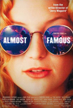
No. 1 / Almost Famous / Poster design by Pulse Advertising / Unless you are a fan of Kate Hudson’s lips, I don’t quite see how this is the best poster in the last 25 years. The reflection-on-the-sunglasses is a cliche, and there is nothing particularly unique about the rest of the it. For my money, the Hancock poster pulls this off more convincingly.

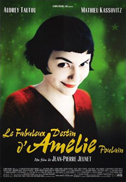
No. 2 / Amelie / Okay, so in this case I’m a fan of Audrey Tautou, and the photography is interesting. I just wish someone had actually handwritten the title, instead od just using a typeface out of the box. Or at least, modified the repeating characters a little bit.

No. 3 / American Beauty / Poster design by Pulse Advertising / I wasn’t sure about this one, but if you consider the simplicity of it, it’s quite remarkable that it’s so uncluttered for a Hollywood poster. Too bad that when you look closer, as the poster suggests, you are rewarded with some badly spaced Times.

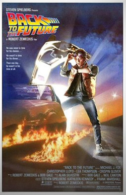
No. 4 / Back to the Future / Illustration by Drew Struzan / Hard to argue against this master illustrator, and the “logo” for the movie is quite clever but, then again, I’m a sucker for reverse italics.

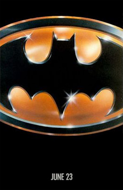
No. 5 / Batman / Poster design by B.D. Fox Independent / Yes. Although not as hot once you put in all the other poster crap, nor when you outline badly the actors’ names.

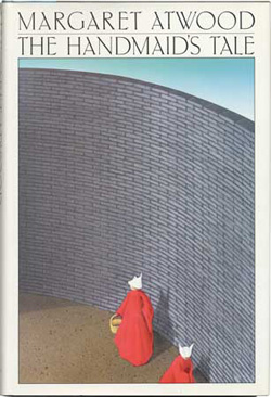
No. 1 / The Handmaid’s Tale, by Margaret Atwood / Design and illustration by Fred Marcellino / I’m going to have to claim ignorance on this one. Not sure why it’s in the top spot.

No. 2 / A Million Little Pieces, by James Frey / Design by Rodrigo Corral / Few book covers have been in the news and the mainstream’s attention like this controversial candy-coated one. The aqua background looked great in all the newscasts. Even without the attention, this is a memorable cover.

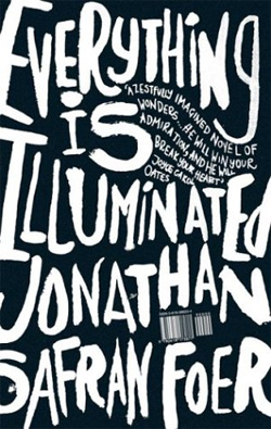
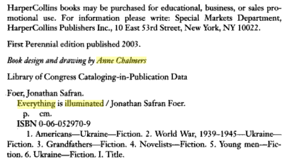
No. 3 / Everything is Illuminated, by Jonathan Safran Foer / Design and illustration by Anne Chalmers / Lovely type illustration. But is that enough?

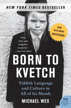
No. 4 / Born to Kvetch, by Michael Wex / Design by Jennifer Carrow / Great photo. Great type. However, not all Hasidic Jews are Yiddish, and not all Yiddish-wielding Jews are Hasidic, so there is a little bit of a reductive representation here, but it does convey the idea of the book quickly.

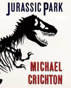
No. 5 / Jurassic Park, by Michael Crichton / Design by Chip Kidd / With six covers in the top 25, Chip’s cover for Jurassic Park topped in at the five spot. While I am not a fan at all of heavier “J” and “P” in the title — some work should have been done to maintain even weight among the letterforms — the starkness of this cover is pretty captivating. Also, bonus points go to a book cover influencing the logo for a movie franchise, at the designer’s credit expense.

Maintained through our ADV @ UnderConsideration Program
ENTRY DETAILS
ARCHIVE ID 4964 FILED UNDER Discussion
PUBLISHED ON Jun.27.2008 BY Armin
WITH COMMENTS
Comments
JonSel’s comment is:

I prefer the Almost Famous poster to the Hancock interpretation because all the title information is kept centralized and incorporated into the imagery. It makes for a more singular image. Best poster in the last 25 years? That's a tough call.

Maybe I missed something, but I always wanted the American Beauty poster to have something hidden within. The "look closer" line obviously applies to the movie's central theme, but it seemed like it should have been incorporated into the poster.

On Jun.27.2008 at 10:32 AM
Doug Bartow’s comment is:

For my money, the Hancock poster pulls this off more convincingly.

Nice image, but the anamorphically scaled Bank Gothic on the poster is just plain awful.

On Jun.27.2008 at 10:54 AM
Gunnar Swanson’s comment is:

So Armin is on the record as preferring Will Smith's lips to Kate Hudsons, even when the former are deliberately made dried and crusty.

On Jun.27.2008 at 01:03 PM
kevin’s comment is:

I believe the Everything is Illuminated cover is done by the (imho) inimitably talented Jonathan Gray of Gray 318. And in response to the question, is it enough, (again imho) YES, it certainly is.

On Jun.27.2008 at 05:24 PM
Armin’s comment is:

Kevin, I thought it was John Gray too, but the writing on the wall credits Anne.

On Jun.27.2008 at 05:36 PM
JonSel’s comment is:

I thought it was John Gray too

Could it be a case of the design credit food chain? Perhaps Anne Chalmers was hired to art direct the cover and she, in turn, hired Gray for the lettering?

On Jun.27.2008 at 07:55 PM
Kevin’s comment is:

sorry if I'm being dumb Armin, but where is this writing on the wall of which you speak?

Either way, I think its a beautiful cover. As for the rest of this list... let's just say I think design journalism has a long way to go to cut into the mainstream in this continent.

On Jun.28.2008 at 12:32 AM
Armin’s comment is:

On Jun.28.2008 at 09:27 AM
Pesky’s comment is:

Recently walked into a Barnes and Noble to do some shoplifting and looked at book covers for a while...

Is there such a thing as too-clever-by-half design? Sometimes covers convince me pick them up for a second, but reading the first page is the test of an interesting book.

Got a copy of Zagat's to find a good Chinese restaurant in Atlanta: Tall, dark red cover with white type.

On Jun.28.2008 at 10:01 AM
Jose Nieto’s comment is:

Armin, the credit "Book design" on the copyright page usually refer to designer of the text, not the cover. The credit for the jacket can usually be found on the jacket itself.

John Gray certainly does not have a problem taking credit: http://www.gray318.com/books.html.

As far as I'm concerned, the EW list ridiculous. Then again, so it the magazine.

On Jun.28.2008 at 03:25 PM
Jose Nieto’s comment is:

What I meant to write: As far as I'm concerned, the EW list is ridiculous. Then again, so is the magazine.

Guess I shouldn't type and take care of a small child at the same time..

On Jun.28.2008 at 04:25 PM
kevin’s comment is:

Thanks Armin!

Having read Extremely Loud and Incredibly Close, the book design credit makes a lot of sense as Jose mentions, because there's some very interesting typographics employed in the text.

On Jun.28.2008 at 05:14 PM
nks’s comment is:

nice post, good covers and posters. also visit my book cover design blog site and give your comments thank you...

http://bookcoverdesigns.blogspot.com/

On Jun.29.2008 at 08:52 AM
Daniel’s comment is:

Even though I love the film, I would have never thought of Almost Famous as a classic poster. What a bizarre choice.

Despite the poor reviews, I personally think the Funny Games (US version) poster is one of the best things in ages.

On Jun.30.2008 at 06:12 AM
Jason’s comment is:

I think Schindler's List should have made the list. That defining image, the typewriter list of names, and the logotype of the title is one of the most hauntingly respectful I've seen.

On Jun.30.2008 at 09:35 AM
Jw’s comment is:

It's all pretty blah.

On Jul.01.2008 at 07:59 AM
Neslihan’s comment is:

I suppose I won't be able to look at any book covers or movie posters without having this in mind anymore. Oh my god, you made me become a typo- monster.
But I like it. Gives me an idea what to think about while "designing" (and laughing about others).

On Jul.01.2008 at 04:53 PM
big steve’s comment is:

I don't even know where i would begin - it's hard to name movie posters and book covers from the past 25 years that AREN'T better.

Just what's sitting on the coffee table in front of me, Hard Candy, Fear and Loathing (the movie), and Less Than Zero (the book) are all better, and more representative. I like the "illuminated" cover, but it just reminds me of the Iggy Pop album cover. Meh, maybe I misunderstood the question.

On Jul.03.2008 at 04:19 AM
illustrationISM’s comment is:

being a 'pen-inker' - i'd have to agree the everything is illuminated cover is 'good' (outta the bunch); the almost famous poster as #1 tho'!?? (they mustard voted on a monday)!

mark jaquette @
illustrationism &
bammgraphics

On Jul.05.2008 at 12:34 AM