Speak UpA Former Division of UnderConsideration
The Archives, August 2002 – April 2009
advertise @ underconsideration
---Click here for full archive list or browse below
  
Highlights from TypeCon 2008

This past weekend I had the pleasure of attending TypeCon in Buffalo. While the festivities, lectures and workshops had been going strong since last Monday, I only made it to two full days of lectures. As usual, TypeCon presents a collection of topics that can be considered, well, peculiar: A panel devoted to contextual alternates, a history of the Ludlow (a metal typesetting machine), and a wild discussion about font embedding on the internet, among others. Below are a few random things that caught my attention, in no order of importance or preference.

---

TypeCon Highlights

Script goes Sans
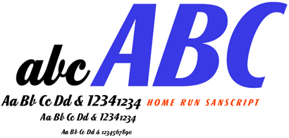
Doyald Young’s Home Run Script comes with a companion set of uppercase sans, called Home Run Sanscript, where the angle and proportions matches that of the script.

---

Heavy Metal
P22 has released Stern, the first typeface to be simultaneously released in digital and metal (available in 16 and 18pt) form. The video above is an initial cut by P22’s Richard Kegler of a documentary about designing metal type, which he filmed as Jim Rimmer designed and produced Stern.

---

TypeCon Highlights

Typefaces from Up Above
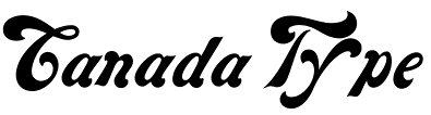
Canada Type is a small type foundry creating display typefaces at affordable prices.

---

The New Marketing
To promote Accidents Grotesque, YouWorkForThem produced this weird video. And for the slabbiest slab of them all, Black Slabbath, they had a release party with a punk band headlining. Who needs a type specimen, right?

---

TypeCon Highlights

New Type
I wasn’t aware that type distributor MyFonts updated their library so often, but they sure do, almost every day. You can stay up to date with an RSS feed.

---

TypeCon Highlights

The Missing Type Foundry
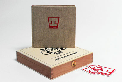
Jay Rutherford, a teacher at Bauhaus University Weimar spoke about VEB Typoart, a government-funded type foundry whose designs now live in limbo with no clear sense of who owns the rights to the designs, while a German guy that purchased VEB Typoart has all the digital data but is not quite eager to help anyone bring these typefaces back to life. More information can be found here. And Rutherford’s students have set up Die Typoart Freunde (Typoart Friends) to re-establish the presence of this foundry, and have produced a book showcasing the typefaces.

TypeCon Highlights

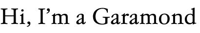
Above is one of the most interesting Garamonds I’ve seen, Typoart Garamond.

---

TypeCon Highlights

Pardon my Catalan
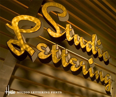
House Industries recently released Studio Lettering, a collection of three script typefaces that, in good House Industries fashion, is completely tricked out with contextual alternate characters that make the typesetting look more like lettering. But, what’s really cool about this collection, is that it comes with alternate characters, glyphs and accents that can adapt to different languages and take on the nuances of language and its depiction as typography around the world. Here is a video of this language feature.

---

TypeCon Highlights

You can, and should, spend endless hours looking at Trollbäck + Company’s work. Here is one quick thing I picked out of their reel that caught my attention, for the World Science Festival.

---

TypeCon Highlights

Type Superhero
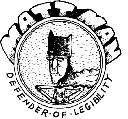
Matthew Carter’s comic alter ego, MattMan. See full comic here! Thanks to Si Daniels for the material.

TypeCon Highlights

Another Carter tidbit, his first typeface for Microsoft was Elephant (1992), later renamed Big Figgins. A nice, fat Roman. And that’s a compliment.

---

TypeCon Highlights

Mobile Type
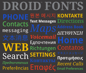
Steve Matteson of Ascender talked about the development of a type faimly (including sans, serif, monospace and too many languages) for Google’s Android operating system for mobile devices. Full info here.

---

TypeCon Highlights

TypeCon Highlights

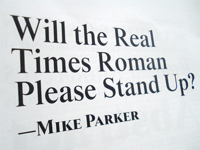
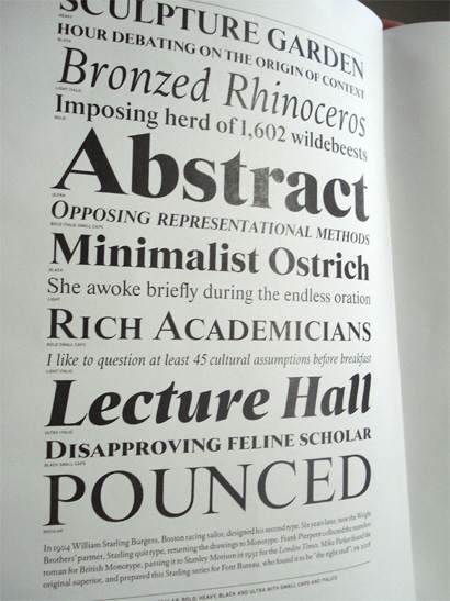
Starling is the New Times
If you are 100% convinced that Stanley Morrison designed Times New Roman, you might want to listen to Mike Parker’s account, where he explains how Starling Burgess is the designer of Times New Roman, having drawn it in 1904, 28 years before Monotype designed it. Font Bureau is releasing Starling, a revival of the original Times New Roman, shown above. Starling will come with an Ultra weight that looks absolutely delicious.

---

TypeCon Highlights

Lucky Me
During the heated TypeQuiz’s first round I won the P22 Pop Art Set by answering what is Sagmeister’s favorite typeface. The question, first asked in the TypeQuiz in 2003, may be out of date: Gotham.

Maintained through our ADV @ UnderConsideration Program
ENTRY DETAILS
ARCHIVE ID 5052 FILED UNDER Typography
PUBLISHED ON Jul.22.2008 BY Armin
WITH COMMENTS
Comments
Si Daniels’s comment is:

Armin, a lovely write up. But you weren't always so hot for TypeCon. What changed TypeCon or you?

On Jul.22.2008 at 02:01 PM
Armin’s comment is:

Ha! I have mellowed, Si, I have mellowed. I'm a dad now, so I'm too tired to get uppity about much these days. However, the questionable amount of empty seats -- in contrast to the amount of people registered -- is still a little troubling, which has always been my main criticism of TypeCon.

I also thought that a little visual pow was missing this year. A few moments of great examples of typography in use (or development) in between all the arcana would have been nice. But I am currently in research/learn mode, so I highly enjoyed the content of this year's conference.

On Jul.22.2008 at 02:28 PM
Kent Lew’s comment is:

> However, the questionable amount of empty seats -- in contrast to the amount of people registered -- is still a little troubling,

Armin -- This always troubles me, too. Any theories as to why this is? Are the offerings so eclectic that any given presentation will only appeal to a small proportion of the total? Is there just so much that folks feel the need to bail on some talks in order to get catch some networking time? Too much didactic presentation and not enough interaction?

I'd love to hear your thoughts. Feel free to contact me privately.

-- K.

On Jul.22.2008 at 04:01 PM
Armin’s comment is:

Kent, I'm happy to talk about it openly, as I don't say any of this trying to be mean to attendees or TypeCon organizers.

In all conferences, you always have people milling outside. For a variety of reasons: People catching up, people engaged in an interesting conversation, people late from lunch, people that just don't find a specific talk interesting. These are all valid reasons, and to each his own; it's only when a half-full room of people welcomes a speaker who is excited and eager to share their talk, it seems to deflate their level of energy. I know it does for me when I speak; I prefer a small room packed, than a big room empty; it's silly, but it makes a difference; so maybe it's a matter of getting a more modest venue. I've been to many conferences now, from AIGA to HOW to TypeCon, and TypeCon does have the most disproportionate number of empty seats to registered attendees. So, I just realize that I've just repeated myself, anyway...

My theory is that the single track structure of TypeCon is too limiting. It's very hard to have a lecture that everyone will be interested in; specially, as was the case this year I felt, where the lectures were very historical or academic. This were fine topics, and as I said I really enjoyed them, but I really doubt this is everyone's cup of tea. Having two tracks, one for education/research and another one for creativity/development for example would provide more choice and breadth to attendees. This changes the dynamic, but I have seen this work very well in bigger conferences. AIGA is an extreme, where they can have up to 12 simultaneous tracks. But two seems fair enough for a smaller conference like TypeCon.

I also think a single moderator would work best. Even though you, and Alan Haley and Laurence Penney did great jobs at different points, there is a lack of continuity that a moderator and master of ceremonies can bring. Not sure if that helps with attendance to each lecture, but I find that an "authority figure" helps keep people interested and in tune with the conference.

I realize that TypeCon attendees are all good friends, and this is one of the few opportunities they have to get together, so maybe there is just too much pull to be outside chatting up. This is hard to control, and there are enough breaks during the day, so I dunno...

I have another theory: The conference might be too affordable. When you are paying more for a conference you feel a responsibility or pressure to get the most out of your payment. Having a lower price point may lead to feeling less obligated to attend the lectures. Of course, a higher fee makes it more challenging to put proverbial asses in seats, but it's known to happen if you have the right roster of speakers and topics.

Since we'll be involved in the next TypeCon, I'll be happy to put our money where my mouth is, and help come up with some viable alternatives and incentives to make the experience better.

On Jul.22.2008 at 04:51 PM
Christopher Slye’s comment is:

That's funny, I like the empty seats.

One thing I liked about this year's TypeCon (and it was similar in Boston) is the huge room that allows people to come and go easily. People come in late, or leave early. Some people want to sit in the back and work but glance up at the slides once in a while. It is really nice to have extra space to do this.

Two tracks is not a bad idea, but I imagine it adds a lot of complexity to the organization of the conference. And about half the time it's annoying. The two-track ATypI conferences that I've been to always generated a lot of complaints because people had to miss things. Perhaps, in the final analysis, the question of one versus two tracks is a 50-50 proposition.

I do know that I had a hard time figuring out how much technical information to put in my presentation. It's always a luxury to be on a technical track and to know just what your audience expects.

And I agree that TypeCon (et al.) can be all about networking for some. I can say that I've now been to a lot of type conferences and some presentations just seem like something I've seen before! I am more selective than I used to be.

On Jul.22.2008 at 09:45 PM
Darrel’s comment is:

"The question, first asked in the TypeQuiz in 2003, may be out of date: Gotham."

What a stupid question. *EVERY* graphic designer's favorite typeface is Gotham. ;o)

On Jul.23.2008 at 01:42 PM
Josh’s comment is:

I'm sorry but that video for Accidents Grotesque is genius. The people in the video make videos for a living, albeit as bad as that, but it's like a cult phenomenon. Instead of getting a star to sell your typeface, you have the world's worst video people do it.

The typeface is a little better than the video, but I give Mike Cina and the YWFT team a round of applause for such a clever marketing attempt and for being home town boys.

On Jul.23.2008 at 09:21 PM
Kent Lew’s comment is:

Armin, I think that's the first time I've heard TypeCon's affordability cited as a potential negative. ;-)

Seriously, though, I appreciate all your comments. Thanks for having enough interest in TypeCon to take the time to formulate your thoughts.

As you can imagine, with as broad a constituency as we have, it can be tricky to find the right mix of programming. Tamye always makes a very conscious effort to balance the various categories of interest. But, of course, it's only through feedback from the audience(s) that we can know for sure how well we're doing. So, it's always good to hear comments.

I'll respond directly to only one of the points you bring up, because I've wrestled with this one myself. At one point early in my involvement, I too brought up the idea of breaking out of the single-track format. I had actually proposed a hybrid solution -- single-track, plenary sessions of broad interest in the mornings, combined with two-track, smaller interest sessions in the afternoon. Maybe not all three days; but some combination like this on Saturday (and maybe Friday, too) could be useful.

I thought this might preserve some of the intent of the single track (keeping group energy together and providing cohesiveness) while also possibly accommodating more material of a narrower interest without all the shoe-horning or constantly whittling away at session times to pack more in.

But the steering group has always been very intent on keeping things on a single-track. Part of this is a reaction to the acknowledged downsides of multi-track formats. People are always commenting positively that at TypeCon they don't have to make the tough choices (in contrast with that other popular type conference, for instance) and it feels like everyone is on the same page. And then there's always the additional overhead required for multi-track -- additional room support, tech support, A/V support, etc.

Still, I think the matter is worthy of periodic re-examination, and I'm glad to have your thoughts on this and all your other topics.

It's all good grist for milling and re-milling.

P.S. I'm really excited to have you on board for next year's identity.

On Jul.24.2008 at 02:58 PM
John Nolan’s comment is:

As an amateur type lover, I like the single track scheme: I get to hear about a broad range of topics.

And, in my position as amateur, I'm very glad that Typecon is so affordable, I couldn't justify it to myself otherwise.

After all, the A in SOTA is aficionados.

On Jul.24.2008 at 08:54 PM
Allan Haley’s comment is:

Armin,

I checked with Stephan about his favorite typeface. Gotham was his favorite face in 2003 and it still is today.

Allan

On Aug.18.2008 at 01:45 PM