


John Downer once compared the work of professional sign painters and type designers, concluding that “exploring the two subjects simultaneously shows that at any given time, each discipline somehow influences the other.” He went on to muse about “the visual dialogue between, say, the myriad graffiti ‘taggers’ [or untrained, nonapprenticed letterers doing sign work] and legions of self-taught, novice users of type design software…”. (1) Tokyo-based designer (and frequent PingMag contributor) Ian Lynam has followed Downer’s lead and produced Parallel Strokes, a book of interviews with graffiti writers and typeface designers. There is an ever-growing number of books on graffiti, and a scant few on type design, but this is probably the first volume to give both practices an equal footing. (2) While the content of the book leans heavily towards graffiti, Lynam’s originality lies in approaching all of his subjects as creators of letterforms, plain and simple.
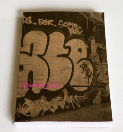
Cover, above. Spread showing work by Jonas Williamsson.
Lynam presents his central idea in the introduction to the book. “If we look at graffiti and typography and study their visual commonalities as lettering, much is revealed. Writing is graphic design. This is the first line of Gerrit Noordzij’s essay, The Nature of Writing, the introduction to his argument that writing is graphic in nature and reliant upon aspects of visual perception such as form, rhythm, color, shade and composition. Examinations of vernacular lettering have explored the visual and semantic importance of our most common surroundings. In doing so, graffiti was often noted, but had rarely been critically assessed in design writing within the last thirty years. Perhaps deemed too transgressive, too immature, or too inaccessible to design culture at large, graffiti had consistently been treated as kids’ stuff. As graffiti matured and diversified, more and more of its aesthetics seeped into graphic design, and it gained acceptance in the popular culture at large. (…) Beyond aesthetic fashion and subcultural trends, graffiti and design, specifically typography, share a common ancestry in the written word.”
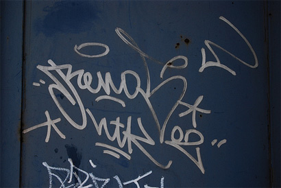
A basic tag by Renos.
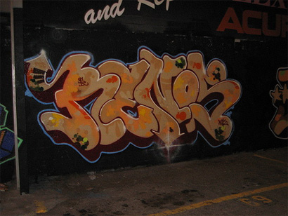
More elaborate pieces, also by Renos.
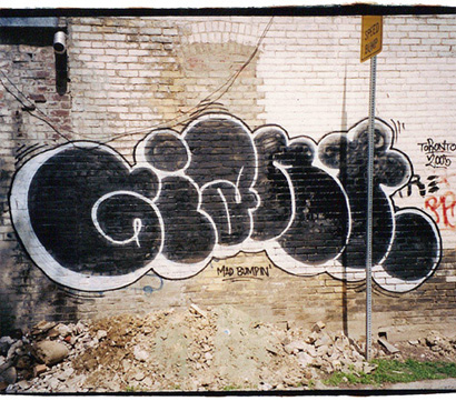
Bubble lettering by Giant.
Once he presents his theme, he takes the reader on a brief tour of the history of graffiti, mostly concentrating on the regional styles of late twentieth century America, and explains some basic terms (such as tag, piece, and throwup). More importantly, he conducts a formal analysis of graffiti writing’s letterforms, drawing on essays by John Downer (from which I quoted above) and Gerrit Noordzij to show correspondences between graffiti, lettering (including sign painting and showcard writing), and type design. “There’s an often hidden relationship between these two lettering practices, typeface design and graffiti, that is worth looking deeper into. (…) I hope this book helps others find meaning and widen interest in both the historical and contemporary landscape of lettering.” This makes “Parallel Strokes” a great title for this volume, and the point is further reinforced (albeit subtly) on the cover, which juxtaposes a photograph of a graffiti-covered wall with custom lettering by Dutch type design collective Underware.
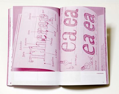
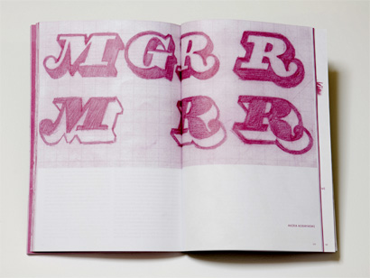
Spread showing sketches by Dutch type designers Underware.
The heart of the book is made up of nineteen (3) interviews. As if to prove one of the author’s points, many of his subjects have multiple, overlapping careers. (Chaz Bojorquez, Lady Pink, and Barry McGee are graffiti writers and fine artists, while Jonas Williamson is a graffiti writer and a partner in the graphic design studio Reala. Tauba Auerbach, a former sign painter, is now a full-time fine artist. The members of Handselecta are graffiti writers and typeface designers. And so on.) Each interview is crammed with photographs, many previously unpublished, of the artist’s work. While the individual interviews do not always seem directly related to the ideas presented in the introductory essay, as a whole they provide a rich panorama of two interconnected worlds, exposing the reader to a wealth of ideas, names, and information. Akira Kobayashi, Chaz Bojorquez, Underware, Lady Pink, Renos, and Handselecta deliver some of the meatiest interviews. The shorter interviews left me wanting more, but they do include several pages of photographs as compensation. One other quibble I have is with a few transcription errors here and there.
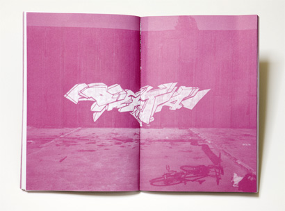
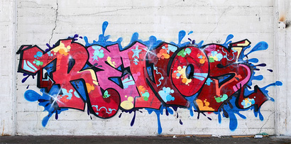
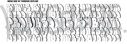
Spread showing graffiti by Delta.
Cedar Lewisohn, in his recent book Street Art, makes a clear distinction between graffiti writing and street art. “Graffiti writing is an activity completely reliant on the tag. (…) We can see graffiti writing as a genre that, generally speaking, revolves around typography and letter formation.” I’m sure Lynam would concur. Even when the artist being interviewed has very abstract-looking graffiti (for example, German partners Daim and Seak), letters turn out to be the origin or basis of this work. Lynam clearly loves letterforms, and his questions allow his subjects to give an account of their career paths — but also to reflect on, and analyze, their own practice. Now and then interviewer and interviewee lapse into insider terminology, but this is not a significant problem throughout.
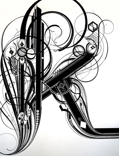
K, by Tauba Auerbach. Ink on paper.
In preparing this review, I discovered that Parallel Strokes is an extension of Lynam’s thesis at CalArts. “I had come up with the idea for this project about a year or so before attending CalArts,” he told me by e-mail. “In my break between years at CalArts, I spent a lot of time riding my bicycle around Portland, Los Angeles and San Francisco photographing graffiti that I thought was relevant, so I have enough raw material for a few books.” This aspect of the book, the documentation of the subject matter, deserves some commentary. Photography has been essential to graffiti’s popularization. Seminal books like Subway Art, along with documentary films such as “Style Wars”, helped to spread the influence of the early New York tagging styles to the rest of the world, inspiring others to pick up a can of spray paint, leave their mark, and develop writing styles of their own. In addition, graffiti tags and pieces can be painted over at any moment — photography allows them to live on beyond their physical disappearance.
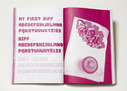
Spread showing sketches by Akira Kobayashi.
Which brings me back to Parallel Strokes. The interior of the book is printed in just one color, magenta. This bothered me at first, but later I realized that by printing in just one color, the book lets you focus on the lettershapes of the work shown. Still, I asked Lynam about this, and he gave me a brutally honest reply. “It was a matter of the printing cost: 4 color is just immensely more expensive. As far as going with the spot color, it was just an intuitive choice. Strange enough to be appealing while dark enough to be readable. Black would have been boring.” Most of the images translate well from 4 colors to 1, but a few suffer from lack of contrast. Also for reasons of cost, the book employs perfect binding instead of case binding. This poses a problem with images that take up an entire spread, as the center gets lost in the gutter.
This book is the first from Wordshape, Lynam’s boutique type foundry. In an e-mail, he told me that “I’ve always self-published on one level or another, and Wordshape is the culmination of that. In the 90s I ran a small D.I.Y. publishing venture called Migraine that put out zines, comics, books, and the occasional record. Wordshape is similar in spirit, though the output differs in being focused on language, both spoken and physical.” For his next project, he is compiling a book version of Néojaponisme, the online Japanese cultural criticism journal that he co-founded and edits.
Two typefaces from Handselecta, based on the lettering of actual graffiti writers.
Meanwhile, Lynam’s copies of Parallel Strokes, which he was selling on the book’s website, have sold out, but the book is still available from a number of distributors. Lynam told me that he is “not planning to do a reprint at the present time. There are still enough copies out there to satisfy initial demand. I would be interested in partnering with a larger publisher for a second edition, but the opportunity would have to present itself.” I, for one, hope that if the first run sells out, Parallel Strokes gets the four-color reprint it deserves. Either way, readers coming from the world of graffiti can learn something about type design, and those coming from the world of type design can discover something about graffiti writing. Both kinds of reader can walk away with a broader view of lettering, encompassing its highbrow and lowbrow manifestations.

Footnotes
(1) John Downer, “Brush Tracks to Type Design,” in Lift and Separate: Graphic Design and the “Vernacular”, Barbara Glauber (ed.), The Herb Lubalin Study Center of Design and Typography, Cooper Union, New York, 1993.
(2) Nicolete Gray briefly analyzes graffiti from ancient Pompeii in A History of Lettering, but it is barely a few lines in a 255-page book.
(3) Although the book’s advertising states that it contains twenty-plus interviews, Lynam had to leave a couple out. In an e-mail, he told me, “There were two writers who did really amazing interviews but couldn’t provide decent shots of their work.”
Ricardo Cordoba is a Brooklyn-based graphic designer and production artist currently freelancing at McCann Erickson. He spends way too much time on FontStruct.
What a great and informative review! Quite a serious subject, even in pink. Okay, magenta...the most serious of pinks! Thanks for the introduction to the work of Ian Lynam. Inspiring. Well worth a bookmark.
On Aug.27.2008 at 01:11 PM