Speak UpA Former Division of UnderConsideration
The Archives, August 2002 – April 2009
advertise @ underconsideration
---Click here for full archive list or browse below
  
Now I know my A-B-Cs

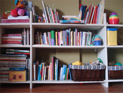
Children’s books have nestled in my heart for years, as I fondly remember certain titles or times spent perusing book fairs full of dust and memories. These days I have the perfect excuse to finally start a collection: an eighteen-month-old who loves her libros. I am still a few years away from the books I hold dear from my childhood, fragile pages and sensitive spines that would never survive the hard use the new sturdier titles endure — new titles that I happily read over and over, repetition that gives me a chance to analyze every detail.

Maya’s library

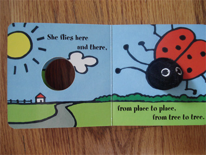
It is well understood that books are fountains of knowledge — be it a historical reference book or a lesson learned at an early age, where colors, shapes, objects, experiences and facts of life are explained to children in many ways — knowledge that needs to be clearly communicated. As I try to teach my daughter the shapes known as letters that form the words she loves to pronounce loudly into my ear, I am bemused at the type selections and the art of typesetting.

---

---

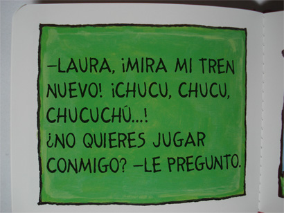
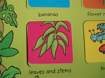
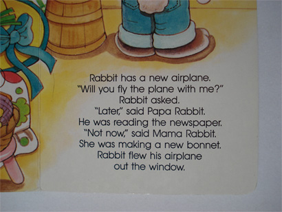
There are the traditional and legible selections that leave little to the imagination and play a secondary role to the story and the illustrations.

Title

Title

Title

Title

Title

---

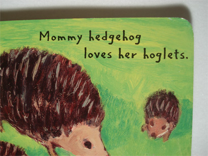
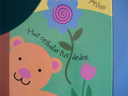
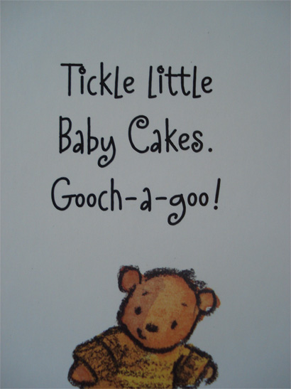
Then you have the marriage between comic sans and childish handwriting that makes my skin crawl more than fingernails on a chalkboard.

Title

Title

Title

---

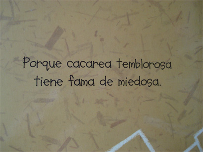
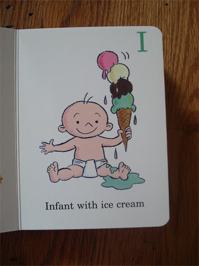
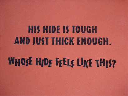
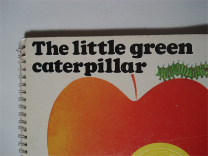
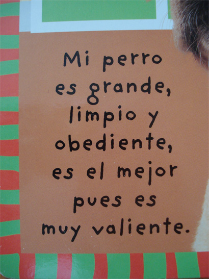
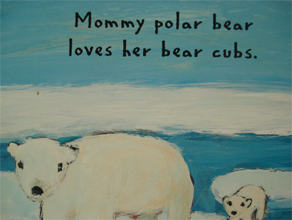
The use of all caps is also a favorite. While I see the ease of working in the caps and then the lowers in the learning experience, I can’t for the life of me see how a child is supposed to read everything in caps — especially is the base line shifts, the kerning is in the negative realm or the boldness of each letter is different based on size changes that are badly executed.

Title

Title

Title

Title

Title

---

How am I supposed to teach her each letter, when individual letters are so similar? Oh, double-story “a” where art thou?

Title

Title

Title

When the iteration of each letter can vary so greatly?

Title

Title

Title

Title

Title

---

Is she supposed to drive her bike from one letter to the next and add them to make a word to make up for bad kerning? When does a word end?

Title

Title

Title

Title

---

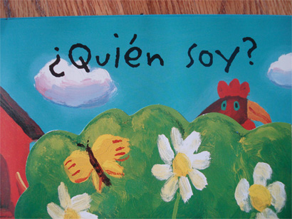
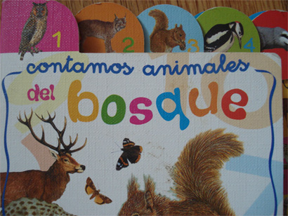
And while at it, what is up with all the centered type?

Title

Title

Title

Title

---

Ultimately, some things should not be done. Ever.

Title

Title

Title

---

So, to any children’s book designers out there who might be reading this, I dutifully beg: see the letters from a child’s perspective. Not everything needs to be set in Helvetica, but do remember how hard it was to learn/teach letters, reading and writing and ask yourself and those involved if you are helping or confusing the hell out of those four feet and under.

Maintained through our ADV @ UnderConsideration Program
ENTRY DETAILS
ARCHIVE ID 5397 FILED UNDER Typography
PUBLISHED ON Nov.05.2008 BY bryony
WITH COMMENTS
Comments
John Mindiola III’s comment is:

Excellent post. A self-professed type nut and father of a beautiful 4-yr-old boy with autism, reading children's books is a constant challenge. It's upsetting that these books have "fun" type faces that are almost illegible, especially when set in wild colors, and set in a different area every page. If I'm having trouble reading it, how can this possibly be good for my son?

It's an odd phenomenon that we teach our youngsters the ABCs with the capital letters first. I think it speaks more about the type we see as adults (most notably, signage), than it does about what would be easiest to teach children as a basis for learning to read. However, the capital letters DO have a key differences from one to the next, which is easy to see when they're set separately, like on an ABC chart.

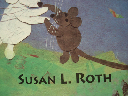
Children's books, especially for children 6 and younger, might make the best case for TRUE small caps, unlike the Susan L. Roth image (above). If we're teaching toddlers and preschoolers the ABCs as capital letters, then the transition to reading words, sentences, and eventually paragraphs with TRUE small caps seems like the logical progression.

One thing I will note though, is that the negative tracking probably HELPS the children see words as whole shapes, not just collections of individual letters. That being said, I think the leading needs to increase, especially when these books have the lines run the the full width of the page.

Also, if using true small caps, then I think an argument can be made for using typefaces of exaggerated varying widths. I'm not advocating Trajan here (I wish it would just go away), but Gill Sans, Futura, and the like.

Oh, and one more thing: bold and italics should NEVER be used. Why confuse them?

On Nov.05.2008 at 10:17 AM
Armin’s comment is:

I'm continually baffled, amused and surprised at how many children's books use Jeffery Keedy's Keedy Sans

On Nov.05.2008 at 01:37 PM
Diane’s comment is:

My five year old took an Early Admission test for Kindergarten this year (his birthday is mid-Sept. and the cut off for admission was Aug. 31) and one of his fall backs was that he could not identify any of the lowercase letters, only capital letters.

I think that in itself helps support your case.

On Nov.05.2008 at 07:41 PM
Tan’s comment is:

I think children are incredible little machines. They have an amazing capacity to learn and adapt language, both verbal and written. Plus, there have been many studies that have shown that today's kids visually process up to 10 times more imagery per day than kids from 25 years ago -- or in other words, their parents.

I know 4 year olds that can read both English and Arabic, and others that can read and write in English, as well as in Japanese Kanji. To those kids, it's all language, and "toy" in English is the same as "toy" in Arabic or Japanese. And they can switch between instantly, without thinking.

So my point is that kids have an incredible ability to process visual language -- letter forms and characters, in all shapes, sizes, fonts, whether it's good or bad.

Yes, it would be great if children's books adopted better typographic standards. I get your point, Bry. If you're going to teach them how to read, why not teach them with good type? But to suggest that poor typography is perhaps a hindrance to a child's ability to learn to read is unfounded.

Just looking around my dinner table, I see a few placemats (Pixar's The Incredibles, in all caps), an issue of Cricket (Young Children's mag, great type), a Captain Underpants book and a Pokemon book (both with good and bad type throughout). You just can't control and select everything your child will see and read. So why not train them to adapt and read everything, good type and bad type. When they get older and realize that they are children of designers, you can teach them to discern the difference.

Now, if you really want to give your kids a headstart in reading and writing, then go to a teaching supply store, and buy a bunch of McGraw-Hill early reader books. McGraw-Hill is still the standard teaching books in most K-12 schools, and their typographic standards are top-notch, as expected.

Lastly, the one thing I see in today's schools is a deterioration of handwriting skills. Penmanship is a dying art. But maybe that's just a symptom of technology and changes in communications. My father had impeccable handwriting, much better than my own. And my son's will probably be worse than mine. But he will probably be able to type 250 words per minute, and text message blindfolded, while doing three simultaneous things. That's just the way it goes, I guess.

On Nov.05.2008 at 10:20 PM
Rob’s comment is:

My wife is a children's book illustrators and getting a peek behind the curtain, the typeface seems to be the absolute least of the art directors concerns. Some of the typeface choices they make make my jaw drop, typefaces that should never see the light of day set for the main body copy. It seems to boil down to a quantity over quality thing.

XX amount of books being worked on at the same time causes the publishers to lose focus on the idea of the beauty of the printed word and become more focused on the quantity produced. I also think the fact that most of the audience can't differentiate kerning from kernals doesn't help the situation.

On Nov.06.2008 at 02:13 PM
Tan’s comment is:

Swiss children don't learn to read any faster.

On Nov.06.2008 at 04:28 PM
mc’s comment is:

I think there's something's missing in this discussion: the purpose for many children's books. I imagine that not every book is intended to teach reading (at least not primarily).

For example, the Susan L. Roth book pictured is a counting book. A toddler is probably focused on the difference between "one bear" and "two giraffes." They are learning to recognize animals and visual representations of math. Pretty heady stuff.

I think the words are only there for adults to read the stories. Unfortunately, this is sometimes challenging even for us because of bad type! But the point is that a good children's book offers many learning opportunities beyond recognizing letter forms. Learning to read may not be the point at all.

On Nov.06.2008 at 06:42 PM
Pesky’s comment is:

Children's books can be grouped in different categories, I think. (This is by no means a definitive list):

1.)Endearing bed time stories read by a parent to their child. There is a quality of sparkling innocence and timelessness that makes a book of this sort. It doesn't have to be an approved award winner with a gold embossed seal on the cover to be so.

2.) Participation books for parents and kids where the child gets to look at pictures, perhaps to count or identify objects, not necessarily to learn to read but to absorb bigger ideas.

3.)Books for a child to begin reading themselves by identifying words to objects.

4.) New children's books with a social agenda.

5.) Books made by famous hip illustrators or ghost written for celebrities to have an ego boost. Madonna's book fits this category

I've spent the last several years studying children's books. Watching kids read. Teaching a design school course on designing children's books. Talking to experts and given finger wagging lectures on how not to talk to prickly editor's. And, whenever possible, hanging around in bookstores looking at the new books, and old libraries digging up older books ("Madeleine" and "Curious George" being favorites)

And so when I was down with no illustration work I decided to make my own. With a manuscript from a gifted writer as my only compass, I would start with the first page and then just continue until I finished the front and back cover. There is nothing like having a prototype in hand and the fresh eyes of a child to read it to make it feel worth the effort.

My collection of rejection letters from big east coast publishing houses (your book is "too colored" was one response.) are enough to paper my studio if I ever wanted to get permanently discouraged. And so I gave up looking for their approval. It's possible to self publish now in ways that open all sorts of possibilities.

I've just completed a second one - a creole story - with a friend of mine who's grandchild went missing. She hopes someday that the girl will see the book and read her name and remember. It's as simple as that. A book meant for one lost girl somewhere. And yet there's a universal story here of being lost then found.

Years ago Maurice Sendak came to my school, Pratt Institute, and told us of the years of rejection he got before anybody recognized that "Where the Wild Things Are" was a classic. I admired his fortitude as well as his storytelling skill.

I have come to realize that what fascinates me most, above all else, is how amazing a child's mind is to learn and absorb. Any book that truly inspires wonder is a good book.

On Nov.06.2008 at 10:06 PM
Bryony’s comment is:

While I agree that the purpose of each book varies, I also think that any kid should be able to pick up a book—no matter the intention—and read from it without confusion. As independence sets in, kids like to read books themselves often starting with favorite toddler titles who's primary intention is not teaching to read but a book that nonetheless has established an emotional connection that a child will go back to.

There are plenty of typographic choices that need to reduce the quality of the work and it is a shame to hear that this decision is many times an afterthought as Rob mentioned.

I am all for the creative use of typography in these books, as long as the principles of said typography are not compromised.

On Nov.07.2008 at 08:31 AM
Rob B.’s comment is:

While I can certainly appreciate the typographic study and critique of current children's literature, I wonder to myself—as the parent of two kids—does it really matter?

As Byrony notes, some of these books have been around for ages and those of us who have read them have turned out just fine, and just as typographically astute. Do I think my son or daughter, when he was they were toddler, needs to worry about such things, no.

As someone noted, wacked out typography has not been shown as impediment to learning one's alphabet. And more so, some of these various type crimes (thanks Ellen for that phrase) seem utterly appropriate for the art work that accomopanies them and the audience for which they are intended.

I say all this after sharing this post with the students in my typography class who exclaimed "it sounds just like you." Especially, you see, the Comic Sans part.

I absolutely enjoyed reading the critique and from a typographic purist point of view it makes sense. But from my kids (when they were younger) point of view, maybe not as much.

On Nov.07.2008 at 02:05 PM
Sabine Krauss’s comment is:

This comment is not about books, but I thought this (http://www.wordworld.com/) may be interesting to all of you that discuss how reading, letters are taught to kids.

I recently saw this series at Target and thought it was cute/fun but I had a hard time reading some of these objects which kind of defeats the purpose of the product.

On Nov.11.2008 at 11:36 AM
Tan’s comment is:

WordWorld is scary. The computerized illustrations are contrived and joyless. And yes, the 3D words are damn hard to read. It looks like a product developed and created by a corporate marketing team, rather than someone who actually knows something about teaching kids to read. I guarantee you that it's created to support a television series.

For my daughter, the thing that helped her most to learn to read was the LeapFrog device and series of books. And we're not alone. The LeapFrog reading system has proven so effective, that many elementary schools are using it to introduce reading to kindergarteners. The books are well-designed, with good, straightforward type and professional illustrations. They are sort of like the modern-day version of Richard Scarry books. Now those are some great children's reading books.

On Nov.11.2008 at 12:42 PM
Joe Moran’s comment is:

Bryony,

Good stuff!

Have asked several friends over the years (German, Korean, Mexican, Spanish, Polish) this question: How do you think?

They have all responded that they "think" in their native tongue. CLARIFICATION: When brushing my teeth in the morning, am thinking of making coffee; getting dressed; etc… all my thoughts are internally spoken/thought in English.

Just wondering… do non-English speaking peoples internalized thought process "see" other images than English speaking/thinking people?

Realize some countries' words mean different things and are spelled differently and have different letterforms.

Example: Pumpkin in English is Calabaza in Spanish and 호박 in Korean. Same "idea" but very different letters/shapes/sounds to visualize that same orange, round "pumpkin."

How do people perceive "concretes" based on how our language spells those things?

In college a good buddy from Jordan told me of his weekly calendar: Monday: Money day; Tuesday: Two-ee day; Wednesday: Wedding day; Thursday: Thirsty day, Etc. (Forgot the rest.)

Also thinking of fun word games my grandfather used to play on my brother and I. Example: CDB? DBSABZB. See the bee? (Think Paul Rand here.)

Can only imagine people in their creative process "see" different things based on their known language.

My son— I call him son because he's so bright :-)— has fun with Dr. Seuss, Disney and Richard Scarry books, too. The pictures and words lead to internal images as well as those drawn or written on the page.

Have no idea what it's like to be bilingual, though. Imagine it takes a lot of work to internally translate one language to another and back again.

Hope that makes sense. ?!?!?

Keep up the good work.

VR/

On Nov.12.2008 at 02:35 PM
Tan’s comment is:

I'm bilingual. People who are truly fluent in different languages don't translate between languages in their head. An "apple" can just be expressed in different ways, depending on the person you are addressing, or situation. You don't see the word or think about the language -- you see the apple.

Sure, if you think about it -- you can translate between languages. But true language fluency is about communication and expression, not just about syntax and grammar. Does that sort of make sense?

I have a niece who is lucky to be fluent in 3 languages. Her parents speak English and a native language, and her nanny taught and speaks to her only in Spanish. When she was 3, she would approach me and my wife (who is not Asian), and instantly switch between languages when addressing each of us. I'm sure she didn't even think about what she was able to do -- she just knew to address her uncle one way, and her aunt in another. It was seamless. Kids are amazing.

On Nov.13.2008 at 02:04 AM
Joe Moran’s comment is:

Tan,

Interesting feedback. The idea of language is fascinating.

When thinking of "apples" not only do I "see" one but I hear the sound of the word I know to signify that object in my head. Just wonder what other non-English speaking people hear in their heads and/or if it changes anything.

Example: A friend who goes to Argentina often brings back these little cookies called "alfajores." The first time she offered me what I heard as "alpha whore," I imagined something quite different than a cookie.

But a rose by any other name would smell just as sweet, right?

Ha!

Very Respectfully,

On Nov.13.2008 at 12:09 PM
Joe Moran’s comment is:

On Nov.13.2008 at 02:06 PM
Michael D’s comment is:

The presentation of letterforms in children's books might affect handwriting development, but the variety in the typography has very little affect on the development of reading skills. (If anything, the type eccentricities, often in the form of "type crimes," prepare a child for the variation in type they will have to process in everyday life).

Children with hindered reading development will have the same problems regardless of the type issues discussed in this article.

On Nov.15.2008 at 08:08 PM
Rachael ’s comment is:

This is a fascinating topic. I really enjoyed Tan's comment about the foreign language perspective.

I have been reading my preschoolers the bilingual book "Tim and Kim" by Kay Linda Nord. It is a great book. The kids love it and they are obviously learning and putting it to use in our daily lives. Kids minds are so amazing!

This book is great if anyone is interested. I left the url. It is unique in that it teaches mexican spanish versus the traditional castilian spanish. Here is where I found it: http://kaylindanord.com/

Thanks so much for the great discussion!

On Nov.18.2008 at 02:47 AM
Colin’s comment is:

Here's a great place to look at entire Picture books before buying. What a great idea.

www.lookybook.com

On Nov.18.2008 at 02:40 PM