


Let me start by declaring that I am an ardent fan of black letter. I understand its connotations and associations to a certain fascist regime. I understand its importance as the type choice for a certain book printed with movable type many centuries ago. And I understand that, well, for the most part it can unreadable in contrast to Times and Arial. I rarely even use it myself. I’ve tried, to no avail. Still, black letter typefaces display some of the most innovative interpretations on any given character — the F of Fraktur? Drool! — and, as I noted years ago, it is one of the few classes of type that can span any given industry or audience. So, for me, going through the more than 640 pages devoted to black letter in Judith Schalanksy’s Fraktur Mon Amour was like eating ice cream from a bottomless bowl: Delicious and satisfying with sudden cases of brain freeze.

Fraktur Mon Amour was originally released in 2006 by German publisher Hermann Schmidt Mainz after Judith had shown her prototype of the book, among other enthused designers looking to get published, to them and won them over with an early facsimile of the physicality of the book: A black vinyl cover with hot pink type and hot pink page edges. Fraktur Mon Amour has enjoyed a lot of success in Europe and has garnered attention through many international design competitions, including the Type Directors Club annual of 2007, where I was one of the judges who gathered around this object as we all salivated over it and debated who would get to take it home. (Sadly, no one). This year, Princeton Architectural Press has republished Fraktur Mon Amour, making it more easily available in the U.S.

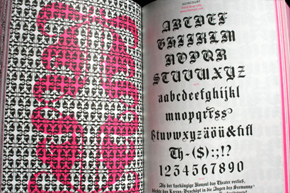
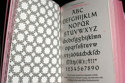
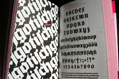
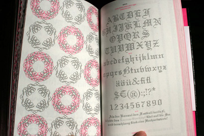
The book is deceptively simple in its showcase of 300 different black letters. On every right-hand page is the full alphabet and details of the designer, year and foundry. On every left-hand page is a graphic exercise by Judith where she simply has fun with each typeface. Actually, I can’t imagine it being fun for all 300 typefaces, making it all the more commendable that she was able to create all of them and make them feel energetic. While this structure is appealing, it is hard not to skip dozens if not hundreds of pages at a time, as you can get the gist rather quickly and if you are not into black letter or typographic exercises set in black and hot pink there is no need to stop at every page.


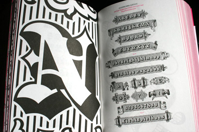
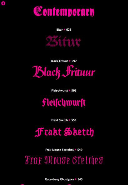
What is truly remarkable, for black letter believers and non-believers alike, is the sheer amount of variants available and the marked differences within each style when, at a superficial and uninformed glance, all might look alike. The book is divided into the common classifications of black letter — Rotunda, Textura, Schwabacher and Fraktur — but where it really shines is in the chapters devoted to Modern and Contemporary versions, showcasing the revivals and interpretations by a new generation of type designers.

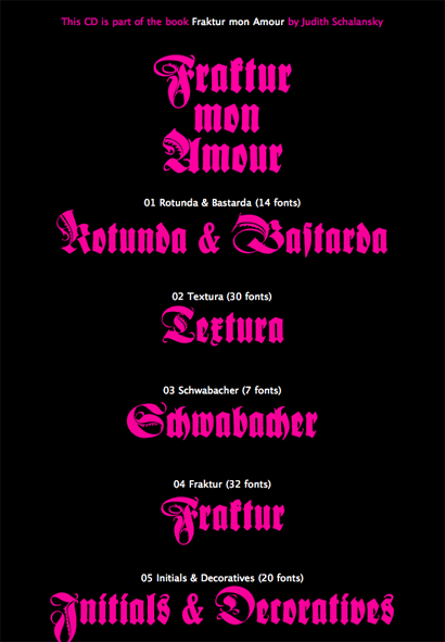
At US$75 this is not an easy purchase in times that call for frugality, but there is no denying that this is a truly collectible item, whether for reference, for inspiration or simply to show it off to designer friends who will envy you. Light sarcasm aside, the book is worth the price even if just for the juxtaposition of structure (Bible-like) and execution (Disco-like). What may convince some buyers could be the included CD that comes with 137 typefaces of varying quality and interest. The contents of the CD are neatly arranged in the same way as the book, making them easy to pinpoint.

Fraktur Mon Amour is not for everyone, I actually wonder who it’s for, but if you like type specimens, things that look like a Bible or that are otherwise downright geeky sexy, then, mon amour, this book might just be for you.

I love blackletter too, but rarely get a chance to use it. I thought my dream had come true when I was asked to design a logo for a website for Catholic schoolkids. They wanted it young and fresh, but holy. I used a big blackletter initial with text in black and hot pink. The priest in charge told me it looked 'too AC/DC'. Now if that's not typographic irony, what is?
On Dec.03.2008 at 07:52 AM